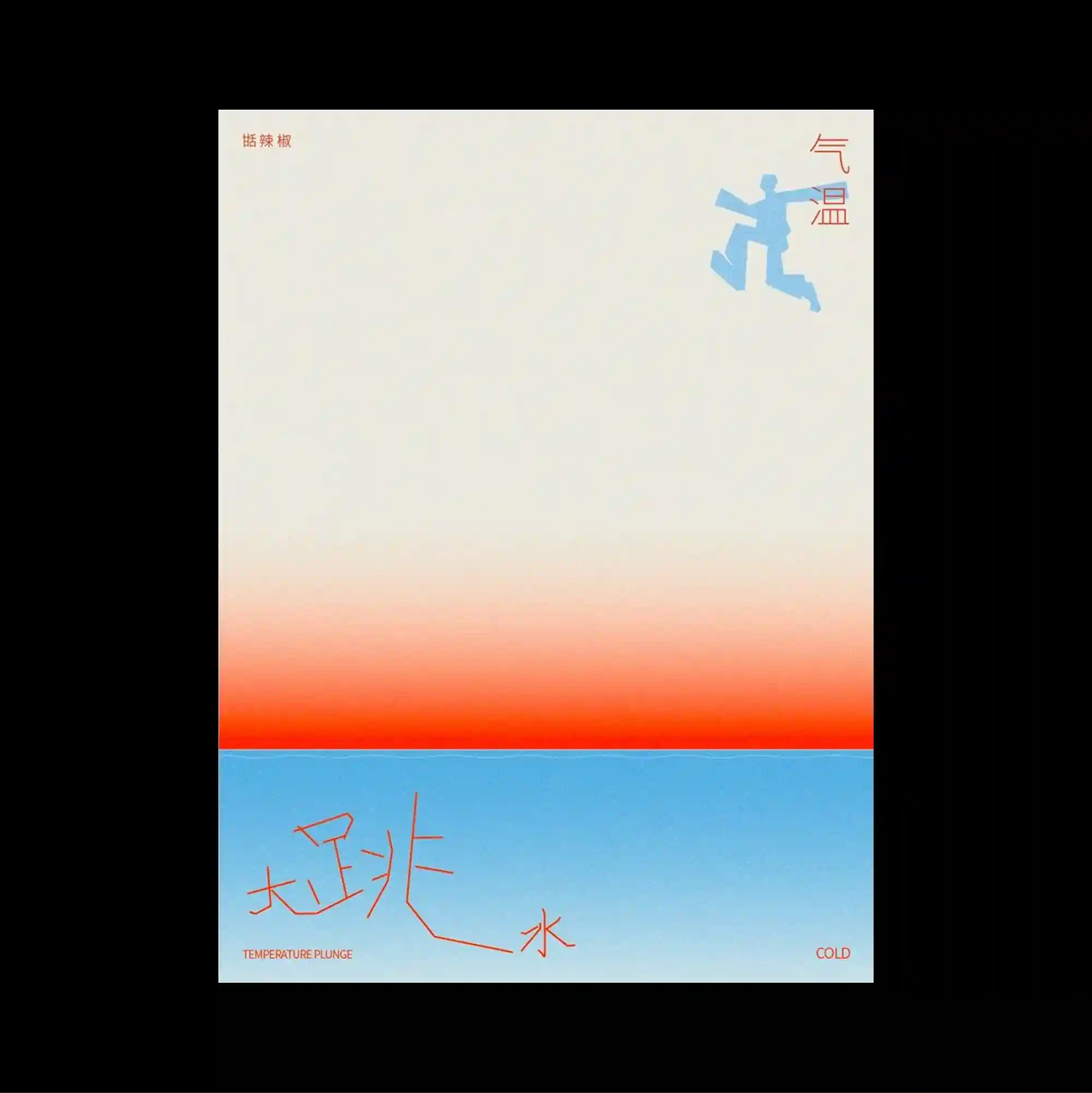
The design is divided into strongly contrasting color and image zones, using large rectangular fields to establish a clear structural hierarchy. Handwritten marks and informal annotations are layered over more systematic printed type, creating tension between spontaneous gestures and controlled typography. A pale upper field transitions through a warm orange band into a bright blue lower section, accented by a small cyan figure and loose red handwritten strokes. Soft tonal transitions and selective color accents create an atmospheric surface where texture and spacing carry as much weight as typography.
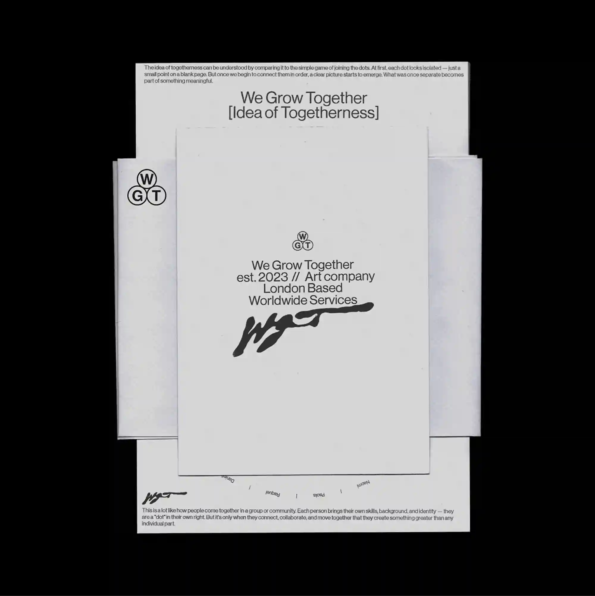
Several overlapping panels and cropped fragments are layered across the page, creating an assembled composition in which foreground and background continuously exchange roles. Restrained serif typography is used at a relatively small scale, allowing generous spacing and subtle alignment shifts to define the hierarchy. Several pale paper-like rectangles are stacked slightly out of register, with small centered labels and a bold signature-like mark creating subtle depth through overlap. Generous empty space and restrained detail create a quiet composition in which small shifts of placement become visually significant.
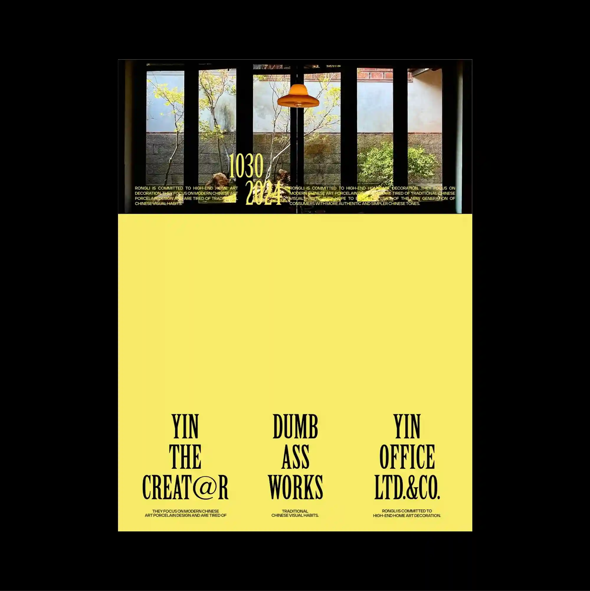
The poster separates a compact image band from a larger lower field, creating a two-part structure with a pronounced shift in density between the sections. A strong hierarchy is created almost entirely through scale, with very large type set against miniature labels and finely printed supporting text. A dark panoramic window photograph forms a narrow upper strip, while a large flat yellow field below carries three widely spaced columns of tall black lettering. Bold color contrasts and abrupt shifts in scale produce an energetic graphic rhythm that remains legible despite the density of the elements.
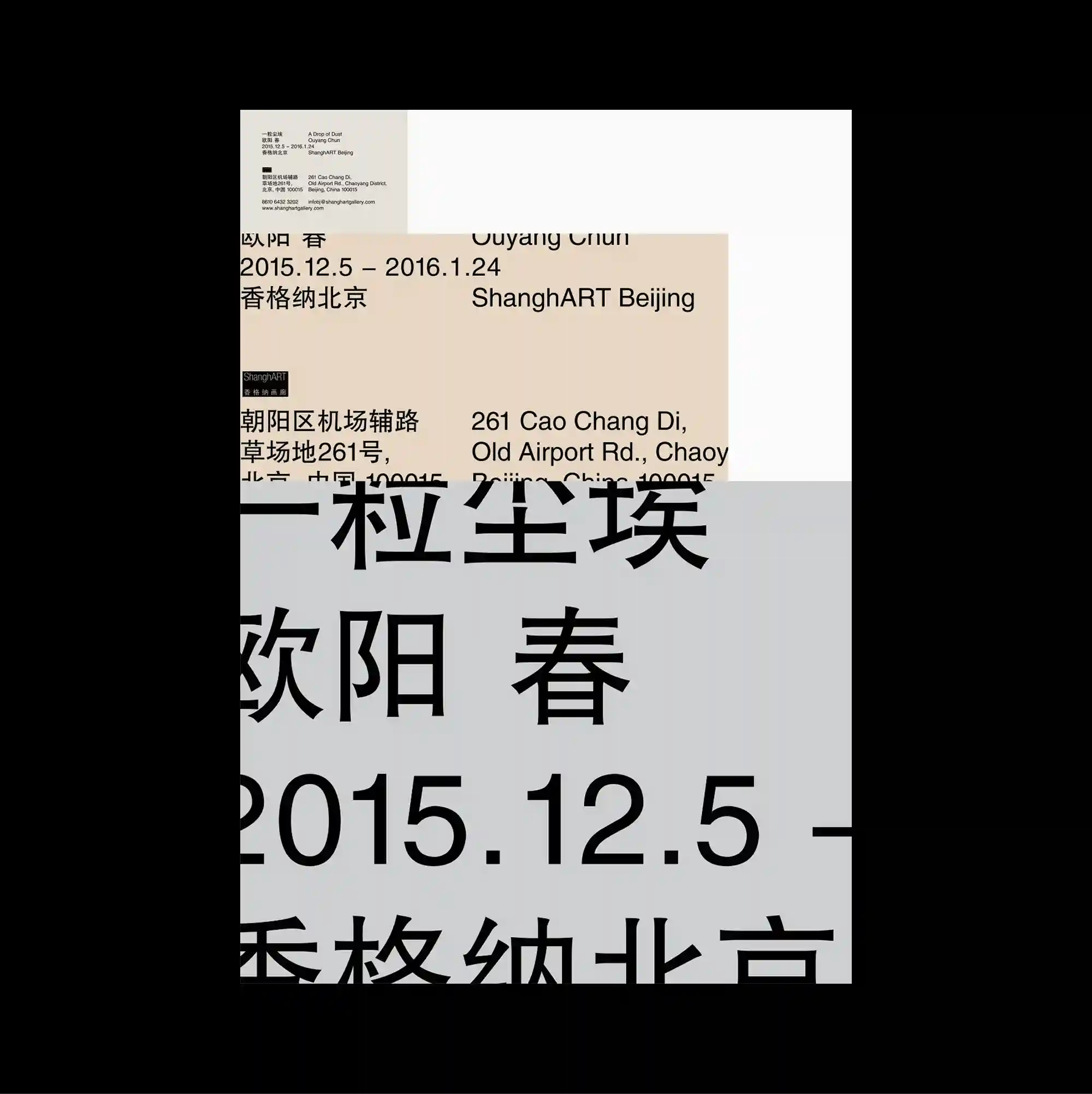
An asymmetrical arrangement is anchored by one oversized geometric or typographic form, while smaller supporting elements are pushed toward the edges. Oversized display lettering is paired with dense micro-typography, creating an extreme scale contrast between headline forms and secondary information. Massive cropped Chinese characters rise from the lower half and extend beyond the edges, while compact bilingual information is held in a narrow band above. Large forms and compressed supporting information create a monumental hierarchy that feels assertive even within a tightly organized layout.
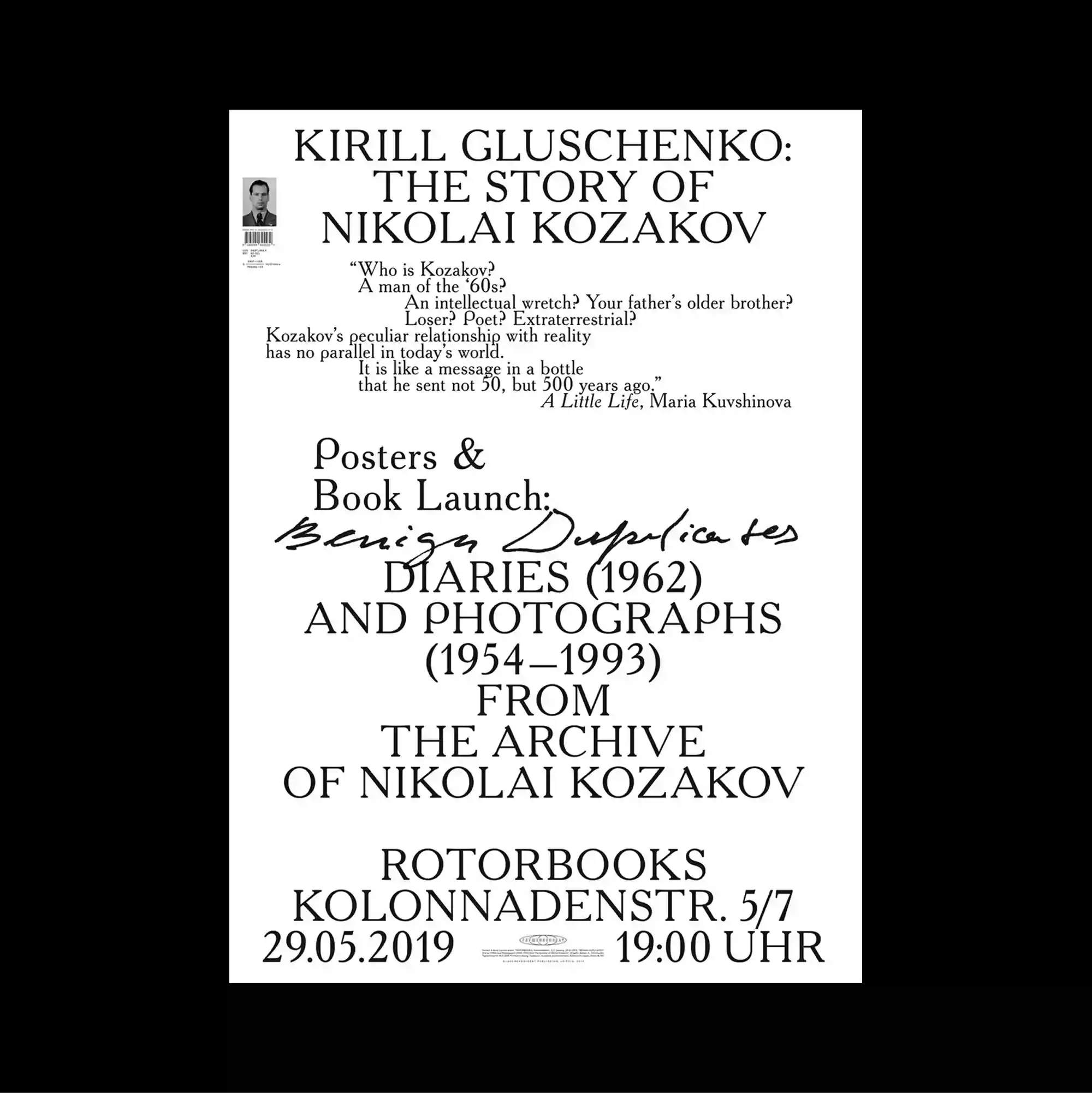
Typography occupies most of the page and functions as the primary image, with letterforms treated as large spatial masses rather than only carriers of information. Serif and sans-serif styles are mixed with thin rules and compact captions, producing a layered hierarchy through changes in weight, width, and alignment. Most of the surface is filled with carefully stacked serif headlines, smaller supporting lines, and one handwritten stroke, leaving almost no imagery beyond the typography itself. Large forms and compressed supporting information create a monumental hierarchy that feels assertive even within a tightly organized layout.
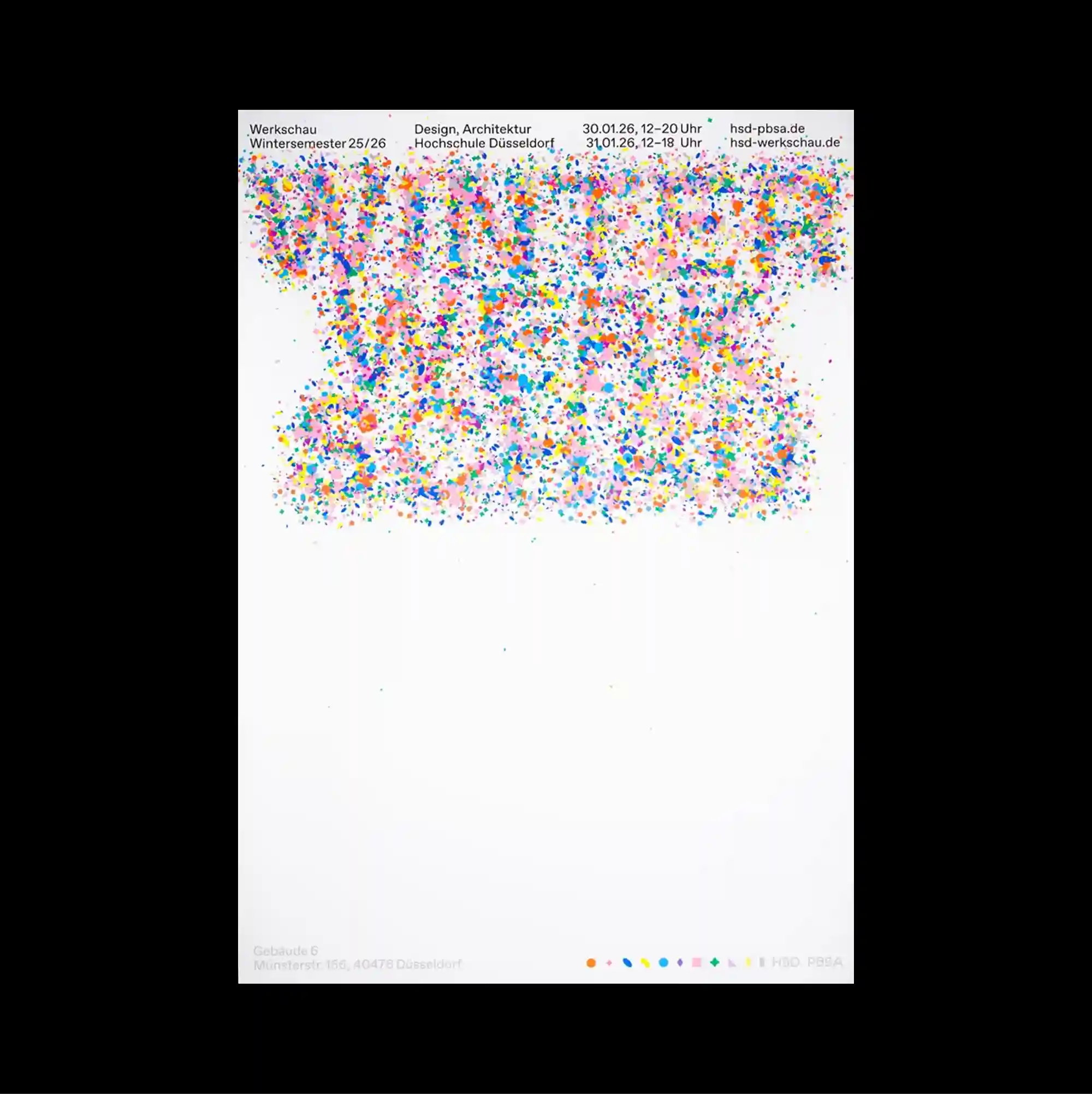
The poster separates a compact image band from a larger lower field, creating a two-part structure with a pronounced shift in density between the sections. Narrow columns of small sans-serif type establish a controlled rhythm, while occasional larger words interrupt the grid and create focal points. A dense cloud of tiny multicolored marks fills the upper region beneath a narrow information header, while the lower half remains largely empty except for minimal indexing details. The repeated structures make the poster read like a diagram or index, with visual meaning emerging from accumulation rather than a single focal image.
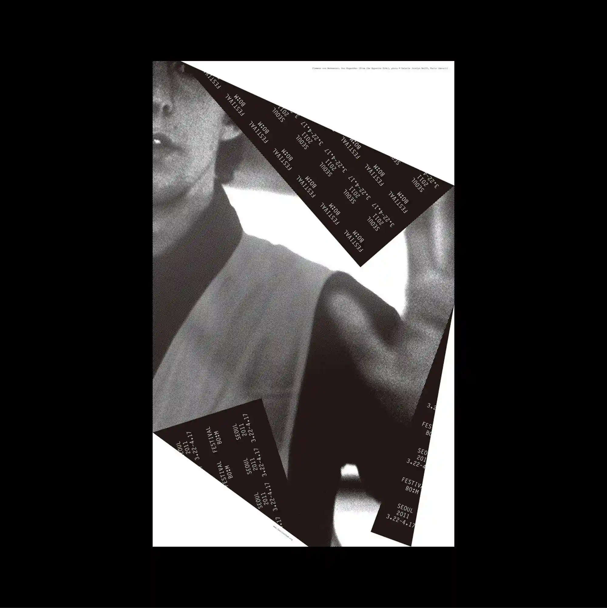
Several overlapping panels and cropped fragments are layered across the page, creating an assembled composition in which foreground and background continuously exchange roles. Repeated words and characters accumulate into a patterned surface, allowing typography to function simultaneously as information and texture. A grayscale close-up of the human body is interrupted by sharp black triangular bands filled with repeated small lettering, creating a strong contrast between soft flesh and rigid geometry. The mixture of irregular fragments, changing scales, and layered surfaces gives the work an experimental collage quality without losing overall balance.
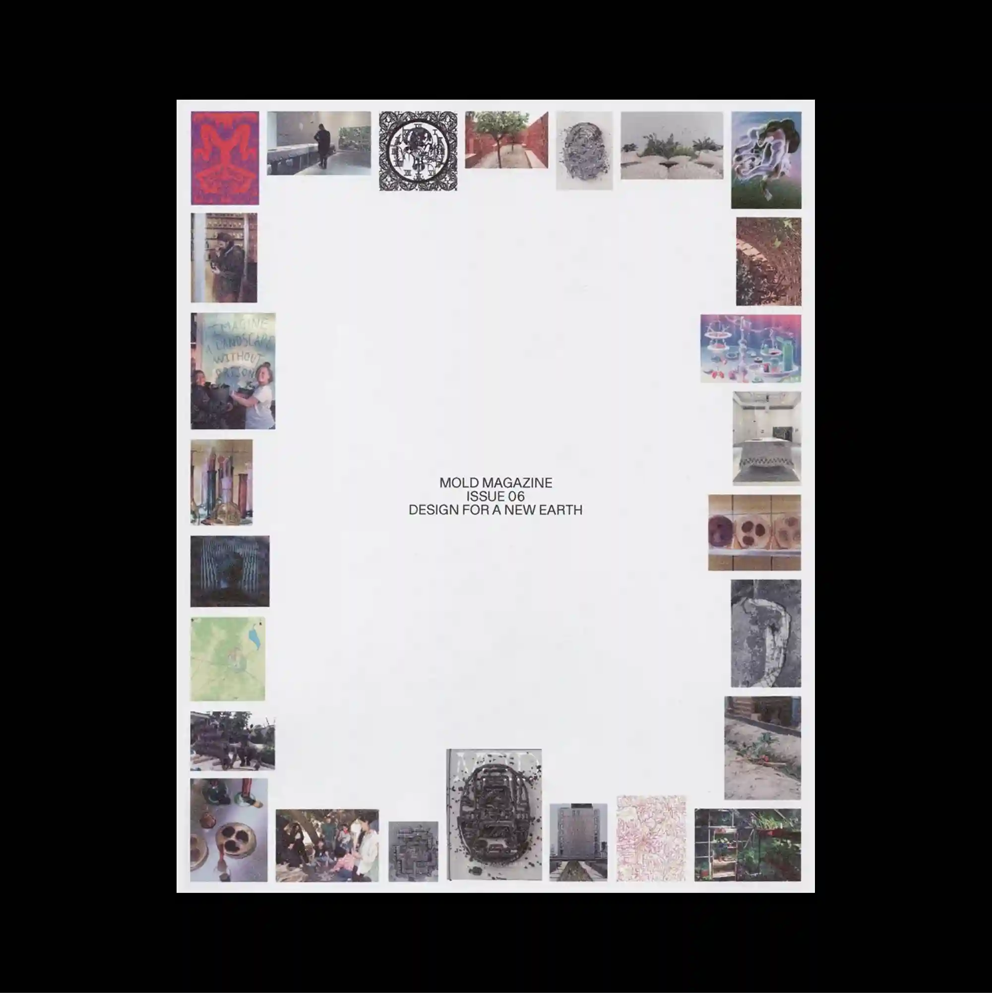
The composition is framed by elements positioned close to the outer edges, leaving the center comparatively open and emphasizing the perimeter as an active zone. Restrained serif typography is used at a relatively small scale, allowing generous spacing and subtle alignment shifts to define the hierarchy. Many small photographs form an uneven perimeter around a large blank center, creating a visual frame made from varied textures, colors, and cropped fragments. Generous empty space and restrained detail create a quiet composition in which small shifts of placement become visually significant.
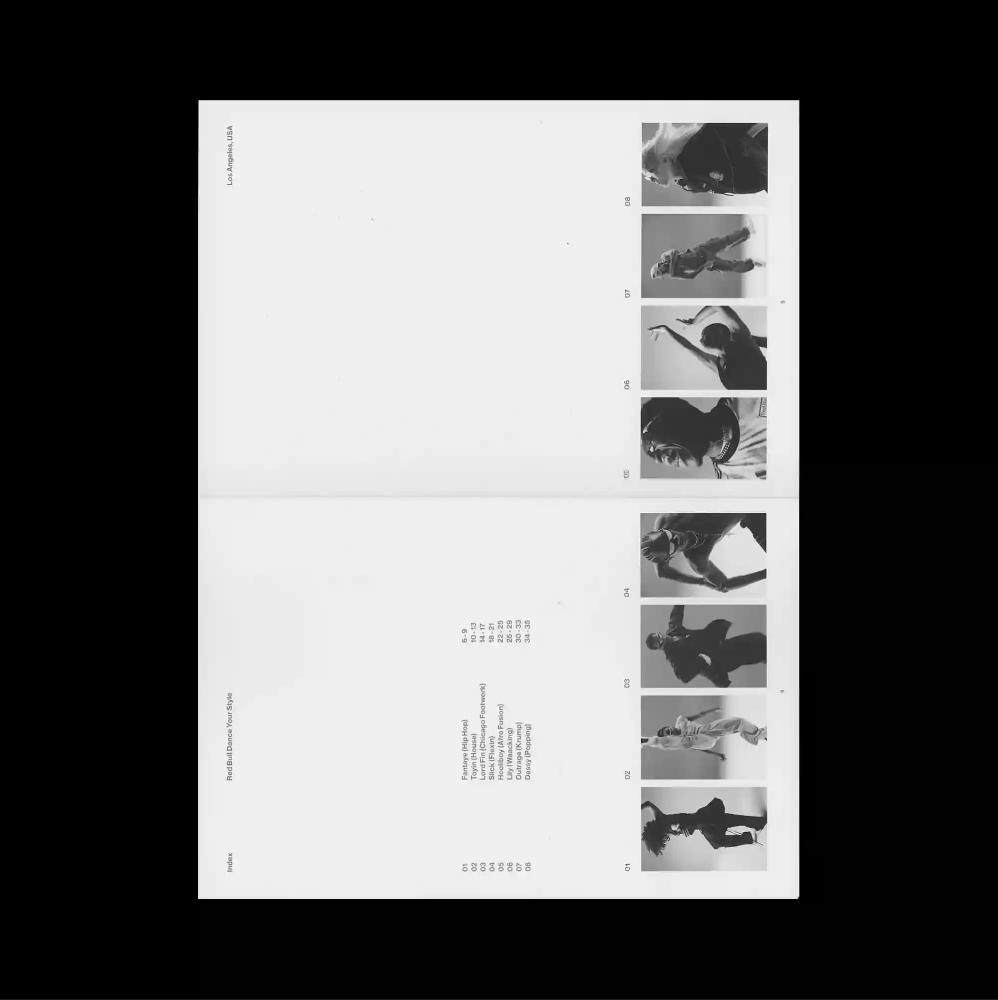
The layout is deliberately sparse, placing only a few compact elements across a broad open field so that distance and scale become active parts of the composition. Restrained serif typography is used at a relatively small scale, allowing generous spacing and subtle alignment shifts to define the hierarchy. A narrow column of monochrome film stills runs down the far right, while tiny centered text and faint fold-like divisions leave most of the sheet visually untouched. The contrast between image fragments and restrained type creates a cinematic pacing, with the eye moving between isolated moments rather than a continuous field.
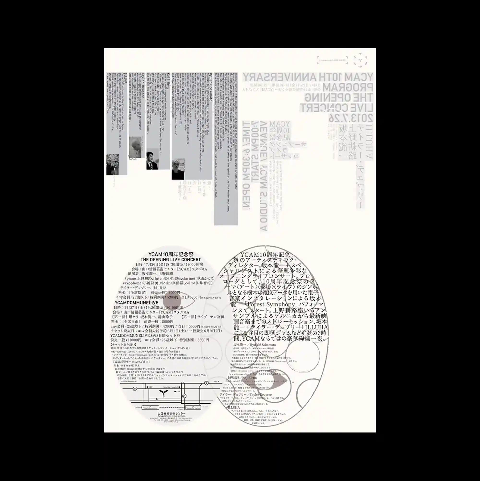
Several overlapping panels and cropped fragments are layered across the page, creating an assembled composition in which foreground and background continuously exchange roles. Typography is integrated with diagrams, coordinates, and graphic notation, so textual information and visual systems become difficult to separate. Layered circular diagrams, fine text columns, translucent gray blocks, and small photographs overlap across the page, producing a complex field of intersecting informational systems. The repeated structures make the poster read like a diagram or index, with visual meaning emerging from accumulation rather than a single focal image.
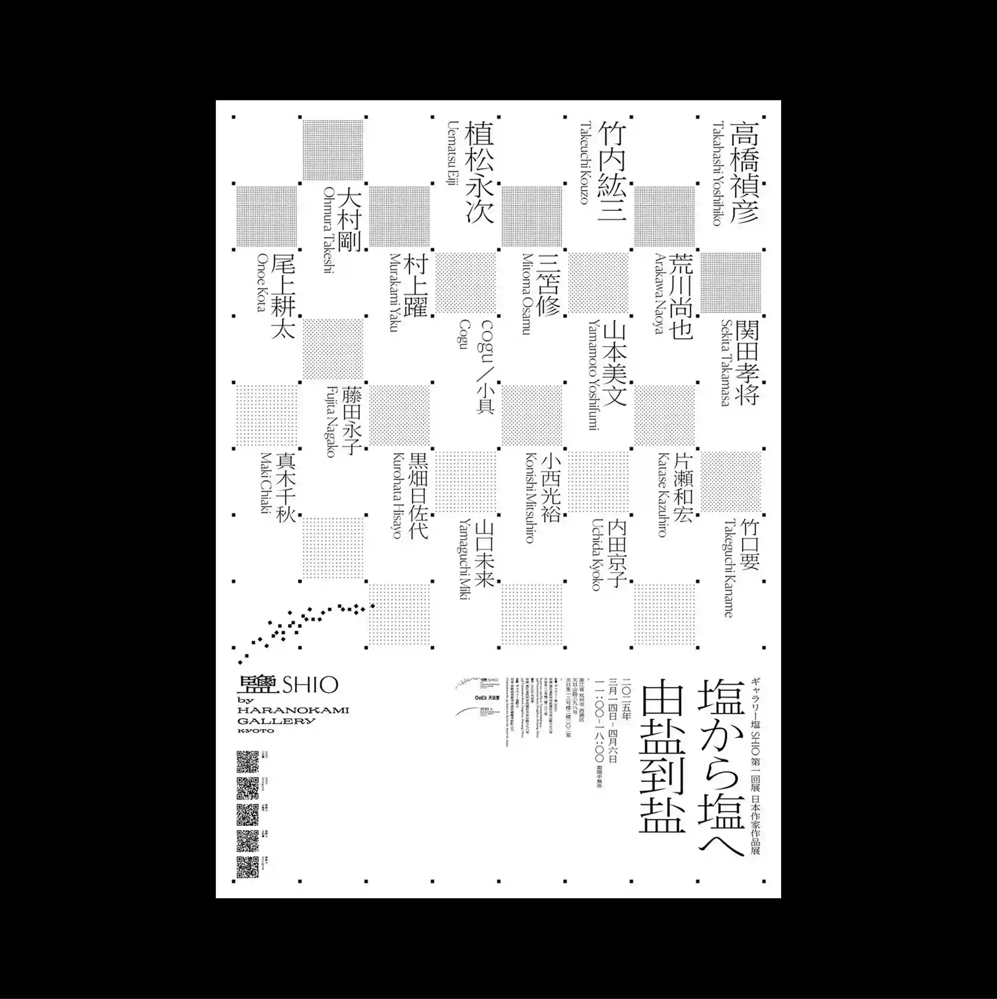
The entire surface is treated as a dense information field, with numerous small units packed closely enough to form an almost continuous visual texture. Vertical East Asian type is combined with smaller horizontal information, creating multiple reading directions within the same tightly controlled structure. Alternating gray squares and vertical East Asian text form a loose checkerboard, with small rules and captions distributed through the gaps like a modular index. Precise alignment and dense secondary information give the design a highly functional appearance while preserving a distinctive graphic hierarchy.
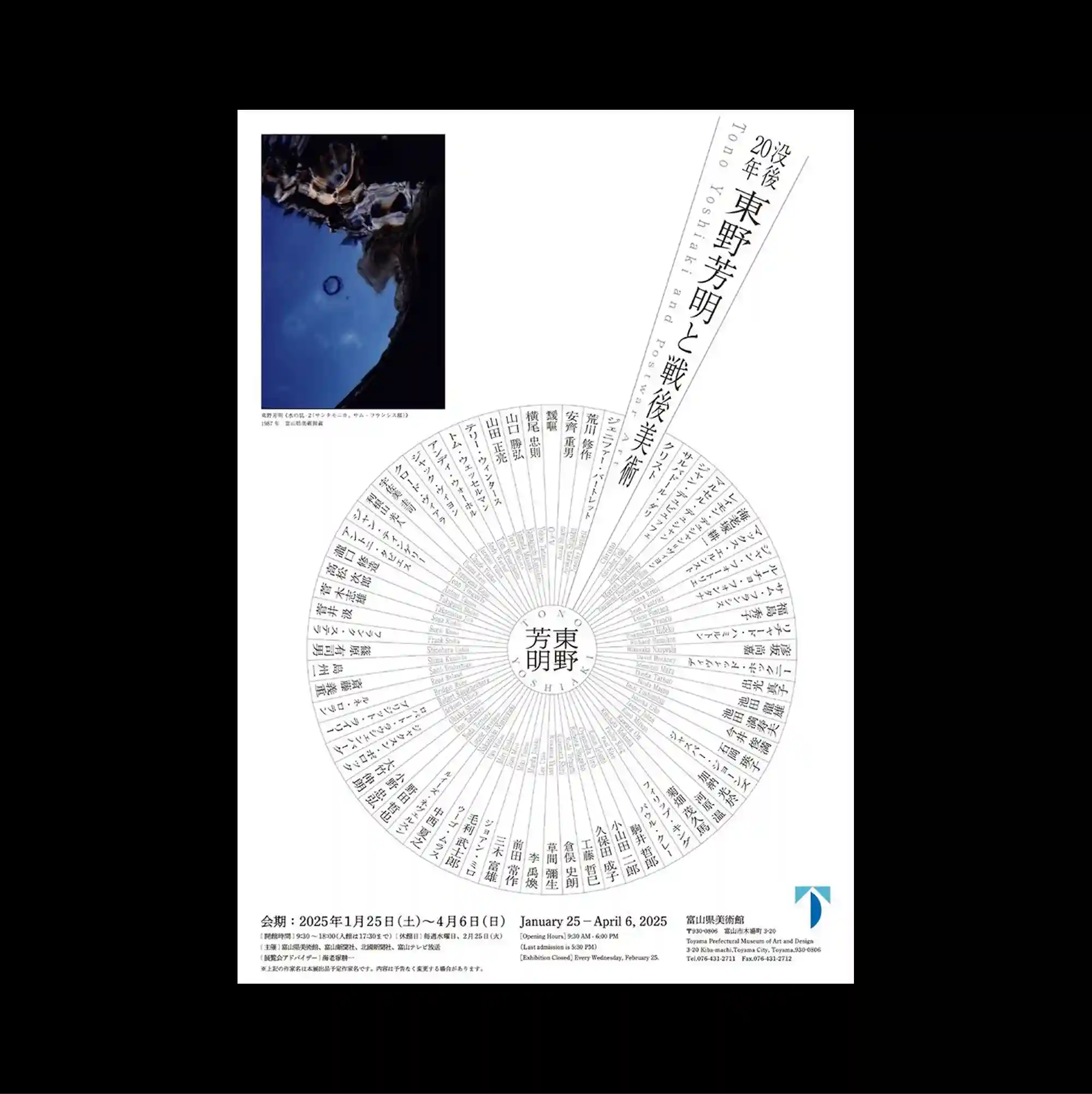
A radial structure dominates the page, arranging text and graphic marks around circular paths that pull attention toward and away from the center. Vertical East Asian type is combined with smaller horizontal information, creating multiple reading directions within the same tightly controlled structure. A large circular typographic wheel occupies the lower half, intersected by a sharply angled text band and balanced by one compact blue-toned photograph near the top. The repeated structures make the poster read like a diagram or index, with visual meaning emerging from accumulation rather than a single focal image.
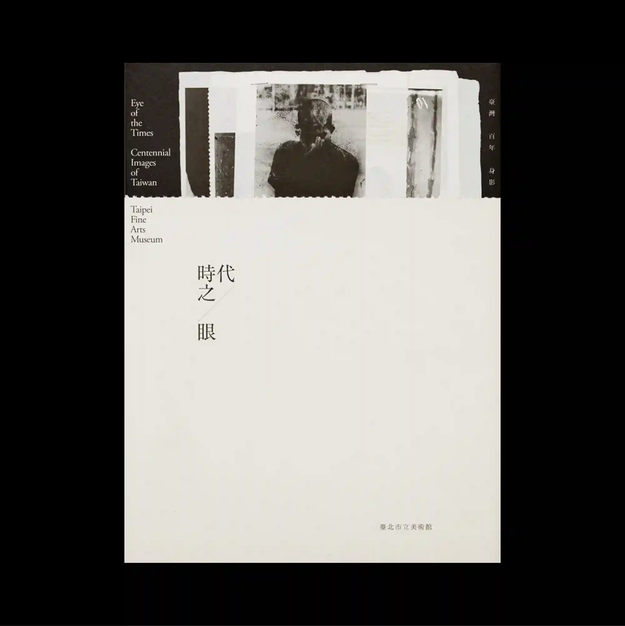
The poster separates a compact image band from a larger lower field, creating a two-part structure with a pronounced shift in density between the sections. Restrained serif typography is used at a relatively small scale, allowing generous spacing and subtle alignment shifts to define the hierarchy. A rough monochrome photo strip is partially exposed along the top edge, while a short vertical title sits almost alone within a large cream-colored field. Generous empty space and restrained detail create a quiet composition in which small shifts of placement become visually significant.
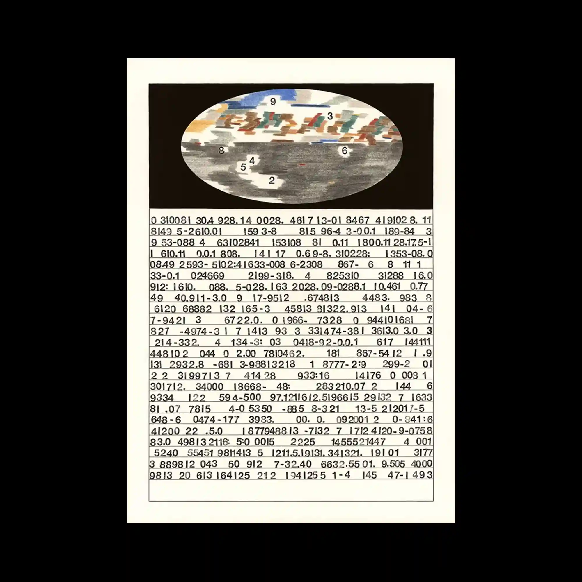
The surface is built from stacked rectangular panels of different sizes, producing a clear vertical rhythm through repeated blocks and abrupt transitions. Monospaced and data-like typography is arranged in repeated rows and columns, giving the text the character of measurements, indexes, or coded information. A small oval image at the top is followed by an extremely dense block of numerical strings, producing a sharp shift from isolated imagery to continuous data texture. The result feels analytical and technical, using repetition and precise spacing to turn information into a structured visual system.
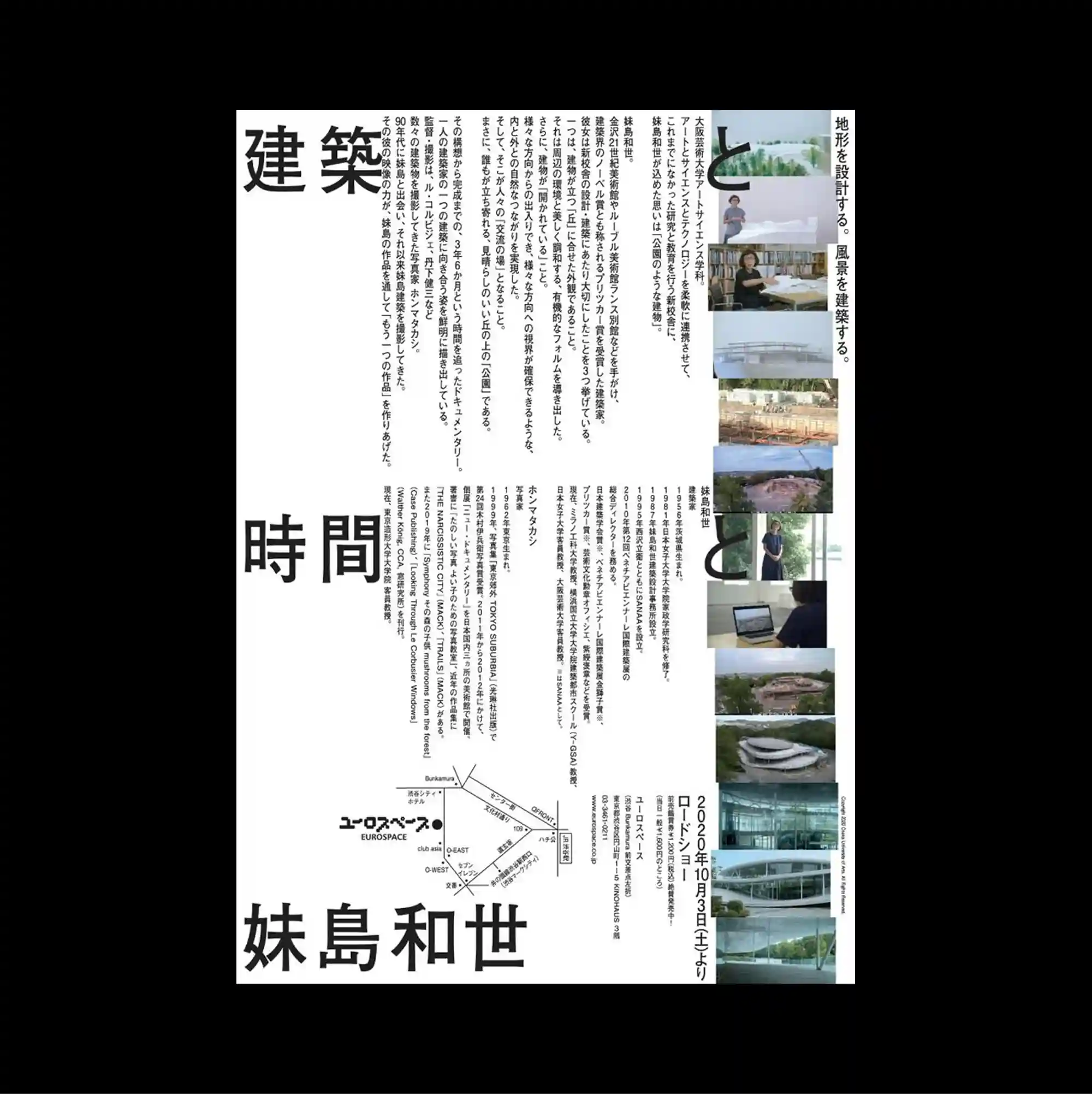
A vertical collage structure guides the eye downward through a sequence of images, notes, and narrow text blocks arranged with uneven spacing. Vertical East Asian type is combined with smaller horizontal information, creating multiple reading directions within the same tightly controlled structure. Large vertical characters anchor the left side, dense columns occupy the center, and a narrow strip of small architectural photographs runs down the right edge. The careful sequencing of headings, captions, and images gives the piece the discipline of a publication page while retaining the impact of a poster.
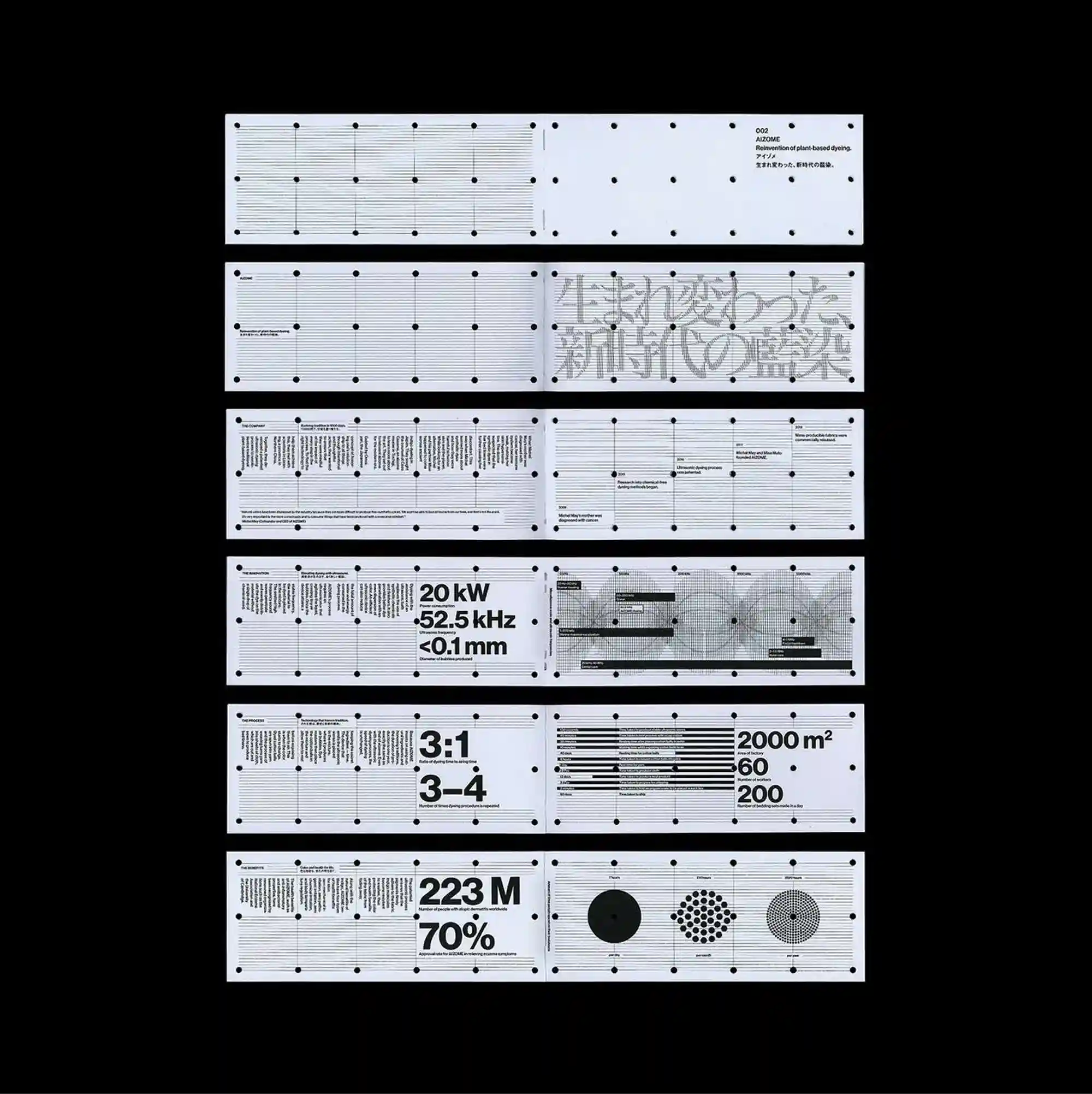
The page is organized as a sequence of modular bands and compartments, each functioning like a small technical panel within a larger information system. Text is tightly aligned to grids, rules, and modular divisions, reinforcing the sense of a carefully engineered information structure. Long horizontal strips contain diagrams, dot grids, measurements, circles, and large numerals, creating repeated technical panels with sharply varying internal densities. Precise alignment and dense secondary information give the design a highly functional appearance while preserving a distinctive graphic hierarchy.
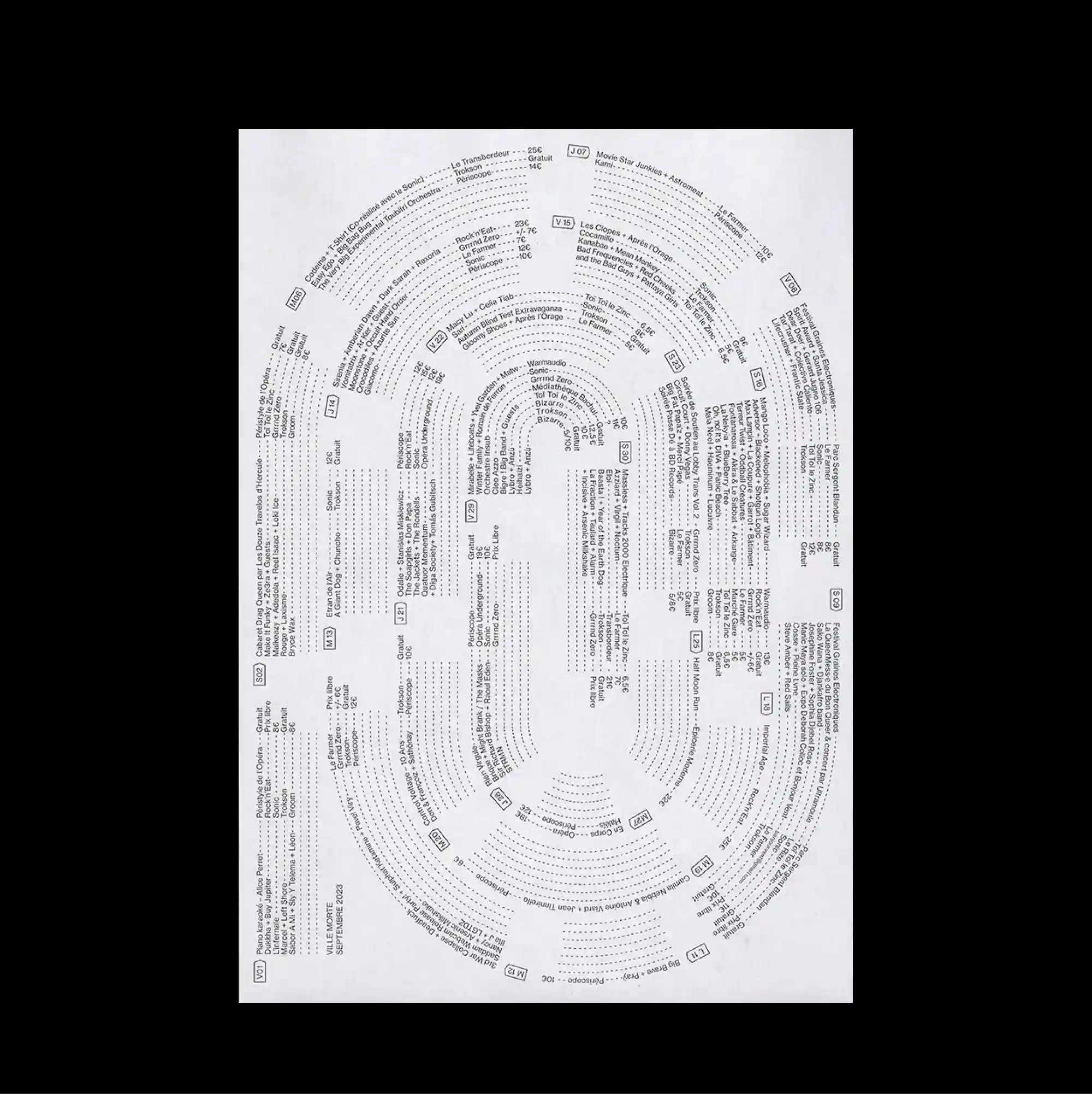
A radial structure dominates the page, arranging text and graphic marks around circular paths that pull attention toward and away from the center. Monospaced and data-like typography is arranged in repeated rows and columns, giving the text the character of measurements, indexes, or coded information. Hundreds of tiny entries follow nested oval paths, with small labels and dotted leaders thickening the outer rings while the center remains comparatively open. The repeated structures make the poster read like a diagram or index, with visual meaning emerging from accumulation rather than a single focal image.
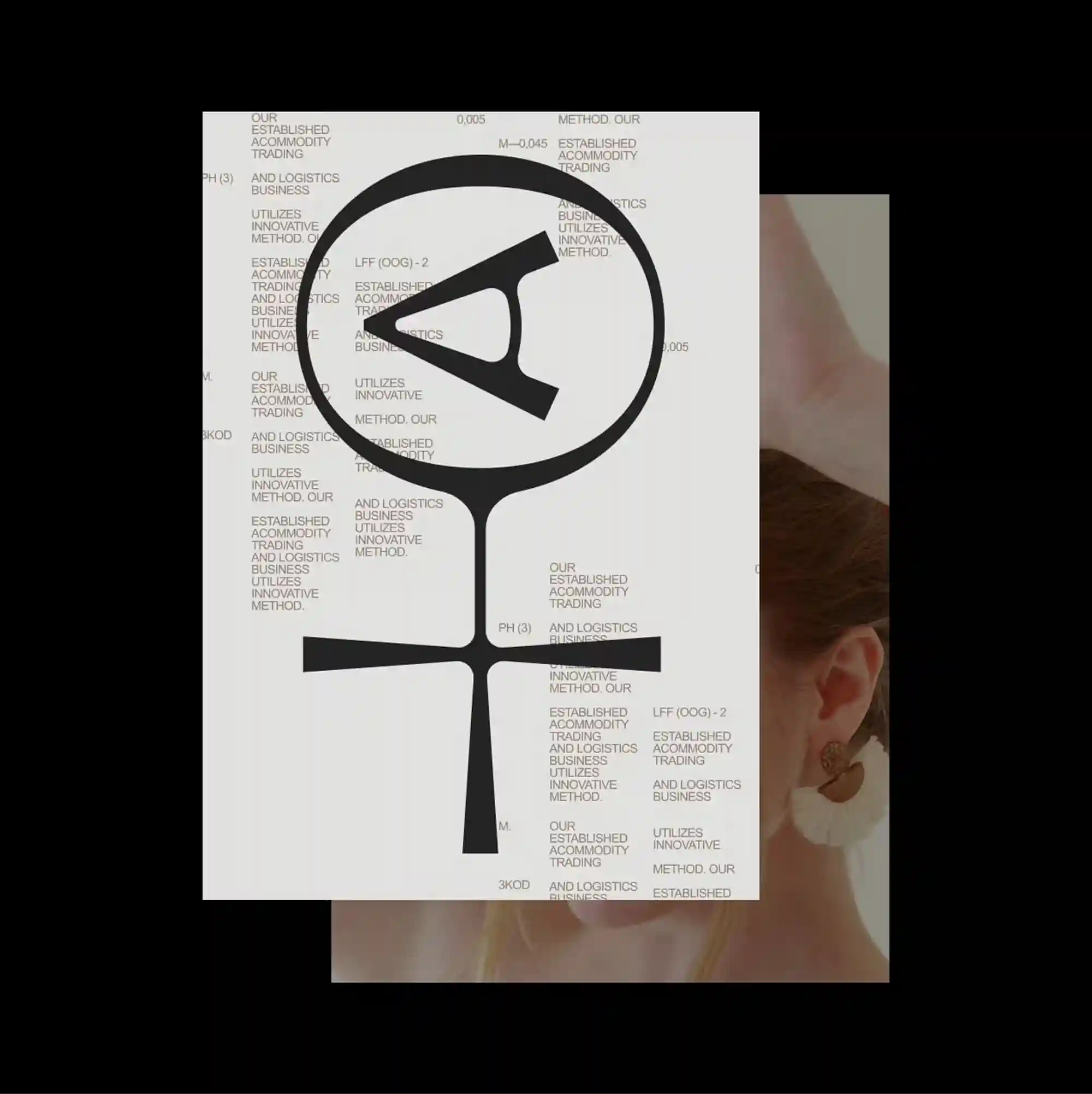
Several overlapping panels and cropped fragments are layered across the page, creating an assembled composition in which foreground and background continuously exchange roles. Repeated words and characters accumulate into a patterned surface, allowing typography to function simultaneously as information and texture. A large abstract black symbol overlaps a dense field of repeated text, while a cropped portrait and pale rectangular panel create additional layers along the lower and right areas. The compressed layering and hard contrasts produce a dense industrial character, with information behaving almost like a physical surface.
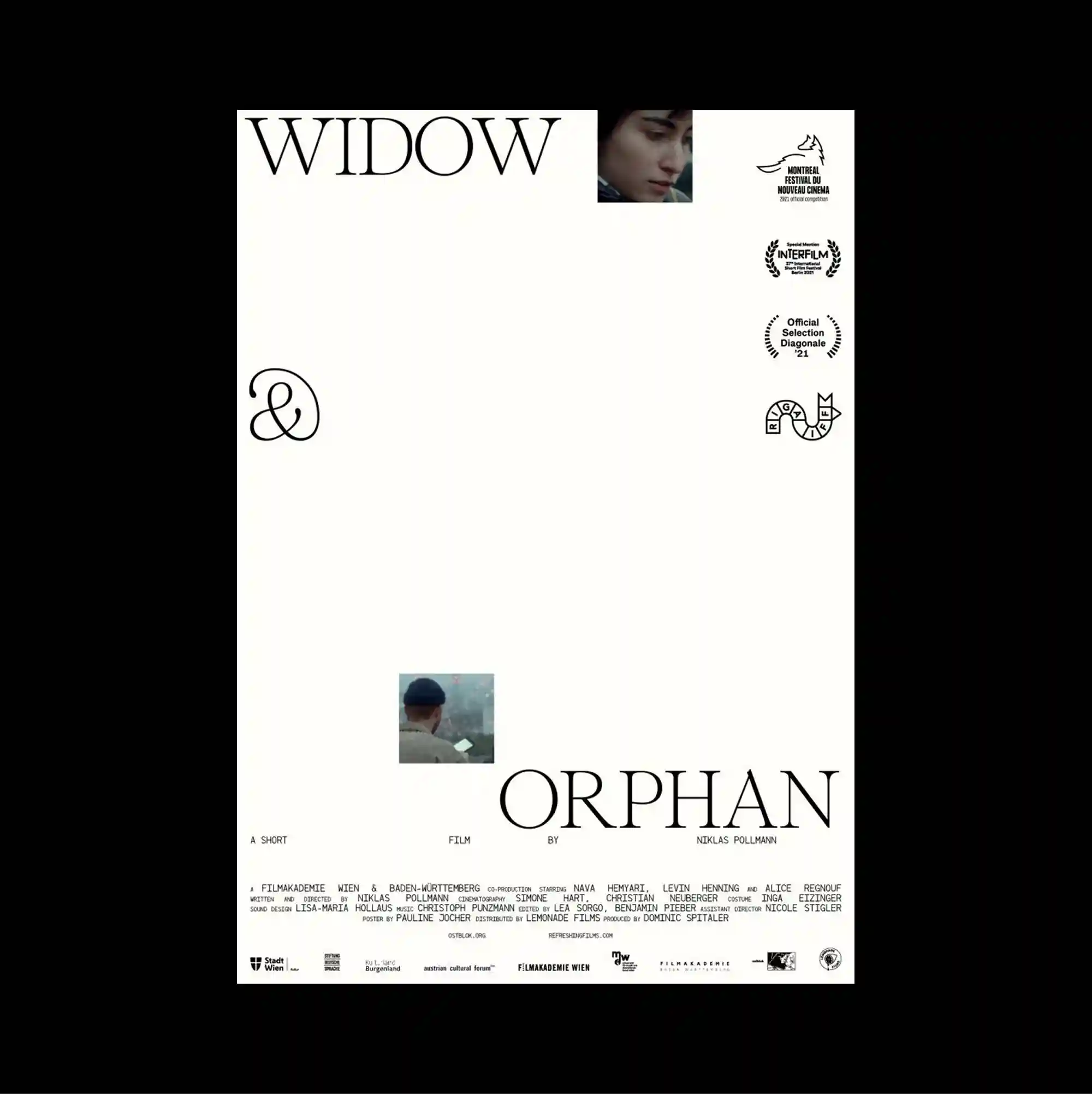
The layout is deliberately sparse, placing only a few compact elements across a broad open field so that distance and scale become active parts of the composition. Restrained serif typography is used at a relatively small scale, allowing generous spacing and subtle alignment shifts to define the hierarchy. Two tiny film stills and a few emblem-like marks punctuate the otherwise open page, while large elegant serif words are positioned far apart near opposing edges. Generous empty space and restrained detail create a quiet composition in which small shifts of placement become visually significant.
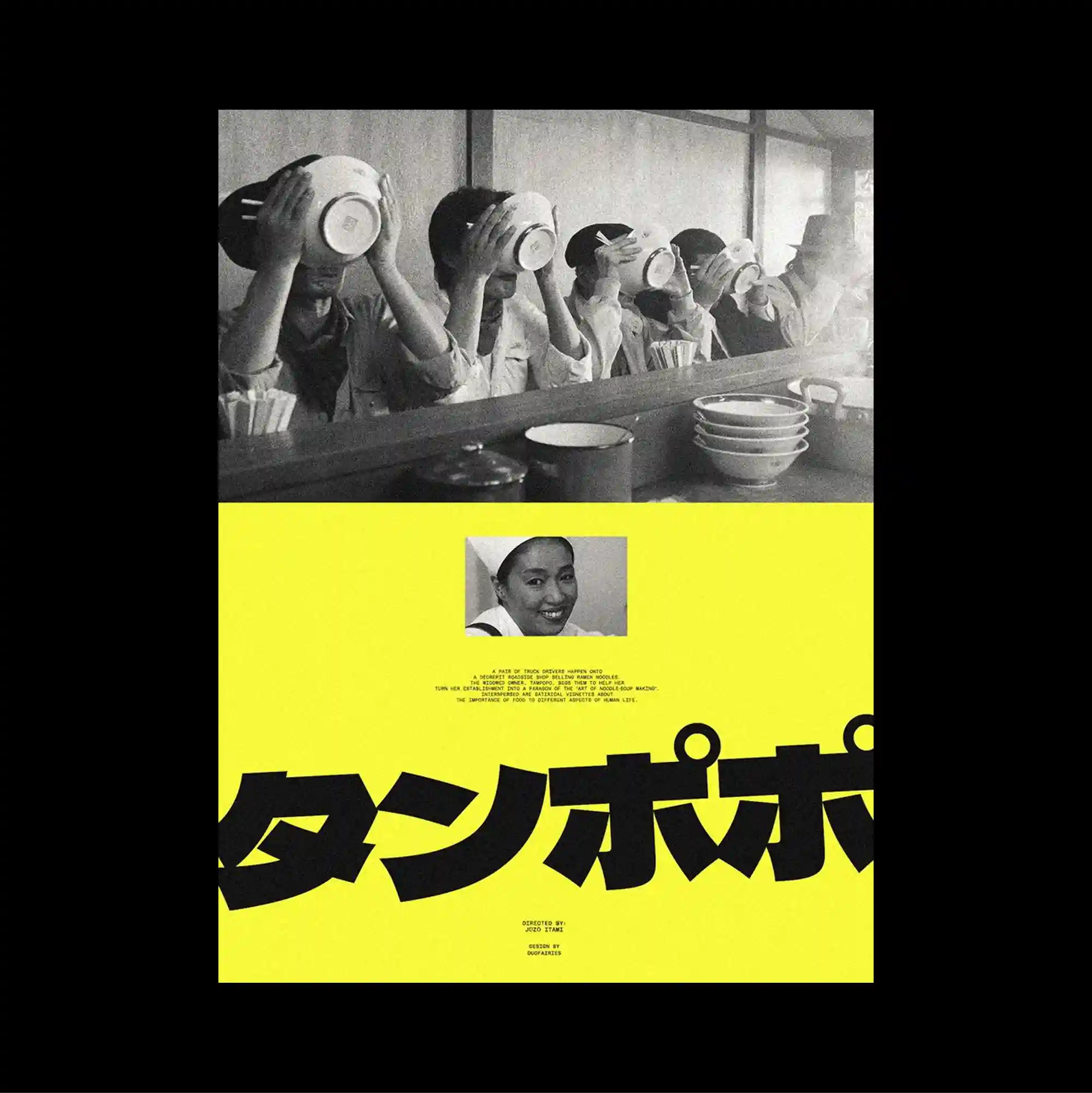
The poster separates a compact image band from a larger lower field, creating a two-part structure with a pronounced shift in density between the sections. Oversized display lettering is paired with dense micro-typography, creating an extreme scale contrast between headline forms and secondary information. A wide monochrome photograph of repeated figures occupies the upper section, while an intense yellow lower field is cut by a small portrait and oversized cropped Japanese lettering. Bold color contrasts and abrupt shifts in scale produce an energetic graphic rhythm that remains legible despite the density of the elements.
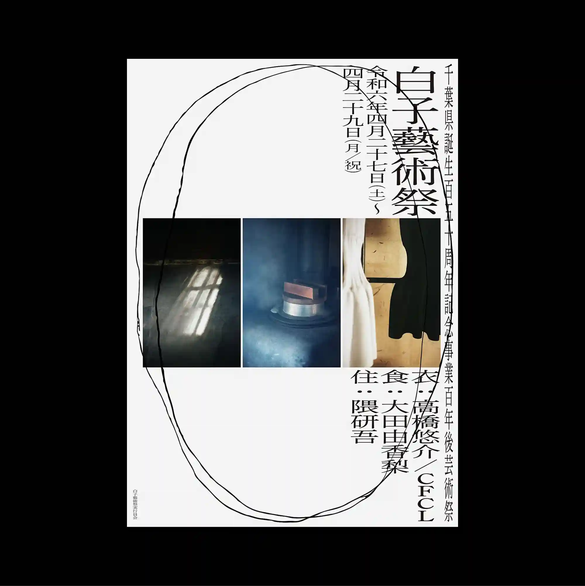
An asymmetrical arrangement is anchored by one oversized geometric or typographic form, while smaller supporting elements are pushed toward the edges. Vertical East Asian type is combined with smaller horizontal information, creating multiple reading directions within the same tightly controlled structure. Three narrow photographic panels sit across the middle while large hand-drawn elliptical lines loop around them and dense vertical characters gather along the right edge. The mixture of irregular fragments, changing scales, and layered surfaces gives the work an experimental collage quality without losing overall balance.
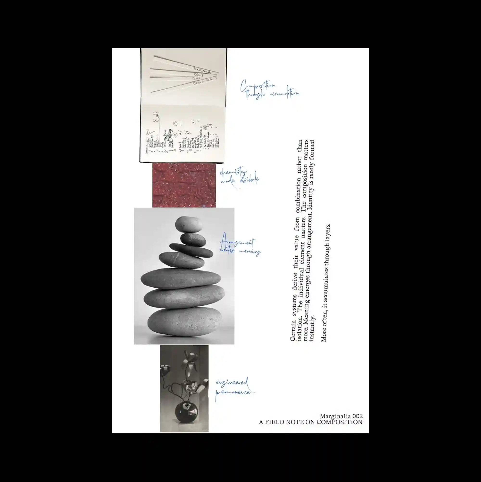
A vertical collage structure guides the eye downward through a sequence of images, notes, and narrow text blocks arranged with uneven spacing. Handwritten marks and informal annotations are layered over more systematic printed type, creating tension between spontaneous gestures and controlled typography. Photographs of stacked stones and material samples alternate with handwritten blue annotations, creating a field-note appearance with noticeably varied scales and textures. Visible grain, imperfect edges, and mixed image qualities introduce a tactile analog character that softens the underlying grid.
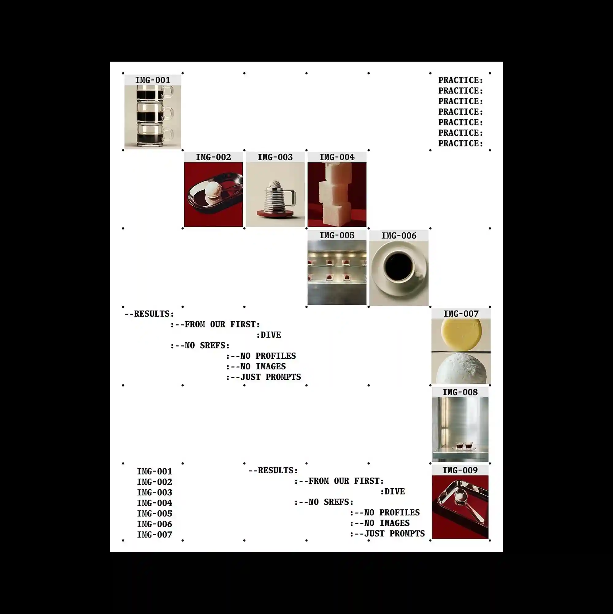
A vertical collage structure guides the eye downward through a sequence of images, notes, and narrow text blocks arranged with uneven spacing. Monospaced and data-like typography is arranged in repeated rows and columns, giving the text the character of measurements, indexes, or coded information. Small photographic samples step diagonally across the page, joined by tiny labels, dot markers, and repeated lists that make the sequence resemble a documented process. The result feels analytical and technical, using repetition and precise spacing to turn information into a structured visual system.
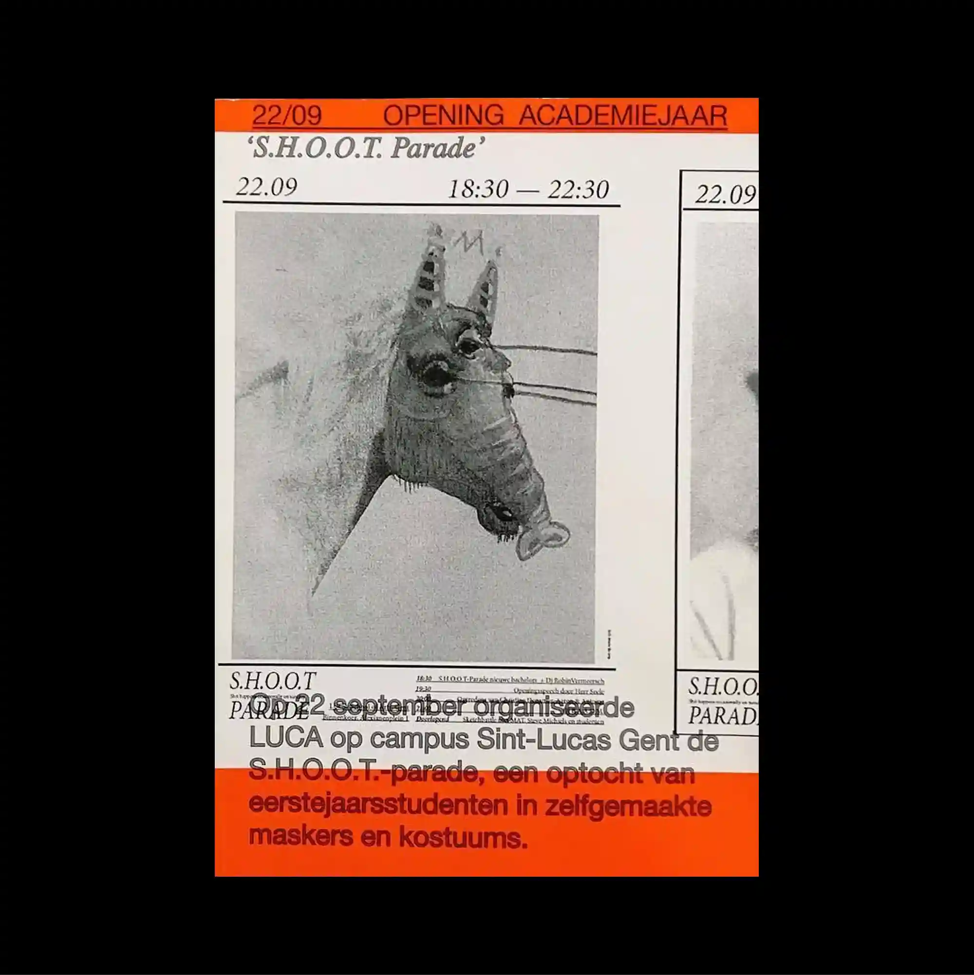
The composition follows a rigid editorial grid, with a dominant visual block framed by narrow information bands and clearly separated sections. Serif and sans-serif styles are mixed with thin rules and compact captions, producing a layered hierarchy through changes in weight, width, and alignment. A grainy monochrome horse photograph is enclosed by vivid orange strips, narrow rules, and cropped secondary imagery that reinforce a newspaper-like visual density. The controlled alignment and rough material details give the poster a direct archival print character while keeping the visual rhythm sharply organized.
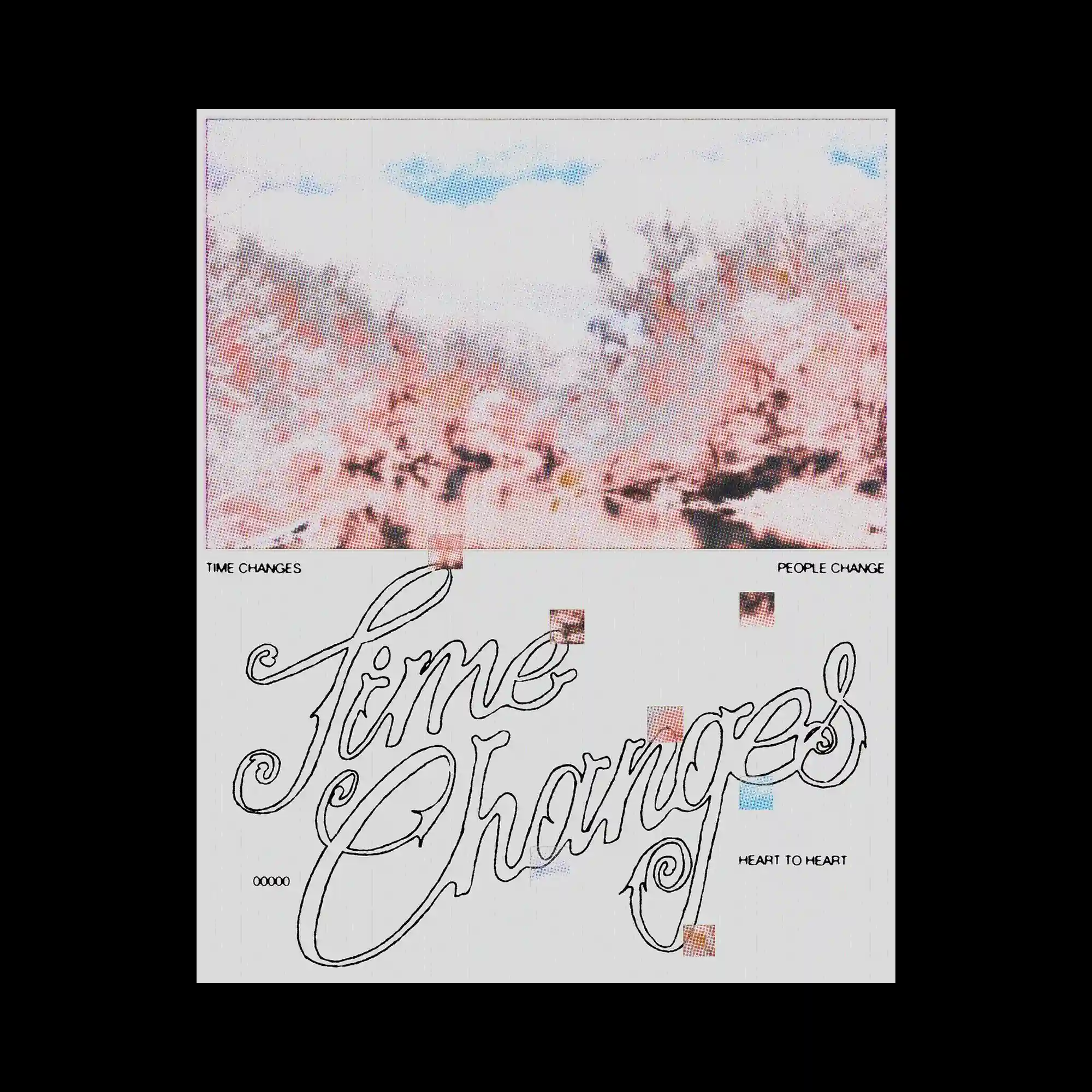
A halftone landscape image occupies the upper portion of the composition, dissolving photographic detail into a soft field of colored dots that creates an atmospheric visual texture. The lower section is dominated by an oversized hand-drawn script that stretches diagonally across the layout, contrasting expressive calligraphic strokes with the restrained geometry above. Small pixel-like color blocks are scattered throughout the composition, acting as subtle visual accents that connect the two sections. Generous negative space, delicate linework, and the balance between raster imagery and flowing typography create a composition that feels both quiet and dynamically layered.
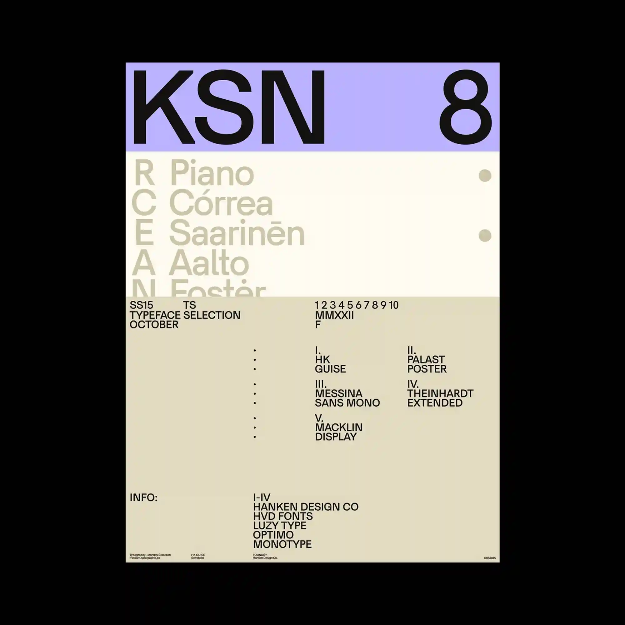
A structured grid supports bold sans-serif headings, oversized numerals, and carefully spaced informational text within a restrained typographic system. Soft lavender and warm beige color fields divide the composition into clearly defined functional areas. Small typographic details are positioned with generous negative space, allowing each section to remain visually distinct. The poster achieves balance through proportion, alignment, and disciplined minimalism.
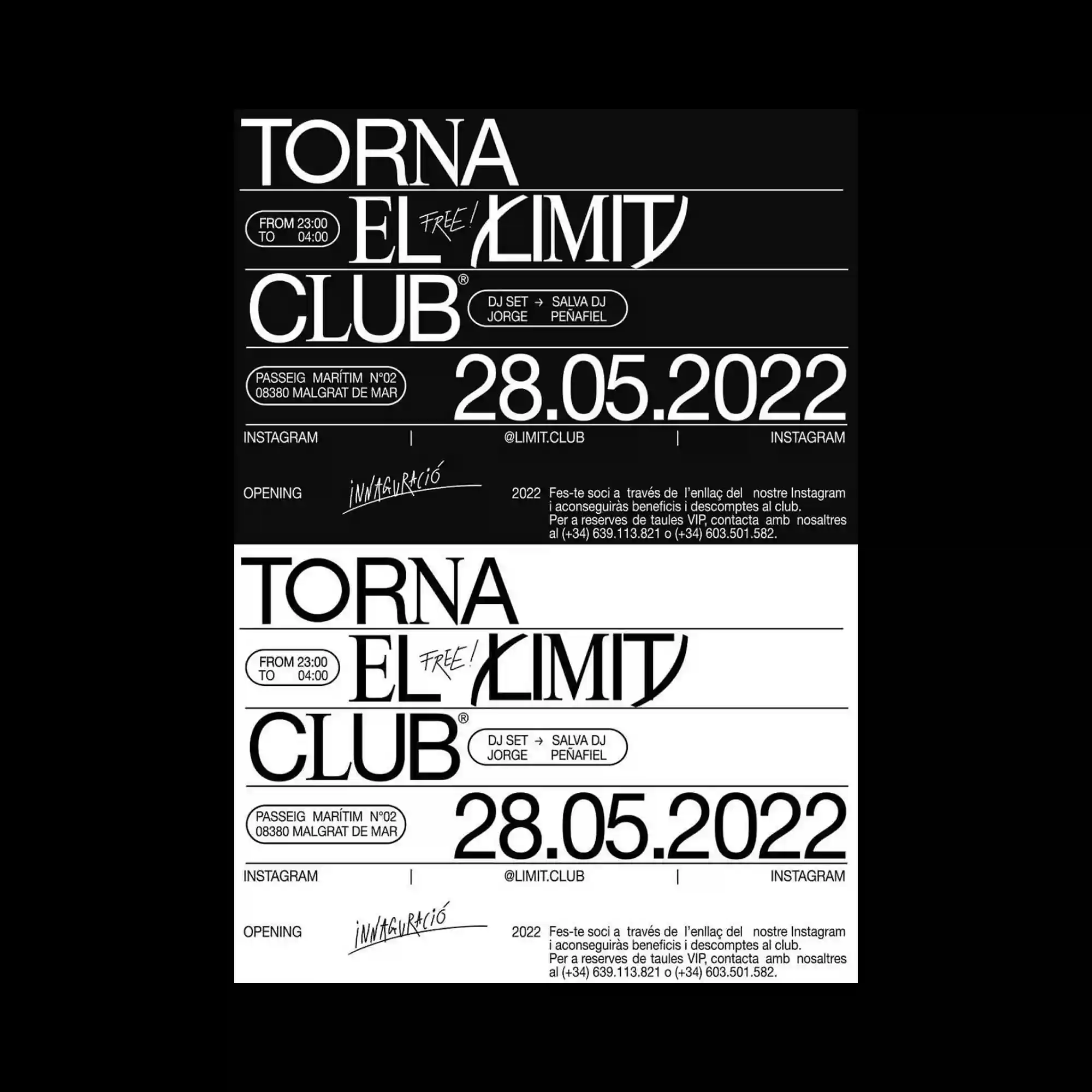
The design is divided into two mirrored sections that invert black and white while preserving the same typographic structure. Rounded labels, thin dividing lines, and contrasting serif and sans-serif typefaces organize the information with precision. The duplicated layout emphasizes symmetry while highlighting the effect of reversed color relationships. Consistent spacing and alignment reinforce the graphic clarity.
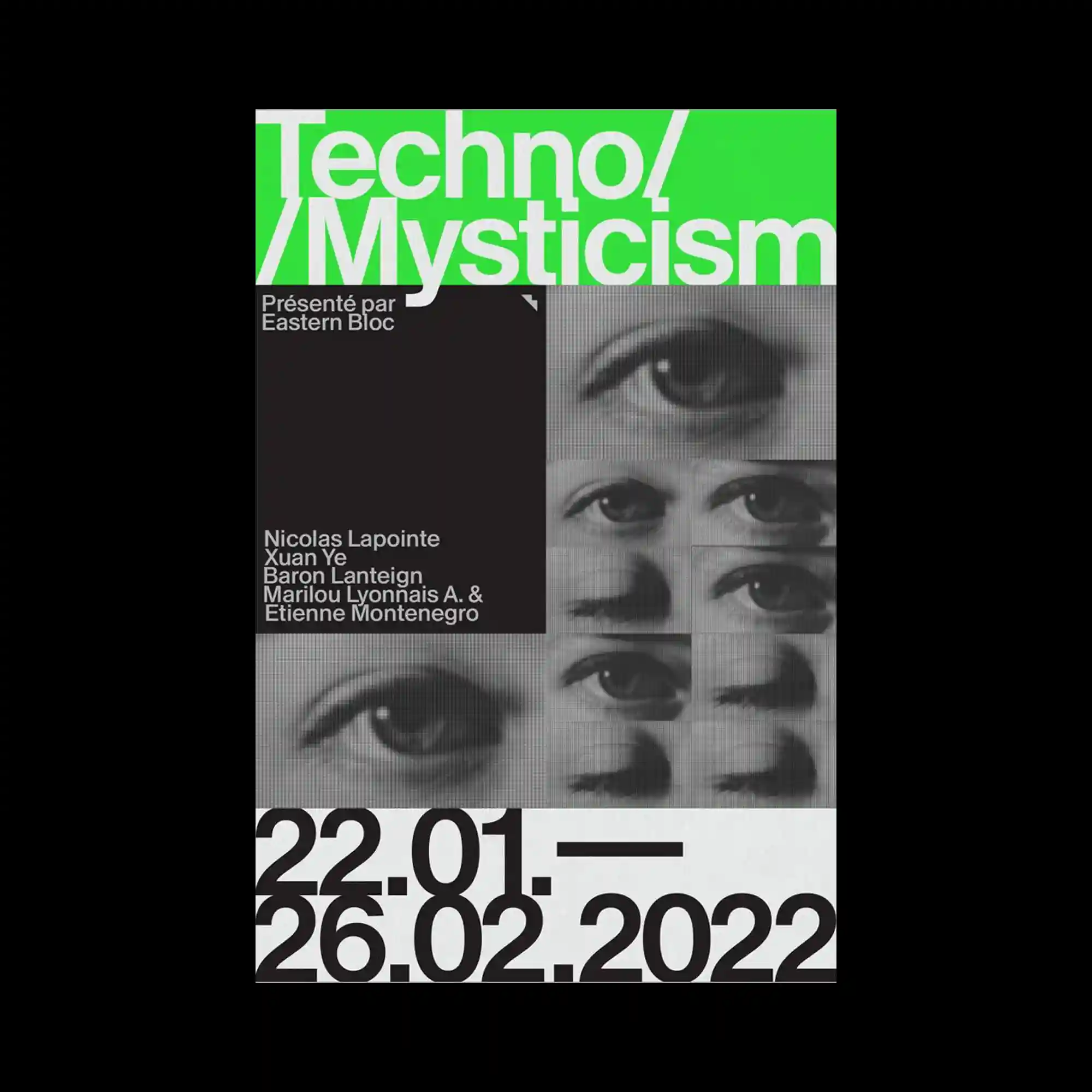
Oversized white typography spans the upper portion of the composition, while monochrome close-up eye images occupy a precise grid beneath it. A bright green header introduces strong color contrast against the grayscale imagery and black structural blocks. Large numerical elements anchor the lower section, creating a clear visual base. The interaction between photography and bold typography produces a contemporary poster language.
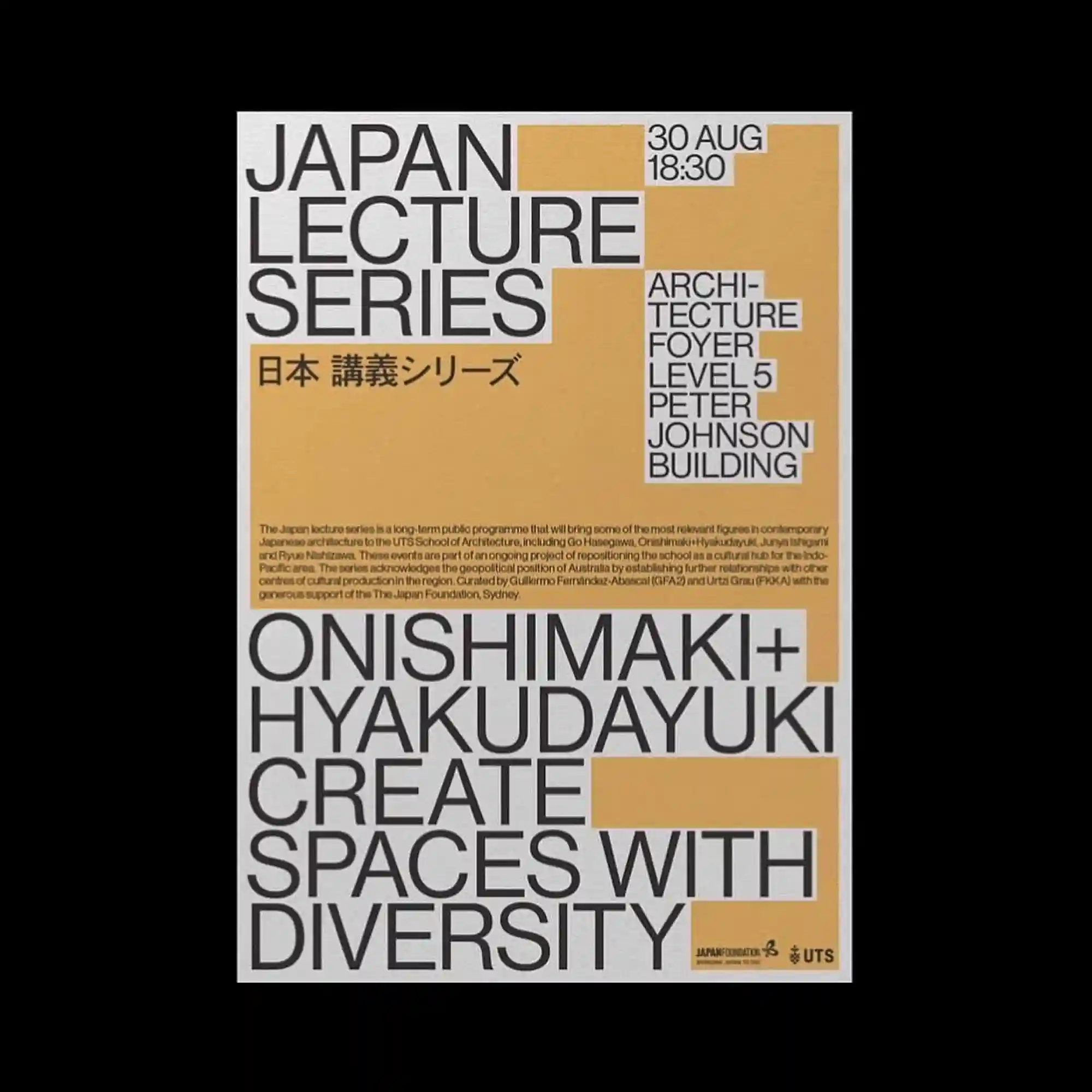
Rectangular color blocks define the composition while bold sans-serif typography expands across the page in a highly modular arrangement. Neutral gray lettering contrasts with warm ochre panels that frame different groups of information. The stepped geometry guides the reading sequence through clearly segmented sections. The layout relies on proportion, alignment, and scale instead of decorative graphics.
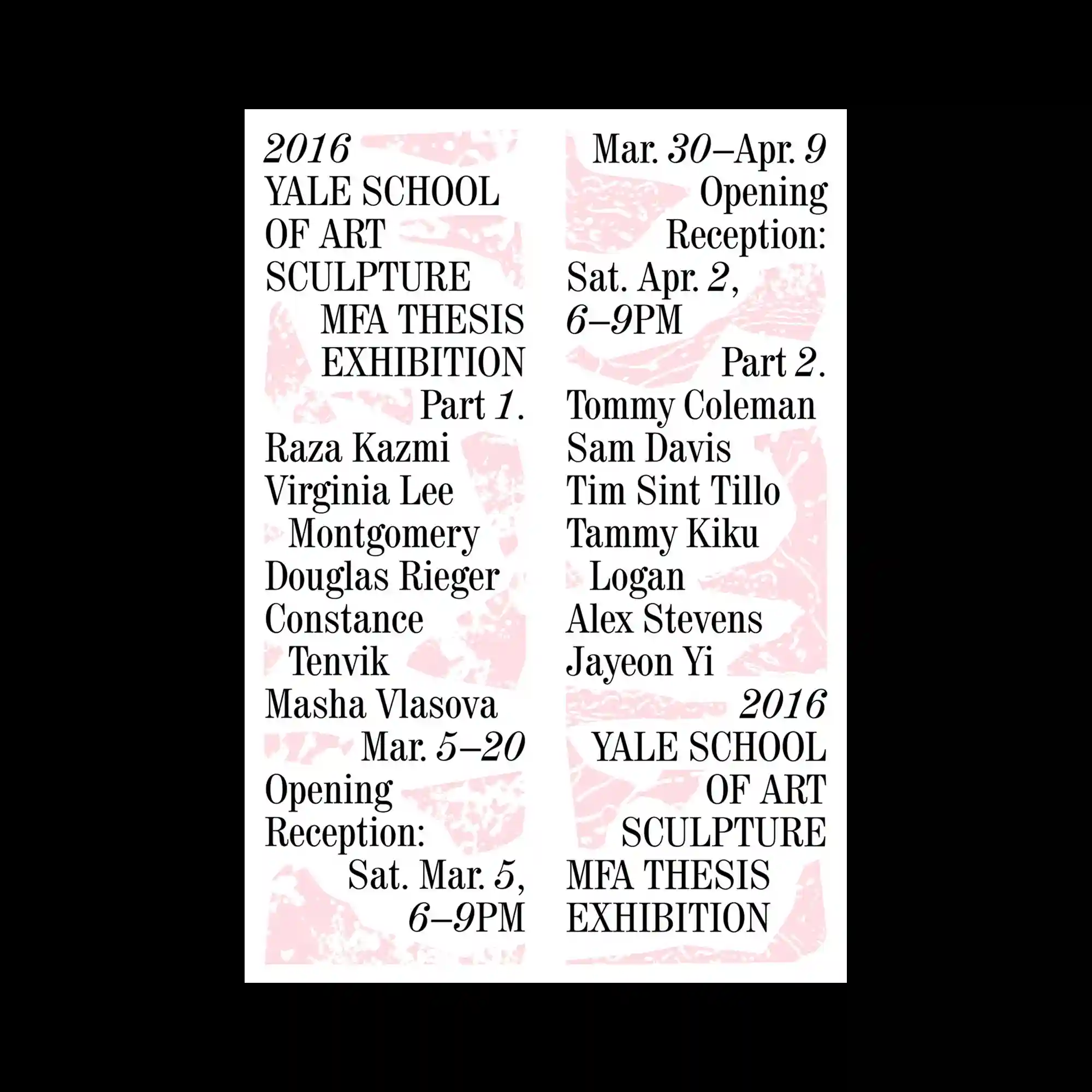
Large serif typography is arranged in multiple vertical columns over a pale pink textured background, creating an orderly editorial composition. The soft marbled pattern remains subtle, allowing the typography to retain visual dominance while adding surface variation. Information is grouped into balanced blocks with consistent spacing and alignment. The restrained color combination reinforces a calm and sophisticated presentation.
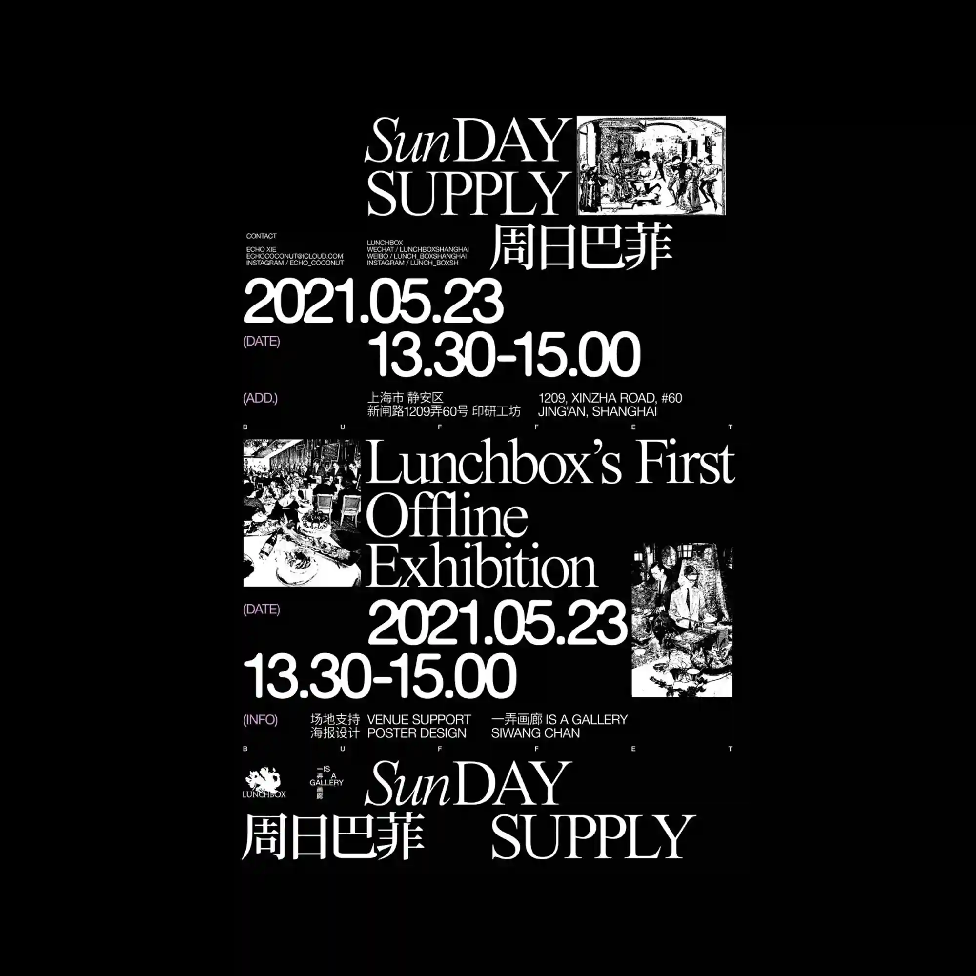
A dramatic black-and-white palette organizes the composition into distinct information zones supported by elegant serif typography. Large date numerals and exhibition details establish clear hierarchy while archival-style photographs punctuate the layout. The generous spacing between elements prevents the dense information from feeling crowded. Contrasts between classic typography and documentary imagery create a refined editorial atmosphere.
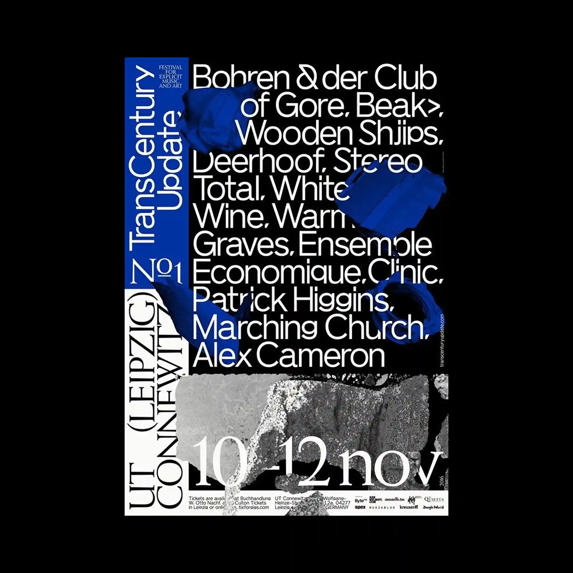
Bold sans-serif typography occupies much of the composition, while deep blue abstract forms overlap the text to create layered depth. A monochrome photographic texture anchors the lower portion, contrasting with the clean geometric arrangement above. Vertical and horizontal typographic alignments intersect across the layout, producing a dense but highly controlled structure. The limited palette of black, white, gray, and blue strengthens the visual impact without excessive ornamentation.
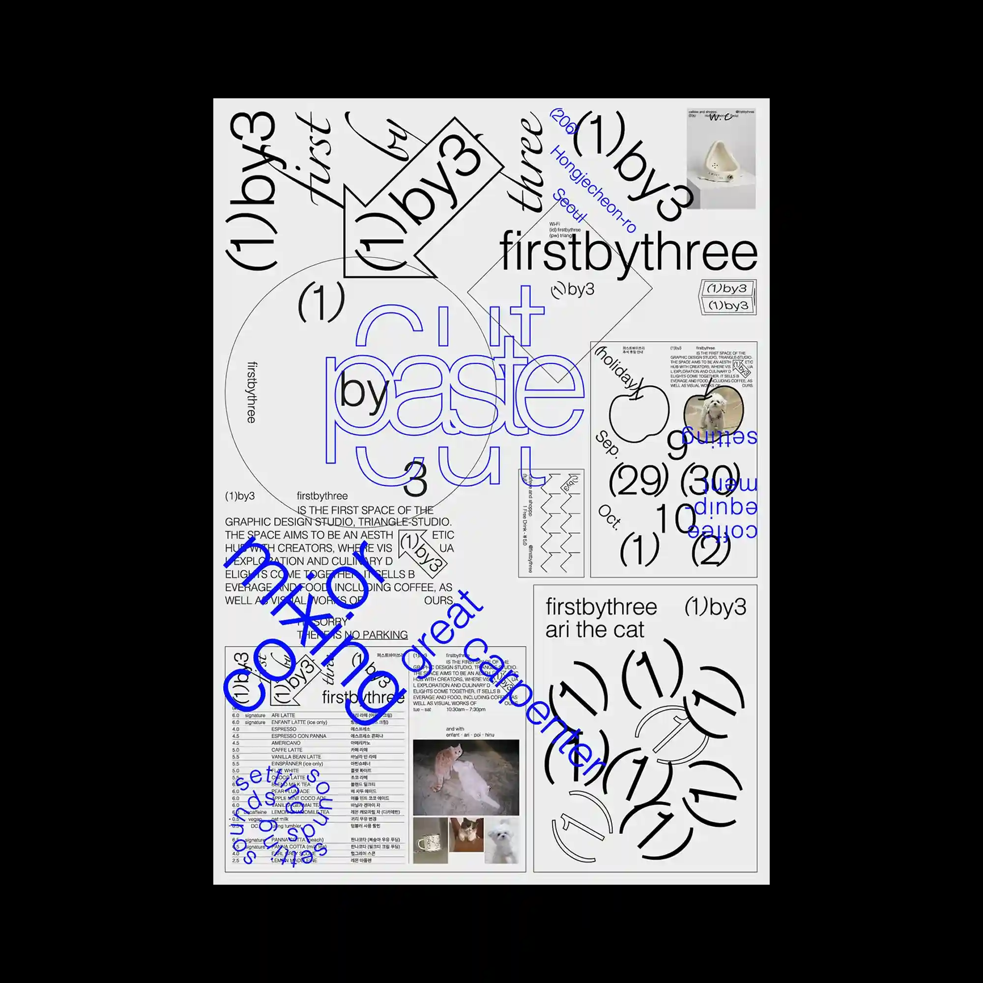
The composition resembles an experimental bulletin board where numerous typographic fragments, diagrams, images, and labels coexist within a modular grid. Black typography is complemented by vivid blue outlines that selectively emphasize specific words and shapes. Circular forms, angled text, and overlapping frames generate multiple reading directions instead of a single visual flow. The poster balances structured organization with playful visual complexity through varied scales and repeated geometric motifs.
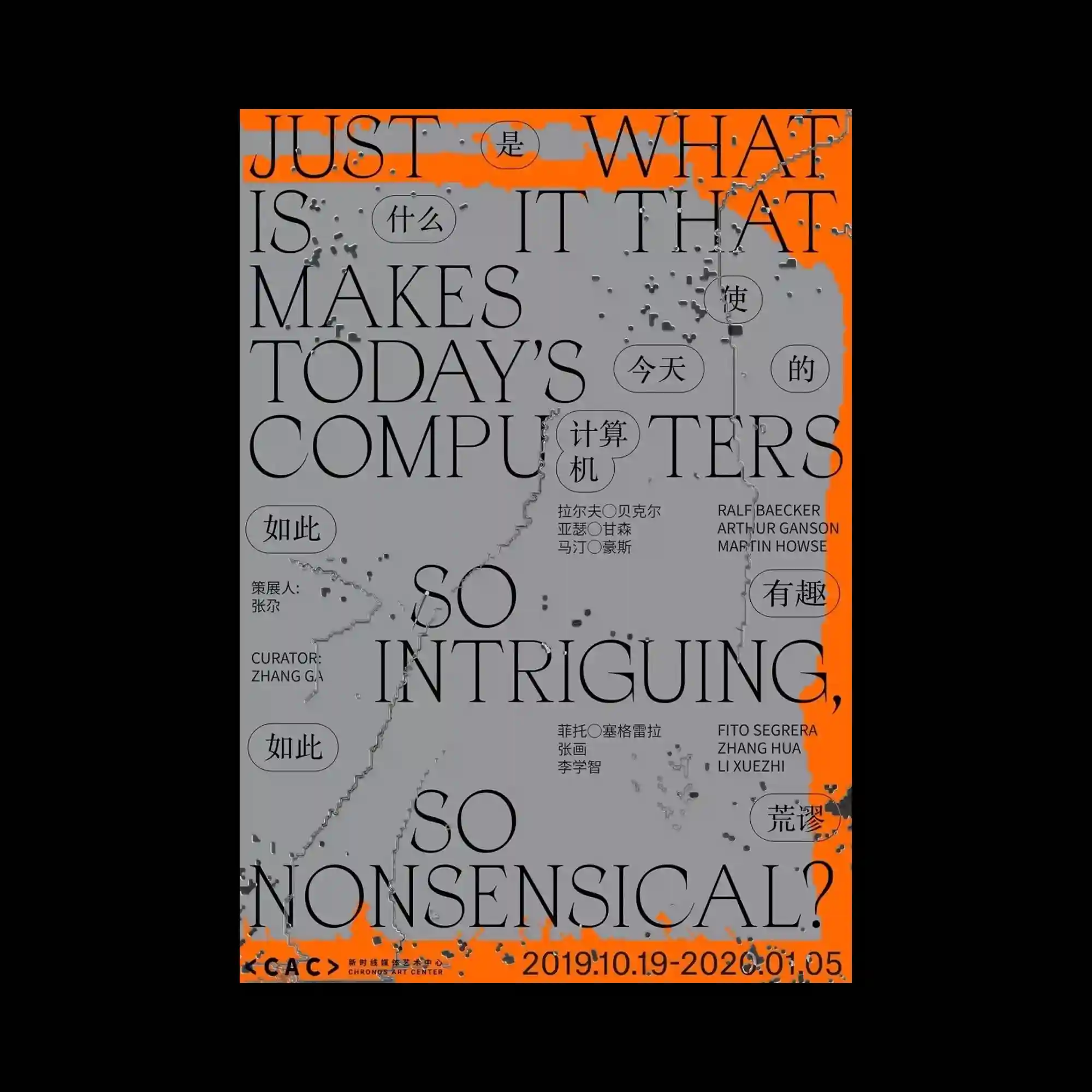
Large serif typography dominates the layout, extending across the page with overlapping English and Chinese elements that merge into a unified composition. A neutral gray surface is interrupted by vivid orange framing along the edges, while scattered textured marks introduce an intentionally weathered appearance. Circular callout shapes punctuate the composition, creating secondary focal points among the oversized letterforms. The contrast between elegant typography and distressed textures produces a balance of refinement and disruption.
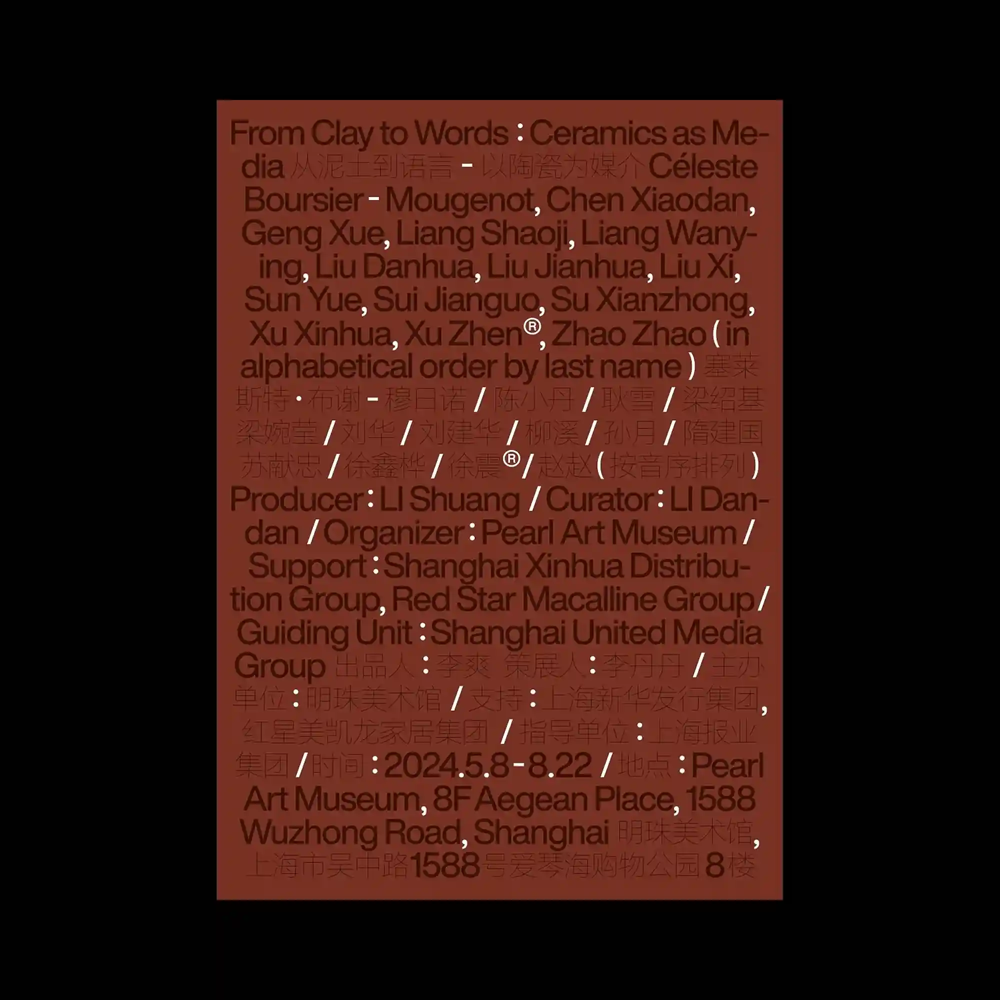
A dense field of bilingual typography fills the entire composition, creating a continuous texture where information becomes the primary visual material. Dark brown letterforms are layered over a muted terracotta background with consistent spacing, allowing the poster to rely on rhythm rather than hierarchy. Repeated separators, multilingual lines, and tightly aligned text blocks establish an editorial grid with minimal visual interruption. The restrained monochromatic palette emphasizes typographic density while maintaining a calm and systematic appearance.
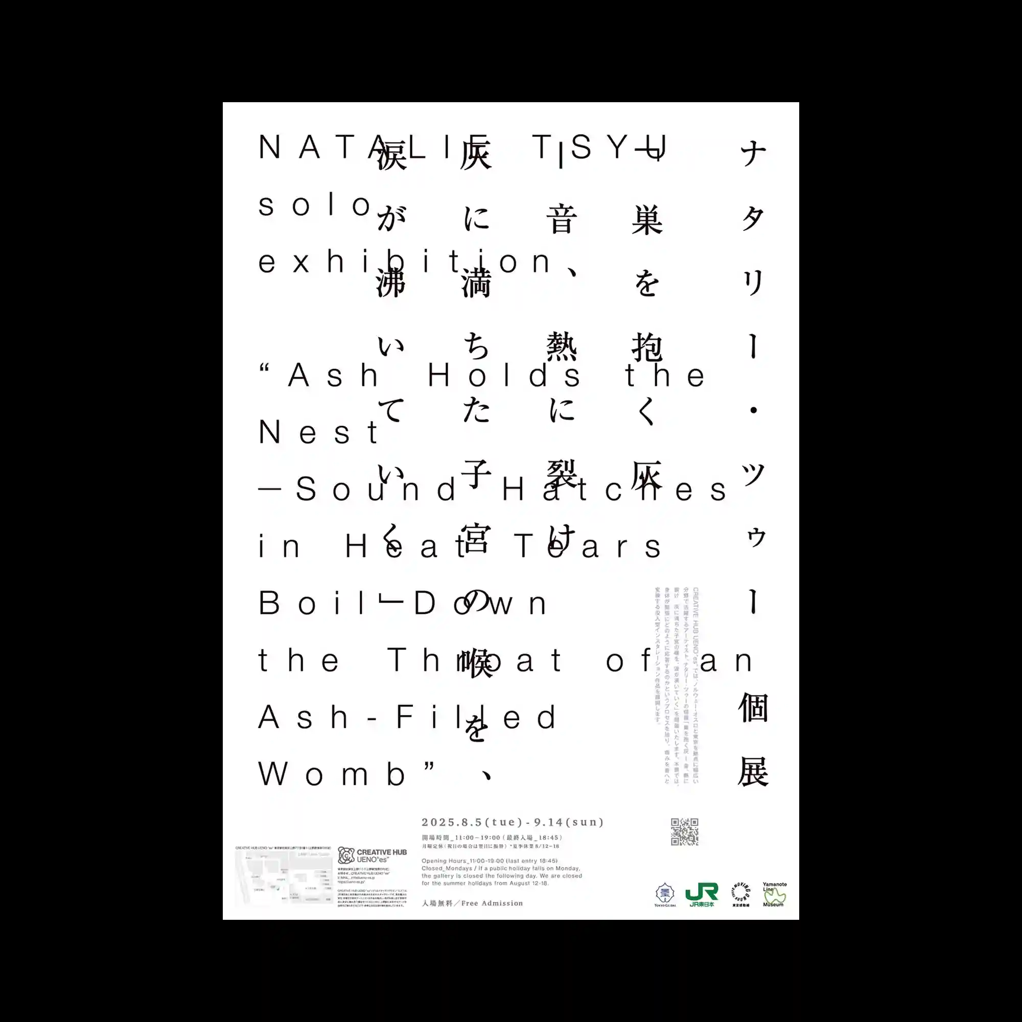
Widely spaced Latin characters overlap with vertically arranged Japanese text, creating a multilingual typographic field built through transparency and layered alignment. Large open areas surround the intersecting letterforms, allowing each textual layer to remain visually distinguishable. Fine informational blocks and subtle vertical columns reinforce the editorial structure without dominating the page. The composition focuses on rhythm, spacing, and the interaction between multiple writing systems.
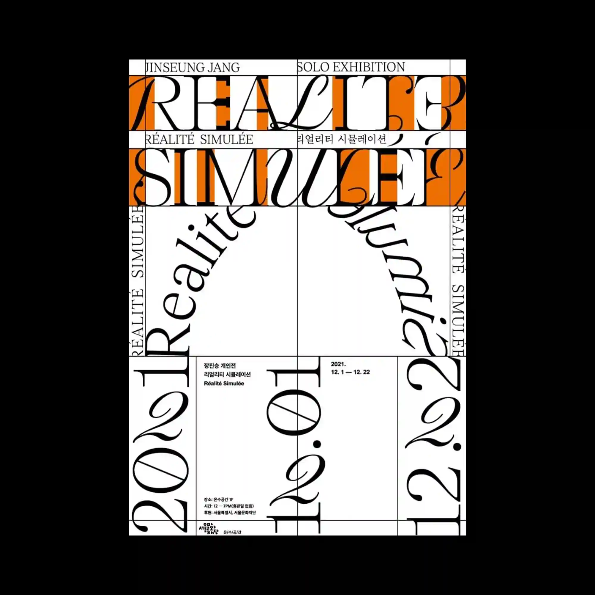
Decorative serif typography stretches across a strict grid, with elongated letterforms intersecting horizontal and vertical divisions. Bright orange rectangular bands introduce strong contrast while segmenting the composition into distinct reading zones. Rotated text follows curved paths, adding dynamic movement within the otherwise rigid framework. The combination of classical letterforms and modular geometry creates an energetic editorial rhythm.
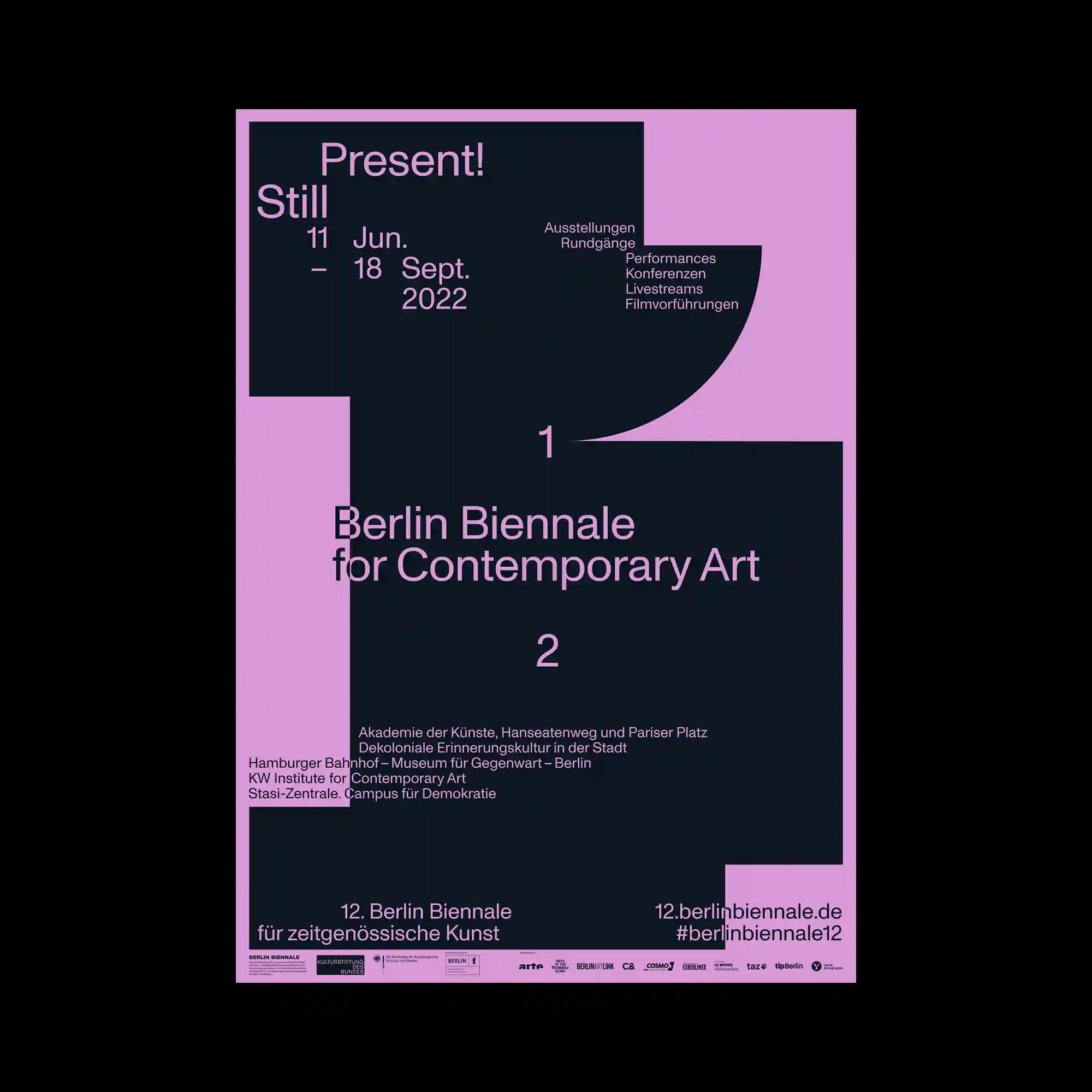
Large black geometric shapes interlock to construct a bold architectural framework against a muted purple background. Typography is integrated directly into the solid forms, creating continuous relationships between text and negative space. Small informational details occupy carefully measured positions around the larger structures without interrupting the visual flow. The restrained palette allows proportion and composition to become the dominant expressive elements.
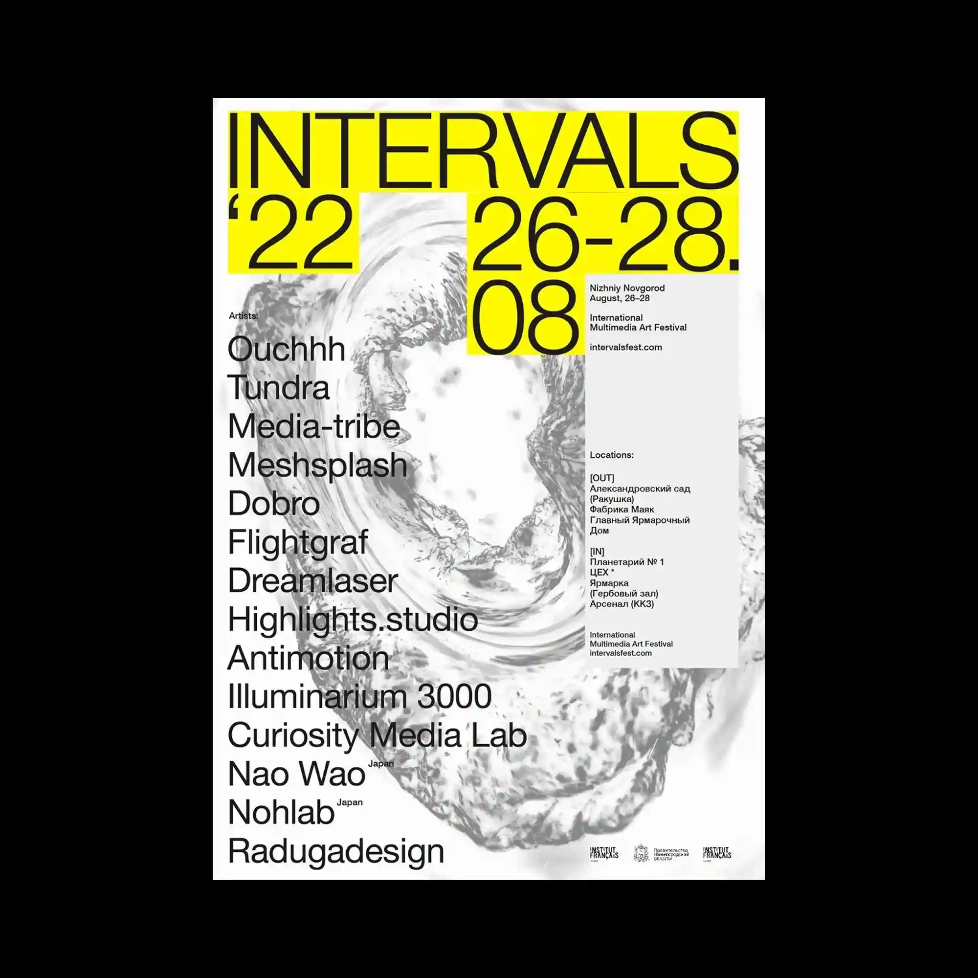
Oversized sans-serif typography in bright yellow forms a bold geometric framework over swirling grayscale textures. Large numerical elements and aligned information blocks are distributed asymmetrically while maintaining a consistent grid logic. The monochrome organic background contrasts with the flat geometric typography, producing tension between fluidity and precision. The composition emphasizes scale shifts and clear informational hierarchy.
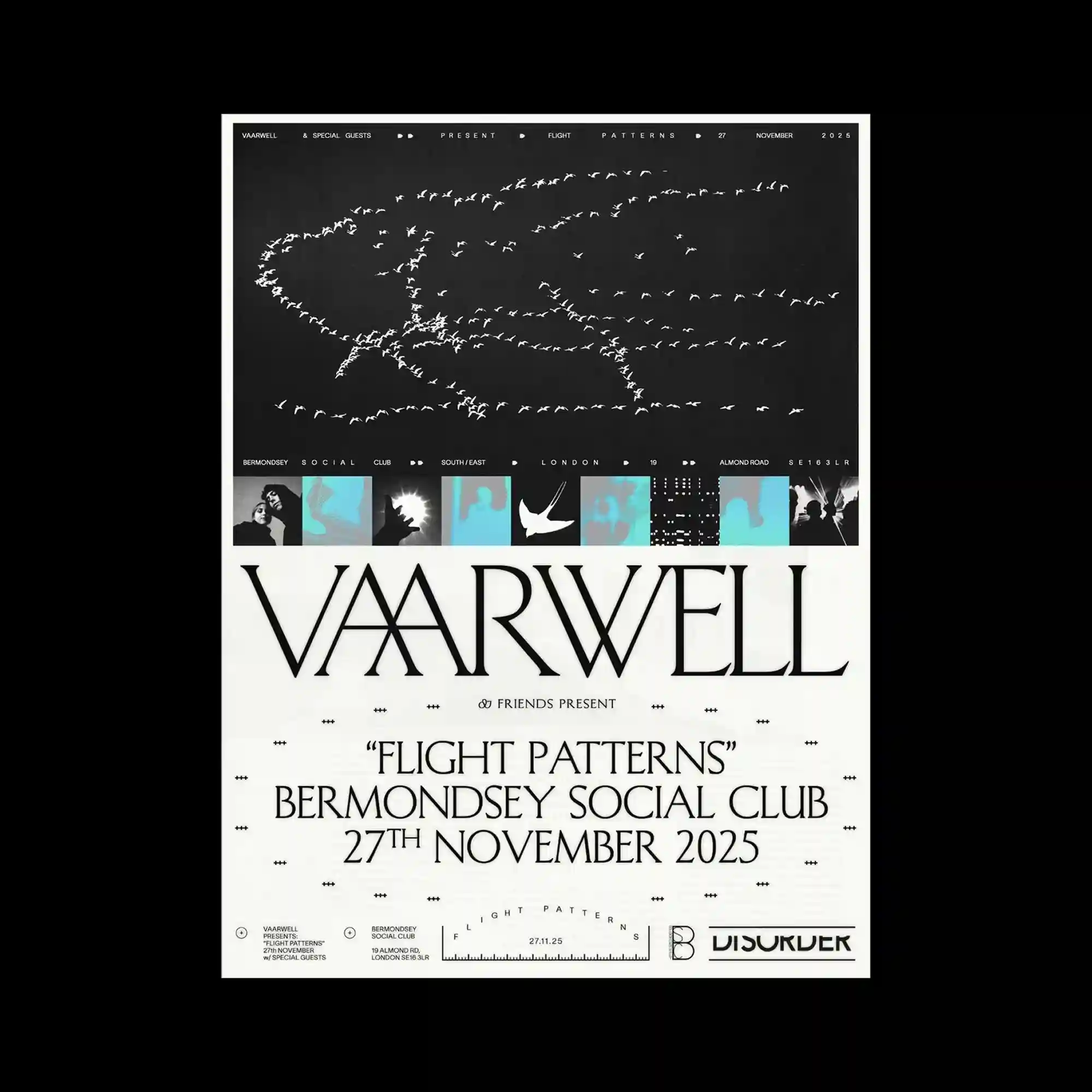
Hundreds of small white bird silhouettes trace looping flight paths across a dark upper field, producing a delicate linear illustration through repetition. A narrow strip of cyan-tinted photographic panels separates the illustration from the large typographic section below. Elegant serif lettering dominates the lower half with generous spacing and refined proportions. The composition balances dense visual activity above with calm typographic stability beneath.
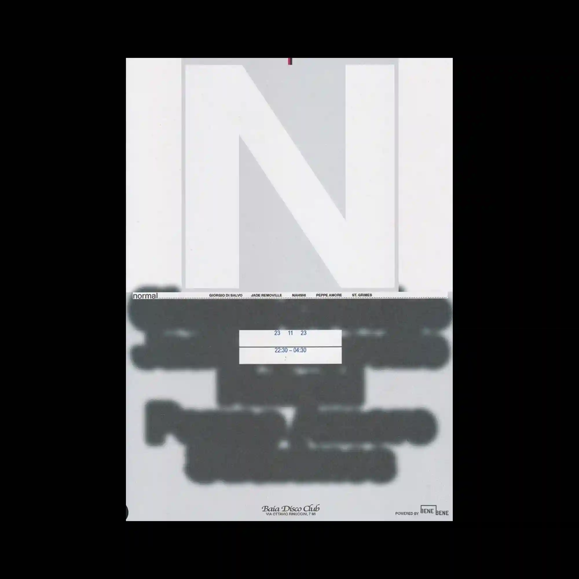
A monumental outlined letterform occupies most of the composition, functioning as both a graphic container and a structural framework. Blurred dark shapes spread horizontally across the lower half, partially obscuring information and creating layered depth. Small aligned text elements remain crisp against the soft visual interruption, reinforcing contrast between clarity and diffusion. The restrained grayscale palette emphasizes form, opacity, and spatial relationships.
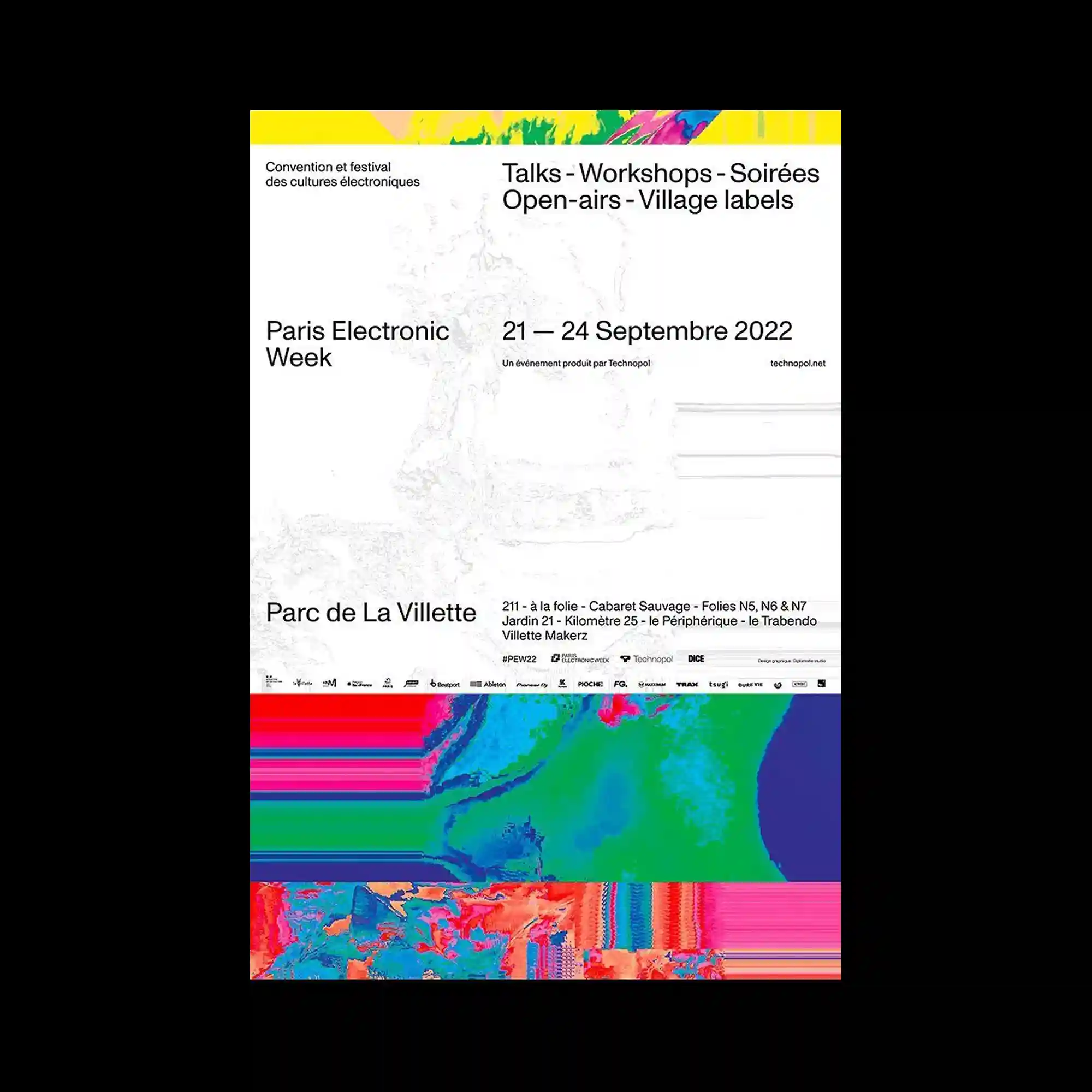
Minimal typography is paired with vivid bands of highly saturated abstract imagery placed along the top and bottom edges. The central area remains predominantly open, allowing the informational text to occupy the composition with exceptional clarity. The colorful visual strips act as framing devices rather than illustrations, balancing the restrained layout. Fine grayscale imagery beneath the text introduces subtle depth without competing for attention.
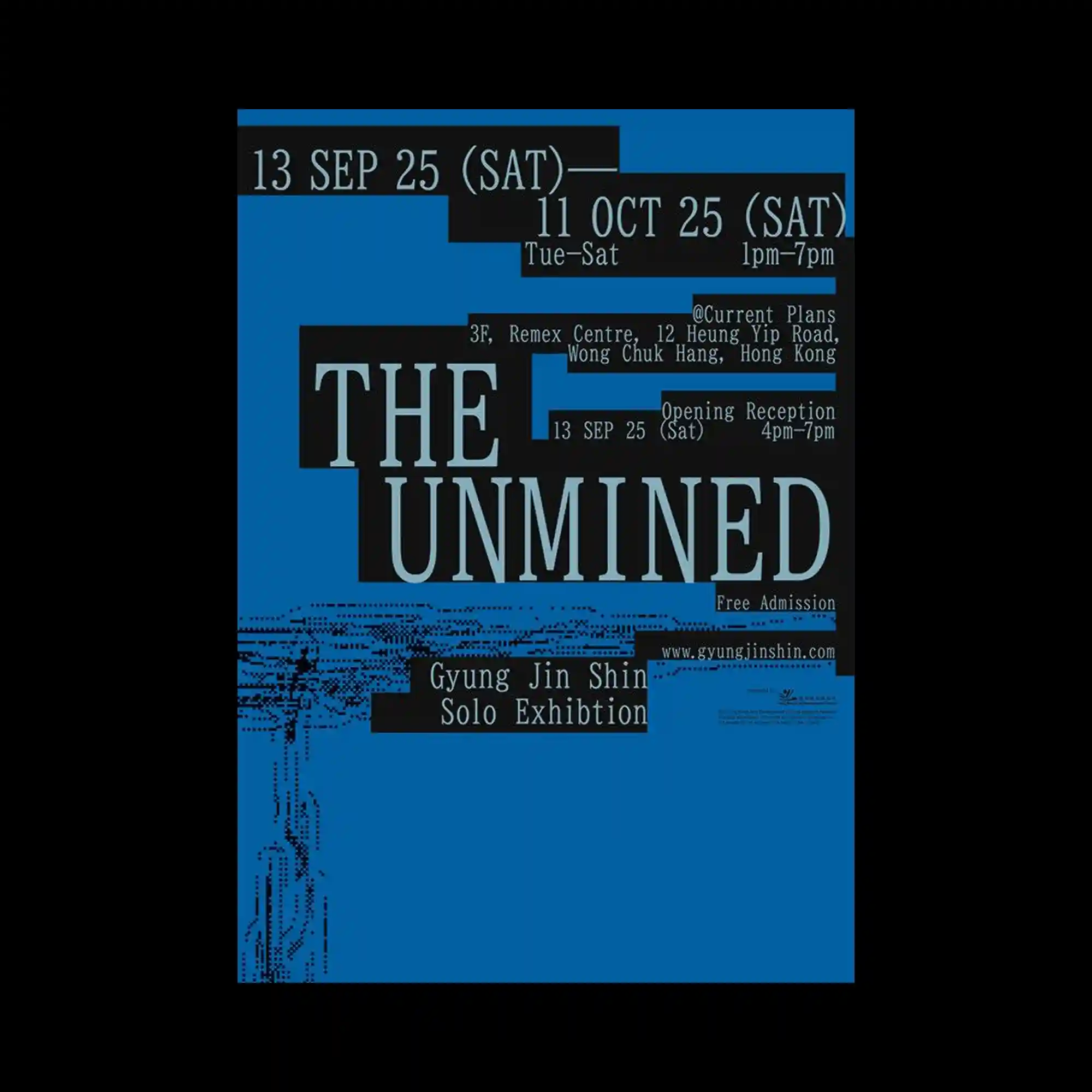
Bold black rectangular fields divide the blue background into modular sections that contain condensed typographic information. Large serif headlines dominate the center, while smaller informational elements occupy surrounding blocks with clear alignment. Pixel-like graphic fragments introduce subtle digital texture without overwhelming the composition. The design relies on high contrast, rigid geometry, and carefully controlled spacing to communicate structure.
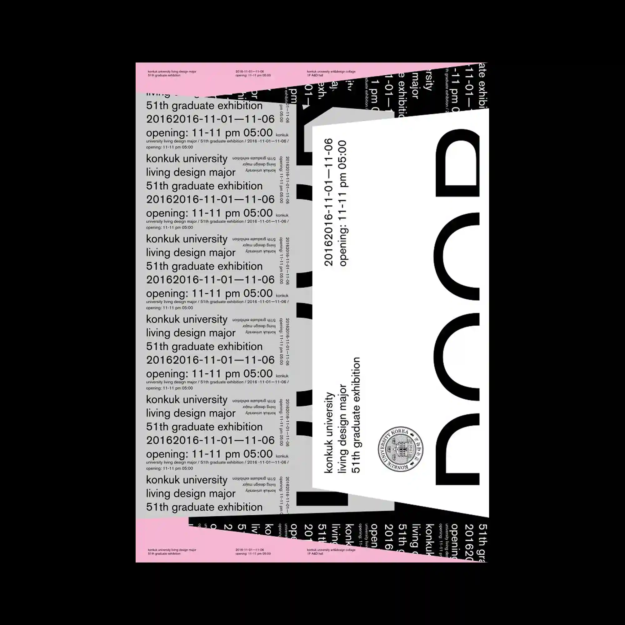
Large typographic blocks overlap at multiple angles, producing a layered composition that resembles stacked printed sheets. Repeated lines of text establish rhythm, while oversized cropped letterforms introduce bold visual anchors. Black, white, and soft pink form a restrained palette that emphasizes hierarchy instead of decoration. Variations in orientation and scale create movement without disrupting the underlying grid.
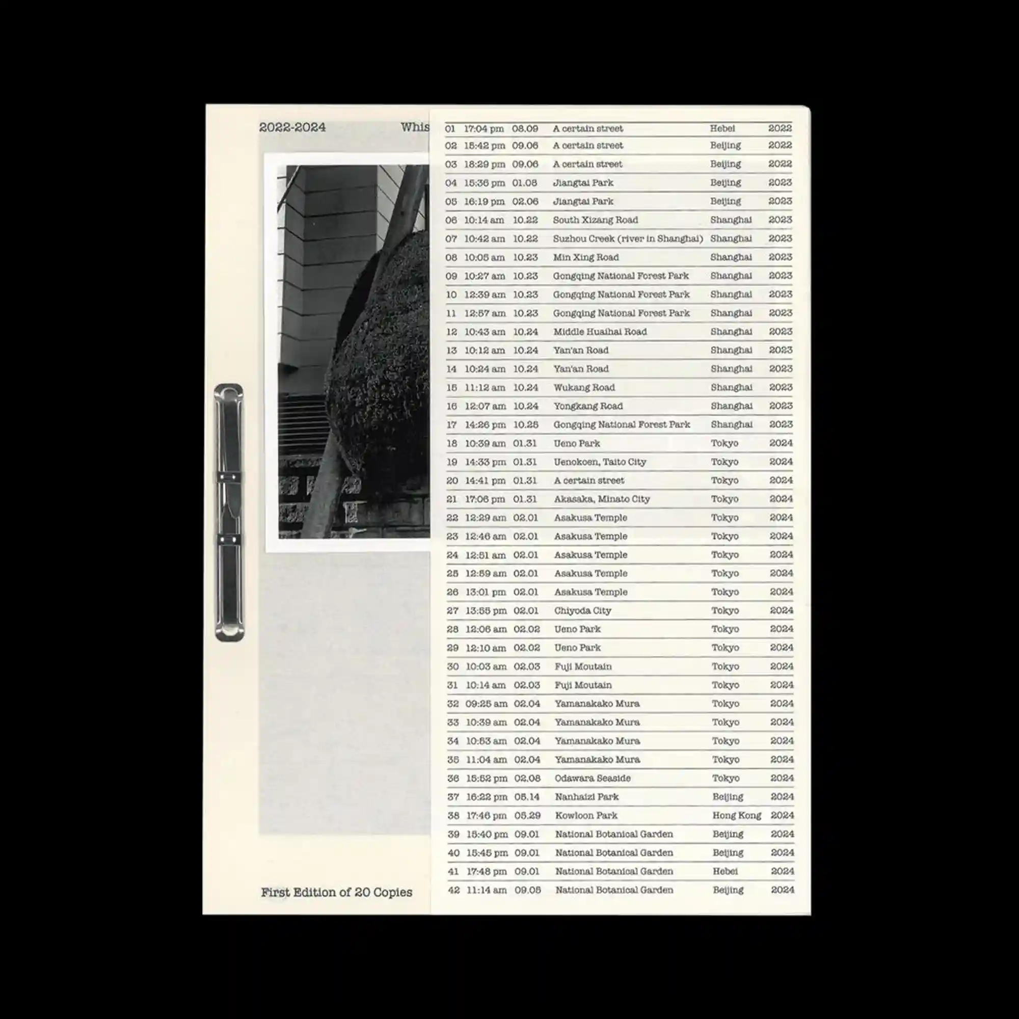
A structured editorial composition combines a monochrome photograph, a narrow vertical metallic element, and a dense tabular list into a single archival layout. Strong vertical divisions organize the page, while generous negative space balances the highly detailed information column. Fine rules, aligned typography, and carefully spaced margins create a documentary aesthetic with restrained visual rhythm. The contrast between photographic texture and systematic data presentation reinforces a precise and catalog-like visual identity.
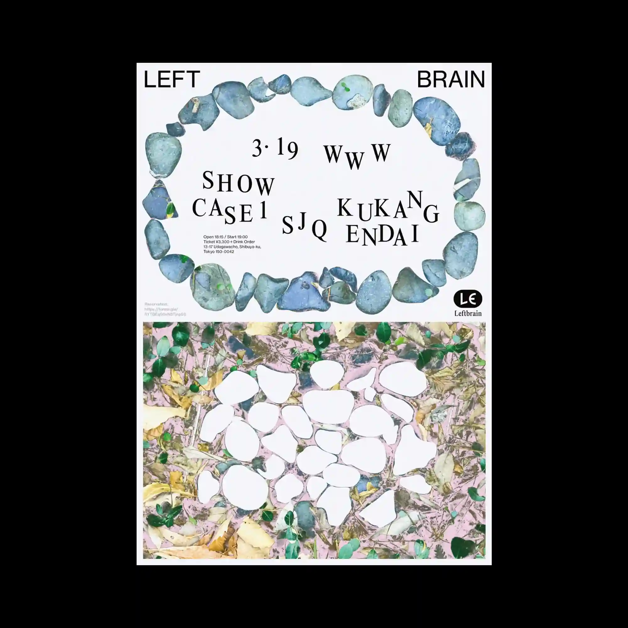
Rounded blue stones form an oval frame around an open central space where scattered typography floats with generous spacing. The lower section introduces an organic collage of leaves, textures, and irregular white shapes that contrasts with the ordered arrangement above. Natural materials and clean typography coexist through a restrained composition and soft color palette. The balance between organic forms and structured layout creates a calm visual rhythm.
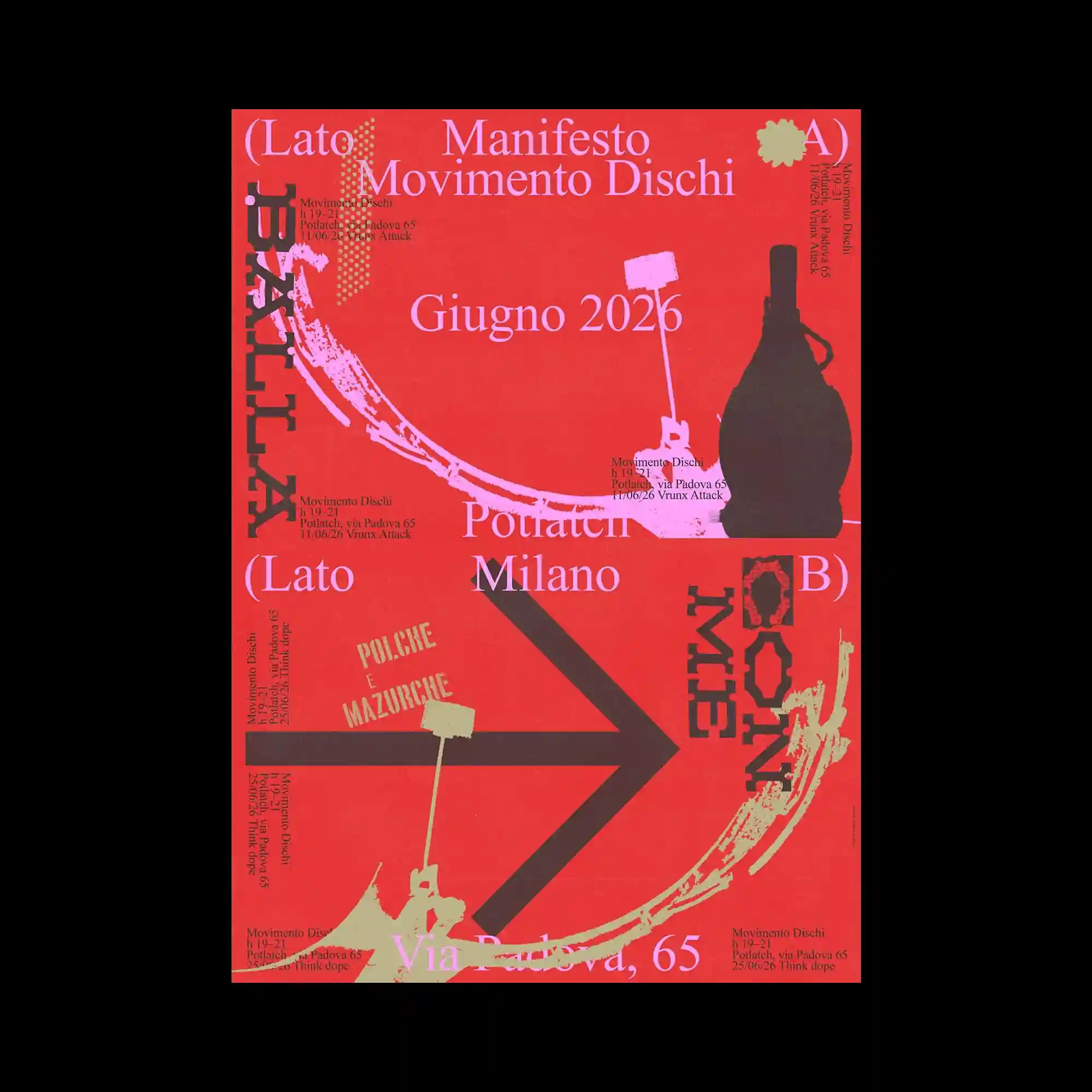
A vivid red background supports an energetic arrangement of layered typography, arrows, gestural brush marks, and silhouetted object shapes. Text appears in multiple orientations and scales, encouraging the eye to move continuously throughout the composition. The interplay of black, pale pink, and cream elements creates a bold graphic hierarchy without overwhelming the page. Directional arrows reinforce movement and visual momentum.
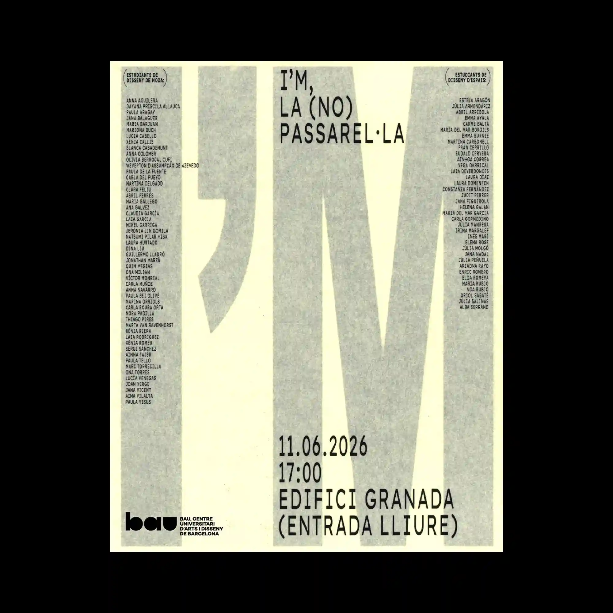
Oversized condensed letterforms extend vertically across the page, functioning as both typography and structural columns within the composition. Dense lists of small text align along both sides, framing the enlarged characters without competing for attention. A restrained grayscale palette emphasizes texture and scale rather than color. The composition relies on proportion and alignment to create visual impact.
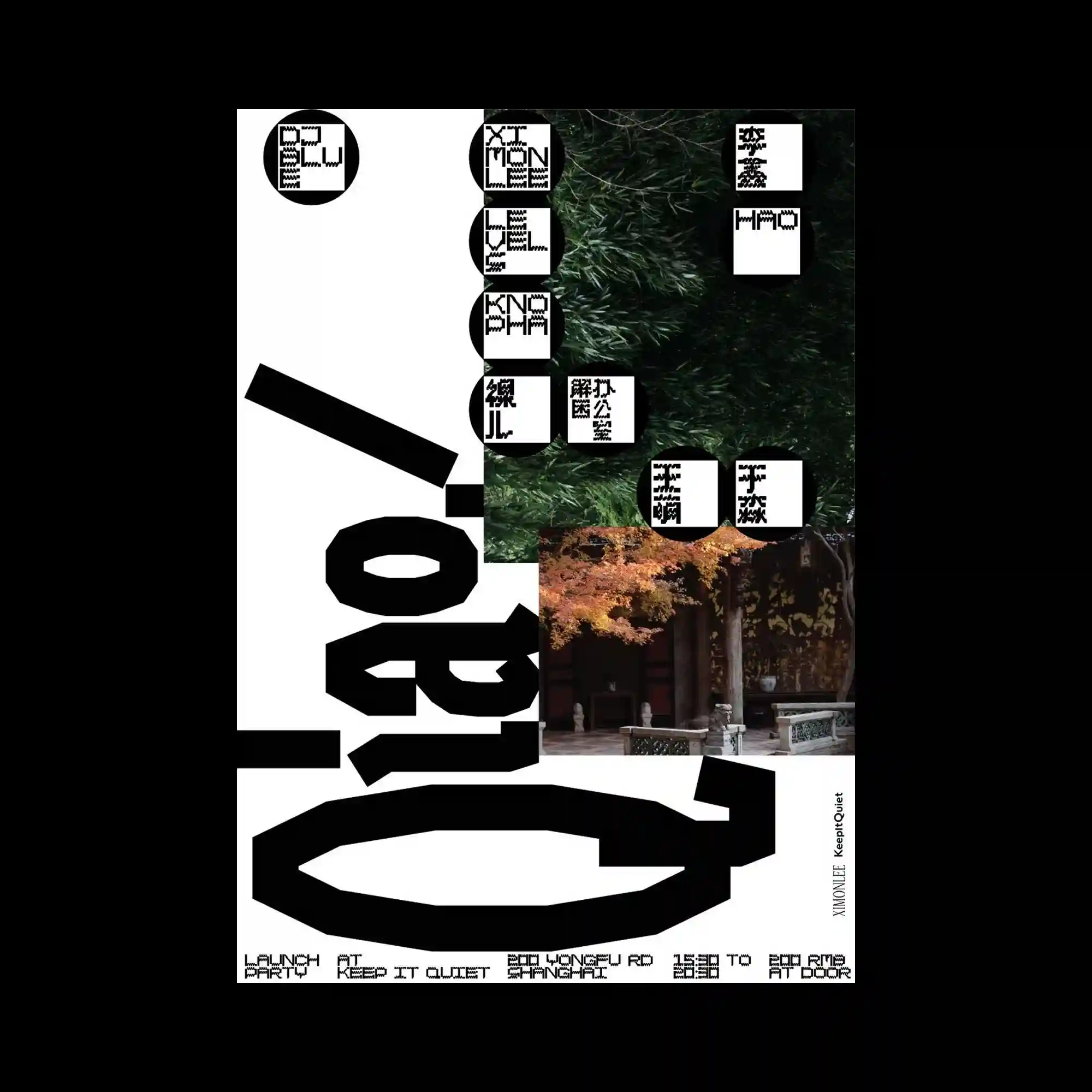
Bold black geometric typography occupies the lower half of the composition while photographic panels introduce natural textures and architectural scenes into the otherwise graphic layout. Circular labels with pixel-inspired lettering establish a repeating modular system across the upper portion. The asymmetrical division between image, typography, and white space creates a dynamic editorial rhythm. Heavy black forms provide strong visual grounding against the lighter surrounding elements.
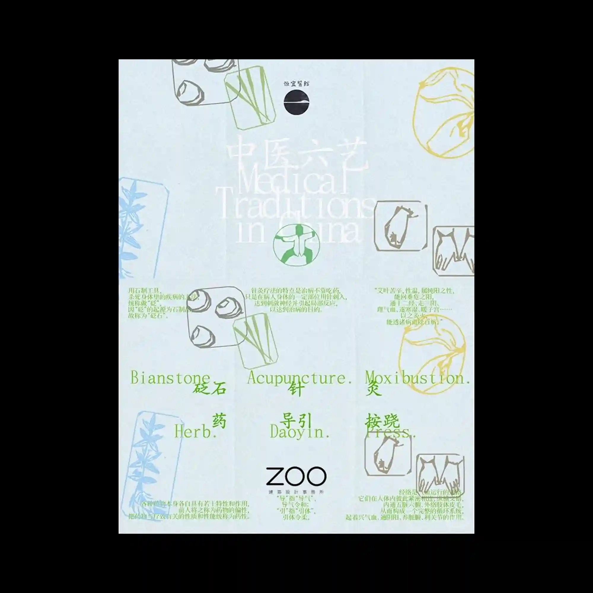
Soft pastel typography is layered with delicate line illustrations and small diagram-like symbols distributed across the page. The central title is intentionally blended into the background through low contrast, allowing surrounding icons and labels to participate equally in the composition. Light green and pale blue accents create a restrained scientific or archival atmosphere. The overall layout emphasizes subtle layering rather than strong visual hierarchy.
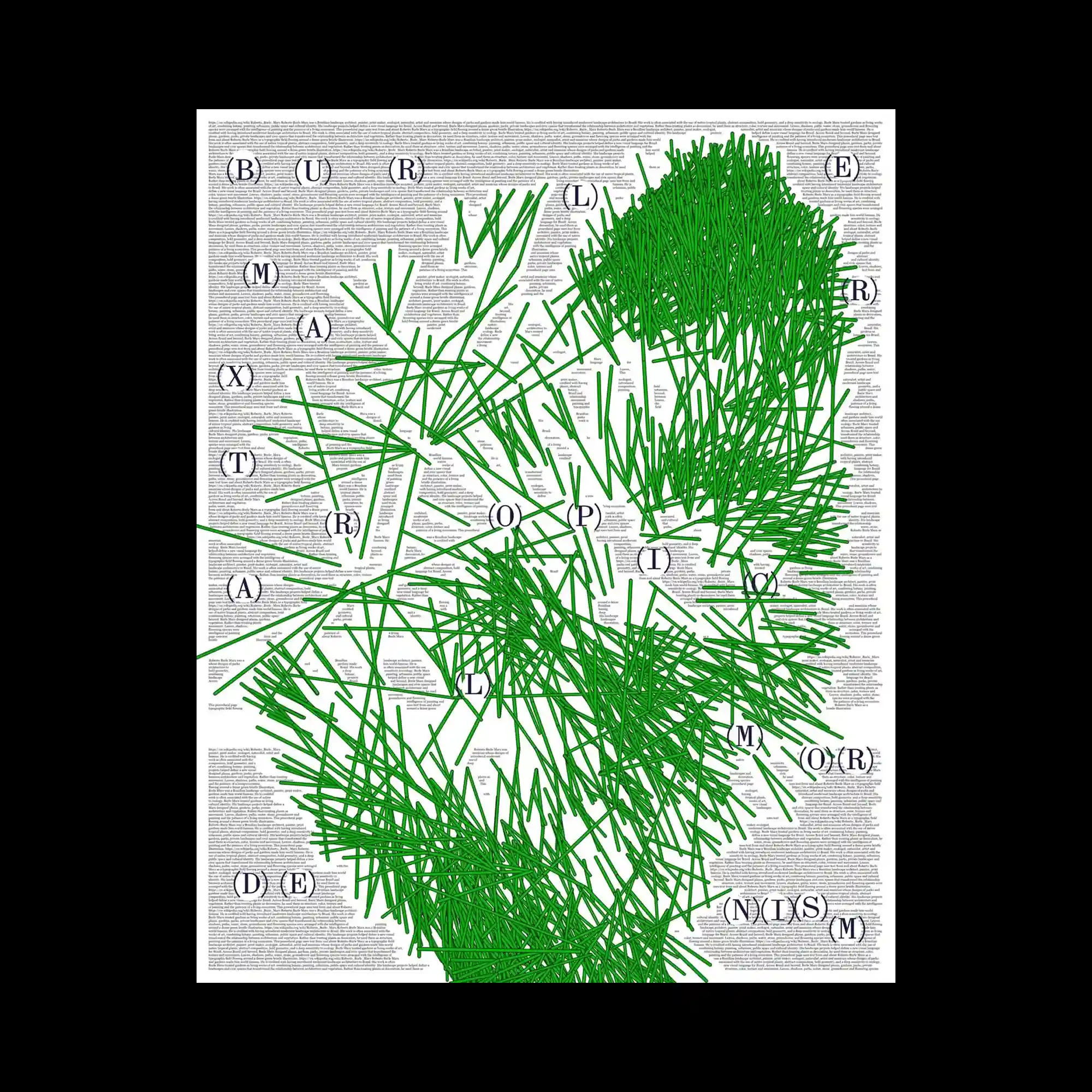
An extremely dense field of small text forms the background while vivid green linear marks accumulate into energetic abstract clusters across the surface. Circular letterforms placed at regular intervals punctuate the composition and establish a secondary rhythm beneath the dominant green network. The contrast between microscopic typography and expressive line work creates multiple scales of visual reading. Despite the complexity, generous white space between clusters preserves overall legibility.
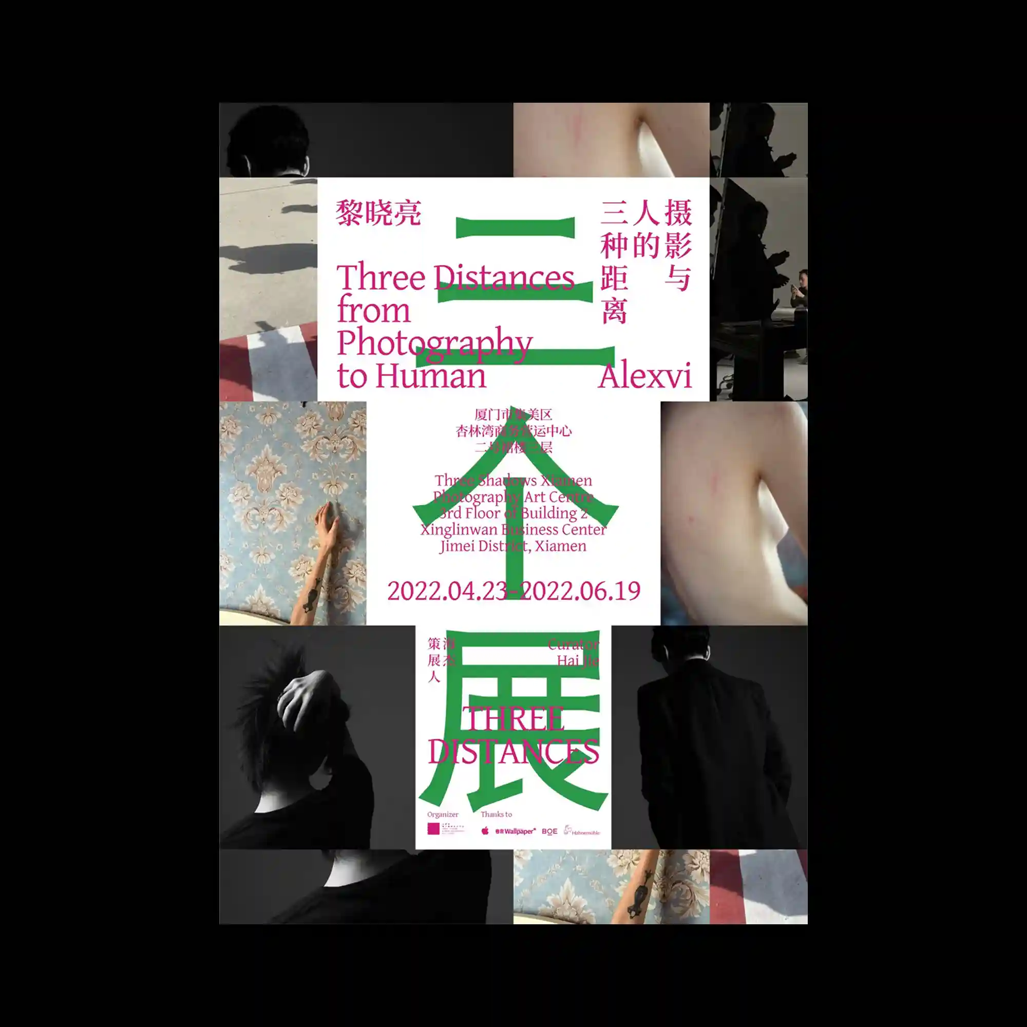
A central typographic panel is surrounded by cropped photographic fragments arranged in a modular grid, creating a dialogue between text and imagery. Bright magenta typography contrasts sharply with bold green geometric bars that cut horizontally through the composition. The surrounding photographs vary in scale, orientation, and cropping, producing an intentionally fragmented narrative structure. The composition balances editorial order with visual interruption through carefully layered elements.
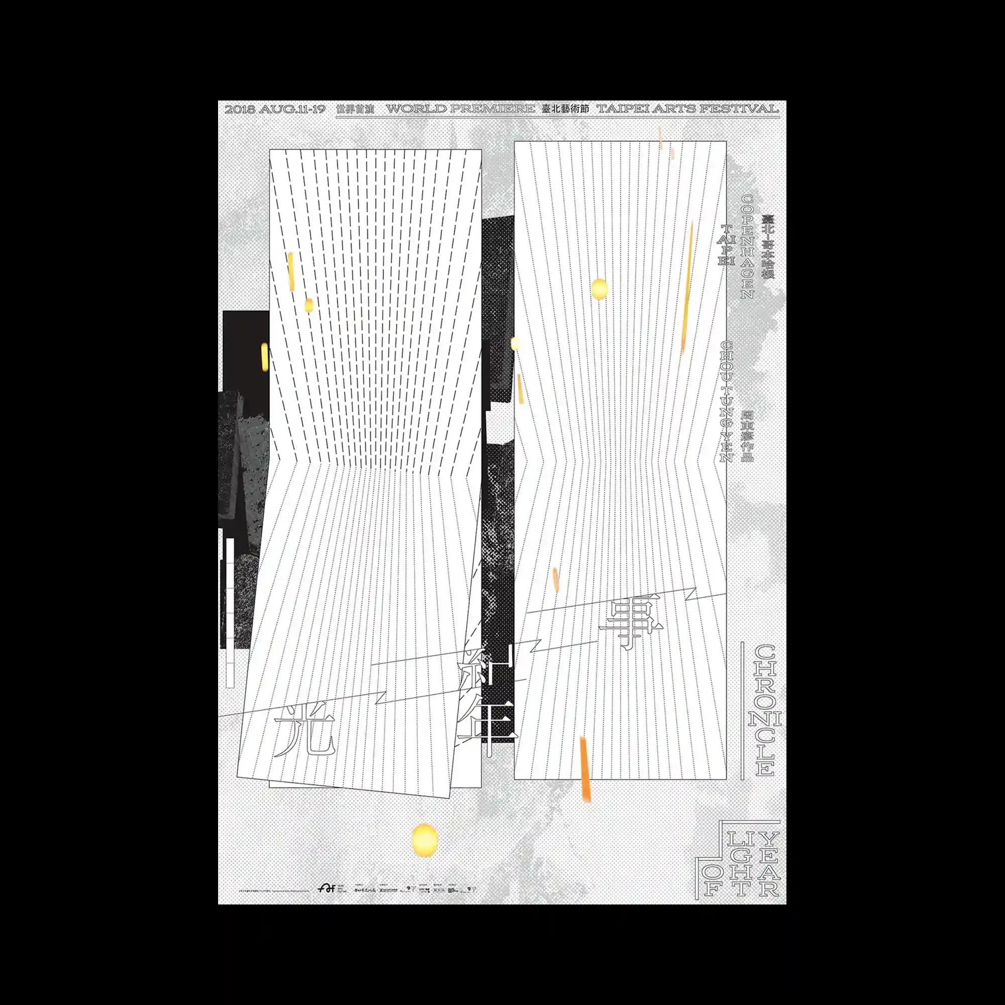
Two tall folded geometric surfaces filled with fine parallel lines dominate the center of the composition, producing a strong illusion of depth through perspective distortion. The background combines textured grayscale imagery with layered graphic fragments that subtly emerge behind the primary forms. Small warm-colored circular accents and elongated marks interrupt the monochrome field, introducing controlled visual contrast. Thin typography aligned around the edges reinforces the architectural and spatial character of the layout.
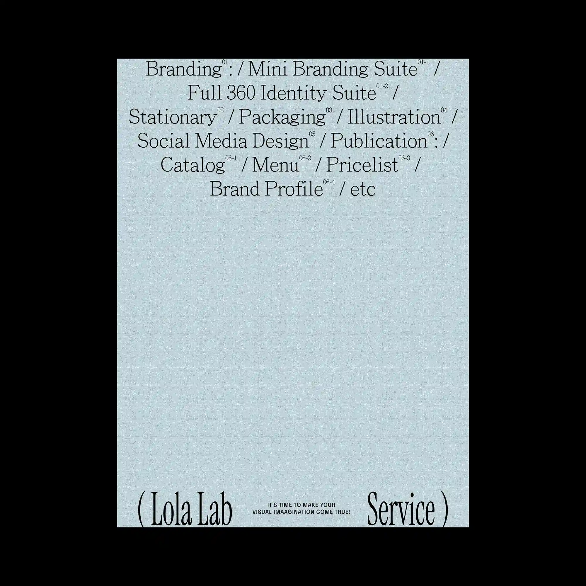
Large areas of empty space dominate the layout, allowing a compact block of refined serif typography to become the sole visual anchor. The text is organized into centered lines with subtle variations in scale, while small superscript numerals introduce an editorial hierarchy throughout the composition. Oversized words positioned along the bottom edge frame the otherwise minimal page and create a sense of structural enclosure. The restrained monochrome palette reinforces clarity, rhythm, and typographic precision.
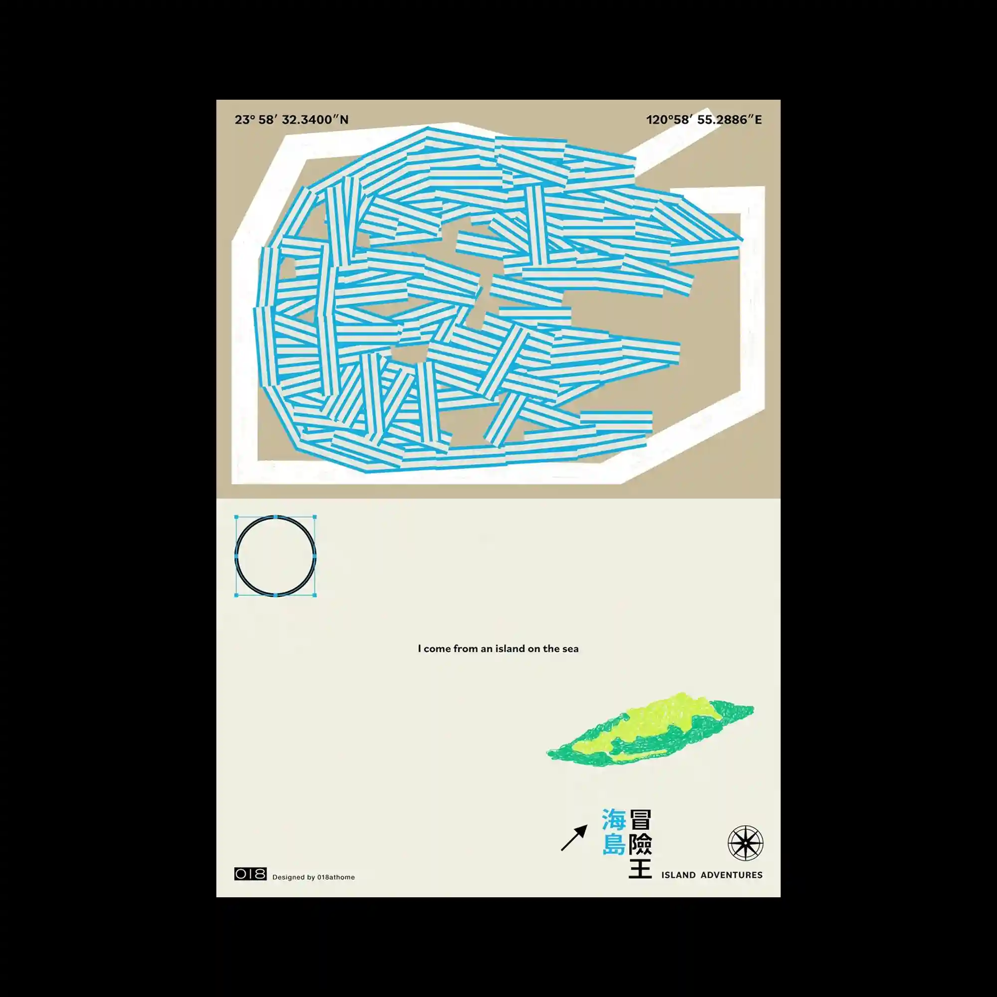
A dense composition of blue linear segments is arranged into an irregular landmass-like structure enclosed by a thick white contour, creating the impression of layered pathways or directional flows. The upper and lower sections are intentionally separated by generous negative space, allowing the composition to breathe while emphasizing the contrast between density and emptiness. A small illustrated island, simple geometric symbols, and restrained typography introduce secondary focal points without disturbing the overall balance. The muted earth-toned palette combined with bright cyan lines produces a calm yet highly structured visual rhythm.
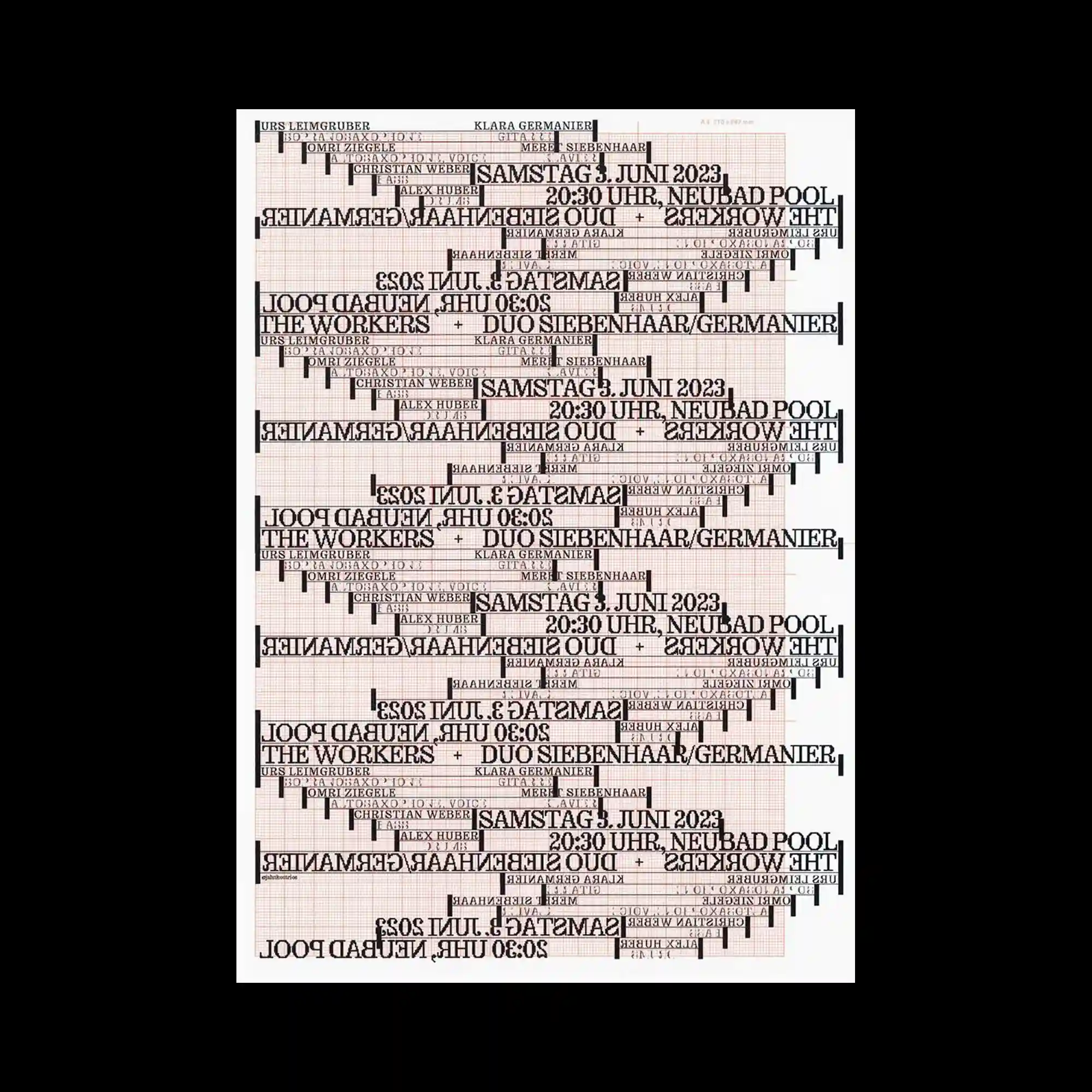
Repeated typographic blocks are mirrored, rotated, and layered across a faint grid, producing a dense field of rhythmic text. Horizontal alignment contrasts with inverted sections, creating alternating reading directions throughout the composition. Thin rules and varying text scales reinforce the modular organization while preserving overall coherence. The restrained monochrome palette emphasizes repetition, alignment, and structural complexity over decorative elements.
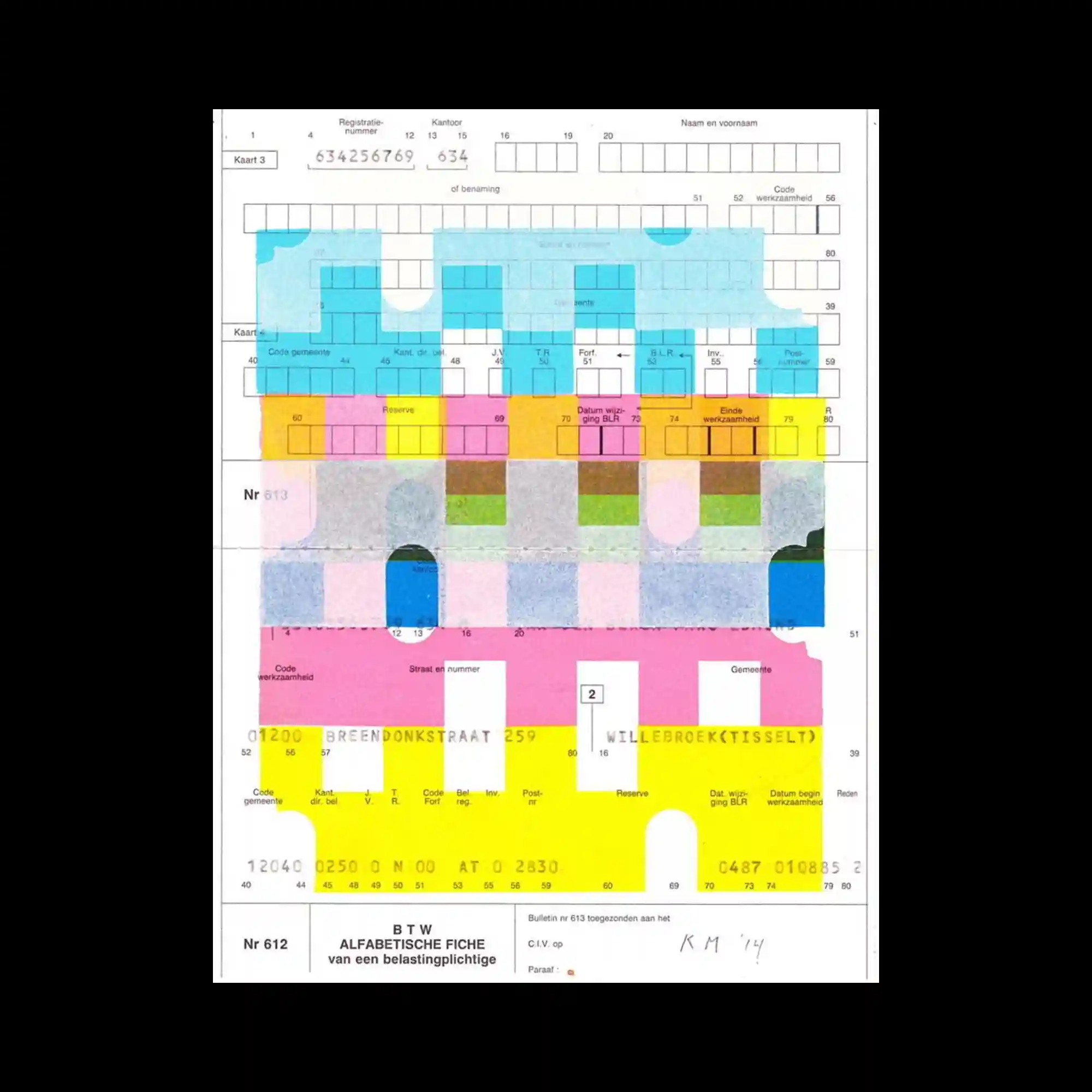
A pre-existing grid and form layout becomes the foundation for translucent geometric overlays in bright cyan, yellow, pink, and green. Rounded cutouts and rectangular color fields align with the underlying structure while introducing a new abstract rhythm. The transparent layering allows original printed details to remain partially visible, creating depth through accumulation rather than opacity. The composition balances systematic order with playful color relationships.
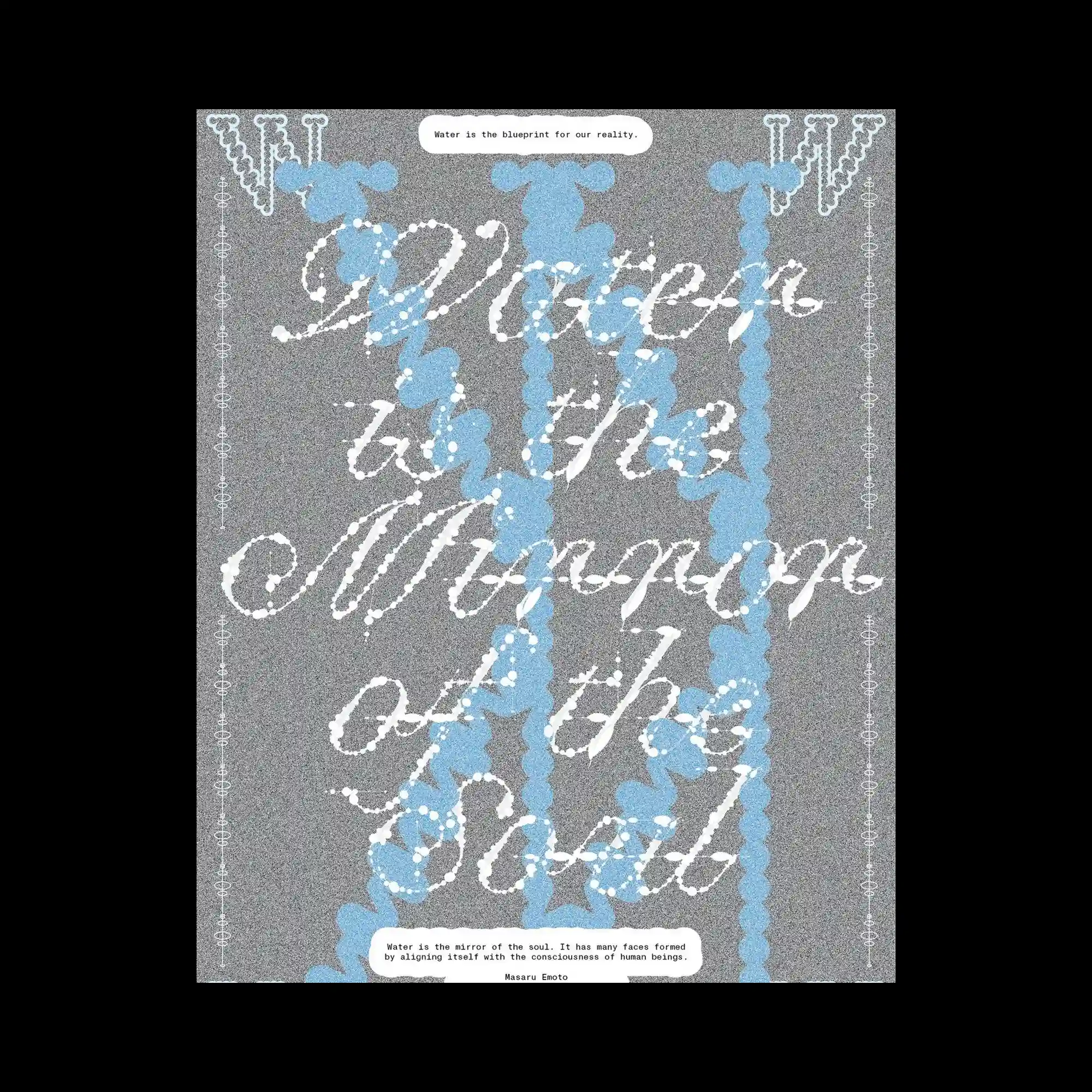
Soft blue bead-like vertical chains extend through the composition, overlapping expressive white script that flows diagonally across the surface. A grainy gray background creates a uniform texture that allows the layered lettering to remain visually distinct. Decorative borders and rounded text containers introduce additional framing elements without overwhelming the central composition. The contrast between structured repetition and fluid handwritten forms produces a richly layered visual rhythm.
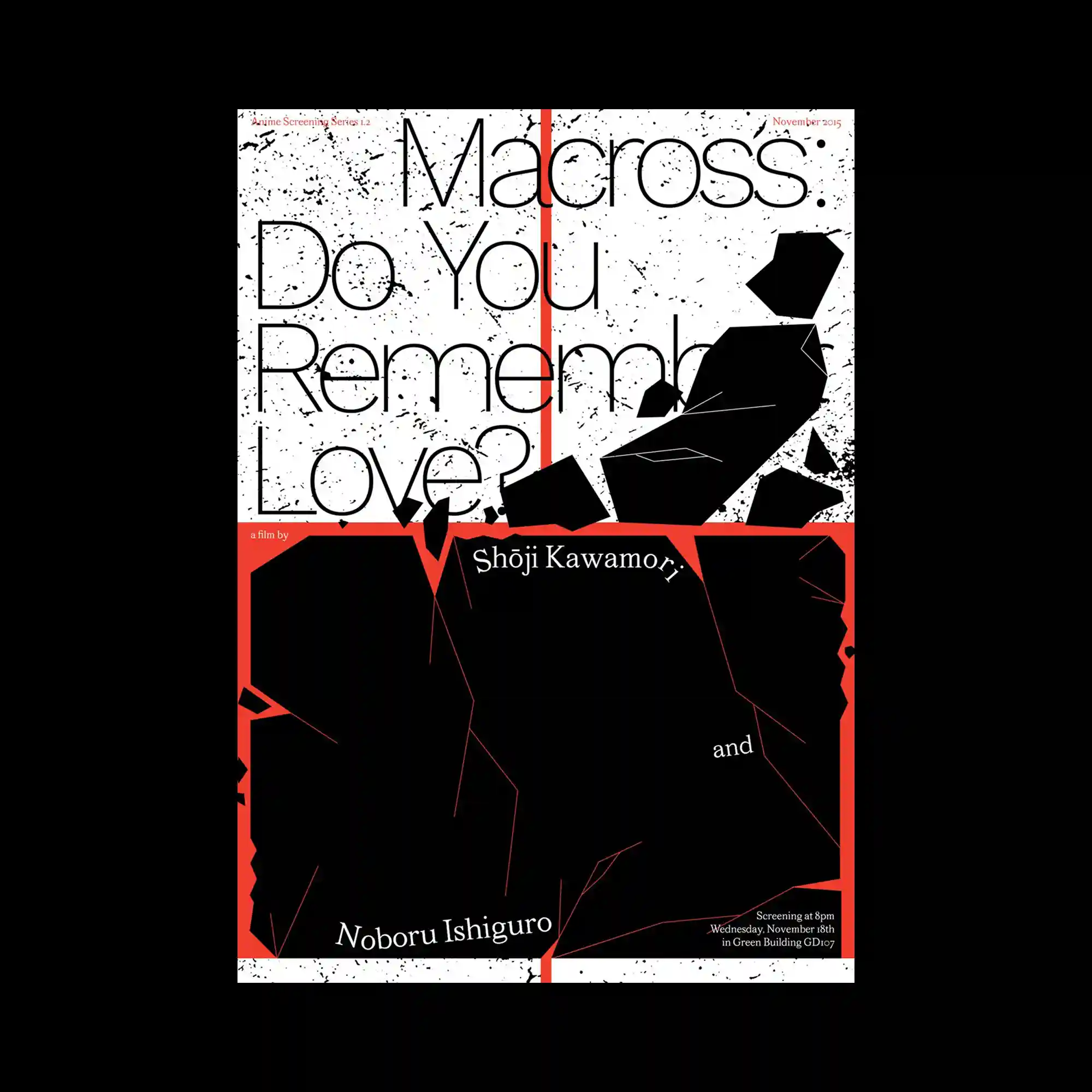
Large lightweight sans-serif typography occupies the composition while fragmented black polygonal forms interrupt the reading flow. A vivid red vertical stripe and matching horizontal band divide the layout into contrasting zones, reinforcing the structural grid. Fine speckled textures spread across the background, adding visual depth without competing with the bold graphic elements. The interaction between geometric fragments and oversized text creates a dynamic balance between disruption and order.
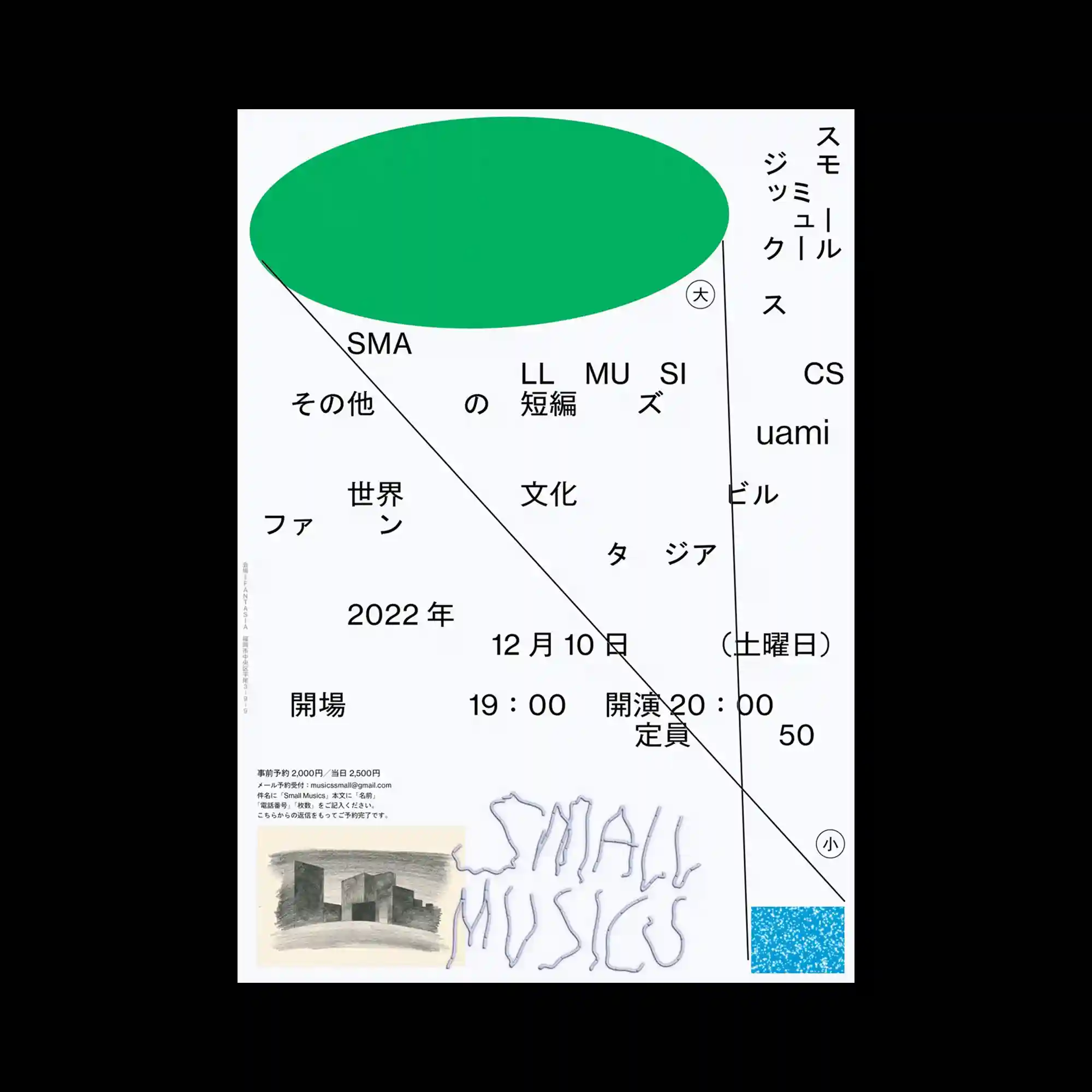
A large green ellipse dominates the upper portion of the layout, balancing against widely dispersed typography below. Thin construction lines extend diagonally and vertically across the composition, linking otherwise independent text groups into a unified framework. The generous spacing between elements highlights asymmetry while maintaining overall stability. Small graphic accents near the bottom provide subtle visual weight without interrupting the minimal composition.
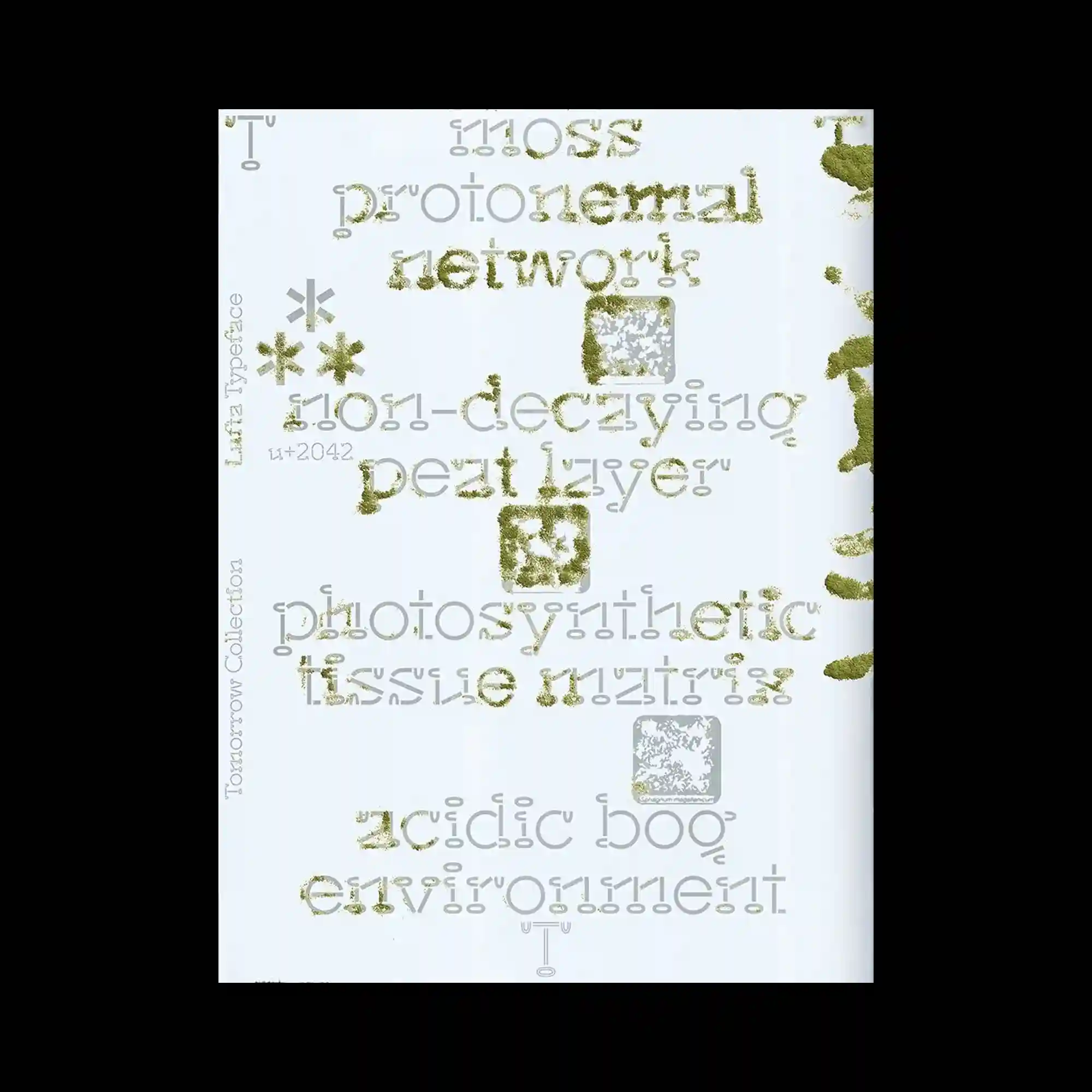
Experimental typography combines multiple letter structures and textured surfaces, making the text itself the primary visual material. Moss-like granular textures partially fill selected characters, contrasting with clean outlined glyphs and pale gray letterforms beneath. Small geometric icons and textured square motifs punctuate the composition, adding rhythm between the typographic clusters. The layered treatment produces shifting legibility while emphasizing materiality over straightforward reading.
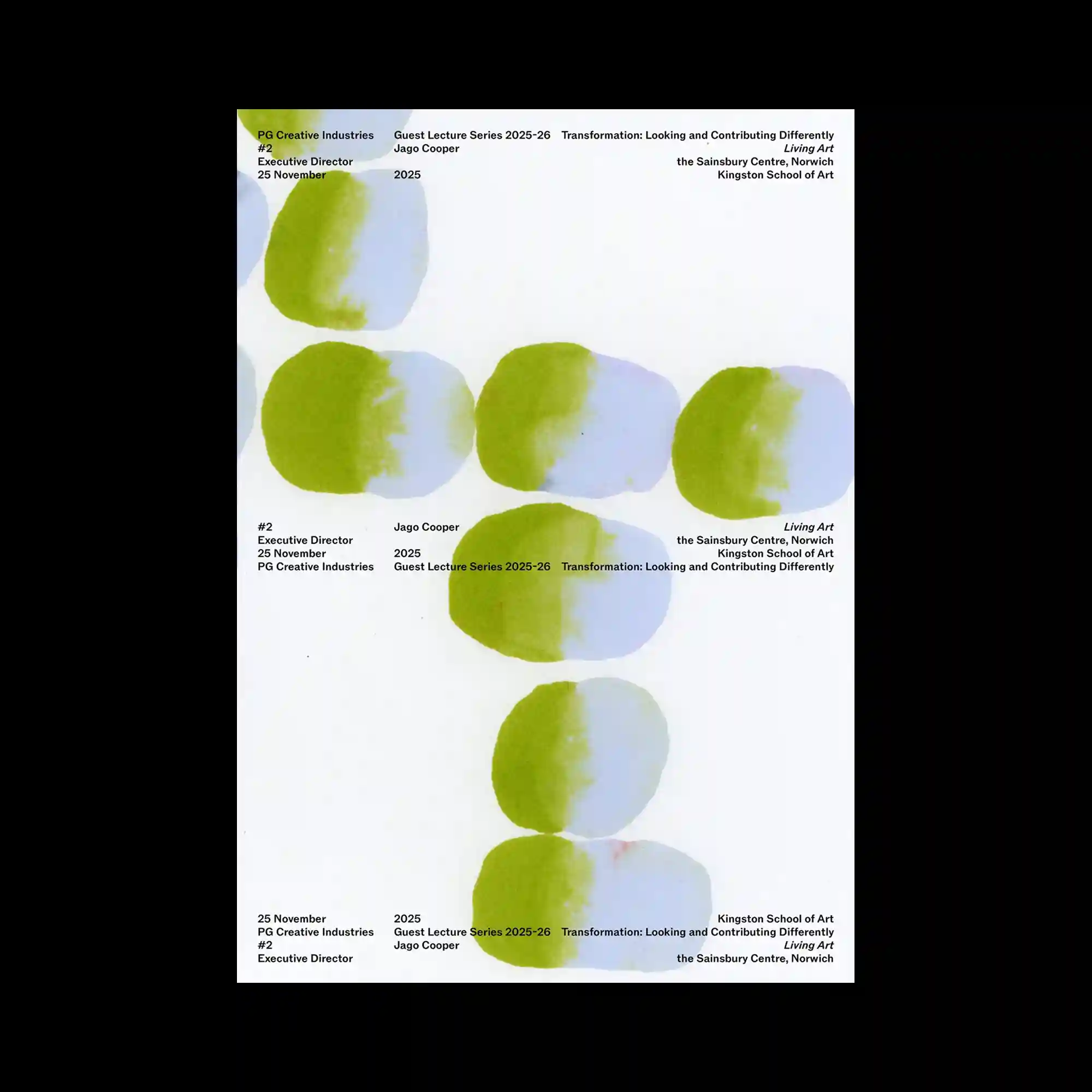
Soft watercolor-like oval forms are arranged vertically with consistent spacing, establishing a calm visual rhythm through repetition. Each shape blends pale blue and green with feathered edges, introducing subtle tonal variation despite the limited palette. Small sans-serif text blocks are distributed around the composition rather than gathered in a single area, creating multiple points of balance. The restrained combination of organic forms and minimal typography produces an understated and spacious layout.
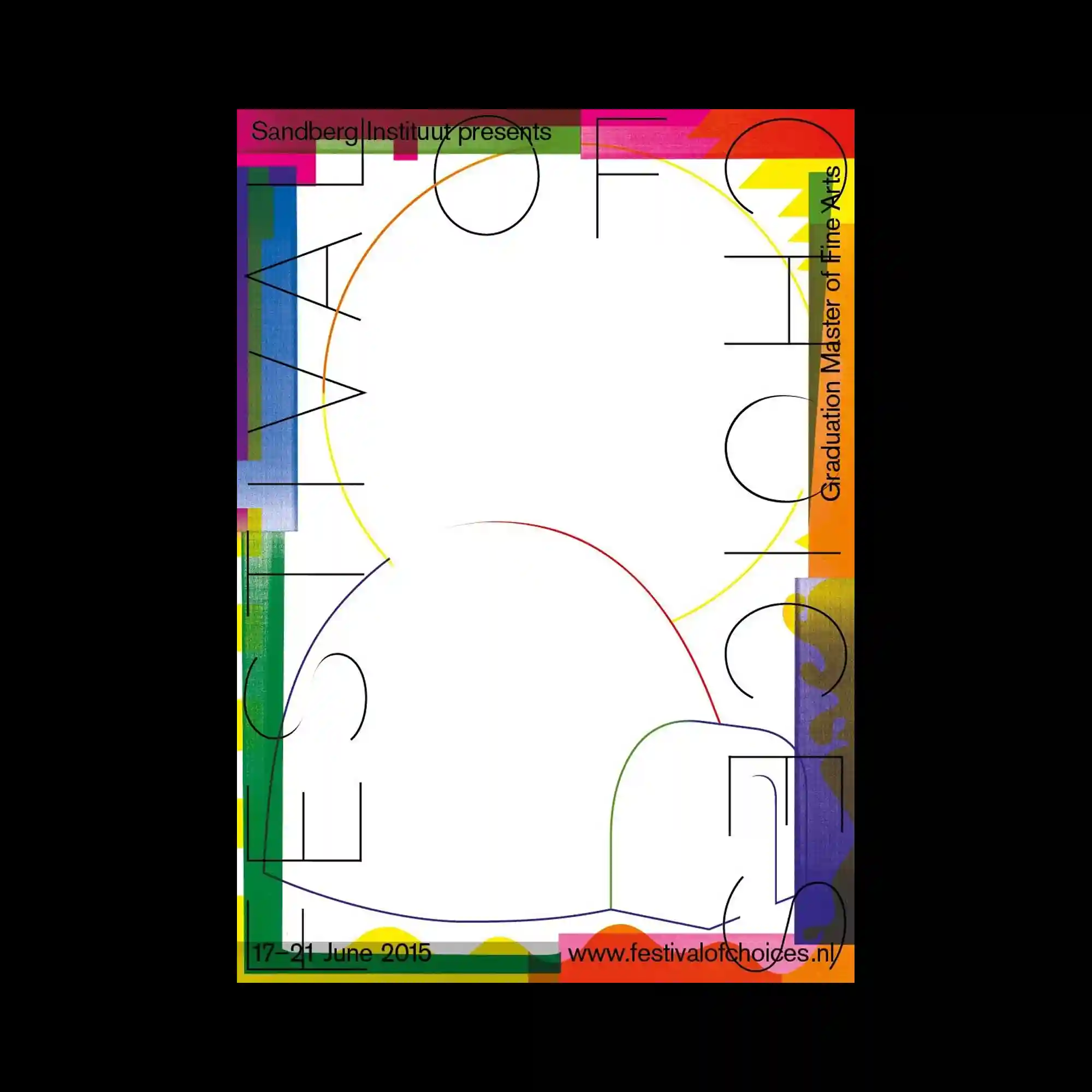
A colorful frame of layered translucent rectangles surrounds an expansive central white space, emphasizing openness through contrast. Thin circular arcs and delicate linear typography weave across the composition, creating a network of intersecting geometric paths. Transparent color overlaps generate subtle secondary hues while maintaining the lightness of the overall layout. Vertical and horizontal text placements integrate seamlessly with the geometric framework, reinforcing the structured rhythm.
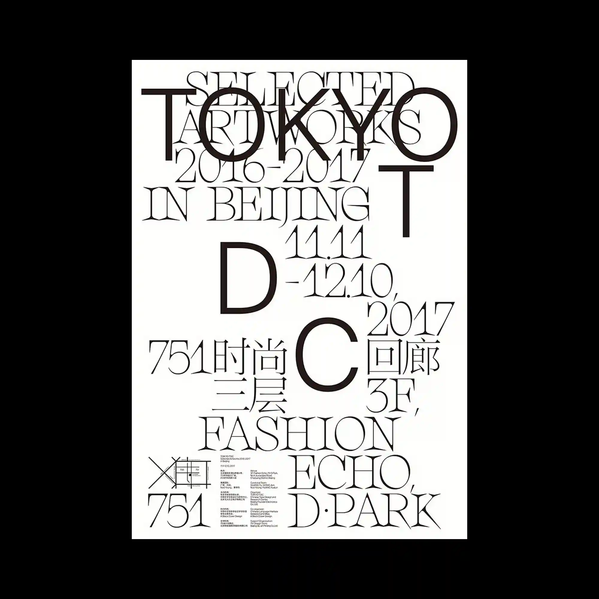
Large serif letterforms overlap extensively across the composition, producing a layered typographic field where hierarchy emerges through scale rather than separation. Thin elegant strokes contrast with oversized initials, allowing individual characters to function as graphic shapes as much as readable text. Generous white space prevents the dense overlaps from feeling heavy while preserving visual clarity. Smaller informational blocks are positioned near the bottom, completing the composition without competing with the dominant typography.
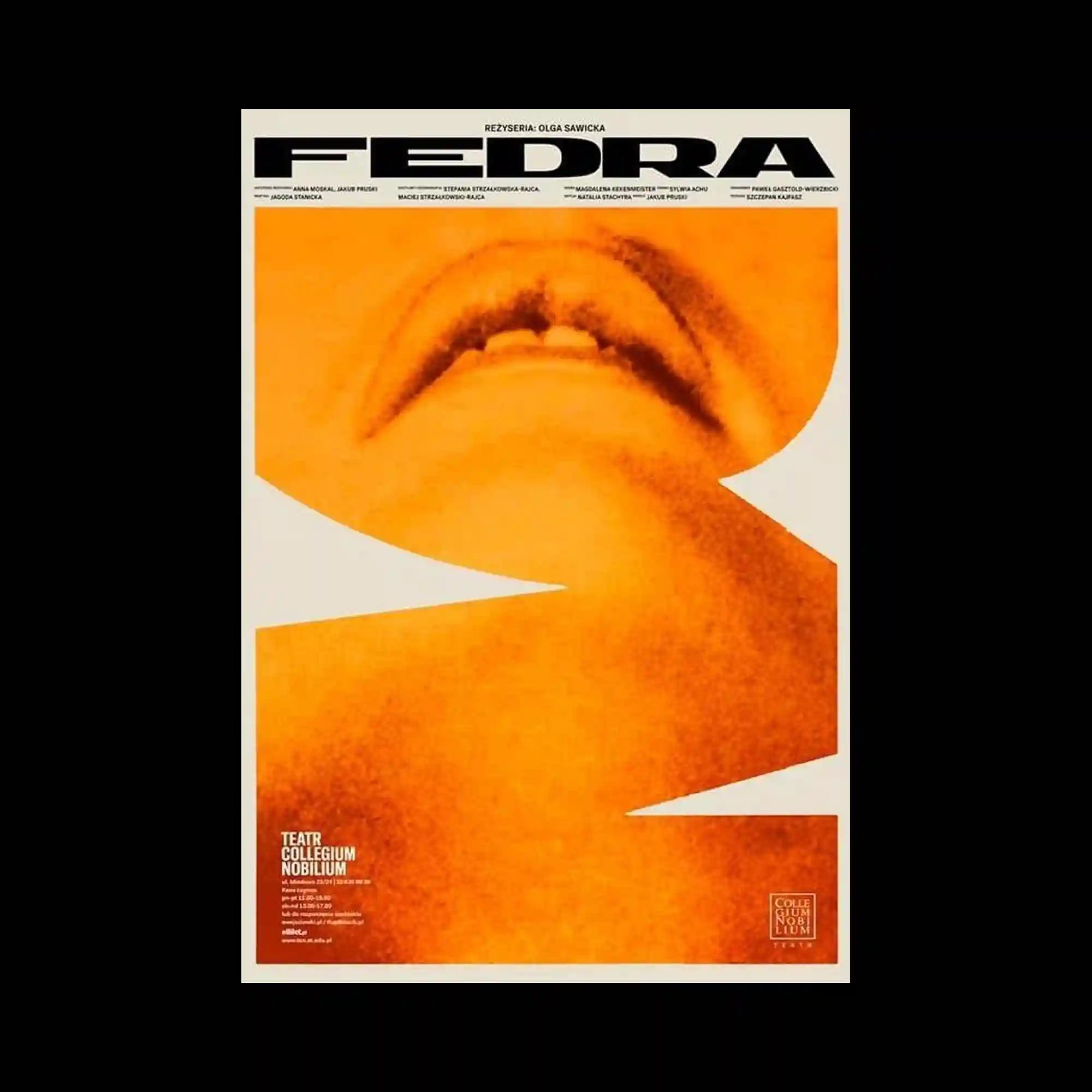
A tightly cropped monochromatic photograph is transformed into an abstract composition through bold geometric cutouts that interrupt the continuous image. Warm orange gradients and visible grain soften the photographic surface while creating depth across the enlarged facial fragment. Heavy condensed typography stretches across the top edge, establishing a strong visual anchor before giving way to the dominant image below. Small blocks of information remain confined to the lower corners, allowing the oversized photograph to control the overall visual hierarchy.
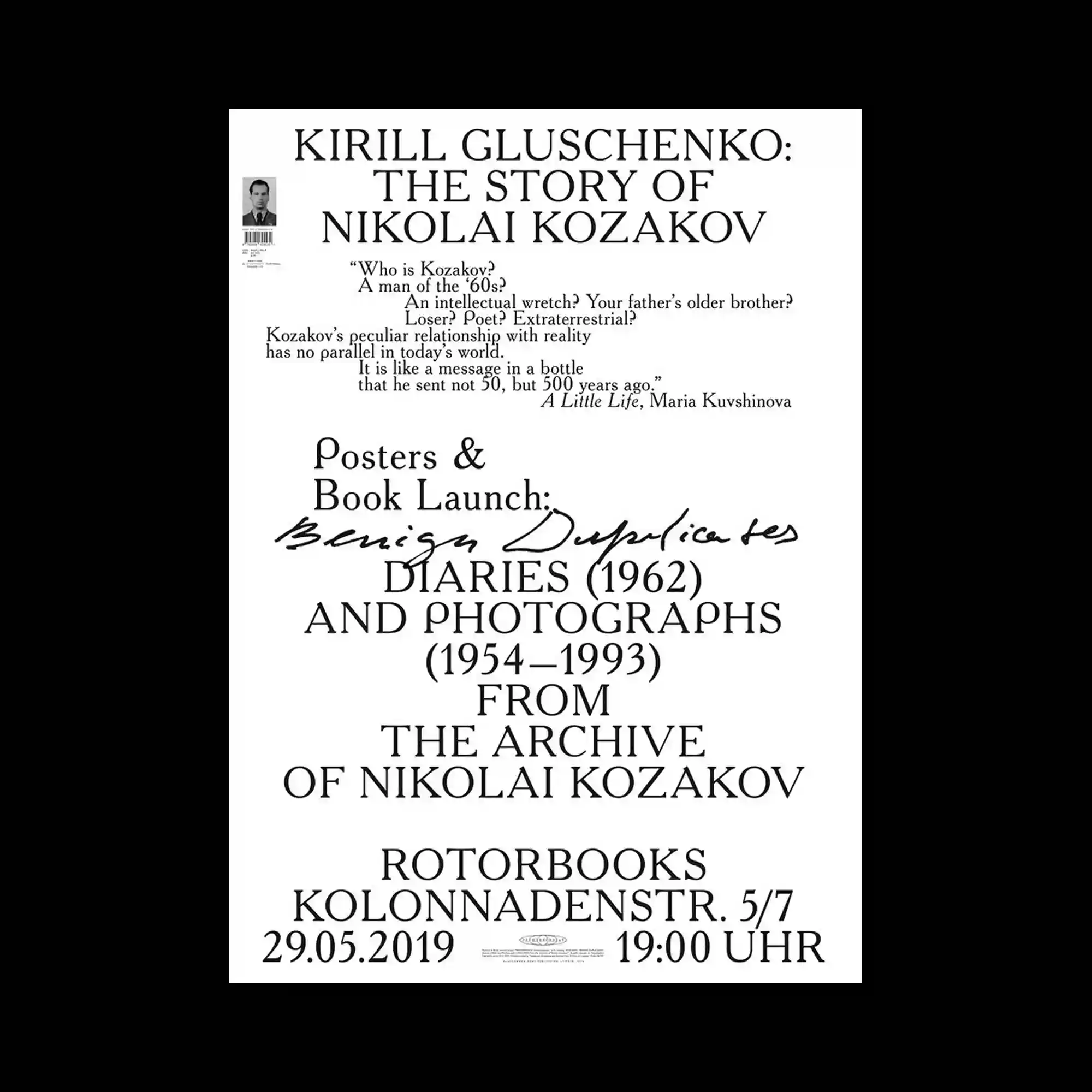
A centered typographic composition relies on classic serif lettering arranged in multiple clearly defined sections. Variations in scale and alignment establish a strong reading hierarchy, while a handwritten script placed across the middle interrupts the rigid structure with expressive contrast. Smaller informational text is positioned with generous spacing, allowing each block to remain visually distinct. The restrained monochrome palette places complete emphasis on typography, proportion, and spatial organization.
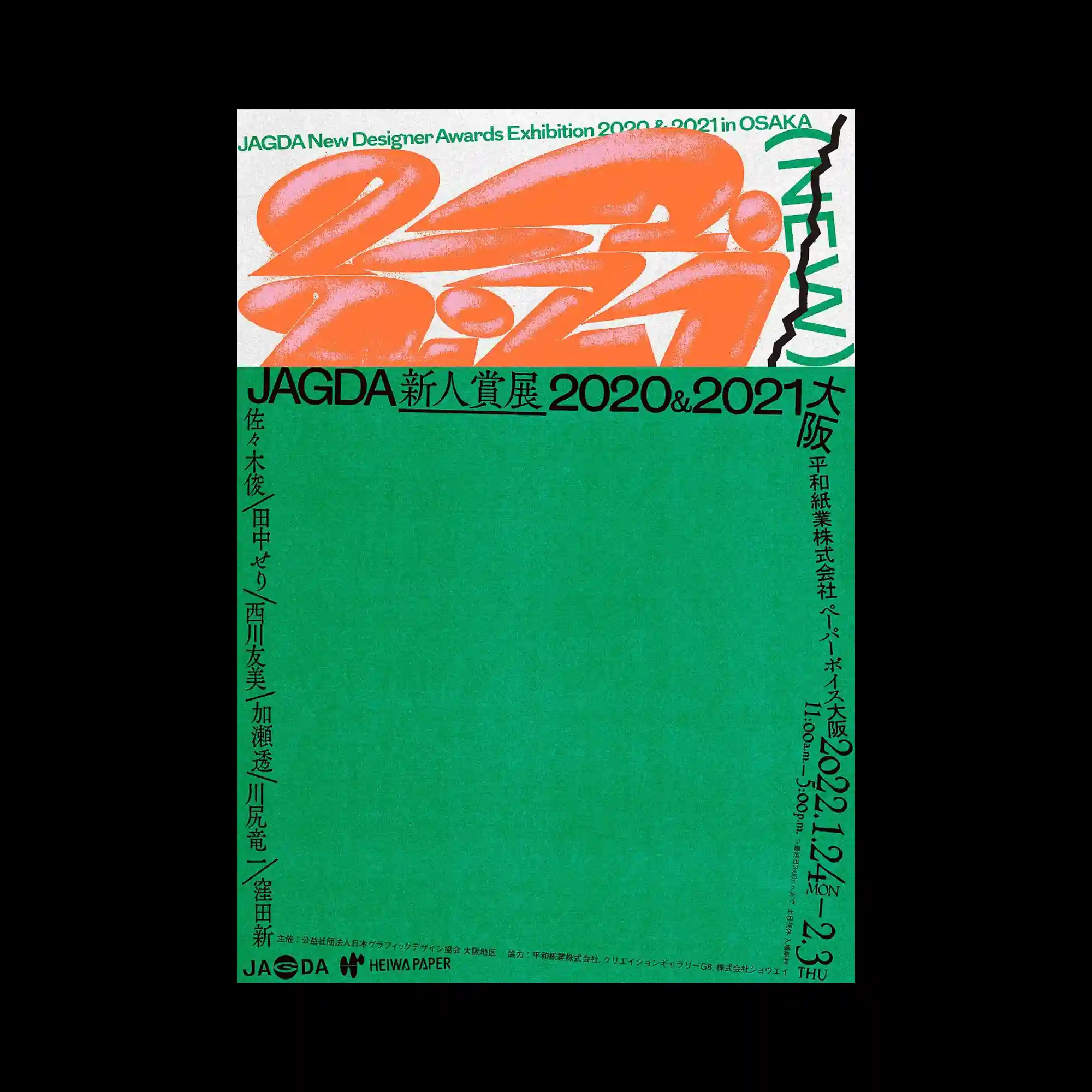
A broad green field occupies most of the composition, contrasting with a narrow white header that contains oversized abstract lettering. Rounded inflated letterforms create a sculptural presence, enhanced by soft gradients and grainy textures that suggest volume without relying on realism. Vertical typography along the edges introduces directional movement while framing the large empty area below. The restrained balance between dense graphic activity and expansive negative space gives the poster a bold visual rhythm.
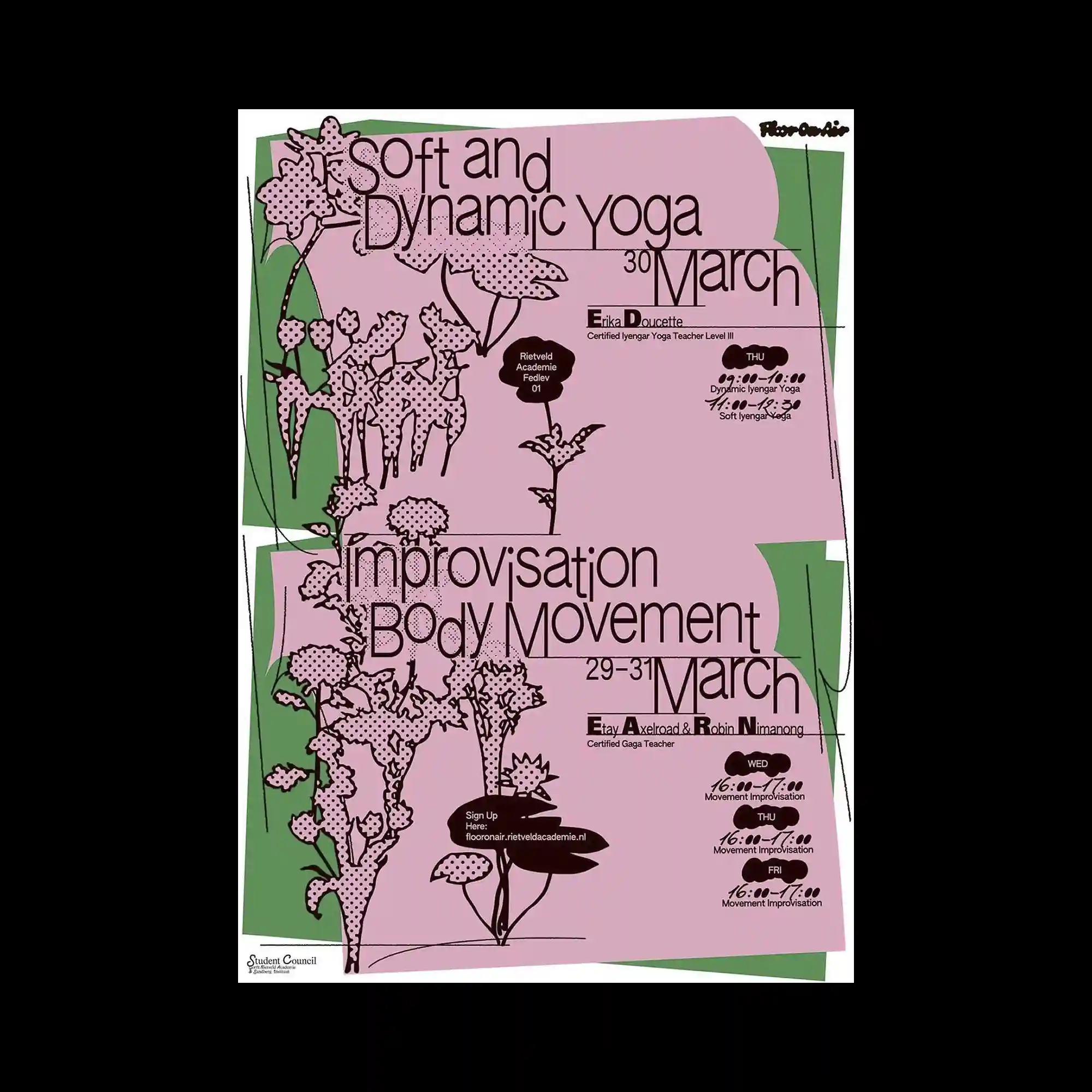
Layered pastel pink geometric panels overlap across the composition, creating an irregular framework for the content. Delicate botanical illustrations extend vertically through the layout, intersecting with typography to merge organic and graphic structures. Thin linear details and small decorative marks add subtle movement without overwhelming the spacious composition. Large condensed text is integrated directly into the illustrated elements, producing a unified relationship between image and typography.
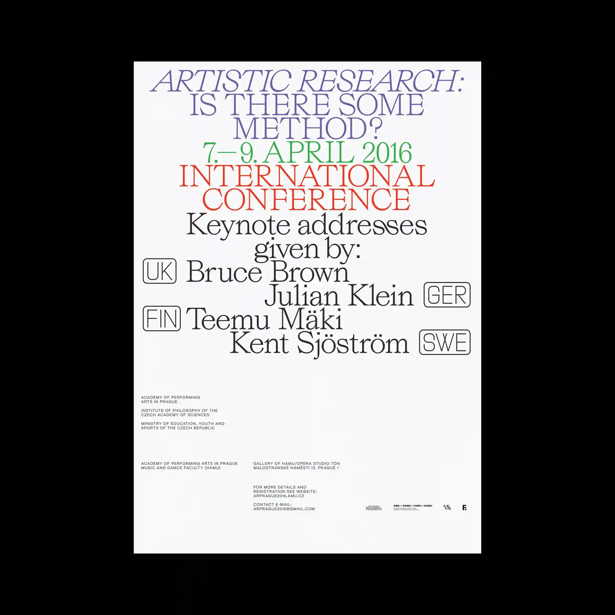
Large serif typography dominates the composition through a carefully structured hierarchy that guides the eye from top to bottom. Different font sizes, weights, and colors separate informational groups while maintaining consistent spacing across the layout. Small outlined labels and compact text blocks introduce secondary layers without disrupting the primary visual rhythm. The generous negative space surrounding the text reinforces clarity and emphasizes the typographic arrangement as the central graphic element.
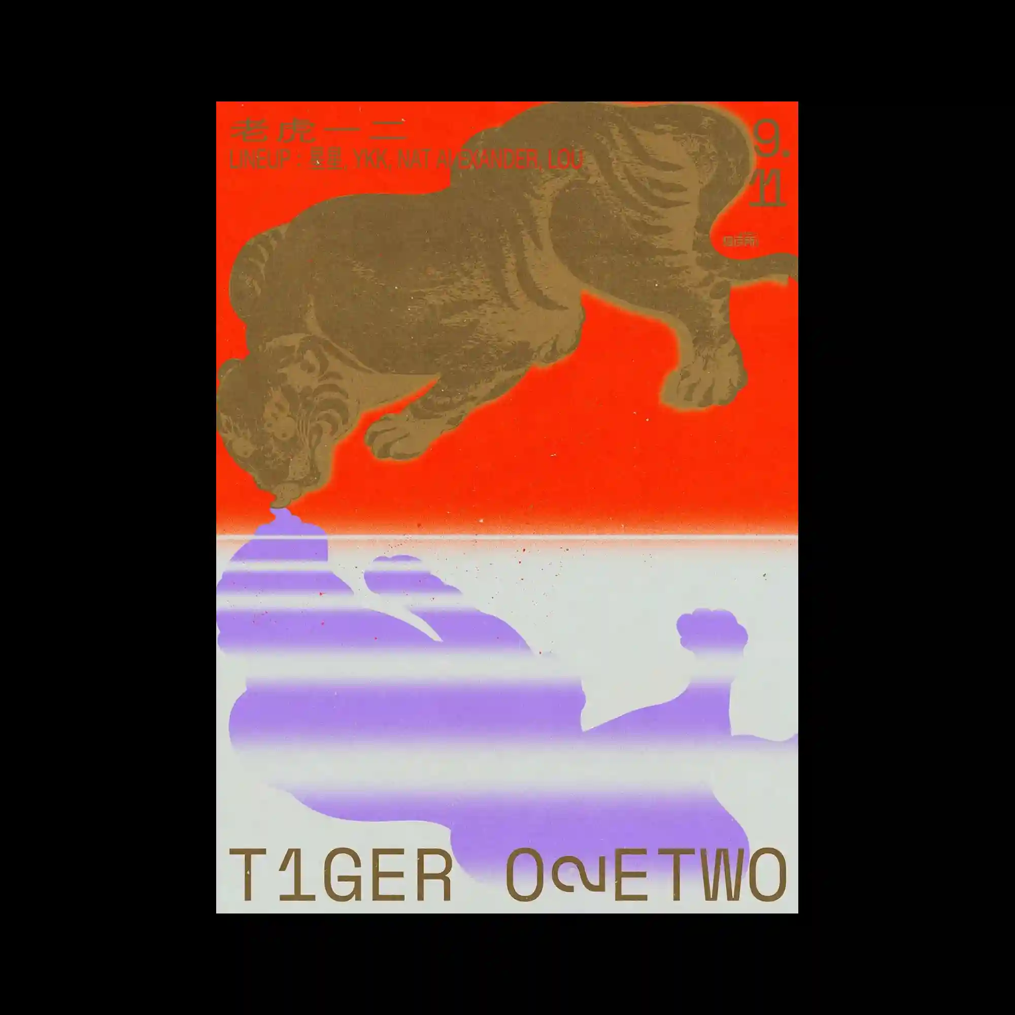
The composition is divided into two contrasting color fields, with a vivid warm upper section and a pale lower section separated by a glowing horizontal transition. A textured animal silhouette stretches dramatically across the upper area, while simplified purple cloud-like forms occupy the lower half as abstract counterparts. Fine grain, faded gradients, and light horizontal bands introduce a printed, atmospheric surface quality. Bold typography is distributed asymmetrically across the layout, reinforcing the dynamic relationship between imagery and text.
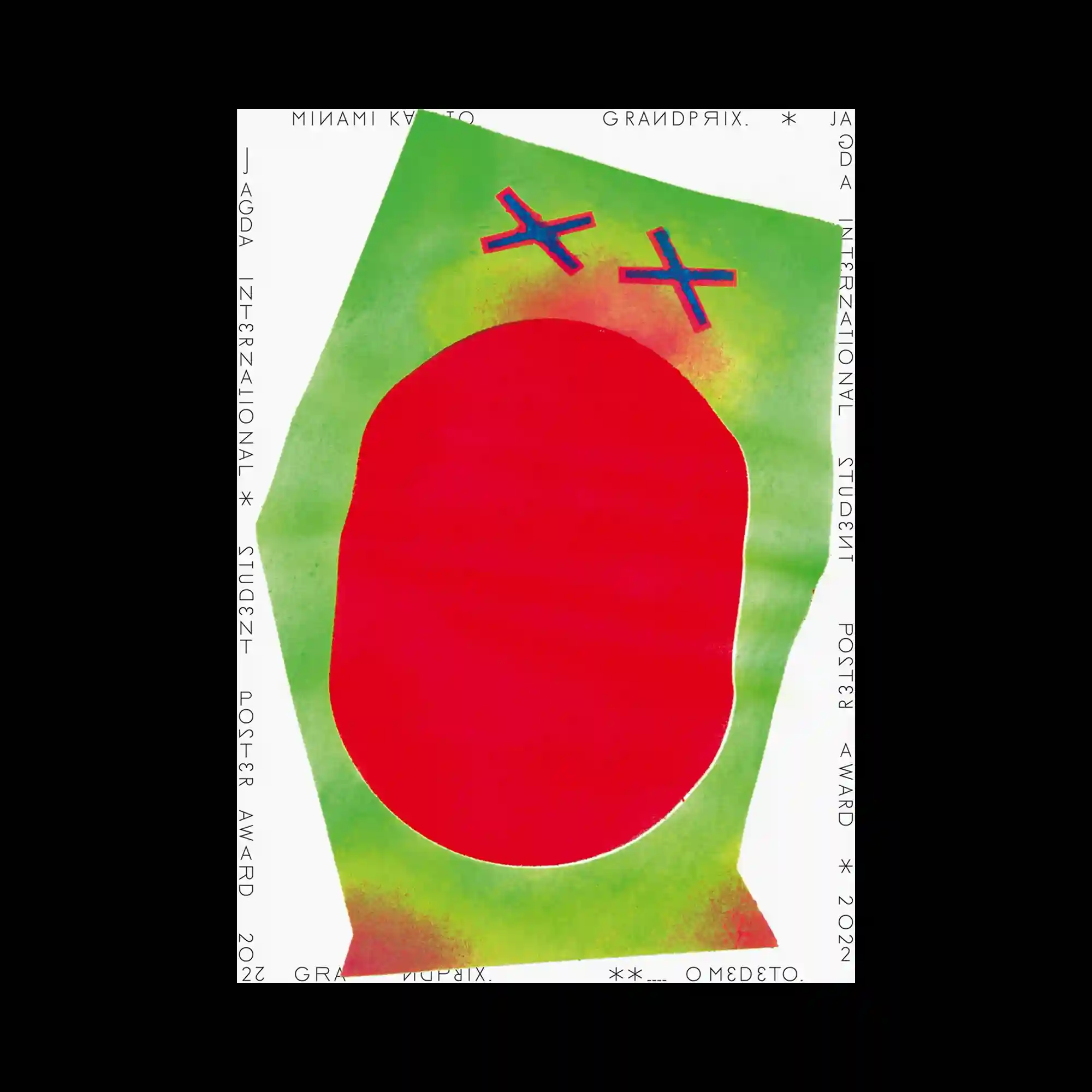
A large irregular green shape fills the composition, framing a bold red organic form positioned at the center. Soft airbrushed gradients and scattered spray-like textures create subtle transitions around the edges, contrasting with the flat geometry of the main shapes. Two small cross-like blue symbols outlined in red hover above the central form, introducing a playful visual interruption. Thin condensed typography runs continuously around the perimeter, forming a restrained border that balances the oversized graphic elements.
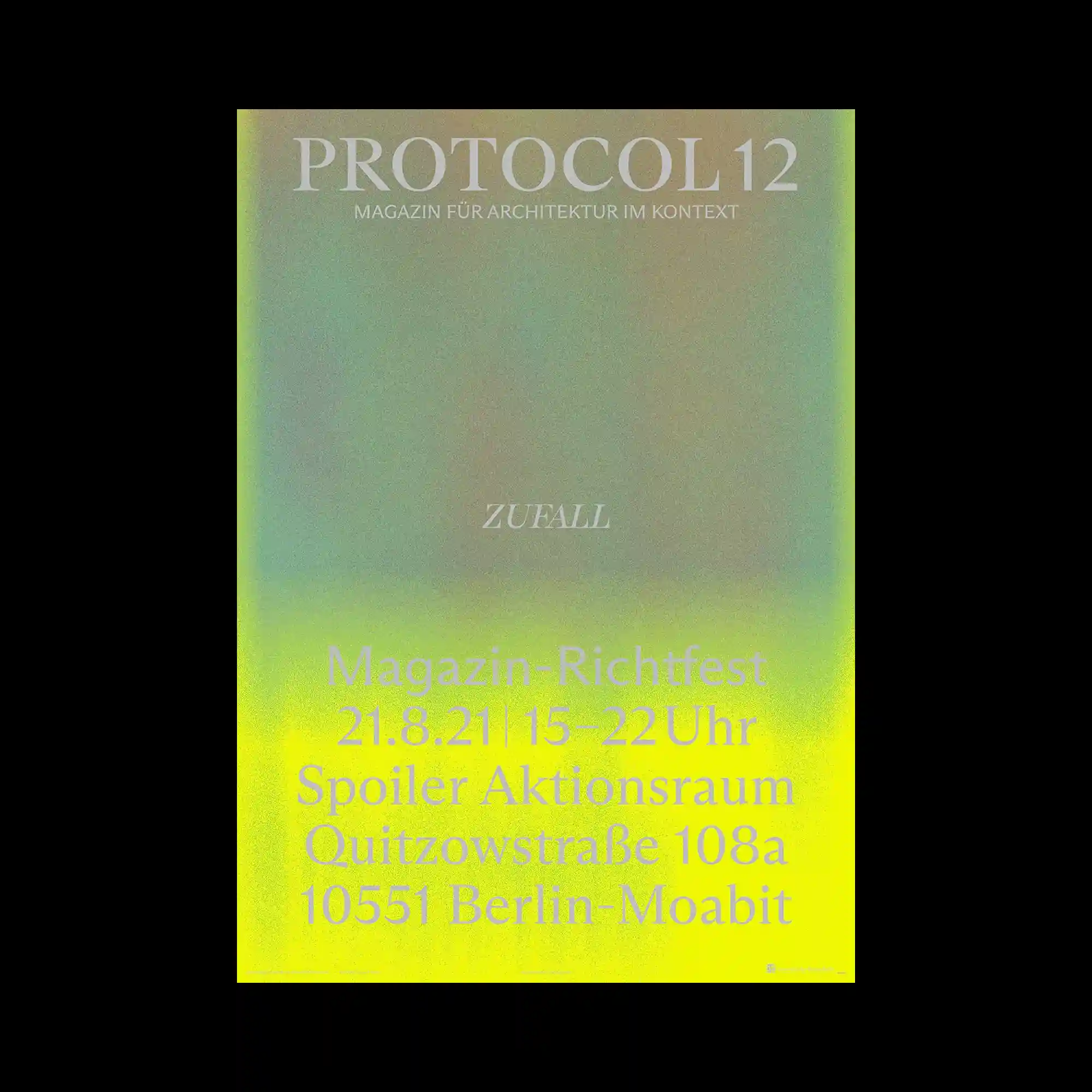
A luminous gradient transitions from muted gray-green into vivid fluorescent yellow, establishing a glowing atmosphere across the composition. White serif typography is arranged in clearly separated blocks, allowing the changing background intensity to define the visual hierarchy. Fine grain texture softens the digital gradient and introduces a tactile surface quality. The restrained layout combines spacious negative space with concentrated information to create a balanced and contemporary editorial composition.
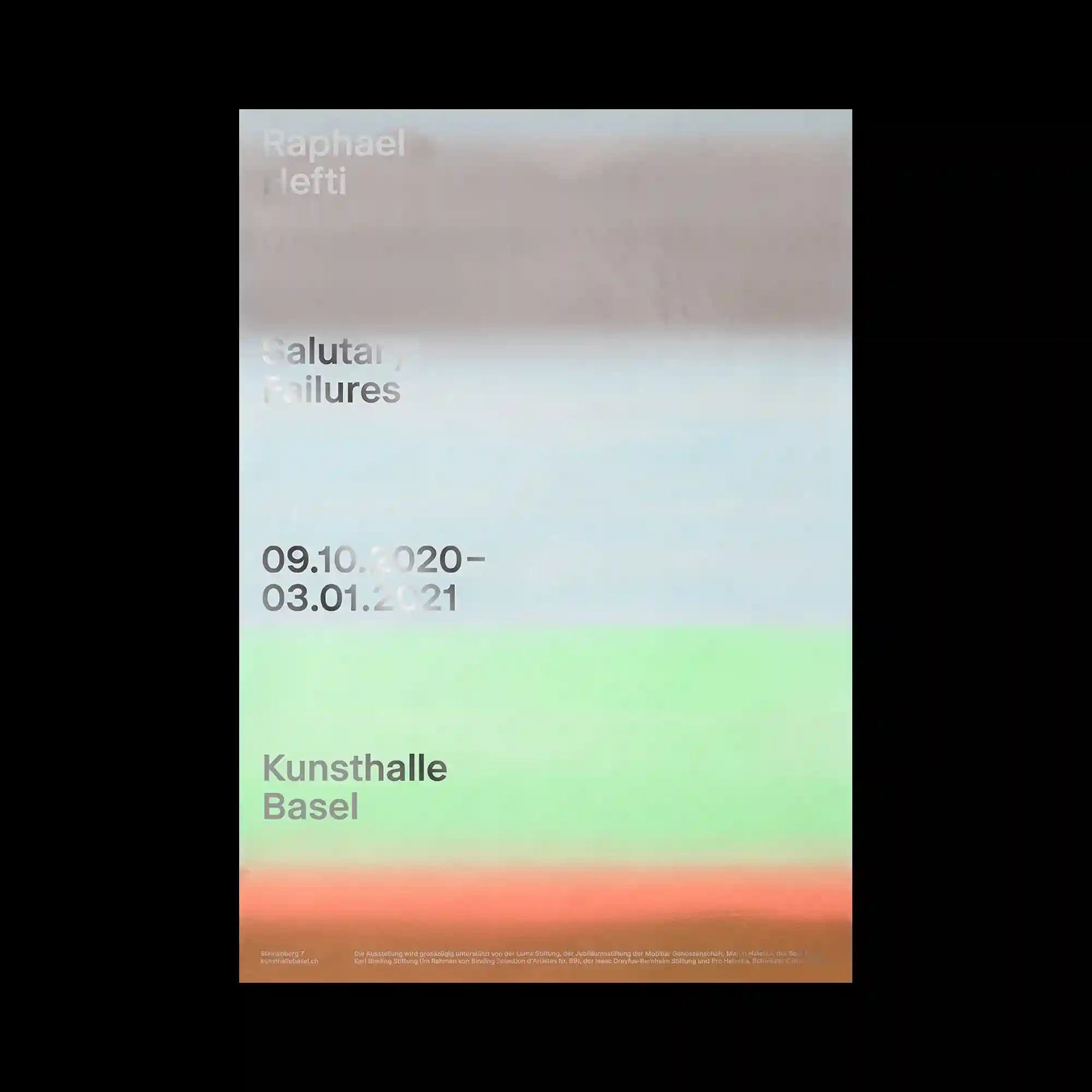
Horizontal bands of softly blurred color transition across the composition, creating an atmospheric surface that dissolves conventional boundaries between image and background. Minimal sans-serif typography is positioned with consistent alignment, remaining crisp against the diffused gradients. The composition relies on subtle tonal variation rather than strong contrast, allowing color fields to establish visual rhythm. Sparse information and restrained spacing reinforce the calm, understated editorial character.
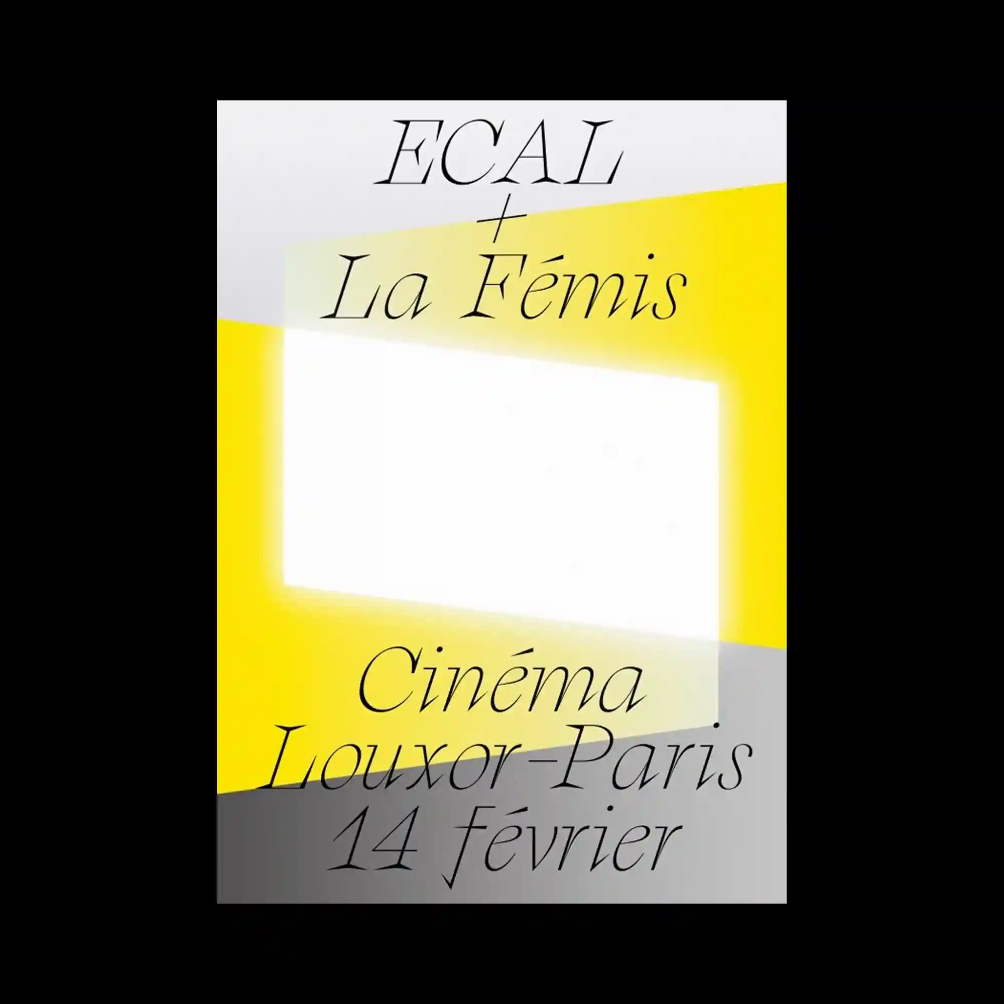
Elegant serif typography is distributed across the composition with generous spacing, allowing individual words to function as visual elements rather than dense information. Large translucent geometric planes intersect diagonally, framing a luminous central rectangle while subtly shifting the hierarchy of the layout. Soft yellow highlights contrast with pale gray surfaces to establish depth through overlapping shapes instead of outlines. The restrained palette and minimal composition emphasize rhythm, proportion, and typographic refinement.
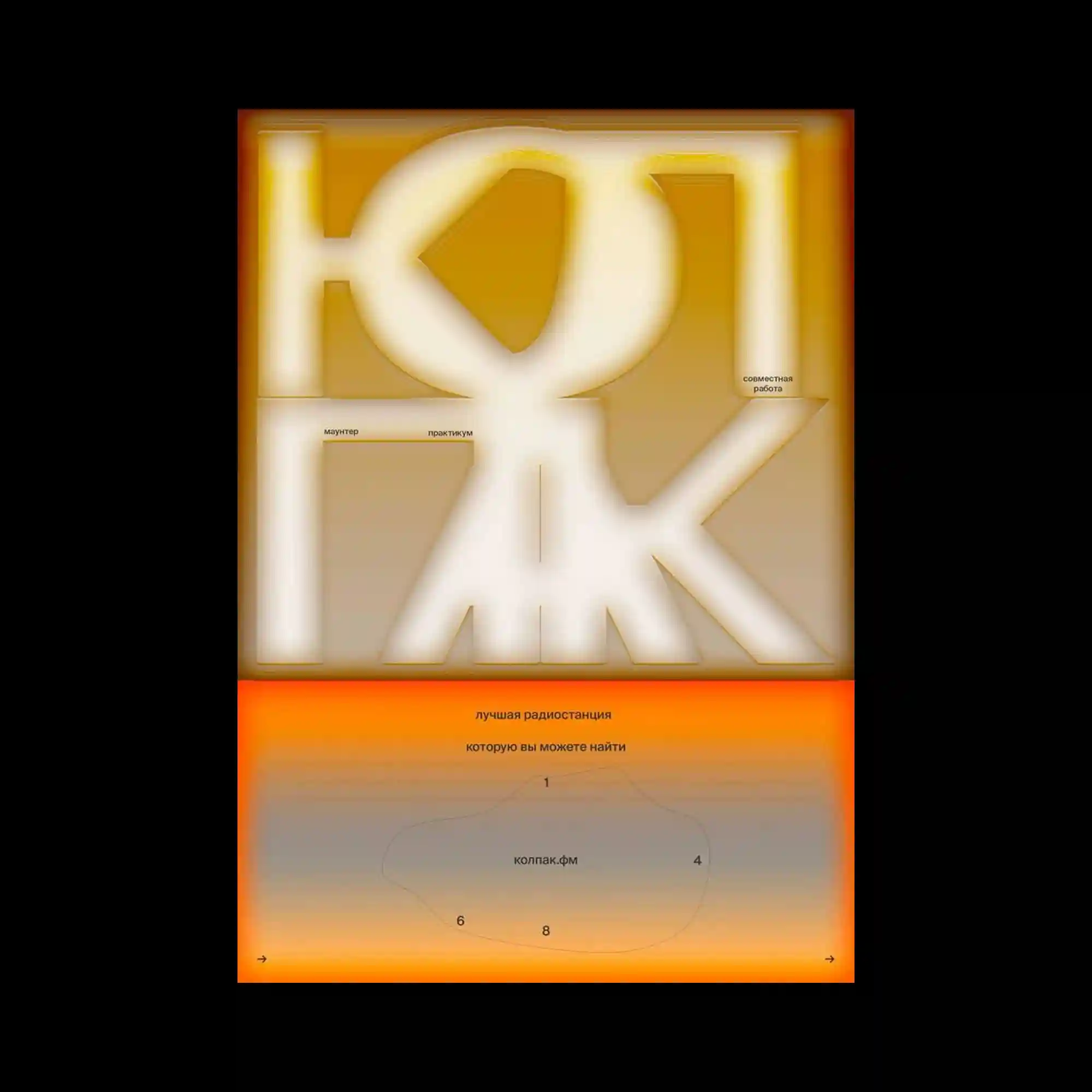
Large geometric letterforms occupy the upper half of the composition, their softened edges glowing against a warm monochromatic gradient. Small informational text is positioned with precise spacing, contrasting the monumental typography with understated editorial details. A vivid horizontal orange band divides the layout and introduces a secondary information zone with restrained diagrams and scattered numerical markers. The balance between oversized forms, atmospheric gradients, and carefully aligned microtypography creates a composition that feels both immersive and methodically structured.
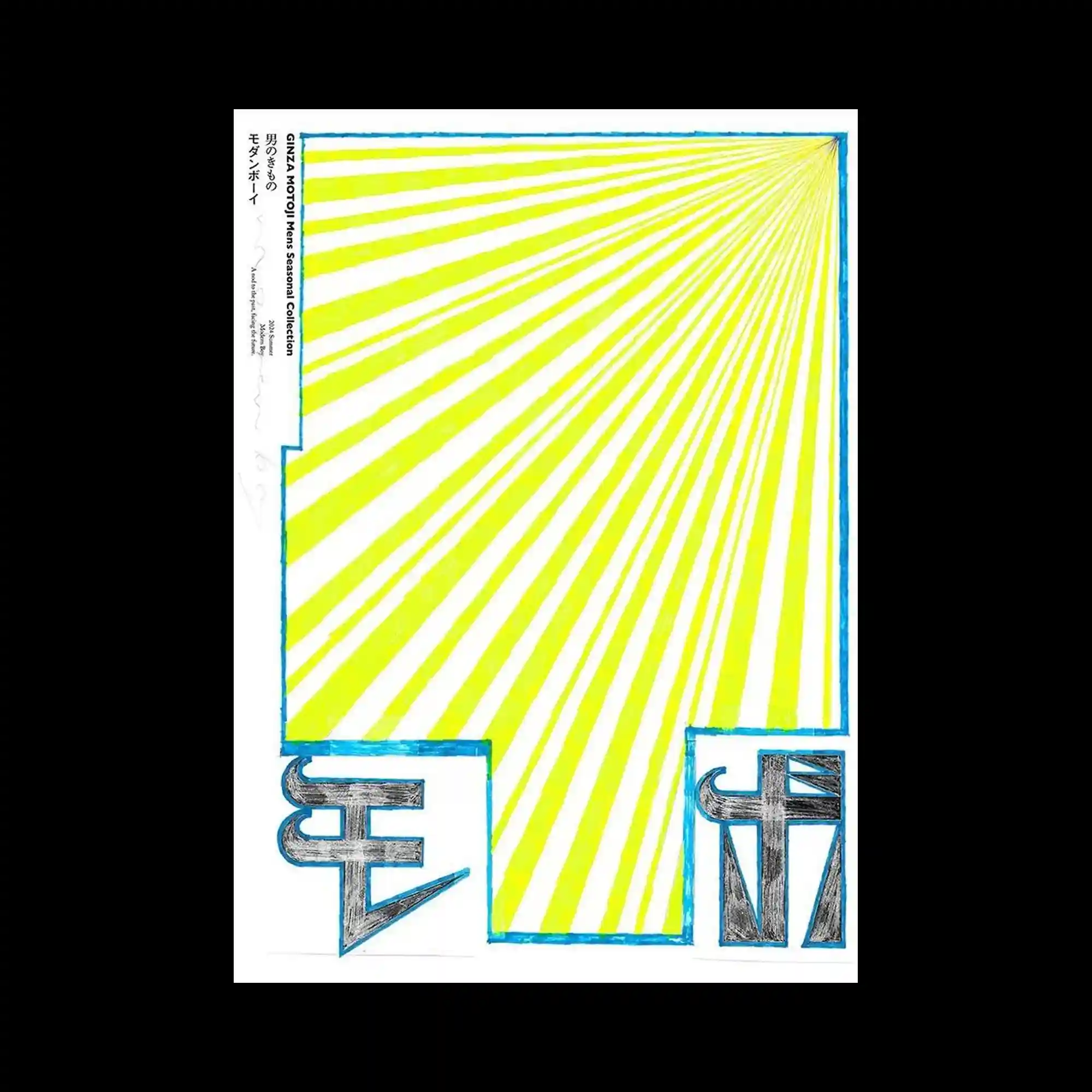
Radiating yellow stripes converge toward a single vanishing point, generating strong directional movement across the composition. Hand-drawn blue outlines frame the geometric structure while bold black symbols anchor the lower corners with heavy visual weight. The contrast between energetic linear expansion and solid typographic forms creates a balanced composition. Minimal graphic elements are used to maximize spatial depth and optical rhythm.
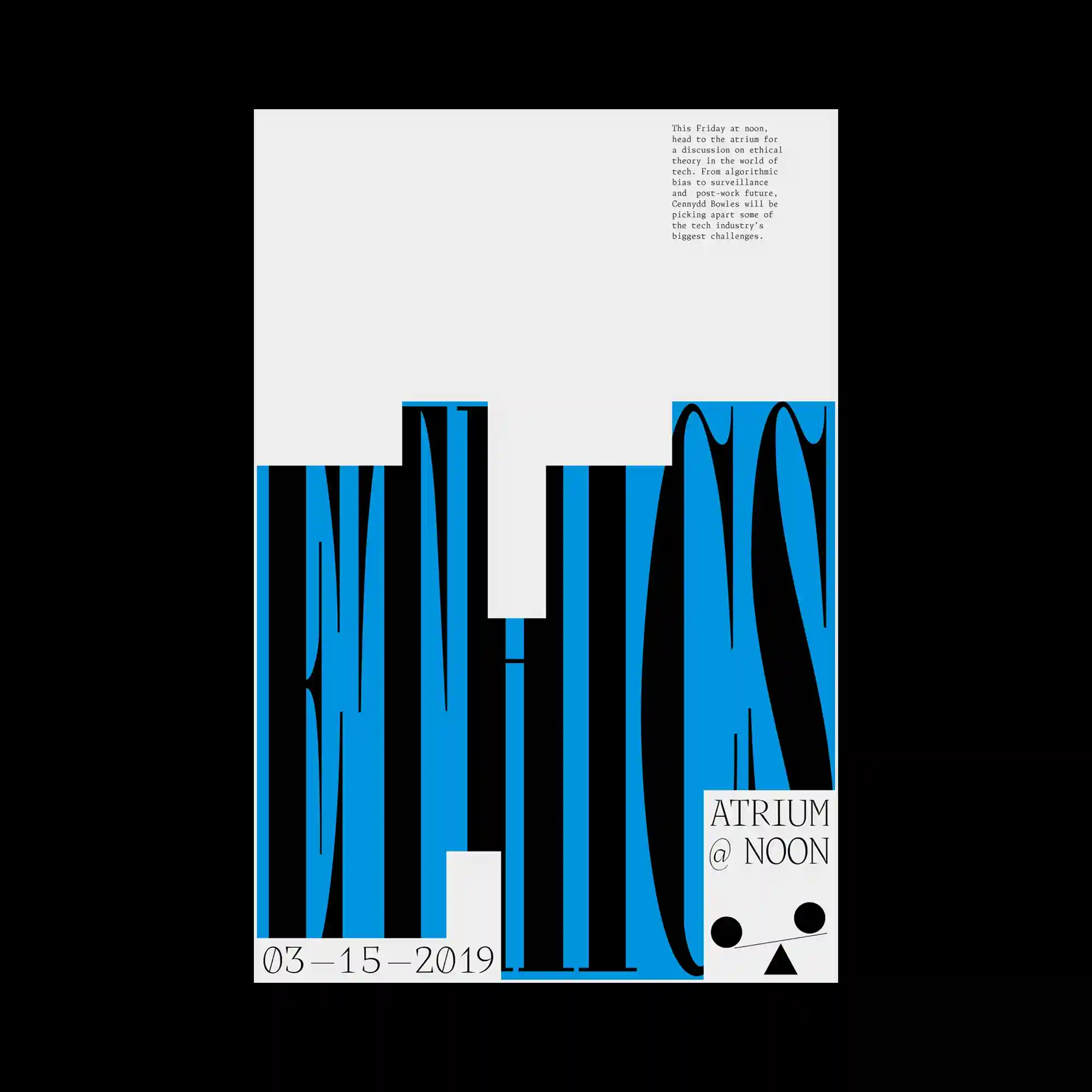
Condensed display typography stretches vertically across the lower half of the composition, emphasizing dramatic proportions and rhythmic spacing. Minimal supporting text occupies the upper area, creating strong contrast between dense and empty regions. Blue rectangular fields interact with elongated black letterforms, producing alternating positive and negative shapes. The restrained layout relies on scale and alignment to create visual impact.
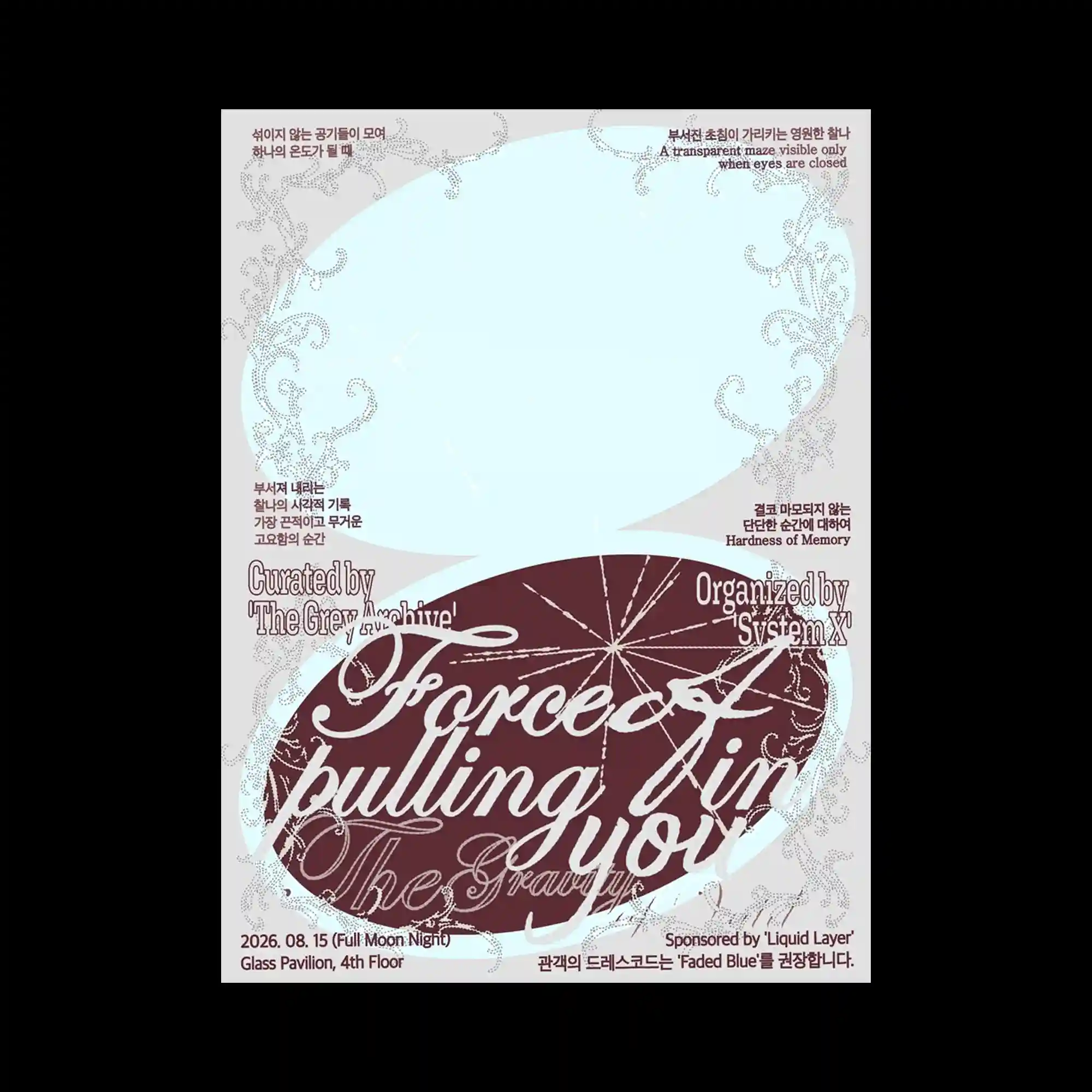
Delicate ornamental linework frames large flowing script positioned within layered oval forms that dominate the center. Pale translucent shapes overlap intricate decorative borders, creating subtle depth through opacity rather than shadow. Serif display text and compact information blocks establish multiple reading scales across the composition. Elegant curves and restrained color transitions produce a refined editorial atmosphere.
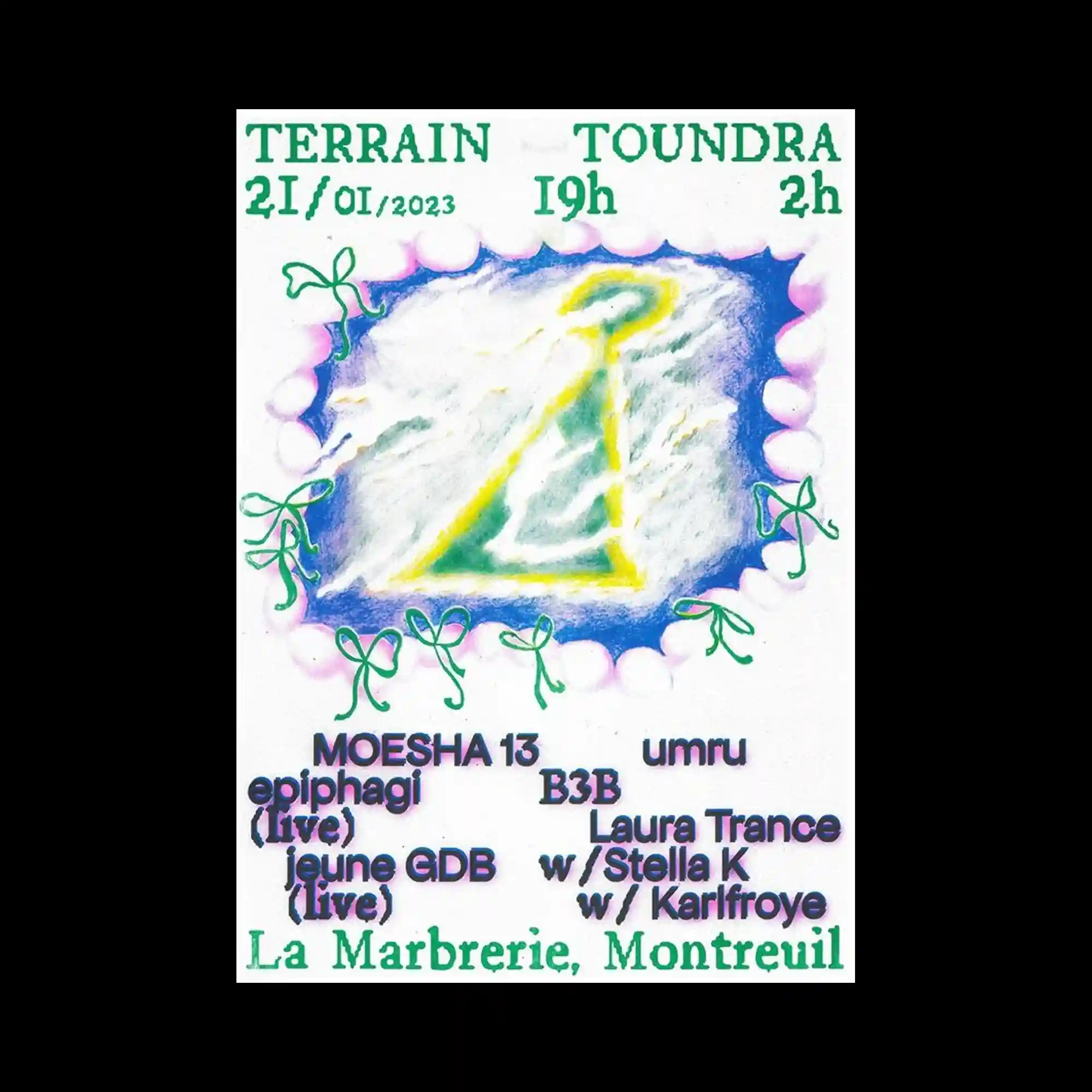
A soft illustrated central symbol is surrounded by hand-drawn floral motifs and expressive typography arranged with generous spacing. Chalk-like textures and glowing color transitions create an atmospheric handcrafted appearance. Decorative elements frame the composition without overwhelming the central graphic, allowing the layout to remain open and balanced. The mix of playful illustration and bold text establishes a light visual rhythm.
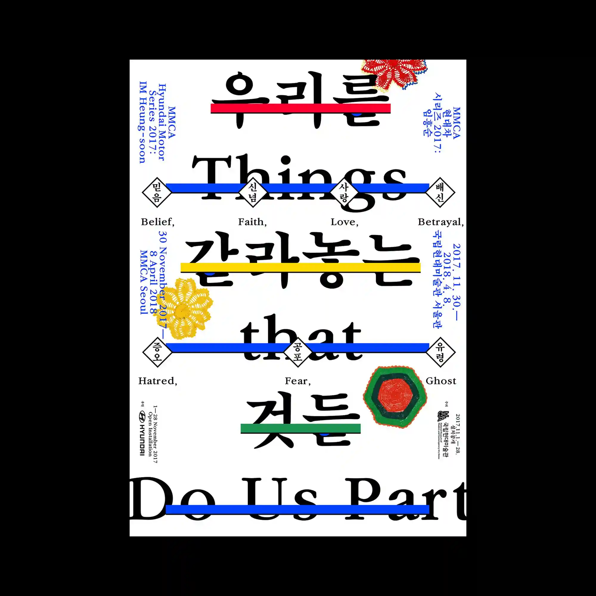
Large bilingual typography fills the composition while colorful horizontal bars slice through selected words to create visual interruption. Fine secondary text is positioned symmetrically around the central structure, balancing the oversized letterforms. Decorative floral graphics introduce organic accents that contrast with the rigid typographic framework. The layered hierarchy combines editorial precision with playful visual emphasis.
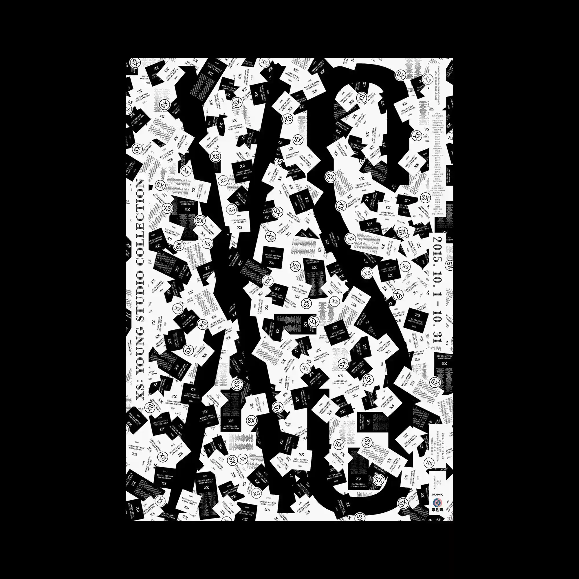
Oversized black letterforms emerge from a dense field of scattered cards, creating figure and ground relationships through repetition. Hundreds of small rectangular modules rotate at varying angles while maintaining consistent proportions, producing a highly textured surface. Monochrome contrast allows the large typography to remain legible despite the visual density. The composition balances randomness and order through controlled repetition of identical graphic units.
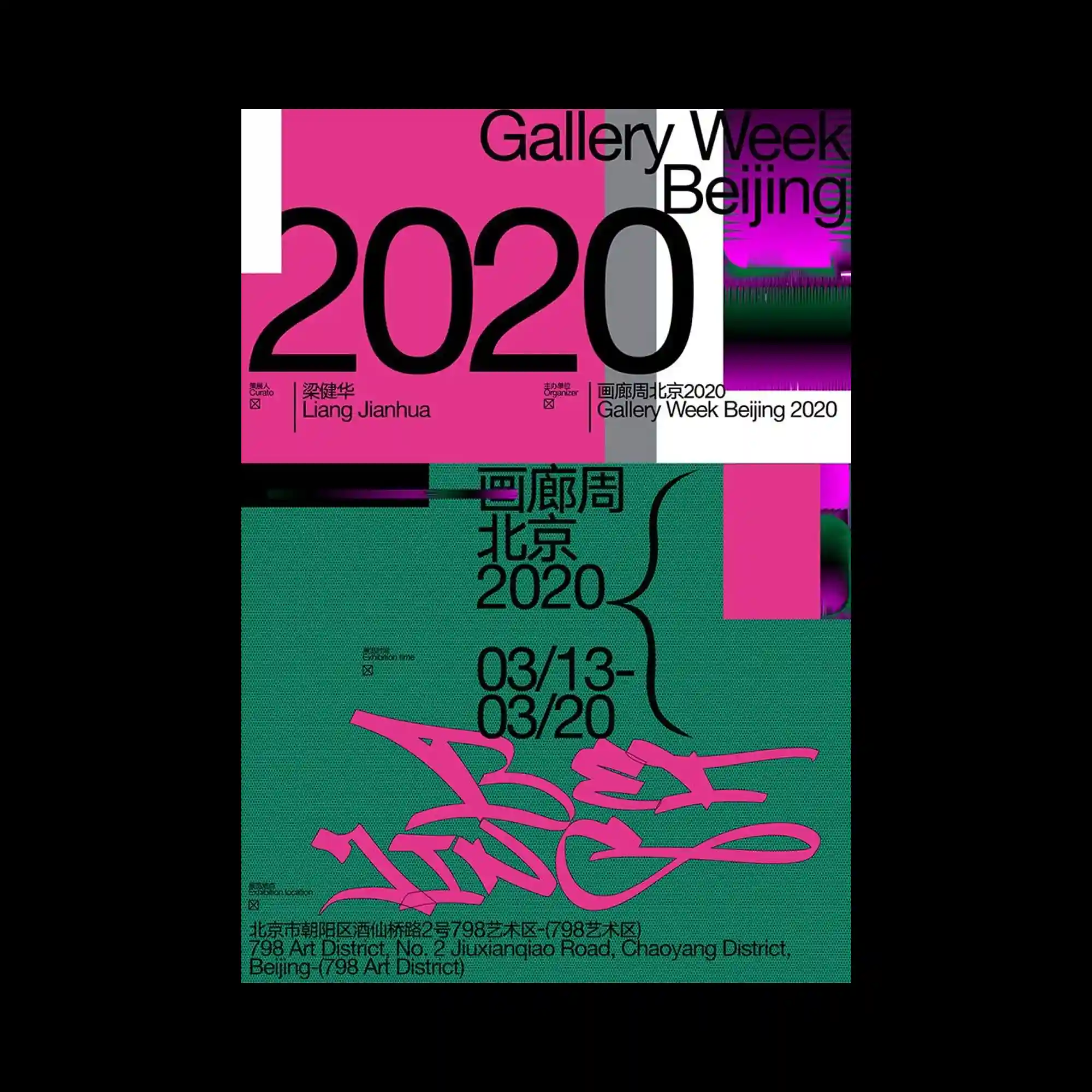
Large-scale numerals dominate the composition while overlapping rectangular color fields divide the layout into distinct visual zones. Bold sans-serif typography interacts with layered graphic textures and high-contrast blocks to create depth without relying on perspective. Vertical and horizontal alignments intersect throughout the poster, producing a dynamic editorial grid. Saturated pink and green fields introduce strong chromatic tension against neutral structural elements.
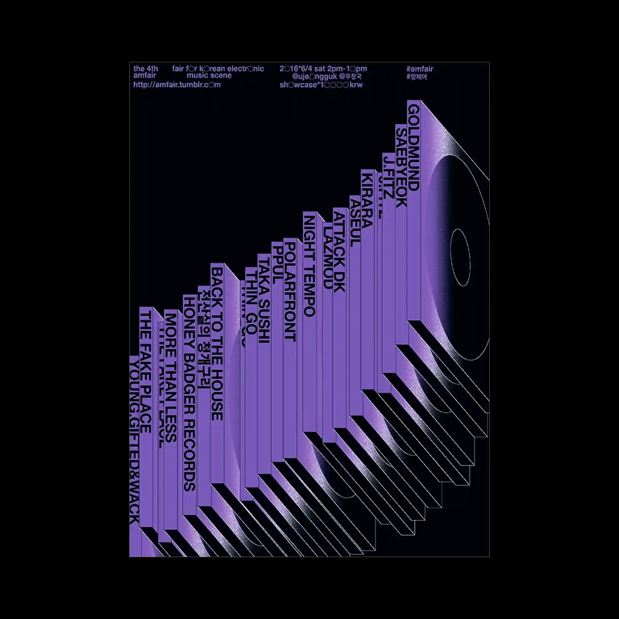
A series of extruded vertical forms gradually increase in height, transforming typography into a perspective-driven architectural sequence. Purple gradients emphasize depth while repeated parallel shadows extend diagonally across the composition. Artist names are integrated directly onto each vertical surface, allowing information to become part of the three-dimensional structure. The restrained color palette focuses attention on spatial rhythm and geometric progression.
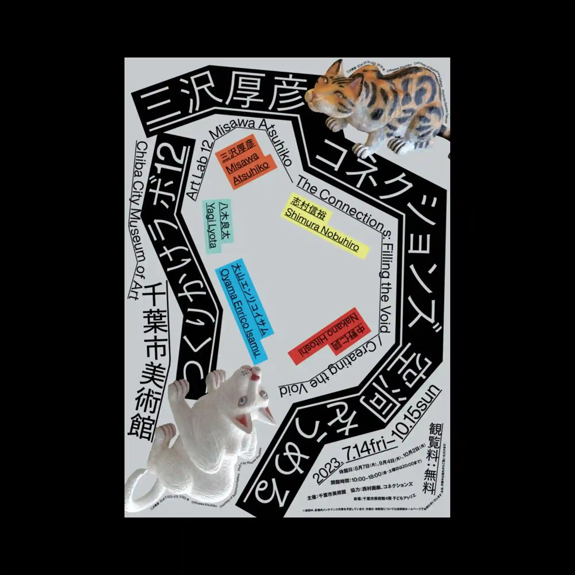
Bold black typographic bands wrap around the composition to form an irregular geometric frame surrounding an open center. Brightly colored text labels punctuate the interior while photographic animal figures extend beyond the graphic boundaries, creating playful dimensional contrast. Rotated text directions and varying type scales generate continuous visual movement around the layout. The combination of strict typographic construction and realistic objects produces an energetic balance between order and surprise.
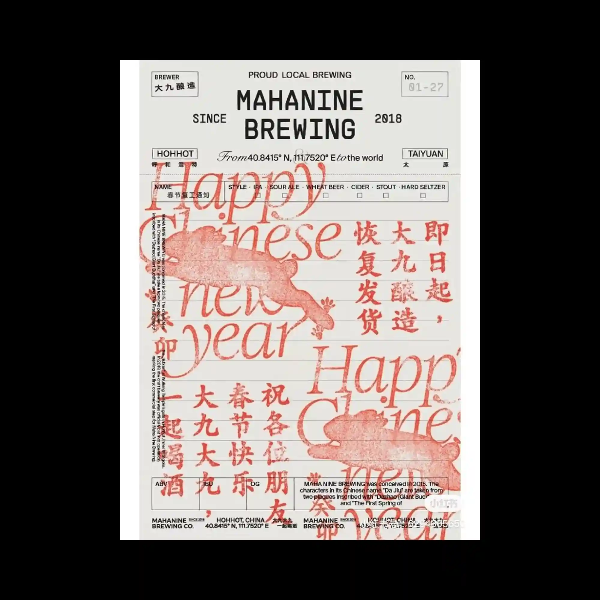
A structured label-inspired composition combines modular typography, ruled fields, and stamped graphic elements into a layered editorial system. Black condensed sans-serif text is arranged with rigid alignment while oversized translucent red serif lettering overlaps the surface to create visual depth. Multiple writing systems and small tabular details reinforce the appearance of archival documentation, balancing precision with expressive overprinting. The contrast between orderly information blocks and soft ink-like textures gives the layout a distinctly tactile graphic rhythm.
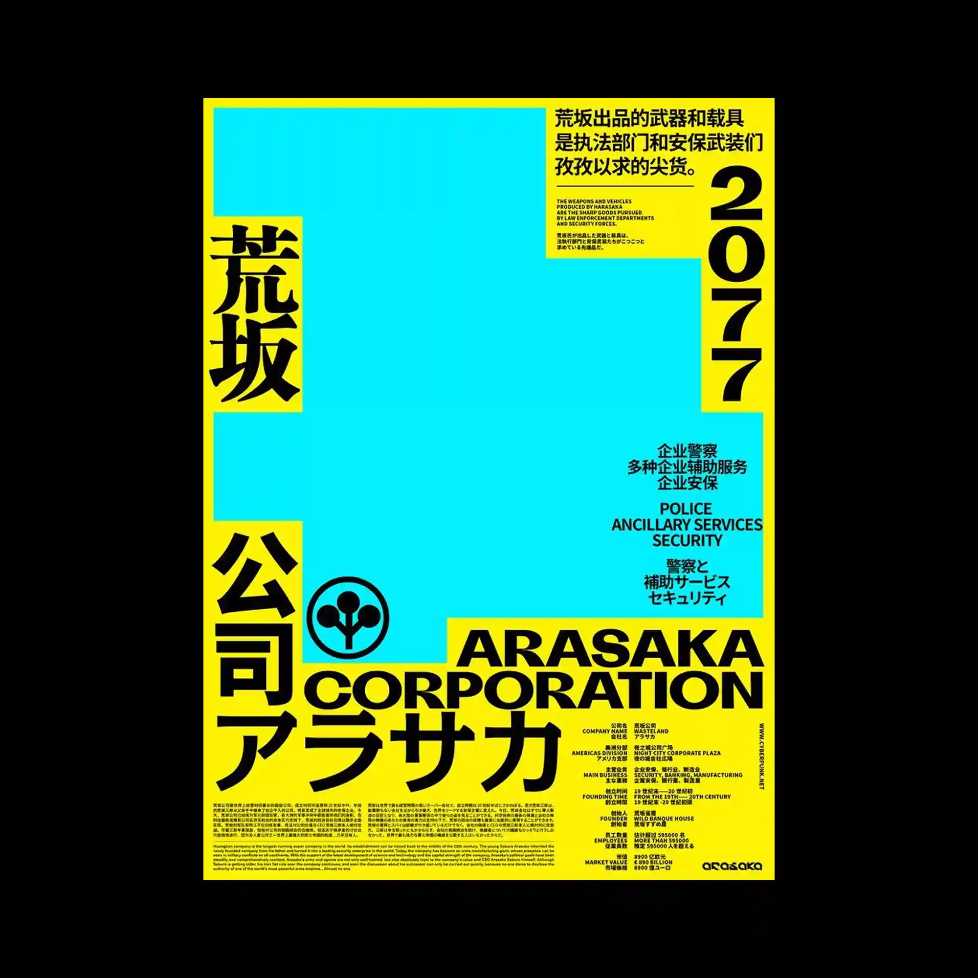
Large areas of solid color establish a bold geometric foundation while oversized multilingual typography frames the composition along the edges. Information is grouped into clearly separated blocks that balance dense text with expansive empty fields. Strong black lettering contrasts sharply against saturated yellow and cyan surfaces, emphasizing hierarchy through scale and weight. The minimal arrangement of shapes allows typography to function as the primary visual element while preserving a clean structural rhythm.
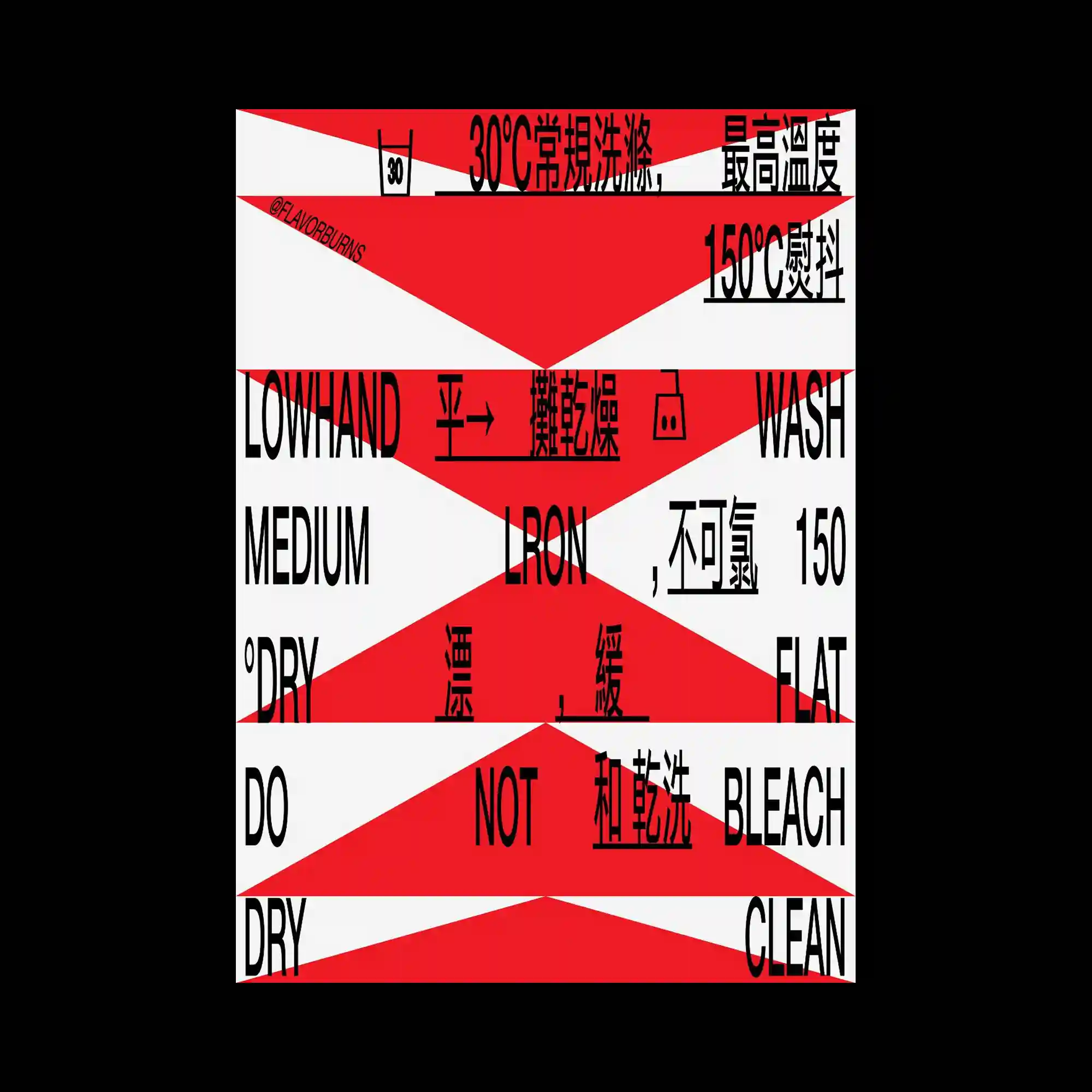
Diagonal geometric bands divide the composition into alternating fields that intersect with condensed multilingual typography. Strong directional shapes cut across the layout, fragmenting text into dynamic visual segments while maintaining overall readability. High-contrast colors reinforce the angular structure and create an energetic sense of movement. Consistent typographic weight ties the fragmented composition into a unified graphic system.
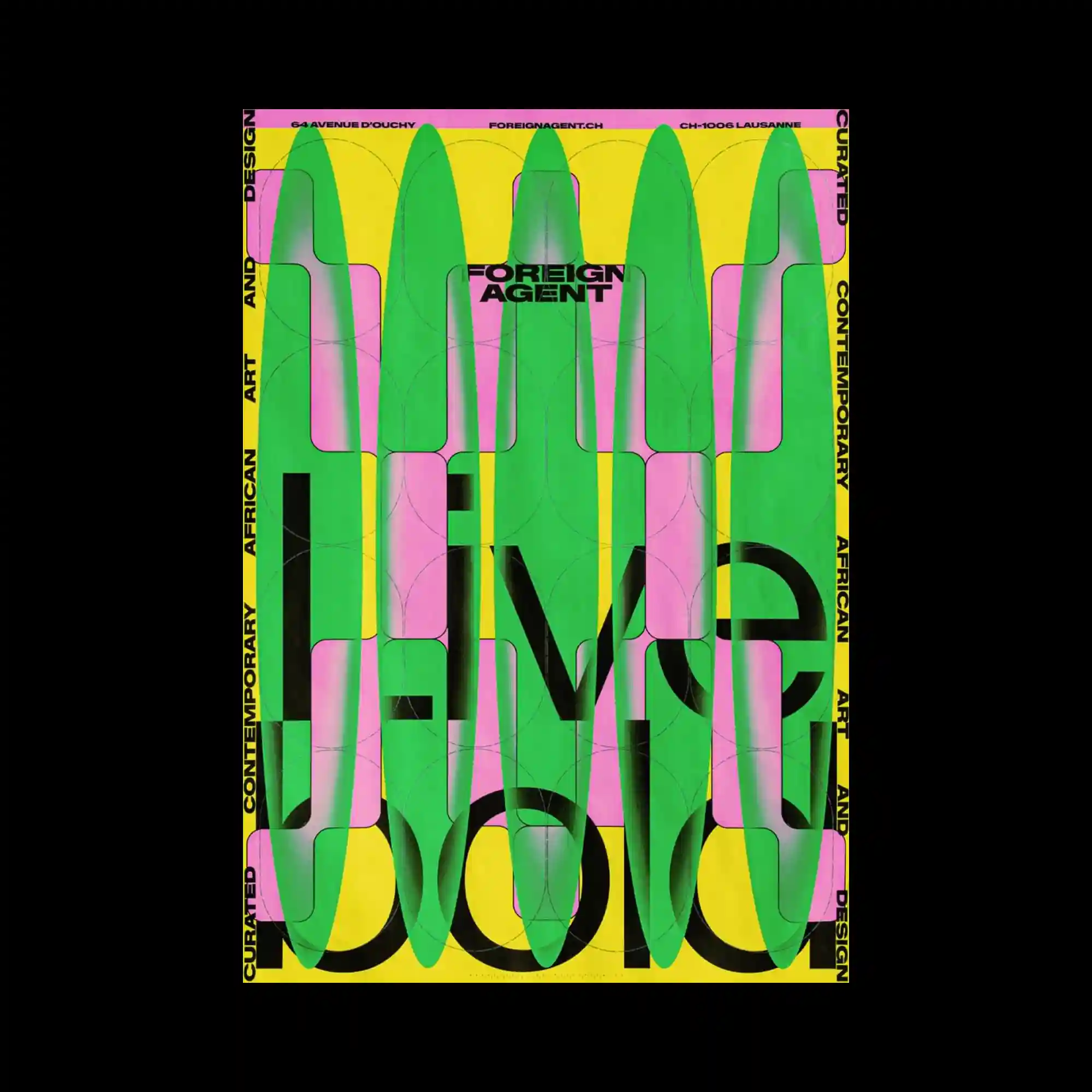
Large translucent organic forms are layered repeatedly over oversized typography, partially obscuring the text while preserving its presence beneath. The composition alternates between bold letterforms and soft rounded shapes, producing a strong interplay of opacity and transparency. A vivid color palette intensifies the layered effect and establishes striking visual contrast. Thin framing typography around the edges encloses the composition and reinforces the poster format.
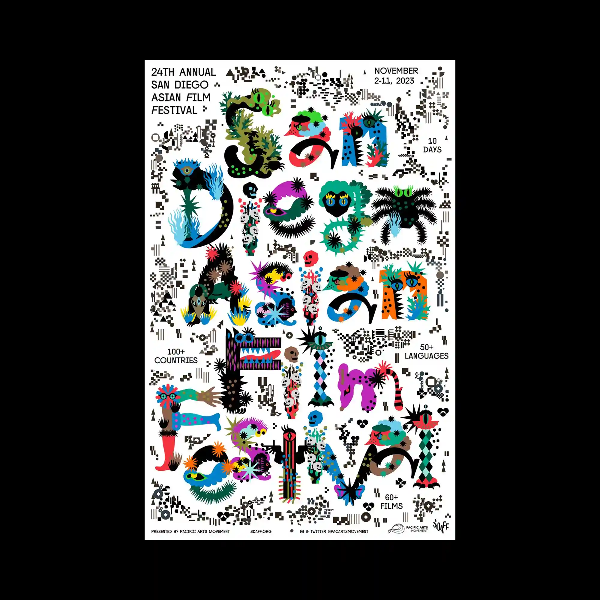
Illustrated letterforms composed of colorful characters, creatures, and decorative motifs transform the title into a highly expressive visual centerpiece. Numerous small graphic details fill the surrounding space, creating a richly textured composition without relying on large background elements. Bright contrasting colors and varied illustration styles maintain constant visual activity across the page. The playful integration of typography and illustration blurs the boundary between text and image.
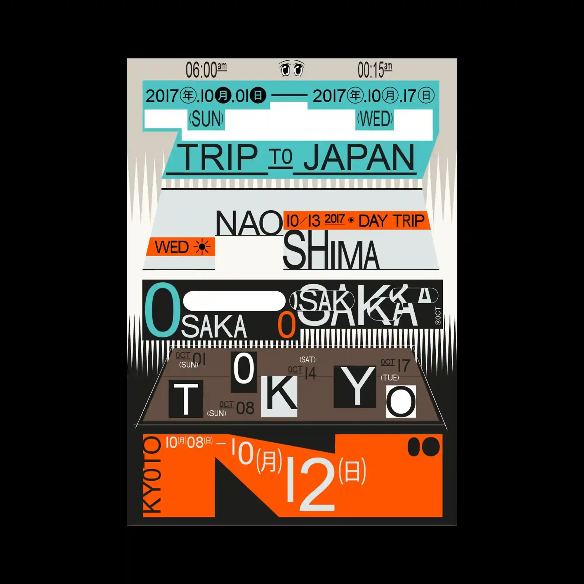
Bold geometric blocks organize the layout into stacked horizontal sections filled with typographic information of varying scales. Thick sans-serif lettering, numerical elements, and rectangular modules interlock to produce a structured yet energetic composition. A restrained palette of neutral tones accented by bright cyan and orange creates clear visual hierarchy. Repetition of modular forms reinforces rhythm while emphasizing the editorial grid.
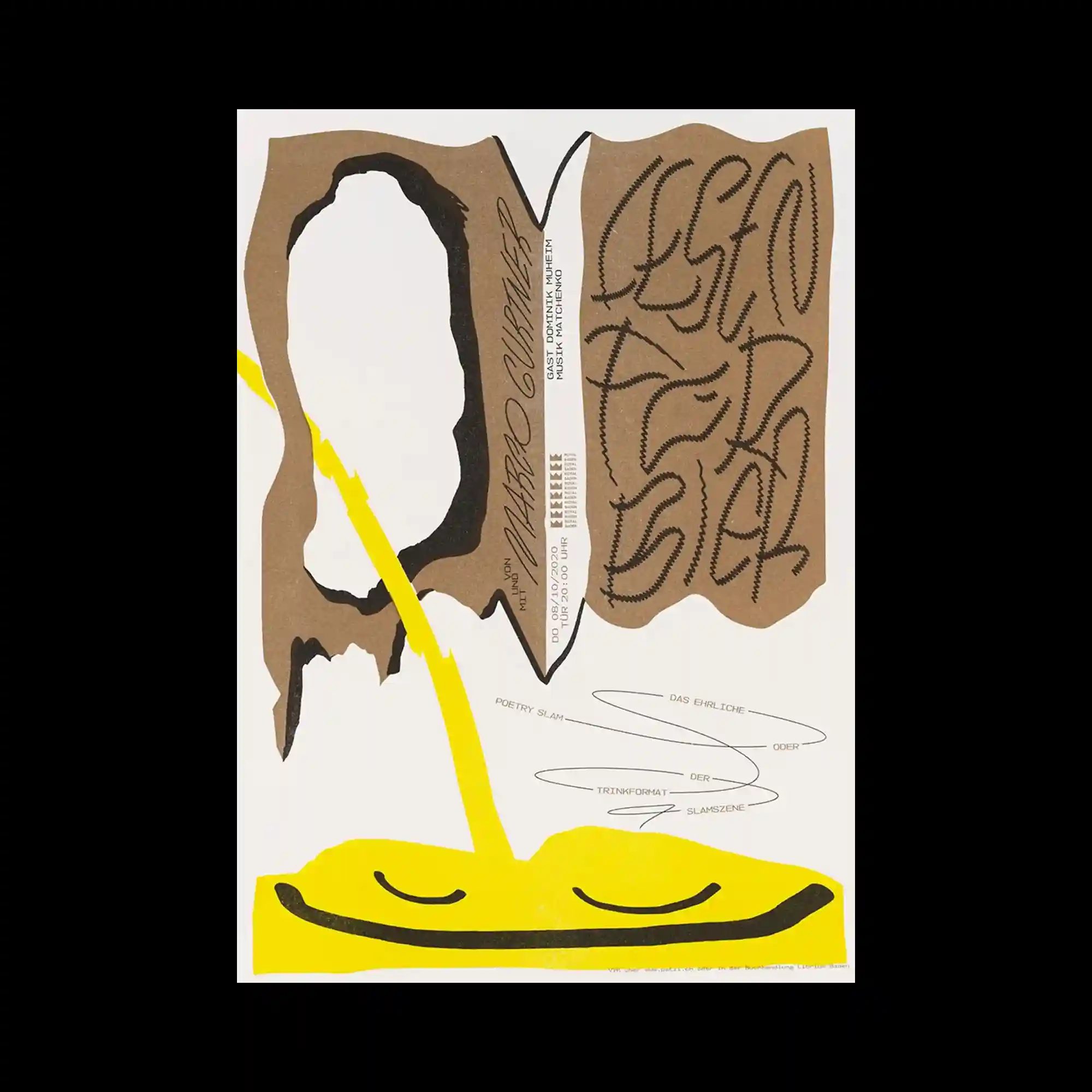
A composition of irregular torn-paper silhouettes is arranged around the center, creating a strong contrast between expansive negative space and dense graphic forms. Thick black brush-like contours, raw kraft-paper textures, and vivid yellow organic shapes establish a layered visual rhythm while guiding the eye diagonally across the poster. Hand-drawn calligraphic typography with varying stroke density interacts with narrow vertical text blocks and delicate linear scribbles, producing a deliberate tension between expressive gestures and structured information. The overall layout balances asymmetry through scale, texture, and directional flow, resulting in a composition that feels both spontaneous and carefully orchestrated.
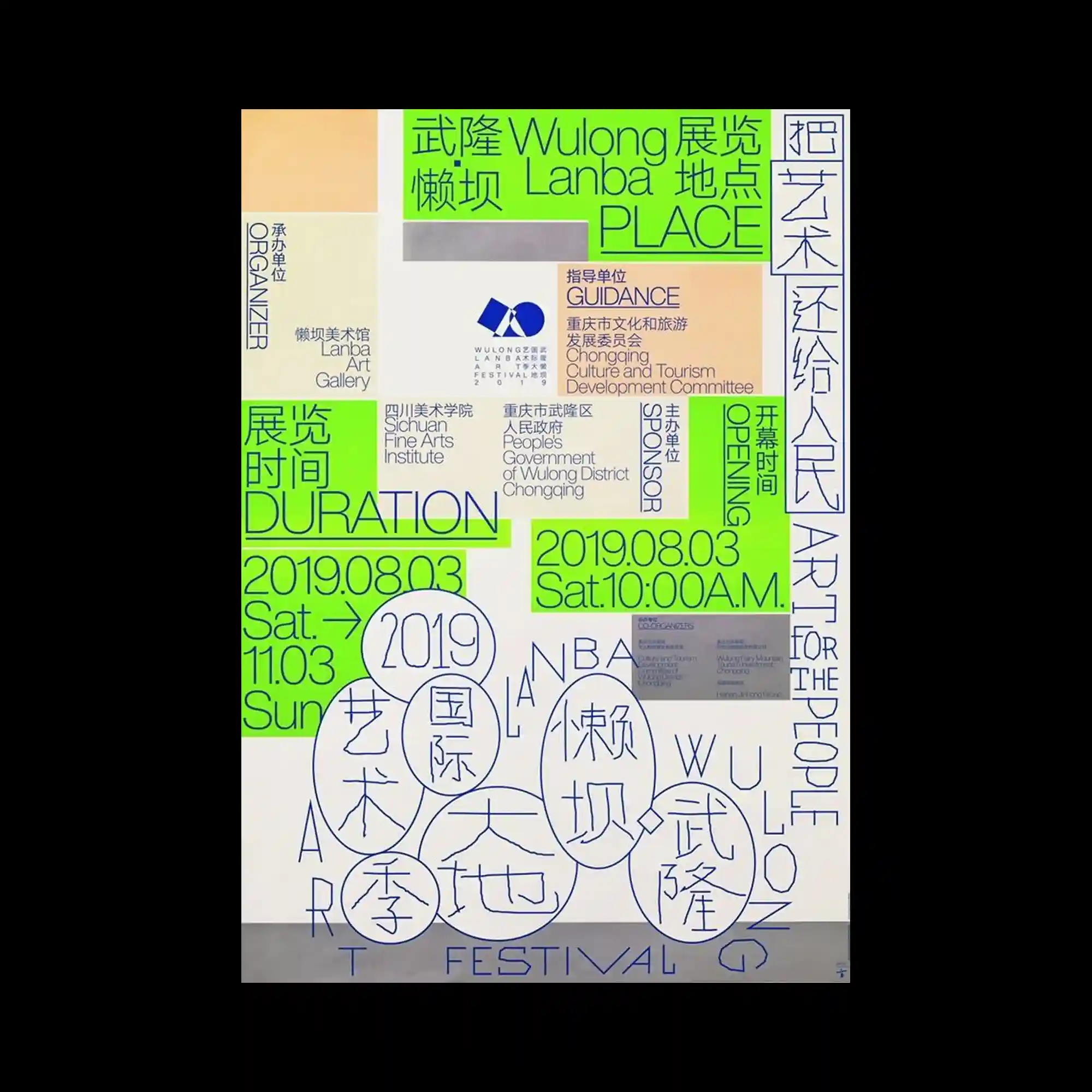
The composition relies on a dense network of multilingual typography arranged within an irregular modular grid. Bright green highlight panels interrupt the neutral background, directing attention toward key information while reinforcing the overall structure. Vertical, horizontal, and circular typographic arrangements intersect to create continuous visual movement across the page. Consistent line weights and restrained color usage unify the otherwise information-heavy layout.
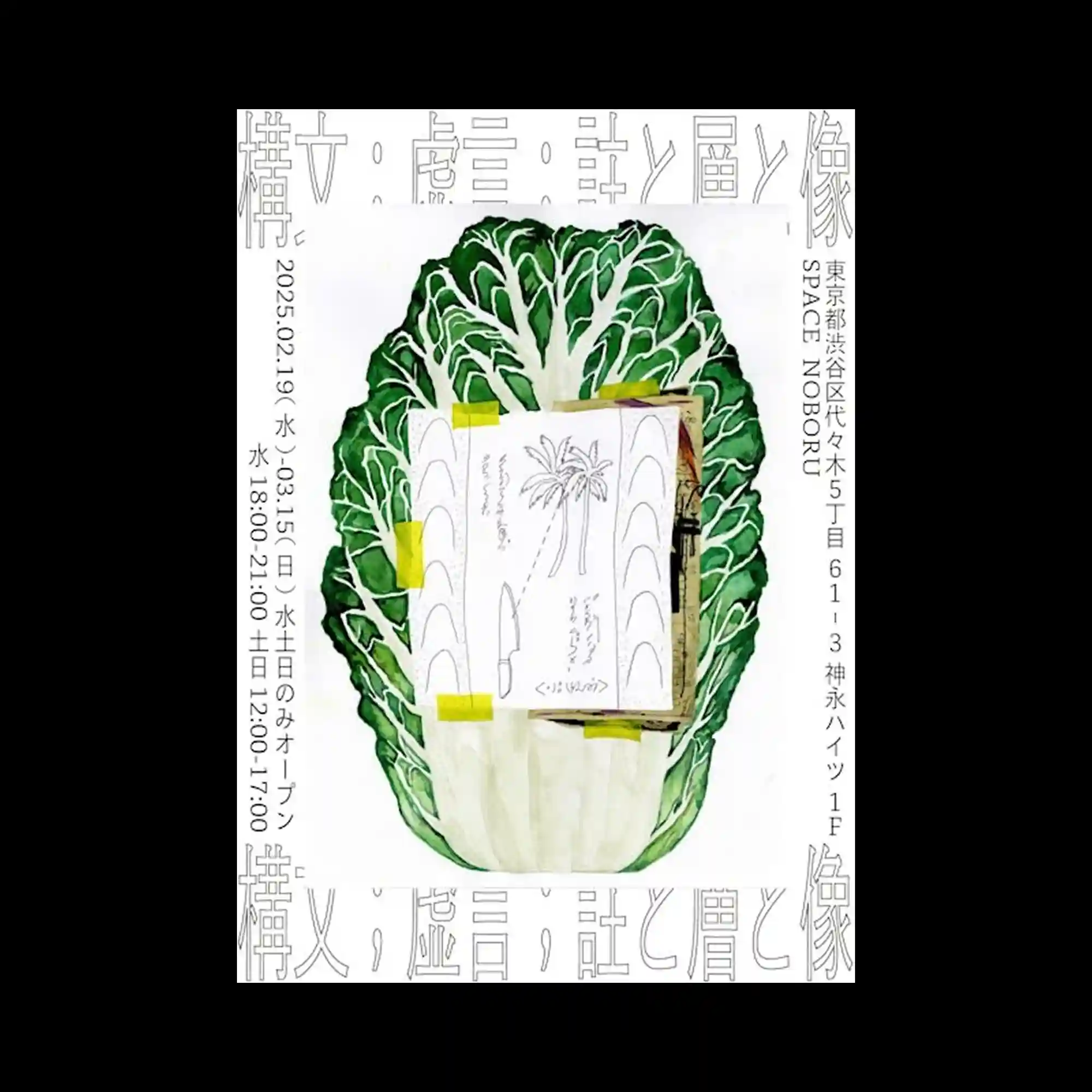
A realistic botanical illustration anchors the composition while printed materials are layered directly over its center, creating a collage-like visual structure. Thin outlined typography frames the image around the edges, functioning as a subtle border rather than a dominant graphic element. Small pieces of colored tape introduce casual accents that contrast with the detailed organic illustration. The combination of photography-inspired realism and minimal typography creates a balanced editorial aesthetic.
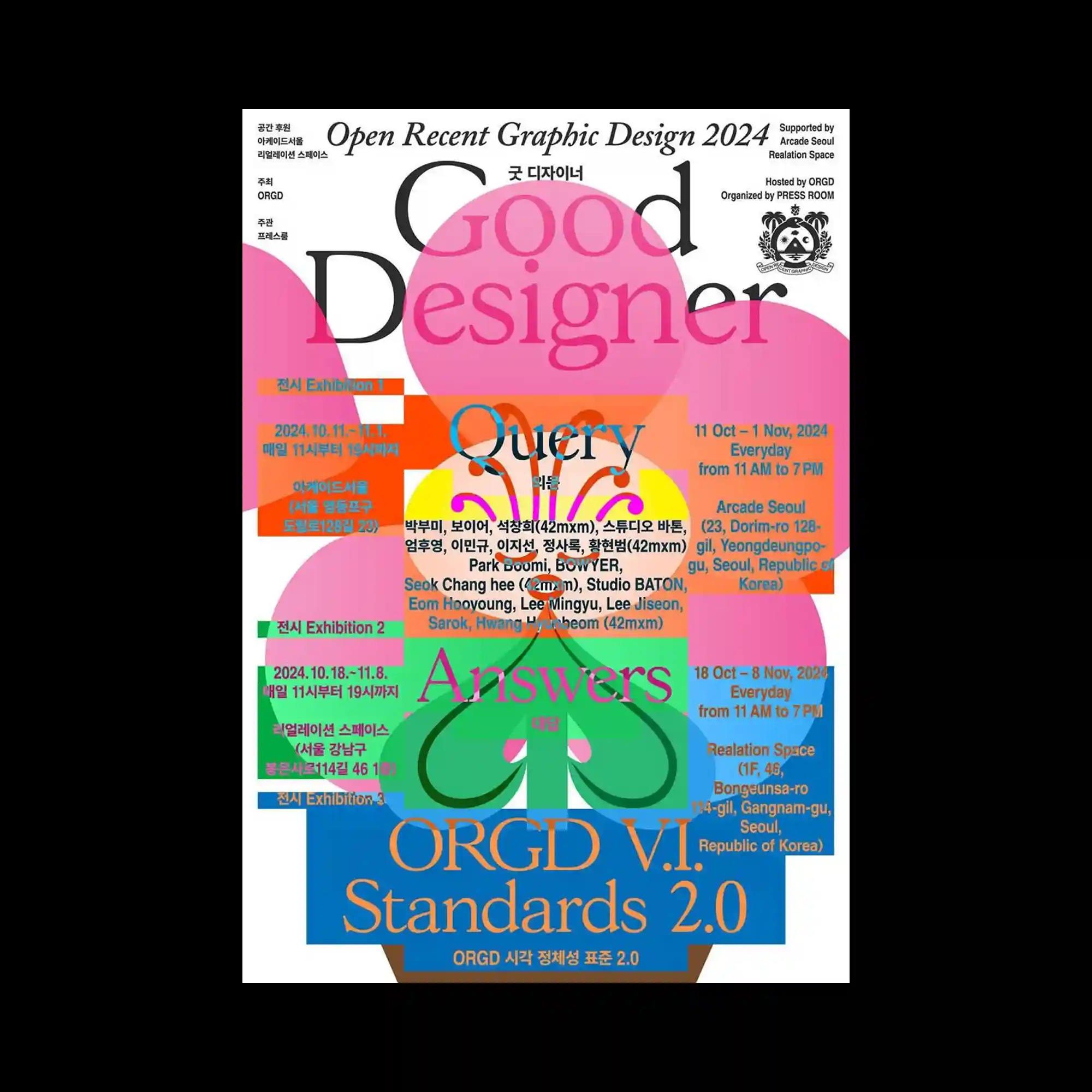
Oversized serif typography overlaps translucent geometric shapes and brightly colored information panels, creating a layered editorial composition. Multiple text blocks intersect across different scales while maintaining a coherent visual hierarchy through alignment and color grouping. Soft rounded forms contrast with rigid rectangular modules, balancing expressive graphics with structured information. High-contrast colors and transparent overlays generate depth while preserving legibility throughout the dense arrangement.
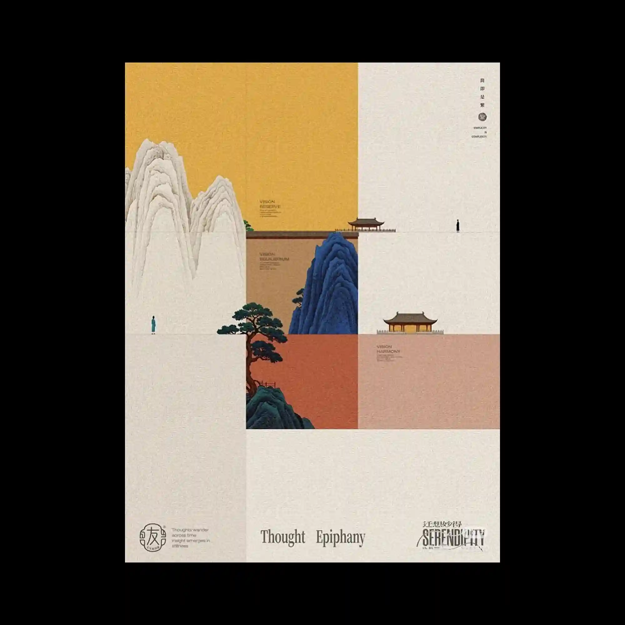
A modular grid divides the composition into asymmetrical rectangular fields, combining expansive negative space with carefully placed illustrated landscape fragments. Stylized mountains, trees, and architectural forms are distributed across the layout, creating visual pauses while reinforcing spatial balance. Warm earthy tones contrast with deep blue landforms, producing a restrained yet distinctive color hierarchy. Small typographic elements are positioned with precision, allowing the illustrated components and open space to define the primary rhythm of the poster.
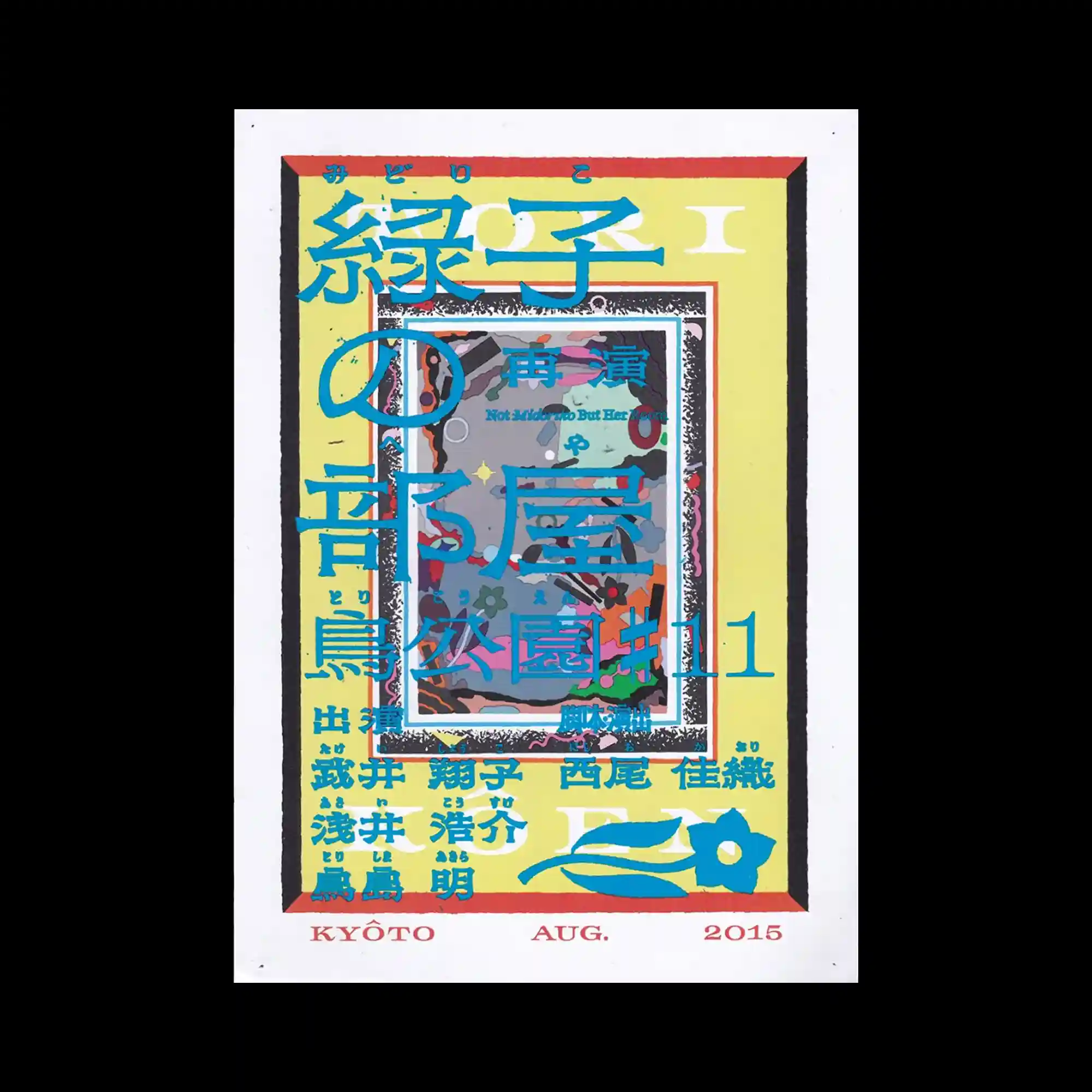
Multiple layers of typography frame and partially obscure a central image, creating a dense editorial composition with strong depth. Large characters extend across the page while smaller text blocks fill the remaining space, generating a rich hierarchy of information. The framed image acts as a visual anchor surrounded by overlapping type and decorative borders. High-contrast colors and stacked elements emphasize complexity while maintaining an organized structural rhythm.
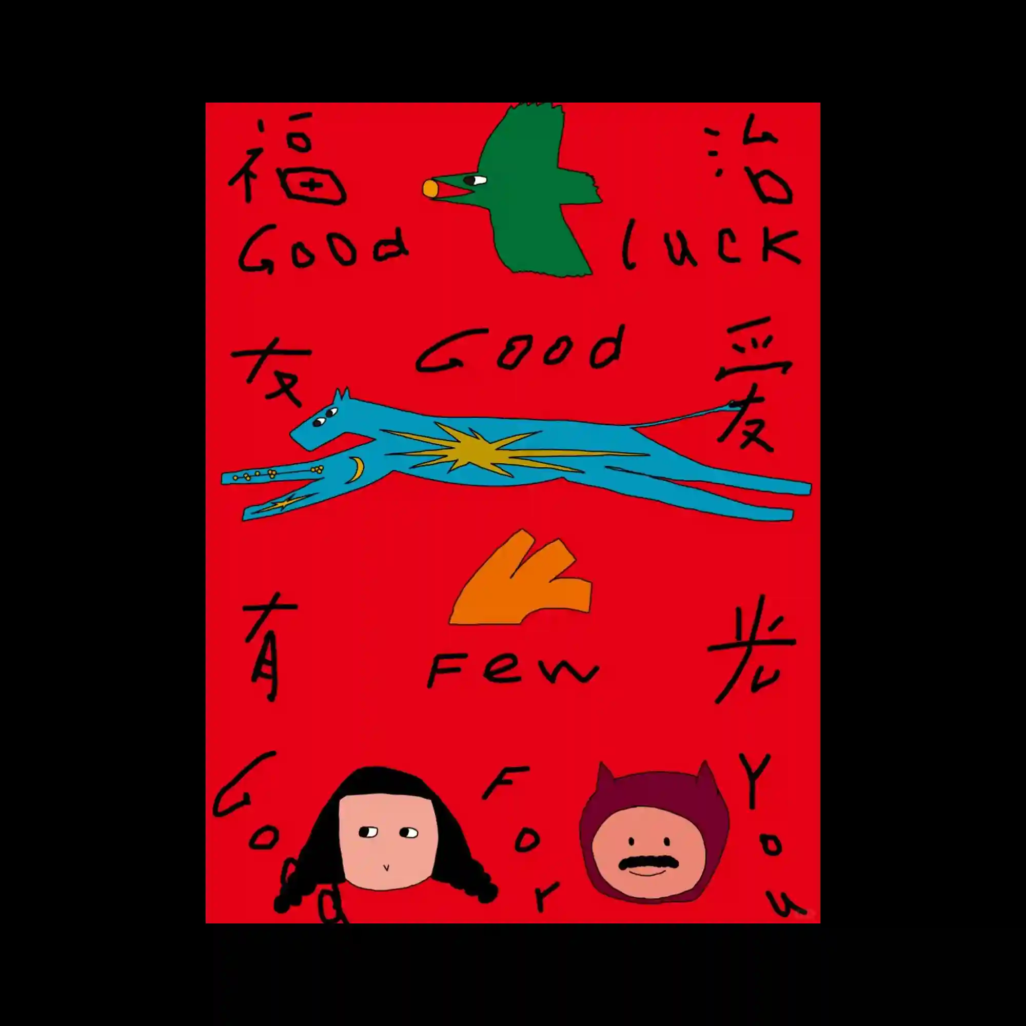
Hand-drawn illustrations and loosely written lettering create an intentionally naïve and spontaneous visual language. Flat colorful figures are distributed across the composition with generous spacing, allowing each element to stand independently. Irregular line quality and uneven typography reinforce the handcrafted character of the design. The limited palette of vivid primary-like colors strengthens the playful and expressive atmosphere.
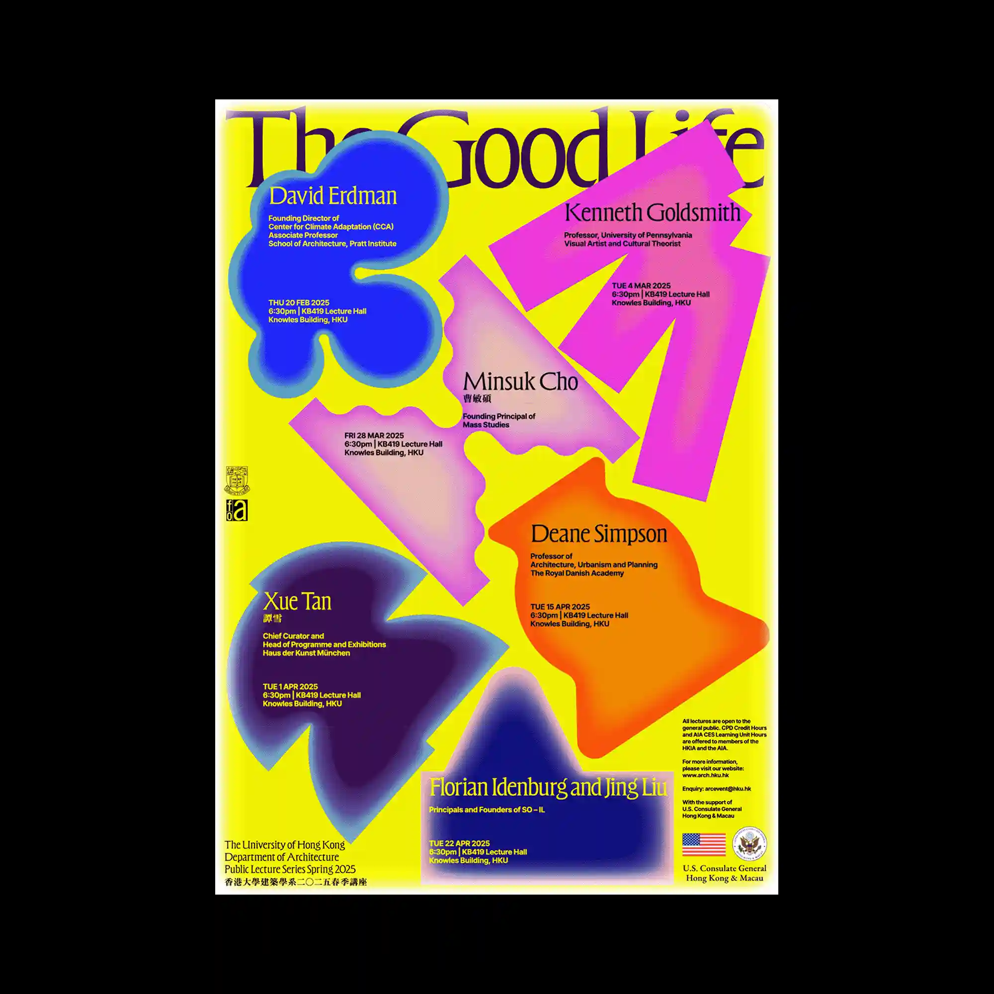
Bright geometric color fields provide a vivid foundation for a collection of oversized abstract forms distributed across the page. Each organic shape features soft gradients and blurred edges that create a sense of volume despite the flat composition. Text blocks are embedded directly within the shapes, integrating information into the visual forms rather than separating them. The energetic color relationships and varied scale establish a dynamic poster with strong visual impact.
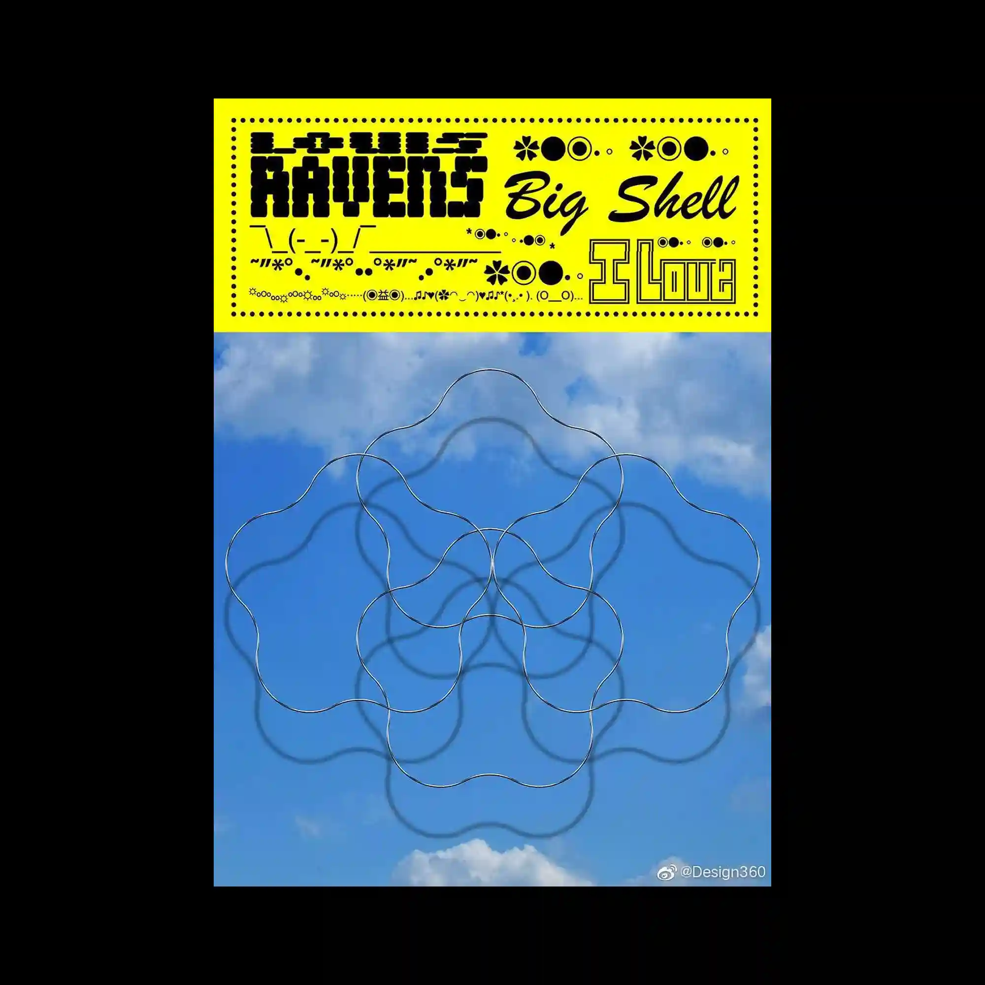
The composition contrasts a bold typographic banner with a photographic background, producing a clear separation between information and imagery. Repeating decorative symbols and varied display typefaces create a playful visual rhythm across the header. Interlocking curved line forms float over the sky photograph, introducing transparency and layered spatial depth. The interaction between rigid graphic elements and organic contours gives the layout a balanced sense of movement.
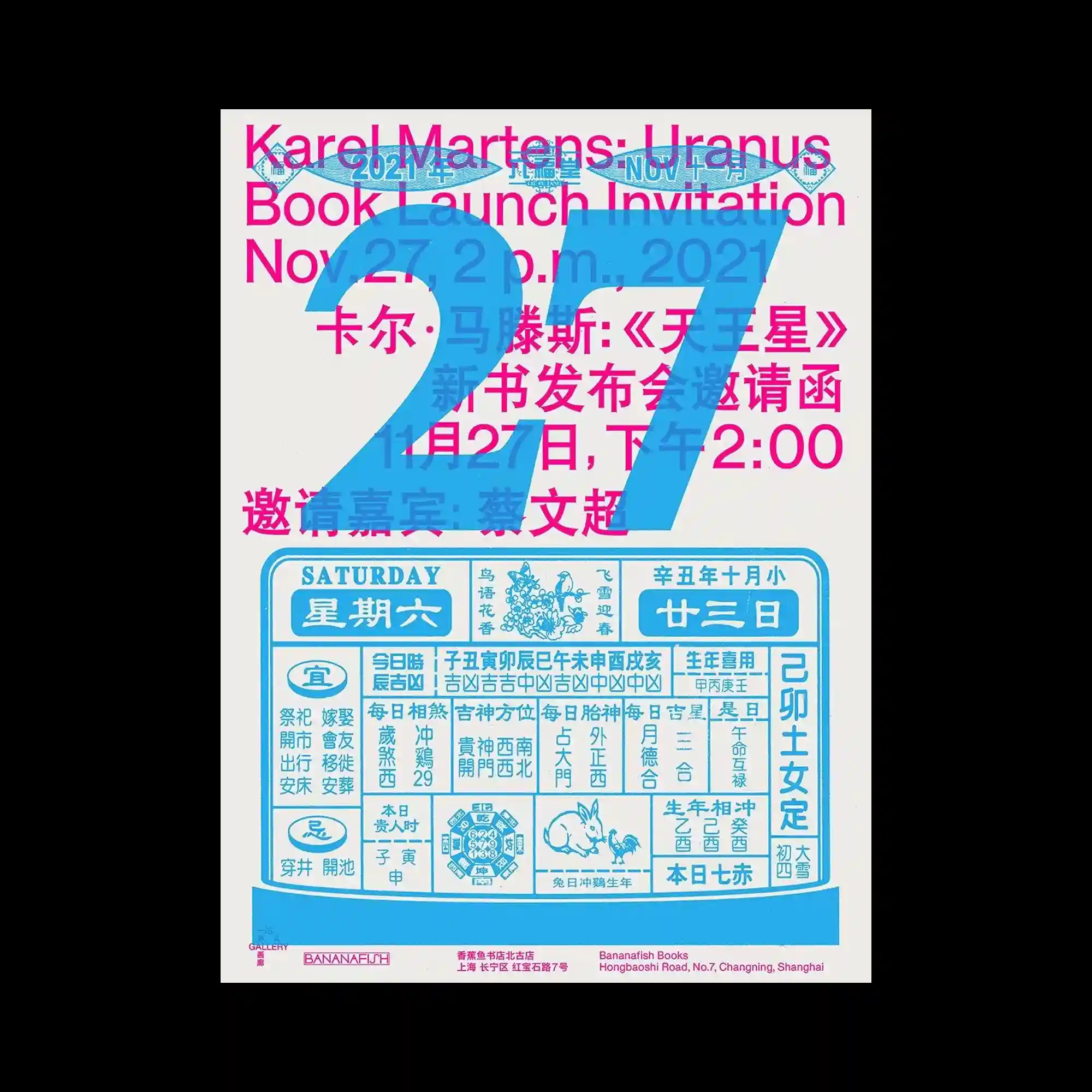
Large numerical typography overlaps multiple layers of multilingual text, creating a dense typographic composition with strong depth. The oversized numeral functions as both a dominant graphic element and a transparent overlay that partially reveals the information beneath. A structured block resembling a calendar introduces a contrasting geometric system within the otherwise layered arrangement. The limited palette strengthens visual cohesion while allowing hierarchy to emerge through scale and overlap.