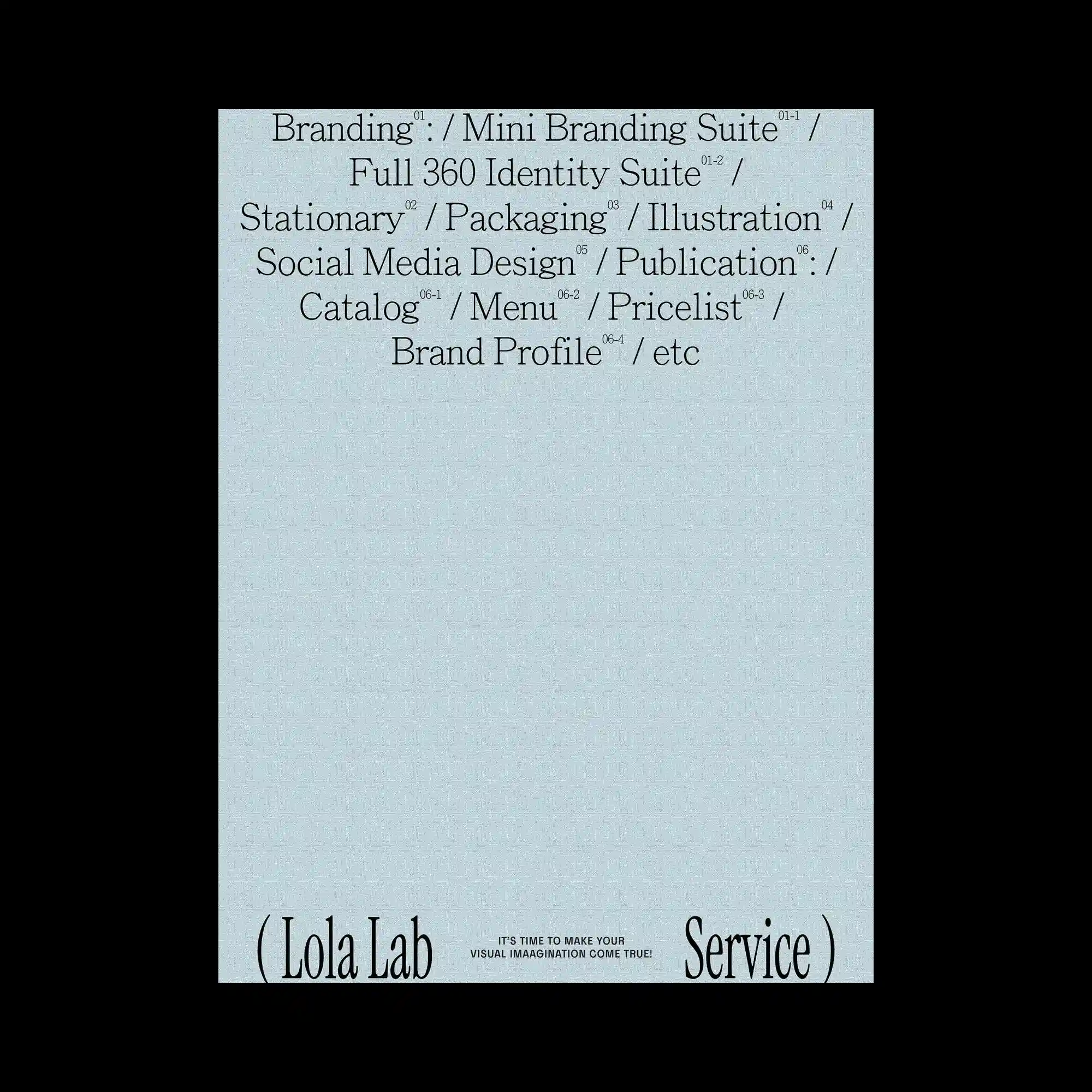
Large areas of empty space dominate the layout, allowing a compact block of refined serif typography to become the sole visual anchor. The text is organized into centered lines with subtle variations in scale, while small superscript numerals introduce an editorial hierarchy throughout the composition. Oversized words positioned along the bottom edge frame the otherwise minimal page and create a sense of structural enclosure. The restrained monochrome palette reinforces clarity, rhythm, and typographic precision.
넓은 여백을 중심으로 정교한 세리프 타이포그래피만을 핵심 요소로 배치한 미니멀한 구성임. 중앙 정렬된 여러 줄의 텍스트와 작은 위첨자 숫자가 편집적인 위계를 형성함. 하단에는 크게 확대된 단어를 양쪽에 배치하여 화면을 프레이밍하는 역할을 수행함. 흑백 중심의 절제된 색상 사용이 타이포그래피의 리듬과 정밀함을 더욱 강조함.
大面积留白成为画面的主体,精致的衬线文字作为唯一的视觉核心。居中排列的文字通过字号变化与上标数字建立出清晰的编辑层级。底部两侧放置放大的文字,对画面形成框架效果。克制的黑白配色进一步强化了排版的节奏感与精确性。