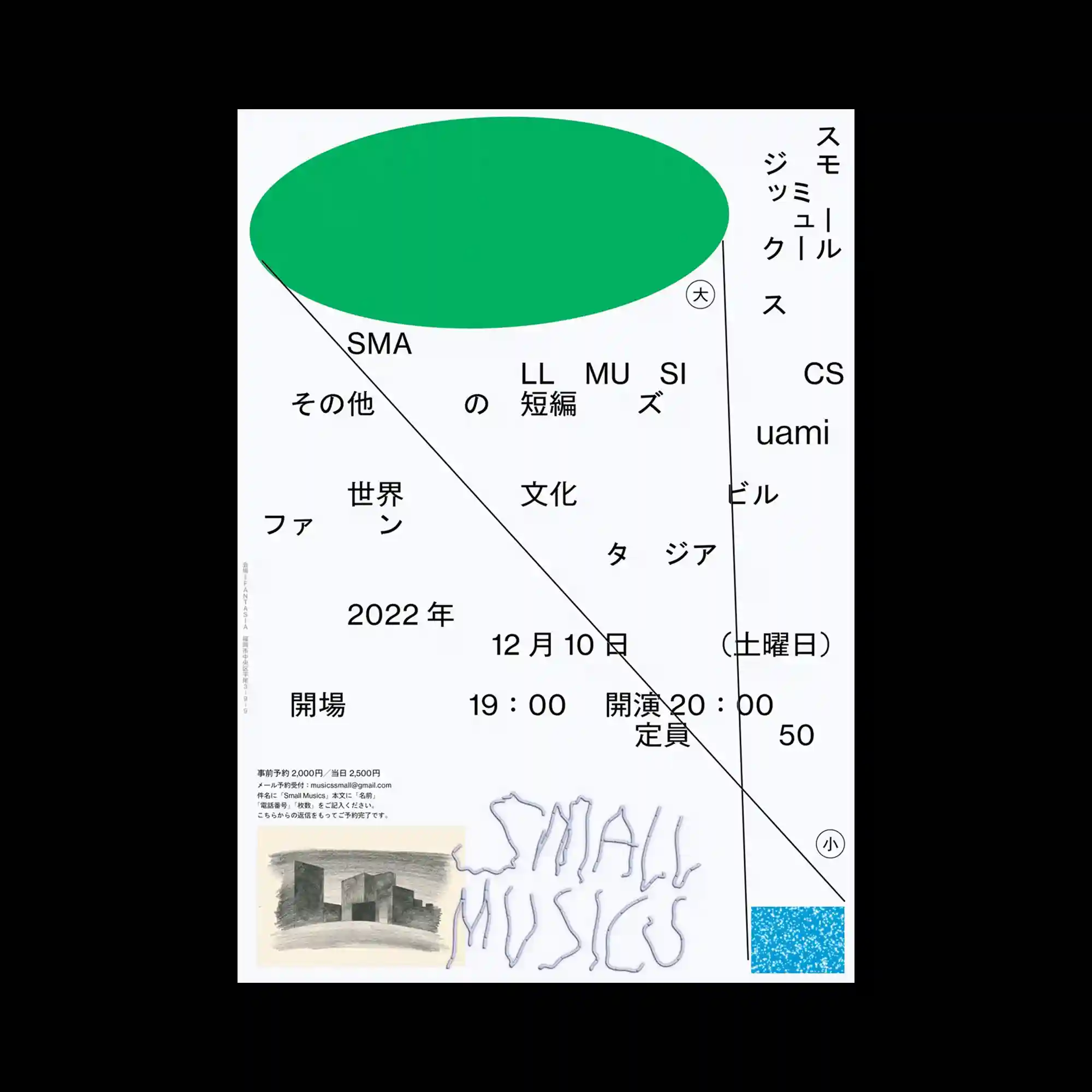
A large green ellipse dominates the upper portion of the layout, balancing against widely dispersed typography below. Thin construction lines extend diagonally and vertically across the composition, linking otherwise independent text groups into a unified framework. The generous spacing between elements highlights asymmetry while maintaining overall stability. Small graphic accents near the bottom provide subtle visual weight without interrupting the minimal composition.
커다란 초록색 타원이 상단을 차지하며 아래에 넓게 흩어진 타이포그래피와 균형을 이루는 구성임. 얇은 대각선과 세로 선이 서로 떨어진 정보들을 하나의 구조로 연결함. 요소 사이의 넓은 간격이 비대칭 구성을 강조하면서도 안정적인 균형을 유지함. 하단의 작은 그래픽 요소가 절제된 포인트를 더해 미니멀한 구성을 완성함.
大型绿色椭圆占据画面上方,与下方分散排列的文字形成平衡。纤细的斜线与竖线将彼此独立的信息串联为统一的结构。元素之间的大面积留白强化了不对称布局,同时保持整体稳定感。底部的小型图形细节为极简构图增添了适度的视觉重心。