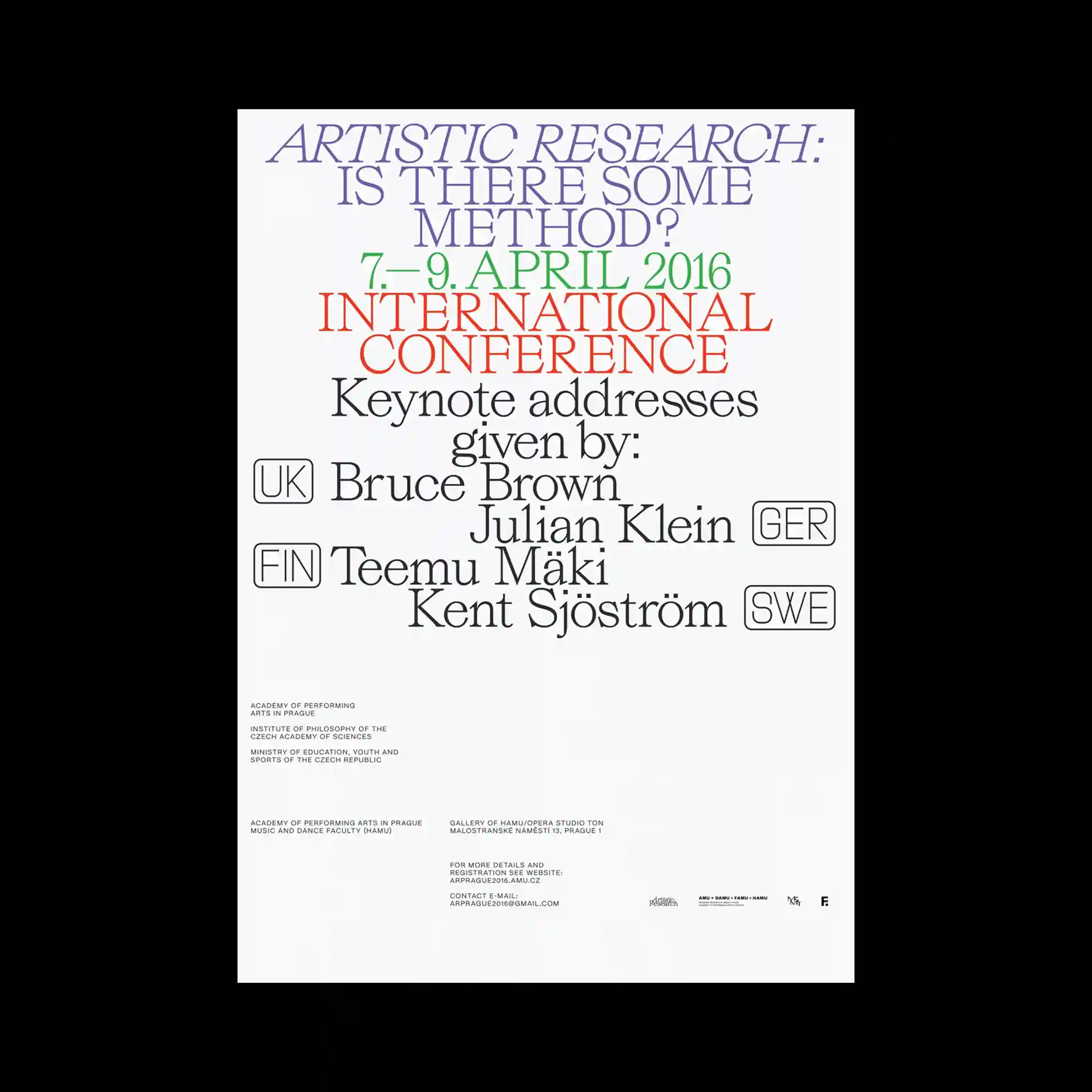
Large serif typography dominates the composition through a carefully structured hierarchy that guides the eye from top to bottom. Different font sizes, weights, and colors separate informational groups while maintaining consistent spacing across the layout. Small outlined labels and compact text blocks introduce secondary layers without disrupting the primary visual rhythm. The generous negative space surrounding the text reinforces clarity and emphasizes the typographic arrangement as the central graphic element.
대형 세리프 타이포그래피가 화면을 지배하며 위에서 아래로 자연스럽게 시선을 유도하는 위계 구조를 형성함. 서로 다른 크기와 굵기, 색상이 정보를 구분하면서도 일정한 간격을 유지해 통일감을 만듦. 윤곽선 박스와 작은 정보 블록이 보조적인 레이어를 형성하지만 전체 리듬은 흐트러지지 않음. 넉넉한 여백이 타이포그래피 자체를 중심 그래픽 요소로 더욱 강조함.
大尺寸衬线字体构成了整个版面的主体,并通过清晰的层级结构引导视线由上至下移动。不同的字号、字重与颜色区分信息层级,同时保持统一的间距关系。描边标签和小型信息区块形成辅助层次,而不会破坏整体节奏。充足的留白进一步强调了排版本身作为主要视觉元素的存在。