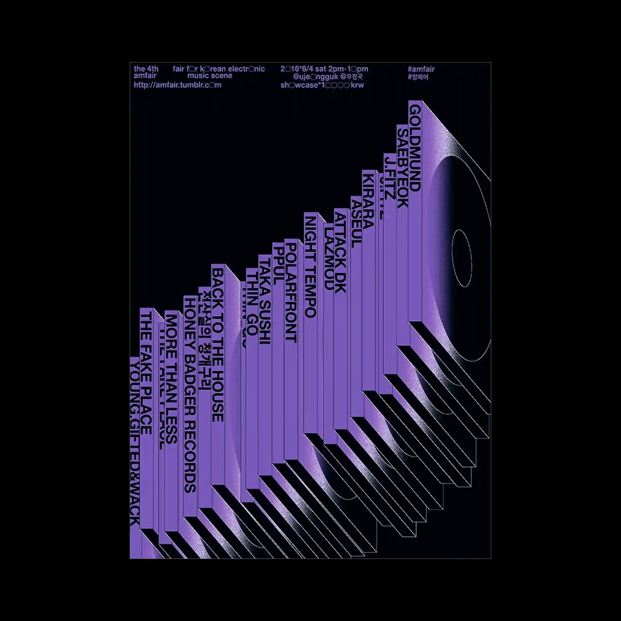
A series of extruded vertical forms gradually increase in height, transforming typography into a perspective-driven architectural sequence. Purple gradients emphasize depth while repeated parallel shadows extend diagonally across the composition. Artist names are integrated directly onto each vertical surface, allowing information to become part of the three-dimensional structure. The restrained color palette focuses attention on spatial rhythm and geometric progression.
입체적으로 돌출된 세로 형태가 점진적으로 높아지며 타이포그래피를 건축적인 구조처럼 표현한 포스터임. 보라색 그라디언트가 깊이를 강조하고 반복되는 그림자가 대각선 방향으로 길게 확장됨. 각 면에는 텍스트가 직접 배치되어 정보 자체가 입체 구조의 일부처럼 기능함. 절제된 색상 구성이 공간감과 기하학적 리듬을 더욱 강조함.
一系列立体竖向结构逐渐升高,将文字转化为具有透视感的建筑式形态。紫色渐变强化了空间深度,重复的平行阴影沿对角线不断延伸。每个立面直接承载文字信息,使内容本身成为三维结构的一部分。克制的配色进一步突出了空间节奏与几何秩序。