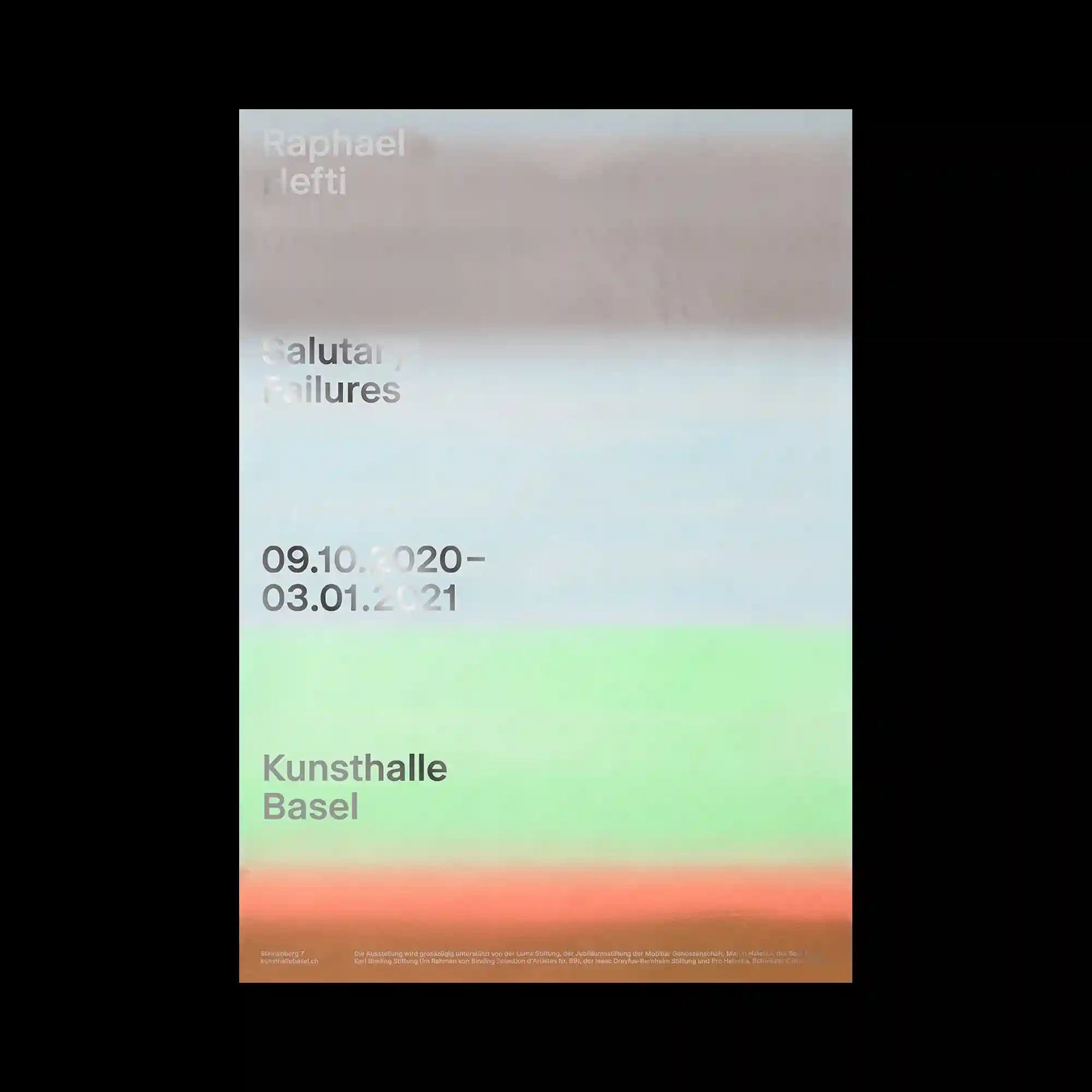
Horizontal bands of softly blurred color transition across the composition, creating an atmospheric surface that dissolves conventional boundaries between image and background. Minimal sans-serif typography is positioned with consistent alignment, remaining crisp against the diffused gradients. The composition relies on subtle tonal variation rather than strong contrast, allowing color fields to establish visual rhythm. Sparse information and restrained spacing reinforce the calm, understated editorial character.
수평으로 번지는 흐릿한 색상 띠가 화면 전체를 감싸며 이미지와 배경의 경계를 흐리는 구성이 특징임. 간결한 산세리프 타이포그래피는 일정한 정렬을 유지하며 부드러운 색면 위에서도 또렷하게 드러남. 강한 대비 대신 미묘한 색조 변화만으로 화면의 리듬과 깊이감을 형성함. 최소한의 정보와 절제된 여백이 차분한 에디토리얼 분위기를 강조함.
柔和模糊的水平色带横贯整个画面,使图像与背景之间的边界逐渐消融。简洁的无衬线字体保持统一对齐,在朦胧渐变上依然清晰可读。设计并未依赖强烈对比,而是通过细微的色调变化建立视觉节奏。极少的信息与克制的留白共同营造出安静而精炼的编辑风格。