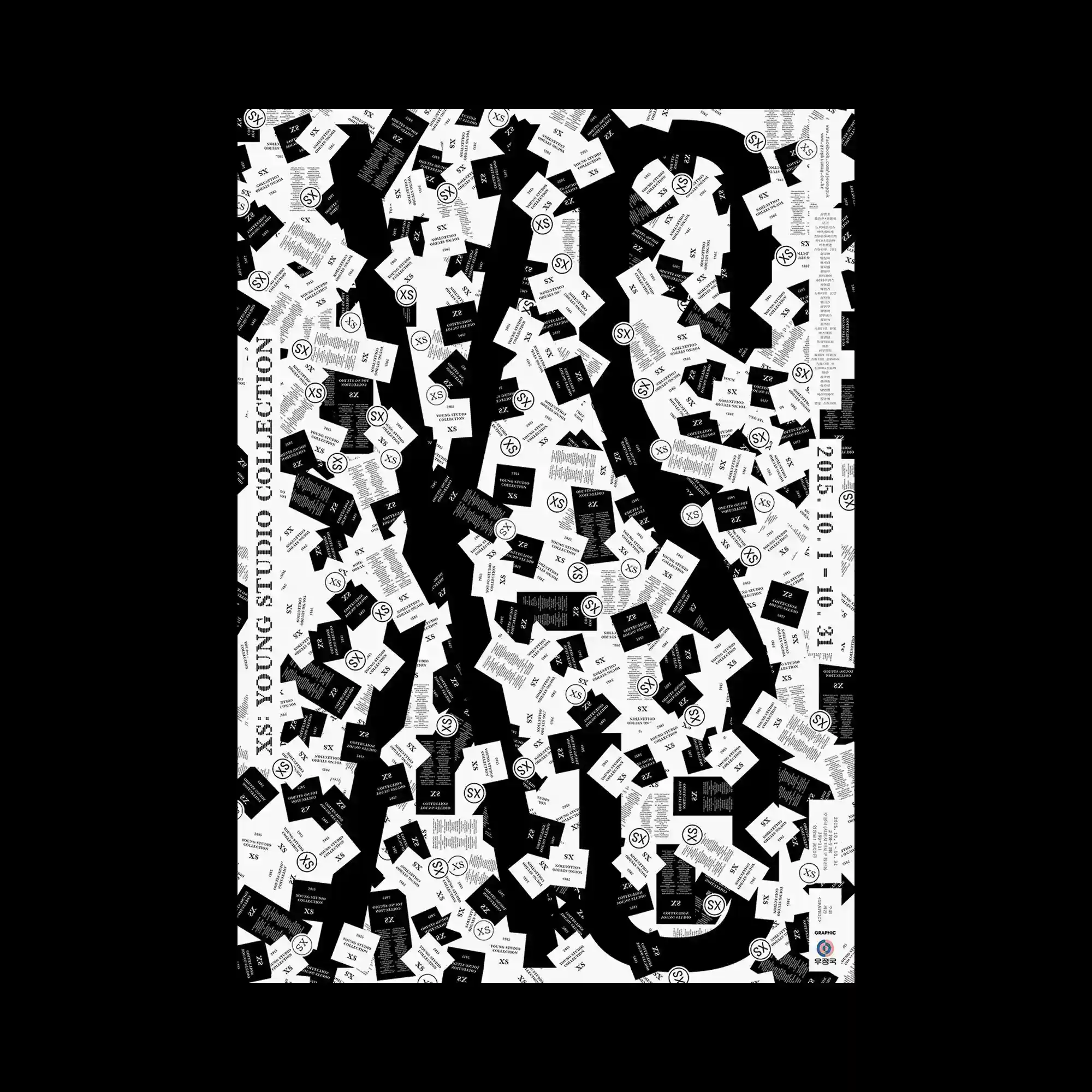
Oversized black letterforms emerge from a dense field of scattered cards, creating figure and ground relationships through repetition. Hundreds of small rectangular modules rotate at varying angles while maintaining consistent proportions, producing a highly textured surface. Monochrome contrast allows the large typography to remain legible despite the visual density. The composition balances randomness and order through controlled repetition of identical graphic units.
거대한 검은 글자가 수많은 카드 형태의 반복 요소 위로 드러나는 흑백 중심의 구성이 특징임. 동일한 비율의 작은 사각형들이 다양한 각도로 흩어져 촘촘한 표면 질감을 형성함. 높은 흑백 대비 덕분에 복잡한 배경 속에서도 큰 타이포그래피가 명확하게 유지됨. 반복되는 모듈을 통해 무작위성과 질서를 동시에 표현한 디자인임.
巨大的黑色字母从密集排列的小卡片模块中浮现出来,形成鲜明的图底关系。数百个相同比例的矩形以不同角度分布,构建出丰富而细密的视觉纹理。黑白对比保证了主体文字在复杂背景中的清晰可读性。通过统一模块的重复,实现了随机感与秩序感的平衡。