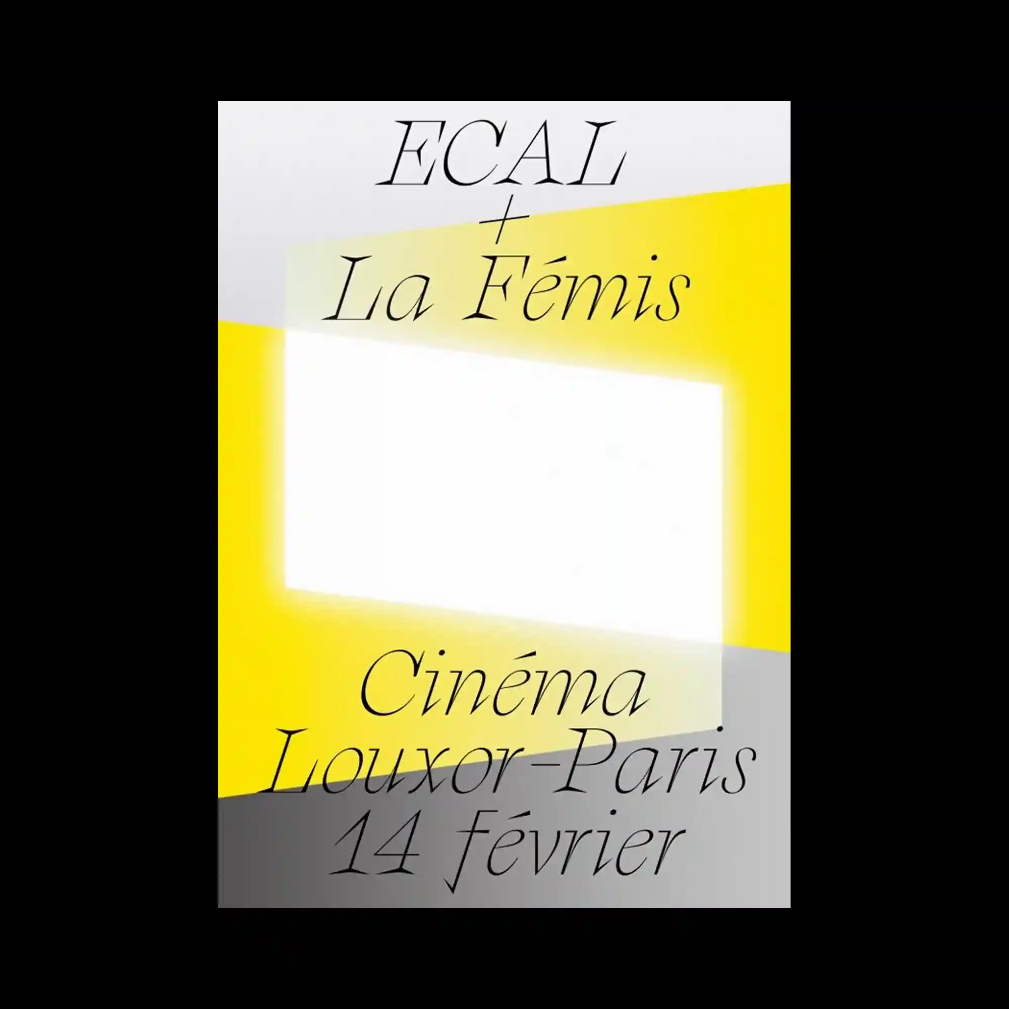
Elegant serif typography is distributed across the composition with generous spacing, allowing individual words to function as visual elements rather than dense information. Large translucent geometric planes intersect diagonally, framing a luminous central rectangle while subtly shifting the hierarchy of the layout. Soft yellow highlights contrast with pale gray surfaces to establish depth through overlapping shapes instead of outlines. The restrained palette and minimal composition emphasize rhythm, proportion, and typographic refinement.
넉넉한 여백 속에 세리프 타이포그래피가 배치되어 각각의 단어가 정보보다 시각적 요소처럼 기능하는 구성이 특징임. 반투명한 기하학적 면이 대각선으로 교차하며 중앙의 밝은 직사각형을 감싸고 화면의 위계를 형성함. 부드러운 노란색과 옅은 회색 면이 겹쳐지며 외곽선 없이도 깊이감을 만들어냄. 절제된 색상과 미니멀한 구성이 비례감과 타이포그래피의 우아함을 강조함.
优雅的衬线字体以宽松留白分布,使文字本身更像视觉元素而非密集信息。半透明几何色块沿对角线交叠,围绕中央发光的矩形建立清晰的视觉层级。柔和的黄色与浅灰色块相互覆盖,通过重叠关系而非描边营造空间深度。克制的配色与极简构图进一步突出了比例关系与字体的精致气质。