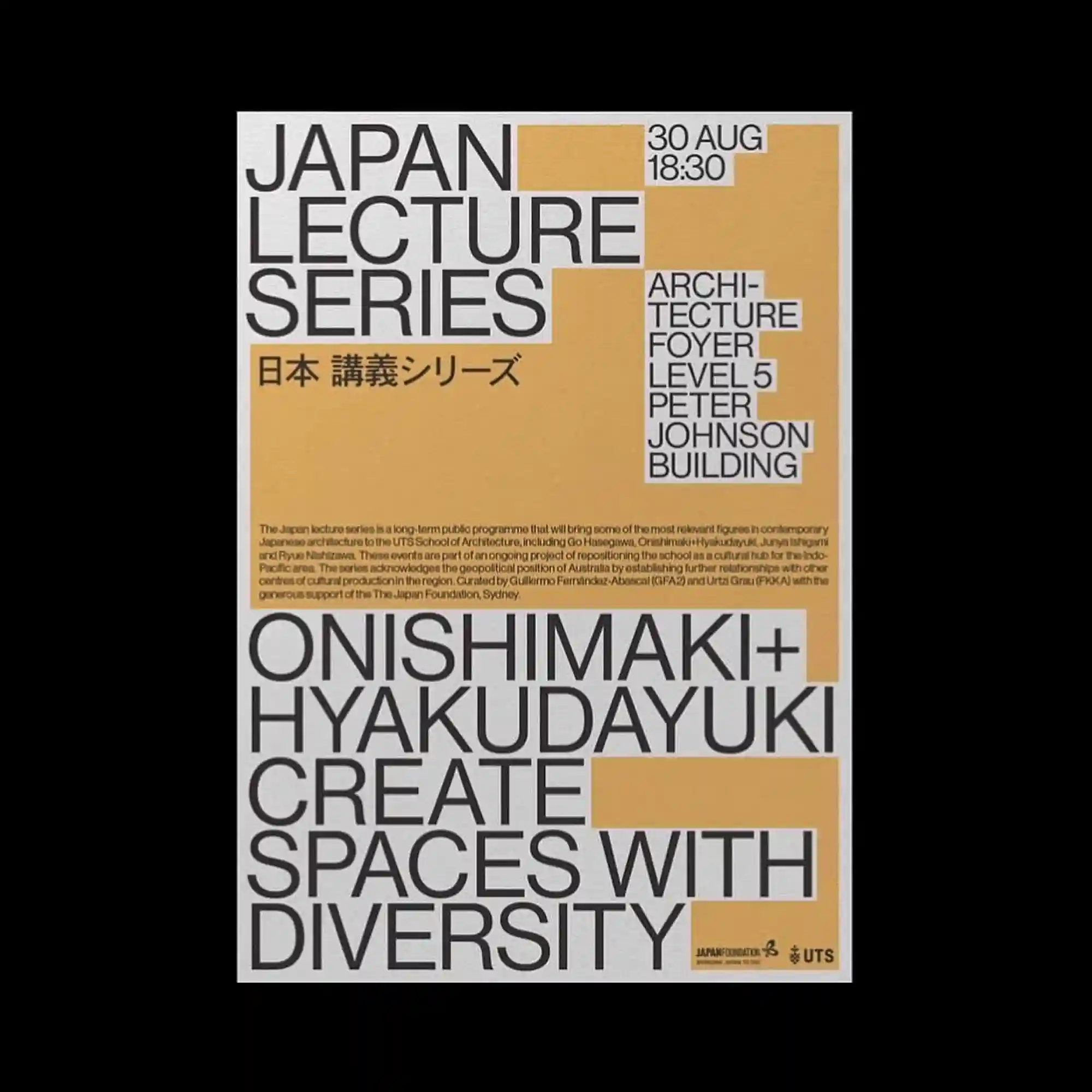
Rectangular color blocks define the composition while bold sans-serif typography expands across the page in a highly modular arrangement. Neutral gray lettering contrasts with warm ochre panels that frame different groups of information. The stepped geometry guides the reading sequence through clearly segmented sections. The layout relies on proportion, alignment, and scale instead of decorative graphics.
직사각형 색면이 화면을 구획하고 굵은 산세리프 타이포그래피가 모듈형 구조 안에서 크게 확장됨. 중성적인 회색 글자는 따뜻한 황토색 면과 대비를 이루며 정보를 구분함. 계단식으로 이어지는 기하학 구성이 자연스럽게 읽는 순서를 유도함. 장식 요소보다 비례와 정렬, 크기 변화만으로 강한 시각 구조를 완성함.
矩形色块划分出清晰的版面区域,粗体无衬线文字以模块化方式覆盖整个画面。中性的灰色字体与暖黄色块形成对比,并明确区分不同信息。阶梯式几何结构自然引导阅读顺序。整体主要依靠比例、对齐与尺度变化建立视觉秩序,而非装饰元素。