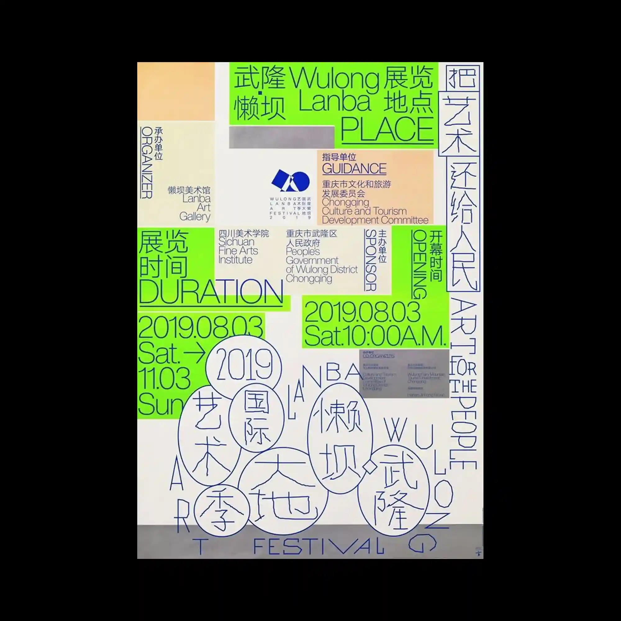
The composition relies on a dense network of multilingual typography arranged within an irregular modular grid. Bright green highlight panels interrupt the neutral background, directing attention toward key information while reinforcing the overall structure. Vertical, horizontal, and circular typographic arrangements intersect to create continuous visual movement across the page. Consistent line weights and restrained color usage unify the otherwise information-heavy layout.
불규칙한 모듈 구조 안에 다국어 타이포그래피가 촘촘하게 배치된 정보 중심의 구성임. 형광 녹색 패널이 중립적인 배경을 가르며 주요 정보를 강조하고 화면 구조를 분명하게 만듦. 세로와 가로, 원형 배열의 타이포그래피가 교차하며 시선의 흐름을 자연스럽게 이어감. 일정한 선 굵기와 절제된 색상 사용이 복잡한 정보량을 하나의 시스템으로 통합함.
画面以不规则模块构建,多语言文字密集分布其中。荧光绿色信息块打破中性色背景,突出重点内容并强化整体结构。纵向、横向及圆形排版彼此交织,形成持续的视觉流动。统一的线条粗细与克制的配色,使大量信息仍保持整体一致性。