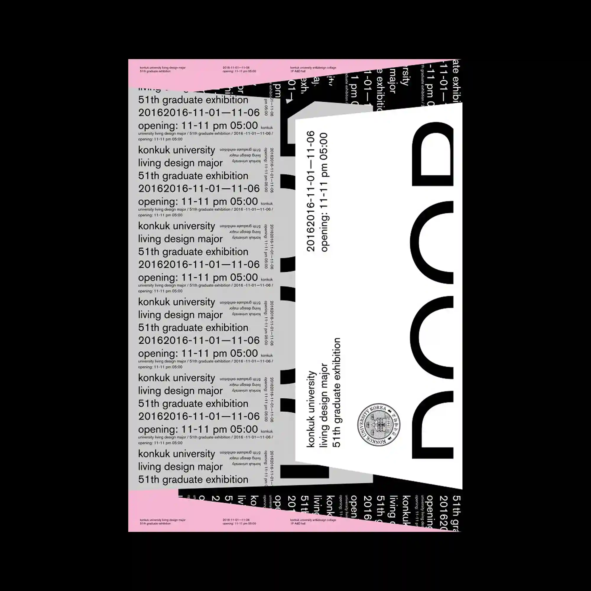
Large typographic blocks overlap at multiple angles, producing a layered composition that resembles stacked printed sheets. Repeated lines of text establish rhythm, while oversized cropped letterforms introduce bold visual anchors. Black, white, and soft pink form a restrained palette that emphasizes hierarchy instead of decoration. Variations in orientation and scale create movement without disrupting the underlying grid.
多个不同角度的大型文字区块相互重叠,形成如同层叠印刷品般的版面结构. 重复排列的文字建立稳定节奏,被裁切的超大字形则成为醒目的视觉焦点. 黑、白与柔和粉色构成克制的配色,将重点放在层级关系而非装饰效果上. 不同方向与尺度的变化带来流动感,同时保持整体网格秩序.
여러 방향으로 기울어진 대형 타이포 블록이 겹쳐져 인쇄물을 포개 놓은 듯한 레이어 구성을 형성함. 반복되는 텍스트가 일정한 리듬을 만들고, 크게 잘린 문자 형태가 강한 시각적 중심을 제공함. 검정, 흰색, 연한 분홍의 절제된 색상이 장식보다 정보 위계를 강조함. 방향과 크기의 변화가 움직임을 만들면서도 전체 그리드 질서는 유지함.