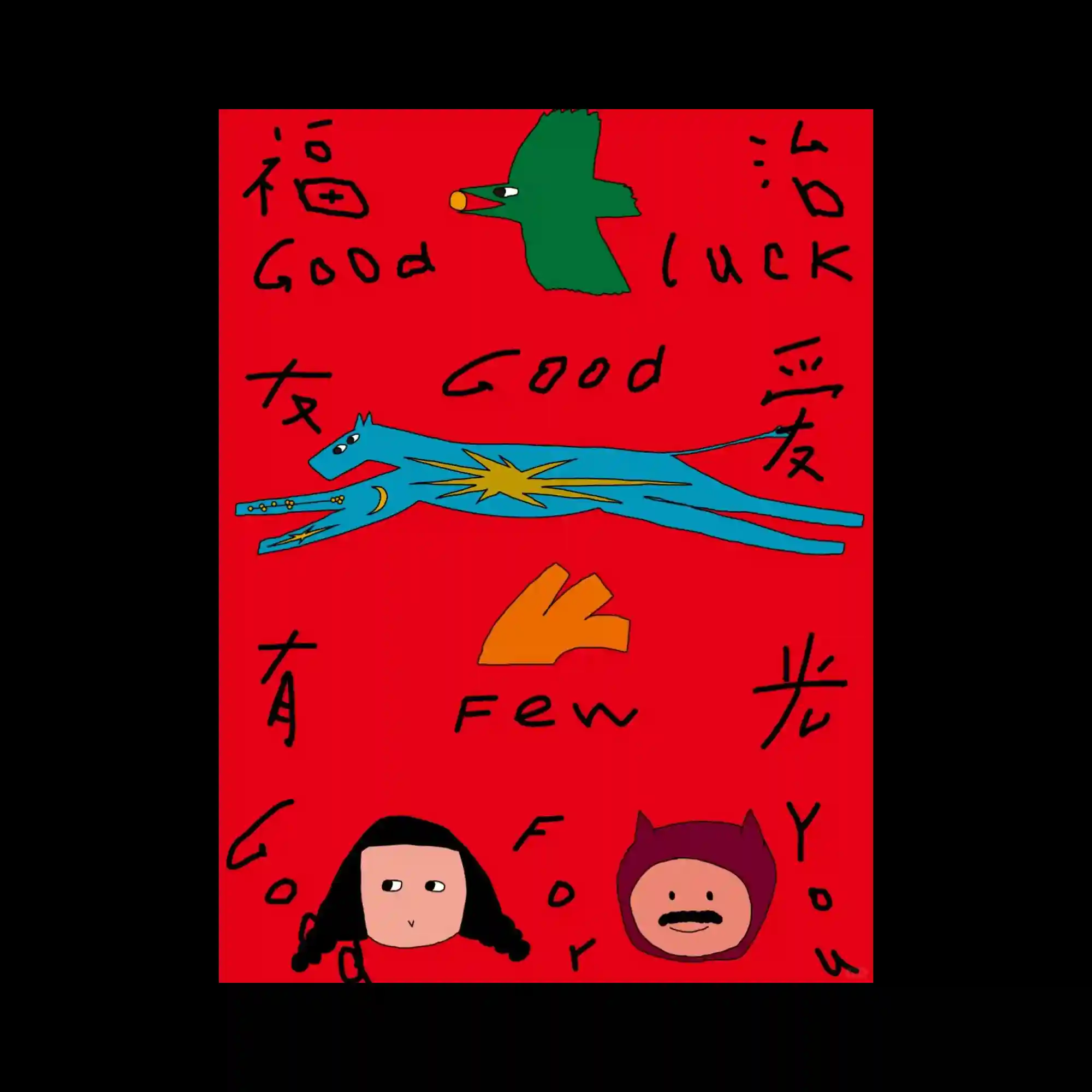
Hand-drawn illustrations and loosely written lettering create an intentionally naïve and spontaneous visual language. Flat colorful figures are distributed across the composition with generous spacing, allowing each element to stand independently. Irregular line quality and uneven typography reinforce the handcrafted character of the design. The limited palette of vivid primary-like colors strengthens the playful and expressive atmosphere.
손으로 그린 듯한 일러스트와 자유로운 손글씨가 의도적으로 순수하고 즉흥적인 시각 언어를 형성함. 단순한 색면의 캐릭터들이 넓은 간격으로 배치되어 각각의 요소가 독립적으로 강조됨. 불규칙한 선과 일정하지 않은 타이포그래피가 수작업 특유의 감성을 더욱 강화함. 선명한 원색 중심의 제한된 색상이 유쾌하고 표현적인 분위기를 완성함.
手绘插画与随性的手写文字共同构成了刻意保持天真感与即兴感的视觉语言。色块简洁的人物与图形分散排列,使每个元素都保持独立的视觉存在。粗细不均的线条和不规则字体进一步强化了手工制作的特质。以鲜艳原色为主的有限配色营造出轻松而富有表现力的整体氛围。