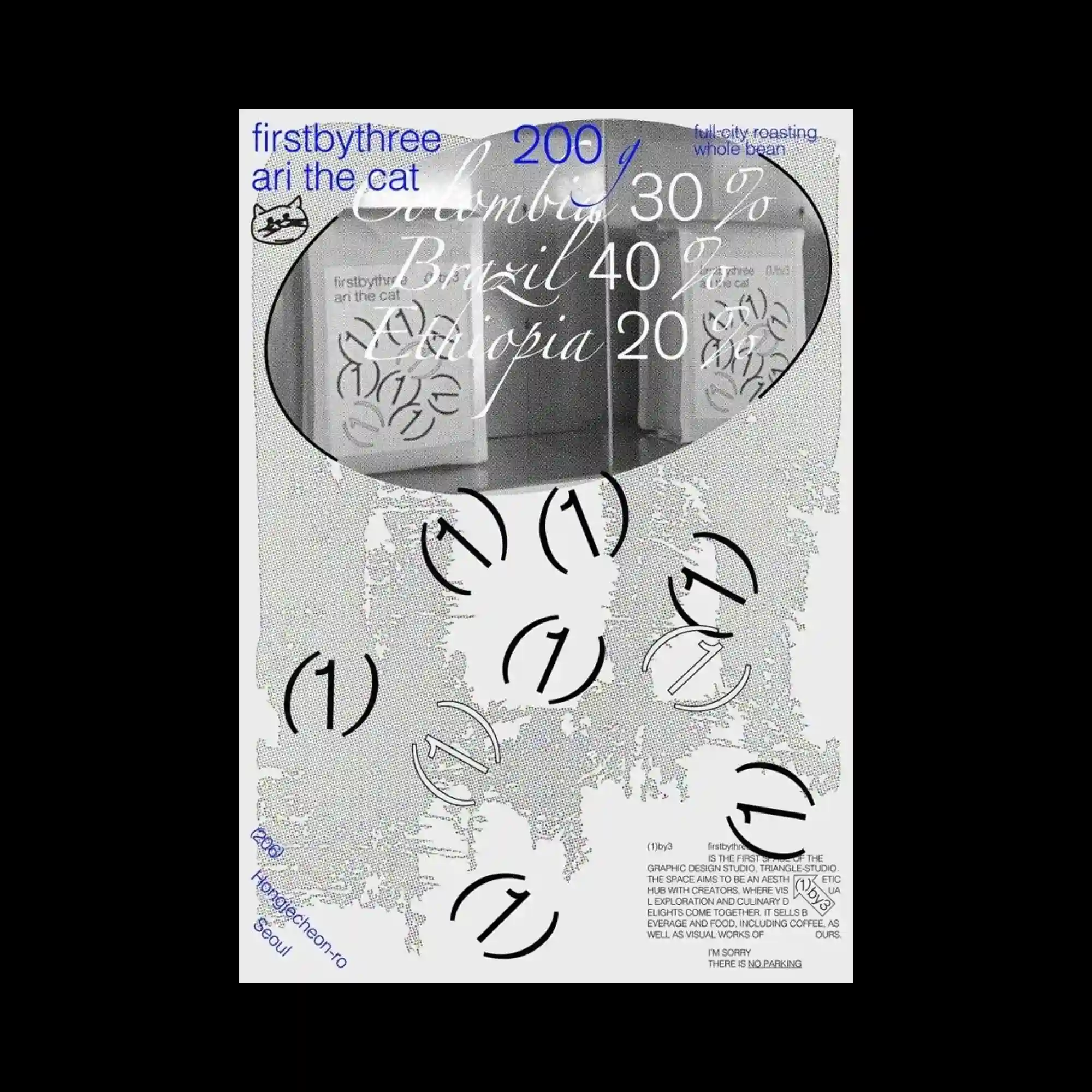
An oval photographic window occupies the upper section while layered cursive typography and percentage numbers float across the image surface. Grainy grayscale textures spread beneath the composition, giving the background a rough printed quality that contrasts with the cleaner vector elements. Repeated circular arrow symbols are scattered rhythmically throughout the lower area, functioning like modular graphic markers rather than readable icons. Blue accent typography positioned near the edges introduces subtle color contrast and reinforces the poster’s collage-like editorial structure.
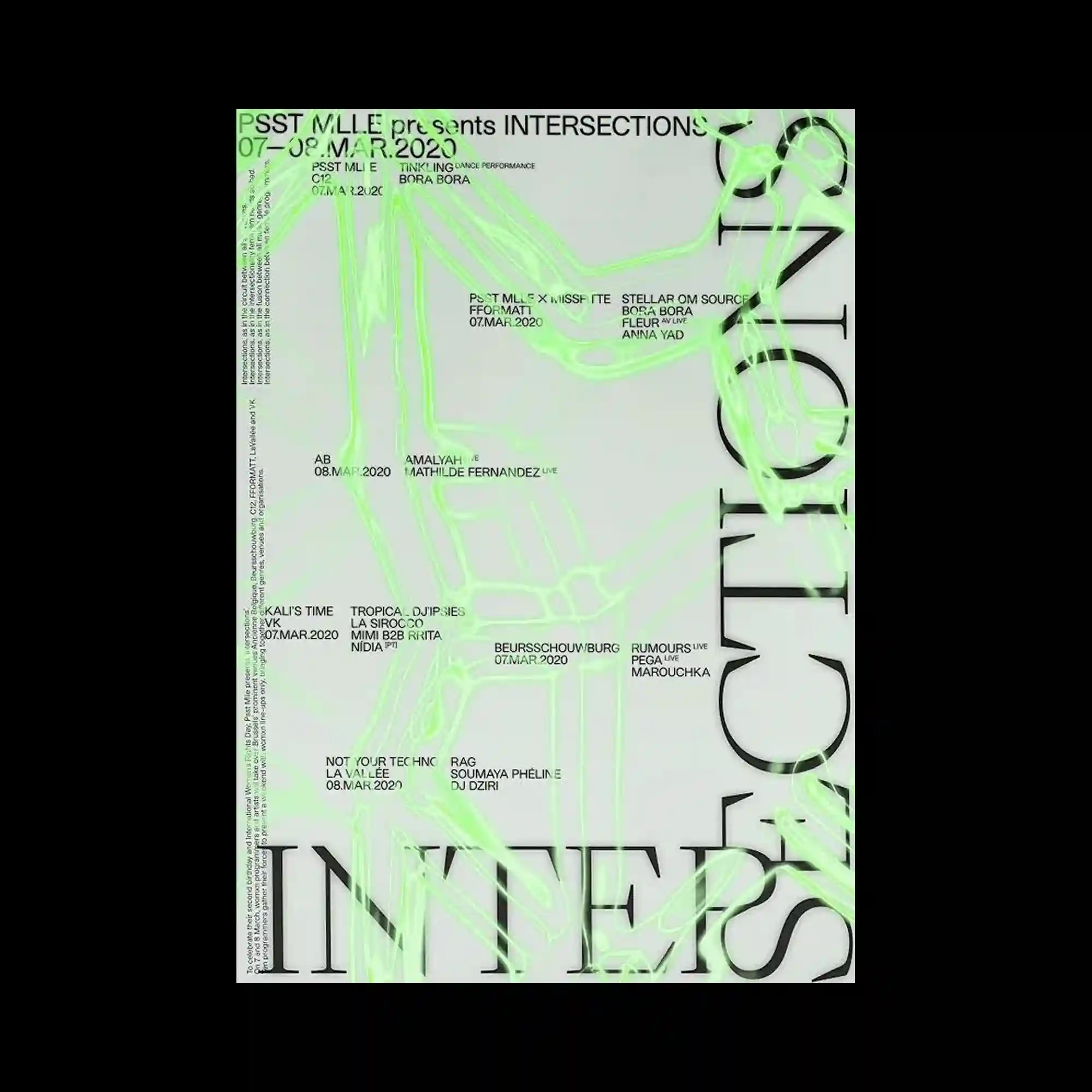
Large cropped serif typography stretches vertically along the edges while translucent neon green line textures drift across the surface like glowing smoke or tangled digital threads. Small clusters of black sans-serif text are positioned within the empty center, creating a restrained informational layer against the highly expressive background graphics. The soft luminous lines partially obscure the typography and generate a sense of movement flowing diagonally through the composition. The contrast between rigid editorial typography and unstable organic textures gives the poster a futuristic and atmospheric tone.
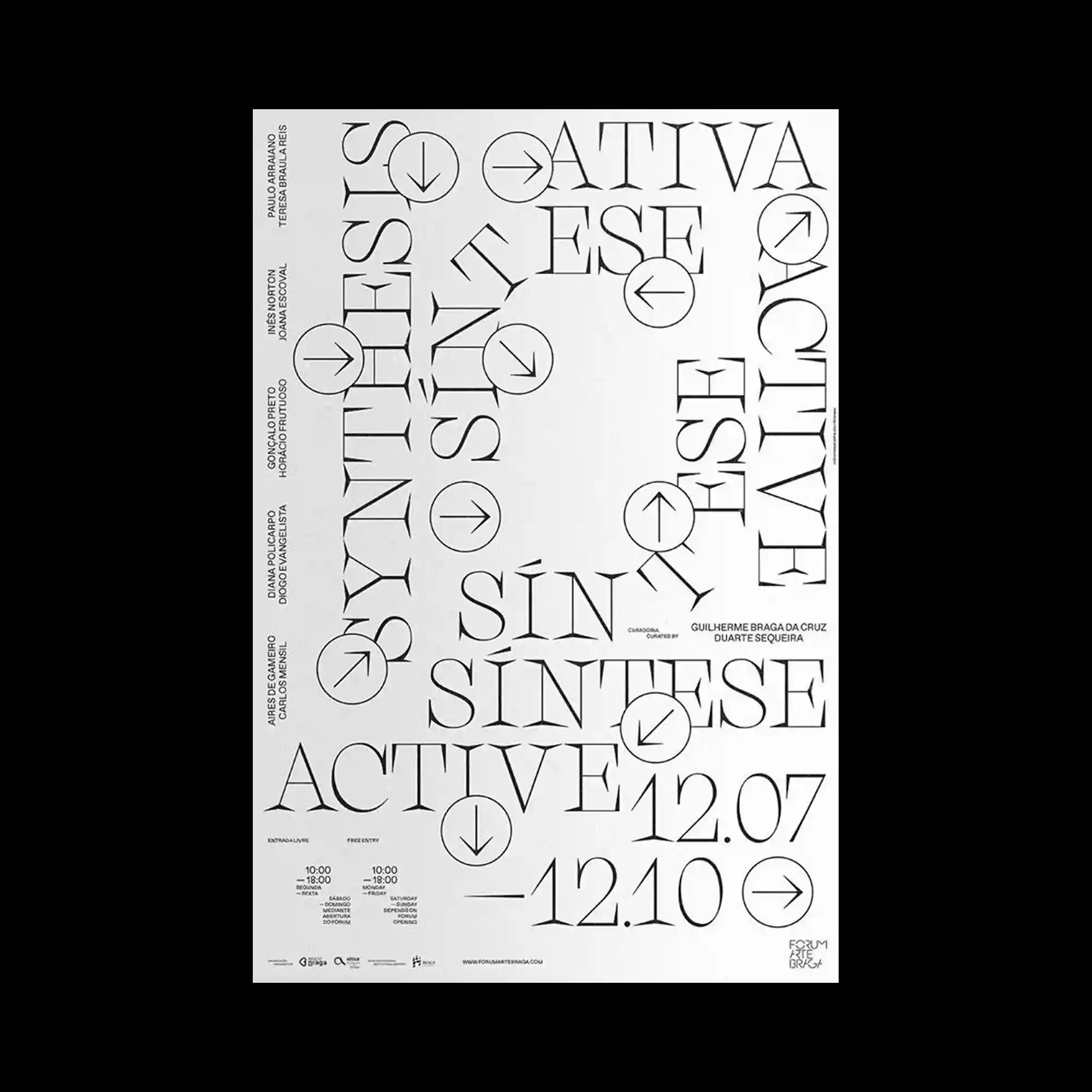
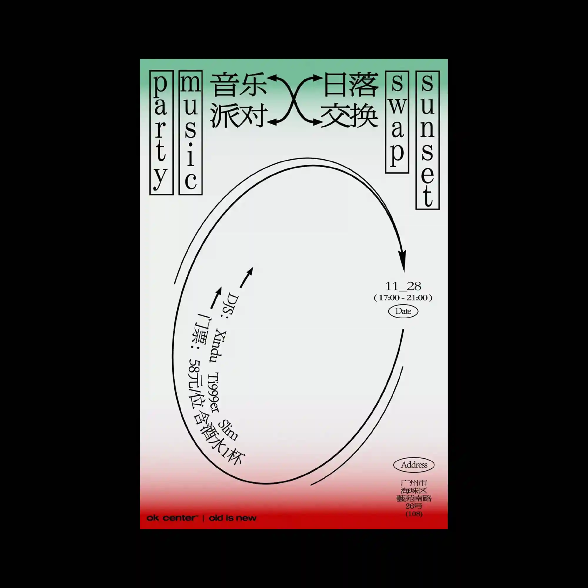
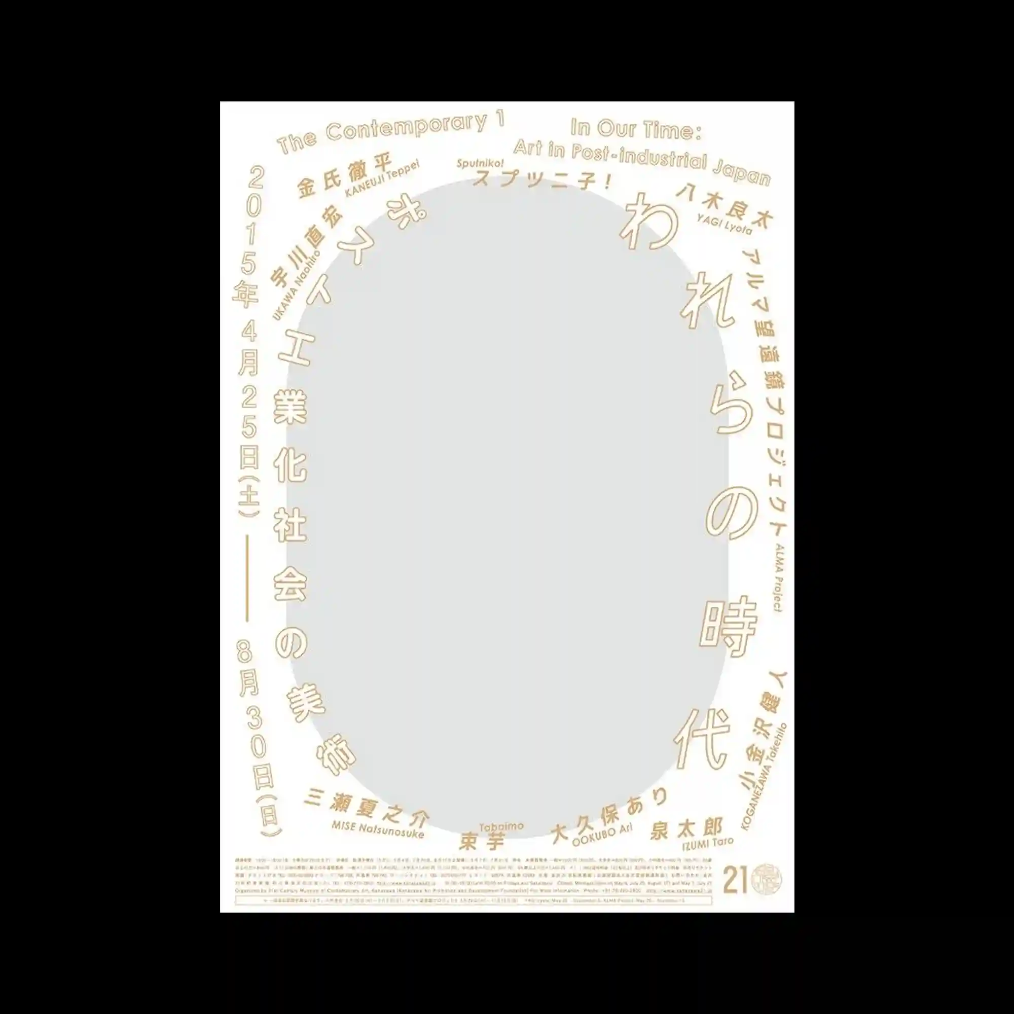
Elegant serif typography wraps around the composition in fragmented directional arrangements, forming an open rectangular frame around a large central void. Circular icons containing arrow symbols are scattered between the words, introducing a navigational rhythm that softens the rigidity of the sharp letterforms. The typography shifts between vertical, diagonal, and horizontal orientations, allowing the layout to feel simultaneously structured and unstable. Thin informational text aligned near the edges reinforces the editorial atmosphere while maintaining the spacious minimal composition.
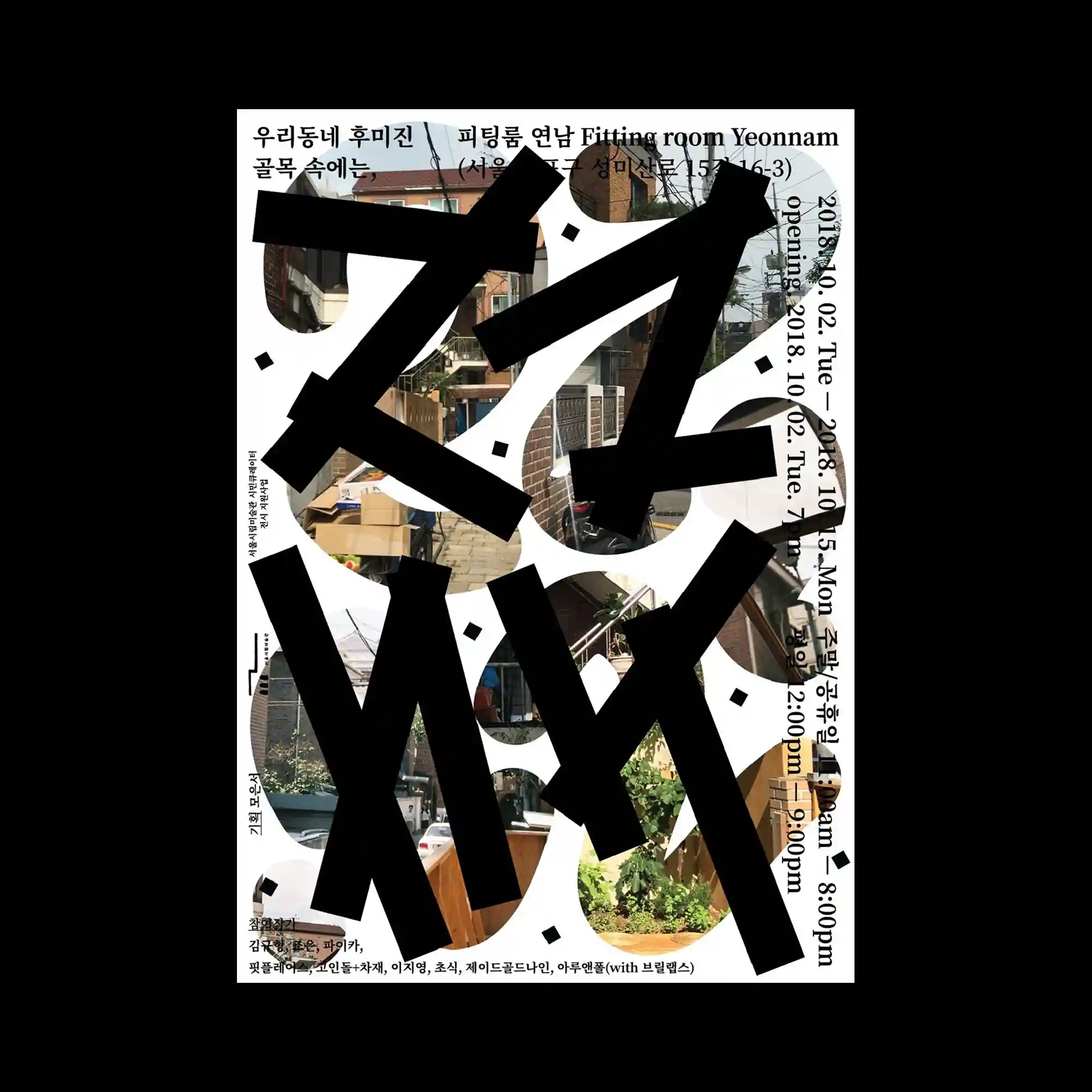
Massive black typographic forms slash across a collage of urban alleyway photography, partially obscuring the imagery beneath with thick angular strokes. Rounded white cutout shapes interrupt both the text and the photographs, introducing pockets of negative space that soften the otherwise heavy composition. Vertical lines of information wrap around the right edge while smaller text elements are embedded throughout the layout, creating multiple directional reading paths. The contrast between raw street photography and aggressive abstract typography gives the poster a layered and highly energetic visual rhythm.
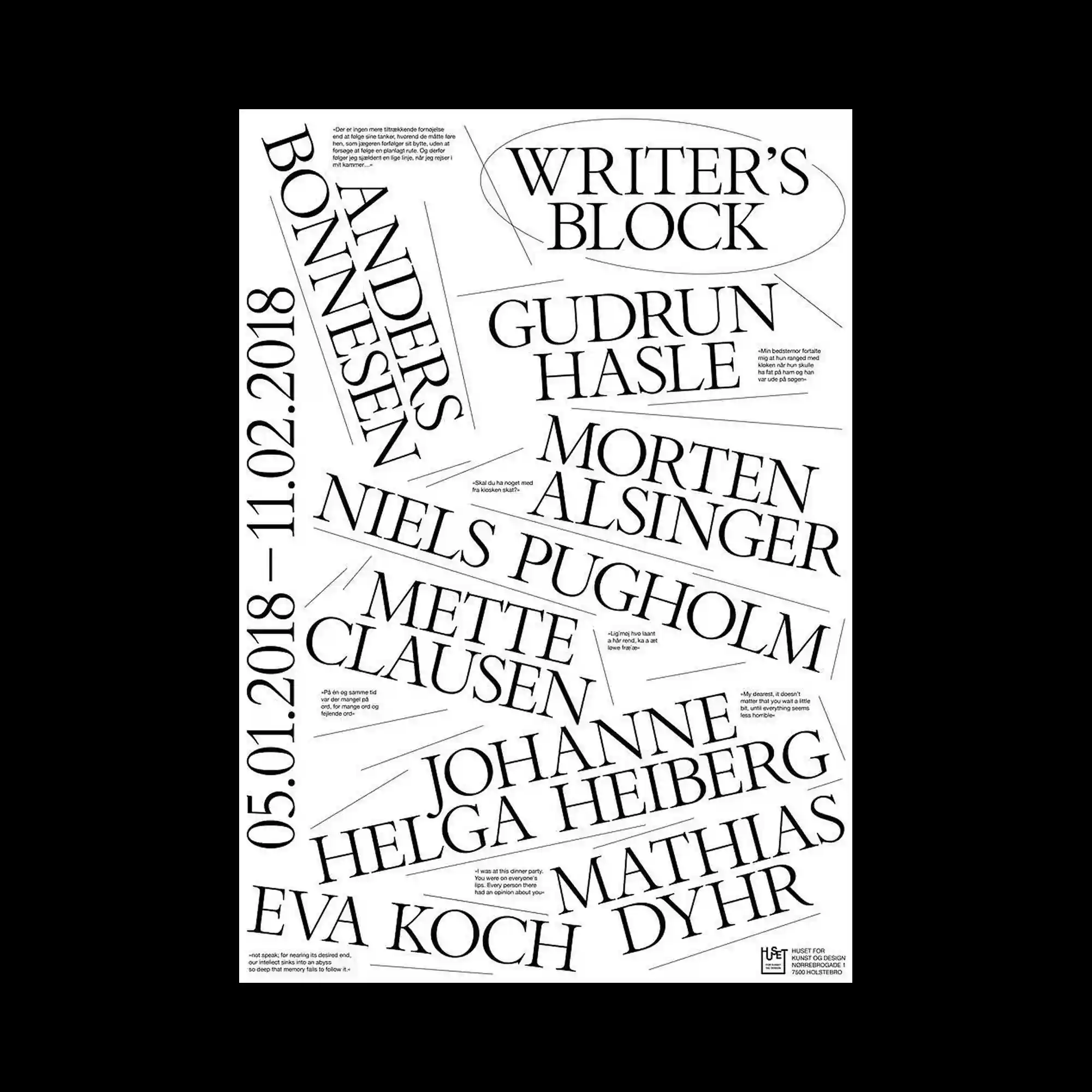
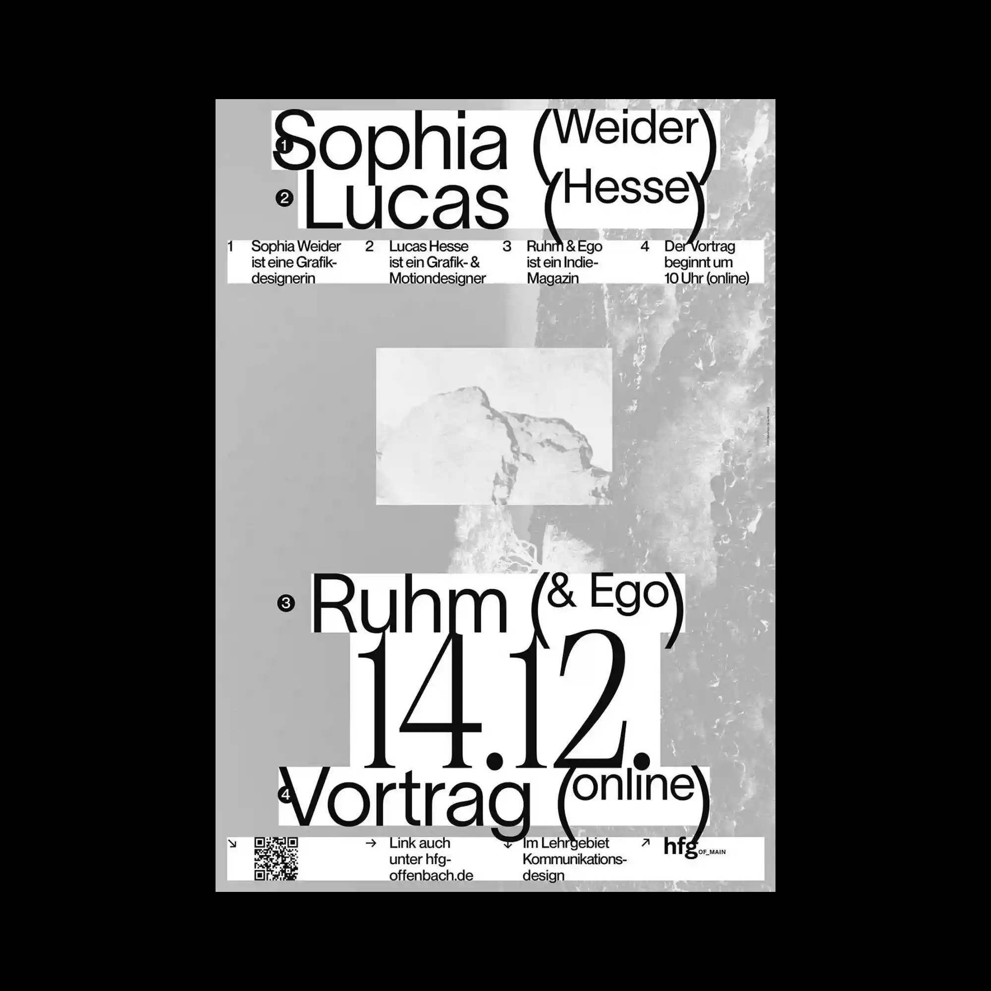
Large serif names are scattered diagonally across the composition, overlapping and rotating at varying angles like fragmented strips of printed paper. Thin line segments radiate outward between the text blocks, creating the impression of directional movement or conversational exchange. The composition avoids strict alignment, instead relying on collision and interruption between the oversized typographic elements. Despite the chaotic arrangement, the consistent monochrome palette and elegant serif forms maintain a refined editorial coherence.
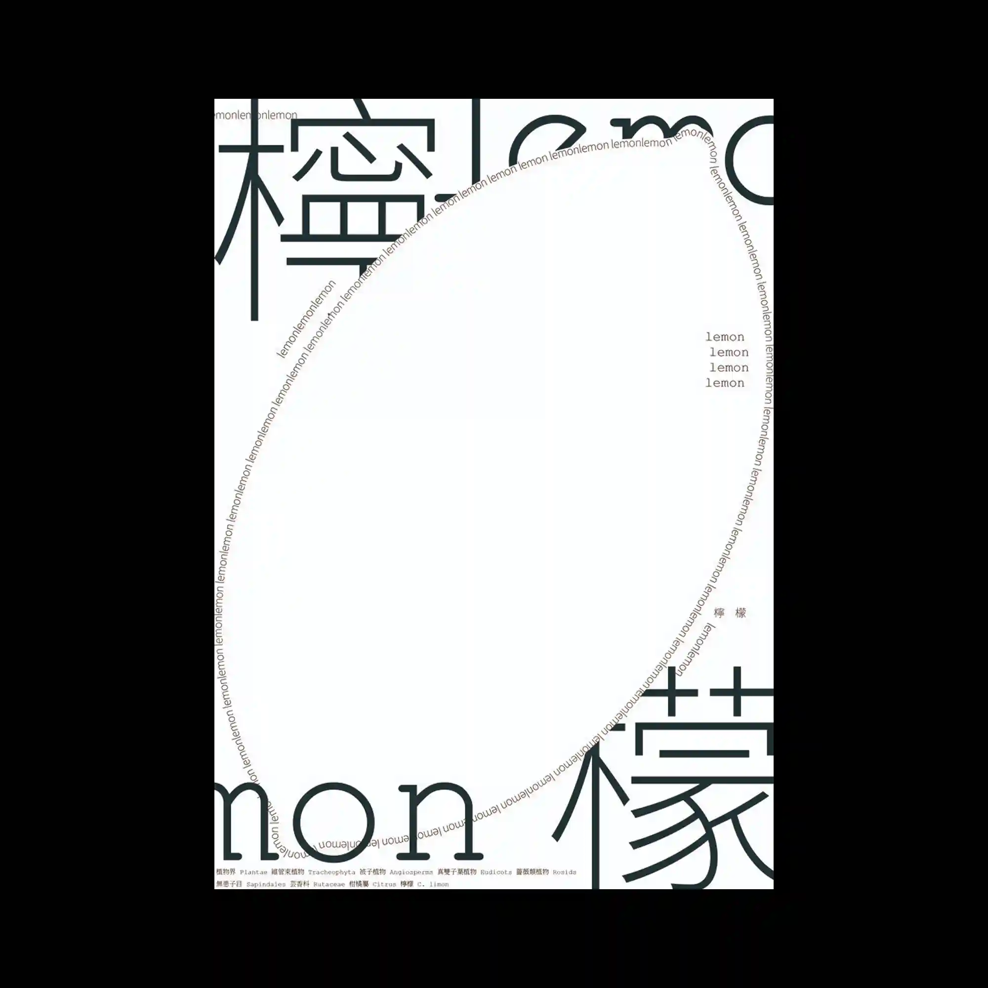
Oversized cropped characters extend beyond the edges of the composition, framing a large empty central area with thick geometric strokes. Repeated tiny text arranged along a curved border forms a circular contour that visually contains the otherwise open space. Small clusters of aligned words positioned near the upper and right sections introduce delicate moments of balance within the highly minimal structure. The poster combines monumental typography with precise microtypographic repetition, producing a composition that feels simultaneously spacious and tightly controlled.
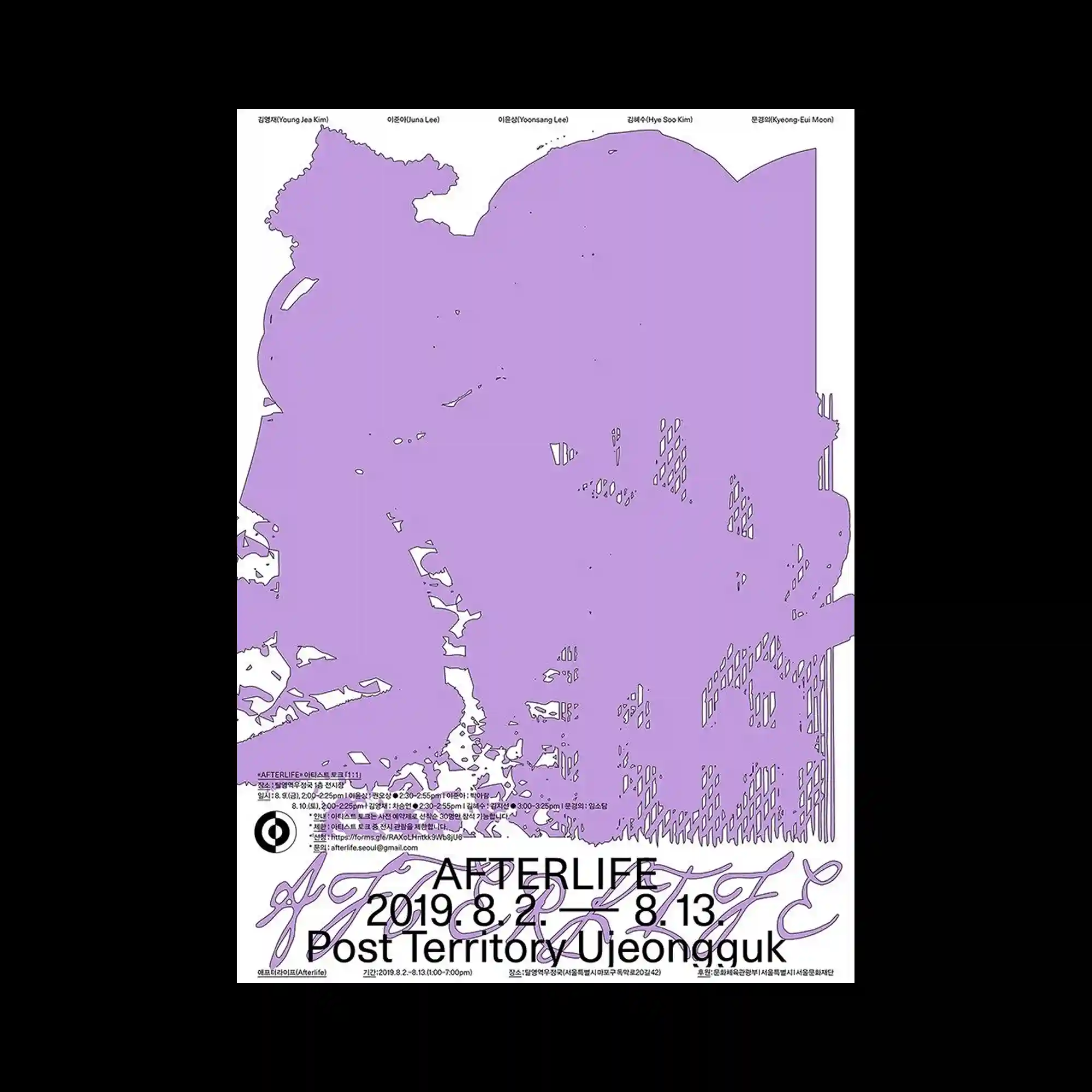
A large irregular purple silhouette occupies almost the entire surface, appearing like a distorted scanned texture or fragmented territorial map. Fine outlines and scattered internal marks remain visible within the flat color field, allowing hidden structural details to subtly emerge beneath the dominant shape. Thin black typography is compressed along the edges and lower section, functioning more as informational residue than a central focal element. The poster creates tension between massive abstract volume and delicate peripheral details through its restrained monochromatic palette.
Thin black curves sweep across the composition in large elliptical motions, functioning simultaneously as arrows, pathways, and typographic guides. Vertical boxed text columns positioned along both sides create a rigid frame that contrasts with the fluid motion of the central lines. Small labels and directional markers are distributed sparsely within the empty space, reinforcing the feeling of navigational graphics or transit diagrams. A soft gradient transition near the bottom edge introduces a subtle atmospheric glow beneath the otherwise minimal monochrome structure.
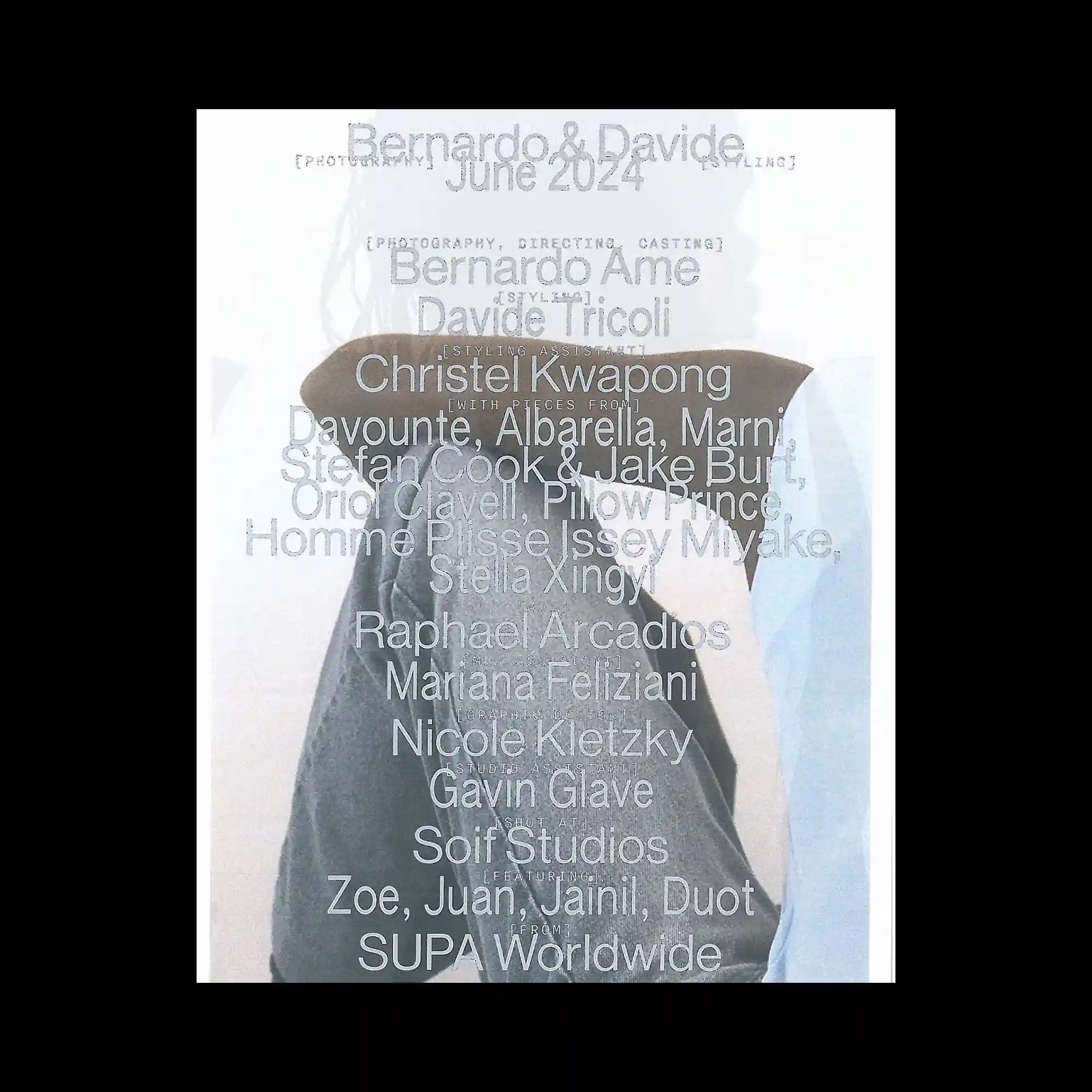
Soft desaturated photography is overlaid with semi-transparent silver typography, causing the text and image layers to visually dissolve into one another. The central figure remains partially obscured behind stacked credits and names, creating a hazy editorial atmosphere rather than a clearly readable hierarchy. Thin uppercase labels and large lowercase names alternate throughout the composition, producing subtle shifts in scale and texture. The washed-out palette and blurred photographic treatment give the poster a fragile and atmospheric visual tone.
Large black sans-serif typography dominates the composition through aggressive scaling and overlapping cropped text blocks. Thin informational rows stretch horizontally across the upper section, acting like structural dividers that organize the otherwise chaotic arrangement. The grayscale photographic textures embedded in the background introduce soft irregular surfaces beneath the sharp typographic forms. Heavy numerical elements near the center anchor the layout visually, creating a strong focal point within the layered composition.
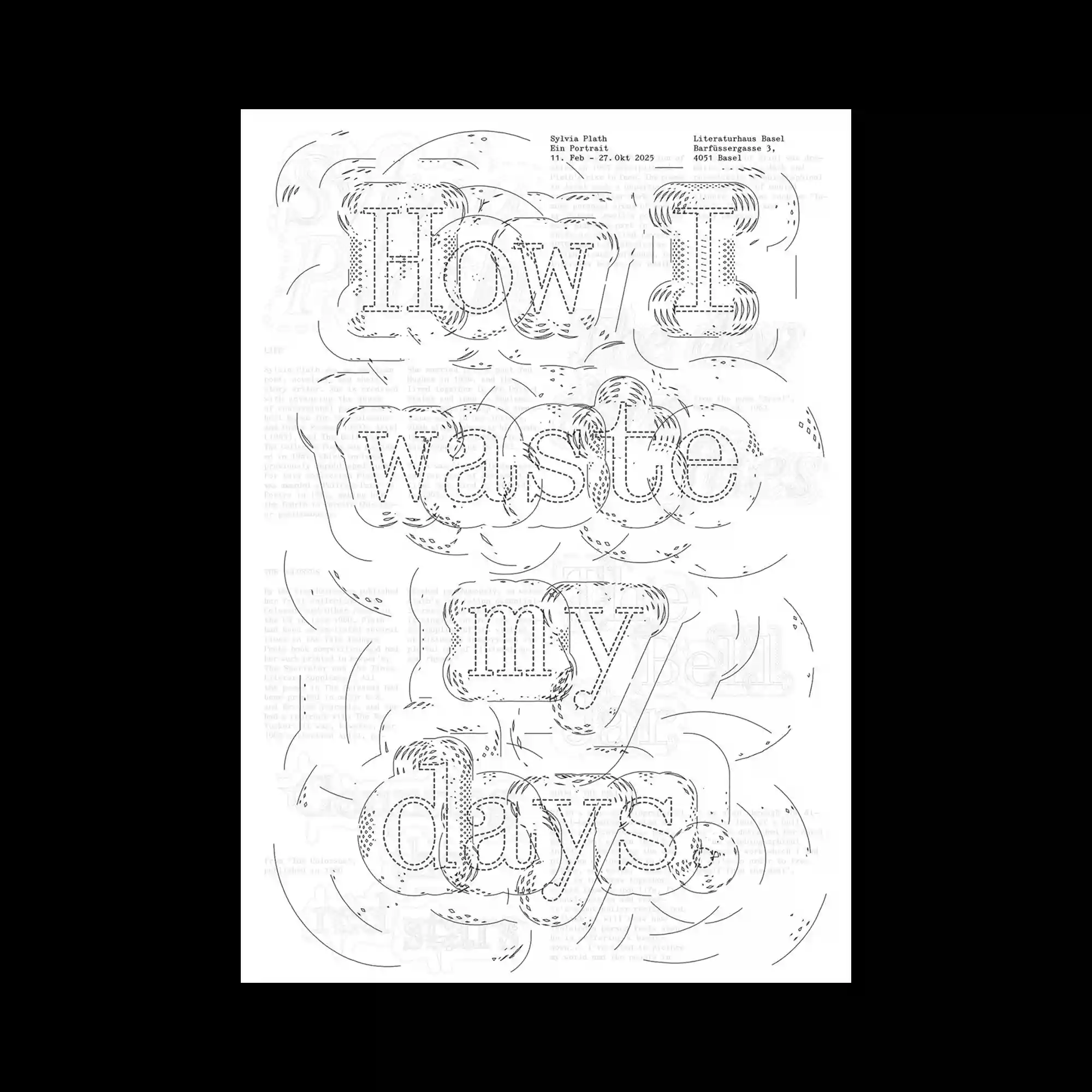
Tiny repeated lines of text are densely arranged to construct oversized letterforms that gradually emerge only from a distance. The composition relies on repetition and accumulation rather than solid shapes, giving the typography a porous and fragmented texture. Small circular markers scattered across the surface interrupt the rigid rhythm of the text grid and introduce subtle points of visual noise. A large serif word placed at the bottom overlaps the constructed letterforms, creating a layered contrast between microscopic detail and bold typographic mass.
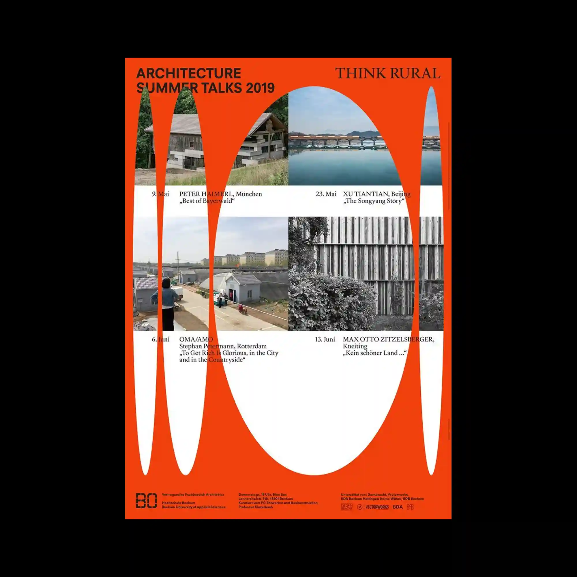
Bright orange fills the entire composition while elongated white oval cutouts carve through the surface like stretched apertures or flowing negative spaces. Rectangular photographic fragments are inserted within the central area, contrasting the organic curved shapes with documentary architectural imagery. Bold sans-serif headlines positioned near the edges stabilize the highly dynamic layout and prevent the composition from feeling visually unstable. The poster combines rigid editorial structure with exaggerated spatial distortion, creating a striking balance between clarity and visual tension.
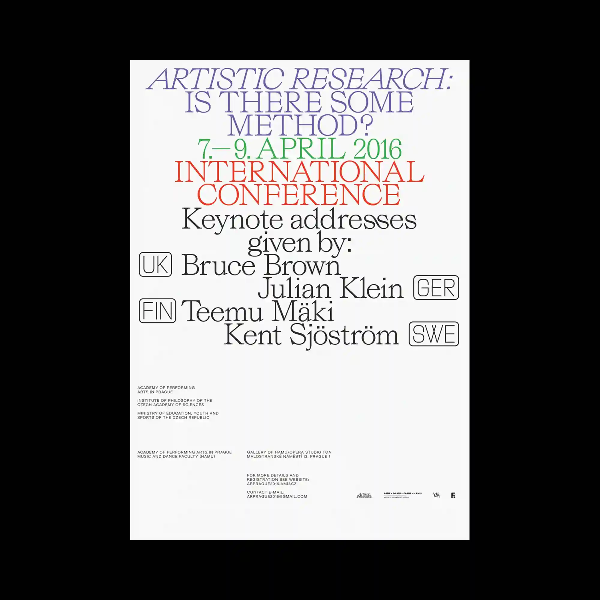
Condensed serif typography is stacked vertically in tightly controlled alignment, creating a dense text-centered composition with almost no decorative imagery. Different colors are assigned to separate text groups, allowing the hierarchy to emerge through tonal contrast rather than changes in scale or layout structure. Thin outlined labels positioned beside the names introduce a subtle modular rhythm that balances the otherwise classical typography. Large areas of empty space in the lower half reinforce the refined editorial feeling and give the poster a restrained institutional atmosphere.
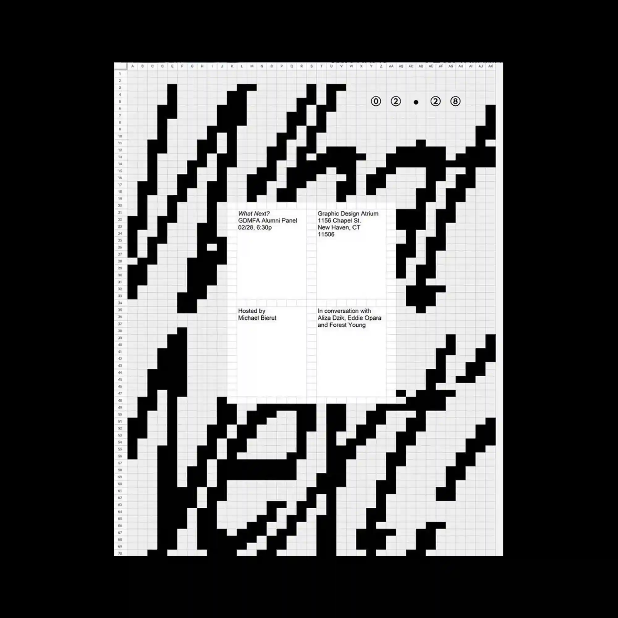
Large black geometric forms stretch diagonally across a faint spreadsheet-like grid, creating the impression of enlarged pixel fragments cut from a digital interface. The composition balances rigid rectangular blocks with sweeping curved segments, allowing the fragmented typography to feel both mechanical and fluid at the same time. Small text panels are placed precisely within the empty spaces of the structure, introducing a strong contrast between dense visual weight and restrained informational layout. The overall poster feels highly systemized, combining the aesthetics of data sheets, bitmap graphics, and oversized cropped letterforms into a minimal monochrome composition.

The composition is almost entirely covered by a dense, allover pattern of small rectangular marks in black, green, and red-orange, arranged in curvilinear and concentric formations that suggest a distorted grid or data-visualization structure. The marks vary in density and clustering, producing lighter and darker zones across the surface that together form a large-scale figural shape when viewed from a distance. A gradient from white to black to red bleeds across the lower portion of the poster behind the pattern layer. The upper portion contains a fragmented header zone where text elements are interspersed directly within the pattern field, rendered in mixed sizes and typefaces. A small block of event information in a light grotesque is positioned in the lower-right area against a relatively open zone in the pattern.

Two lines of large mixed-weight display text in a rounded grotesque are set at the top of the poster, with the second line partially dissolving into a white fade toward the bottom edge of the letterforms. A faint square grid covers the entire surface at low opacity, functioning as a structural underlay. The vast majority of the poster is an open white field, with a dense cluster of small-scale text, logotypes, and date numerals compressed into the lower-left and lower-right corners. The typographic fade applied to the display text—transitioning from solid black at the top to white at the bottom—is the singular graphic treatment that distinguishes this otherwise minimal layout.
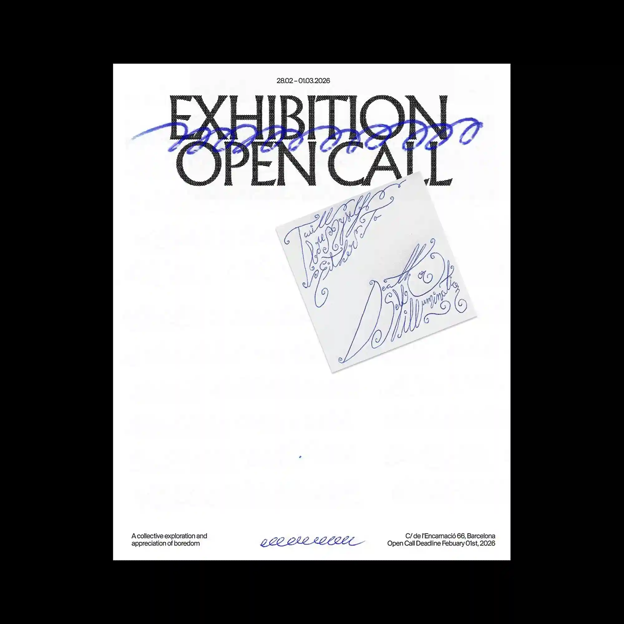
Two lines of large bold display text in a halftone-dot rendered serif occupy the upper portion of the poster, with a loose cursive blue ink stroke sweeping diagonally across both lines of type. A rotated rectangular notepad or paper slip is placed in the center of the composition, bearing ornate cursive lettering in blue ink on a slightly off-white ground. The lower margin holds small body text flush left and flush right, with a decorative cursive flourish centered between the two blocks. The composition uses blue as the sole chromatic accent against the monochrome display type, and the contrast between the halftone-rendered letterforms and the fluid handwritten elements is the dominant visual relationship.
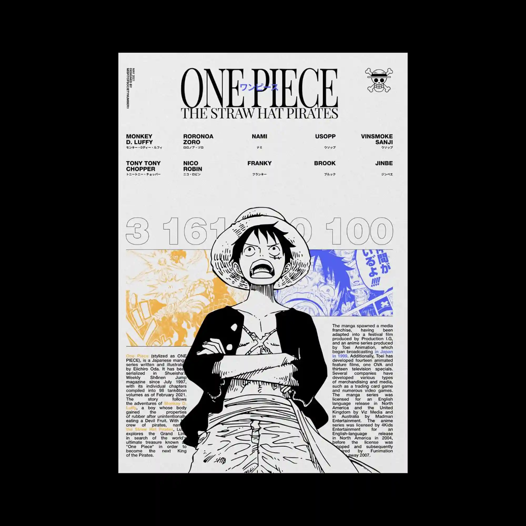
The poster is organized into four horizontal zones. A header band carries the main title in a high-contrast serif and small katakana, with a skull emblem in the upper-right corner. Below this, a two-row grid of ten name labels in bold grotesque spans the full width. A large numeral sequence in a light grotesque sits across the midsection, partially obscured by a manga-style ink illustration of a figure that bleeds through the text layer. The lower half contains two columns of dense body text flanking the illustration, which continues from the center zone downward. Color is introduced through selective orange and blue tinting applied to portions of the illustration, set against an otherwise monochrome off-white surface.

The upper third of the poster is dominated by two lines of large bold typewriter-style display text with visible character spacing, set against a faint photographic layer showing a printed form with horizontal ruled lines. A block of handwritten script in ink occupies the upper-right quadrant, layered over the form texture with varying line pressure and informal letter construction. The middle section contains small two-column body text in a light grotesque, while the lower portion returns to the same typewriter display style for a secondary text block. A small institutional logotype in the lower-right corner anchors the footer. The layering of typewriter type, form-document texture, and handwriting produces a stratified archival surface.

A vertical sequence of small, thumbnail-scale graphic images is arranged along the central axis of the poster, spaced at irregular intervals from top to bottom. The images are diverse in style and color—including photographic, illustrative, and pixelated formats—and vary in size, with a bright green rectangle and a pair of red horse figures among the more visually prominent elements. A compact block of event information text in a small grotesque is positioned at the vertical midpoint, partially overlaid by large faded Korean characters that extend horizontally across the center zone. The composition has an open, list-like structure with generous white space surrounding the vertical image sequence.

The poster is built on a strict bilateral symmetry, with matching text blocks and rotated label columns mirrored across the vertical center axis. Large bold grotesque display text occupies the top and bottom zones, with Chinese characters flanking the Latin title in the header area at equal weight and size. A single small black square is placed precisely at the geometric center of the composition, functioning as a minimal focal point within an otherwise text-only layout. Vertically rotated small text columns run along both left and right inner margins, and the overall typographic density is heaviest at the top and bottom with the center kept sparse.

A repeating calligraphic phrase in a high-contrast italic script runs continuously along all four edges of the poster, forming a complete typographic border that frames a large empty white interior. The script is set at a consistent scale and angle, with the text wrapping around the corners without interruption. Small-scale institutional information in a spaced uppercase grotesque occupies the top and bottom margins inside the border, while the central white field remains entirely void. The contrast between the ornate, fluid letterforms of the border and the rigid utility text of the margins defines the compositional dynamic.
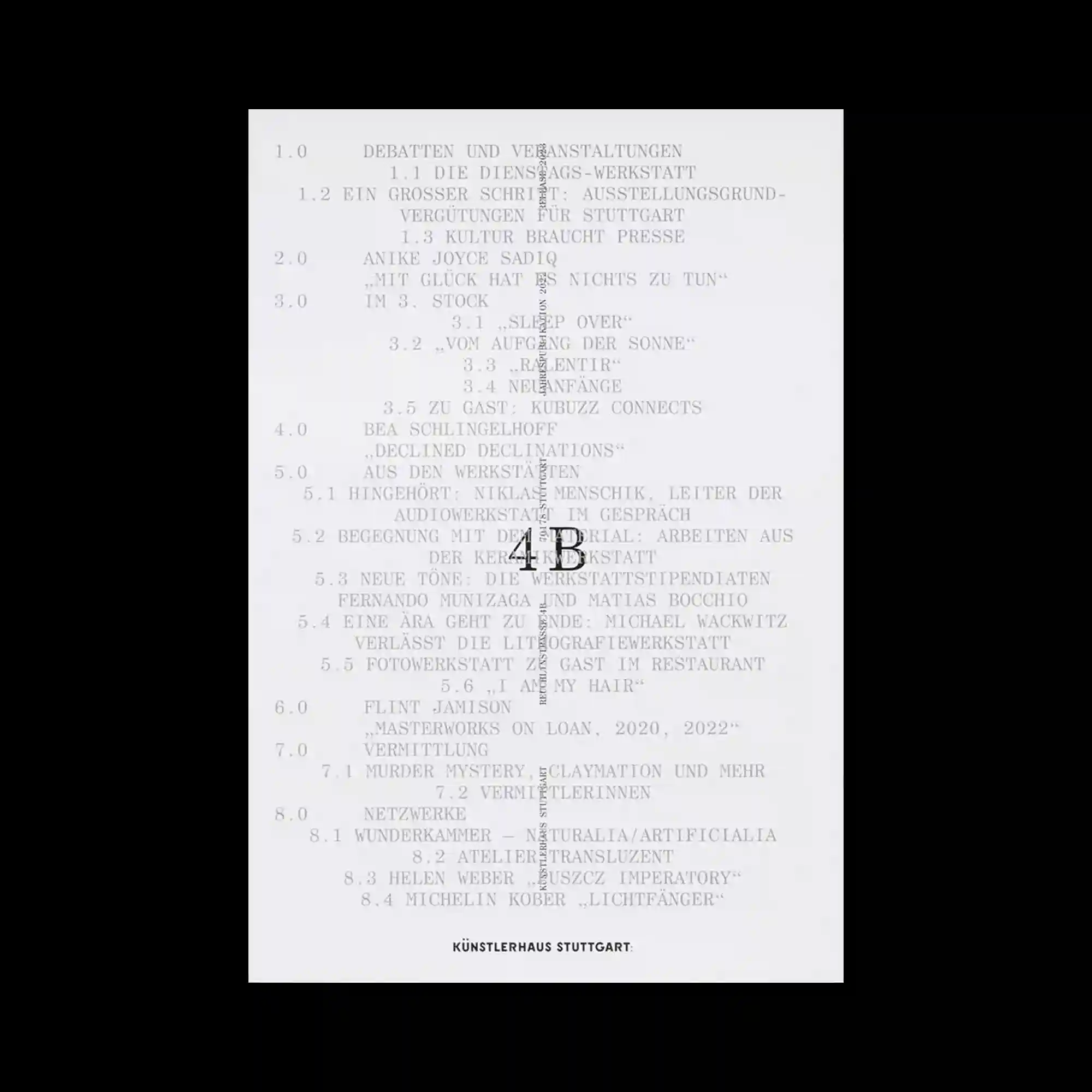
A full-page numbered table of contents is set entirely in a light monospaced typeface, with entries arranged in a hierarchical outline structure using decimal numbering. The indentation pattern and number prefixes establish multiple levels of visual depth across the left-aligned text. A single large typographic element—a bold serif "4B"—is superimposed over the central section of the list, scaled to span several lines of text and partially obscuring the underlying content. A thin vertical rotated text strip runs along the right edge, and a small bold logotype anchors the bottom center. The contrast between the delicate monospaced listing and the singular oversized letterform is the primary structural tension of the composition.

The poster is organized into three horizontal zones. The top section contains a rounded-corner header box with a bold display title and small katakana text flanked by four-pointed star symbols. Below this, a wide horizontal band presents two side-by-side manga panels in grayscale ink illustration style, with a large red geometric shape—a thick triangular wedge rendered in flat color—overlaid across the center of both panels, extending into the lower zone. The bottom section holds two columns of small-scale body text alongside a bold label and Japanese subtitle in a clean grotesque. The red element stands as the sole chromatic accent against an otherwise monochrome composition, drawing the vertical axis of the layout downward through its pointed form.

The entire surface is a saturated yellow ground, with all graphic and typographic elements rendered in black. A structured table of contents occupies the central area, set in a compact grotesque with numbered entries and indented subcategories. The hierarchy is established through size variation, indentation depth, and em-dash prefixes rather than color. Two small halftone portrait photographs are positioned in the upper-right corner, printed with high contrast at reduced scale. Institutional logotype and mark elements appear in the upper-left, and a rotated year indicator runs vertically along the right edge. The monochromatic yellow palette and flat print quality reinforce a functional publication aesthetic.

The layout combines a printed text sheet with a physical fabric swatch attached directly to the surface, creating a mixed-media document quality. The text is set in a compact grotesque across two columns on the upper portion, printed over a faint photographic surface showing handwritten annotations and ruled grid lines. Two dark fabric pieces—roughly rectangular with raw edges—are adhered in the lower-center zone, overlapping the printed grid and text below. Handwritten notations in pencil are visible around the swatch area, integrating material samples with typographic content in a sample-sheet or atelier-document format.

All text is concentrated in the upper-left quadrant of an otherwise blank white poster, set in a mixed typographic system that combines upright grotesque, italic serif, and underscored file-name style strings. The text block is compact and left-aligned, with line breaks falling at irregular intervals and parenthetical labels interspersed within the running text. A small isoloted italic word appears near the vertical center of the composition, and a cluster of small institutional logotypes is placed in the lower-right corner of the text block. The large expanse of empty white space below and to the right of the text mass is the dominant visual element of the layout.

The upper half of the poster is covered by a dense field of repeated small-scale text in a fine grotesque, printed in uniform rows across the full width to create a textured typographic ground. Superimposed over this repeat field, five lines of large bold grotesque display type interrupt the pattern at full width, with the underlying text remaining partially legible through and around the letterforms. The lower half is a clean, open white field with no typographic content except for a cluster of small credit blocks positioned near the bottom right and left corners. The structural division between the dense upper zone and the empty lower zone gives the layout a strong vertical asymmetry.

The graphic is presented on a physically folded sheet, with visible horizontal fold creases dividing the surface into distinct horizontal bands. Large rounded grotesque display type runs across the top and bottom of each panel, while the fold causes the letterforms to warp and misalign at the crease lines, producing a distorted reading of the repeated title text. Between the display zones, two-column body text blocks in a compact grotesque fill the middle sections with dense informational content. The physical fold is treated as an active design element, integrating material deformation directly into the typographic composition.
A strictly typographic poster built on a high-contrast grotesque in extra-bold weight, with the main display text spanning nearly the full width across two lines at the top of the composition. A secondary Korean title set in the same typeface appears vertically along the right edge, stacked in a narrow column. The left side carries a dense block of small-scale names in a light grotesque, running vertically parallel to the display text. The lower half of the poster is almost entirely empty white space, broken only by a compact block of bilingual event information at the bottom. The overall layout is defined by extreme contrast between the heavy display type and the open, unoccupied field beneath it.

The poster is structured as a multi-panel grid reminiscent of manga page layouts, with a large central image flanked by smaller framed panels on both sides. All illustrations are rendered in a detailed monochrome ink style with gray toning, depicting figures at various scales and angles. A light gray header band at the top holds three evenly spaced text labels in a compact grotesque. A bold, wide-tracking grotesque display type spans the full width of the bottom zone in heavily weighted black letterforms. A single italic line of small text sits between the illustration grid and the display type, creating a narrow transitional band.
A repeat pattern of small multicolored graphic marks—red ovals, yellow-green rectangles, gray squares, and red cross symbols—tiles the lower two-thirds of the poster in a loosely gridded rhythm. The marks vary slightly in scale and orientation, producing a handmade, stamp-like texture across the surface. Display text in a large mixed-serif occupies the upper portion, set in multiple lines with centered alignment, and the pattern continues behind and around the letterforms without interruption. The overall palette is limited to red, yellow-green, and gray against white, giving the composition a risograph-printed quality.

A Swiss-style typographic poster structured around a dominant block of large, bold grotesque text listing place names in the upper half, with consistent line-length wrapping and uniform underlines applied to most entries. The type weight is heavy and the character spacing tight, producing a high-density text mass that anchors the top of the composition. Below this, a row of circled numerals set in the same typeface marks a second visual band with rounded, pill-like forms in graduated increments. A narrow tabular section with fine-weight grotesque text follows, presenting scheduled route data in a compact, structured format. A small set of circled letter glyphs in the upper right corner and additional size-indicator rings below the number strip add systematic indexical elements throughout.

Structurally identical in approach to the prior piece, this version presents a more legible typographic relationship between the tabular data layer and the display text. The table rows in a fine grotesque remain fully readable throughout, while the bold condensed display type—arranged in three hierarchical tiers at the top, middle, and bottom of the page—sits prominently without obscuring the underlying content entirely. The large letterforms maintain sharp edges and consistent stroke weight, and the overall composition reads as a unified typographic system rather than a layered interference. The tighter visual integration between data and display type gives this iteration a more resolved, structured character.

The composition is split into two distinct zones stacked vertically on a white ground. The upper portion holds a dense block of small, tightly leaded body text set in a light serif, running across nearly the full width of the sheet. A small black square emblem with ornate interlocking forms anchors the top-left corner of this text block. The lower third of the poster is occupied by two lines of large display lettering in an ornate blackletter-derived script with pronounced swash terminals and high stroke contrast, rendered at a scale that approaches the width of the entire page. The spatial gap between the text block and the display lettering is wide and uninterrupted, reinforcing the weight differential between the two zones.

The poster employs an exposed grid structure with thin rules visibly dividing the layout into columns and rows, which remain active as a design element throughout. A heavy condensed serif is used for large display text, deployed in three key zones—the header, mid-section, and footer—each scaled to span multiple columns. Smaller grotesque type fills the tabular cells with scheduling and logistical content, maintaining a deliberate contrast between the monumental type blocks and the utilitarian text. Corner decorative marks at intersections of the ruled border add a restrained editorial detail. The overall composition balances systematic information architecture with typographic assertion.
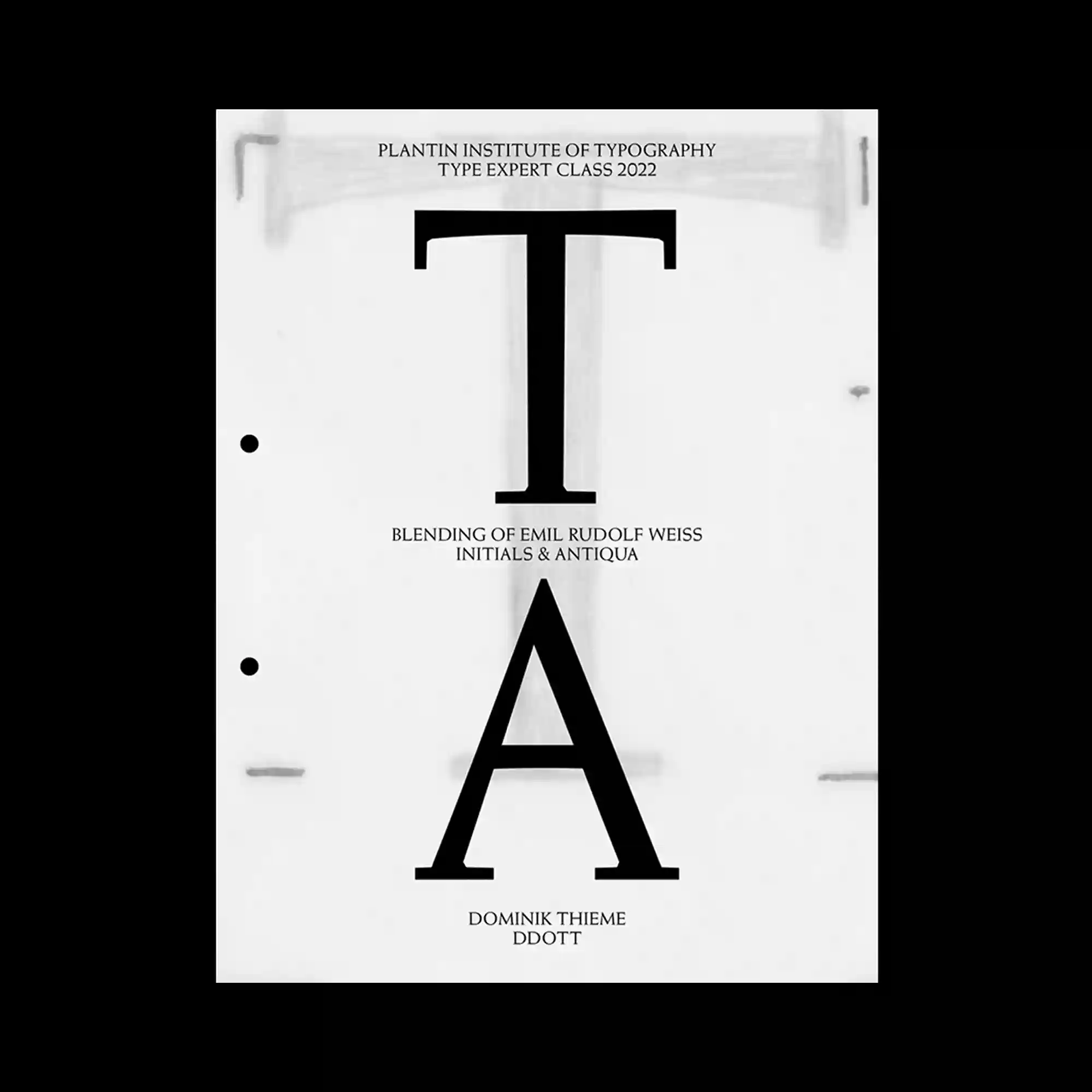
Two oversized letterforms, "T" and "A," are placed vertically along the central axis of the page, each scaled to near-maximum width. The typeface is a high-contrast serif with pronounced thick-thin stroke variation and strong bracketed serifs, rendered in solid black. A blurred photographic texture—appearing to show a binder or physical binding mechanism—bleeds through the background, adding a faint material quality behind the sharp letterforms. Small-scale caption text in a light grotesque appears at the top and bottom, framing the typographic specimens with minimal institutional labeling. Two hole-punch marks along the left edge reinforce a document or specimen-sheet format.

The poster relies almost entirely on typography as its visual structure, with a block of large, stacked display text in a high-contrast serif dominating the upper two-thirds of the composition. Type size and weight vary across the lines, mixing roman and italic cuts to introduce rhythm without a grid break. Two small photographic images—roughly cropped and warm in tone—are placed asymmetrically in the lower half alongside scattered small-scale text elements and arrow symbols. The lower margin holds a row of brand logotypes in a restrained, centered arrangement. The wide empty field between the display text and the lower elements amplifies the spatial tension across the vertical axis.
The poster is divided into a clear upper and lower zone on a white ground. The top half centers an ink-rendered illustration in a manga-derived linework style, depicting a figure from the shoulders up with heavily inked hair and a fractured facial detail rendered in gray tone. Above the illustration, bold grotesque display type spanning the full width anchors the composition at the header zone, accompanied by smaller utility text in the upper corners. The lower section is split between a dense paragraph of small text and a horizontal strip of high-contrast graphic imagery with horizontal scan-line patterning, grounding the composition with a band of maximum density.

A dense data table occupies the full surface, its fine horizontal rows set in a small grotesque typeface and printed at high typographic density. Superimposed over this grid are three tiers of bold display text in a heavy condensed serif, scaled to dominate across the width of the page. The display type and table content are layered simultaneously visible, producing a tension between structured tabular data and monumental letterforms. The strictly monochrome palette and absence of color separation between layers intensifies the visual compression.

The layout adopts a typographic collage approach, layering text of sharply varying scales across a worn, off-white surface. Large display-sized figure captions in mixed typefaces—combining serif, grotesque, and typewriter styles—overlap with dense bibliographic lists set in small monospaced type. The compositional hierarchy is deliberately disrupted, with oversized text running through catalogued reference lines and creating illegibility at intersections. A vertical strip of small rotated text along the right edge introduces a secondary axis, reinforcing the document's archival and indexical character.

A light gray poster structured around a numbered twelve-section grid, with thin ruled lines dividing the layout into irregular compartments. Each section pairs small-body text with a bolded, enlarged typographic statement set in a high-contrast serif, producing a consistent rhythm of quiet and loud across the surface. Bullet points appear at the edges of several cells, functioning as minimal punctuation within the grid. The overall density remains balanced despite the varying text sizes, and the ruled divisions reinforce a systematic, document-like quality throughout.

A typographic layout explores spacing and fragmentation across a large central title. Letters are separated and repositioned, creating gaps that disrupt conventional reading flow. Small alignment markers and subtle lines emphasize positioning and construction. Dense columns of fine text below provide contrast to the expansive upper composition.
A grid-based composition alternates between illustrated faces and typographic characters within square modules. The consistent framing creates a rhythm, while variations in content introduce visual interest. High-contrast black and white imagery enhances clarity of each unit. The arrangement merges narrative imagery with typographic structure.
A dense field of red vertical bars overlays blocks of text, partially obscuring readability. Black rectangular text panels are layered on top, creating strong contrast zones. The composition relies on repetition and disruption, where patterns interfere with underlying information. The visual system oscillates between clarity and distortion.

A sequence-based layout distributes small images and shapes across a grid, each labeled with numerical identifiers. The progression suggests motion or transformation through incremental visual changes. Pixelated figures and abstract blocks introduce variation in scale and density. The overall structure emphasizes temporal sequencing within a static composition.

A bold typographic grid is combined with a central photographic element that spans multiple cells. Large letterforms intersect the grid, partially obscuring and interacting with the image. The rigid structure is softened by the organic texture of the photographic object. The composition creates tension between geometry and material detail.

A monochrome layout presents photographic objects arranged within dashed bounding boxes. Each element is labeled, resembling a scientific or instructional diagram. The spacing between objects is carefully controlled, allowing each form to stand independently. Minimal typographic accents maintain clarity and emphasize classification.

A modular grid layout arranges multiple image thumbnails alongside labeled identifiers. Each image is framed within consistent boundaries, creating a systematic visual catalog. Small typographic annotations and dotted markers reinforce the sense of structure and indexing. The composition emphasizes repetition and alignment across the entire surface.

Ornamental script typography forms a continuous frame around the composition, flowing along the edges. The letterforms are highly decorative with extended strokes and curls, creating a rhythmic border. Inside, smaller text elements are placed with more conventional alignment, contrasting with the expressive perimeter. The composition balances between decorative excess and controlled central information.

A soft-toned background supports a composition where large bold lettering anchors the lower portion. Above, delicate script typography introduces contrast in texture and weight. A secondary tilted panel overlaps the main surface, creating a layered editorial effect. The use of spacing and minimal elements allows the typography to dominate the visual field.
A typographic composition is structured through a combination of serif letterforms and technical graphic marks. Brackets, arrows, and small alignment indicators are distributed across the layout, giving the impression of a constructed system. Thin connecting lines with nodes introduce a diagrammatic layer that intersects with the text. The hierarchy is defined by scale variation, with large titles balanced against compact informational clusters.

A collage of weather-related icons, numbers, and text fragments is scattered across the surface. Different typographic scales and orientations create a dynamic, layered composition. Hand-drawn illustrations of clouds and symbols add an informal visual tone. The arrangement blends structured data with spontaneous placement, resulting in a semi-chaotic layout.
Soft grey typography is rendered with dotted and dashed outlines, creating a textured letterform effect. The background text remains faint, acting as a subtle layer beneath the main message. Curved line motifs surround the letters, suggesting motion and airflow. The monochromatic palette emphasizes form and detail over color.

Large blue typographic blocks dominate the composition, layered over faint text textures. Script-style lettering overlays the bold forms, introducing contrast between expressive and rigid typography. Transparency allows underlying content to remain visible, adding depth. The arrangement creates a dialogue between scale, opacity, and typographic style.
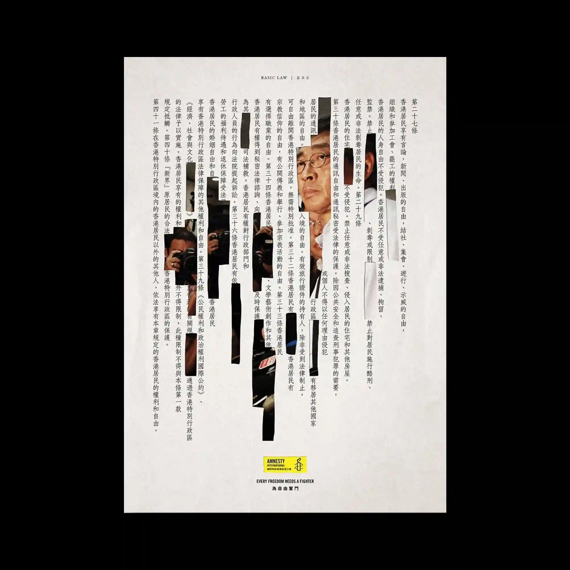
Dense columns of text form the primary structure, interrupted by vertical cut-out strips revealing photographic fragments. The contrast between continuous text and fragmented imagery creates tension within the composition. Narrow gaps act as visual channels guiding the eye downward. A small highlighted logo at the bottom anchors the otherwise complex visual field.

A grid of vertical lines creates a structured framework resembling a timeline or schedule. Text elements are rotated and aligned along these lines, reinforcing the linear rhythm. The top edge forms a peaked contour, subtly breaking the rigidity of the grid. The limited color palette of muted pink and green maintains clarity while emphasizing the system-based layout.

A wide horizontal composition emphasizes typographic layering across an open space. Large condensed type overlaps with smaller annotations, creating a dense informational field near the bottom. A pair of illustrated eyes introduces a focal point, contrasting with the otherwise typographic emphasis. The use of minimal color accents highlights key data without disrupting the monochrome balance.

Two contrasting panels are placed side by side, combining monochrome illustration with a blue informational block. The left panel uses dense line textures to form organic shapes, creating a tactile visual weight. The right panel organizes text in a list format with clear alignment and spacing. The juxtaposition of expressive imagery and structured typography highlights the dual nature of the composition.

A triptych of red-toned illustrations sits at the top, each framed as individual panels with intricate line work. The middle section introduces decorative typography with varying weights, creating contrast between ornamental and functional text. Circular elements scattered across the composition act as visual anchors, punctuating the layout rhythm. The lower area shifts into a more abstract arrangement, combining organic shapes and gradients against a soft background.

A centered layout presents a typographic header above a pixelated illustration composed of small colored dots. The imagery forms recognizable objects through low-resolution dithering, giving a handcrafted digital aesthetic. Bright primary colors are distributed evenly, creating a playful yet structured visual rhythm. Supporting information is aligned with strict margins, reinforcing a clear informational hierarchy.

A layered composition of multiple paper-like elements is arranged with slight offsets, creating a tactile collage structure. A large vertical typographic element runs centrally across translucent sheets, partially obscuring and revealing underlying content. Metal binding details and a clipped photograph introduce physicality, contrasting with the flat graphic surfaces. The use of pale blue panels and neutral tones establishes a calm hierarchy while emphasizing material layering and depth.
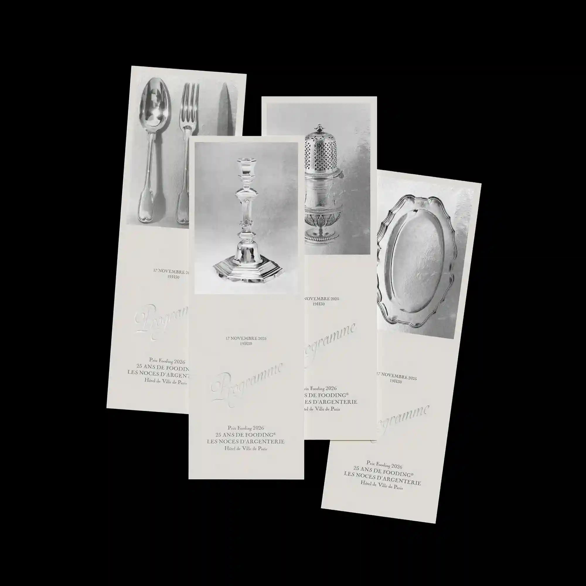
A series of monochrome photographs is arranged in overlapping vertical cards, creating a layered editorial composition. Each card features a central object with strong lighting, emphasizing texture and form. Subtle embossed typography appears beneath the images, blending into the surface with low contrast. The staggered alignment introduces depth while maintaining a restrained and refined aesthetic.

Playful line drawings and simple shapes are distributed across the layout in a loose composition. Thick outlines and pastel color fills create a childlike visual language. Circular and rectangular frames act as containers for smaller illustrations and icons. Text elements are integrated casually, supporting the informal and illustrative tone.

Organic green shapes resembling vines frame the composition symmetrically along both sides. A grid of small rectangular images is placed centrally, connected by branching line structures. Decorative serif typography at the top integrates with the organic forms, blending ornamental and structural elements. The overall layout combines botanical motifs with a modular system.

A vertical typographic axis runs along the right side, anchoring the composition with strong linear emphasis. A blurred photographic texture fills the background area, contrasting with sharp geometric shapes layered on top. Cut-out elements and rotated text blocks introduce dynamic imbalance within a controlled grid. The interplay between sharp edges and soft blur creates visual tension.

A collage of layered photographs is clipped together, creating depth through overlapping rectangular frames. The central portrait is framed by translucent overlays and paper textures, evoking a tactile composition. Decorative cursive typography arches across the top, contrasting with the structured image stack below. Small captions and labels are distributed around the edges, reinforcing the editorial layout.

A sculptural typographic system forms a circular arrangement, with each character rendered in a soft, inflated three-dimensional style. Repetitive curved line motifs radiate around each glyph, suggesting motion and vibration. The central area contains compact informational text, contrasting with the bold outer forms. The composition emphasizes symmetry and rotation, creating a cohesive radial structure.

The composition combines playful illustration with scattered typographic elements arranged without a strict grid. Hand-drawn figures and abstract shapes are layered with pixelated textures, creating a hybrid analog-digital aesthetic. Thin lines connect elements across the canvas, forming a loose network that guides visual flow. Color accents are applied selectively, emphasizing key areas while maintaining overall lightness.

A smooth gradient field transitions from blue to pink, creating a soft atmospheric background. Large italic serif typography is centered and spaced generously, allowing the letterforms to float within the gradient. A radial burst graphic emerges from the lower center, reinforcing the focal point with directional lines. Supporting text is condensed into a horizontal strip, maintaining clarity without disrupting the main composition.

A central typographic block dominates the composition, combining serif letterforms with irregular spacing and alignment. Thin blue frames divide the layout into sections, guiding the eye across multiple textual clusters and graphical marks. Hand-drawn line elements intersect the grid, introducing organic disruption against the structured layout. The contrast between dense central text and peripheral annotations creates a layered reading hierarchy.

The layout is constructed through layered rectangular bands that create a stepped visual rhythm across the surface. Serif typography in varying scales is distributed asymmetrically, with large words fragmented and spaced to emphasize hierarchy and movement. Subtle vertical line textures fill the rectangular fields, adding depth while maintaining a restrained monochromatic palette. The composition balances informational density and whitespace through controlled alignment and staggered blocks.

Soft, pixel-like shapes in pastel tones form an organic central figure with rounded edges. Above, small image blocks and text elements are aligned horizontally, introducing a contrasting rigid structure. The halftone-like rendering of the main form adds texture and visual softness. The composition juxtaposes playful organic imagery with structured typographic information.

A dense grid of black-and-white typographic modules fills one side, while colorful geometric patterns occupy the other. The contrast between monochrome repetition and vibrant gradients creates a strong visual division. Smaller text blocks are embedded within the grid, maintaining informational clarity. The composition balances order and visual intensity.

Large serif letterforms are fragmented and positioned around the perimeter, partially cropped by the frame. Straight line segments connect the typographic elements, forming an implied geometric structure. The empty central space contrasts with the distributed letter fragments. The composition combines typographic deconstruction with linear connection.

Thin outlined typography appears loosely scattered across the surface, with irregular stroke textures suggesting hand-drawn movement. The composition is largely open, with text elements distributed asymmetrically around the edges. Small blocks of information are aligned centrally, anchoring the otherwise dispersed layout. The design emphasizes lightness and spatial distribution.
A textured background with grain and noise is overlaid with bold central typography. Elliptical line forms repeat vertically, creating a rhythmic overlay that intersects the text. The color palette combines muted tones with subtle contrasts, enhancing depth without overwhelming the composition. The structure blends expressive texture with geometric repetition.

Character-based shapes constructed from repeated symbols form a larger figurative composition. The blue typographic units vary in density and orientation to create shading and depth. Bright accent text in a contrasting color is layered above, introducing hierarchy and focal points. The composition merges image-making and typography into a unified system.

A single diagonal line connects two halftone-rendered masses positioned at opposite corners, creating a strong directional axis. The forms are rendered in blue dot patterns, emphasizing texture and weight through density variation. Minimal typography is placed around the composition, leaving large areas of empty space. The layout relies on tension between two points and the line that connects them.
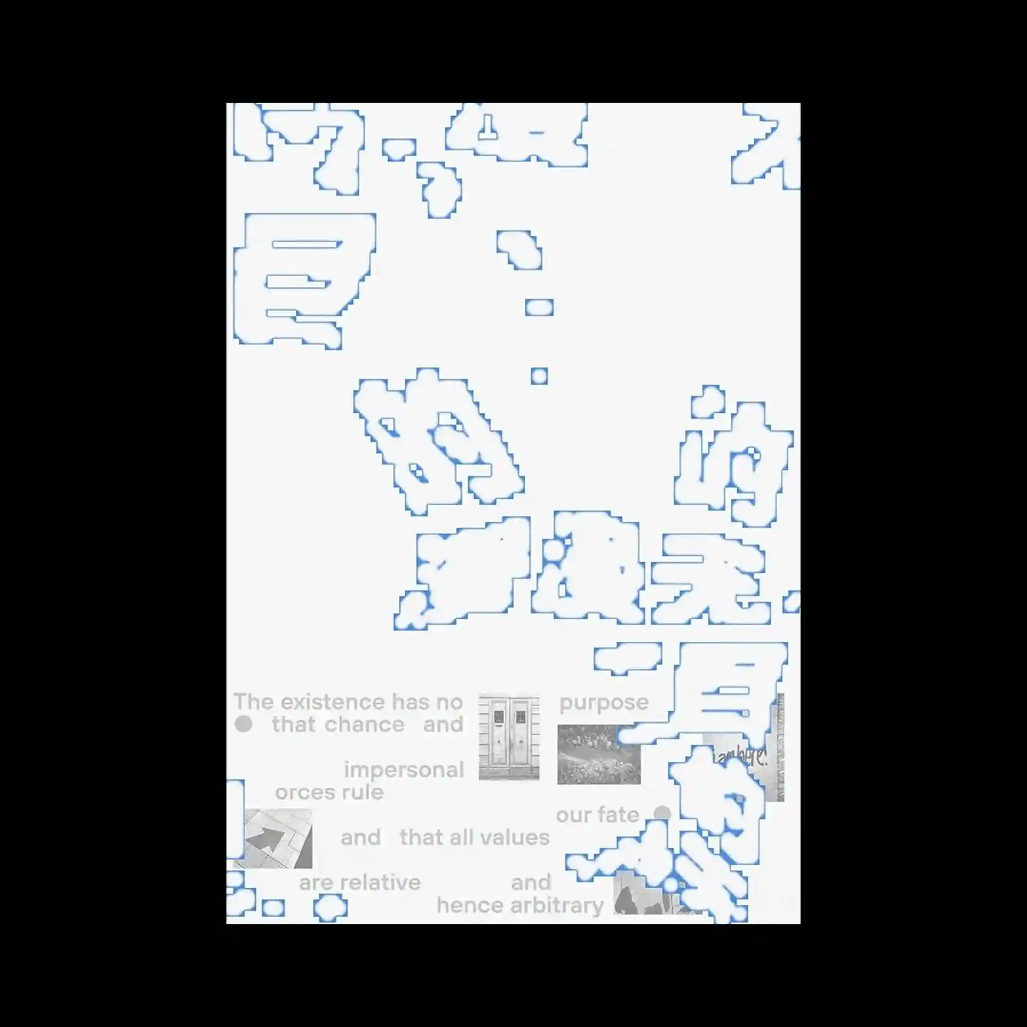
Pixelated typographic fragments appear dispersed across the surface, rendered in low-resolution block forms with blue outlines. The fragmented shapes create a sense of digital erosion or incomplete rendering. Beneath these elements, faint grayscale imagery and text are partially visible, adding a secondary layer. The composition explores degradation and layering within a digital aesthetic.
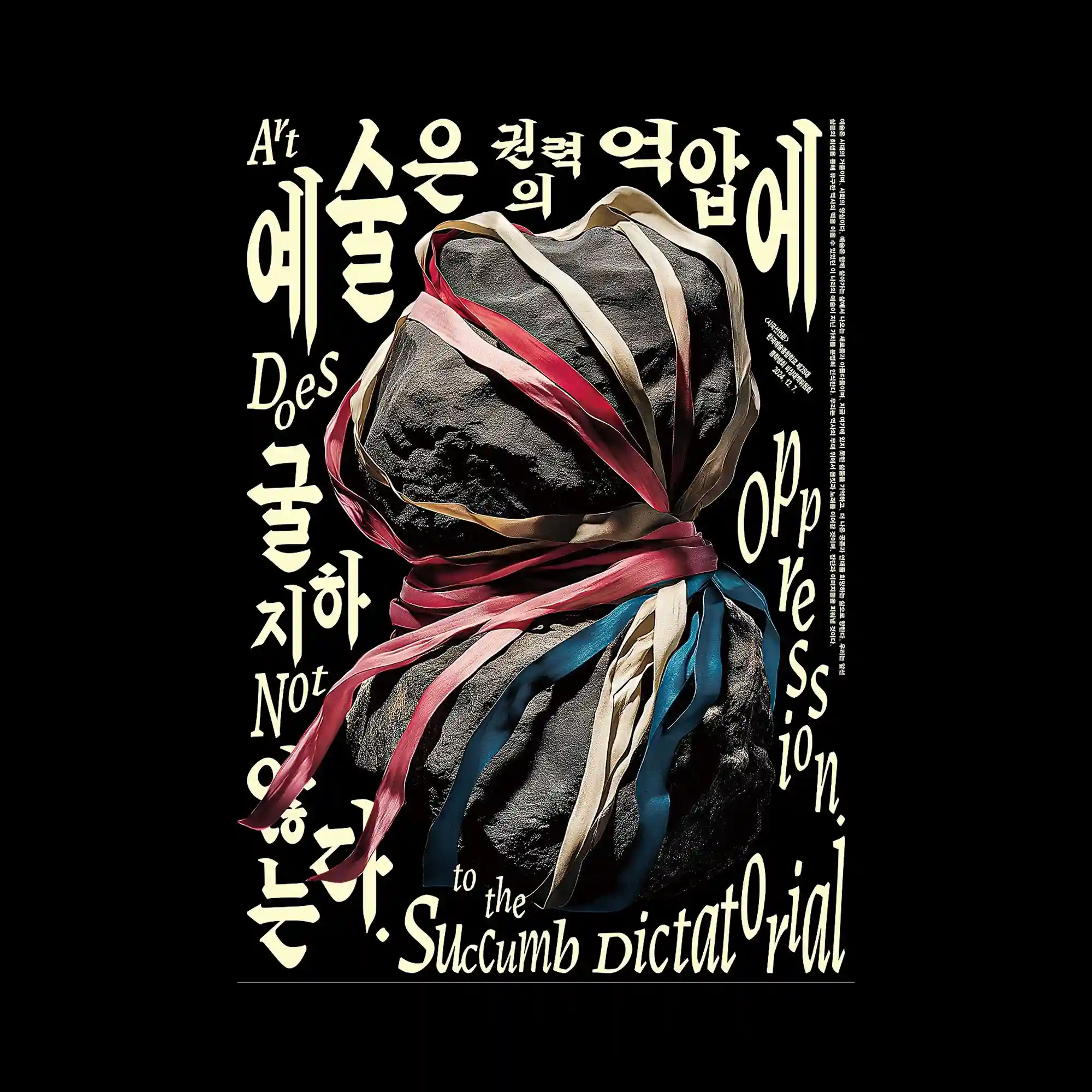
A central volumetric object with rough texture is tightly wrapped by ribbon-like elements that twist around its form. The ribbons introduce contrasting colors and directional flow, guiding the eye around the composition. Surrounding typography in varying sizes creates a dynamic perimeter, framing the central object. The composition balances sculptural mass with typographic movement.
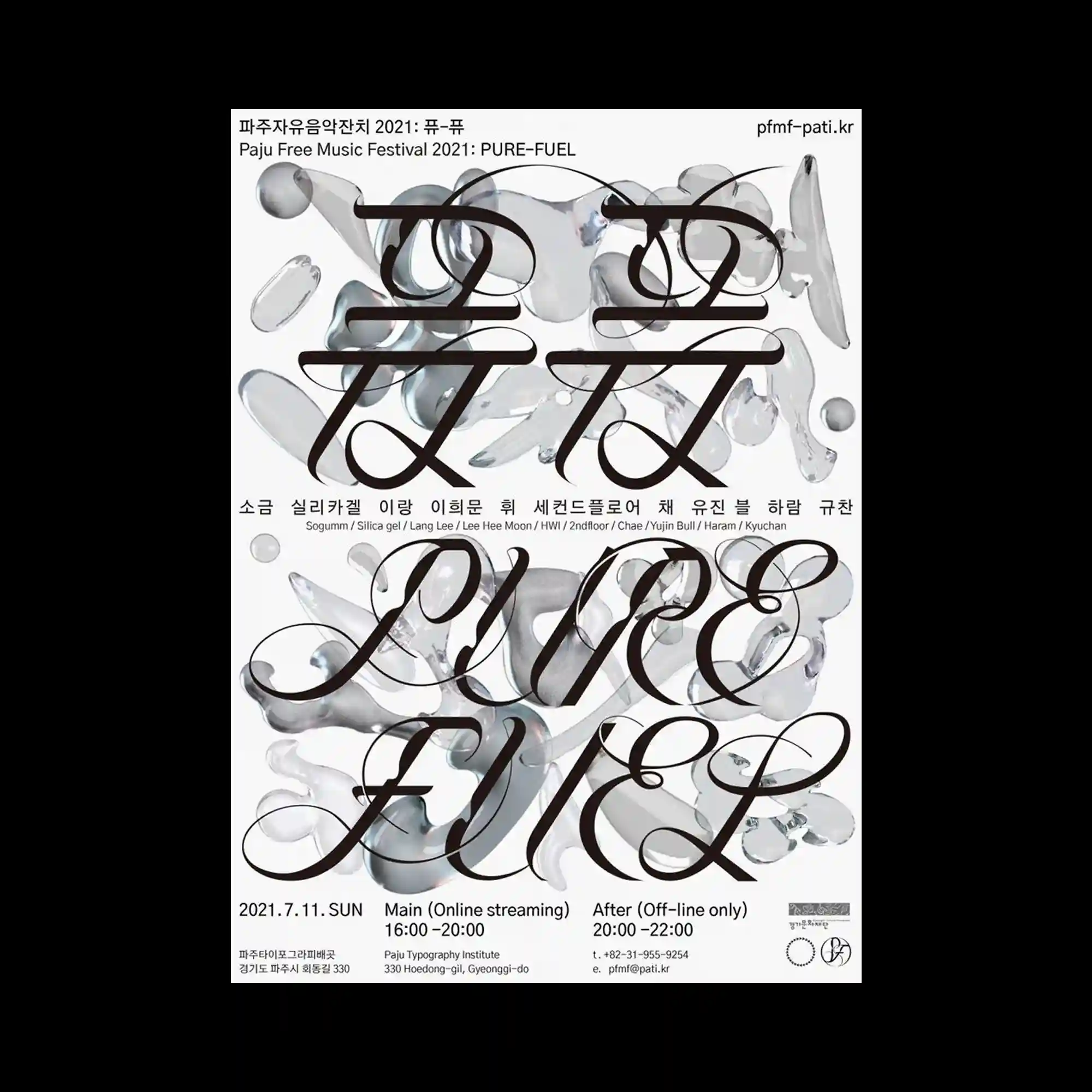
Large flowing serif typography spans across the composition with exaggerated curves and extended strokes, forming a dominant visual layer. Behind the text, semi-transparent amorphous shapes resembling liquid glass are scattered, creating depth through overlap and refraction-like distortion. The contrast between sharp typographic edges and soft organic forms enhances spatial layering. The layout integrates expressive typography with translucent volumetric elements, resulting in a dense yet balanced composition.

A large italic serif word is expanded across the composition, with its letterforms stretched and flowing diagonally through the layout. Horizontal bands cut across the surface at regular intervals, slicing the typography into segmented layers while maintaining overall continuity. The soft gradient within the bands transitions between light blue and neutral tones, adding depth behind the dark letterforms. The composition creates a rhythm between interruption and continuity through the interaction of slicing and fluid typography.

Large serif typography fills the background, while outlined graphic forms overlay the surface with a translucent effect. The layered lines create a sense of depth and visual interference. The contrast between solid text and outlined shapes produces a dual reading of foreground and background. The composition emphasizes overlap and contour complexity.

A repeating lattice structure forms the base grid, within which soft gradient shapes are embedded. The metallic-looking framework contrasts with the smooth, glowing interior forms. Typography is placed in open spaces between structural elements, maintaining clarity without disrupting the pattern. The composition explores repetition and variation within a controlled system.

Layered typographic elements are placed over a blurred photographic background, creating depth through foreground and background separation. Red text blocks contrast sharply against the soft green gradient, establishing a strong focal point. The hierarchy is built through scale variation and overlapping text clusters. The composition combines environmental imagery with editorial typography.
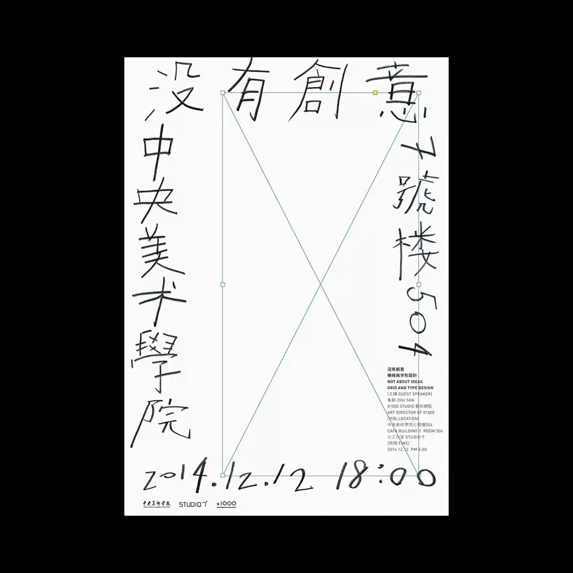
Handwritten-style typography surrounds a central rectangular frame, with lines crossing diagonally through its interior. The irregular strokes contrast with the rigid geometric frame, creating a tension between spontaneity and structure. Additional small typographic details are aligned to one side, maintaining balance within the asymmetrical layout. The composition merges informal mark-making with precise alignment.

A series of vertical forms expand progressively, accompanied by fine diagonal lines converging toward a single point. Numerical markers are distributed along the structure, suggesting measurement or sequential progression. The contrast between solid black shapes and thin linear elements establishes a clear directional flow. The layout reads as both a diagrammatic system and an abstract composition.

Soft, diffused white forms overlap a dark rectangular field, partially obscuring underlying typographic elements. The blurred edges and semi-transparent layering create a sense of depth and visual noise. Typography emerges intermittently through the haze, becoming part of the texture rather than a clearly readable element. The composition relies on opacity variation and layering to construct a dense, atmospheric surface.
A circular typographic system frames the composition, with text arranged along a large ring that encloses an empty central space. The typography follows the curvature precisely, creating a continuous flow that guides the viewer’s eye around the perimeter. The restrained color palette and thin stroke weight emphasize clarity and spatial balance. The central void acts as a visual pause, enhancing the rhythm between text and empty space.

The composition is dominated by bold black geometric blocks intersected by thin white curved lines that sweep across the layout. The contrast between solid shapes and rough, textured edges introduces a tactile printed quality. Minimal typographic elements are positioned along edges and corners, reinforcing an underlying grid system. The interaction between rigid rectangular forms and fluid curves creates a dynamic visual tension.
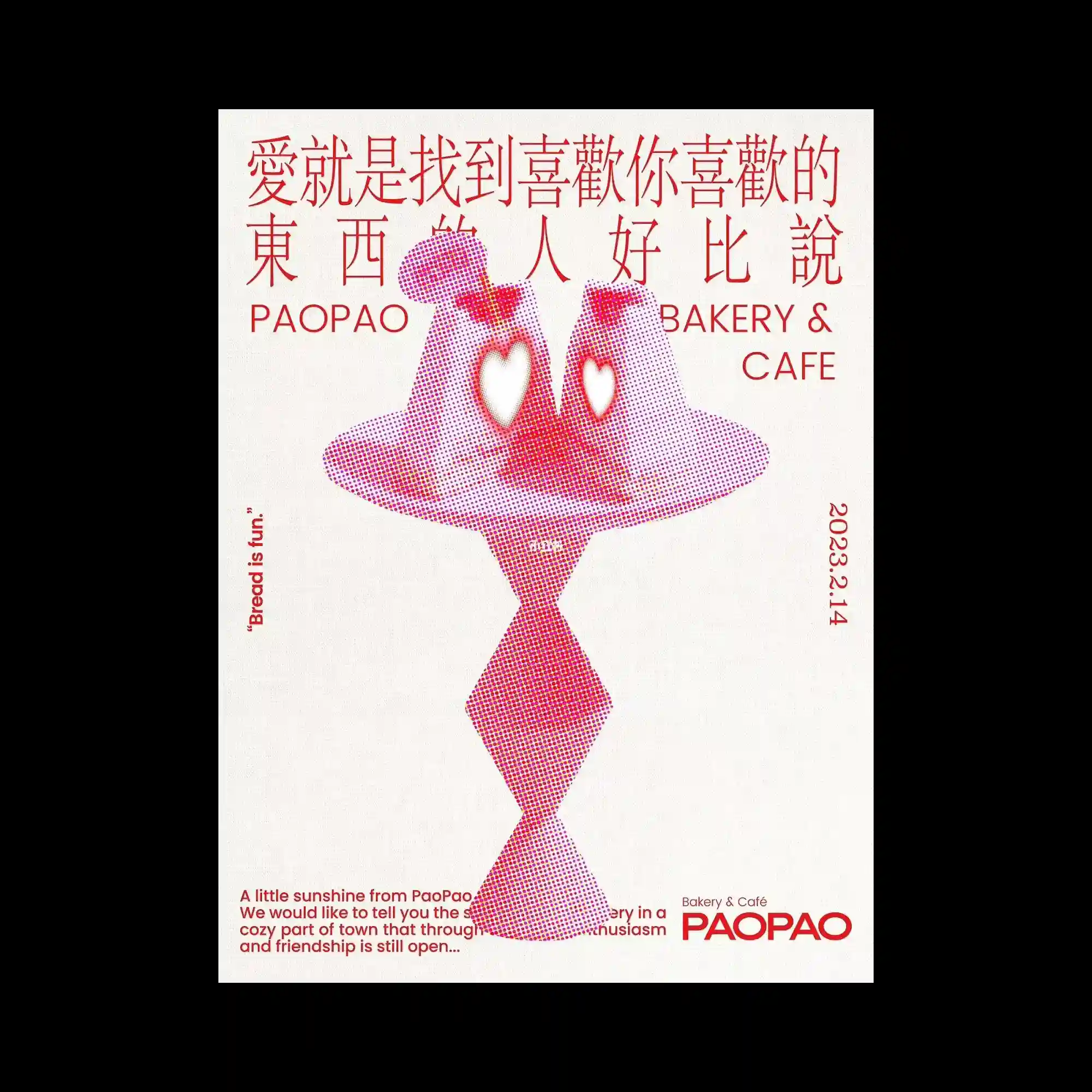
A halftone-rendered symmetrical figure occupies the center, constructed with dense red and magenta dot gradients that transition smoothly across the form. The shape resembles two mirrored organic silhouettes connected vertically, with heart-shaped negative spaces carved into the upper section. Surrounding this central composition, typographic elements in red are arranged in a loose grid, combining Chinese characters and Latin text with varying scales and alignments. The overall layout balances playful figurative abstraction with structured typographic placement, creating a layered visual hierarchy.

Large elongated typographic forms stretch vertically across the composition, functioning as both text and abstract shapes. The black forms are highly simplified, emphasizing rhythm through repetition and variation in thickness. A small figurative element is placed at the top, contrasting scale and introducing a focal point. The composition relies on strong vertical flow and minimal detail to create a bold visual statement.

Two horizontally stacked compositions use blurred typography inside oval shapes, creating a soft-focus visual effect. Surrounding text is arranged along curved paths, following the contours of the oval forms. The contrast between sharp peripheral text and blurred central text establishes depth and hierarchy. The layout explores distortion and legibility through controlled blur and curvature.

Vertical green lines of varying thickness extend across the composition, acting as both background pattern and structural grid. Bold black typography overlaps these lines, partially intersecting and breaking their continuity. The minimal color palette enhances contrast and focuses attention on alignment and spacing. The composition emphasizes repetition and interference between linear elements and text.
A modular layout organizes typographic elements into distinct blocks with varying sizes and colors, forming a balanced yet dynamic composition. Bold uppercase text anchors the design, while smaller handwritten elements introduce contrast and irregularity. The use of colored frames and dividing lines emphasizes segmentation and alignment. The composition integrates both structured and informal typographic styles within a unified grid.

A dense typographic field fills the upper portion with repeated lines of small text arranged in horizontal rows, creating a textured block. Below, large expressive script typography dominates, overlapping with smaller text and graphic elements. The composition uses scale contrast to shift focus from dense information to bold visual expression. The division between upper and lower sections establishes a clear structural hierarchy.

A structured layout combines a tabular grid with expressive cursive typography, creating a layered information system. Fine lines and labeled sections divide the space into functional zones, while large flowing script overlays these divisions. The contrast between precise linear organization and fluid typographic movement introduces visual tension. The composition balances systematic structure with decorative expression through overlapping layers.

A grid-based composition incorporates fragmented letterforms scattered across vertical divisions, with thin red guide lines reinforcing structural segmentation. The central area features a block of blue-toned typographic forms, partially obscured and layered to create depth. Surrounding text is aligned vertically along the edges, emphasizing directional contrast and hierarchy. The composition uses fragmentation and overlay to disrupt conventional typographic legibility while maintaining an underlying grid system.

Multiple vertical strips divide the composition into narrow columns, each containing dense text and elongated calligraphic strokes that extend across boundaries. The flowing script overlaps rigid column structures, creating tension between organic curves and strict alignment. The repetition of narrow modules introduces rhythm, while slight variations in spacing disrupt uniformity. The composition highlights the contrast between expressive gesture and controlled typographic organization.