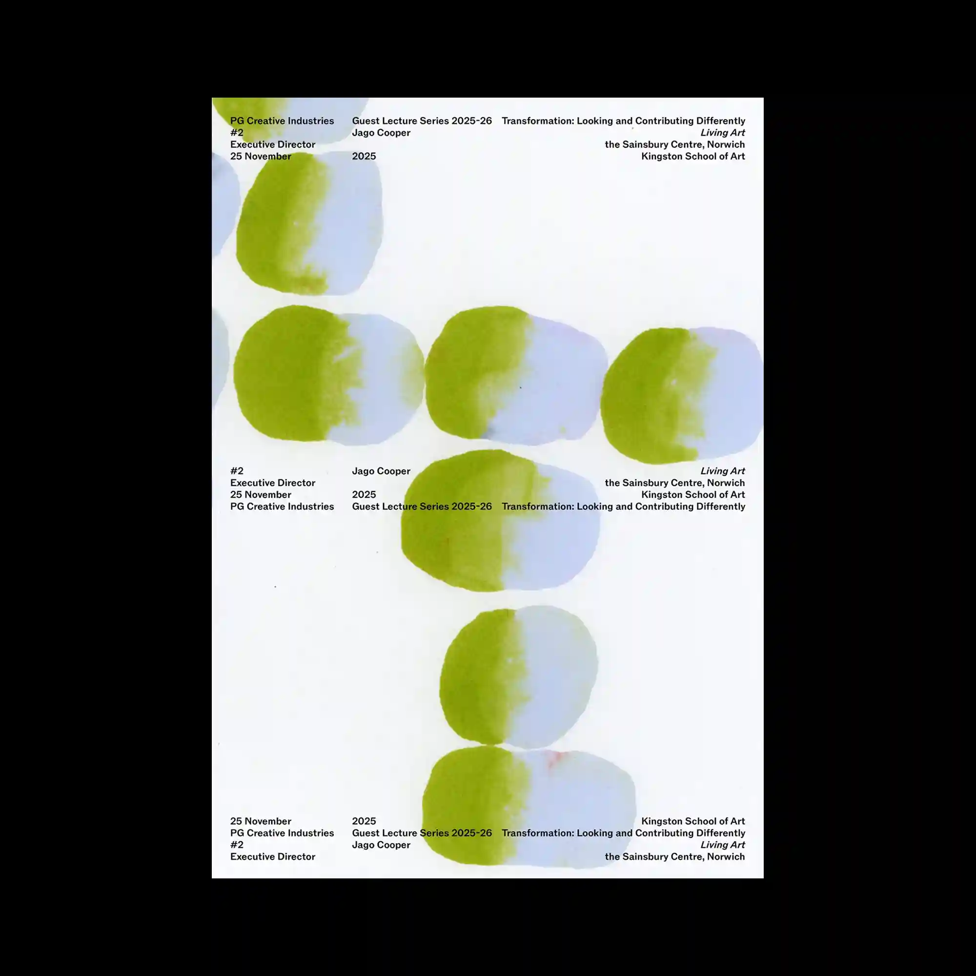
Soft watercolor-like oval forms are arranged vertically with consistent spacing, establishing a calm visual rhythm through repetition. Each shape blends pale blue and green with feathered edges, introducing subtle tonal variation despite the limited palette. Small sans-serif text blocks are distributed around the composition rather than gathered in a single area, creating multiple points of balance. The restrained combination of organic forms and minimal typography produces an understated and spacious layout.
수채화처럼 번지는 타원형 형태가 일정한 간격으로 반복되며 차분한 리듬을 형성하는 구성임. 각각의 형태는 연한 파란색과 초록색이 부드럽게 섞여 제한된 색상 안에서도 미묘한 변화를 만듦. 작은 산세리프 정보는 한곳에 모이지 않고 화면 곳곳에 분산되어 균형을 형성함. 유기적인 형태와 절제된 타이포그래피의 조합이 넓고 여유로운 분위기를 완성함.
柔和的椭圆水彩形状以均匀间距纵向排列,通过重复形成平静的视觉节奏。每个图形都融合了浅蓝与绿色,并以柔和边缘呈现细腻的色彩变化。小型无衬线文字分散布置于画面各处,而非集中排列,使整体保持平衡。自然形态与极简文字相结合,营造出宽松而克制的版面氛围。