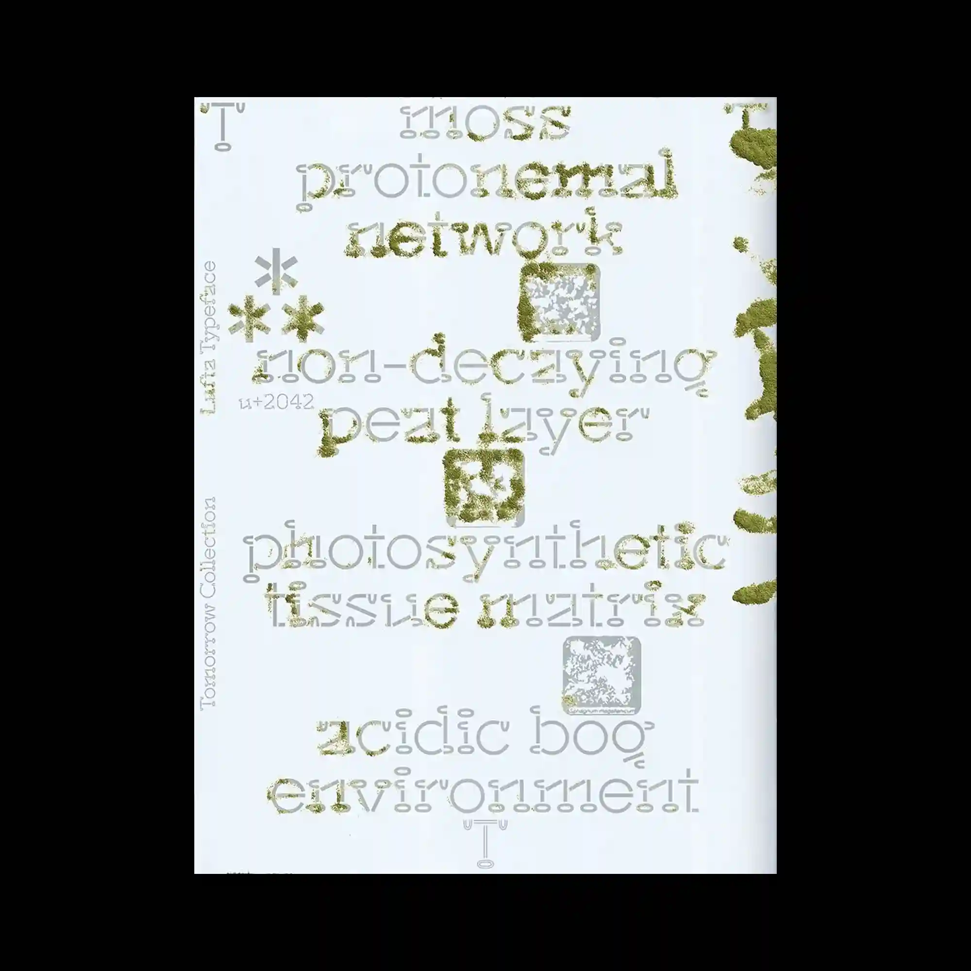
Experimental typography combines multiple letter structures and textured surfaces, making the text itself the primary visual material. Moss-like granular textures partially fill selected characters, contrasting with clean outlined glyphs and pale gray letterforms beneath. Small geometric icons and textured square motifs punctuate the composition, adding rhythm between the typographic clusters. The layered treatment produces shifting legibility while emphasizing materiality over straightforward reading.
다양한 형태의 글자 구조와 질감 표현이 결합되어 타이포그래피 자체가 주요 그래픽 요소로 기능하는 구성임. 일부 글자는 이끼 같은 입자 질감으로 채워지고, 윤곽선 글자와 옅은 회색 글자가 겹쳐져 강한 대비를 만듦. 작은 기하학 기호와 질감이 있는 사각형 요소가 글자 사이의 리듬을 형성함. 여러 층의 문자 표현이 가독성을 유동적으로 만들면서도 물성 중심의 인상을 강조함.
实验性的字体结合了多种字形结构与丰富纹理,使文字本身成为主要视觉材料。部分字符覆盖着类似苔藓的颗粒质感,与描边文字及浅灰字形形成鲜明对比。细小的几何符号和带纹理的方形元素点缀其中,为文字群组之间增添节奏。多层叠加的文字处理弱化了直接阅读性,更强调字体的材质表现。