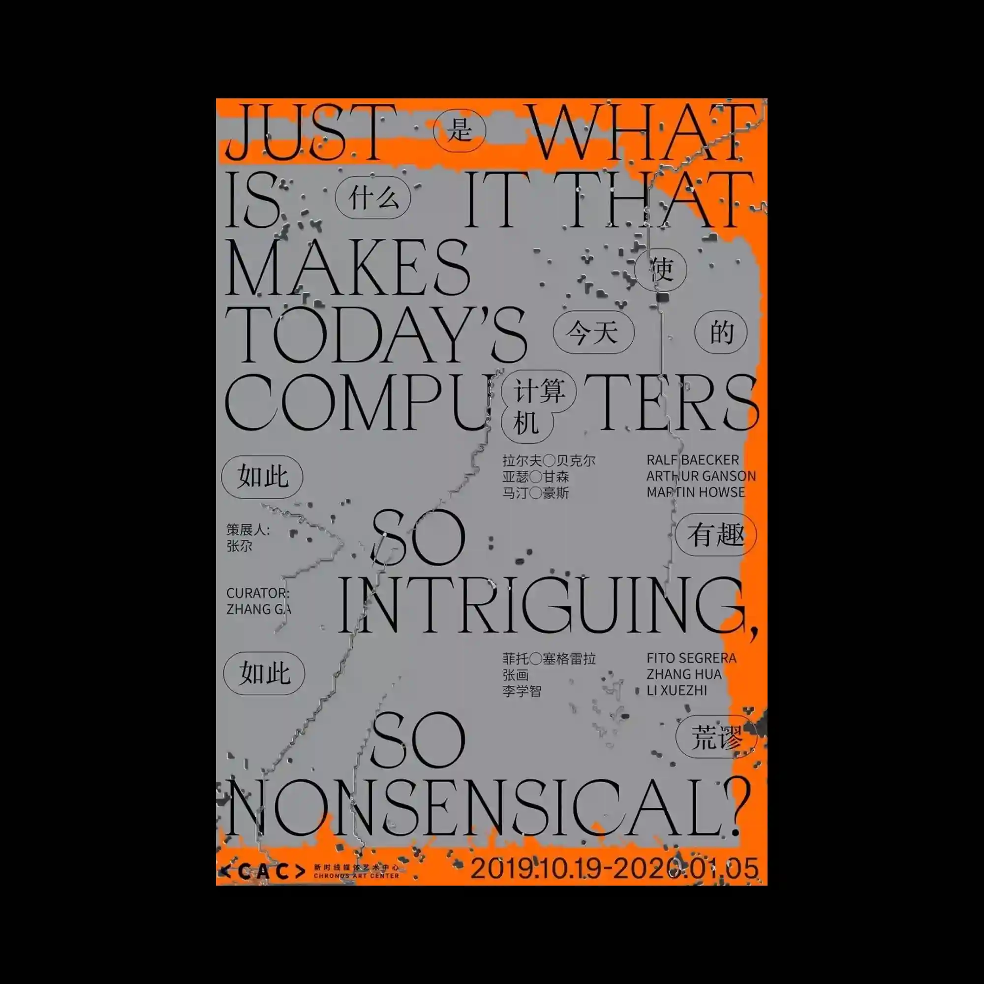
Large serif typography dominates the layout, extending across the page with overlapping English and Chinese elements that merge into a unified composition. A neutral gray surface is interrupted by vivid orange framing along the edges, while scattered textured marks introduce an intentionally weathered appearance. Circular callout shapes punctuate the composition, creating secondary focal points among the oversized letterforms. The contrast between elegant typography and distressed textures produces a balance of refinement and disruption.
커다란 세리프 타이포그래피가 화면 전체를 가로지르며 영문과 중문이 하나의 구성으로 겹쳐 배치됨. 중성적인 회색 바탕은 가장자리의 선명한 오렌지 영역과 대비를 이루고, 표면 곳곳의 거친 질감이 의도적인 마모 효과를 더함. 원형 말풍선 형태의 요소가 대형 글자 사이에 배치되어 보조적인 시선을 형성함. 우아한 서체와 거친 텍스처의 대비가 정제됨과 불완전함을 동시에 표현함.
大型衬线字体横跨整个版面,英文与中文相互叠加,形成统一的视觉构图。中性的灰色背景与边缘鲜艳的橙色区域形成强烈对比,表面的斑驳纹理营造出刻意做旧的效果。圆形标注元素穿插在巨大的文字之间,形成次级视觉焦点。优雅的字体与粗糙的纹理相互对照,使画面兼具精致感与破坏感。