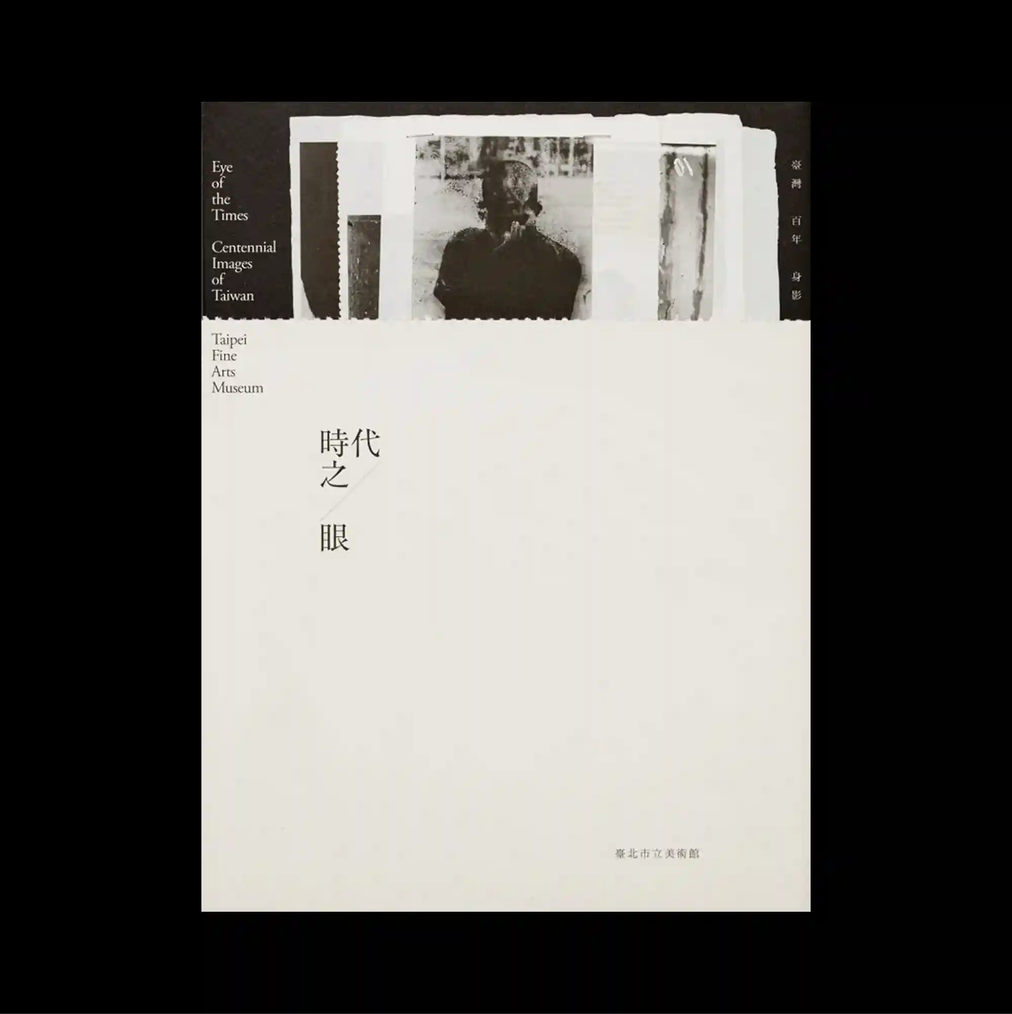
The poster separates a compact image band from a larger lower field, creating a two-part structure with a pronounced shift in density between the sections. Restrained serif typography is used at a relatively small scale, allowing generous spacing and subtle alignment shifts to define the hierarchy. A rough monochrome photo strip is partially exposed along the top edge, while a short vertical title sits almost alone within a large cream-colored field. Generous empty space and restrained detail create a quiet composition in which small shifts of placement become visually significant.
작은 이미지 띠와 더 넓은 하단 영역을 분리해 두 부분의 밀도가 뚜렷하게 달라지는 이중 구조를 형성함. 절제된 세리프 타이포그래피를 비교적 작은 크기로 사용하며 넉넉한 간격과 미세한 정렬 변화로 위계를 구분함. 거친 흑백 사진 띠가 상단 가장자리에서 일부 드러나고 짧은 세로 제목이 넓은 크림색 영역 안에 거의 홀로 배치됨. 넓은 여백과 절제된 디테일 덕분에 작은 위치 변화까지 중요하게 느껴지는 조용한 구성이 형성됨.
海报将紧凑的图像带与更大的下方区域分开,形成上下两部分密度明显不同的结构。 克制的衬线字体以较小尺度出现,通过宽松间距与细微对齐变化建立层级。 粗粝的黑白照片条在顶部边缘局部显露,简短竖排标题几乎独自置于大面积米色区域中。 大量留白与克制细节营造安静构图,使细微的位置变化也具有明显视觉意义。