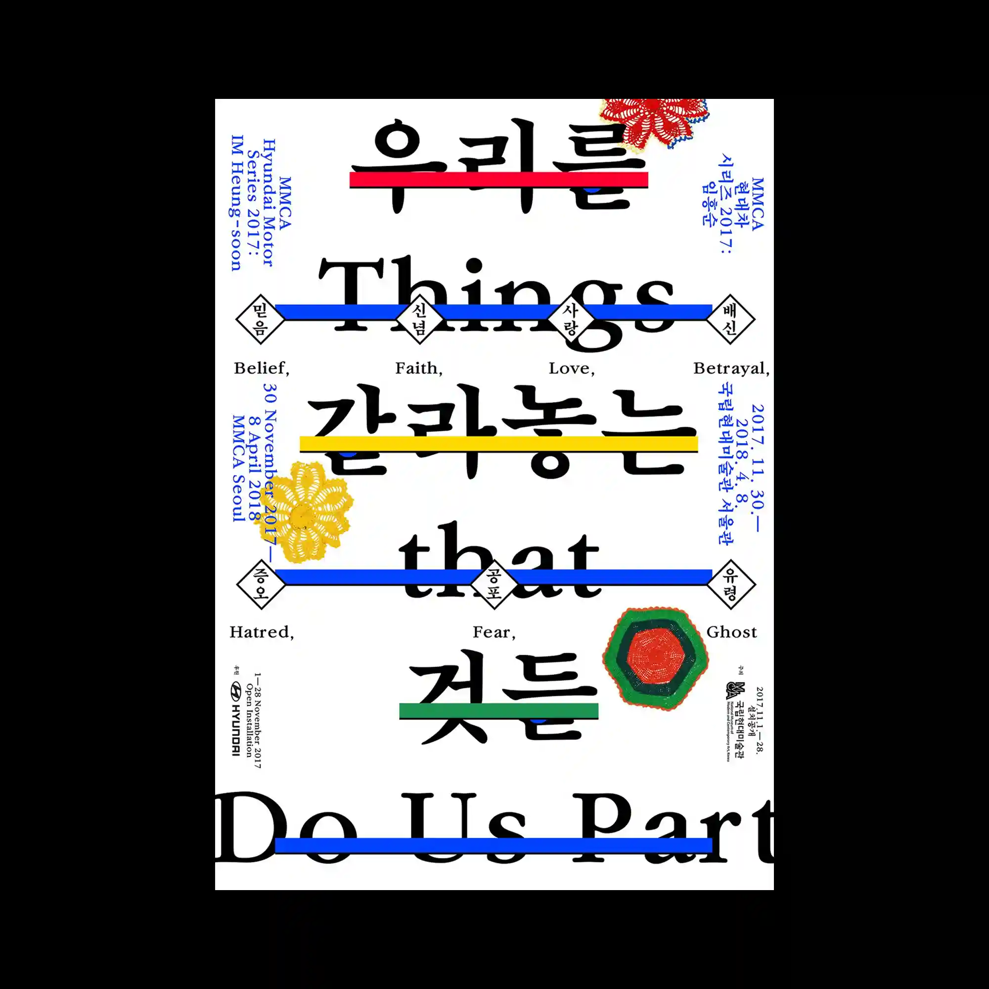
Large bilingual typography fills the composition while colorful horizontal bars slice through selected words to create visual interruption. Fine secondary text is positioned symmetrically around the central structure, balancing the oversized letterforms. Decorative floral graphics introduce organic accents that contrast with the rigid typographic framework. The layered hierarchy combines editorial precision with playful visual emphasis.
대형 이중 언어 타이포그래피를 중심으로 여러 색상의 가로 막대가 단어를 가로지르며 리듬감을 만드는 구성이 특징임. 작은 정보 텍스트는 좌우 균형을 이루며 중심 구조를 안정적으로 보완함. 장식적인 꽃 형태 그래픽이 단단한 문자 구조와 대비를 이루며 유기적인 분위기를 더함. 명확한 정보 계층과 장식 요소가 조화를 이루는 에디토리얼 디자인임.
大型双语文字占据主体,不同颜色的横向色条穿过部分文字,形成富有节奏的视觉切割。细小的信息文字围绕中心对称排布,使整体更加稳定。装饰性的花卉图形与严谨的文字结构形成柔和对比。清晰的信息层级与装饰元素共同构建出富有编辑感的版式。