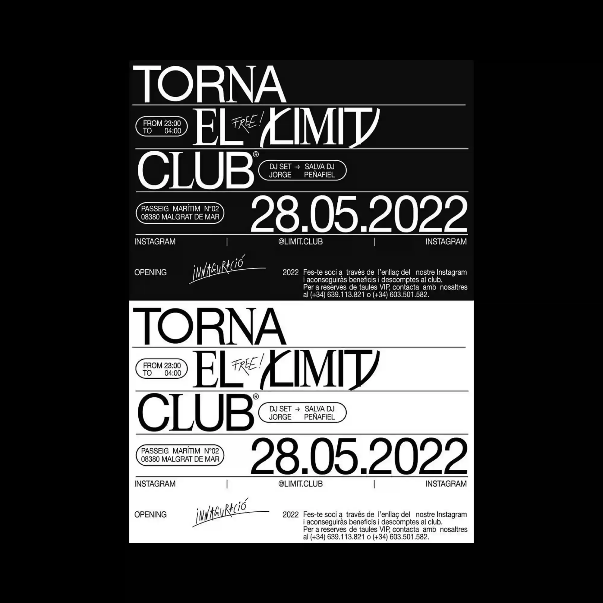
The design is divided into two mirrored sections that invert black and white while preserving the same typographic structure. Rounded labels, thin dividing lines, and contrasting serif and sans-serif typefaces organize the information with precision. The duplicated layout emphasizes symmetry while highlighting the effect of reversed color relationships. Consistent spacing and alignment reinforce the graphic clarity.
동일한 타이포 구조를 유지한 채 흑백이 반전된 두 개의 영역으로 화면을 구성함. 둥근 라벨과 얇은 구분선, 세리프와 산세리프 서체의 대비가 정보를 정교하게 정리함. 반복된 레이아웃은 좌우의 대칭성을 강조하면서 색상 반전의 효과를 더욱 부각함. 일정한 간격과 정렬이 그래픽의 명료함을 강화함.
画面被分为上下两个镜像区域,以黑白反转的方式呈现相同的排版结构。圆角标签、细分隔线以及衬线与无衬线字体的搭配,使信息组织得十分精确。重复的版式强化了对称关系,也更加突出黑白反转带来的视觉效果。统一的间距与对齐进一步提升了整体的清晰度。