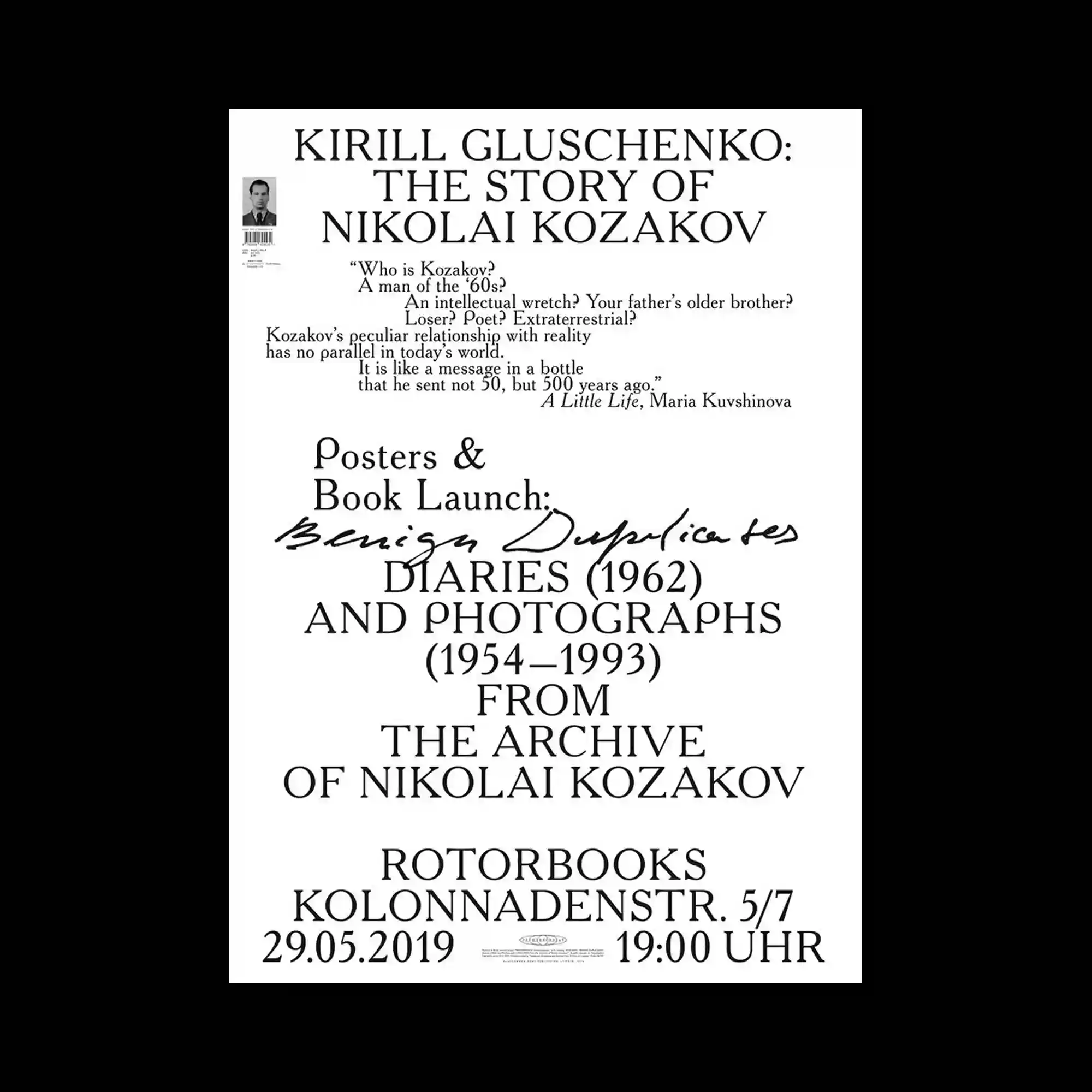
A centered typographic composition relies on classic serif lettering arranged in multiple clearly defined sections. Variations in scale and alignment establish a strong reading hierarchy, while a handwritten script placed across the middle interrupts the rigid structure with expressive contrast. Smaller informational text is positioned with generous spacing, allowing each block to remain visually distinct. The restrained monochrome palette places complete emphasis on typography, proportion, and spatial organization.
중앙 정렬된 세리프 타이포그래피가 여러 개의 명확한 정보 구획으로 나뉘어 구성된 포스터임. 크기와 정렬 방식의 변화가 강한 위계를 만들고, 중앙을 가로지르는 손글씨 스타일의 필체가 정적인 구조에 대비를 더함. 작은 정보 블록들은 충분한 간격을 두고 배치되어 각각의 영역이 독립적으로 읽힘. 절제된 단색 구성이 타이포그래피와 비례, 공간 구성을 더욱 강조함.
整张海报采用居中的衬线字体排版,并划分为多个层次分明的信息区域。字号与对齐方式的变化建立了清晰的阅读层级,而横跨中央的手写体则为严谨的结构带来鲜明对比。较小的信息区块之间保持充足间距,使各部分能够独立阅读。克制的单色配色将视觉重点完全放在字体、比例与空间组织之上。