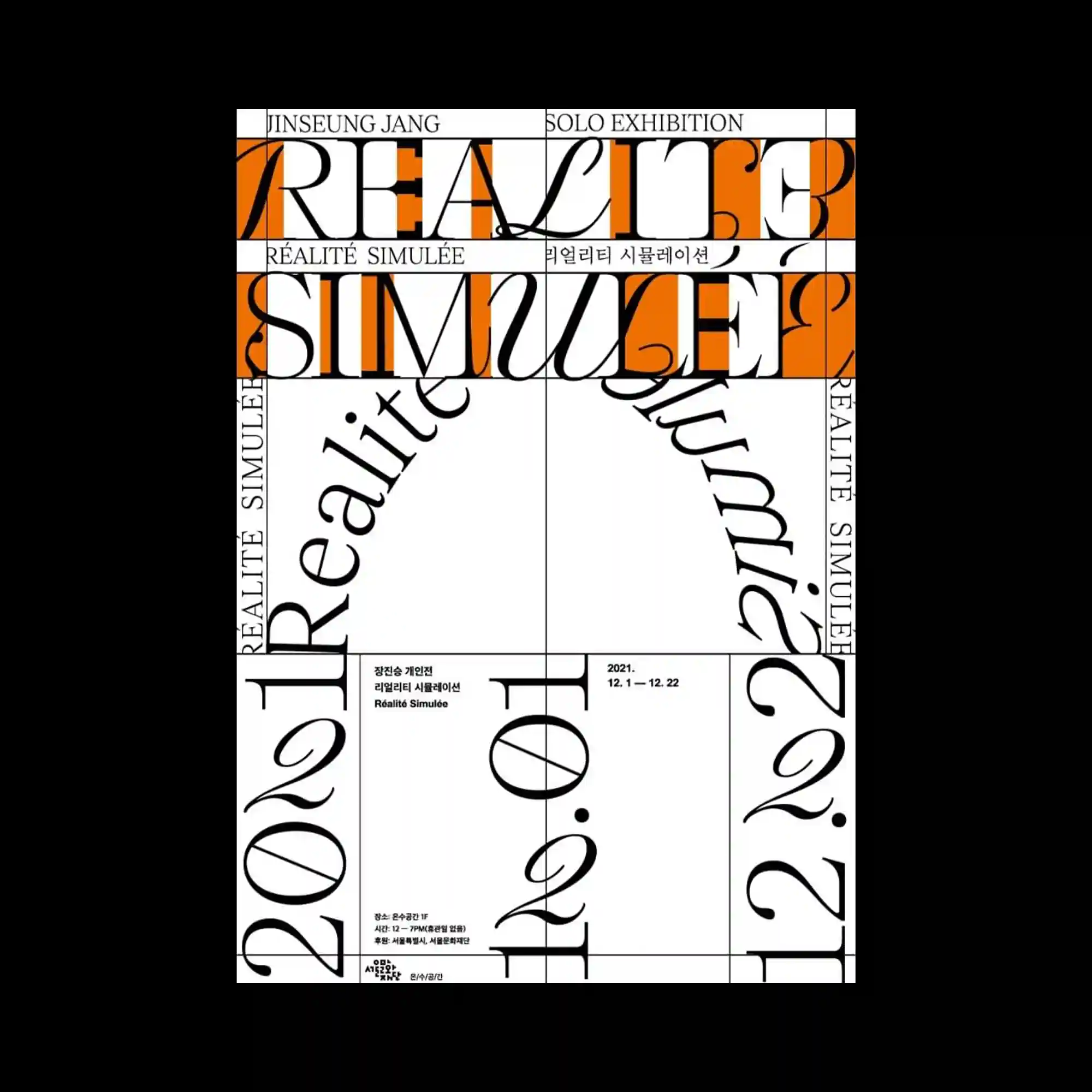
Decorative serif typography stretches across a strict grid, with elongated letterforms intersecting horizontal and vertical divisions. Bright orange rectangular bands introduce strong contrast while segmenting the composition into distinct reading zones. Rotated text follows curved paths, adding dynamic movement within the otherwise rigid framework. The combination of classical letterforms and modular geometry creates an energetic editorial rhythm.
장식적인 세리프 문자가 엄격한 그리드 위를 가로지르며 수평과 수직 구조를 연결함. 선명한 주황색 띠가 강한 대비를 만들고 화면을 여러 정보 영역으로 구분함. 회전된 텍스트는 곡선을 따라 배치되어 단단한 구조 안에 움직임을 더함. 고전적인 문자 형태와 모듈형 그리드가 역동적인 편집 리듬을 형성함.
装饰性衬线字体横跨严格网格,与水平和垂直结构相互交织。鲜艳的橙色矩形带形成强烈对比,同时划分出多个阅读区域。旋转文字沿弧线排列,为严谨结构加入流动感。经典字形与模块化几何共同营造出富有节奏的编辑风格。