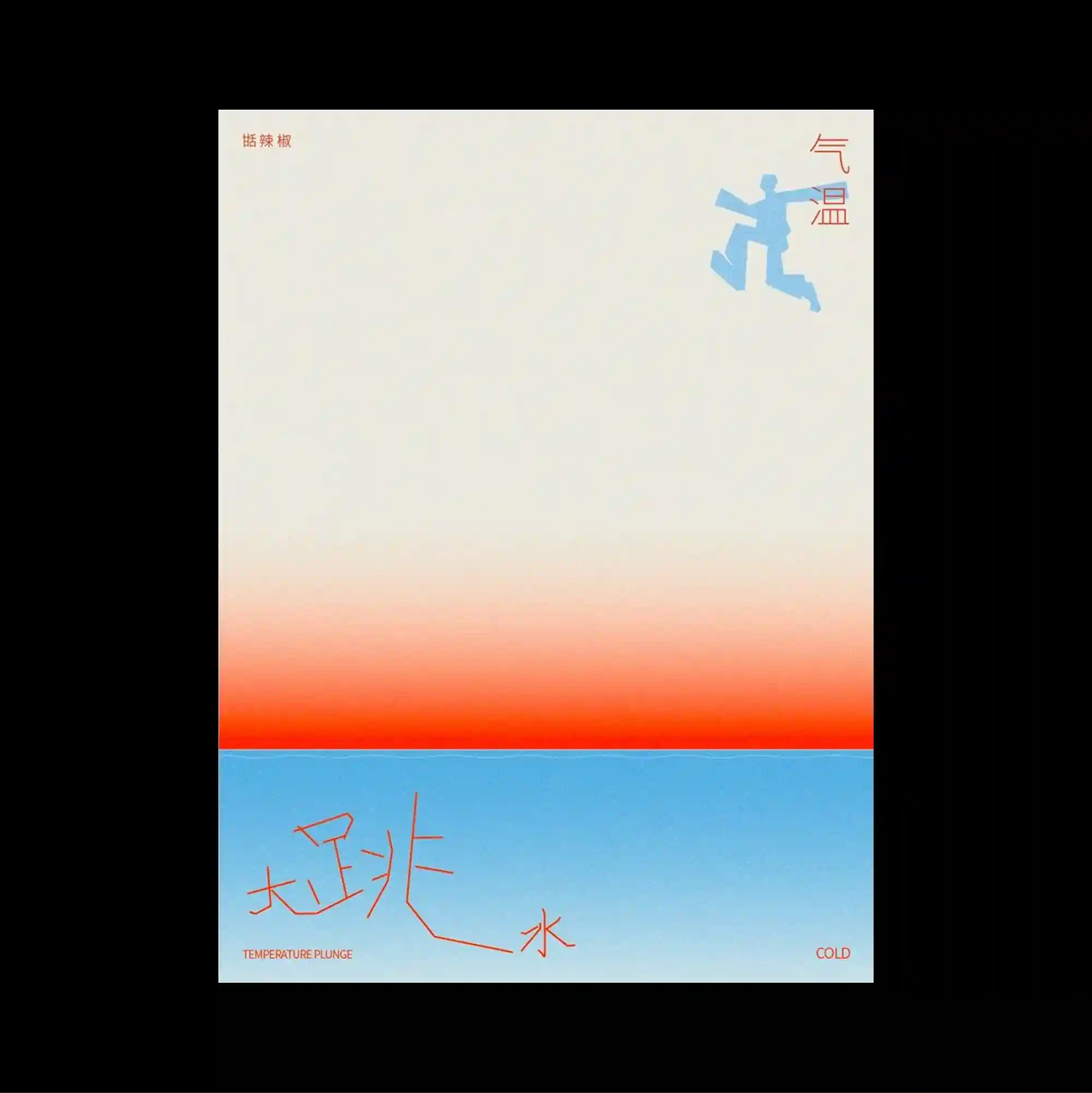
The design is divided into strongly contrasting color and image zones, using large rectangular fields to establish a clear structural hierarchy. Handwritten marks and informal annotations are layered over more systematic printed type, creating tension between spontaneous gestures and controlled typography. A pale upper field transitions through a warm orange band into a bright blue lower section, accented by a small cyan figure and loose red handwritten strokes. Soft tonal transitions and selective color accents create an atmospheric surface where texture and spacing carry as much weight as typography.
큰 직사각형 색면과 이미지 영역을 강하게 대비시켜 분할하고, 이를 통해 명확한 구조적 위계를 형성함. 손글씨 흔적과 비정형 주석을 체계적인 인쇄 타이포그래피 위에 겹쳐 즉흥적인 제스처와 통제된 문자 사이의 긴장을 만듦. 밝은 상단 영역이 따뜻한 오렌지 띠를 거쳐 선명한 파란색 하단으로 전환되고 작은 청록색 형태와 느슨한 붉은 손글씨 선이 포인트로 놓임. 부드러운 색조 전환과 선택적인 색상 포인트가 타이포그래피만큼 질감과 간격이 중요한 분위기 있는 표면을 형성함.
设计以强烈对比的色块与图像区域进行分割,并利用大面积矩形建立清晰的结构层级。 手写痕迹与随性注记叠加在系统化印刷字体之上,使即兴笔触与受控文字之间形成张力。 浅色上部经过温暖橙色横带过渡到明亮蓝色下部,并以小型青色形态与松散红色手写线条作为强调。 柔和色调过渡与选择性色彩强调营造富有氛围的表面,使质感与间距拥有与文字同等的视觉重量。