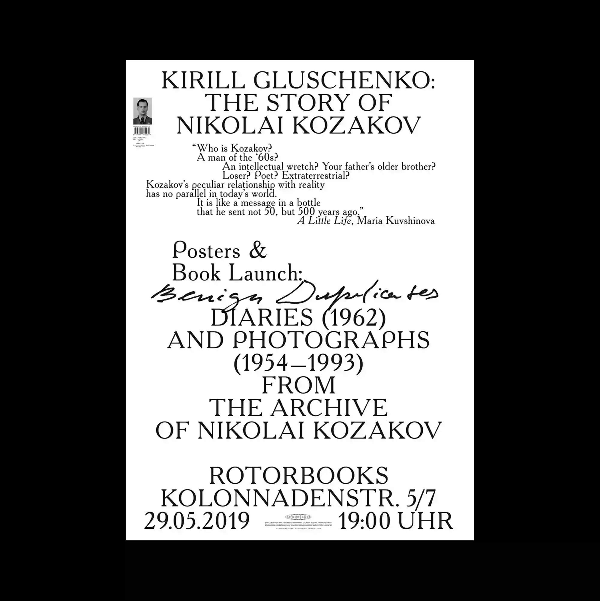
Typography occupies most of the page and functions as the primary image, with letterforms treated as large spatial masses rather than only carriers of information. Serif and sans-serif styles are mixed with thin rules and compact captions, producing a layered hierarchy through changes in weight, width, and alignment. Most of the surface is filled with carefully stacked serif headlines, smaller supporting lines, and one handwritten stroke, leaving almost no imagery beyond the typography itself. Large forms and compressed supporting information create a monumental hierarchy that feels assertive even within a tightly organized layout.
타이포그래피가 페이지 대부분을 차지하며 문자 형태가 단순한 정보 전달을 넘어 큰 공간 덩어리처럼 주된 이미지로 기능함. 세리프와 산세리프 서체를 얇은 선과 작은 캡션과 함께 혼합해 굵기, 폭, 정렬의 변화로 다층적인 위계를 형성함. 페이지 대부분을 세리프 제목, 작은 보조 문장, 하나의 손글씨 획이 촘촘히 채우며 타이포그래피 외의 이미지는 거의 사용하지 않음. 큰 형태와 압축된 보조 정보가 촘촘하게 정리된 레이아웃 안에서도 강하게 느껴지는 기념비적 위계를 형성함.
文字占据页面大部分区域并成为主要图像,字形被当作大型空间体量,而不仅是信息载体。 衬线体与无衬线体结合细线和小型说明文字,通过字重、宽度与对齐方式的变化建立多层级关系。 页面几乎完全由层层叠置的衬线标题、较小辅助文字与一道手写笔触构成,除文字本身外几乎没有图像。 大型形态与压缩的辅助信息在严密布局中建立具有强烈存在感的纪念碑式层级。