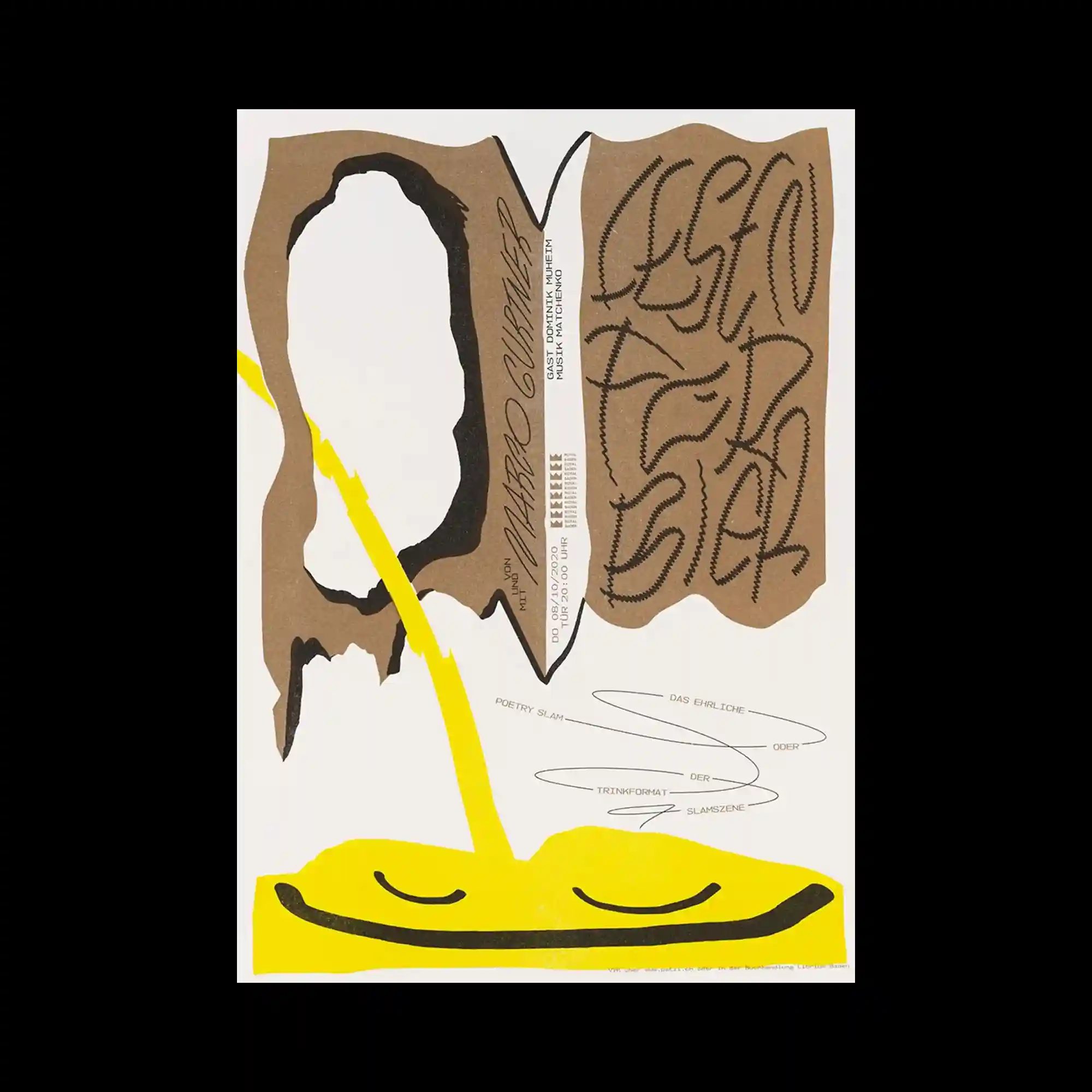
A composition of irregular torn-paper silhouettes is arranged around the center, creating a strong contrast between expansive negative space and dense graphic forms. Thick black brush-like contours, raw kraft-paper textures, and vivid yellow organic shapes establish a layered visual rhythm while guiding the eye diagonally across the poster. Hand-drawn calligraphic typography with varying stroke density interacts with narrow vertical text blocks and delicate linear scribbles, producing a deliberate tension between expressive gestures and structured information. The overall layout balances asymmetry through scale, texture, and directional flow, resulting in a composition that feels both spontaneous and carefully orchestrated.
불규칙하게 찢어진 종이 형태의 실루엣이 중앙을 중심으로 배치되어 넓은 여백과 밀도 높은 그래픽 요소의 강한 대비를 만들어냄. 두꺼운 검은 브러시 형태의 윤곽, 거친 크라프트지 질감, 선명한 노란색 유기적 형태가 겹겹이 구성되어 시선을 대각선 방향으로 자연스럽게 유도함. 획의 밀도가 다양한 손글씨 스타일의 타이포그래피와 세로로 정렬된 좁은 정보 텍스트, 가느다란 선 드로잉이 함께 배치되어 즉흥적인 표현과 정돈된 정보 구조 사이의 긴장감을 형성함. 비대칭 레이아웃이 크기, 질감, 시선의 흐름을 통해 균형을 이루며 자유로운 인상과 치밀한 구성이 동시에 느껴지는 포스터임.
不规则撕纸形态的轮廓围绕画面中央展开,在大面积留白与高密度图形之间形成鲜明对比。粗重的黑色笔刷轮廓、原色牛皮纸纹理以及鲜艳的黄色有机形态相互叠加,建立出富有层次感的视觉节奏,并沿对角线方向引导视线移动。手写书法风格的字体结合纵向排列的信息文字与细腻的线性笔触,在自由表现与秩序化信息之间形成刻意的张力。整体版面通过尺度、材质与视觉流向维持非对称平衡,使画面同时呈现出自发性与精心编排的设计特征。