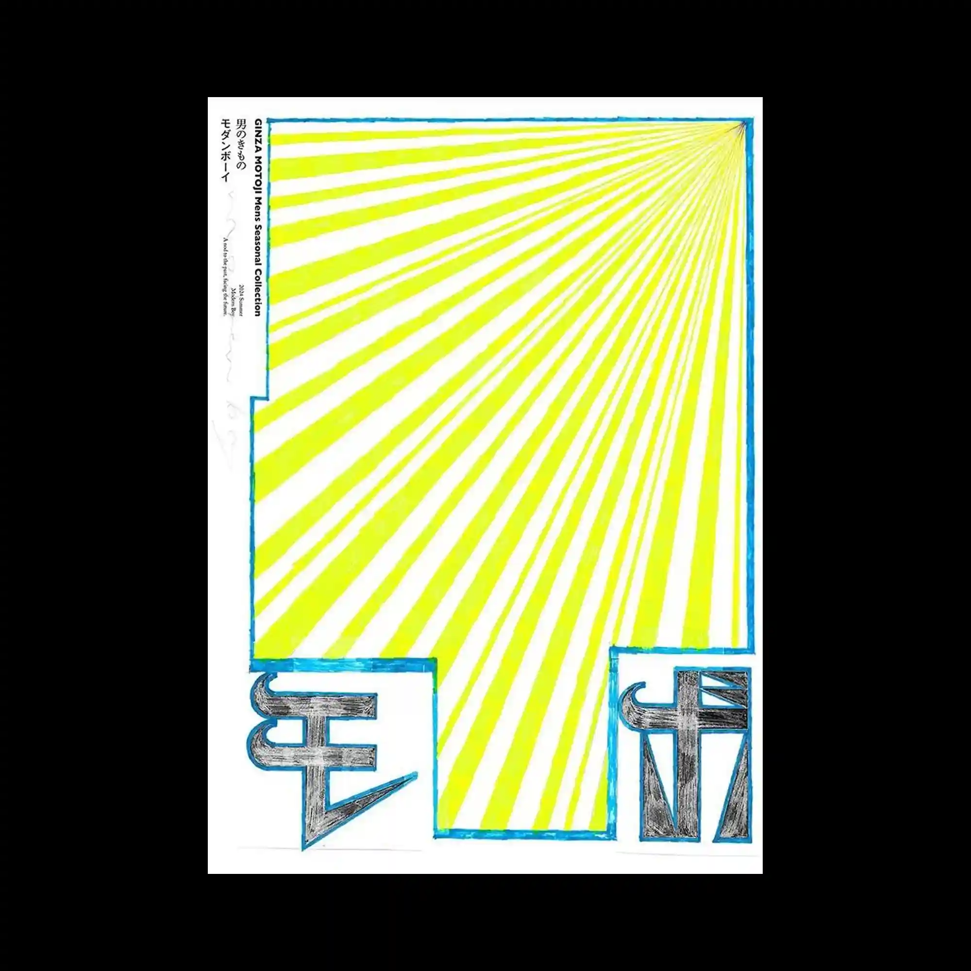
Radiating yellow stripes converge toward a single vanishing point, generating strong directional movement across the composition. Hand-drawn blue outlines frame the geometric structure while bold black symbols anchor the lower corners with heavy visual weight. The contrast between energetic linear expansion and solid typographic forms creates a balanced composition. Minimal graphic elements are used to maximize spatial depth and optical rhythm.
노란 방사형 선이 하나의 소실점을 향해 모이며 강한 방향성을 만드는 구성이 특징임. 손으로 그린 듯한 파란 외곽선이 기하학적 구조를 감싸고 하단의 굵은 검은 문자가 화면의 무게중심을 잡아줌. 확장되는 선형 패턴과 단단한 문자 형태가 대비를 이루며 균형을 형성함. 최소한의 요소만으로 깊이감과 시각적 리듬을 극대화한 디자인임.
放射状的黄色线条汇聚至同一消失点,形成极强的方向感与空间延伸效果。手绘感的蓝色边框包围整体结构,下方厚重的黑色符号稳定了画面重心。不断扩张的线性图案与厚实的文字形态形成鲜明对比。设计仅凭少量元素便实现了丰富的空间感与视觉节奏。