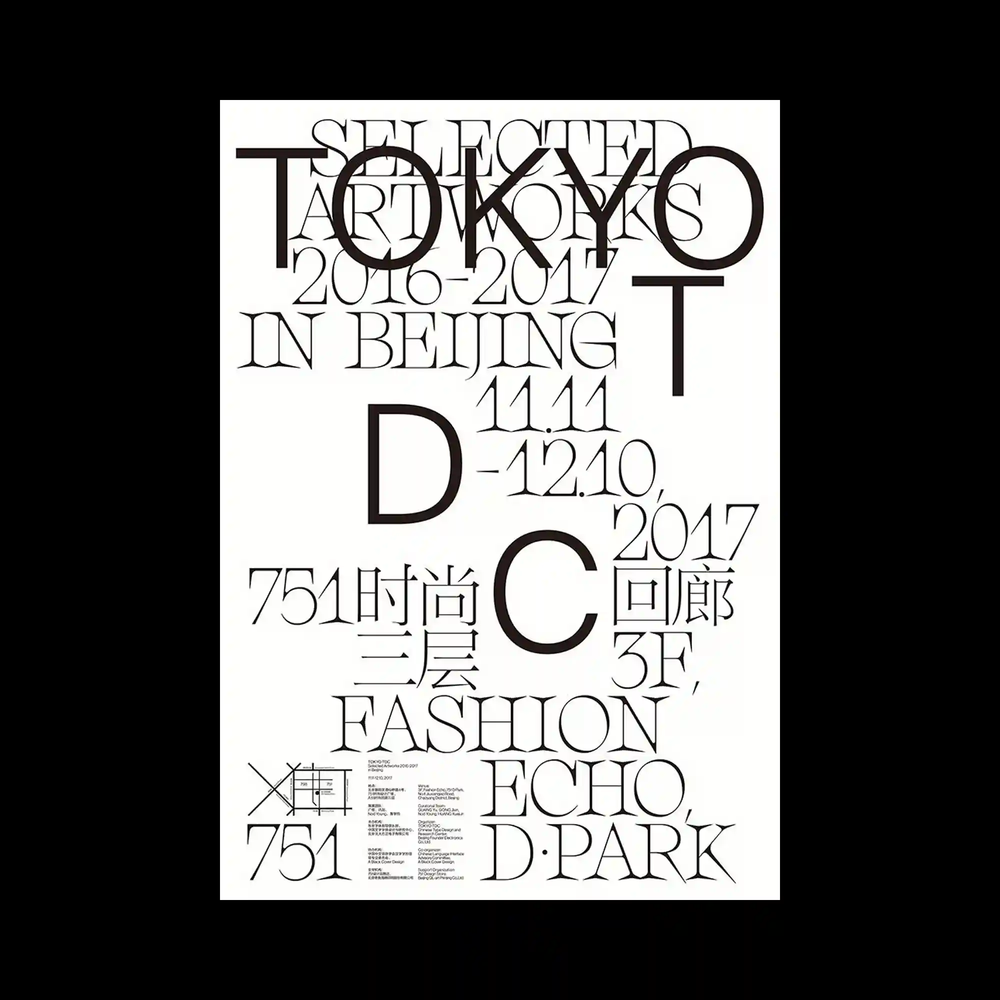
Large serif letterforms overlap extensively across the composition, producing a layered typographic field where hierarchy emerges through scale rather than separation. Thin elegant strokes contrast with oversized initials, allowing individual characters to function as graphic shapes as much as readable text. Generous white space prevents the dense overlaps from feeling heavy while preserving visual clarity. Smaller informational blocks are positioned near the bottom, completing the composition without competing with the dominant typography.
대형 세리프 글자가 서로 깊게 겹쳐지며 크기의 차이를 통해 위계를 만드는 타이포그래피 중심 구성임. 얇고 우아한 획과 거대한 이니셜이 대비를 이루어 글자가 정보이자 그래픽 형태로 동시에 기능함. 넉넉한 여백이 복잡한 중첩에도 답답하지 않은 인상을 유지하며 전체적인 가독성을 확보함. 하단의 작은 정보 영역은 중심 타이포그래피를 방해하지 않으면서 구성을 마무리함.
大型衬线字母大面积重叠,通过尺度变化建立清晰的层级关系。纤细优雅的笔画与放大的首字母形成对比,使文字既具有阅读功能,也成为图形元素。充足的留白避免了密集排版带来的压迫感,并保持整体清晰度。底部的小型信息区块为画面收尾,同时不削弱主体文字的视觉力量。