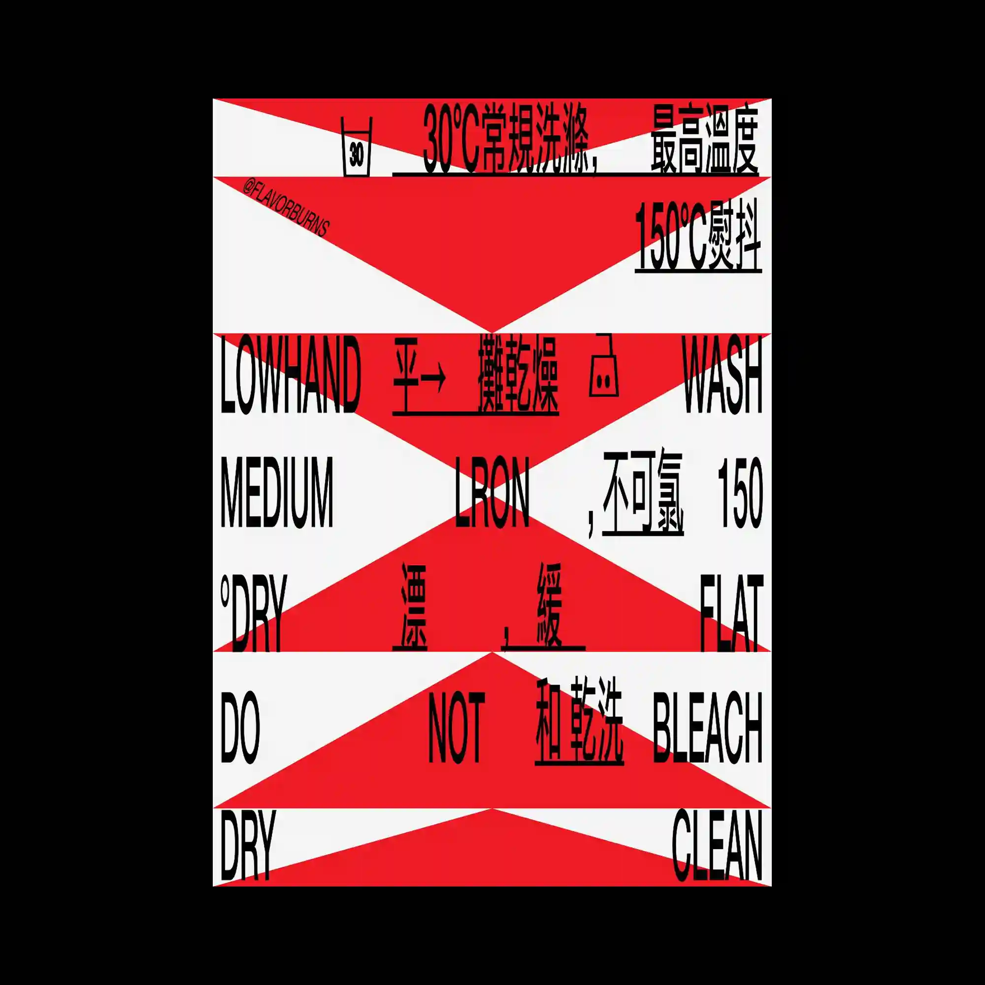
Diagonal geometric bands divide the composition into alternating fields that intersect with condensed multilingual typography. Strong directional shapes cut across the layout, fragmenting text into dynamic visual segments while maintaining overall readability. High-contrast colors reinforce the angular structure and create an energetic sense of movement. Consistent typographic weight ties the fragmented composition into a unified graphic system.
대각선 기하학 띠가 화면을 반복적으로 분할하며 응축된 다국어 타이포그래피와 교차하는 구조를 만듦. 강한 방향성을 가진 도형이 문자를 역동적으로 분절하면서도 전체 정보는 유지되도록 구성됨. 대비가 큰 색상 조합이 각진 구조를 강조하고 화면에 속도감을 부여함. 일정한 문자 굵기가 분절된 요소들을 하나의 그래픽 시스템으로 묶어줌.
斜向几何色带不断切分画面,与紧凑的多语言文字相互交织。具有强烈方向感的图形将文字切割成富有动感的片段,同时保持整体可读性。高对比配色进一步突出锐利结构,并赋予画面强烈速度感。统一的字重将分散元素整合为完整的视觉系统。