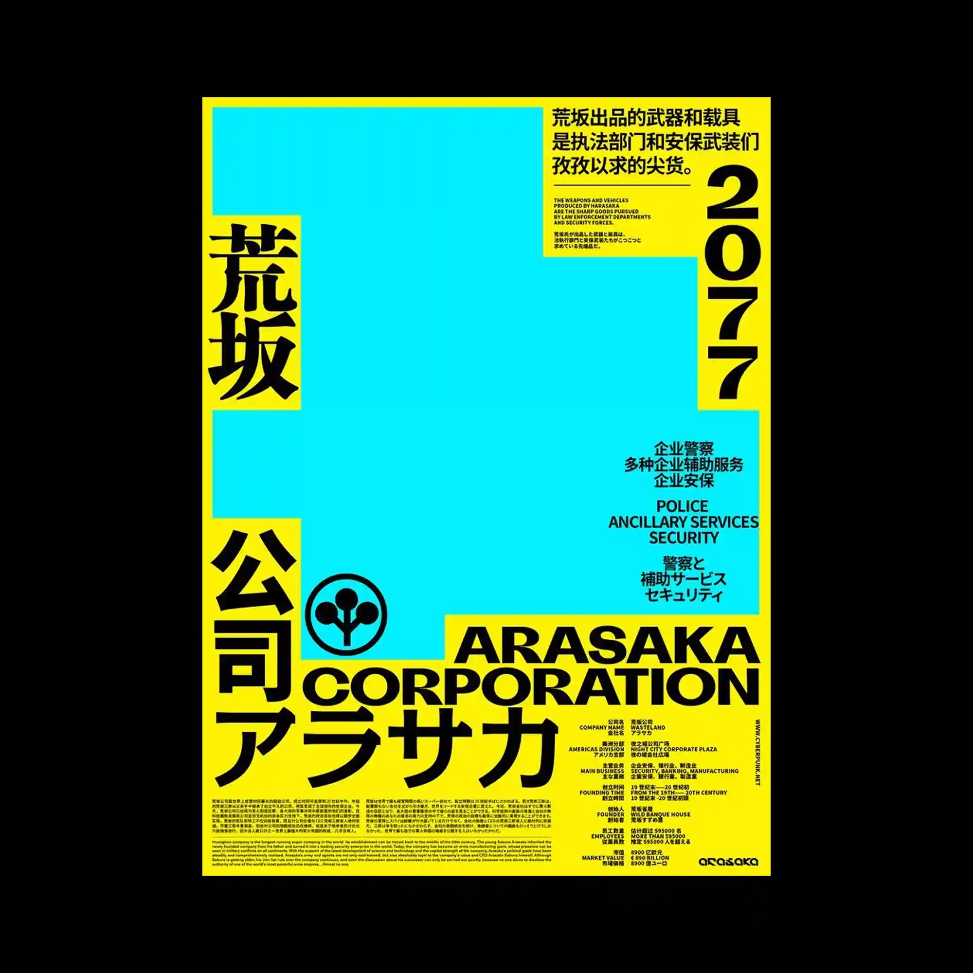
Large areas of solid color establish a bold geometric foundation while oversized multilingual typography frames the composition along the edges. Information is grouped into clearly separated blocks that balance dense text with expansive empty fields. Strong black lettering contrasts sharply against saturated yellow and cyan surfaces, emphasizing hierarchy through scale and weight. The minimal arrangement of shapes allows typography to function as the primary visual element while preserving a clean structural rhythm.
넓은 단색 면과 대형 다국어 타이포그래피가 화면의 기본 구조를 형성하는 미니멀한 구성임. 정보는 명확한 블록으로 구분되어 많은 텍스트와 넓은 여백이 균형을 이룸. 굵은 검정 문자와 강렬한 노랑, 청록 색면이 대비를 이루며 크기와 굵기로 위계를 강조함. 단순한 기하학 구성이 타이포그래피를 화면의 중심 요소로 부각시키면서도 정돈된 리듬을 유지함.
大面积纯色色块构成整体基础,大型多语言字体沿画面边缘形成鲜明框架。信息被划分为清晰模块,在密集文字与宽阔留白之间取得平衡。粗黑字体与高饱和黄色、青色形成强烈对比,通过尺度与字重建立层级。简洁的几何布局让字体成为视觉主体,同时保持整体结构的秩序感。