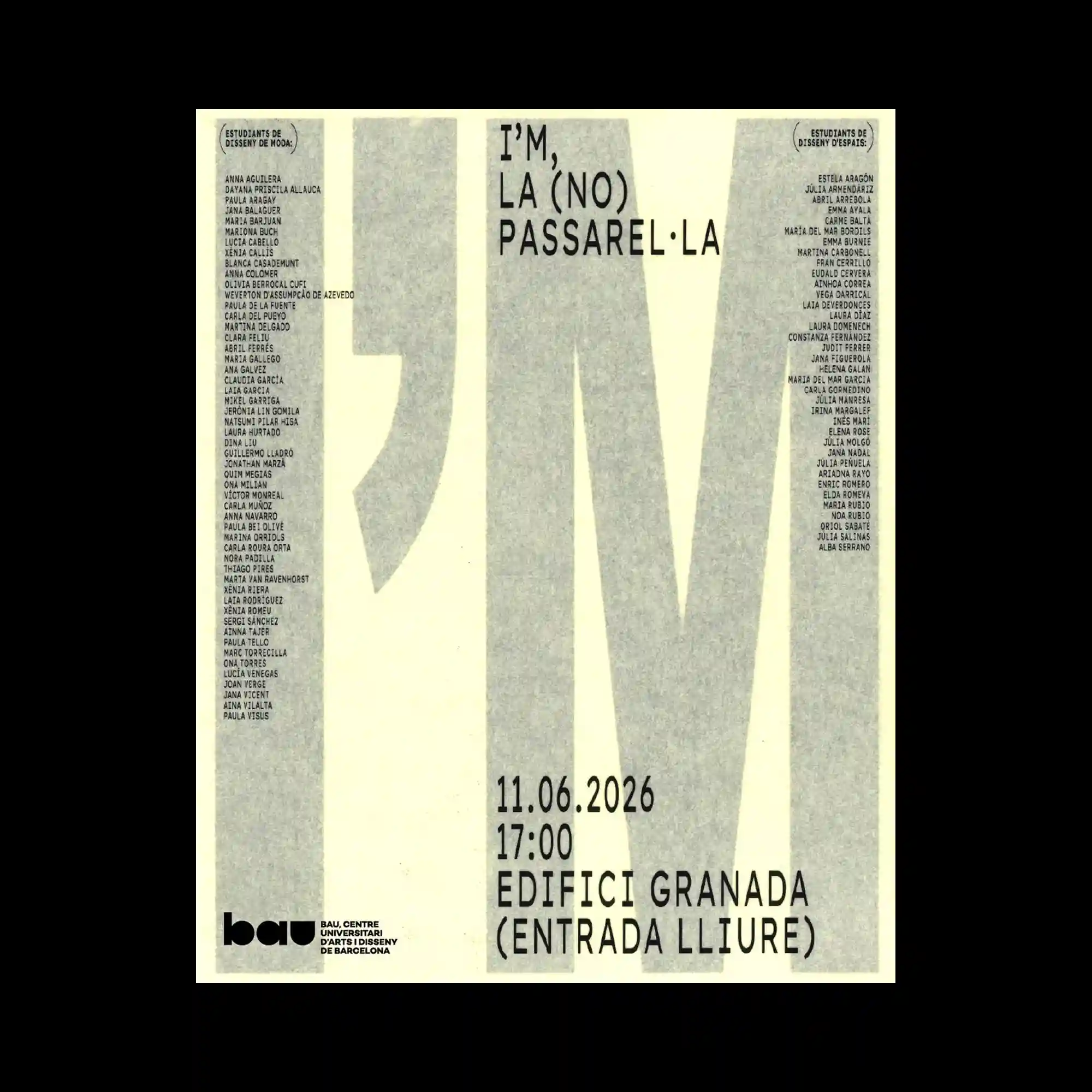
Oversized condensed letterforms extend vertically across the page, functioning as both typography and structural columns within the composition. Dense lists of small text align along both sides, framing the enlarged characters without competing for attention. A restrained grayscale palette emphasizes texture and scale rather than color. The composition relies on proportion and alignment to create visual impact.
매우 크게 확대된 세로형 타이포그래피가 화면 전체를 구조물처럼 가로지르며 중심 요소가 됨. 양쪽에는 작은 텍스트 목록이 촘촘하게 정렬되어 큰 문자와 균형을 이룸. 절제된 회색 계열 색상은 색채보다 질감과 크기의 대비를 강조함. 비율과 정렬만으로 강한 시각적 존재감을 만들어낸 레이아웃임.
超大的纵向文字贯穿整个画面,同时充当排版与结构元素。左右两侧排列着密集的小字号名单,与巨大的字形形成平衡。克制的灰色调将重点放在质感与尺度对比,而非色彩表现。整体依靠比例与对齐关系建立强烈的视觉效果。