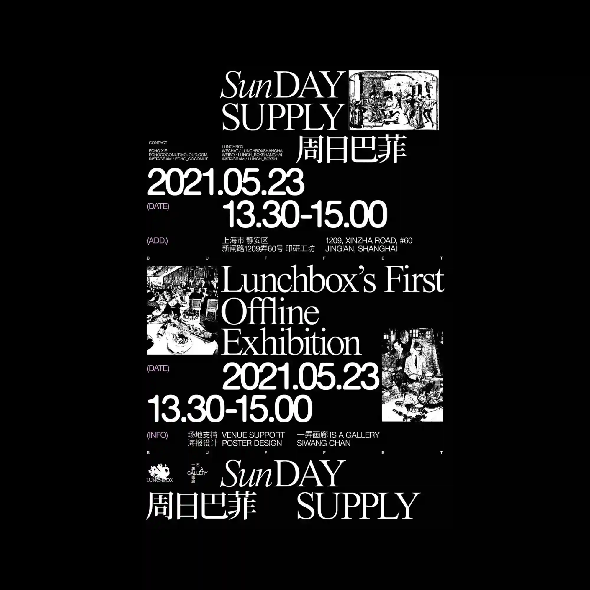
A dramatic black-and-white palette organizes the composition into distinct information zones supported by elegant serif typography. Large date numerals and exhibition details establish clear hierarchy while archival-style photographs punctuate the layout. The generous spacing between elements prevents the dense information from feeling crowded. Contrasts between classic typography and documentary imagery create a refined editorial atmosphere.
강한 흑백 대비 속에서 우아한 세리프 타이포그래피가 정보 영역을 명확하게 구분하며 구성됨. 커다란 날짜와 전시 정보가 위계를 형성하고, 기록 사진이 중간중간 배치되어 리듬을 만듦. 요소 사이의 충분한 여백이 많은 정보를 담으면서도 답답하지 않은 인상을 유지함. 고전적인 서체와 기록성 이미지의 대비가 세련된 에디토리얼 분위기를 형성함.
鲜明的黑白配色将画面划分为多个信息区域,并以优雅的衬线字体建立清晰层级。大型日期与展览信息成为主要视觉焦点,档案式照片穿插其中形成节奏。充足的留白使丰富的信息依然保持通透感。经典字体与纪实影像的结合营造出精致的编辑设计氛围。