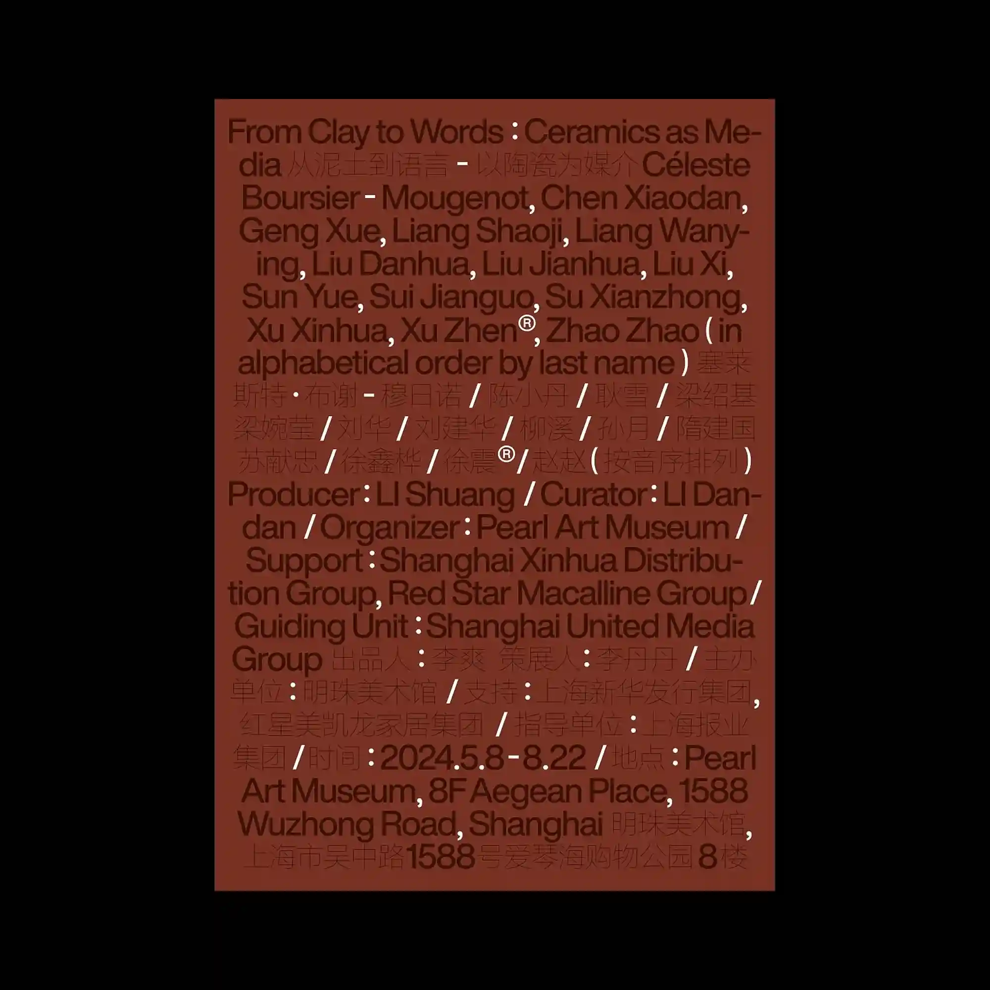
A dense field of bilingual typography fills the entire composition, creating a continuous texture where information becomes the primary visual material. Dark brown letterforms are layered over a muted terracotta background with consistent spacing, allowing the poster to rely on rhythm rather than hierarchy. Repeated separators, multilingual lines, and tightly aligned text blocks establish an editorial grid with minimal visual interruption. The restrained monochromatic palette emphasizes typographic density while maintaining a calm and systematic appearance.
전체 화면을 가득 채운 이중 언어 타이포그래피가 정보 자체를 시각적 재료처럼 활용하며 조밀한 질감을 형성함. 어두운 갈색 글자가 차분한 테라코타 색 바탕 위에 일정한 간격으로 배치되어 위계보다 리듬감에 집중한 구성을 만듦. 반복되는 구분 기호와 다국어 텍스트, 촘촘하게 정렬된 블록이 에디토리얼 그리드를 안정적으로 구축함. 절제된 단색 계열의 색상은 타이포그래피의 밀도를 강조하면서도 차분한 인상을 유지함.
双语排版覆盖整个画面,使信息本身成为主要的视觉元素,并形成细密的纹理。深棕色文字排列在柔和的陶土色背景上,以均匀的间距营造出重视节奏而非层级的版面。重复的分隔符、多语言文字与紧密对齐的文本模块共同构建出稳定的编辑式网格。克制的单色配色进一步强化了文字密度,同时保持整体的平静与秩序感。