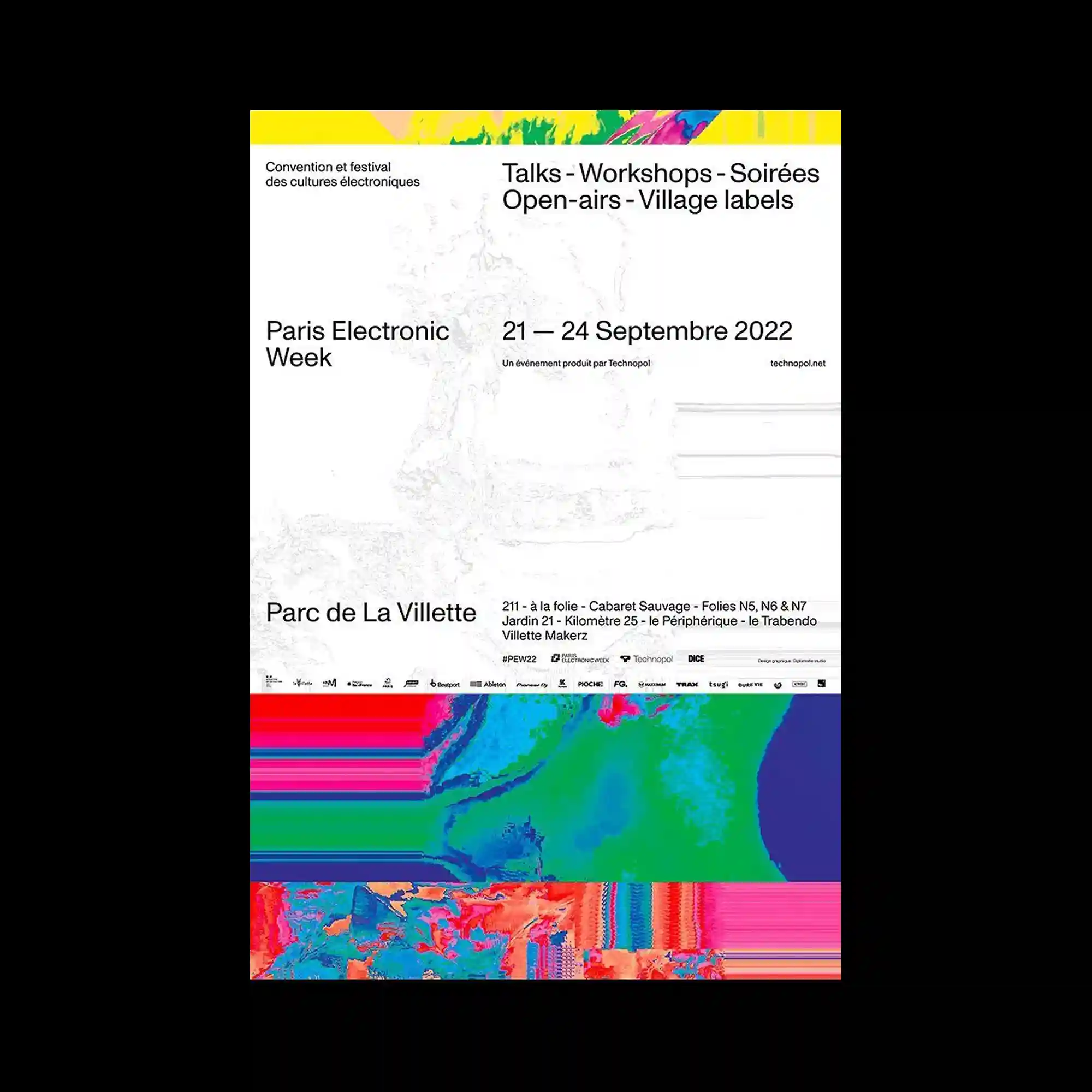
Minimal typography is paired with vivid bands of highly saturated abstract imagery placed along the top and bottom edges. The central area remains predominantly open, allowing the informational text to occupy the composition with exceptional clarity. The colorful visual strips act as framing devices rather than illustrations, balancing the restrained layout. Fine grayscale imagery beneath the text introduces subtle depth without competing for attention.
상단과 하단의 강렬한 추상 색상 띠가 미니멀한 타이포그래피와 대비를 이루는 구성임. 중앙은 넓게 비워 정보 중심의 레이아웃을 강조함. 선명한 컬러 이미지는 삽화보다는 프레임 역할을 하며 화면의 균형을 형성함. 텍스트 아래의 희미한 회색 이미지는 과하지 않은 깊이감을 더함.
顶部与底部以高饱和抽象色带形成鲜明边框,与极简文字形成对比。中央区域大面积留白,使信息内容成为视觉重点。彩色图像更像版面框架,而非主要插图,维持整体平衡。文字下方淡化的灰度图像增加了层次感,同时保持克制。