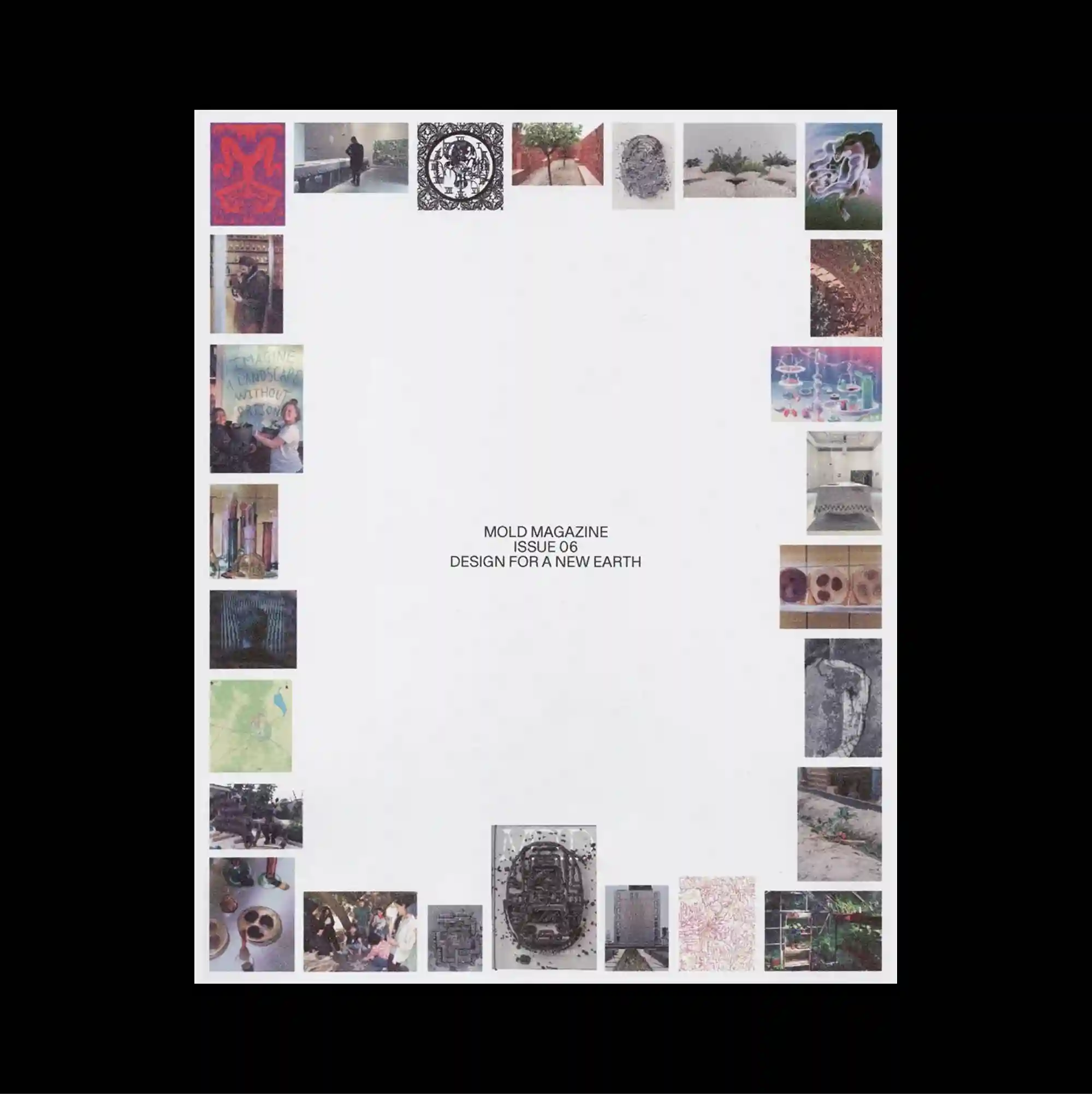
The composition is framed by elements positioned close to the outer edges, leaving the center comparatively open and emphasizing the perimeter as an active zone. Restrained serif typography is used at a relatively small scale, allowing generous spacing and subtle alignment shifts to define the hierarchy. Many small photographs form an uneven perimeter around a large blank center, creating a visual frame made from varied textures, colors, and cropped fragments. Generous empty space and restrained detail create a quiet composition in which small shifts of placement become visually significant.
요소들을 바깥 가장자리 가까이에 배치해 중앙을 상대적으로 비우고, 주변부 자체가 적극적인 구성 영역으로 작동하도록 함. 절제된 세리프 타이포그래피를 비교적 작은 크기로 사용하며 넉넉한 간격과 미세한 정렬 변화로 위계를 구분함. 여러 작은 사진이 큰 빈 중앙을 둘러 불균일한 테두리를 만들며 다양한 질감, 색상, 잘린 조각으로 이루어진 시각 프레임을 형성함. 넓은 여백과 절제된 디테일 덕분에 작은 위치 변화까지 중요하게 느껴지는 조용한 구성이 형성됨.
元素被布置在页面外缘附近,使中心相对开放,并强化边缘区域在构图中的主动作用。 克制的衬线字体以较小尺度出现,通过宽松间距与细微对齐变化建立层级。 大量小型照片围绕大面积空白中心形成不均匀边框,以不同质感、色彩与裁切碎片构成视觉框架。 大量留白与克制细节营造安静构图,使细微的位置变化也具有明显视觉意义。