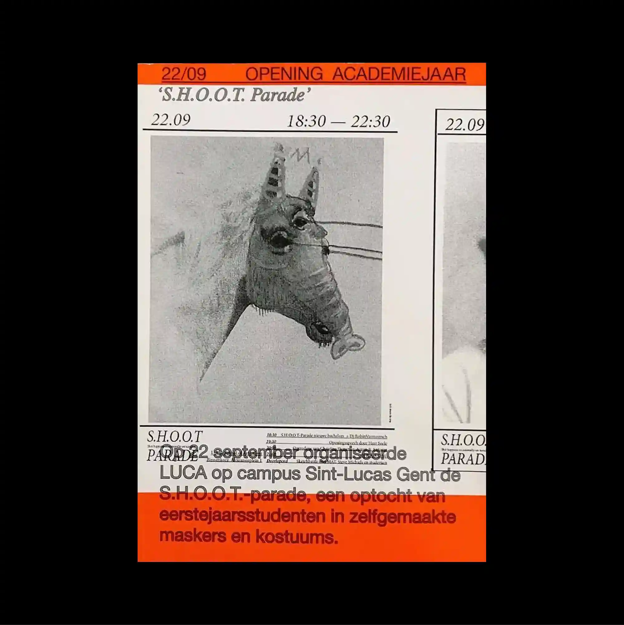
The composition follows a rigid editorial grid, with a dominant visual block framed by narrow information bands and clearly separated sections. Serif and sans-serif styles are mixed with thin rules and compact captions, producing a layered hierarchy through changes in weight, width, and alignment. A grainy monochrome horse photograph is enclosed by vivid orange strips, narrow rules, and cropped secondary imagery that reinforce a newspaper-like visual density. The controlled alignment and rough material details give the poster a direct archival print character while keeping the visual rhythm sharply organized.
단단한 편집 그리드를 기반으로 주요 시각 블록을 중심에 두고 좁은 정보 띠와 명확히 분리된 구획으로 화면을 구성함. 세리프와 산세리프 서체를 얇은 선과 작은 캡션과 함께 혼합해 굵기, 폭, 정렬의 변화로 다층적인 위계를 형성함. 거친 입자의 흑백 말 사진을 선명한 오렌지색 띠, 좁은 선, 잘린 보조 이미지가 둘러싸며 신문 지면 같은 높은 시각 밀도를 강화함. 통제된 정렬과 거친 물성 디테일이 직접적인 아카이브 인쇄물의 성격을 만들면서도 시각적 리듬은 선명하게 유지함.
画面建立在严谨的编辑网格上,以主要视觉区块为中心,并通过狭窄的信息带和清晰分隔的区域组织整体结构。 衬线体与无衬线体结合细线和小型说明文字,通过字重、宽度与对齐方式的变化建立多层级关系。 颗粒感强烈的黑白马匹照片被鲜明橙色条带、细窄线条与裁切辅助图像包围,强化出类似报纸版面的高密度感。 受控的对齐方式与粗粝材质细节赋予海报直接的档案印刷感,同时保持清晰有序的视觉节奏。