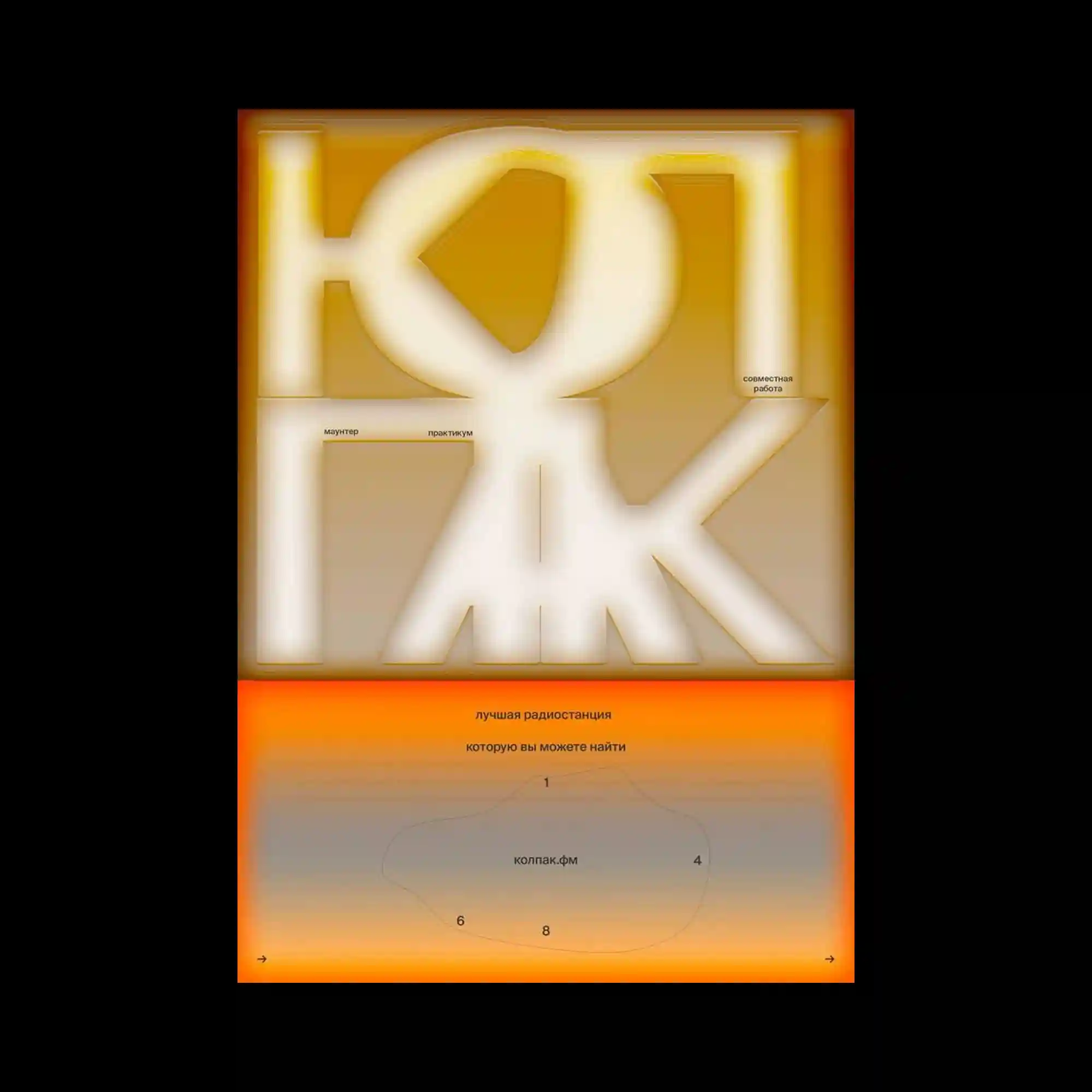
Large geometric letterforms occupy the upper half of the composition, their softened edges glowing against a warm monochromatic gradient. Small informational text is positioned with precise spacing, contrasting the monumental typography with understated editorial details. A vivid horizontal orange band divides the layout and introduces a secondary information zone with restrained diagrams and scattered numerical markers. The balance between oversized forms, atmospheric gradients, and carefully aligned microtypography creates a composition that feels both immersive and methodically structured.
거대한 기하학적 글자가 화면 상단을 채우며 부드럽게 번지는 가장자리와 따뜻한 단색 그라디언트가 공간감을 형성함. 작은 정보 텍스트는 정교한 간격으로 배치되어 거대한 타이포그래피와 절제된 대비를 이룸. 강렬한 주황색 가로 띠가 화면을 분할하며 간단한 도식과 숫자 요소가 포함된 두 번째 정보 영역을 구성함. 대형 문자, 분위기 있는 색상 전환, 정교한 마이크로 타이포그래피가 균형을 이루며 몰입감 있는 에디토리얼 구성을 완성함.
巨大的几何字体占据画面上半部分,柔和发光的边缘与暖色单色渐变共同营造出空间层次。细小的信息文字以精确的间距排列,与醒目的大型文字形成克制的对比。一条鲜艳的橙色横向色带划分画面,并构建出包含简洁图示与数字标记的第二信息区域。超大字体、柔和渐变以及精细的微排版共同形成兼具沉浸感与秩序感的编辑设计。