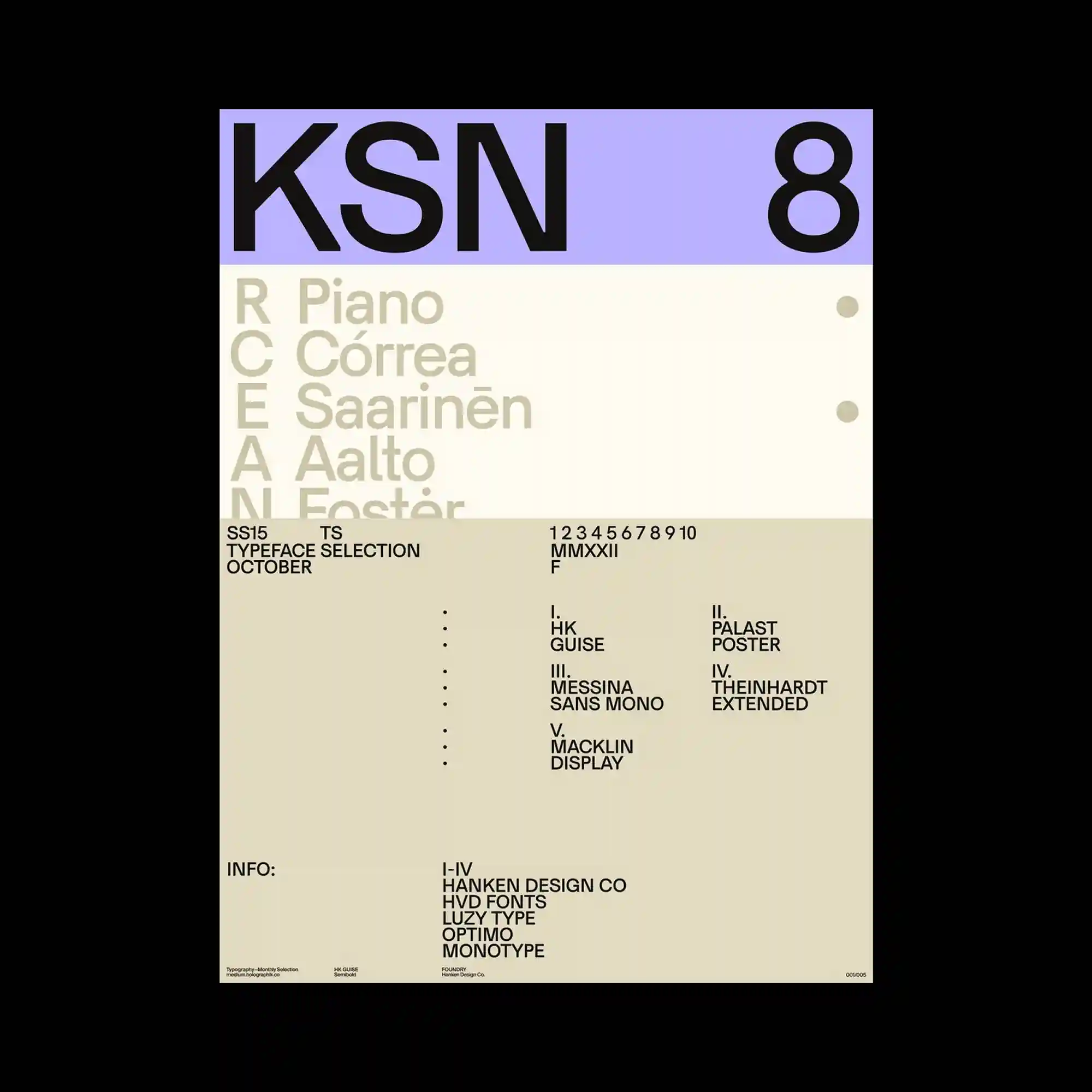
A structured grid supports bold sans-serif headings, oversized numerals, and carefully spaced informational text within a restrained typographic system. Soft lavender and warm beige color fields divide the composition into clearly defined functional areas. Small typographic details are positioned with generous negative space, allowing each section to remain visually distinct. The poster achieves balance through proportion, alignment, and disciplined minimalism.
정돈된 그리드 위에 굵은 산세리프 제목과 커다란 숫자, 세밀한 정보 텍스트가 절제된 타이포 시스템 안에서 배치됨. 부드러운 라벤더와 따뜻한 베이지 색면이 화면을 기능적으로 구분하며 안정감을 형성함. 작은 정보 요소들은 넉넉한 여백 속에 배치되어 각 영역의 독립성을 유지함. 비례와 정렬, 절제된 미니멀리즘을 통해 균형 잡힌 구성을 완성함.
规整的网格支撑着粗体无衬线标题、巨大数字以及精细的信息排版,形成克制而系统化的视觉结构。柔和的薰衣草色与暖米色块将版面划分为清晰的功能区域。细小的文字元素在充足留白中各自保持独立,提升了整体的可读性。海报通过比例、对齐与极简设计实现了稳定而均衡的视觉效果。