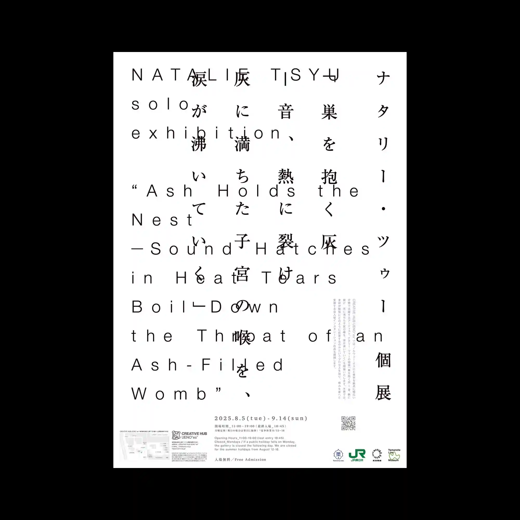
Widely spaced Latin characters overlap with vertically arranged Japanese text, creating a multilingual typographic field built through transparency and layered alignment. Large open areas surround the intersecting letterforms, allowing each textual layer to remain visually distinguishable. Fine informational blocks and subtle vertical columns reinforce the editorial structure without dominating the page. The composition focuses on rhythm, spacing, and the interaction between multiple writing systems.
넓게 벌어진 라틴 문자와 세로 배열된 일본어가 겹쳐지며 다층적인 다국어 타이포그래피 구성을 형성함. 교차하는 문자 주변의 넓은 여백이 각 레이어를 명확하게 구분해 줌. 작은 정보 블록과 세로 열 구조가 화면의 편집 질서를 보조함. 다양한 문자 체계의 리듬과 간격, 상호작용이 핵심이 되는 구성임.
间距宽松的拉丁字母与纵向排列的日文相互叠加,形成多层次的多语言排版结构。大面积留白使各个文字层之间保持清晰可读。细小的信息区块与竖向栏目进一步强化了编辑式版面秩序。整体重点放在不同文字系统之间的节奏、间距与相互关系。