
A mirrored black-and-white portrait is duplicated vertically, creating a symmetrical, stacked face. The image is rendered in coarse halftone texture, reducing detail into grain and contrast. Ornamental vertical frames flank both sides, reinforcing symmetry. Dense micro-typography anchors the bottom edge as a solid text block.
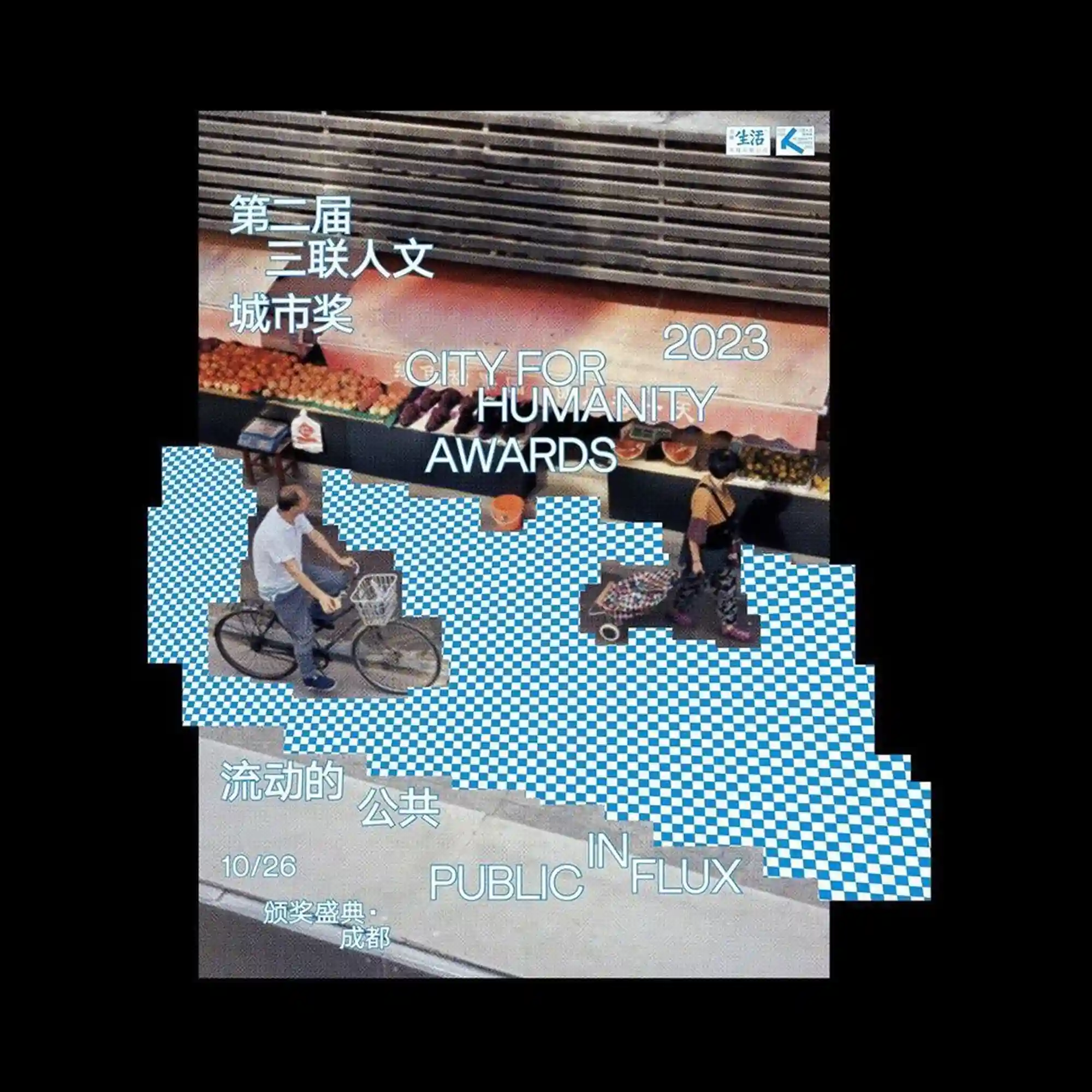
A photographic street scene is cropped and overlaid with pixelated checkerboard blocks that interrupt the ground plane. Human figures and bicycles remain partially visible, floating above the disrupted pattern. The typography is layered directly onto the image, mixing Chinese and English text with varying alignment. The composition contrasts documentary realism with digital obstruction and fragmentation.
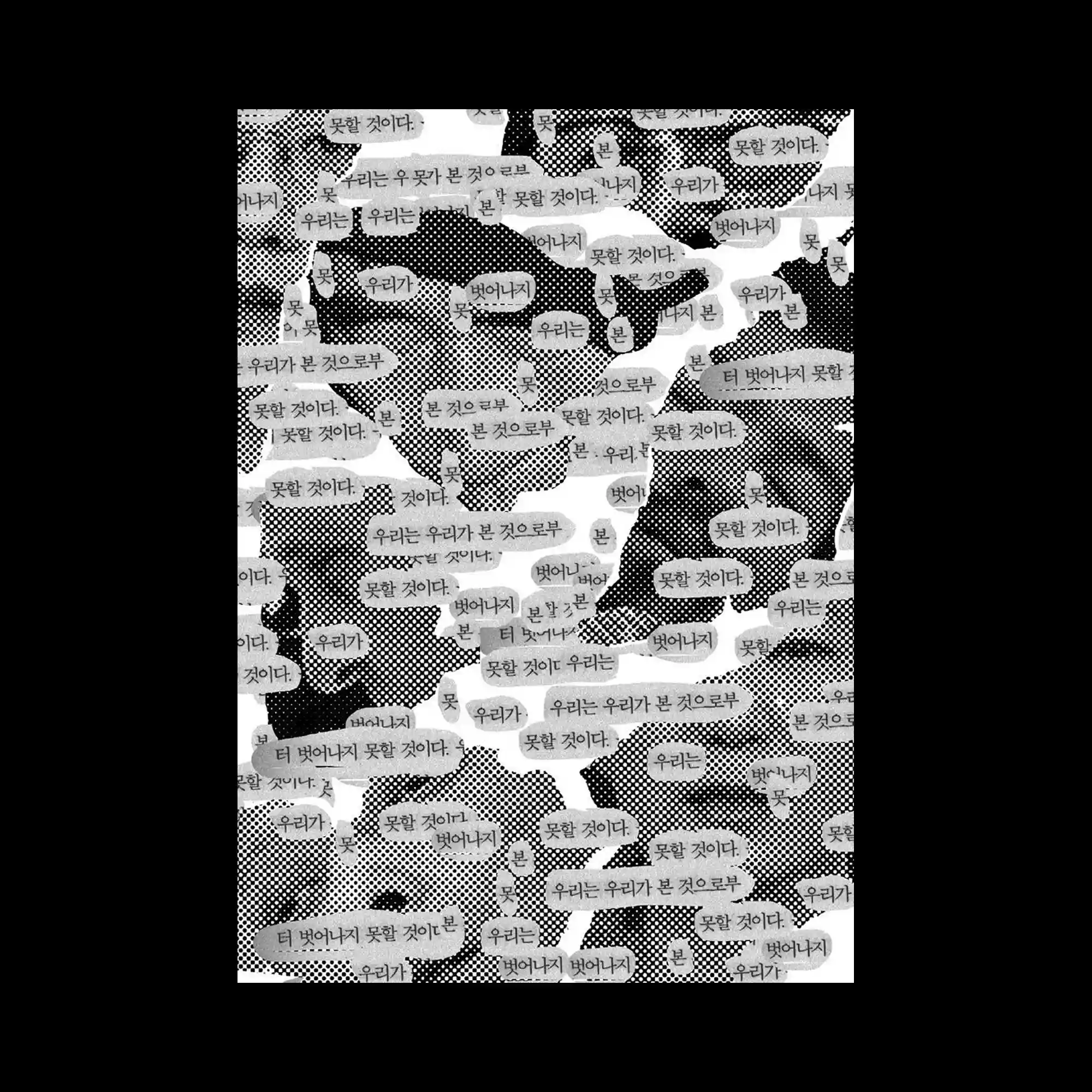
A black-and-white collage fills the surface with torn text fragments layered over halftone textures. Speech-bubble-like shapes overlap, creating a dense field of repeated phrases. The irregular edges introduce visual noise while maintaining a consistent tonal range. The composition feels raw, rhythmic, and text-driven.
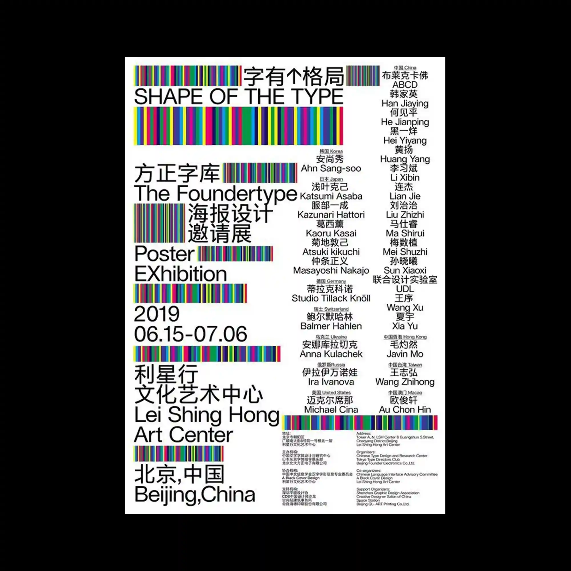
Multicolored vertical stripes act as both graphic elements and typographic underlines. Clean sans-serif text is arranged in clear columns, balancing the vibrant accents. The palette introduces rhythm without overwhelming the structure. The layout emphasizes clarity through alignment and repetition.

Layered blocks of bilingual typography overlap in varying sizes and orientations. Strong color fields anchor the text, while vertical and horizontal alignments intersect. The density of information creates a poster that feels both structured and crowded. Contrast between languages becomes a visual rhythm.
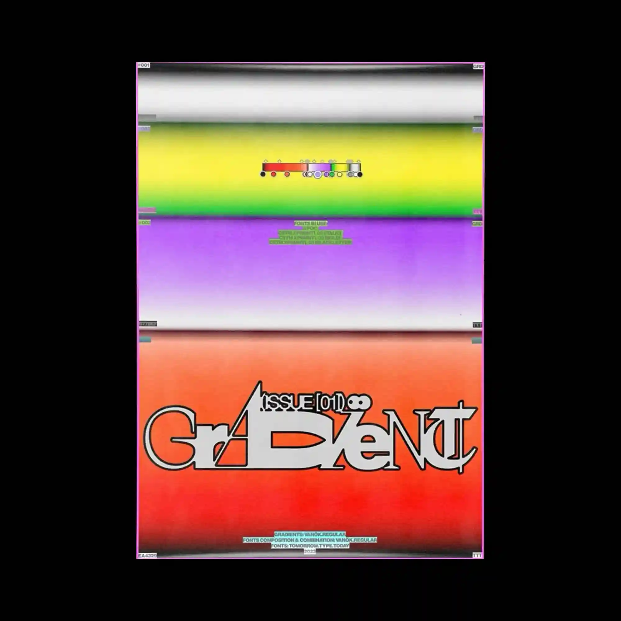
A soft gradient background is divided into horizontal color bands with subtle transitions. A compact typographic mark sits at the center, surrounded by generous empty space. Small interface-like labels appear at the edges, hinting at a system or template. The overall impression is restrained and minimal.
High-contrast black typography dominates the top, while fragmented human silhouettes emerge below. The figures are built from dense micro-textures, dissolving into the white background. Text blocks frame the image edges, creating a poster-like hierarchy. The visual tension comes from clarity in typography versus fragmentation in imagery.
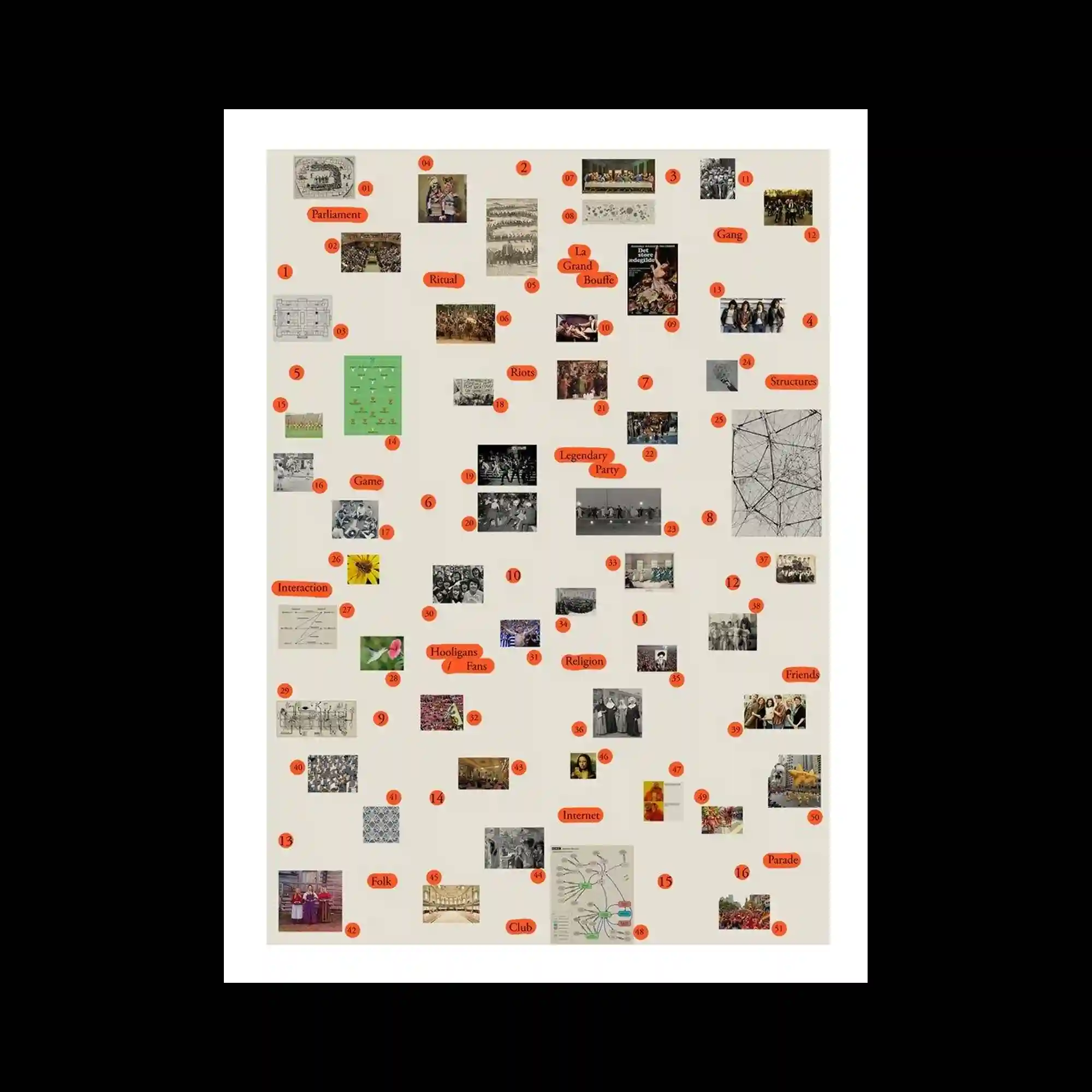
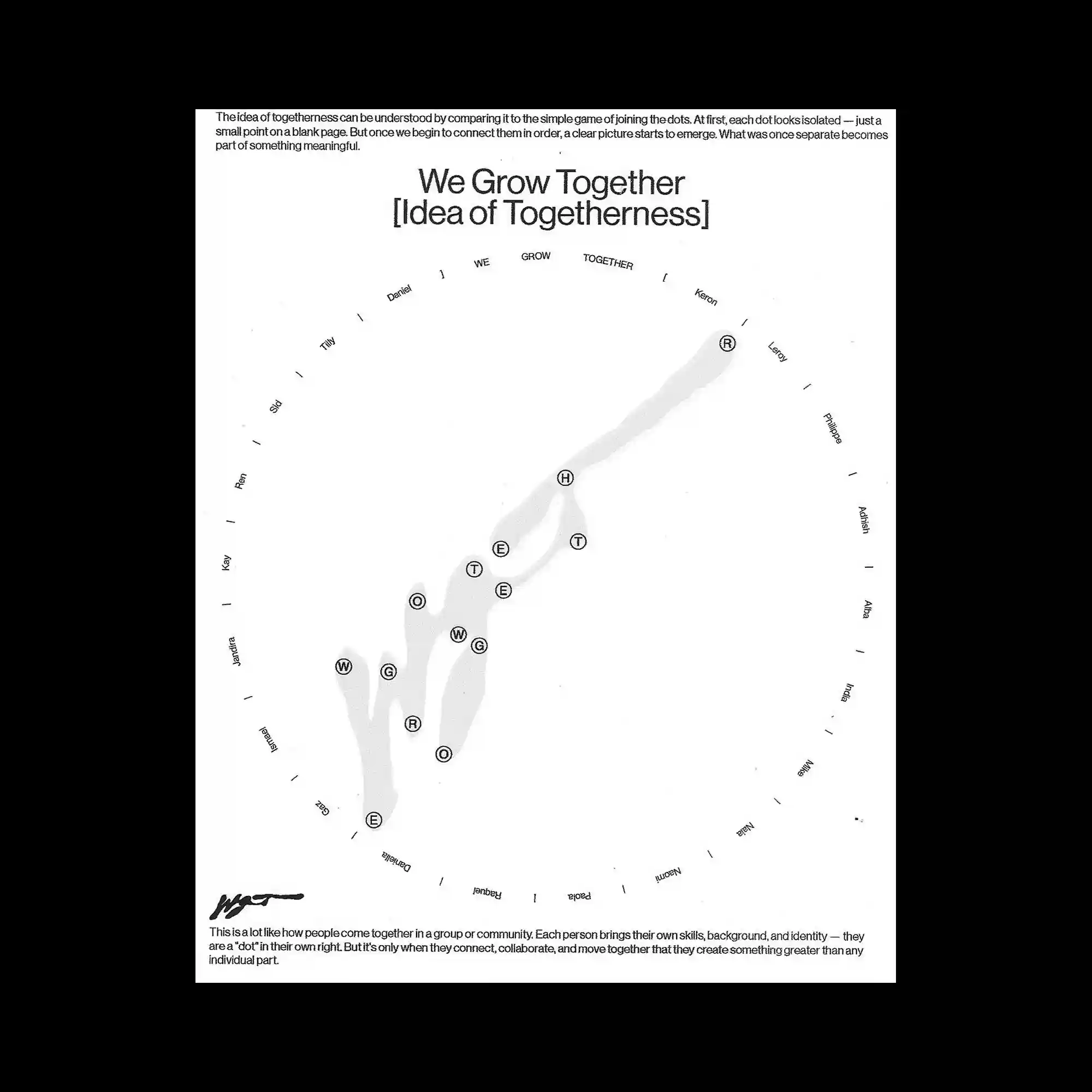
A neutral background hosts a diagram-like arrangement of small photographs and labels. Images are distributed evenly, each paired with minimal text markers and numeric tags. The spacing creates a sense of mapping rather than narrative flow. The composition reads as an organized archive or visual index.
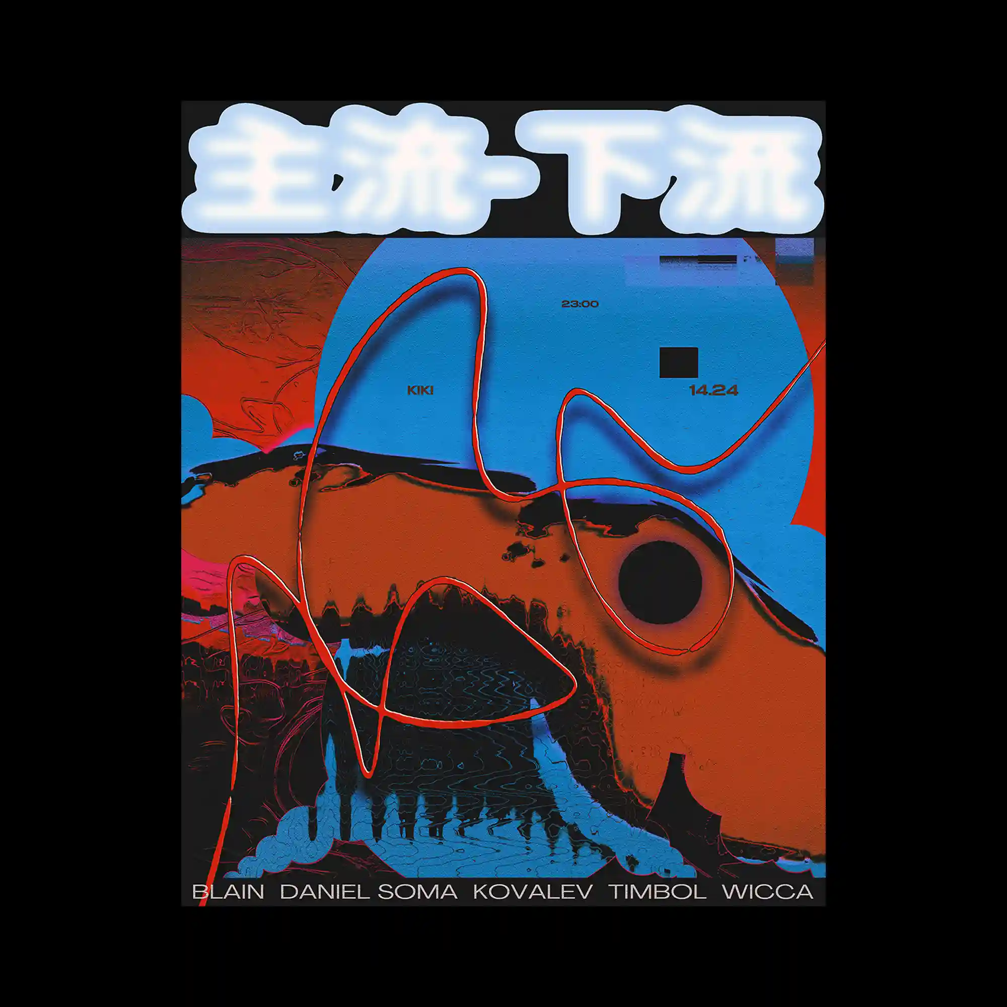
Bold, glowing text sits above an abstract landscape of saturated blues and reds. A continuous, hand-drawn line snakes across the composition, connecting disparate color fields. Flat shapes and textured surfaces overlap, creating a layered depth. The layout feels energetic, driven by color contrast and fluid line movement.
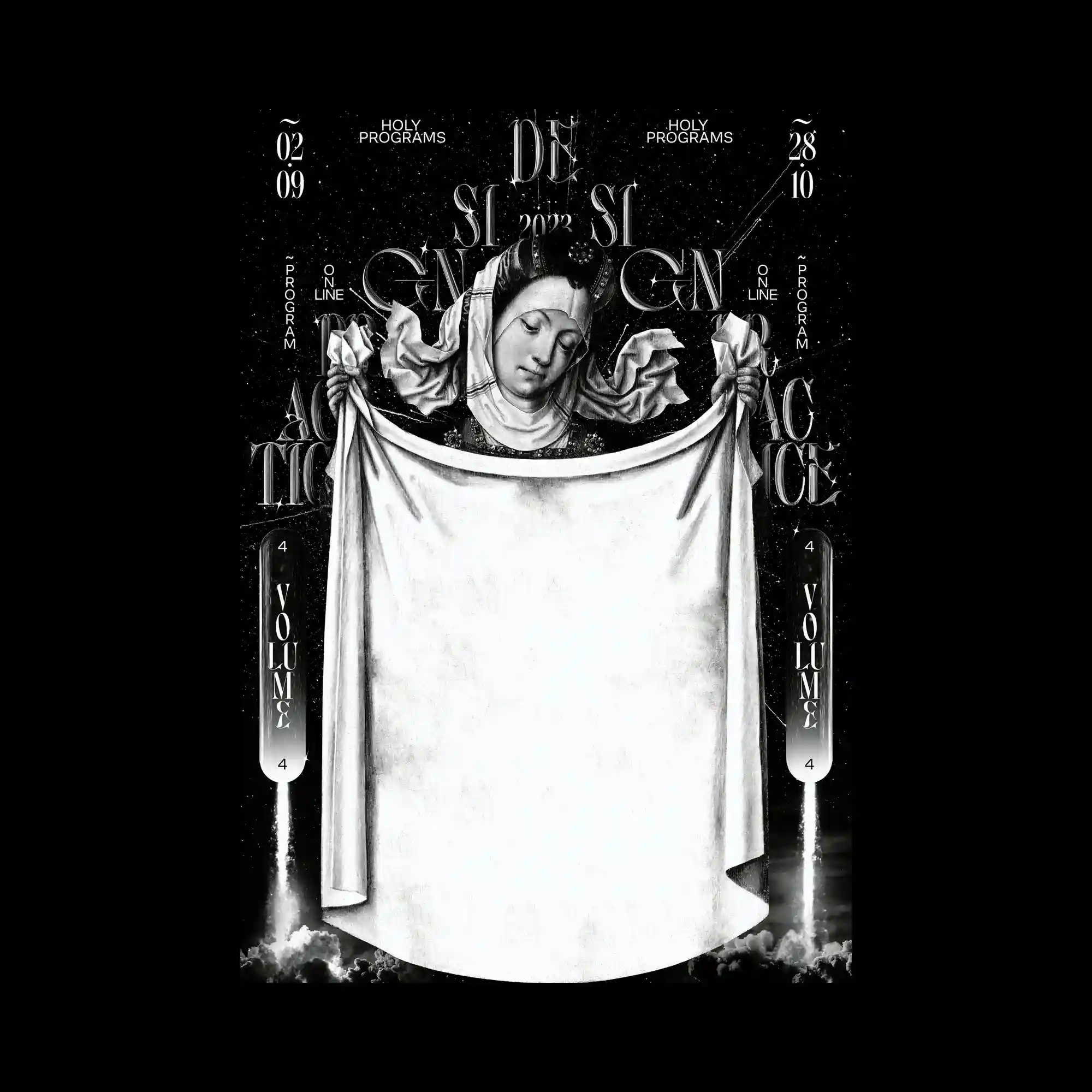
A monochrome, classical figure is centered against a dark, star-like backdrop. Ornate typography and decorative symbols frame the figure symmetrically, creating a ritualistic layout. The draped fabric occupies a large central area, acting as a visual anchor and empty canvas. High contrast between black and white reinforces a solemn, icon-like presence.

A bright sky-blue background is filled with scattered bird silhouettes that collectively form typographic shapes. The birds vary in size and density, creating legible words through clustering rather than outlines. Small blocks of text float in the open sky, balancing the heavier typographic masses below. The composition relies on scale contrast and negative space to maintain clarity.
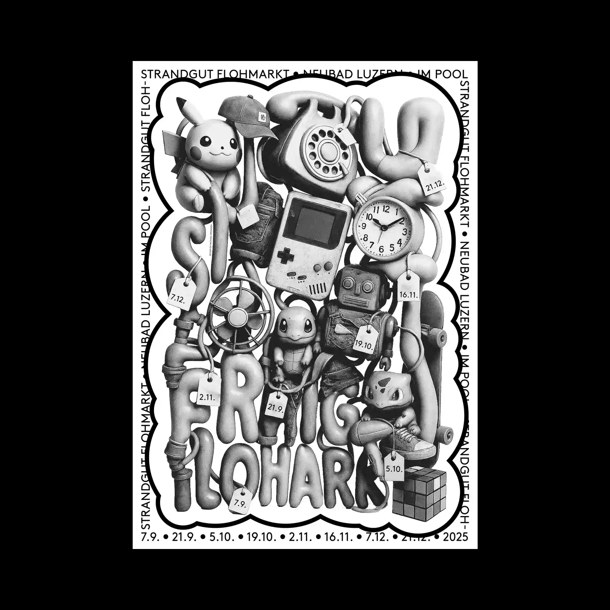
A tightly packed grayscale composition assembles retro objects, toys, and devices into a single sculptural mass. Rounded forms and soft shading give each object a toy-like, molded appearance while maintaining realistic surface detail. The elements are arranged to interlock vertically, leaving almost no empty space within the frame. A thick, irregular outline encloses the entire cluster, separating it clearly from the white background.

Photographic textures, geometric shapes, and graphic dots are assembled into a layered collage. Diagonal bands cut through the composition, creating directional movement. Muted tones are punctuated by occasional saturated accents. The overall structure balances randomness with a clear underlying alignment.
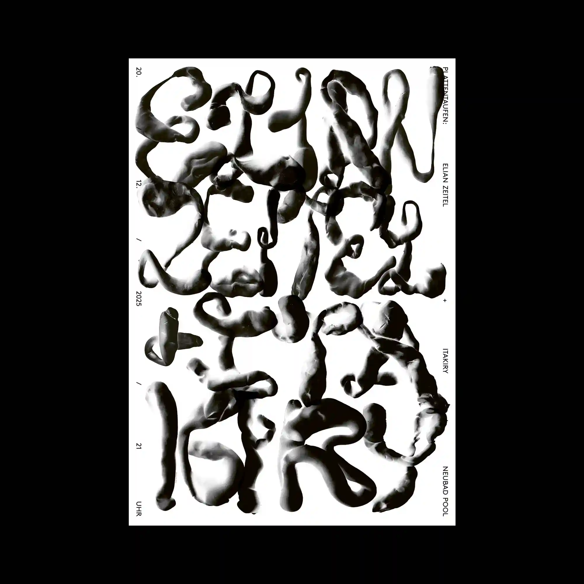
Thick, fluid black forms twist and coil across a white background, resembling sculpted ink or clay. The letter-like shapes blur the boundary between typography and abstraction. Negative space weaves between the forms, maintaining legibility through spacing. The composition feels tactile and expressive despite its monochrome palette.
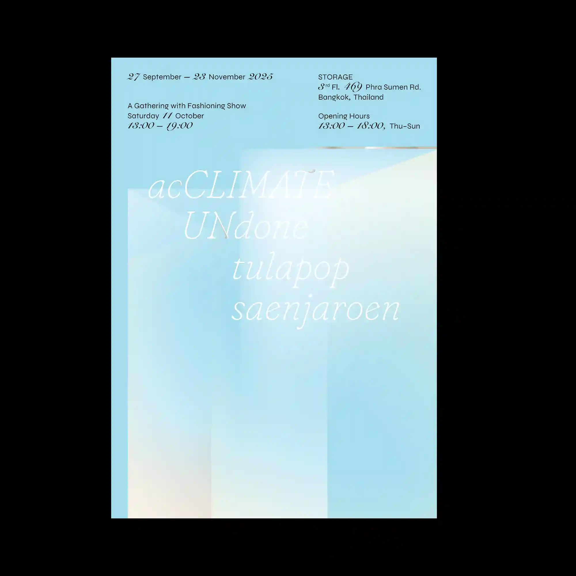
Soft color gradients form overlapping vertical planes that fade gently into one another. Typography is light and airy, floating within the layered background. The absence of hard edges creates a calm, atmospheric depth. The layout relies on transparency and tonal shifts rather than contrast.
Minimal graphic elements form a circular arrangement around a soft, organic central shape. Subtle gradients and translucent layers give the center a fluid appearance. Small typographic labels orbit the form, reinforcing the circular structure. The composition emphasizes restraint, balance, and gradual transitions.
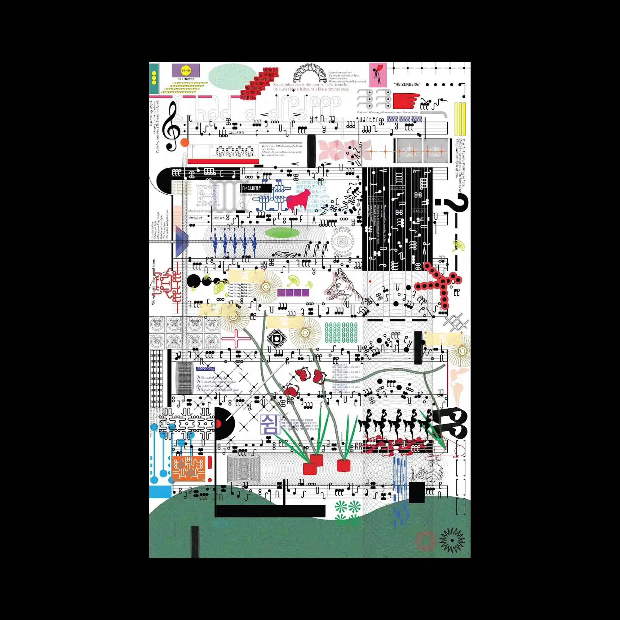
The surface is densely filled with symbols, musical notation, diagrams, and ornamental graphics layered across a grid. Each element maintains distinct visual language while coexisting in a crowded field. Color accents punctuate an otherwise monochrome structure, guiding the eye through complexity. The composition reads as an accumulation of systems rather than a single image.
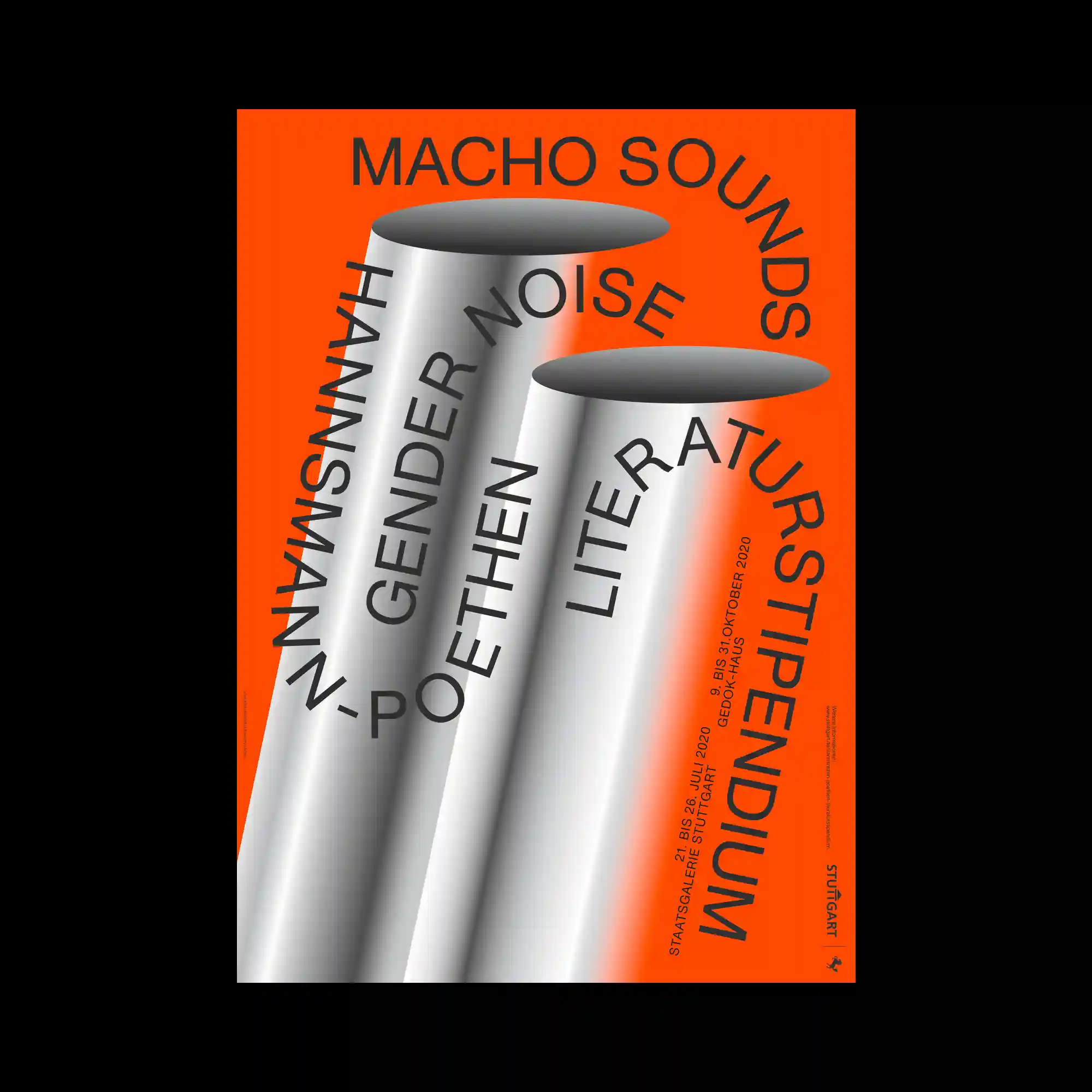
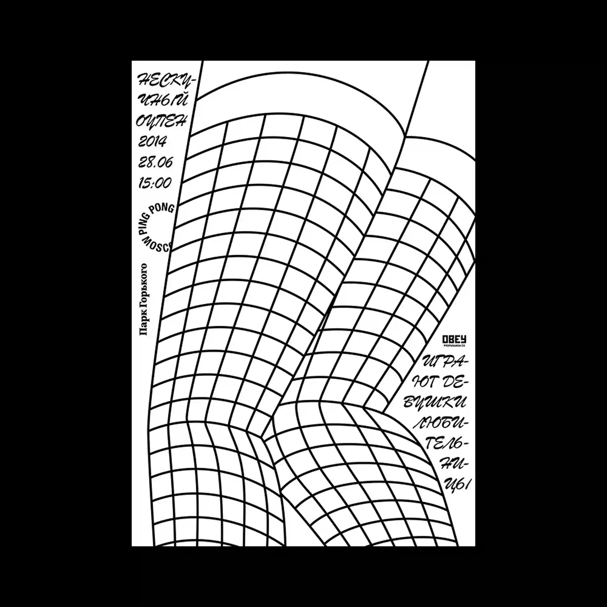
Large cylindrical forms rendered with smooth gradients dominate the composition against a vivid background. Typography wraps around and cuts through the cylinders, following their curvature. The contrast between flat background color and volumetric shading creates a strong spatial illusion. The layout balances bold scale with controlled alignment.
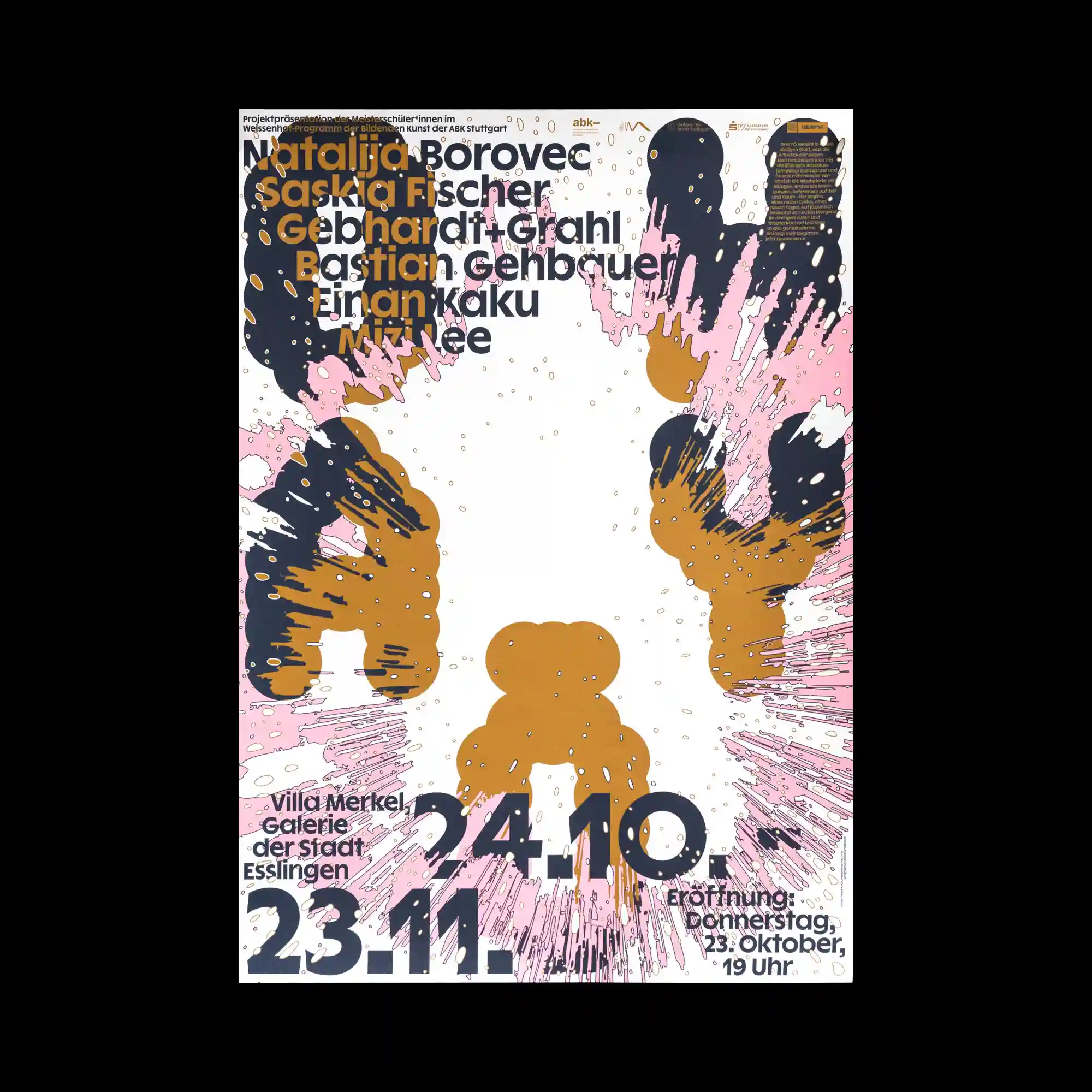
Abstract shapes resembling liquid splashes radiate outward from the center, leaving a bright void in the middle. Flat colors and rough edges suggest digitally manipulated paint or ink forms. Typography is integrated around the perimeter, following the contours of the composition. The visual energy is driven by outward motion and contrast between dense edges and open space.
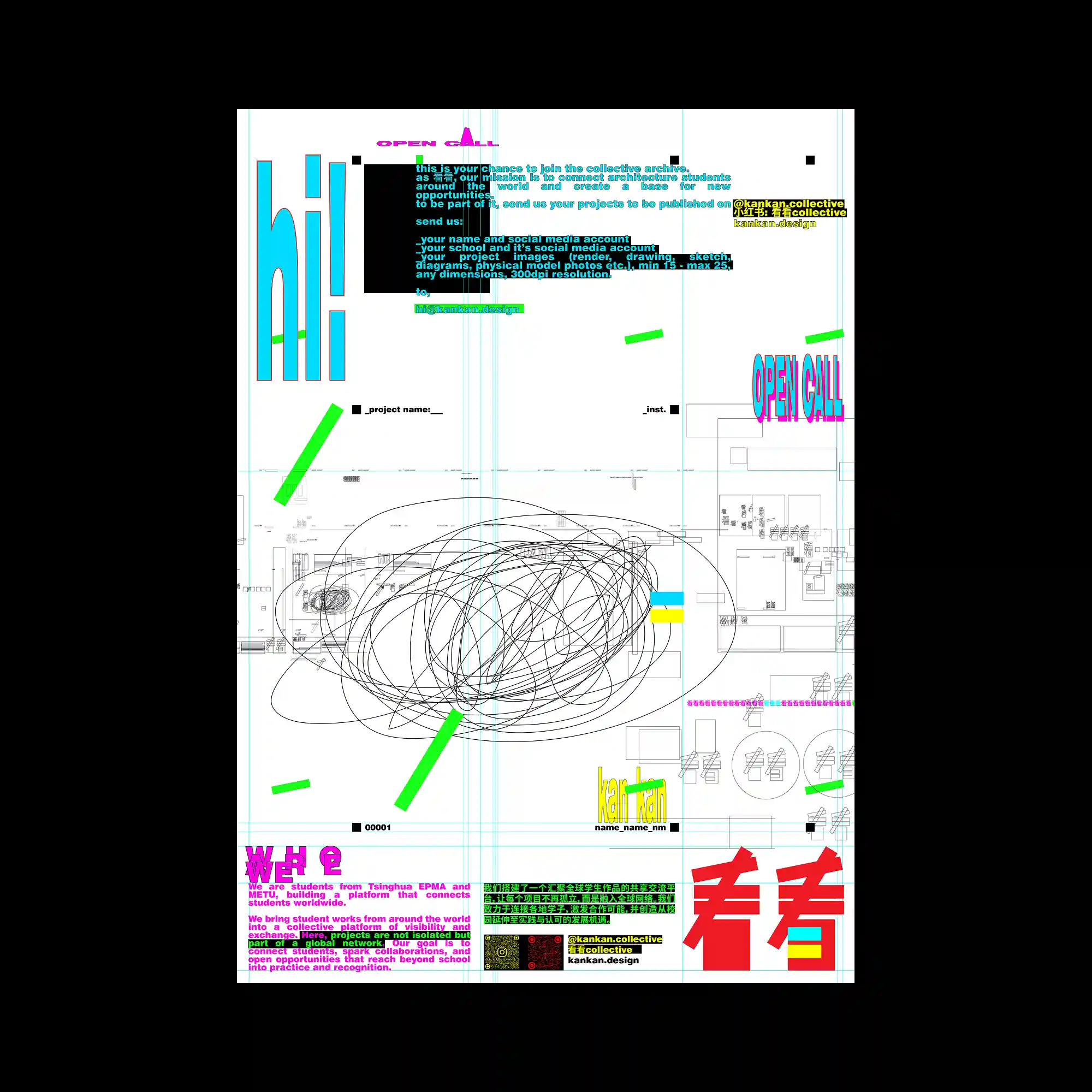
A grid-based layout combines technical drawings, interface-like lines, and high-saturation graphic accents. Bright typographic elements contrast with thin cyan guide lines that remain visible as part of the design. Hand-drawn scribbles overlay precise diagrams, creating friction between control and spontaneity. The composition feels layered and process-oriented rather than finished or minimal.
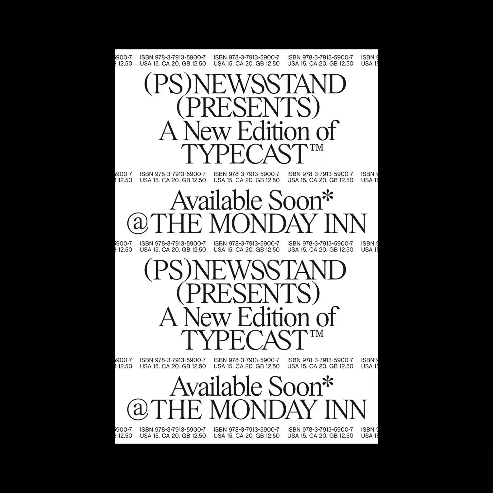
The poster relies entirely on typographic repetition, stacking identical serif text blocks in a vertical sequence. The consistent letterforms create a rhythmic pattern while slight variations in spacing generate visual tension. Small lines of technical text run horizontally, acting as a texture rather than primary information. The composition emphasizes uniformity, scale, and repetition over hierarchy.
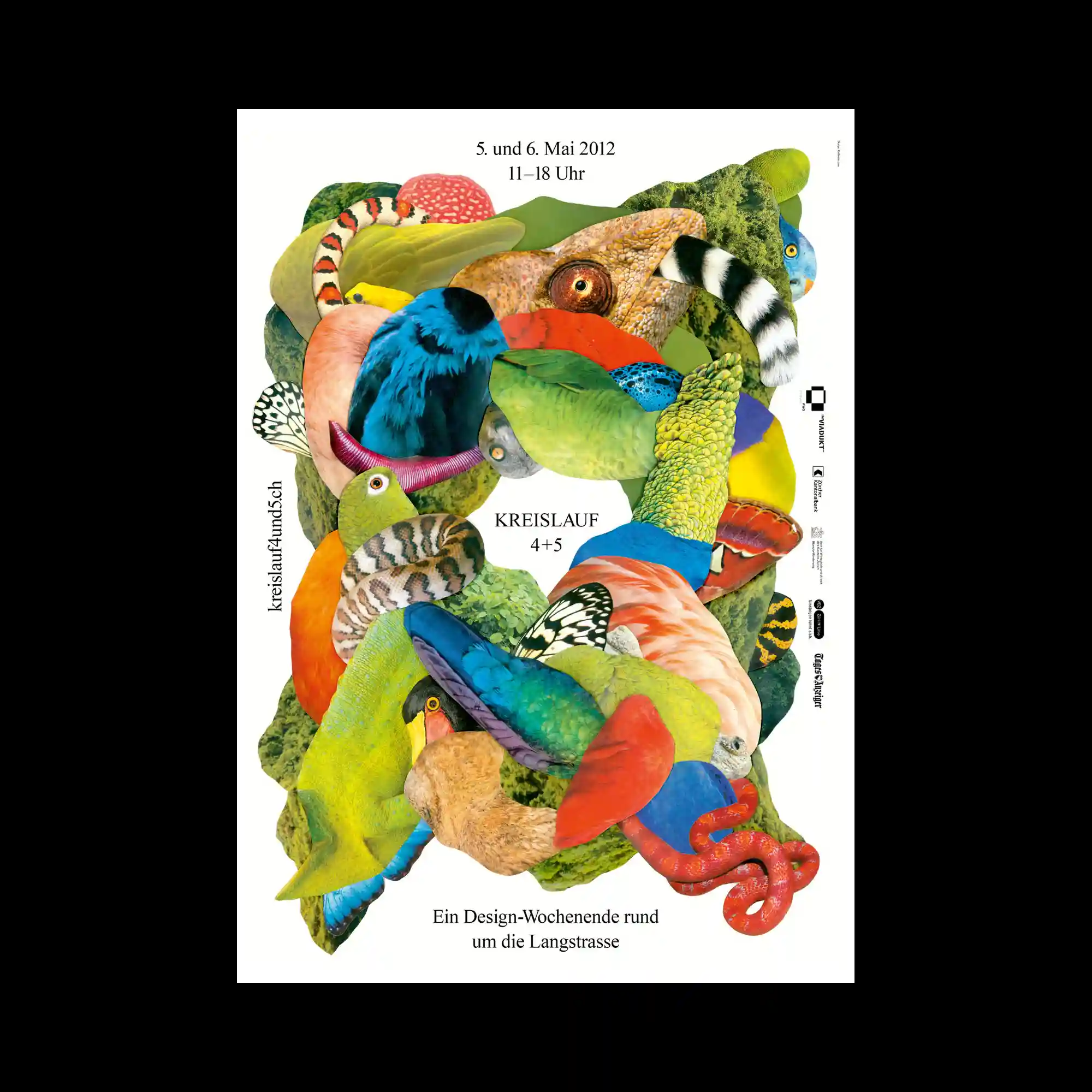
A dense collage is constructed from cut-out fragments of animals, plants, and textured surfaces, layered to form a vertically flowing mass. Each fragment retains its original photographic texture, creating sharp contrasts between scales, feathers, skin, and foliage. The composition is organized through overlapping curves and organic silhouettes that interlock without a clear focal center. Negative space around the collage frames the form and emphasizes its sculptural density.
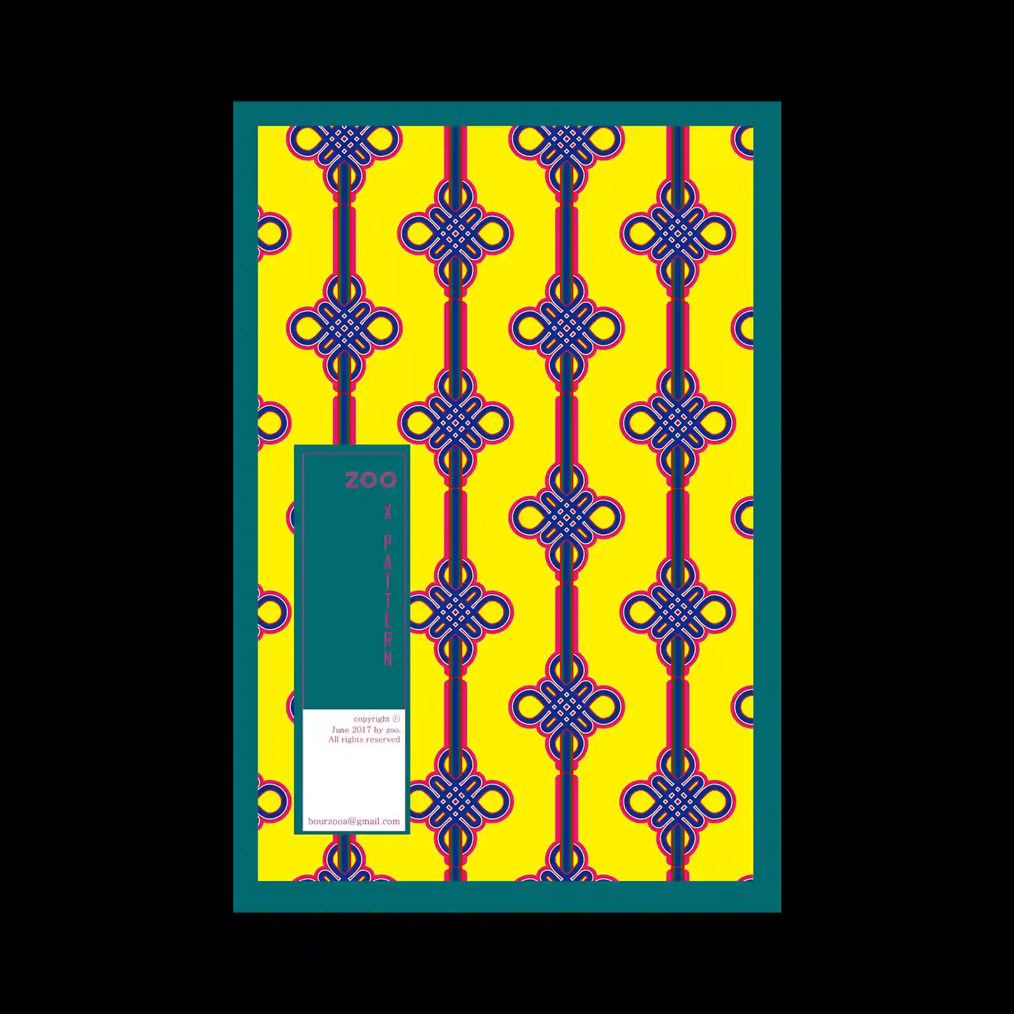
A repeated ornamental pattern fills the majority of the space, consisting of symmetrical knot-like forms aligned vertically along vivid yellow and deep pink stripes. A thick teal border encloses the composition, while a vertical teal panel interrupts the left side, containing small text blocks. The poster relies on strong repetition, symmetry, and high contrast between background and pattern.
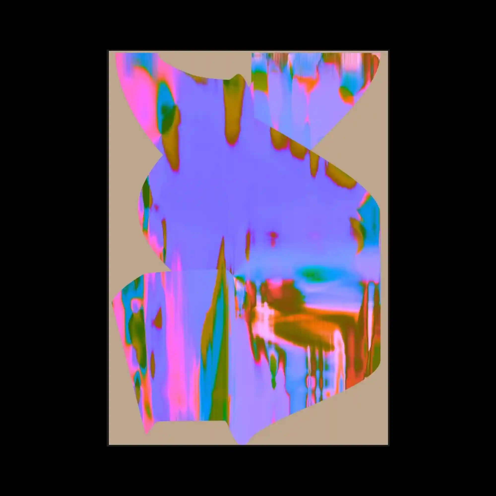
The composition presents jagged, organically shaped planes filled with saturated iridescent gradients. Colors shift in vertical streaks of pink, blue, green, and orange, giving a liquid glitch sensation. The irregular silhouettes break the rectangular boundary, making the central form appear like a fragmented digital object. The muted beige background stabilizes the intense color play.
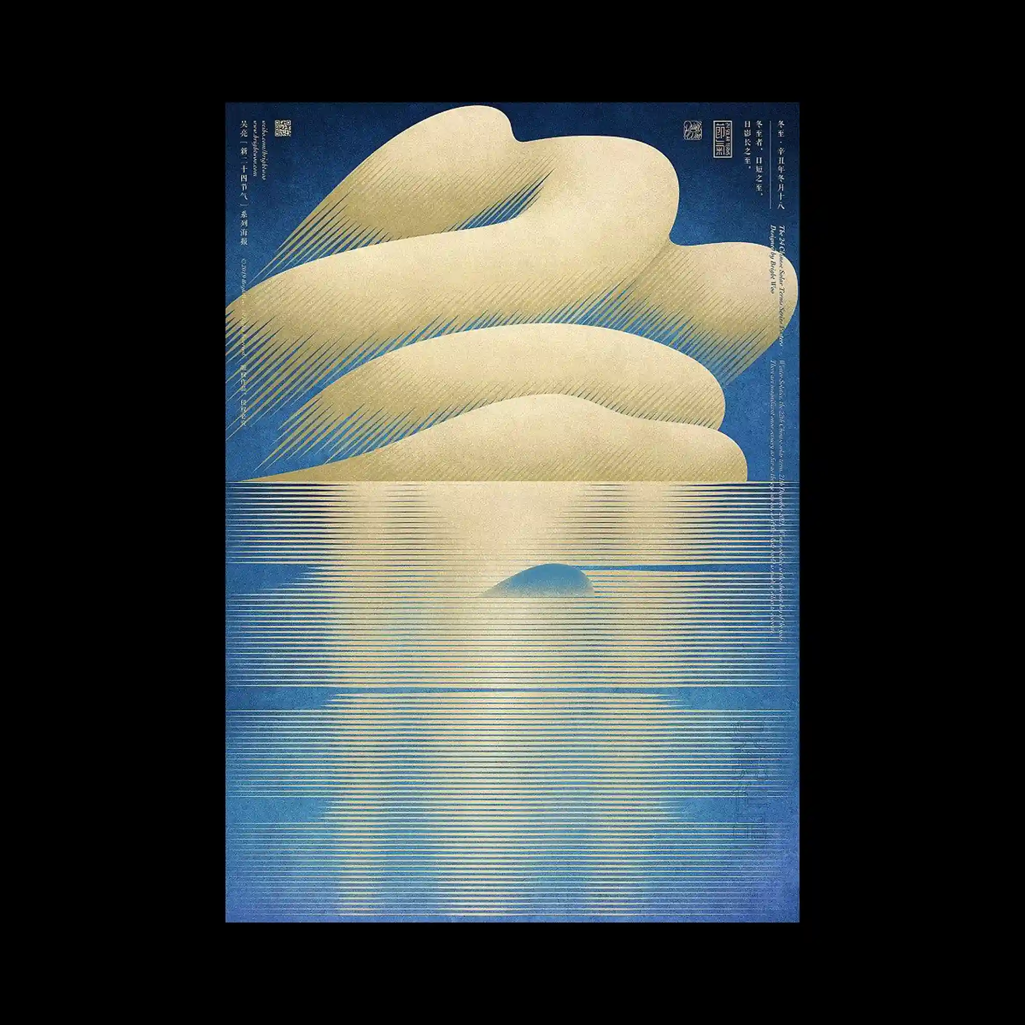
Soft beige cloud-like forms sit above a horizontal field of fine golden lines that extend downward like reflections on water. The lines vary subtly in thickness and spacing, producing a shimmering gradient. Deep blue surrounds the scene to evoke sky and depth. The poster uses minimal shapes and refined line repetition to create a serene, atmospheric landscape.
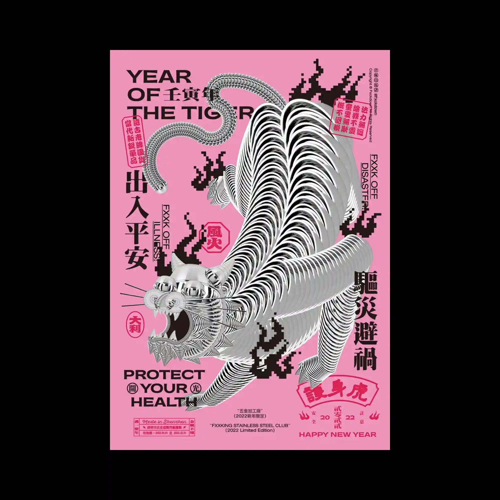
A metallic, highly repeated tiger form stretches across a pink background, each segment echoing the previous to create an accordion-like motion. Pixelated black flame shapes surround the figure, giving a digital edge. Text boxes and seals in varying orientations distribute around the tiger, building a dense, poster-like marketplace texture. The blend of chrome texture and traditional motifs feels both modern and bold.
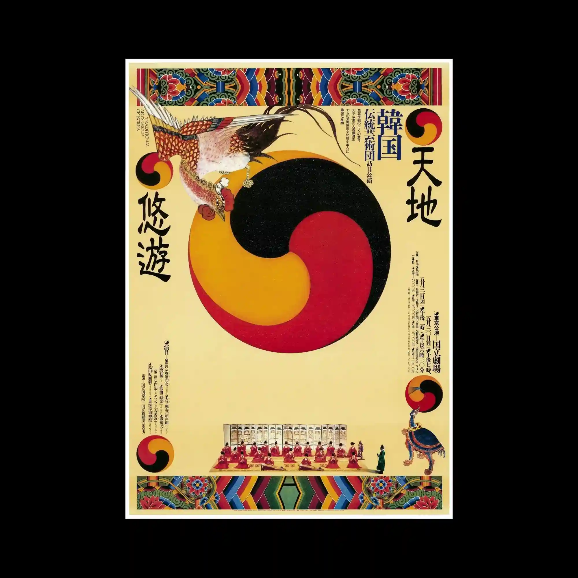
A traditional Korean-inspired composition features a large tri-color taegeuk-like swirl occupying the center. Symmetrical decorative borders frame the top and bottom, using vivid geometric folk patterns. A detailed bird illustration perches on the main circular form, adding narrative character. The arrangement blends flat illustration with symmetrical framing to create a ceremonial, classical tone.
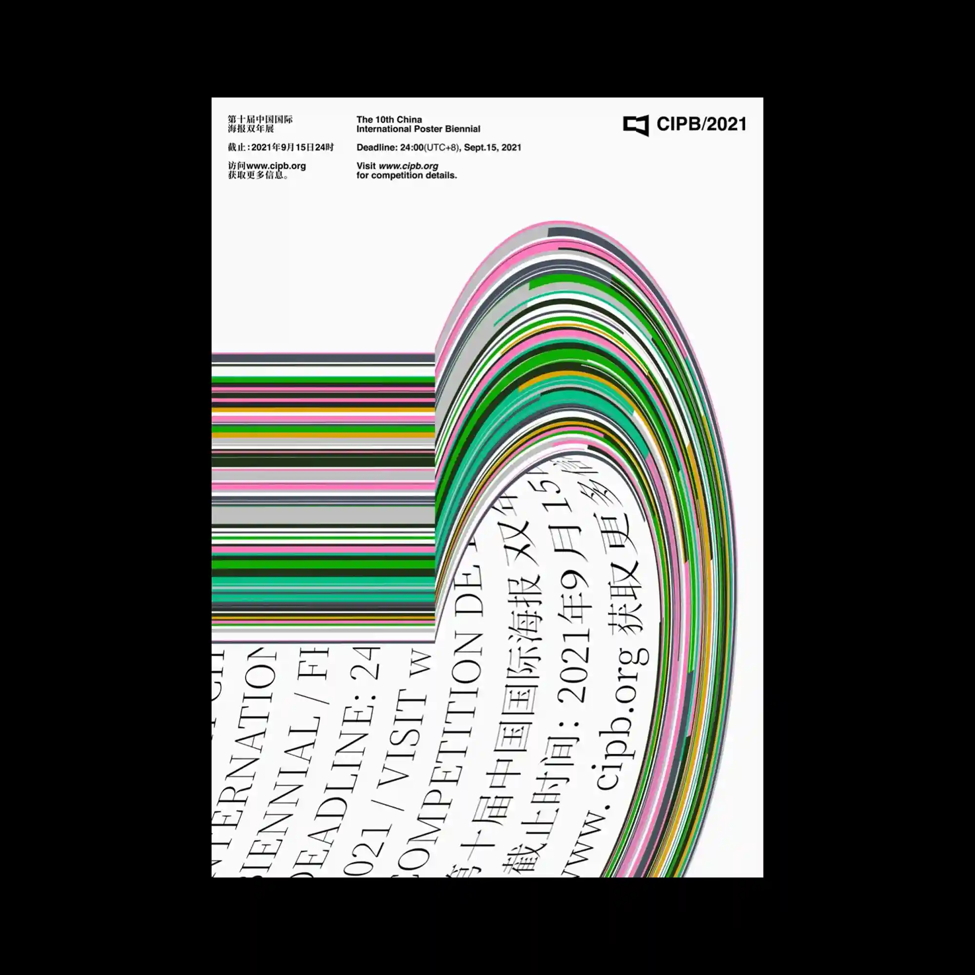
Horizontal multicolored stripes bend sharply into an arching curve, creating a continuous flow from straight geometry into a compressed, layered bundle. Beneath the curve, tilted blocks of multilingual text follow the arc’s pressure. The poster uses dense lines and high contrast between strokes to emphasize tension and directional movement from left to right.
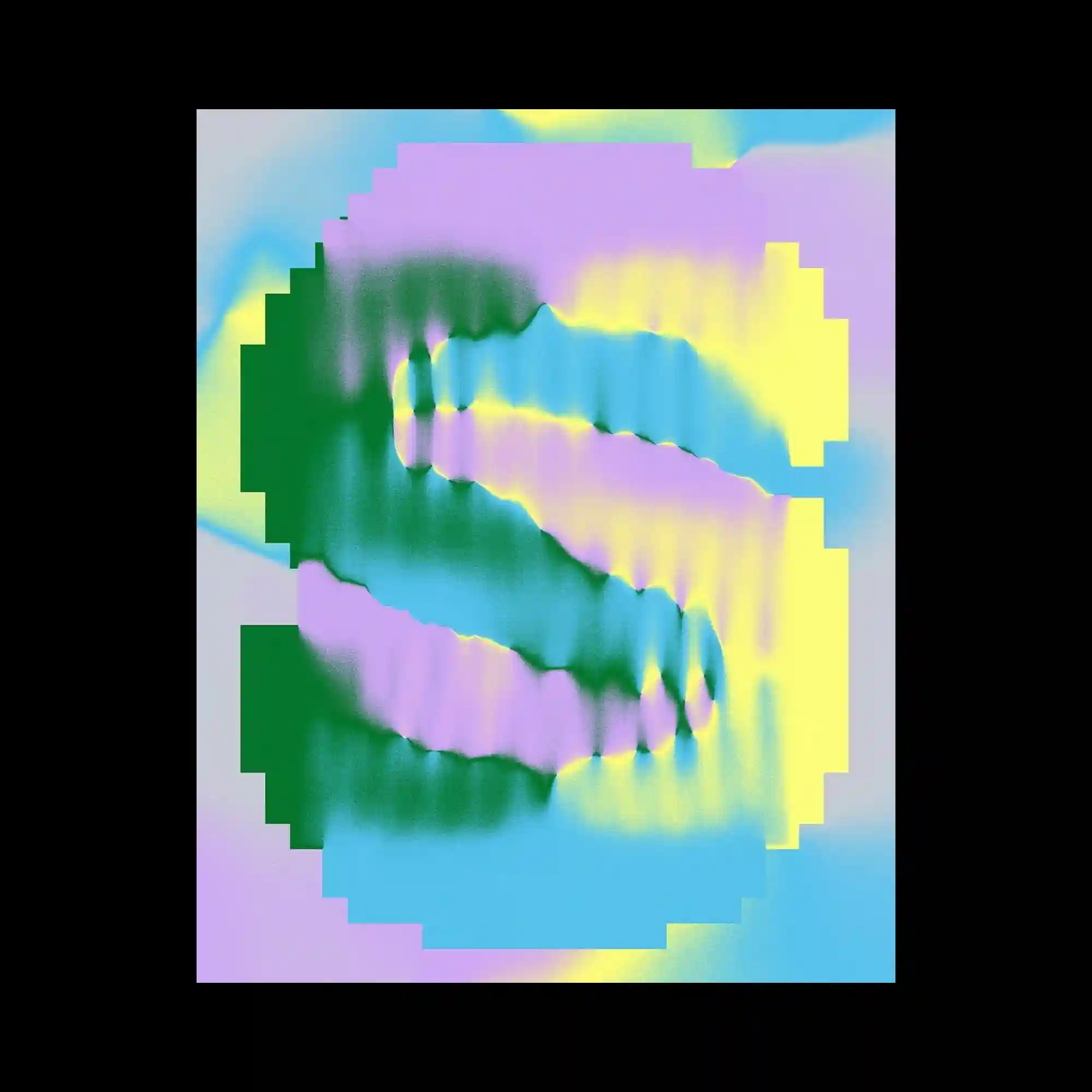
The composition uses a pixelated stepped frame surrounding a soft, diffused gradient interior. Within the center, two mirrored S-shaped forms ripple with airbrush-like color transitions in green, purple, yellow, and blue. The blurred edges create a liquid digital texture, contrasting with the rigid, blocky border. The mix of softness and geometry evokes glitch and vaporwave aesthetics.
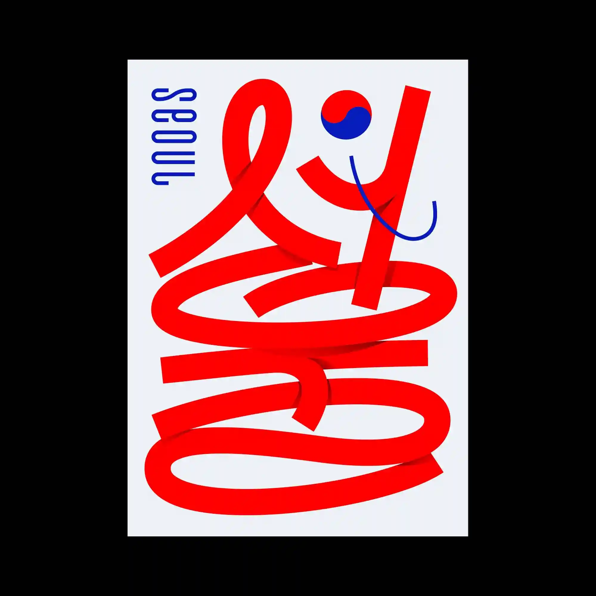
A bold red ribbon-like stroke fills the frame, looping and curling into an abstract wordform. The thick stroke casts gentle shadows, giving the form a dimensional, sculpted feel. A small blue curved line and a circular bifurcated symbol add contrast and rhythm near the top. The entire composition relies on the interplay of sweeping movement and controlled weight.
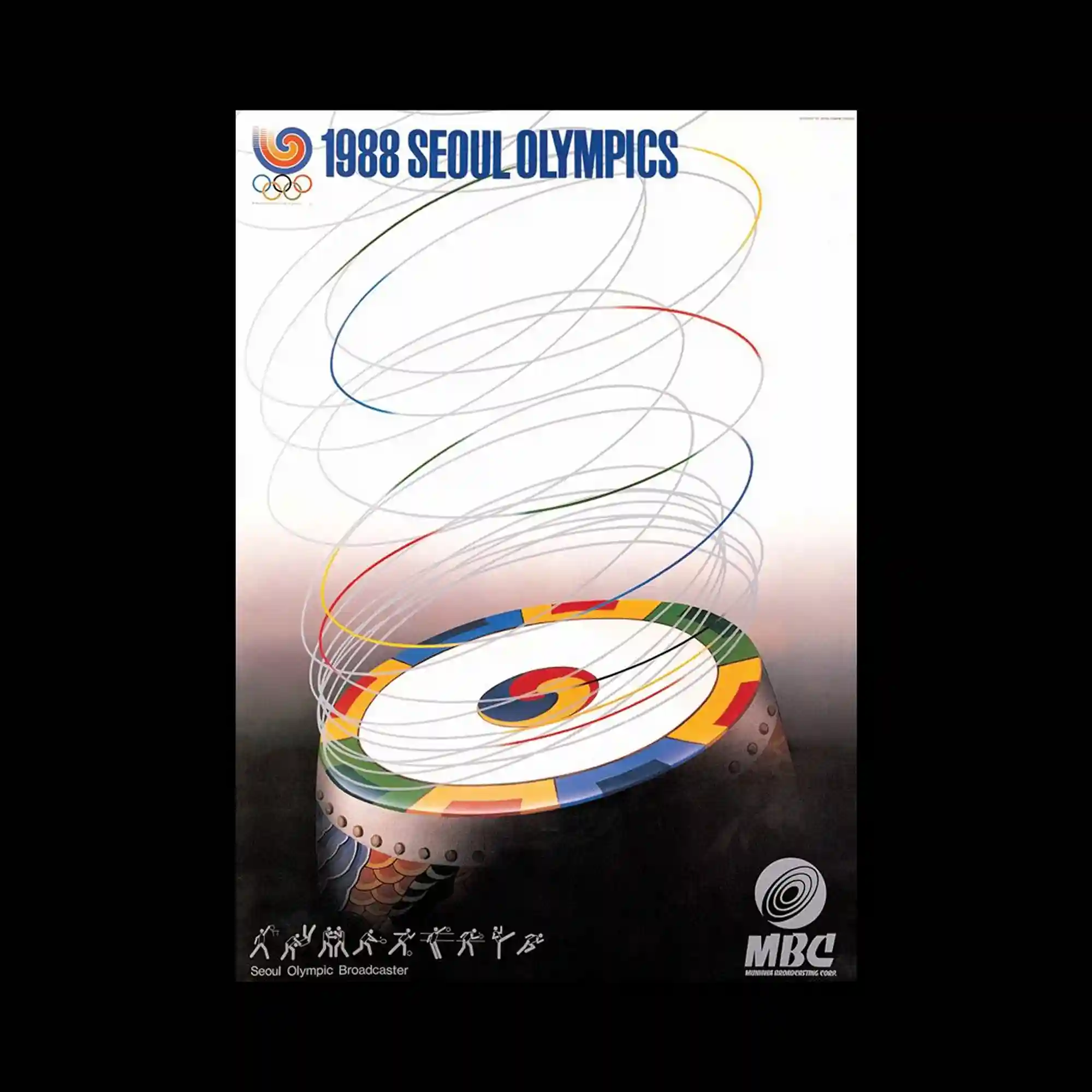
A circular platform decorated with multicolored segments sits at the bottom, emitting upward spirals drawn in thin, airy strokes. Each spiral line shifts through the Olympic palette, creating a sense of motion and lift. The gradient background transitions from dark to light, further emphasizing the ascending movement. The composition balances a heavy base with delicate, floating linear motion.

The poster features a metallic gold typographic composition placed against a highly saturated magenta background. The gold lettering has a reflective, embossed appearance, creating a sense of depth and fluid curvature. Circular text labels and icons are connected by thin gold lines, forming a diagram-like flow between date blocks. The dense shine of the gold elements contrasts sharply with the flat neon background, giving the layout a decorative yet structured rhythm.
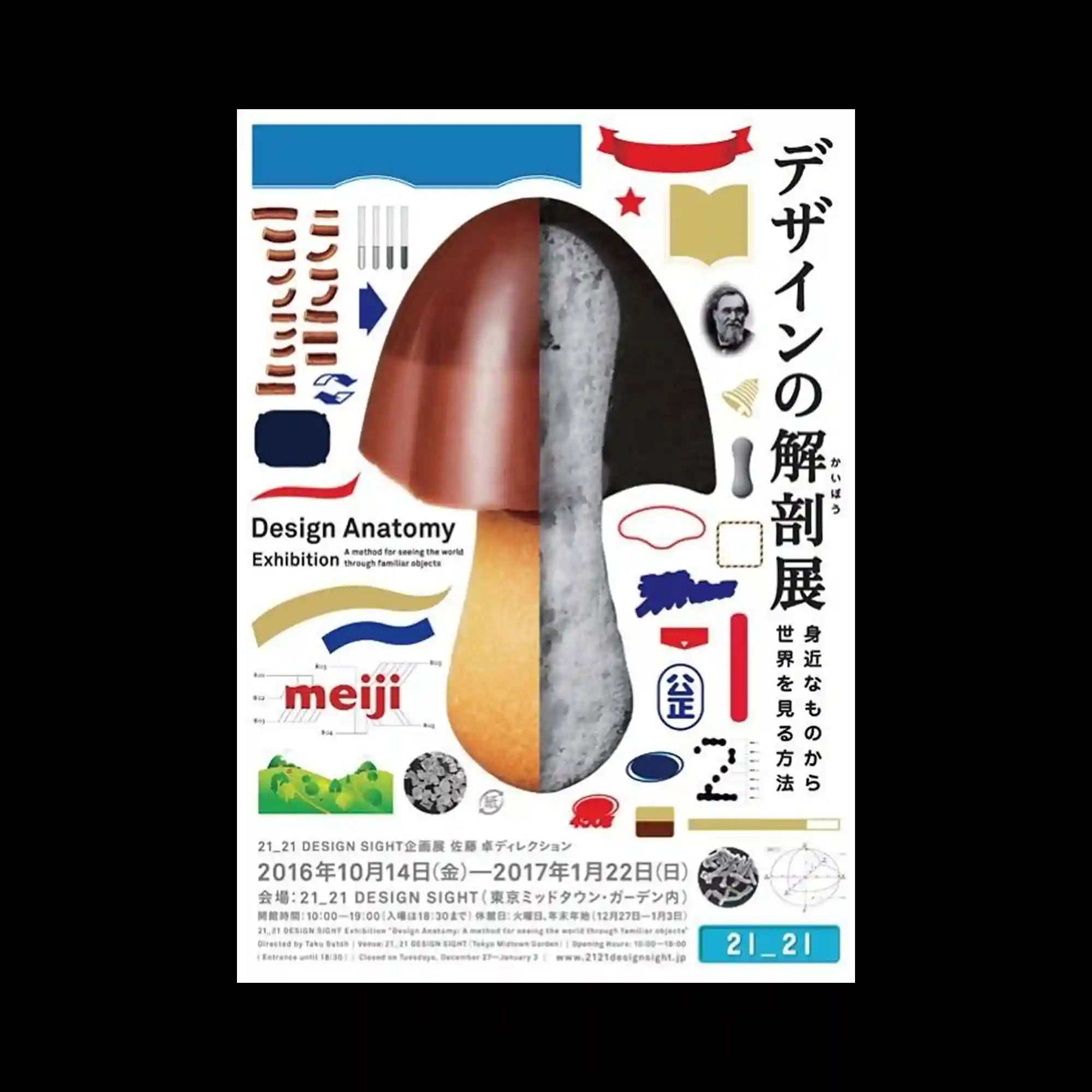
A central mushroom-like object is split vertically into contrasting material sections—glossy, textured, and soft. Surrounding it are diagrammatic fragments, graphic shapes, and labeled components, suggesting analytical breakdown. The layout resembles an instructional sheet where everyday objects are dissected visually. The mixture of photography and flat illustration reinforces the educational, exploratory tone.
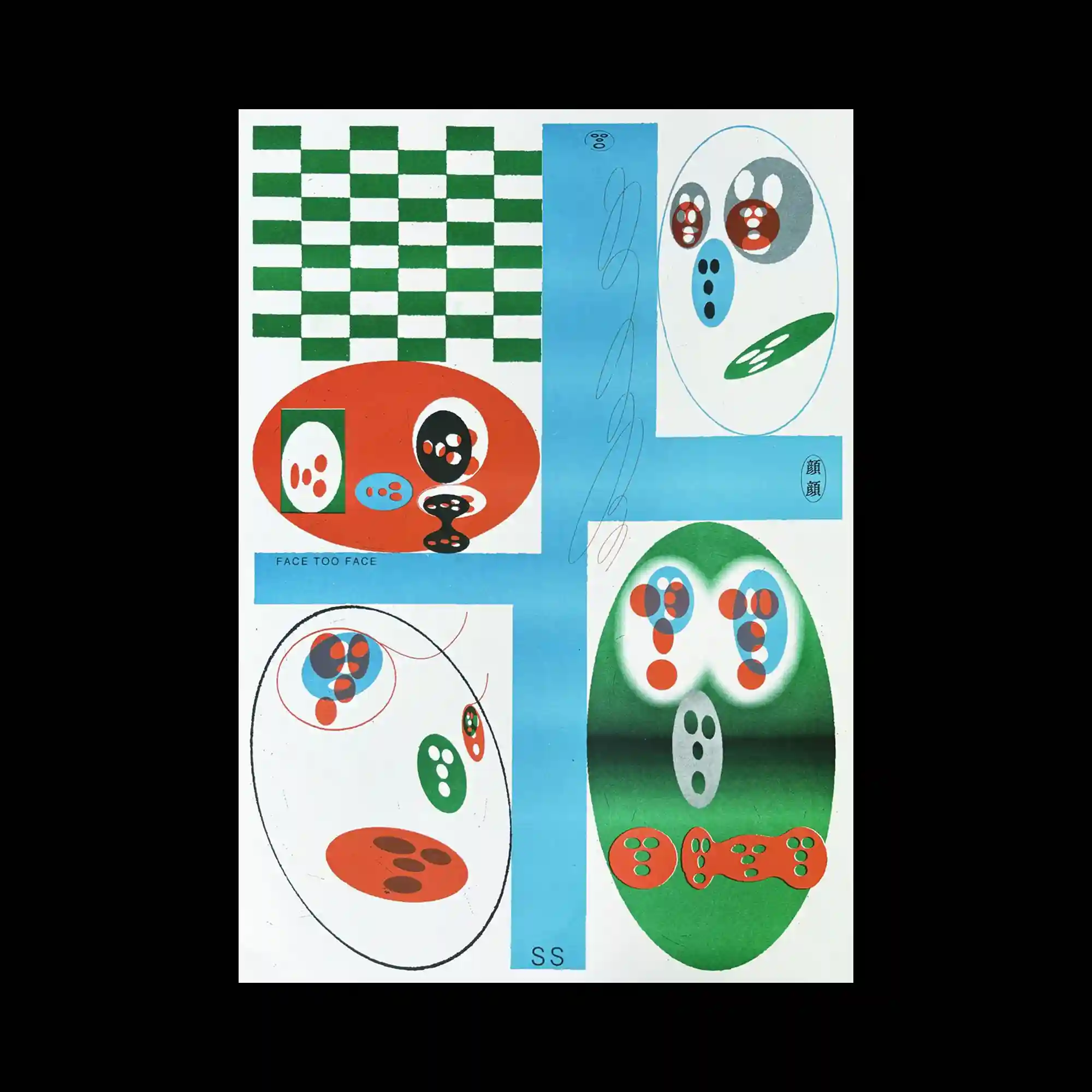
The poster is divided into panels featuring checker patterns, oval compositions, and color gradients. Inside the ovals, small abstract face-like shapes are arranged in various groupings. A vertical blue strip intersects the layout, adding balance to the scattered forms. The arrangement feels playful and experimental, focusing on simple geometric shapes transformed into expressive symbols.
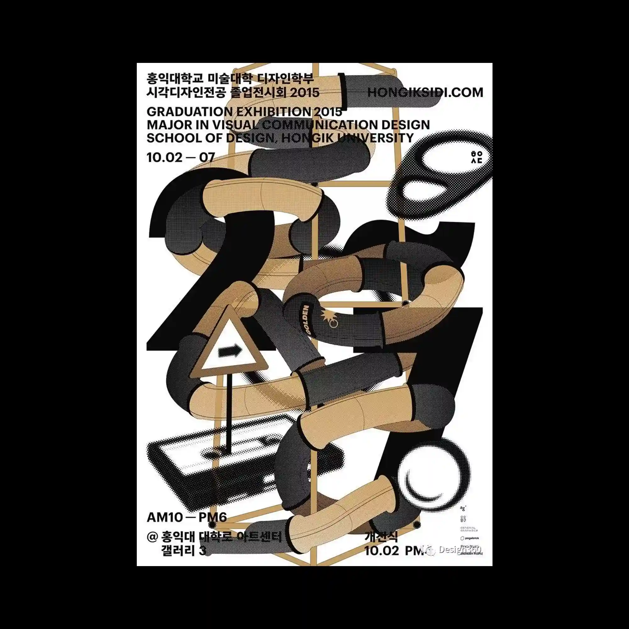
A network of tubular, padded forms curves throughout the layout, weaving between large numerical shapes. The tubes vary in shading and texture, giving them a soft inflated appearance. Minimal halftone patterns and geometric signs appear intermittently. The complexity of overlapping pathways creates a sense of three-dimensional motion within an otherwise flat composition.

A rigid blue header displays oversized white text, while the lower portion consists of a repeated black-and-white photo grid showing groups of people. Over this, elongated white drips descend vertically, partially obscuring the figures and forming distorted letter shapes. The melting effect contrasts with the strict underlying grid, creating tension between order and decay.
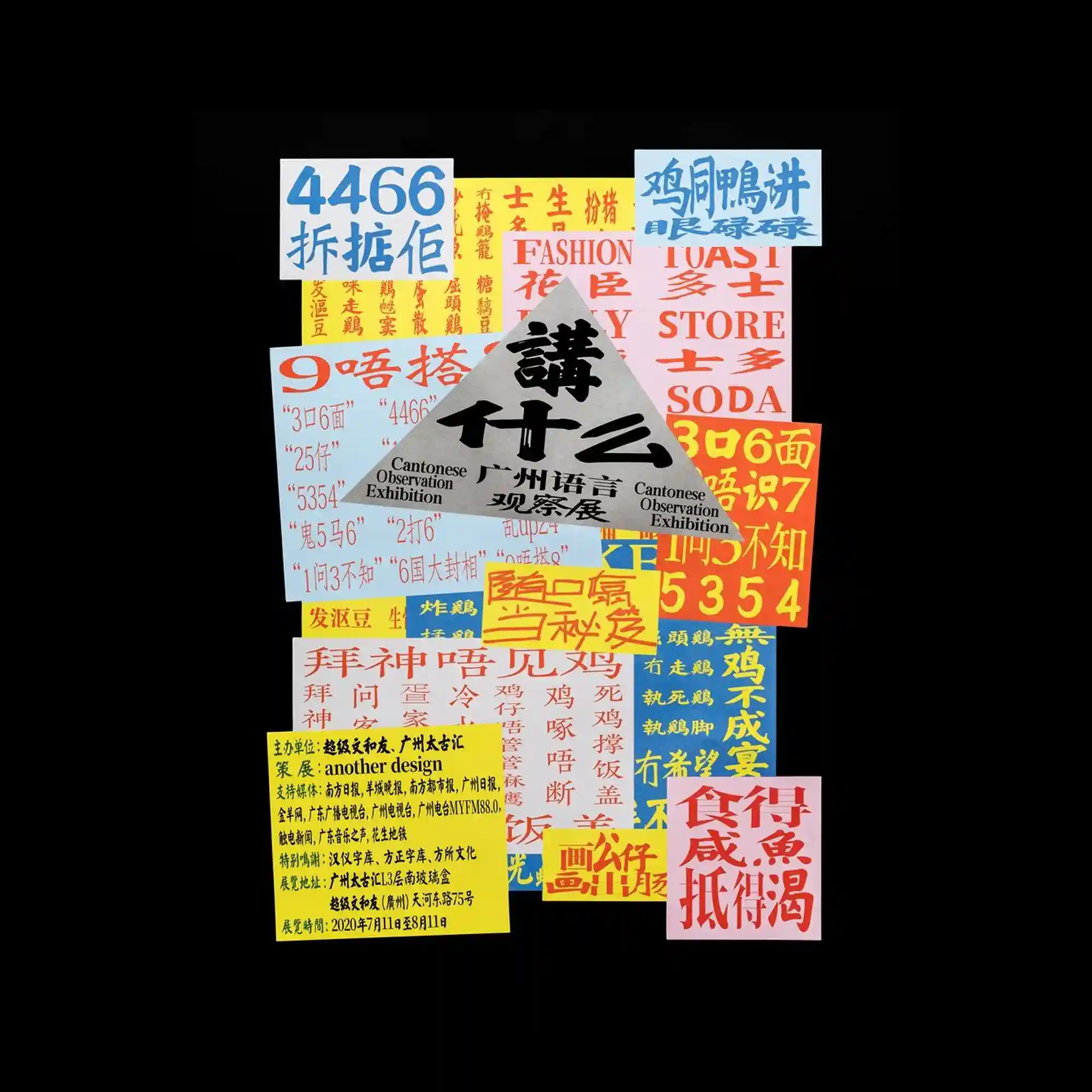
A collection of brightly colored posters, flyers, and handwritten notes are arranged in a chaotic collage. Each piece features different letterforms, sizes, and textures, creating a patchwork of visual fragments. The grayscale triangular piece in the center anchors the arrangement. The composition resembles a wall plastered with layered street advertisements, emphasizing diversity and cultural noise.

Massive black calligraphic characters dominate the composition, appearing as heavy ink blocks with rough, textured edges. Smaller vertical text lines flank the main forms, creating a rigid frame. The stark black-and-white palette emphasizes the weight and solidity of the large shapes. The poster expresses power through scale and density rather than complex arrangement.

Large brush-like characters in blue and green fill the entire surface with translucent overlapping strokes. The layered effect creates subtle color blending, reminiscent of marker ink bleeding. Thin black English text sits across the center, contrasting with the soft, swollen shapes behind it. The poster relies on gesture, texture, and transparency to build rhythm rather than strict structure.
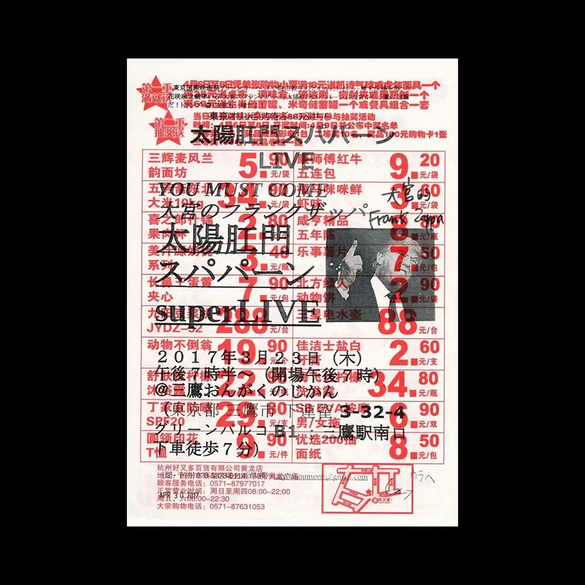
A dense sheet of red commercial-style text forms the base layer, resembling a printed receipt or price poster. Over this foundation, additional black and red handwritten elements, numerical marks, and a small monochrome photo are heavily overprinted. The overlapping information produces a chaotic visual noise. The mixture of mechanical print and rough manual annotation reinforces the feeling of an overloaded marketplace aesthetic.
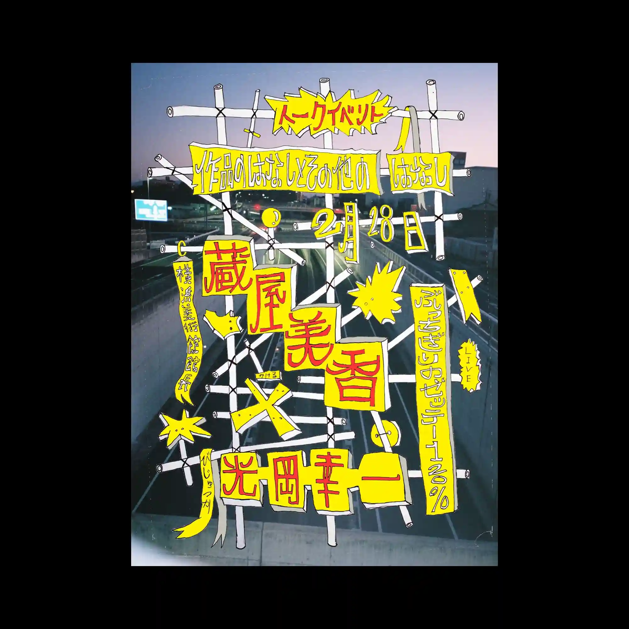
A twilight highway photograph acts as the backdrop, overlaid with hand-drawn yellow shapes and lettering. A scaffold-like white frame anchors the composition, with text pieces taped or pinned onto it. The rough, comic-style outlines and dynamic starbursts inject a chaotic, improvised energy. The contrast between the calm photographic scene and the frenetic graphic additions produces a layered, collage-like effect.
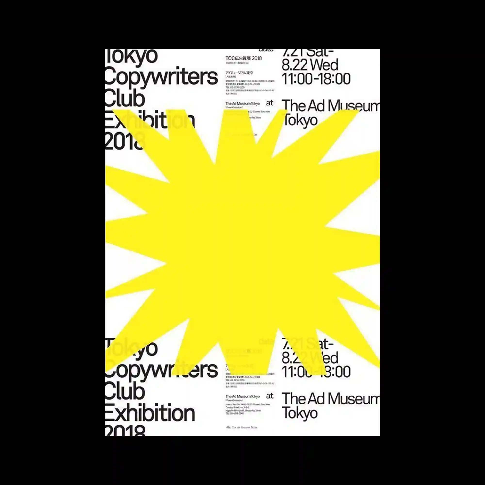
A large, irregular yellow burst shape dominates the center, covering much of the underlying black typography. The star-like form radiates outward with uneven spikes, creating a sense of sudden interruption. Beneath it, the clean sans-serif text is arranged in a structured grid, partially revealed at the edges. The tension between the controlled typographic layout and the oversized graphic explosion generates a bold visual contrast.

Warped blue typography swells and contracts across a vivid red background, creating a liquid-like deformation effect. The letters appear to ripple outward from the center, forming concentric distortions. Irregular edges and scattered fragments enhance the sense of motion. The extreme contrast between saturated red and dark blue heightens the visual impact, turning text into an expressive, fluid graphic form.

Large color blocks—green, white, black, orange, blue, yellow—form a modular layout resembling signage. A bold yellow star anchors the center left, while thick Japanese characters occupy the surrounding rectangles. The crisp separation of each color panel creates a strong grid system. The poster’s simplicity relies on flat color, geometric division, and emblem-like elements.

The poster is built entirely from repeated blocks of bilingual text, each slightly offset and overlapping. The dense tiling creates a typographic field with no single focal point, emphasizing pattern over hierarchy. The variation in scale and layer depth activates the otherwise minimal black-on-white palette. This repetition produces a wallpaper-like texture formed solely through textual elements.
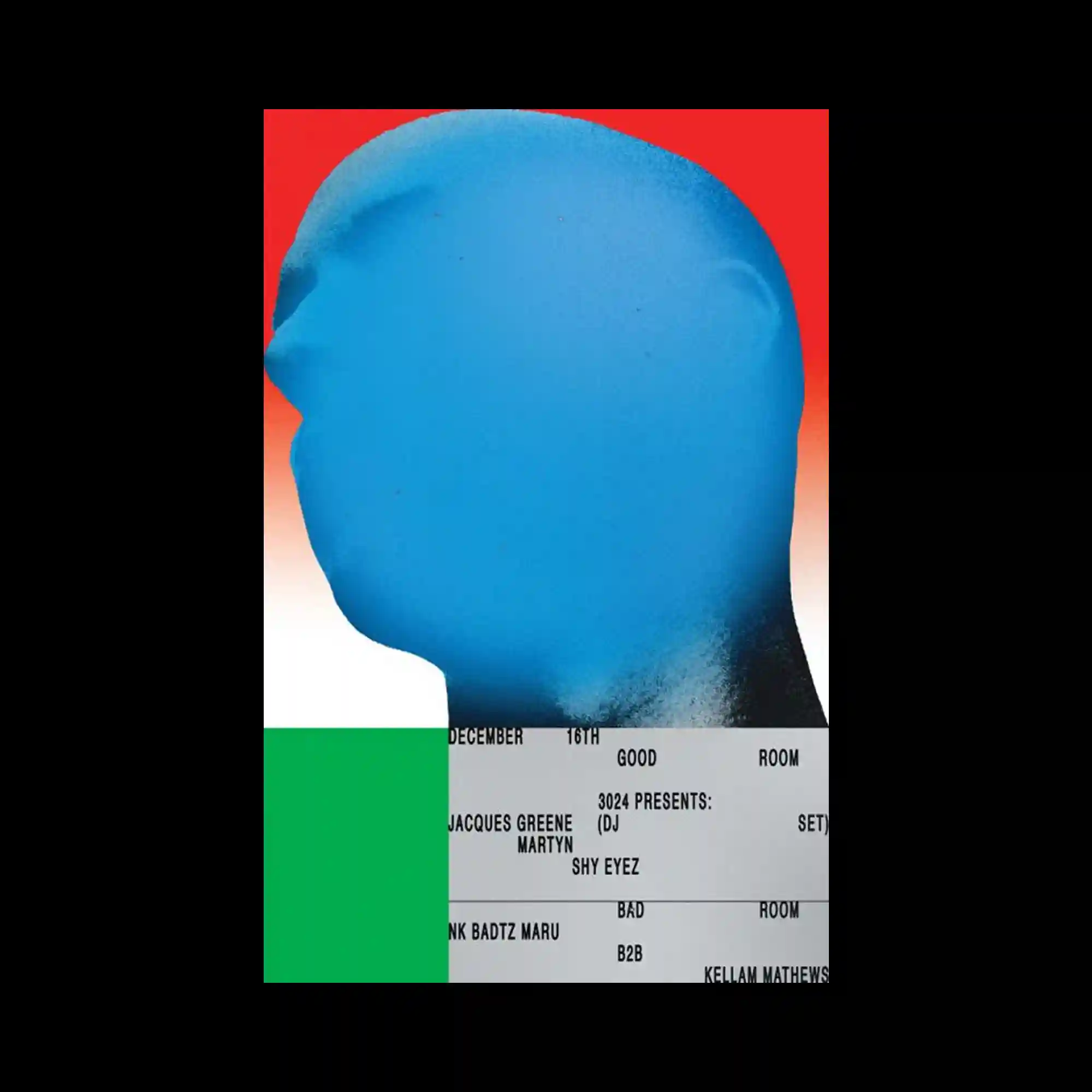
A large blue silhouette head dominates the upper portion, rendered with a soft gradient spray texture. The red-to-white background intensifies the profile’s edge. The lower portion consists of a rigid typographic block arranged in ticket-like strips, creating a sharp structural contrast. The juxtaposition of airbrushed organic form and mechanical text grid yields a striking duality.
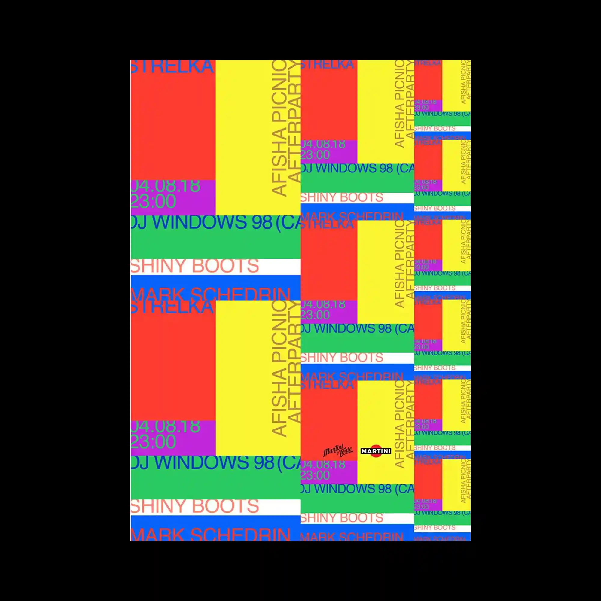
Bright rectangular fields in red, yellow, green, blue, and purple are arranged in a fragmented mosaic that repeats across the right side in smaller scale. Overlaying text in varying weights and alignments introduces a chaotic rhythm. The repetition of the compositional blocks creates a sense of duplication, like printed sheets misaligned. High saturation and overlapping modules produce an intentionally noisy visual cadence.
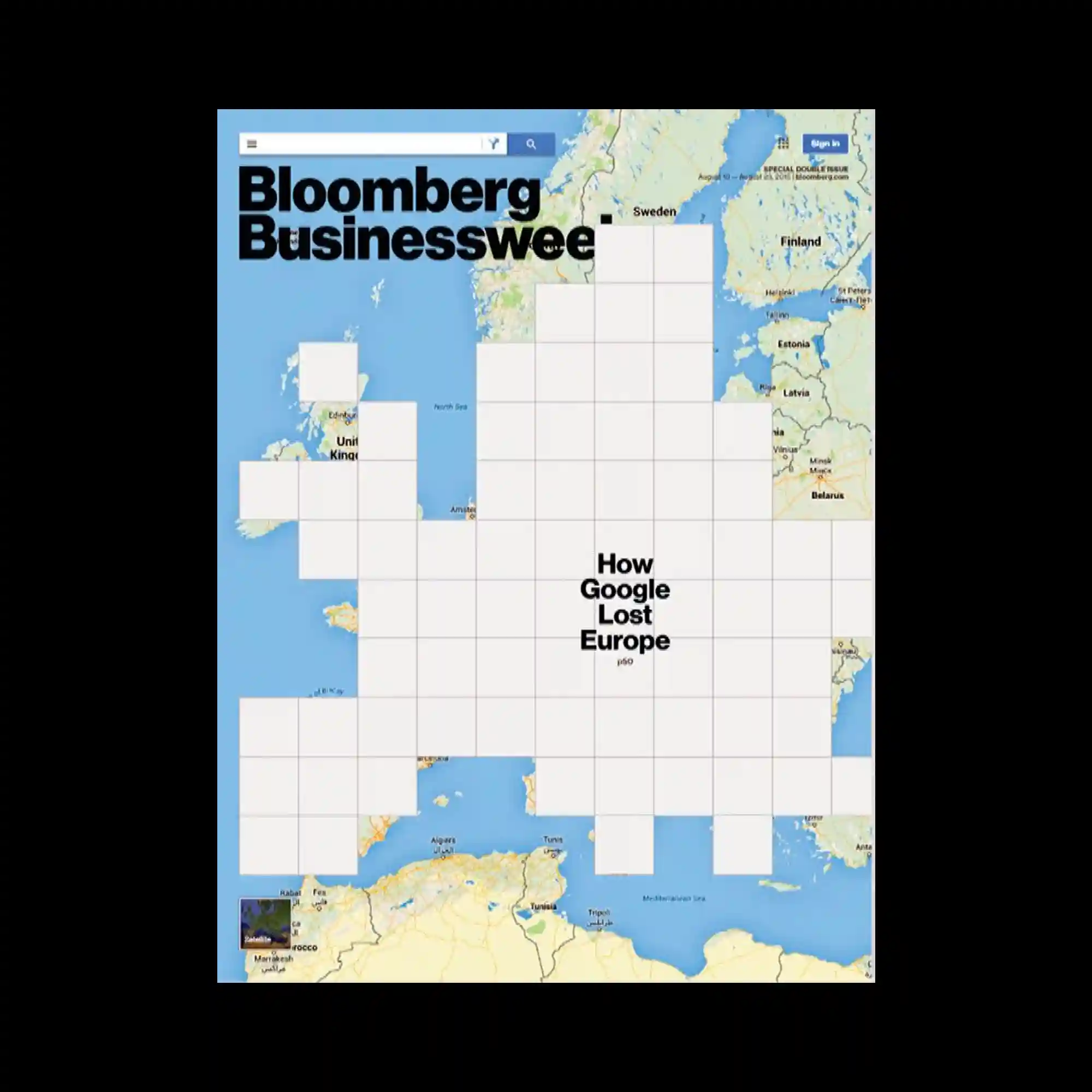
A map of Europe fills the background while a grid of white squares overlays the continent, obscuring most geographic features. The grid creates a pixel-like mask with varying levels of coverage, leaving only partial borders visible. Text sits centrally within the grid, emphasizing the blocked-out structure. The juxtaposition of recognizable map imagery and rigid abstraction creates a conceptual tension.
Organic black shapes spread across a white background like ink bleeding on paper, forming irregular columns. Between these shapes, thin lines of typography weave vertically and horizontally, almost submerged within the fluid forms. The soft fade at the edges of the black shapes gives a watercolor effect, contrasting with the precise text. The tension between liquid abstraction and refined typography creates a visually immersive texture.
Cut-out printed fragments are arranged beneath a spotlight-shaped triangular form, creating the impression of illuminated ephemera. The red background features large faded characters, while the lighter central cone contains dense red seals, symbols, and small illustrations. Blue vertical text curves along the spotlight edge, reinforcing its directional structure. The overlapping of paper textures and print marks adds a layered, collage-like presence.

A large irregular grey block occupies the center, functioning as a dominant shape that interrupts the bright orange background. Around its edges, finely spaced vertical and horizontal typography forms a strict grid-like structure. The contrast between the geometric orange field and the heavy central mass produces a strong spatial hierarchy. Minimal color use—orange, black, and grey—keeps the composition sharp and architectural.
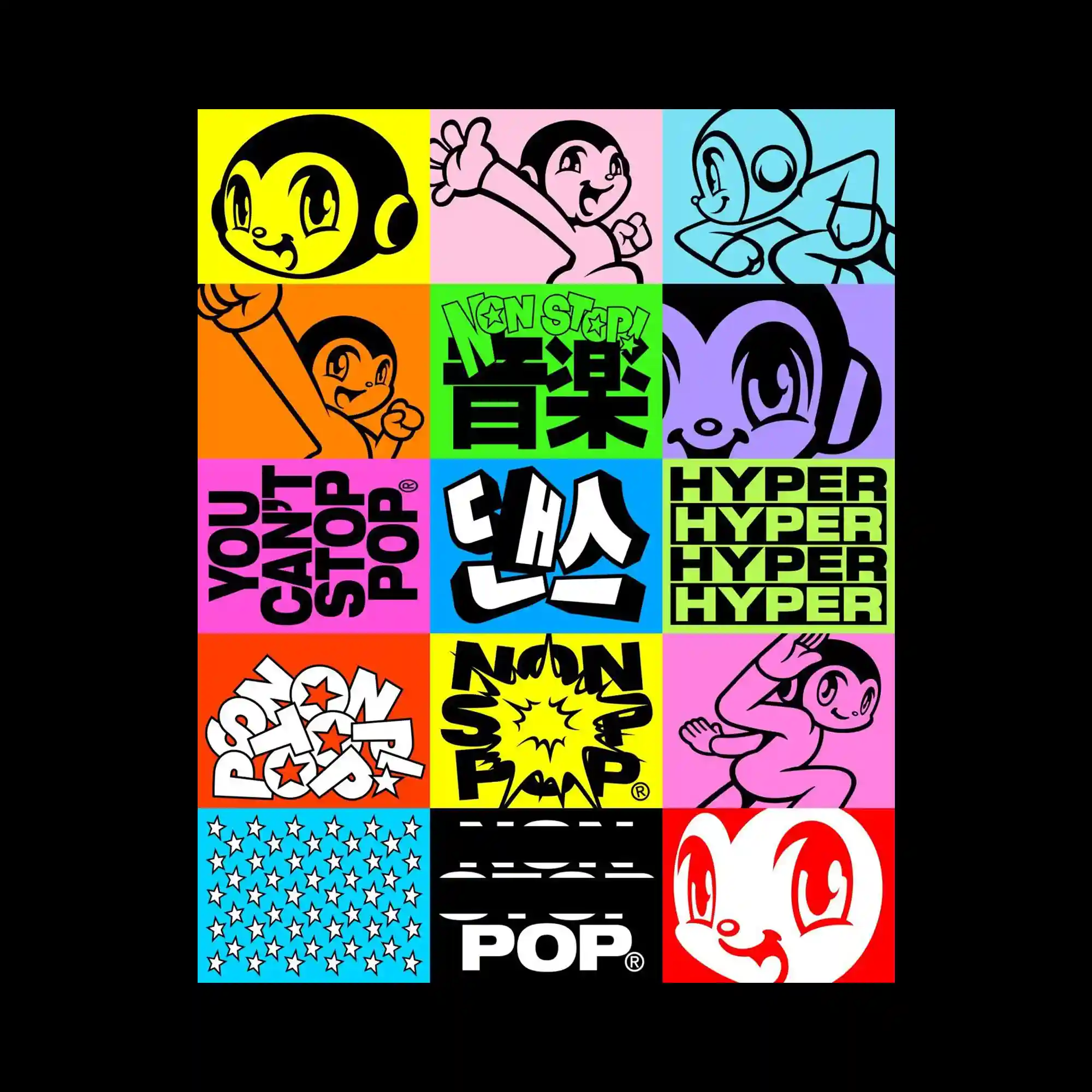
The poster is composed of a tight grid of colorful square panels, each featuring bold cartoon characters, playful lettering, or repeating graphic patterns. High-contrast line drawings and thick outlines emphasize the pop-art aesthetic. The alternating palette of neon yellow, cyan, orange, pink, and purple builds a rhythmic checkerboard effect. Each tile acts as an independent visual unit, but together they create an energetic collage heavily driven by repetition and character-based design.

A bold blue silhouette of a spiky-haired figure stands before oversized, rotated typography filling the background. The silhouette acts as a mask for centered text, which aligns within the character’s body shape. The rough, stencil-like texture of the blue form contrasts with the smooth, enlarged letters behind it. The composition plays with scale, cut-outs, and layering to create a strong graphic impact.

Large black initials dominate the upper and lower portions, while a stepped arrangement of long rectangular blocks fills the center. Each block in orange, green, or pink contains tightly packed text, creating a stacked chart-like layout. The diagonal progression of modules introduces directionality and flow. The contrast between oversized type and dense informational blocks produces a structured, editorial tone.

White silhouette figures—teapots, gnome-like characters, and a candle—sit atop a vibrant splash of orange and pink ink. The background fades from black to green, producing a moody gradient that contrasts with the bright central blot. Thin outlined typography wraps softly around the imagery, retaining an airy quality. The mix of whimsical shapes and bold color spread generates a playful yet mysterious atmosphere.

A large black character dominates the center, rendered in ultra-thick strokes with sharp geometry. Multiple neon-colored border stripes frame the composition, adding depth through layered outlines. Fine, delicate numerals overlay the top portion, creating contrast between heavy and light typographic forms. The strict symmetry and bold character silhouette give the poster a monumental quality.

Brightly colored irregular patches serve as backgrounds for clusters of overlapping serif letters. The letters appear fragmented, as if rebuilt from scattered typeset pieces. The green, yellow, and blue blocks provide distinct zones for separate textual arrangements. The interaction between broken typography and bold color fields creates a playful, puzzle-like visual rhythm.
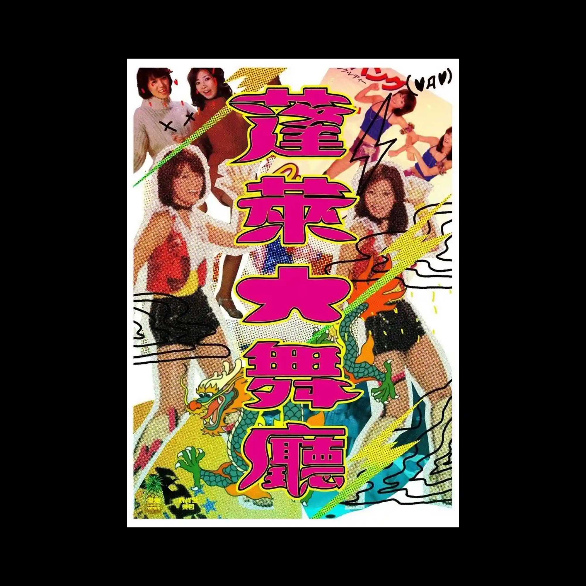
A collage of retro photographs, halftone textures, and cartoon elements fills the frame, with exaggerated pink-outlined characters layered at the center. Diagonal streaks and scribbled lines cut across the composition, increasing motion and chaos. The mix of dragons, dancers, and comic motifs creates a maximalist pop style. The large central lettering becomes the structural core around which the lively fragments orbit.
The poster uses alternating bands of blue fields and monochrome halftone patterns arranged in a stepped sequence. Dot matrices of varying densities build texture and movement, contrasting with the flat cyan rectangles containing text. Each pattern section aligns precisely, creating a mechanical rhythm reminiscent of modernist print experiments. The blend of grids and solid blocks yields a clean but dynamic composition.
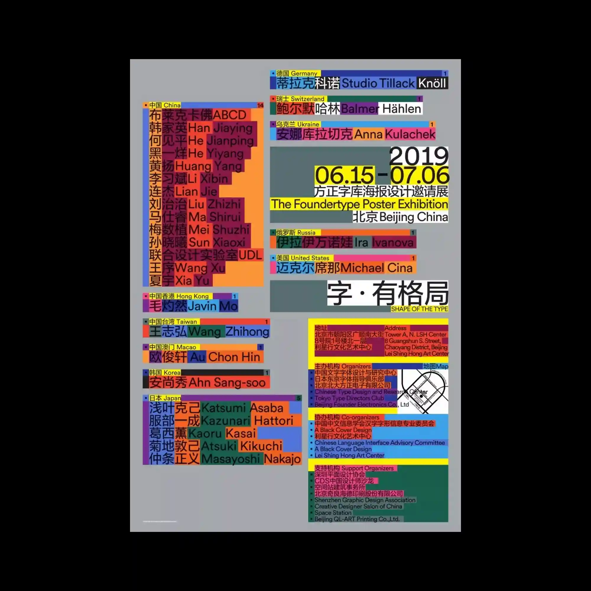
Blocks of text in multiple scripts and colors form a rigid grid, each module acting as an independent data unit. The arrangement resembles an information map where typography becomes a system of categorized labels. Bright yellows, reds, blues, and greens separate regional groups, generating a structured but visually intense taxonomy. The overall impression is systematic organization amplified by saturation and repetition.

A torn-edge layout divides the poster into two contrasting sections: a textured white area with hand-drawn crayon shapes and a black panel containing glossy metallic forms. The crayon drawings in blue and purple mimic rough, childlike strokes, while the metallic shapes introduce smooth, digitally rendered contrast. Delicate serif typography weaves between the irregular forms, creating an interplay between structured text and spontaneous marks.
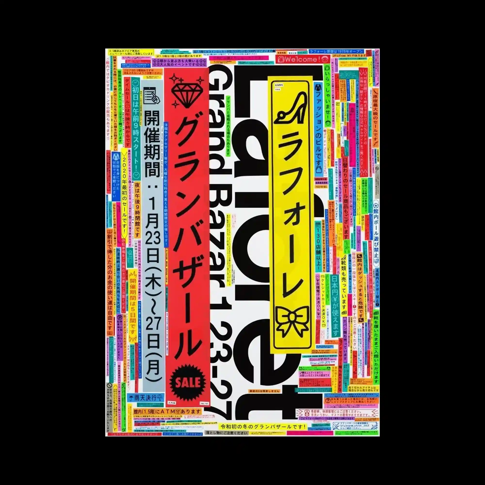
The layout is filled edge-to-edge with narrow rectangular text blocks in vivid colors, creating a dense patchwork frame around larger vertical banners. The central banners in red, yellow, and blue act as primary pillars, contrasting with the surrounding mosaic of smaller captions. Thick black typography forms a bold structural anchor beneath the layers of bright labels. The overall rhythm depends on repetition, saturation, and tightly packed modular units.
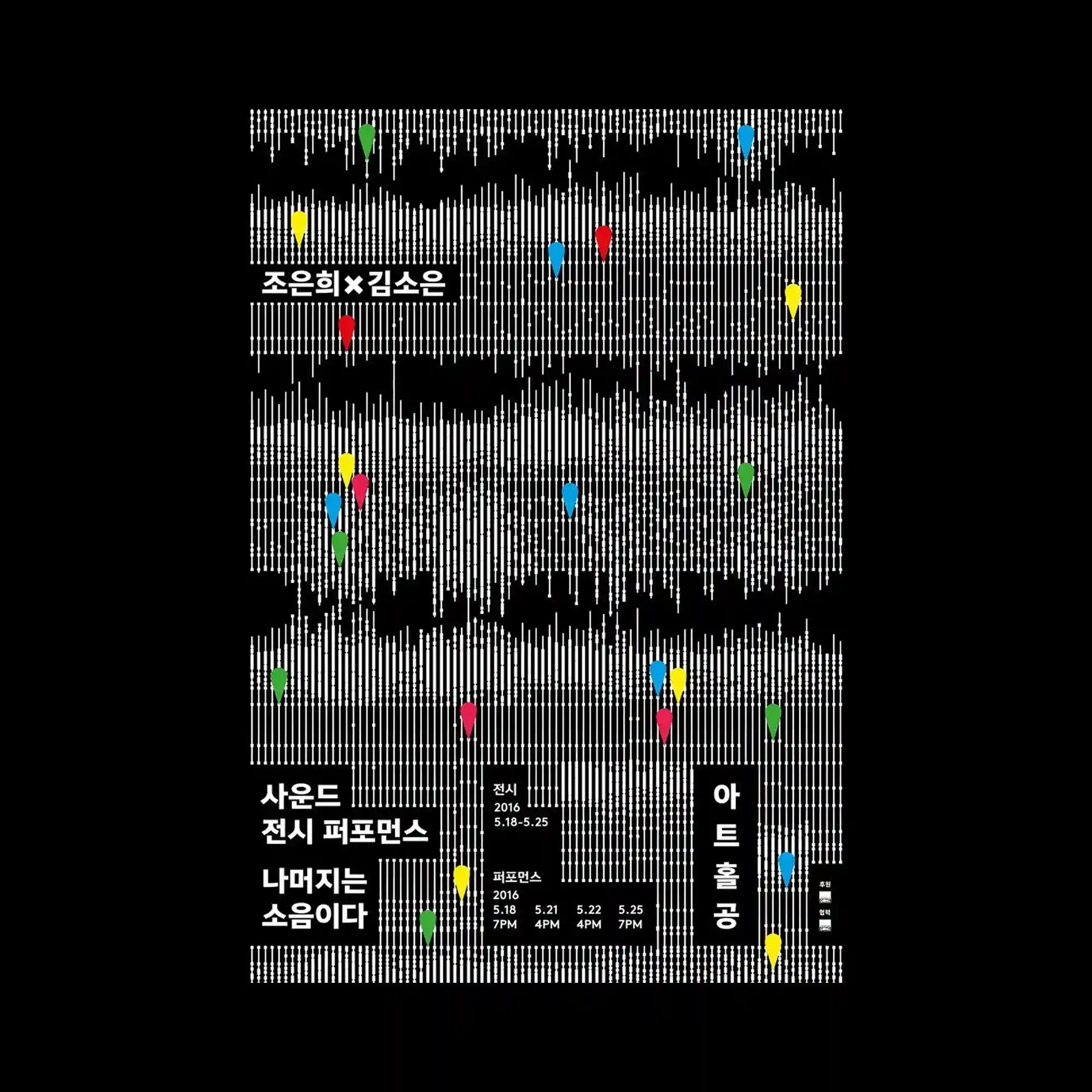
A dense field of vertical white lines forms layered wave-like bands across a black background, creating a pulsating rhythm. Small colored markers punctuate the pattern, adding points of emphasis within the repetitive structure. The lines vary in height, mimicking sound-wave modulation and generating a sense of movement. Overall, the poster builds a dynamic visual rhythm through strict repetition and subtle interruptions.
The composition resembles a scrapbook collage, combining cut-out photos, cartoon characters, and gradient-filled shapes. Each element sits independently with minimal overlap, producing a playful, childlike arrangement. The handwritten-style text at the top enhances the casual, diary-like tone. Soft pastel gradients unify the scattered objects into a cohesive visual field.

A ghostly grayscale figure fills the center, with facial features replaced by a neon pink blurred shape that disrupts the portrait. Accents of blue and red brush-like symbols float around the head, adding rhythmic patches of color. The soft, grainy texture gives the image a dreamlike, slightly eerie tone. The bold fuchsia strip at the top introduces strong contrast and visual hierarchy.
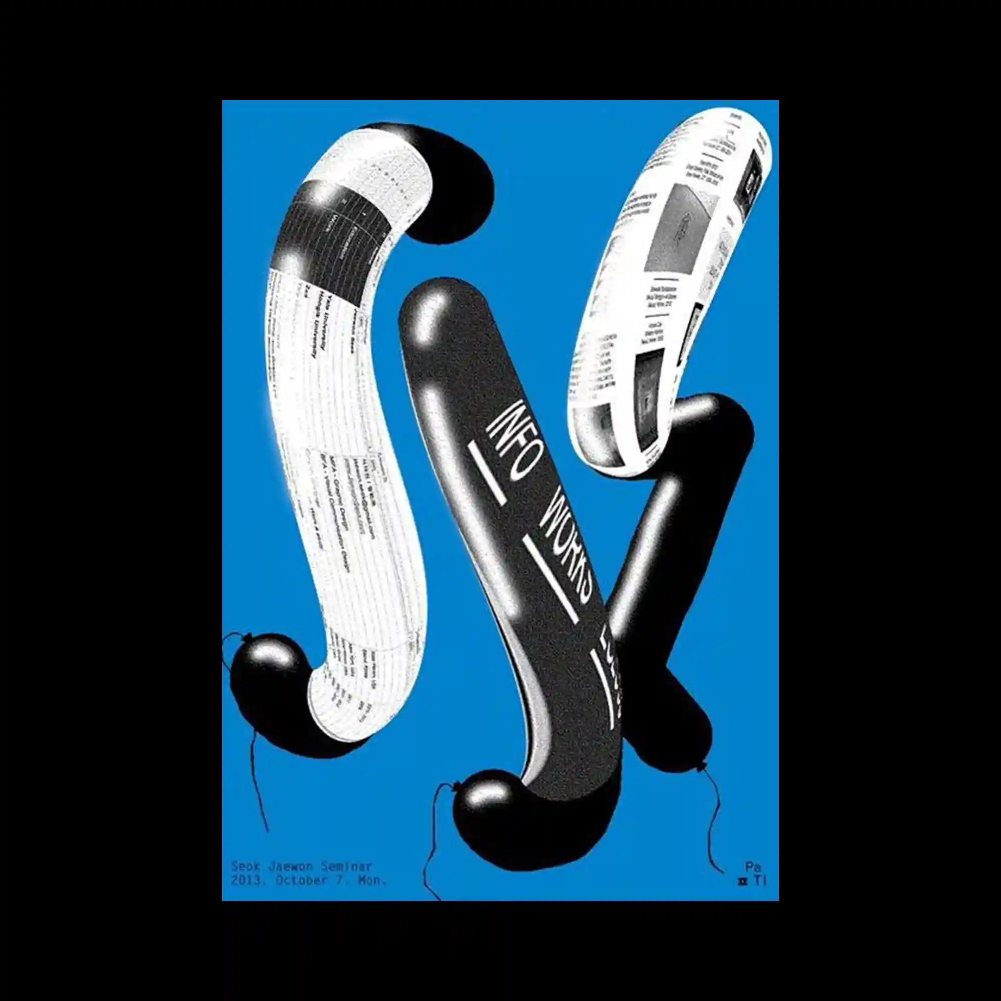
Three elongated, tubular forms twist through the frame, each wrapped with different black-and-white graphic textures including typographic fragments. The shiny surfaces create subtle reflections that emphasize their curved, inflatable appearance. Their floating arrangement gives the image a sense of weightlessness and controlled motion. The vivid blue background sets a crisp contrast, sharpening the sculptural presence of the forms.
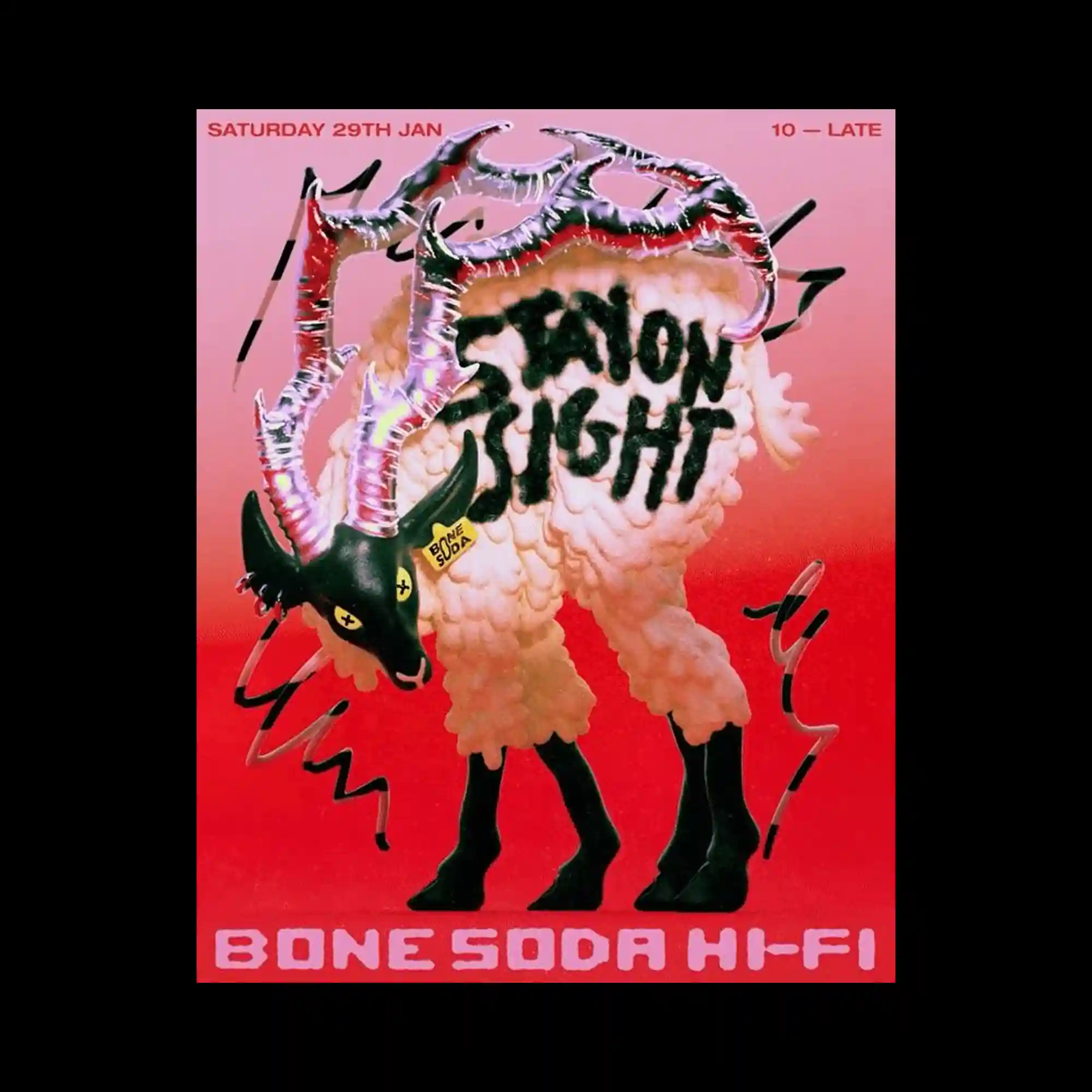
A fantastical creature stands at the center, composed of exaggerated textures including fluffy wool, glossy horns, and a painted surface. The bright metallic highlights on the horns contrast sharply with the matte body texture. Hand-drawn strokes and scribbles surround the figure, adding a raw, energetic layer to the composition. The pink-to-red gradient background intensifies the surreal, theatrical mood.
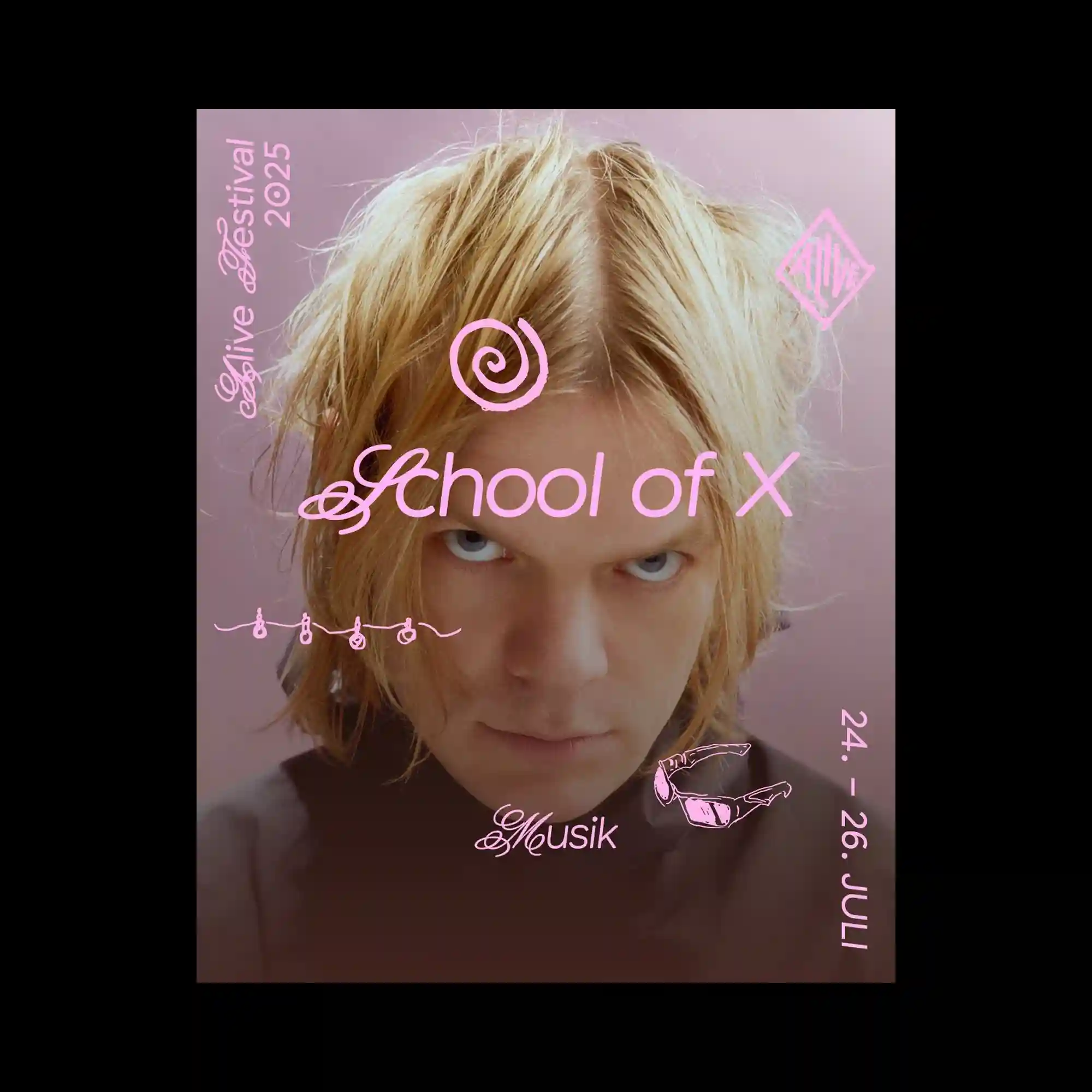
The design overlays elegant, swirling pink typography across a softly lit portrait, creating contrast between delicate lettering and the intense gaze of the subject. Curved lines and ornamental symbols float freely in the composition, giving a fluid, whimsical rhythm. The muted background gradient enhances the central figure while maintaining a gentle visual atmosphere. Together, the elements form a refined yet expressive poster with strong mood emphasis.

The poster illustrates a large book rendered with thick outlines and halftone shading, from which colorful tab-like cards emerge in a fan arrangement. Each card features a small illustrated character or scene, creating a layered storytelling effect. A hand reaches from the upper right, interacting directly with the tabs and enhancing the sense of participation. Bright stars and playful icons scattered around the layout add a cheerful, comic-style tone.

The layout uses a grid of inflated bubble-wrap cells, each acting as an individual circular container for bold orange letters. The glossy plastic texture catches highlights and shadows, adding dimensional depth to the repeated circular modules. The strict alignment of the bubbles contrasts with the playful irregularity of the printed characters. This modular repetition creates a tactile, object-like surface rather than a flat typographic arrangement.
The graphic consists of dense black letterforms that dissolve into clusters of thin horizontal lines, creating a textured, glitch-like appearance. The letters lose their solidity along the edges, blending into fragmented strokes that feel computational and mechanical. The high contrast between the dark core shapes and the dispersed line noise emphasizes the breakdown of the form. Overall, the image balances legibility and abstraction through repetition of linear patterns.
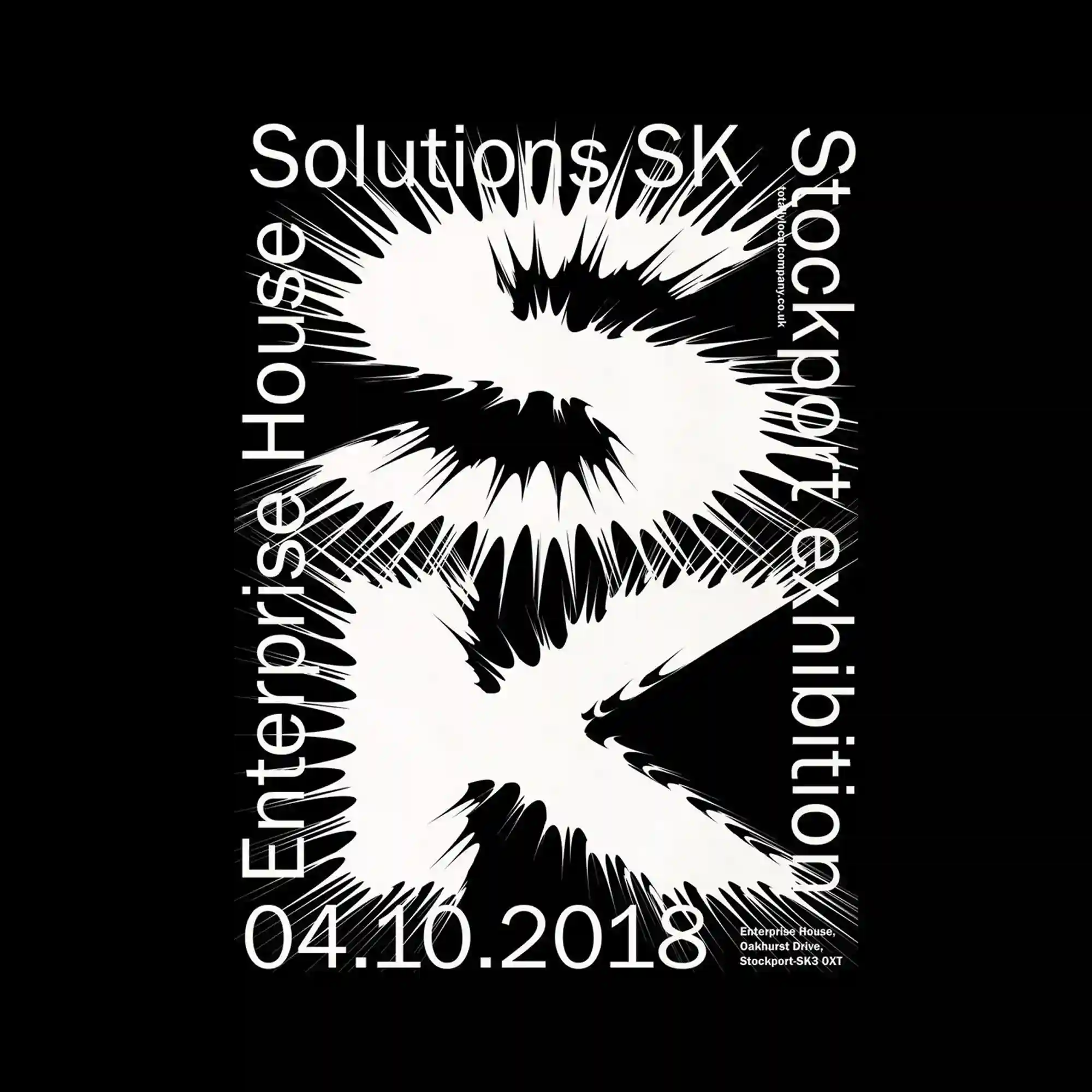
The composition features a bold white form at the center that appears to burst outward, creating sharp radial spikes with high-contrast black edges. Surrounding typography aligns vertically and horizontally along the border, forming a rigid frame against the organic explosion shape. The central figure’s dynamic, almost liquid distortion introduces a strong sense of motion and tension. Negative and positive space interact tightly, giving the entire poster an energetic, vibrating visual structure.
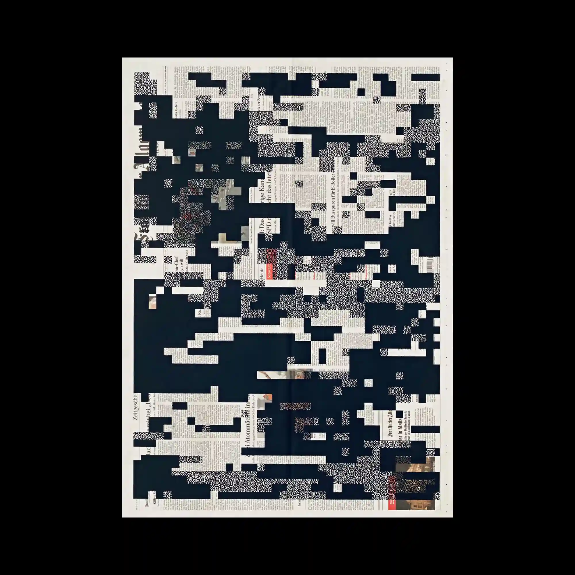
A newspaper-like texture is overlaid with fragmented black rectangles, creating a sense of digital interference or redaction. The scattered gaps reveal bits of printed text and images beneath, forming a layered visual narrative. The grid-like disruption mimics data corruption or censorship. The contrast of analog material and digital abstraction evokes a dialogue between memory and loss.
Thin black grid lines curve dynamically across a white background, forming an illusion of warped architectural surfaces. The minimal typography, placed around the edges, enhances the diagrammatic feel. The bending structure implies perspective and tension within a two-dimensional space. The poster balances precision and elasticity through disciplined simplicity.

A beige background hosts a set of blurred vegetables arranged within visible digital bounding boxes. The precise framing grid contrasts with the soft, unfocused photography, suggesting an experimental study of perception and categorization. Each item is numbered and labeled, reinforcing scientific order against visual ambiguity. The tension between clarity and blur defines the poster’s conceptual core.
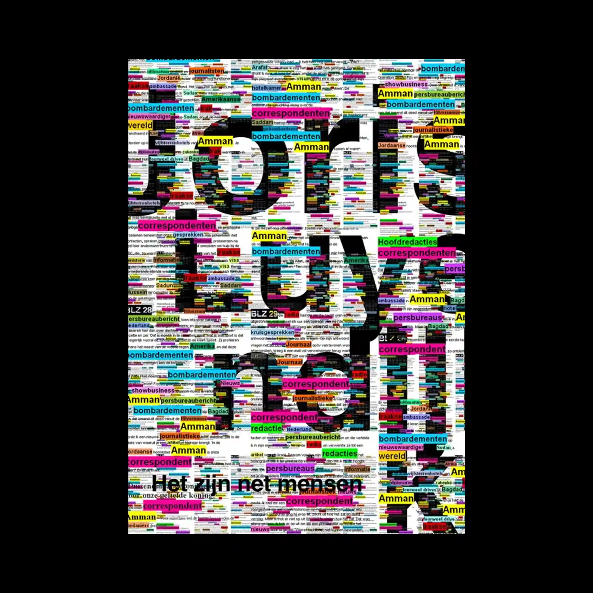
A dense composition built entirely from multicolored text blocks, forming a mosaic-like surface. Large black letters emerge through the colorful chaos, partially legible within the typographic field. The interplay of saturation, hierarchy, and repetition creates visual rhythm and cognitive overload. The design celebrates information density as both noise and pattern.
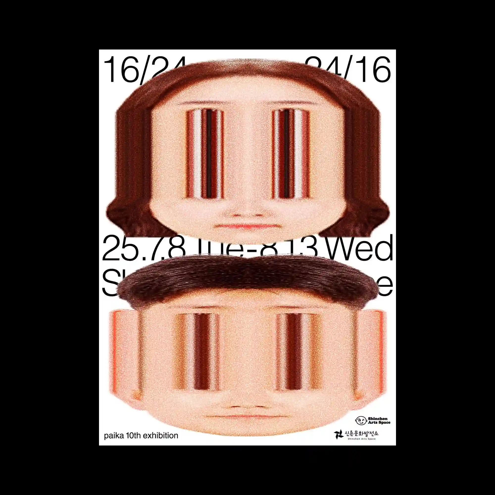
Two distorted human faces are vertically stacked, their eyes stretched into elongated reflective voids. The warped perspective and grainy texture evoke a sense of digital manipulation and uncanny familiarity. Minimal black typography anchors the surreal imagery within a structured layout. The contrast between the mechanical distortion and human softness produces an unsettling visual impact.
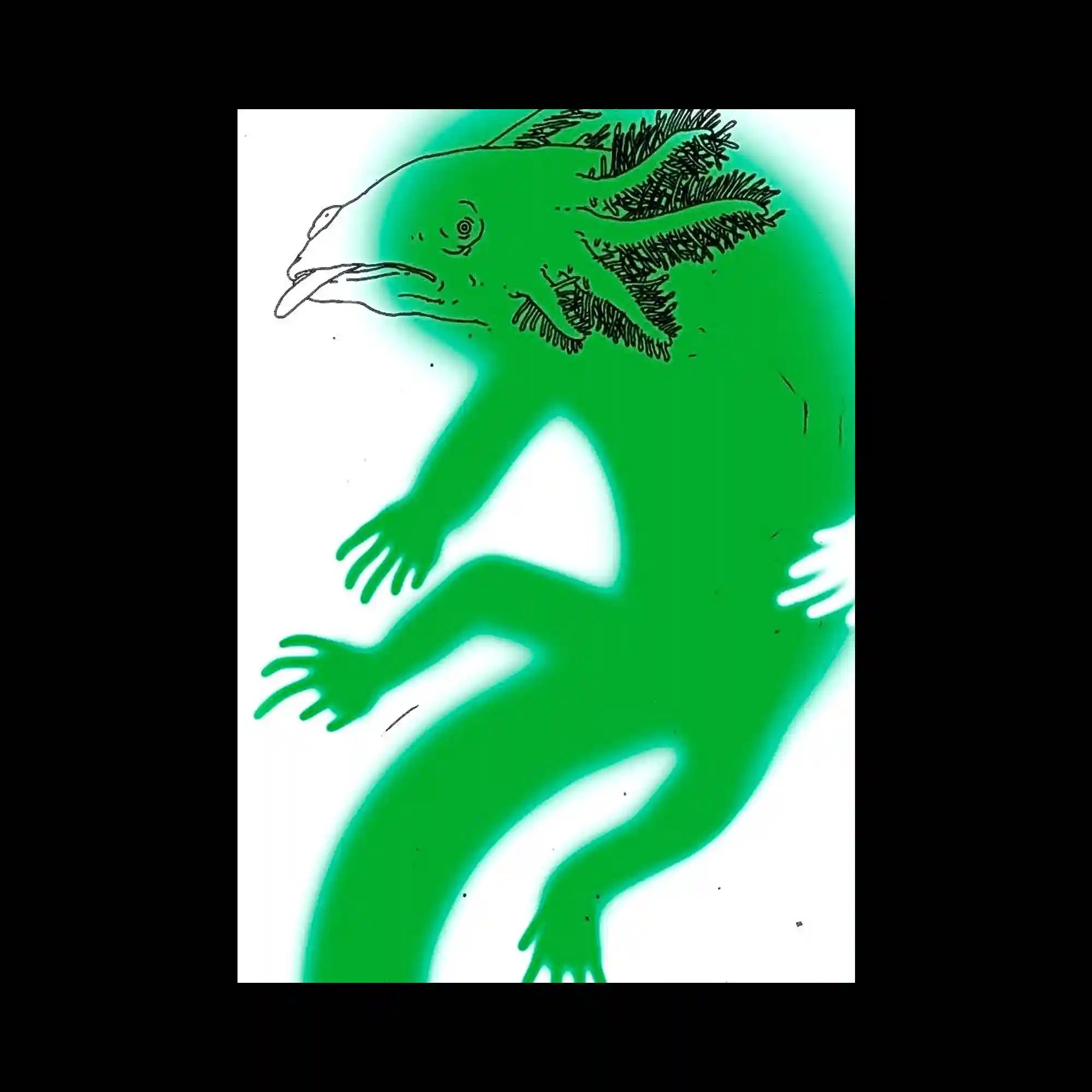
A glowing green amphibian-like creature stretches diagonally across a white field, its outline defined by a soft airbrushed halo. The partially transparent form reveals subtle line drawings beneath, merging anatomical precision with surreal diffusion. The luminous color and fluid pose give the figure an otherworldly vitality. The piece feels both scientific and dreamlike in its visual tension.
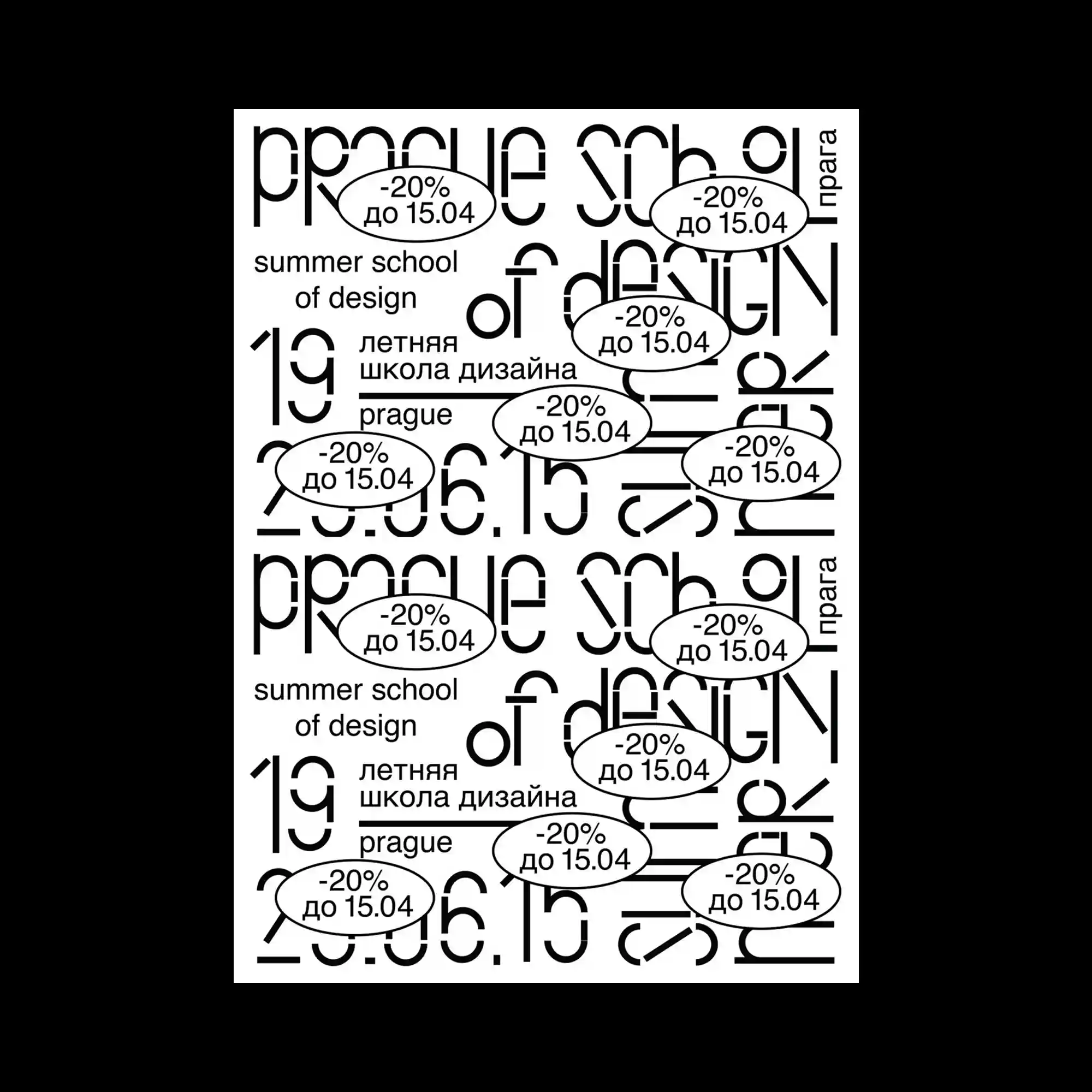
Bold black typography fills the frame in a dense grid, repeated multiple times with overlapping text in various orientations. Oval labels containing discount information break the uniformity, introducing rhythmic pauses. The repetition and mirrored layout evoke visual noise akin to poster walls or typographic patterns. The interplay between legibility and abstraction generates a dynamic, layered texture.

The poster places a bright green box filled with illustrated sheep against a photographic collage of real sheep. The typographic title is stylized in a whimsical, dreamy manner, blending humor with academic reference. The mixture of vectors and photography playfully questions digital representation. The contrast between artificial and natural textures creates a layered commentary on design and imitation.

This piece features flowing organic shapes outlined in gold against a pale mint background. The forms resemble clouds or smoke trails, intertwined with geometric rods and small golden spheres. The mixture of metallic contour and soft pastel space creates a balance between delicacy and structure. The composition evokes a sense of floating movement, as if light and material were in flux.
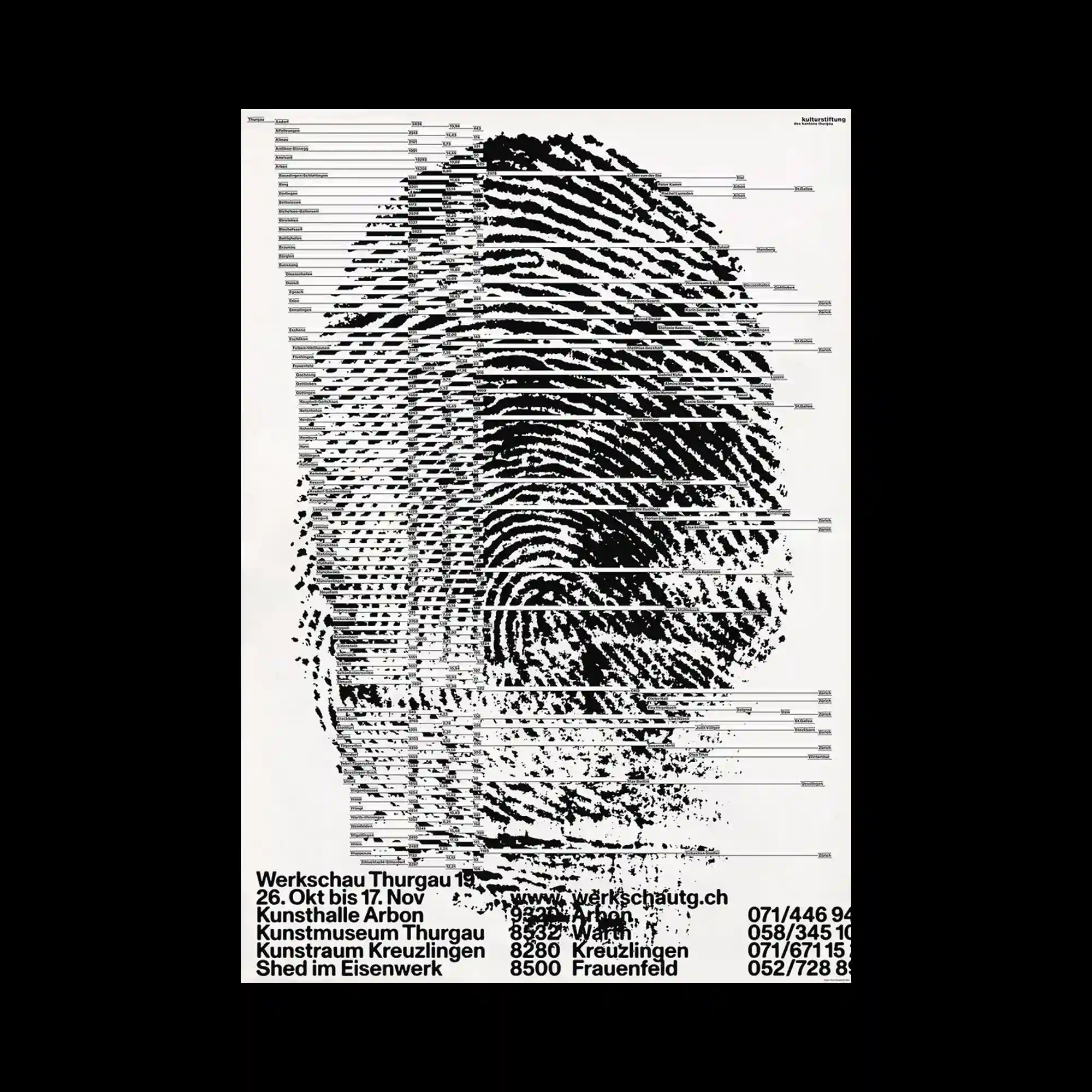
A large fingerprint dominates the composition, fragmented by horizontal data lines resembling barcodes or information charts. The dense black ridges contrast sharply against the white background, creating a sense of identity dissected through digital analysis. The text at the bottom provides structured order beneath the chaotic visual of the fingerprint. This juxtaposition of organic pattern and systematic data highlights the tension between individuality and information systems.
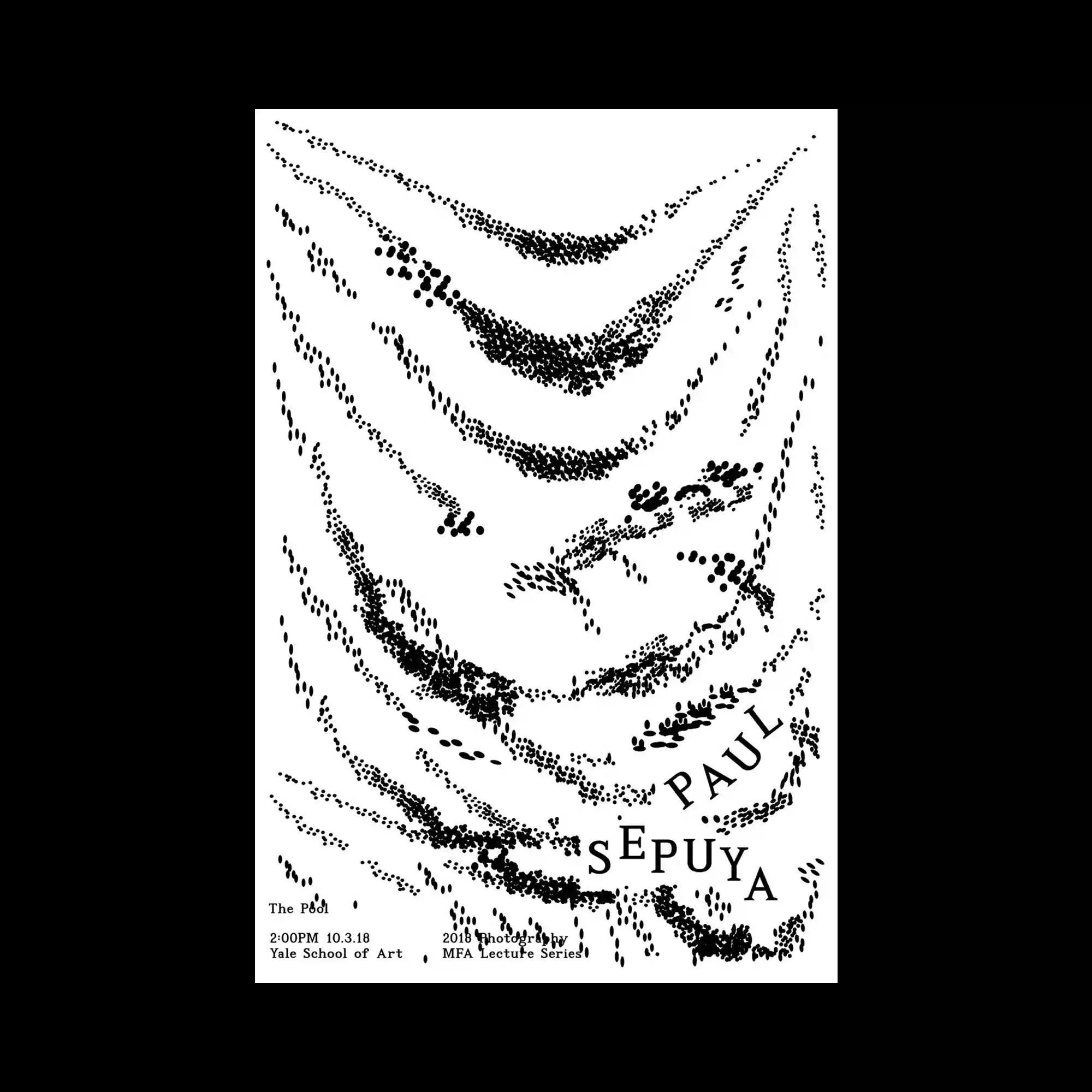
Sparse black dots form sweeping, wave-like trails on a white background, suggesting fabric folds or motion traces. The typographic elements are delicately positioned to follow the curved flow, integrating seamlessly into the composition. The simplicity highlights rhythm through repetition and spacing. The poster embodies quiet motion within a minimal monochrome field.

Black and white marbled textures fill the frame, with bold white text layered densely across. The typography aligns vertically and horizontally, partially obscured by the organic swirls underneath. The mixture of liquid pattern and rigid structure creates visual turbulence. The contrast of motion and grid typifies experimental graphic rhythm.
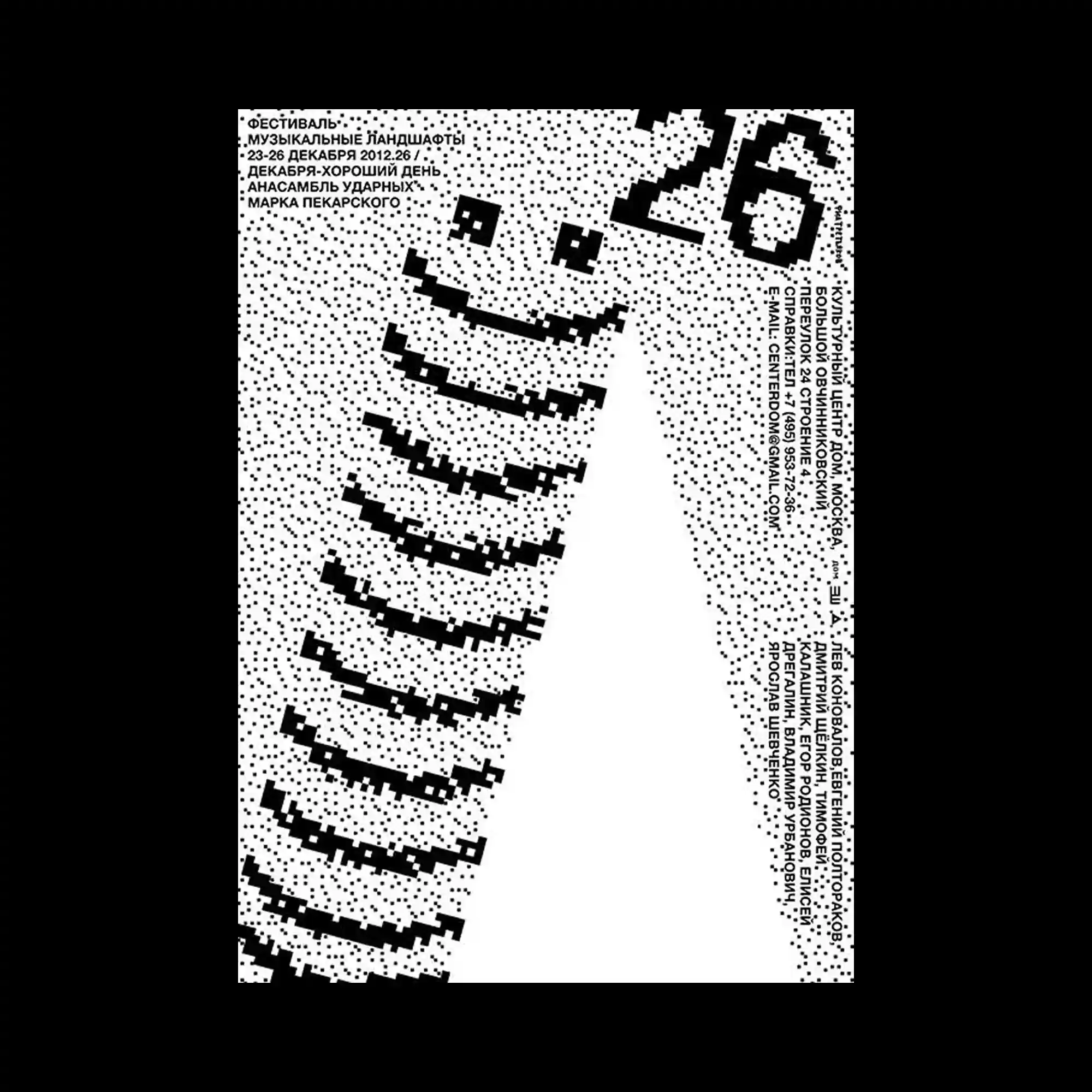
Composed of black pixel-like dots, the poster depicts a large curved form resembling a smiling face or spiral. The dotted texture creates gradation and movement across the surface. Sparse typography integrated at the corners balances the dynamic central shape. The overall aesthetic evokes early digital print processes and playful minimalism.

Two tangerine slices float against a split landscape of green and sky blue, with embedded text revealed on their surfaces. The lower half includes step-by-step pictograms describing a simple ritual of peeling and sharing. The vivid complementary colors enhance the playful, sentimental tone. The work combines instruction, affection, and visual humor into a single graphic narrative.
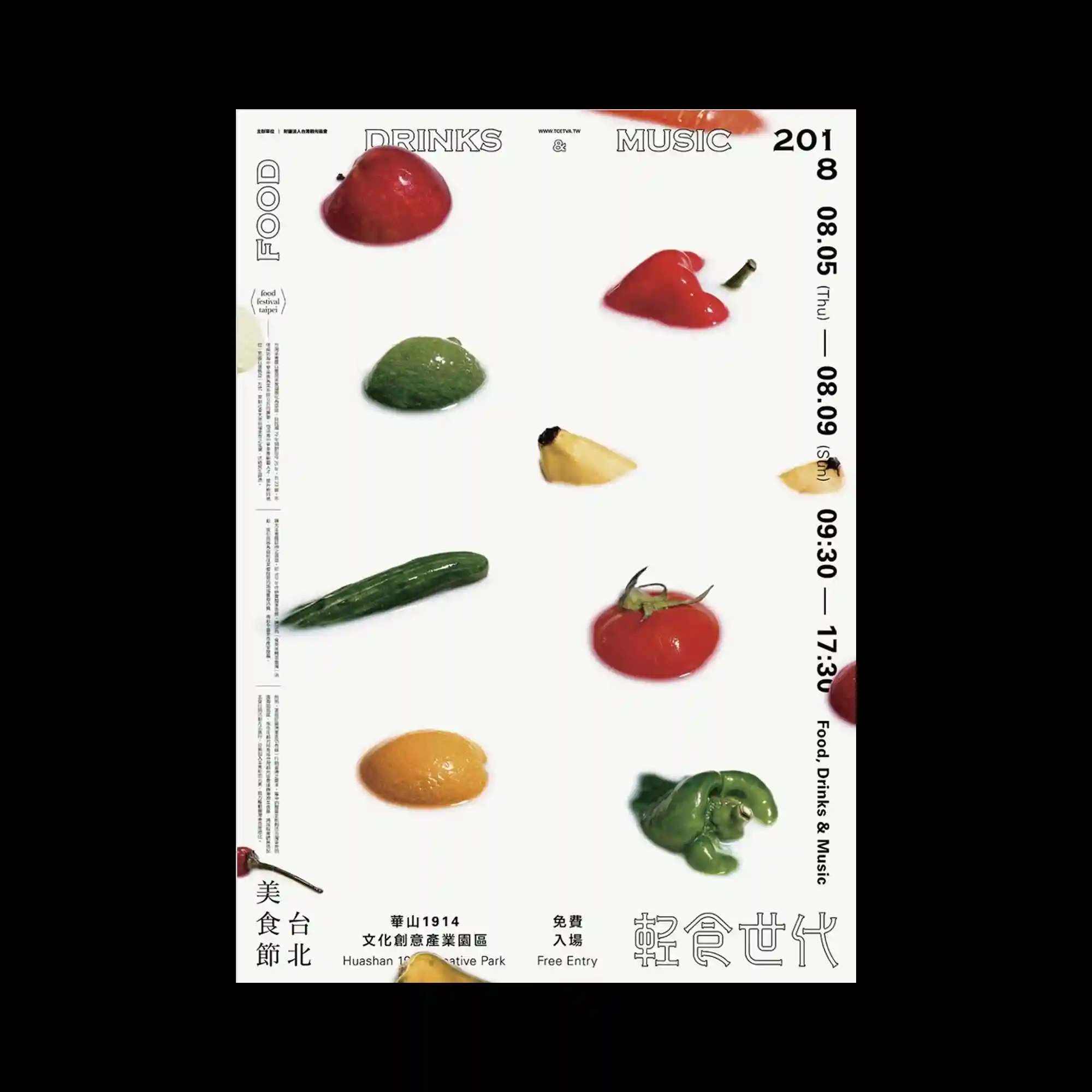
A minimalist white layout presents scattered fruits and vegetables, each isolated against clean space. The glossy textures and slight shadows create a hyperreal photographic quality. The composition’s order and spacing recall a museum display or scientific taxonomy. The restrained design emphasizes material beauty through clarity and precision.

A grid of yellow circles overlays black text and imagery, forming a dense visual field of repetition and vibration. The type oscillates between readability and abstraction, echoing the rhythm of performance or sound. The circular motif unifies the composition while diffusing focus across the surface. The interplay between pattern and information evokes the aesthetics of data and sensory overload.
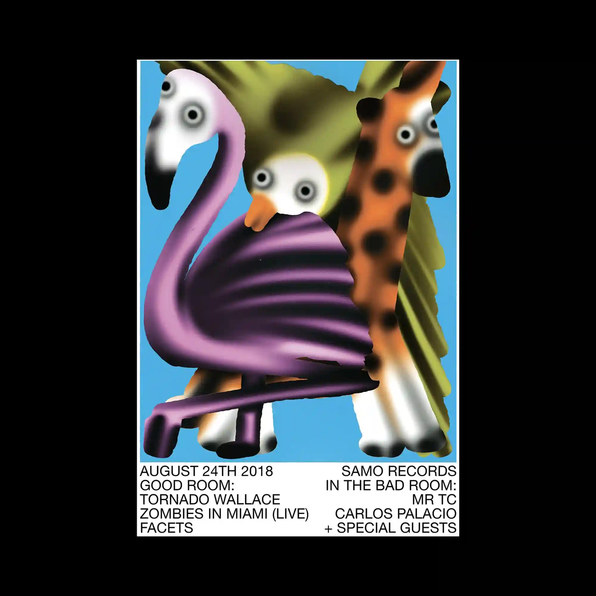
Stylized animals with exaggerated round eyes—a flamingo, parrot, and giraffe—stand against a flat blue background. The airbrushed gradient technique softens their edges, lending a dreamlike plasticity to the figures. Their simplified forms and saturated colors create an uncanny, cartoonish stillness. The composition plays with artificial naturalism through its surreal color harmony and texture.
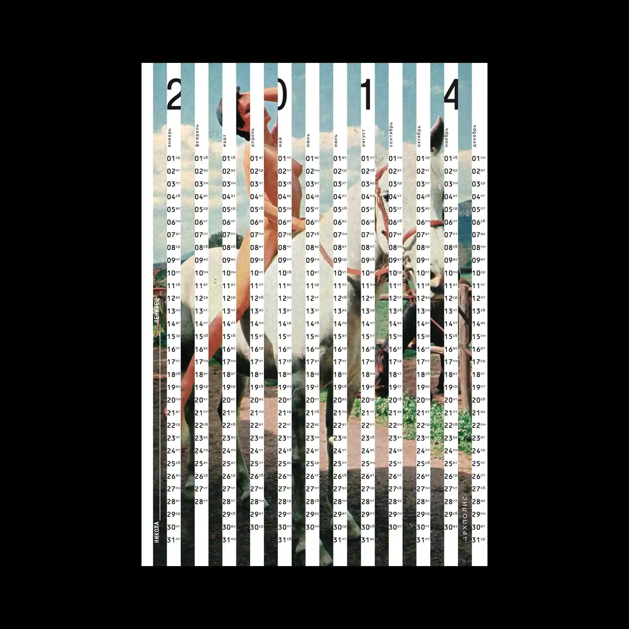
Vertical white bars divide an image of figures in motion, creating a striped rhythm that doubles as a calendar layout. Each strip contains dates and temperature markings, fusing graphic structure with documentary content. The underlying image of summer activity appears fragmented, as if seen through blinds. The design balances data and nostalgia through its precise grid and faded photo texture.
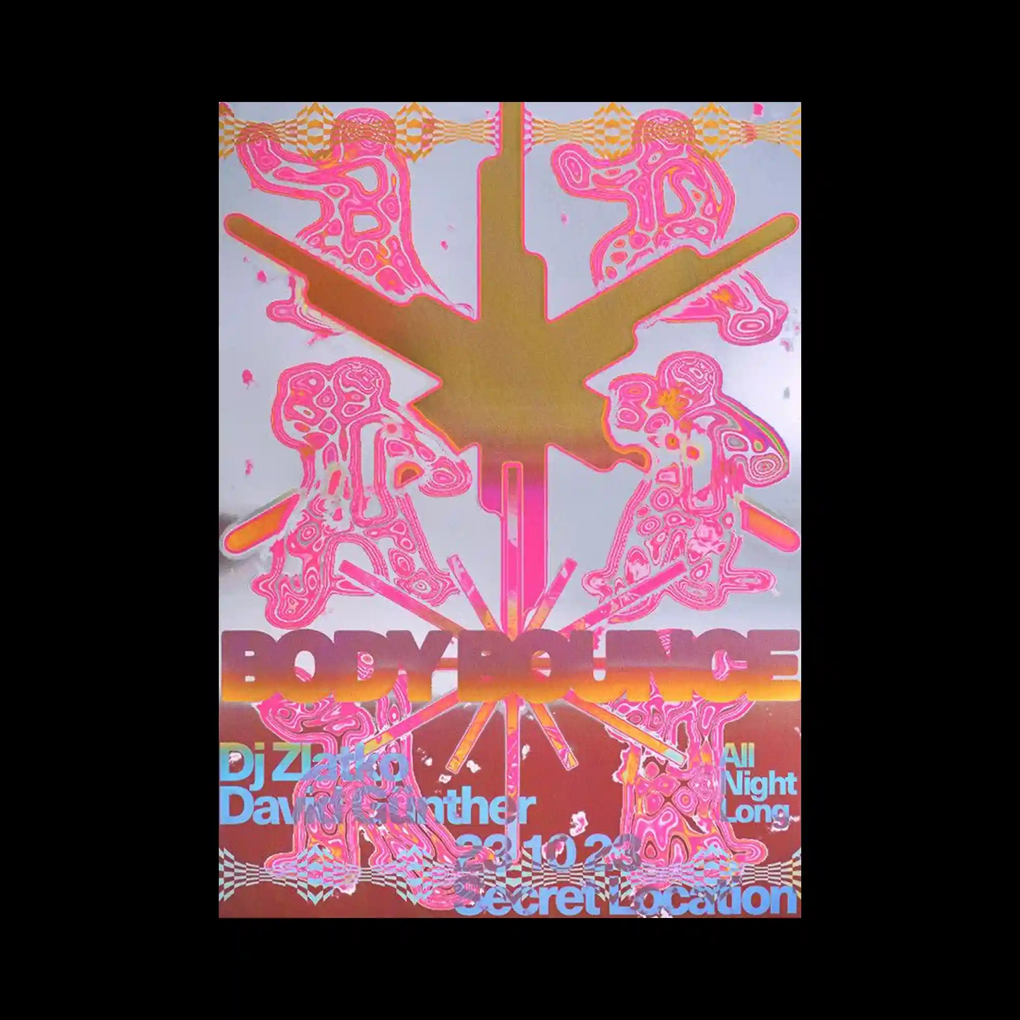
The poster features fluorescent pink silhouettes of dancing figures arranged around a metallic golden starburst. The holographic background enhances the sense of energy and motion, reflecting light in shifting tones. The composition radiates outward, suggesting rhythm and collective movement. The mix of neon outlines and mirrored gradients evokes the atmosphere of nightlife and digital euphoria.
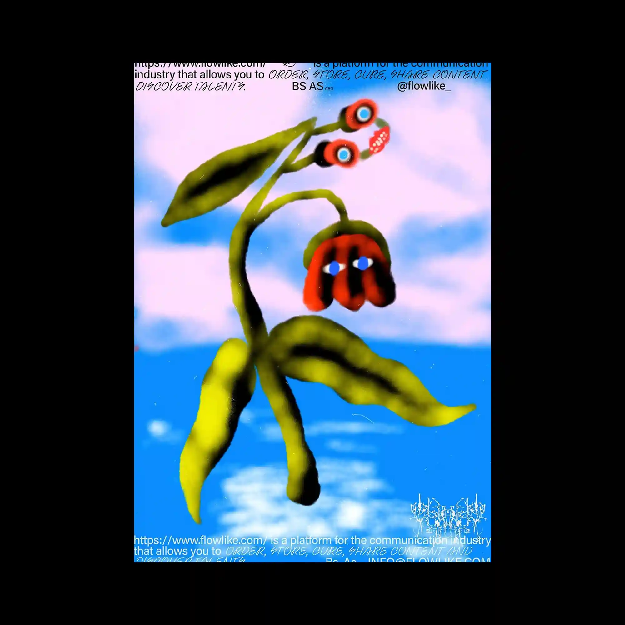
A surreal plant-like figure rises against a gradient sky, its leaves rendered in soft airbrush strokes of green and yellow. The stem bends fluidly, supporting two red flower forms that resemble expressive faces, blending organic and anthropomorphic qualities. The dreamy blue and pink background gives a floating, otherworldly atmosphere. The image merges nature and imagination, evoking digital surrealism through painterly softness.
Undulating vertical bands in greens, blues, and blacks form a rhythmic pattern reminiscent of flowing water or sound waves. Text elements are subtly integrated into the shapes, bending with the contours to maintain the illusion of motion. The alternating light and dark tones create depth and a sense of pulsation. The result is an immersive visual rhythm that feels both systematic and fluid.

A minimal composition dominated by pale tones, thin lines, and subtle wrinkles resembling folded paper. Yellow accents run vertically and horizontally, guiding the viewer’s eye across the otherwise quiet surface. The faint textures evoke material tactility despite the digital execution. The piece explores tension between emptiness and structure, creating a refined sense of spatial balance.

The design layers striped bars and gradients to simulate stacked objects or pages, giving the illusion of volume within a flat poster. Each horizontal band shifts in hue and lightness, producing a sense of physical layering. The composition balances minimal typographic elements with precise symmetry, creating an orderly yet dynamic visual rhythm. The overall impression recalls modernist precision infused with digital gloss.
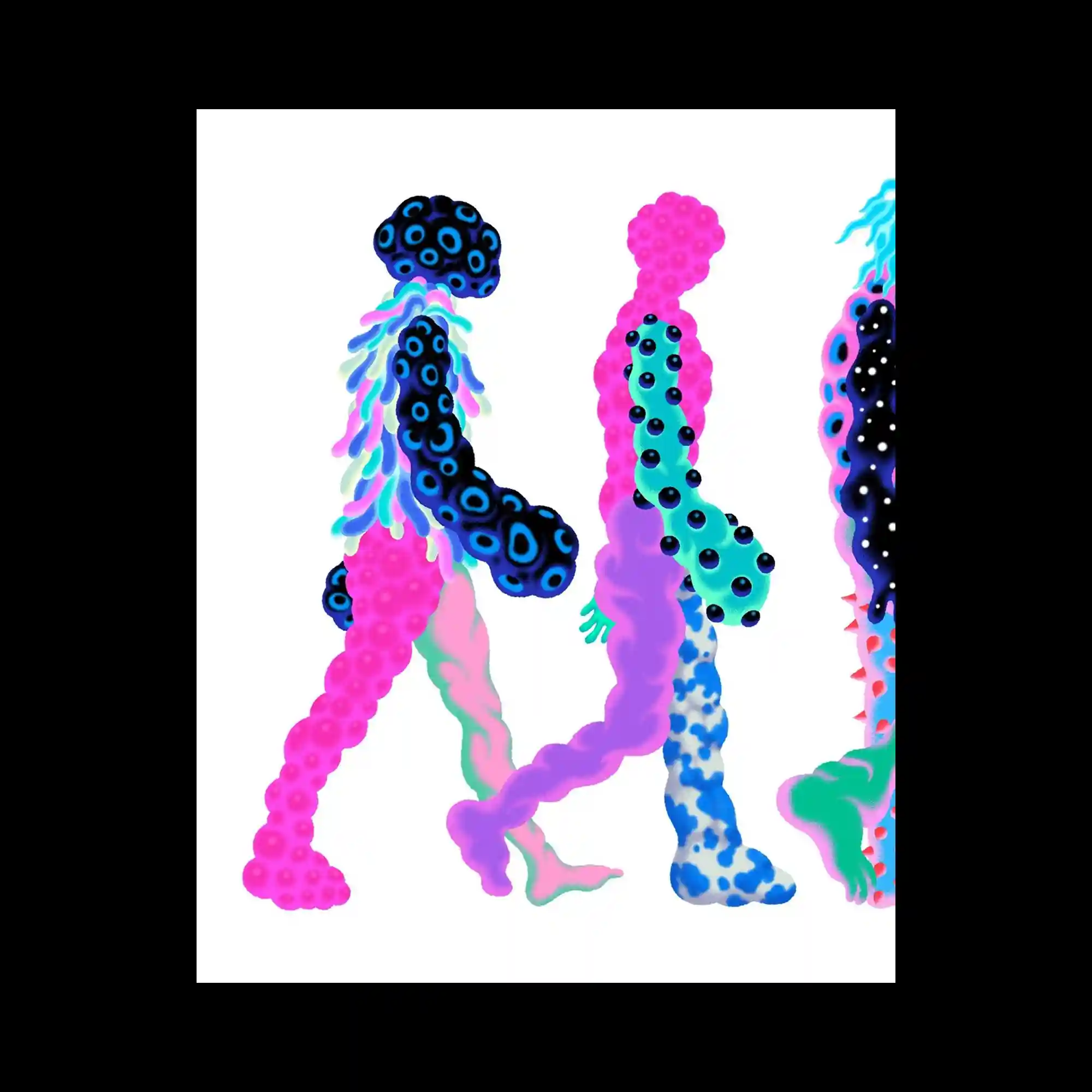
Three abstract human-like figures march across a white background, each constructed from bubble-like textures and gradients. The bodies are composed of organic cells in neon pink, blue, and turquoise, giving a microscopic or alien impression. Despite their strangeness, the repetition of walking poses unifies them as a group. The visual rhythm of rounded forms and smooth transitions emphasizes motion within stillness.
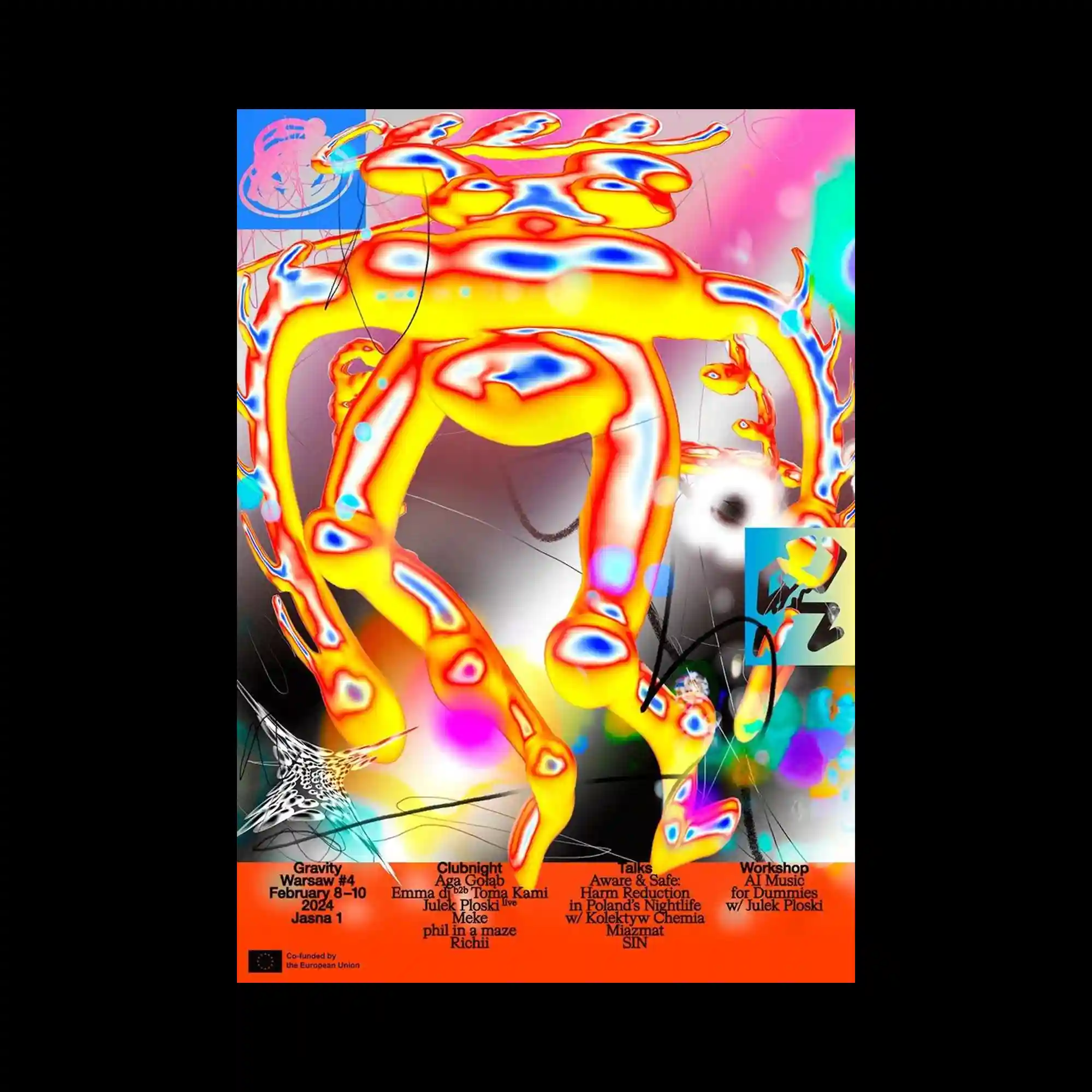
This poster bursts with neon colors and surreal fluid shapes resembling organic creatures in motion. The intense reds, yellows, and blues are layered with blurred glows, creating an electrified, digital energy. The chaotic composition suggests a fusion of biology and technology, enhanced by scattered graphic elements and event information. The result is a hyper-saturated landscape of movement and visual noise.
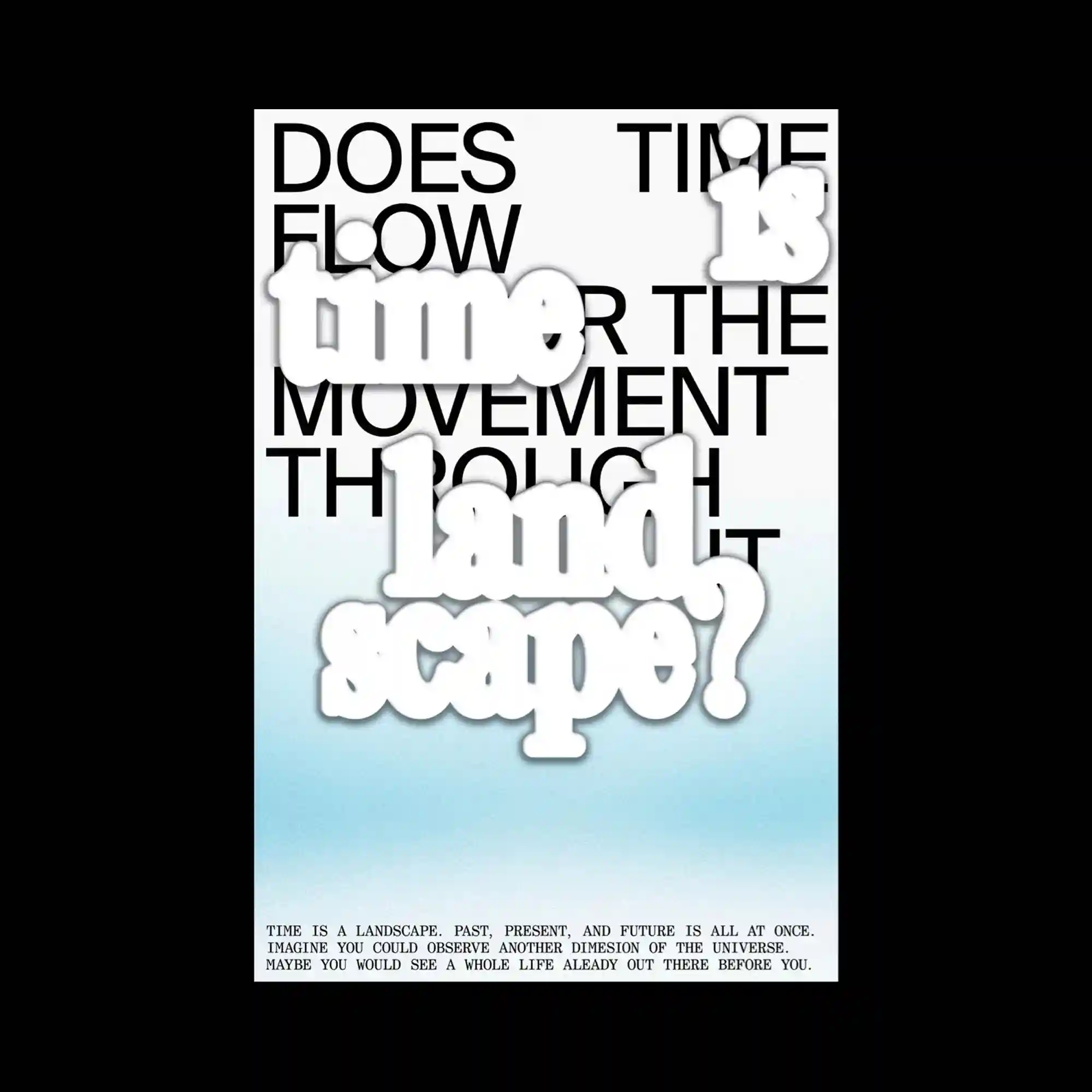
Large black sans-serif text is overlaid with soft, cloud-like white words that float in the foreground. The layered typography explores the relationship between conceptual and visual time, blending gradients from white to cyan that suggest depth and atmosphere. The composition’s hierarchy shifts depending on focus—foreground words appear tactile while background text provides structural rhythm. The overall effect is contemplative, balancing spatial and temporal perception.
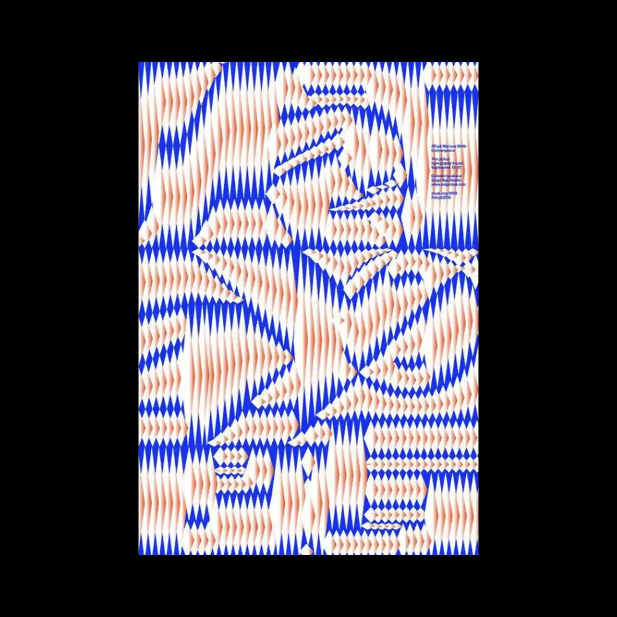
The surface is filled with dense blue and orange wave-like patterns, producing an optical vibration across the frame. The alternating diagonal shapes generate a moiré effect that creates motion through repetition. Despite the abstract geometry, the overall rhythm feels organic, almost like ripples in fabric or sound waves. The tension between order and distortion gives the composition a hypnotic quality.
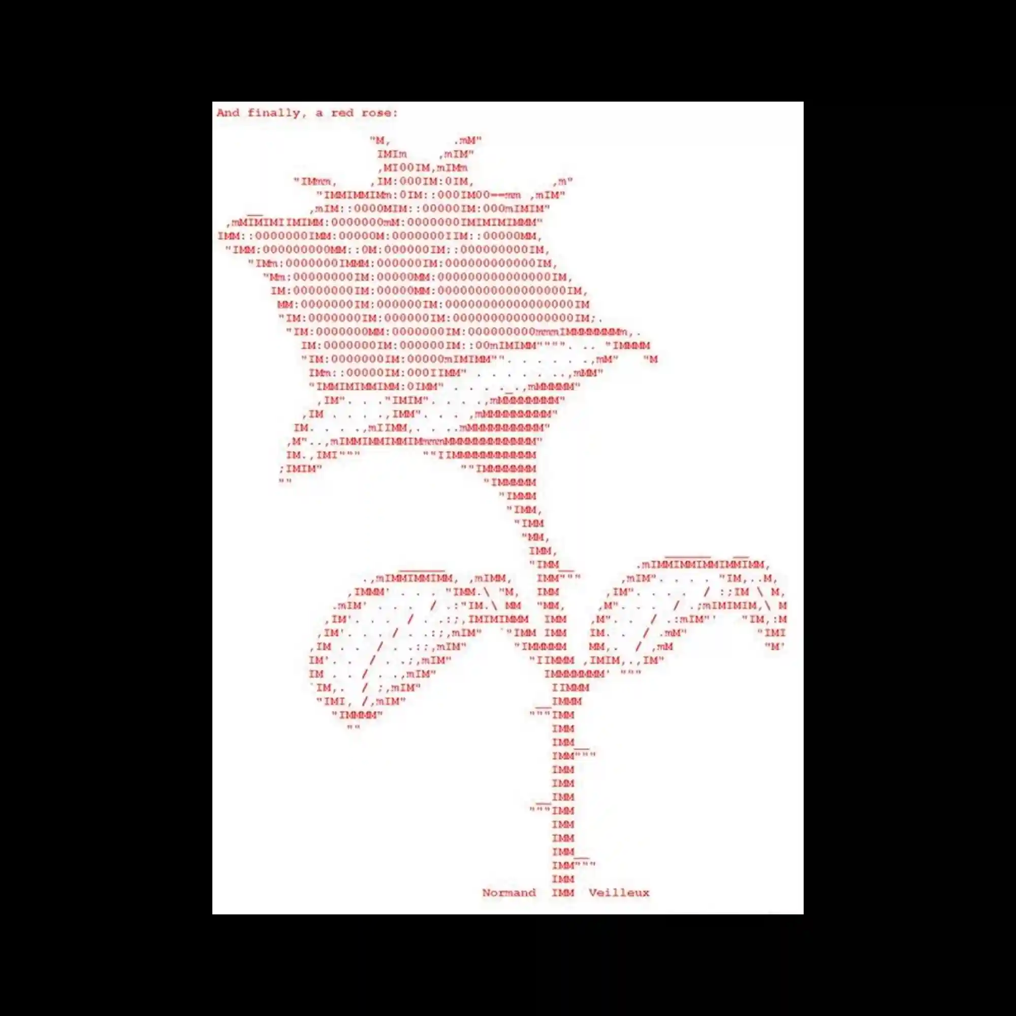
A red ASCII illustration of a rose is meticulously constructed from letters and symbols, evoking early computer-generated art. The pixel-like arrangement of characters forms a delicate balance between technology and organic form. The limited color palette and type-based rendering highlight the nostalgia of digital aesthetics. The work merges mechanical precision with poetic imagery, celebrating the intersection of code and emotion.