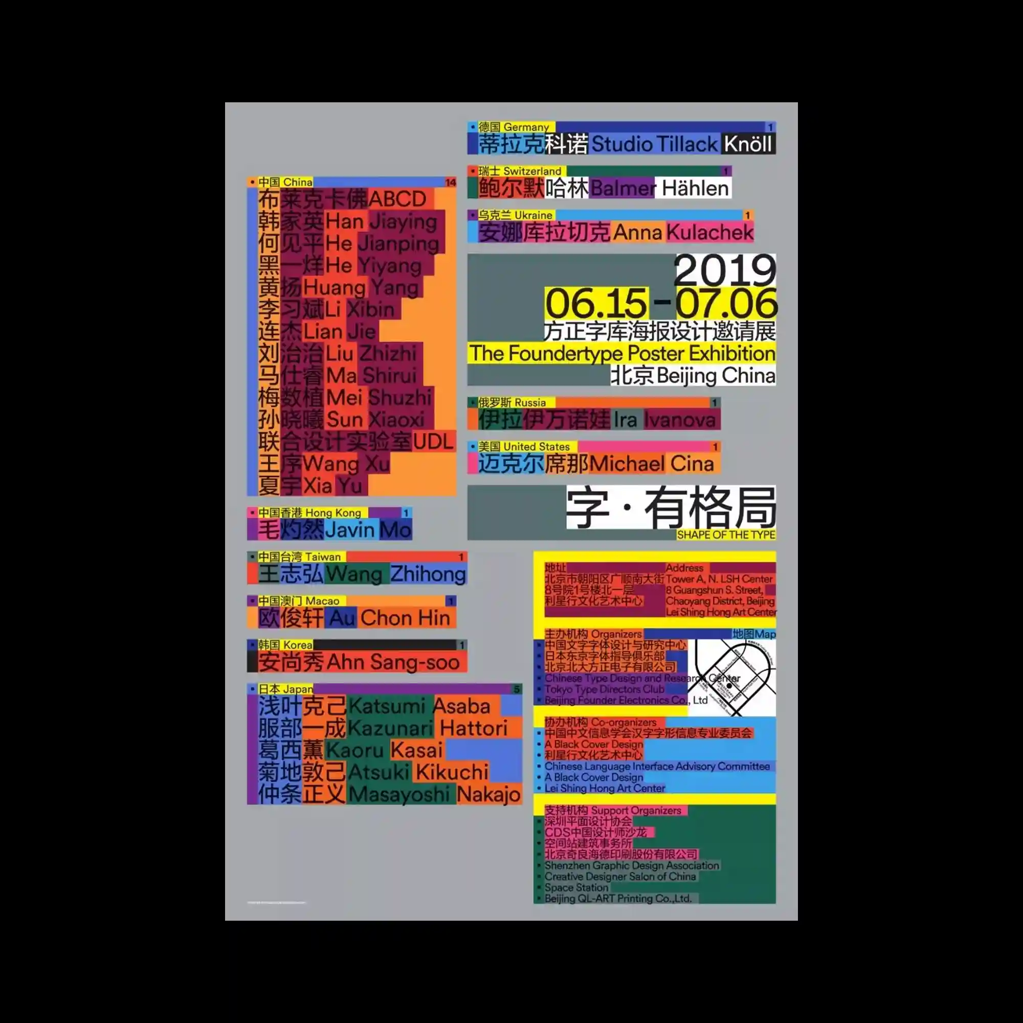
Blocks of text in multiple scripts and colors form a rigid grid, each module acting as an independent data unit. The arrangement resembles an information map where typography becomes a system of categorized labels. Bright yellows, reds, blues, and greens separate regional groups, generating a structured but visually intense taxonomy. The overall impression is systematic organization amplified by saturation and repetition.
다양한 문자와 색으로 된 텍스트 블록들이 격자 구조를 이루며 각각 정보 모듈처럼 배치됨. 지도가 분류되듯 타이포가 레이블 체계로 기능함. 노랑·빨강·파랑·초록 등이 지역 그룹을 나누며 구조적이지만 강한 시각 밀도를 만듦. 전체적으로 체계화된 정보를 색채와 반복으로 강조함.
多语种、多色的文字块组成严格网格,每个模块都像独立信息单元。排版宛如分类地图,各颜色区分不同区域或群组。高饱和色强化结构与密度,使整体呈现系统化的信息图感。