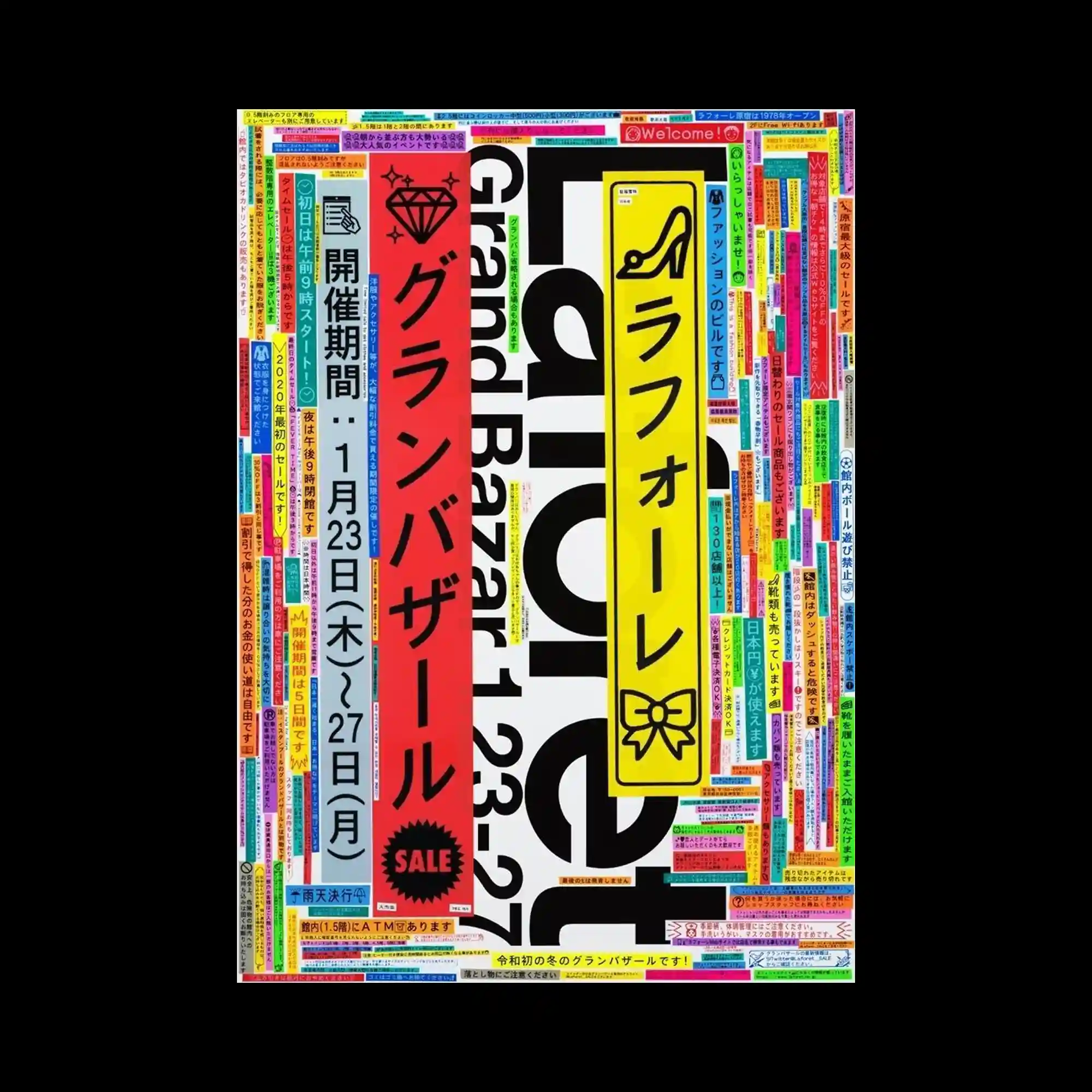
The layout is filled edge-to-edge with narrow rectangular text blocks in vivid colors, creating a dense patchwork frame around larger vertical banners. The central banners in red, yellow, and blue act as primary pillars, contrasting with the surrounding mosaic of smaller captions. Thick black typography forms a bold structural anchor beneath the layers of bright labels. The overall rhythm depends on repetition, saturation, and tightly packed modular units.
형형색색의 긴 직사각 텍스트 블록들이 화면 가장자리를 꽉 채우고 있고, 중앙에는 세로 배너가 기둥처럼 배치돼 있음. 빨강·노랑·파랑 배너가 중심 축 역할을 하고 주변의 작은 캡션 모자이크와 대비됨. 굵은 검정 타이포가 구조적 기반을 잡아줌. 반복·채도·밀집 모듈들이 리듬 형성함.
整个版面被色彩鲜艳的细长文字条填满,围绕中心形成密集拼贴框架。中央红、黄、蓝三条竖向大块构成视觉支柱,与外侧小文字马赛克形成对比。粗黑字体稳固整体结构。重复、饱和与紧密排列共同产生节奏感。