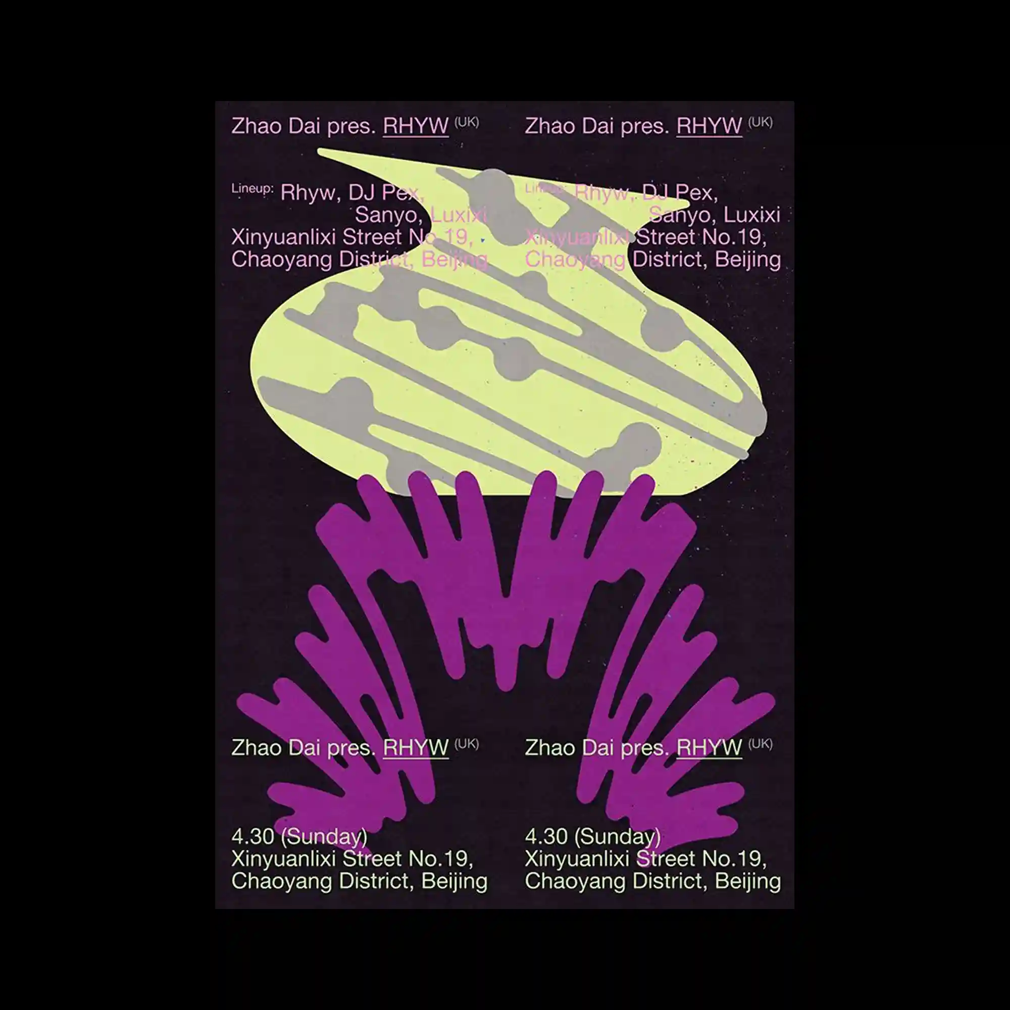
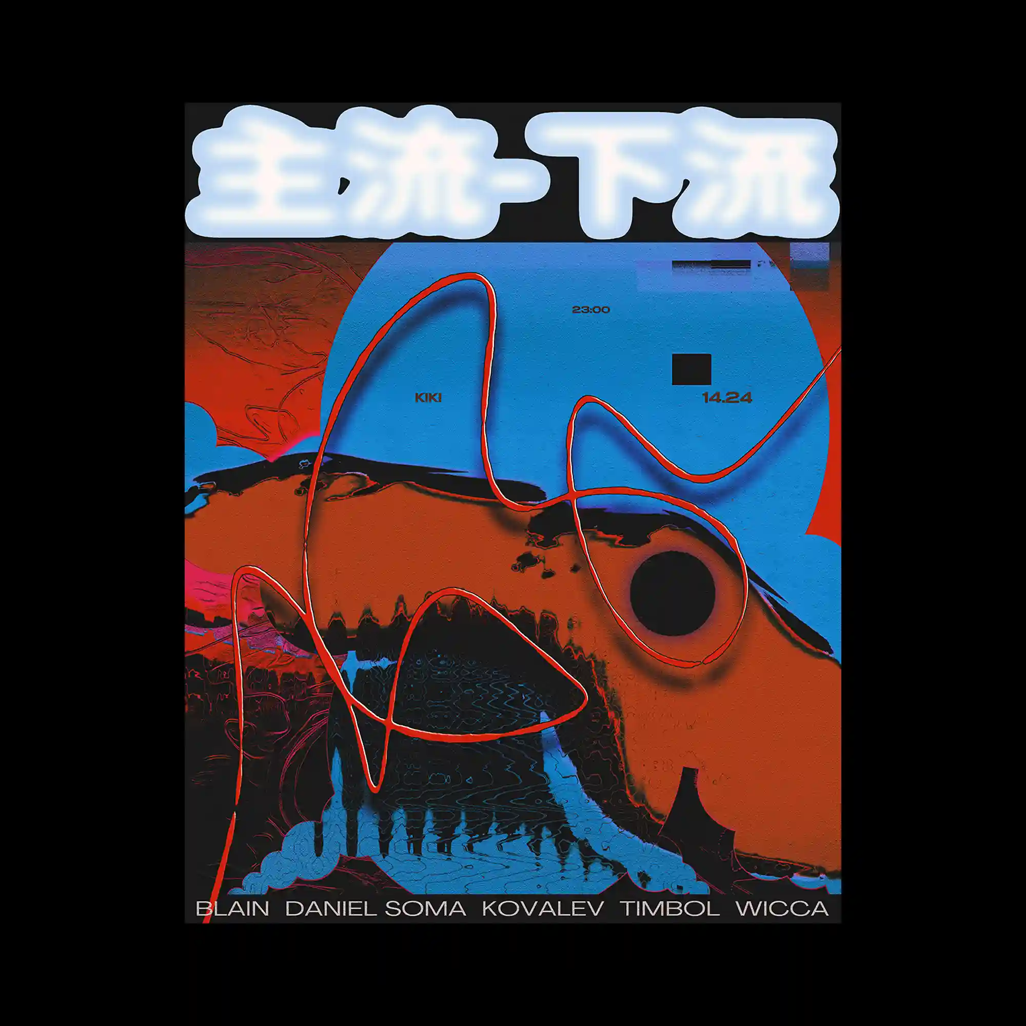
A dark background supports two large, abstract shapes stacked vertically in contrasting colors. The upper form is smooth and flattened, while the lower form splays outward with finger-like extensions. Text is duplicated symmetrically across the top and bottom, reinforcing the vertical axis. The graphic relies on bold silhouette and color contrast.
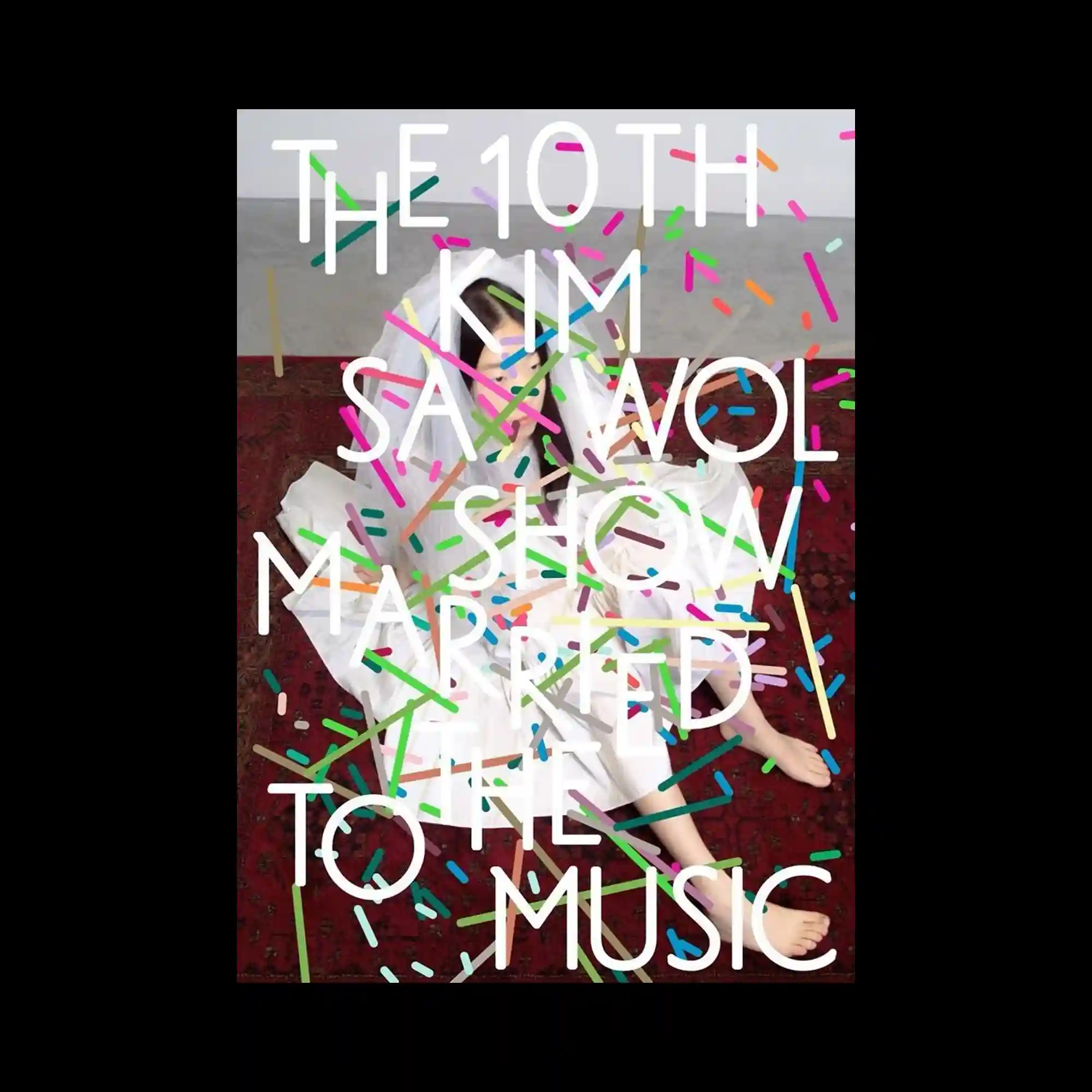
A full-bleed photograph of a seated figure is overlaid with large white typography arranged vertically. Colorful confetti-like strokes scatter across the surface, intersecting both text and image. The typography acts as a structural grid, anchoring the dynamic marks. The interplay of static text and energetic graphic elements defines the composition.
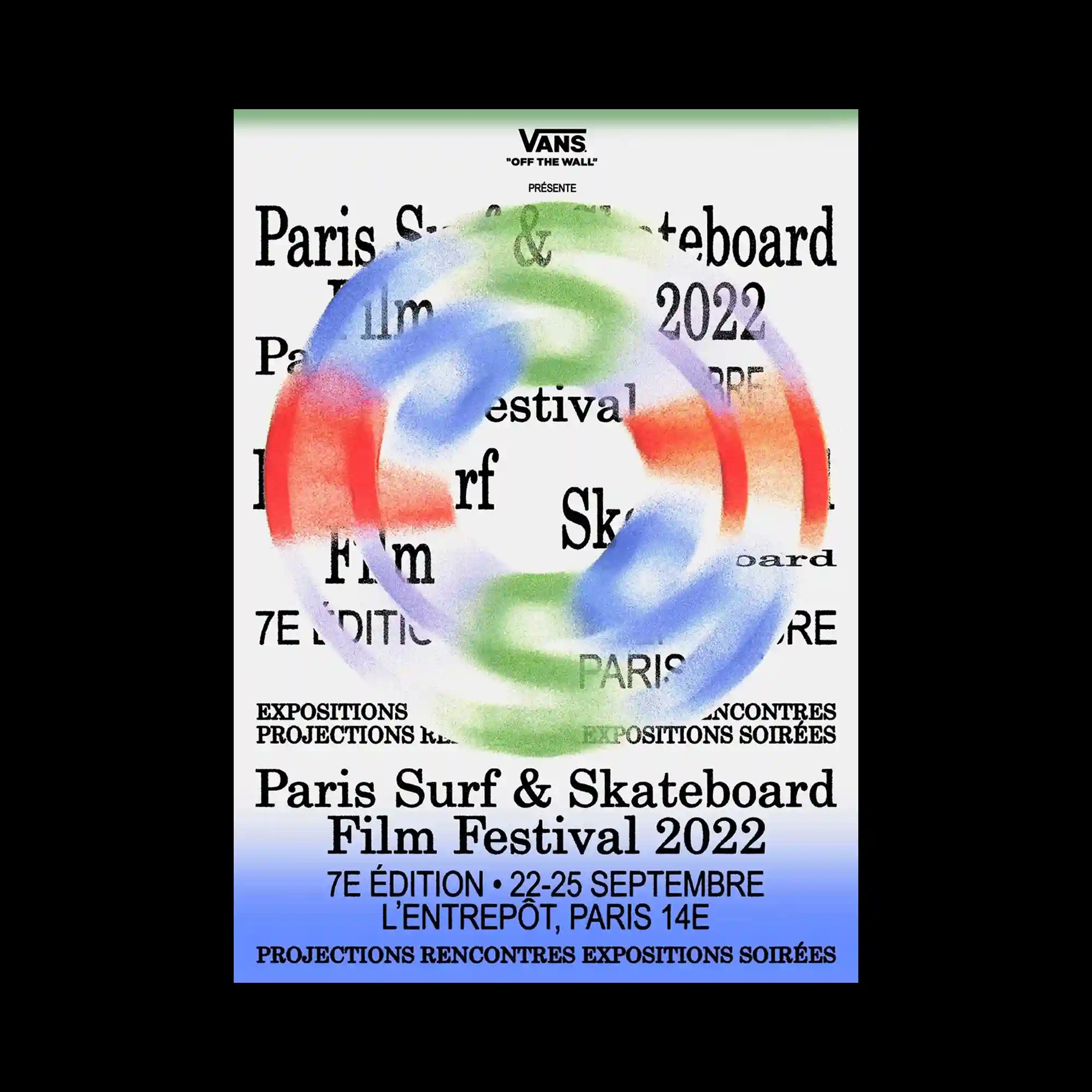
A dense typographic layout fills the background, over which a circular, airbrushed ring is layered. The ring’s soft, multicolored gradient partially obscures the text beneath. The typography remains legible through gaps and overlaps, creating depth through occlusion. The composition balances informational density with a single dominant gesture.
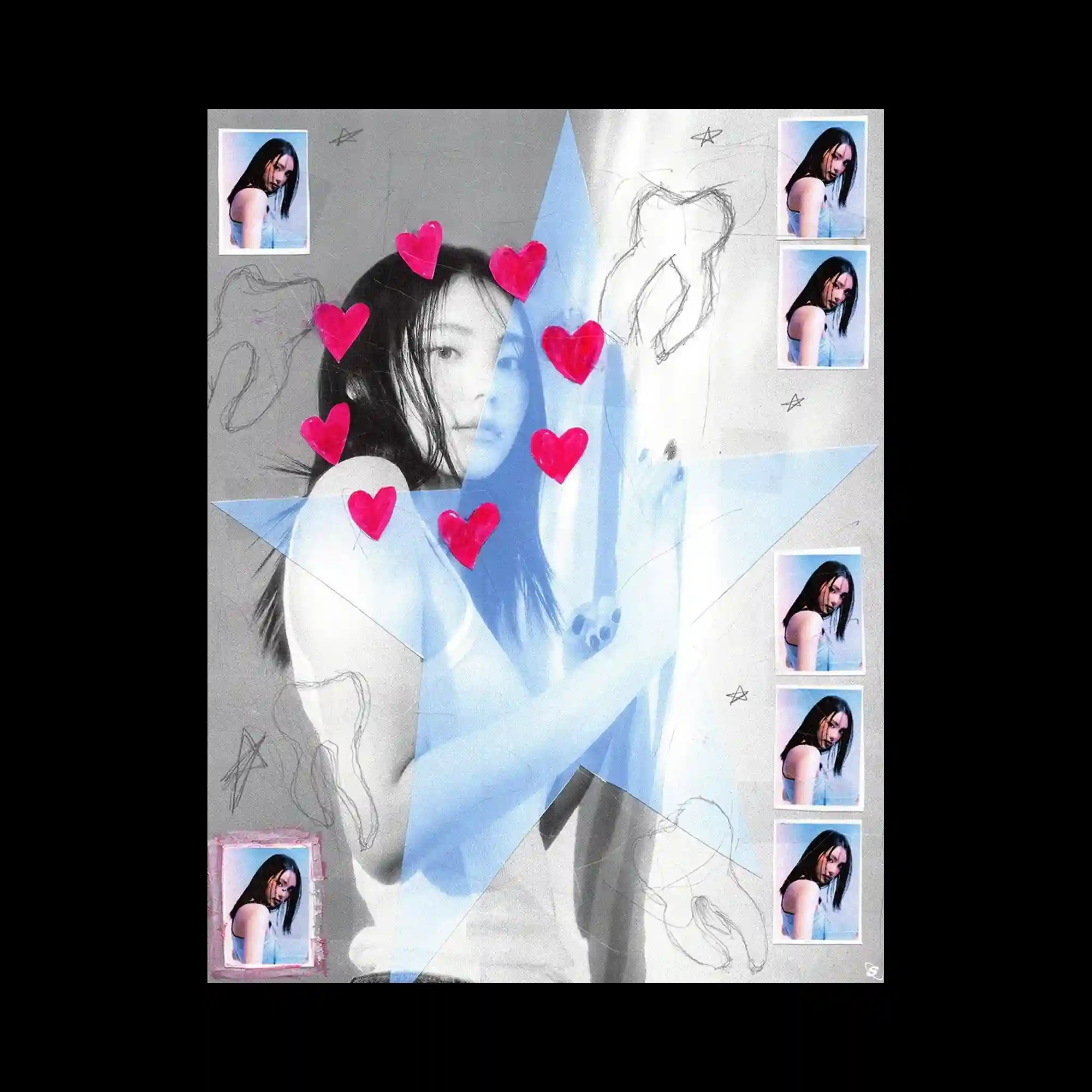
A collage composition centers on a grayscale portrait, intersected by a large translucent star shape. Repeated smaller photo frames line the edges, creating a patterned border. Hand-drawn sketches and symbols are scattered across the surface, adding informal texture. Bright heart-shaped stickers punctuate the image, contrasting with the muted base.
This poster combines torn-paper textures with sharp black gestural marks across a bright, high-contrast background. A small glossy sphere floats above the surface, acting as a focal accent. Horizontal color bands organize the text into clear sections. The contrast between rough edges and smooth gradients defines the visual character.
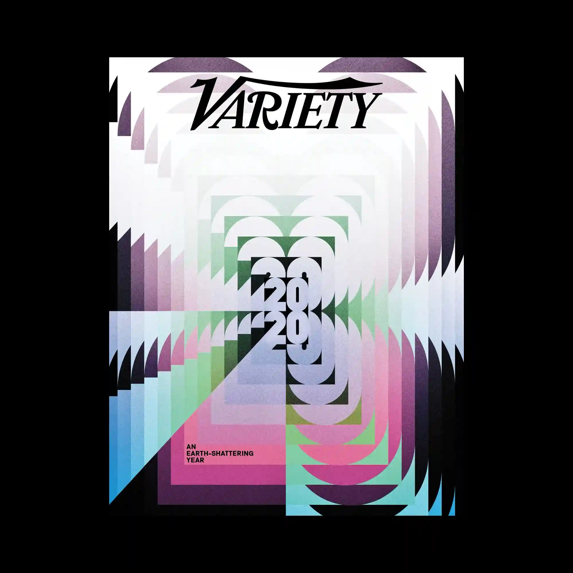
Layered arches and curved shapes repeat inward toward the center, creating a tunnel-like visual effect. Serif typography sits at the top, while large numerals are stacked concentrically within the composition. Overlapping pastel color fields intersect with darker shapes, producing depth through transparency. The repetition of form drives both motion and focus.
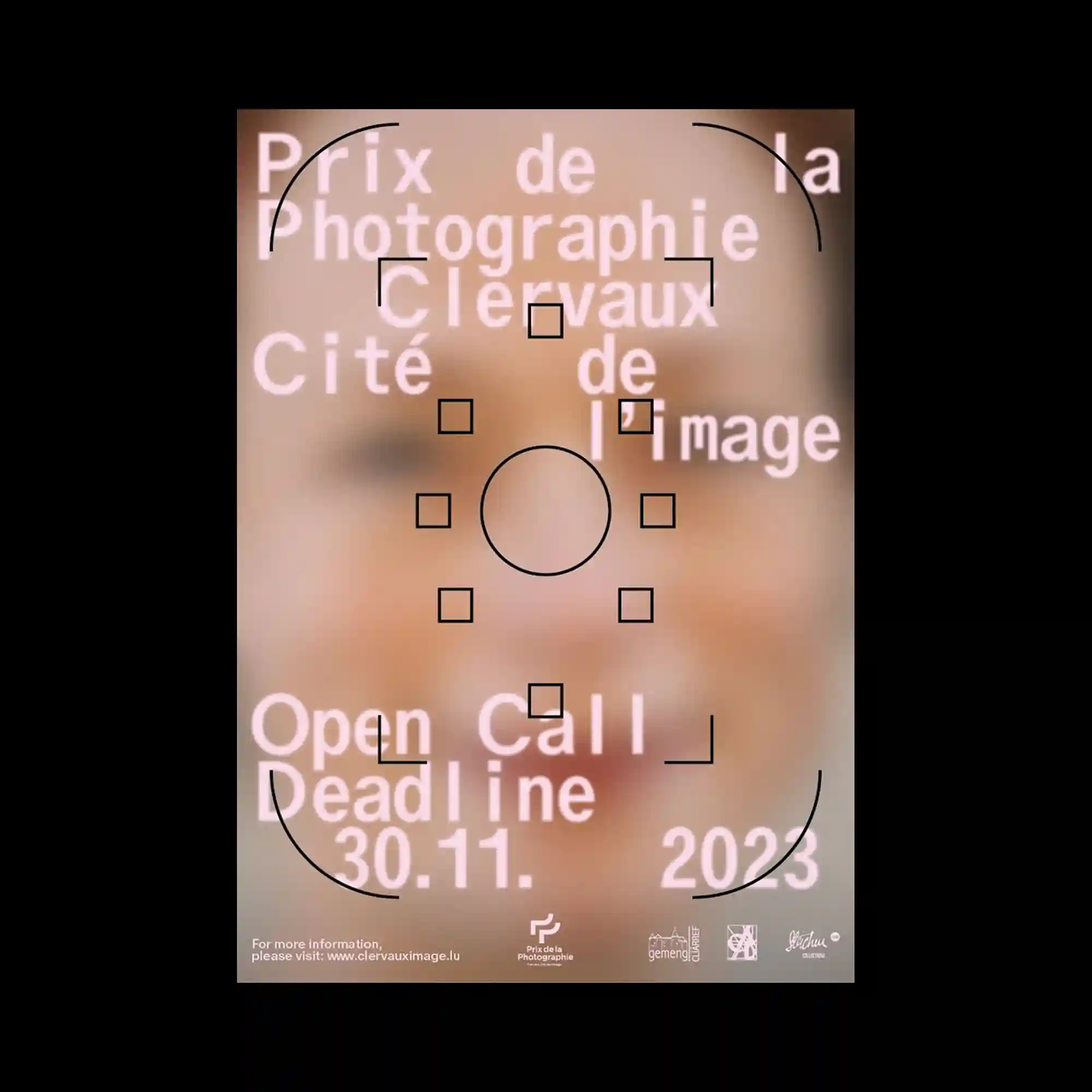
A softly blurred photographic background fills the frame, with sharp black geometric markers layered on top. Square brackets, circles, and corner guides suggest a focus or targeting interface. Large white typography floats above the background, slightly diffused to blend with the image. The composition balances precision graphics against an intentionally unfocused base.
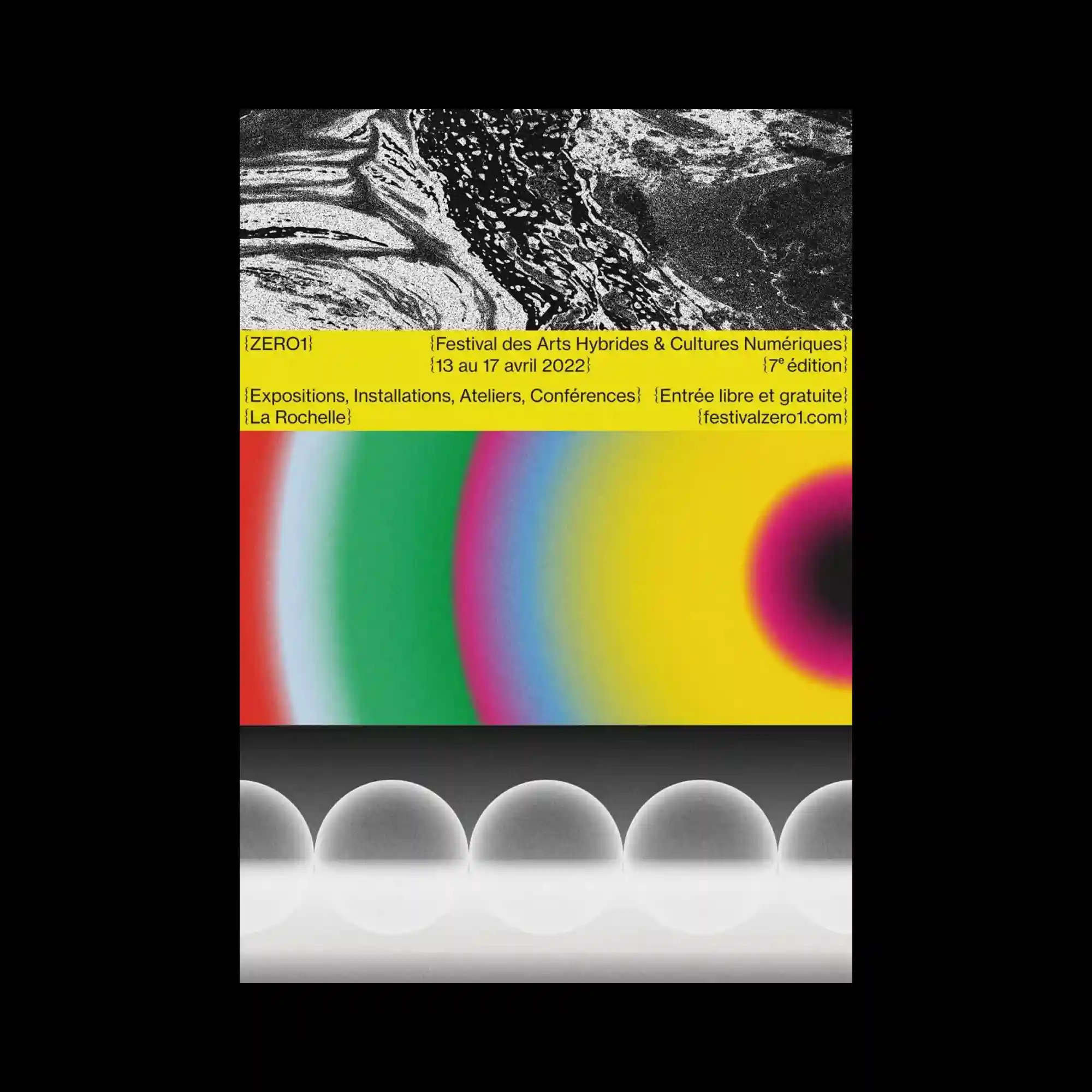
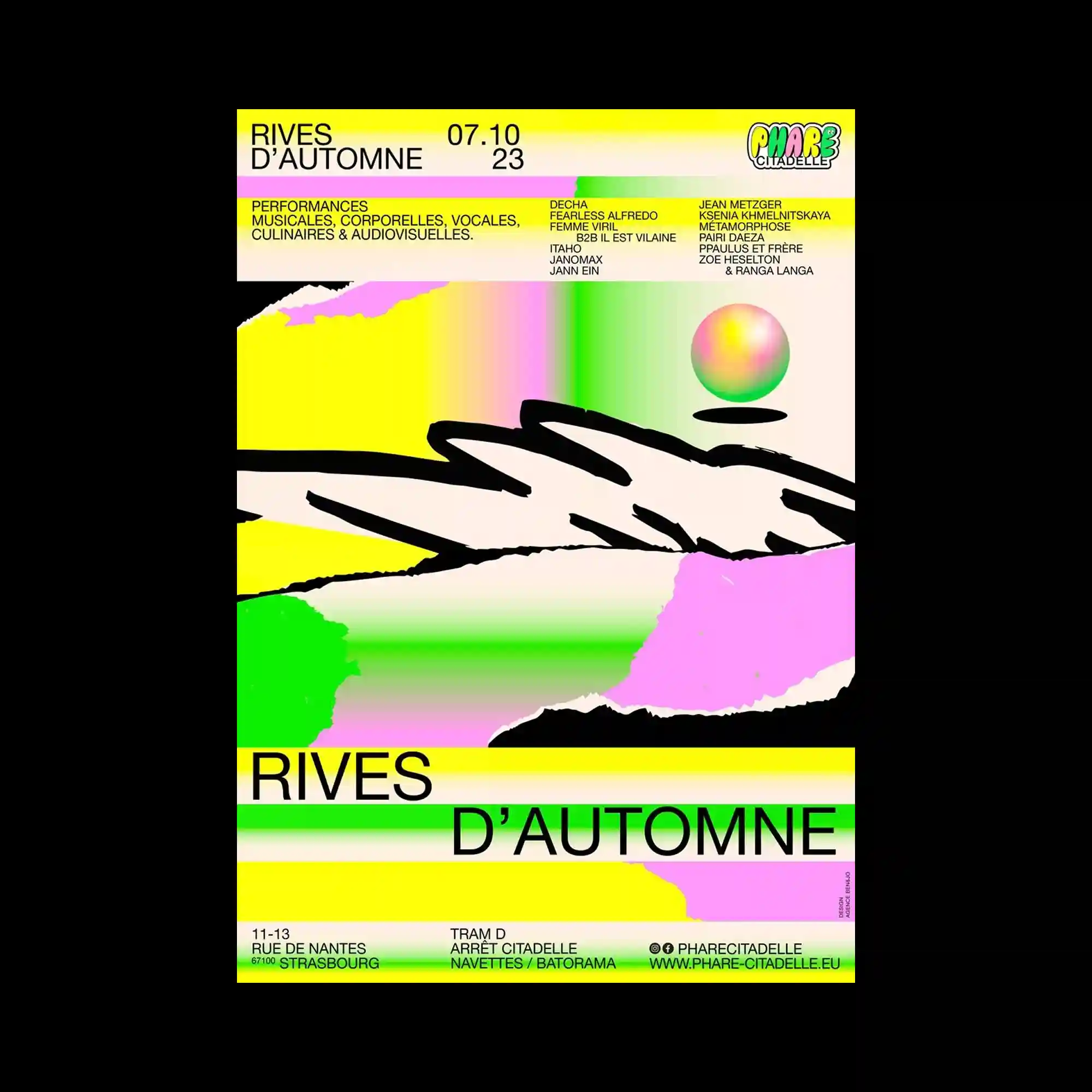
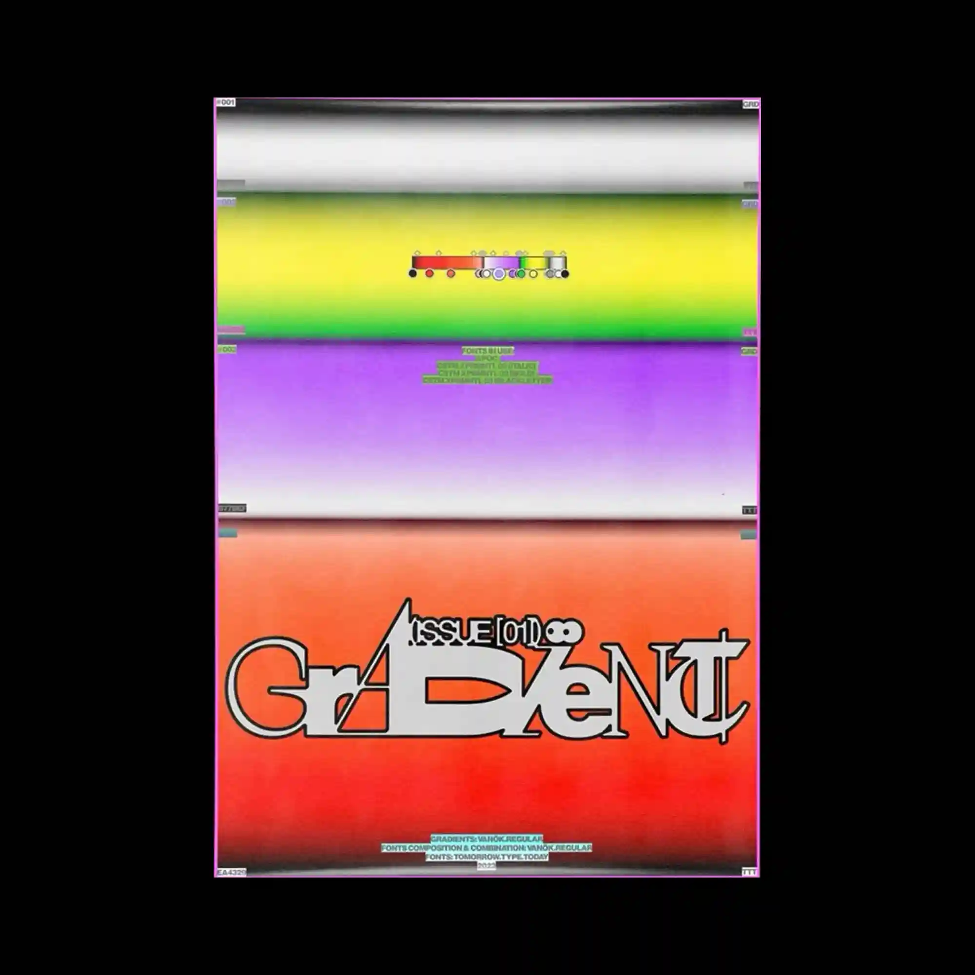
The poster is organized into horizontal bands, each containing a distinct visual texture. A high-contrast monochrome image occupies the top, followed by a bright yellow strip densely packed with text. Below, saturated gradient circles expand across the surface, while the bottom section features repeated translucent spheres aligned in a row. The clear segmentation creates rhythm through variation rather than repetition alone.
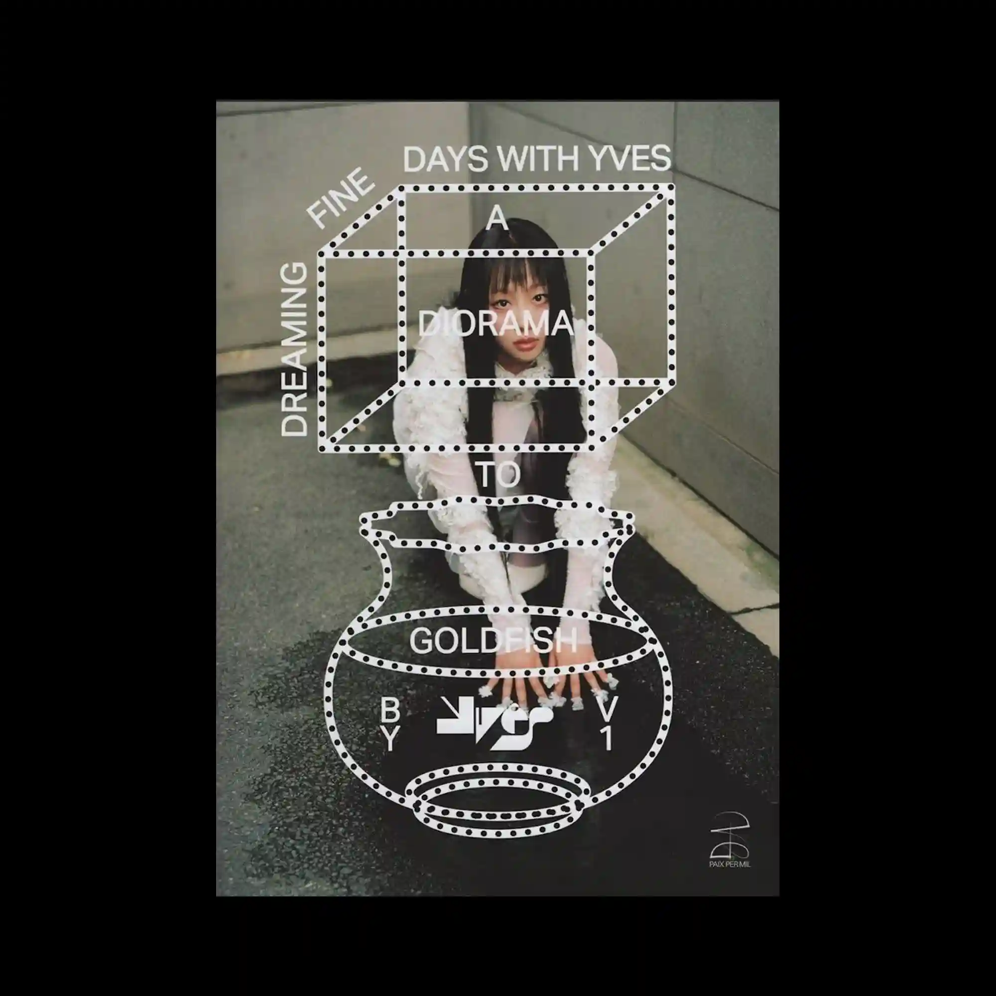
A photographic portrait is overlaid with a dotted white wireframe structure resembling a three-dimensional diagram. The geometric outline floats above the image, intersecting the subject without fully obscuring it. Typography is integrated along the edges of the wireframe, following its perspective lines. The contrast between organic photography and schematic graphics creates a layered visual dialogue.
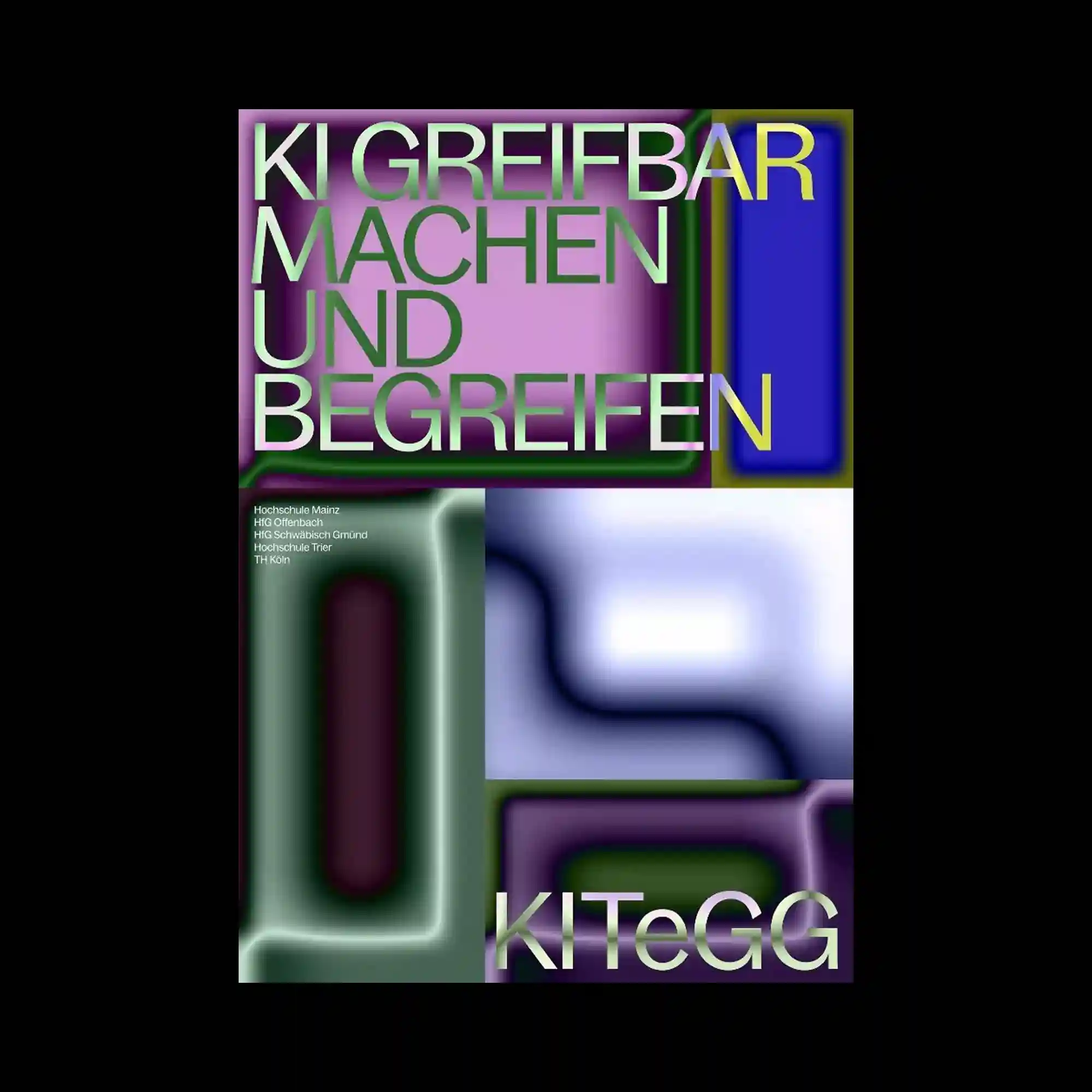
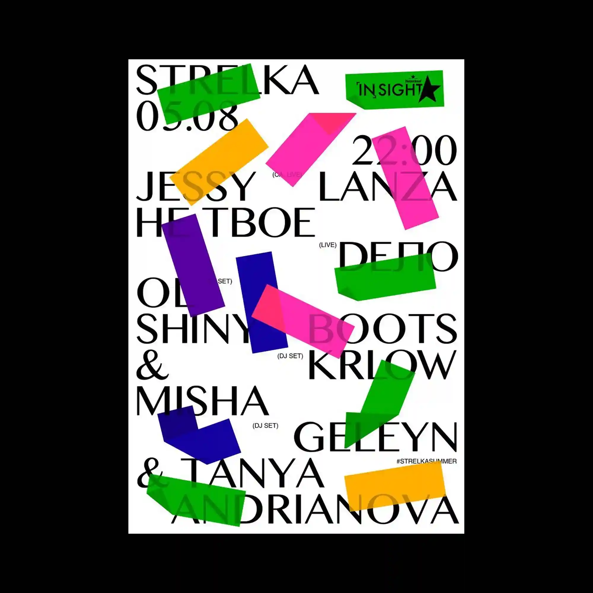
The composition is divided into bold rectangular zones filled with smooth, blurred gradients in purple, green, blue, and pink. Large uppercase typography is tightly cropped and layered over these color fields, creating strong figure–ground tension. Rounded corners and soft edges of the shapes contrast with the rigid alignment of the letterforms. Smaller text blocks are confined to a single area, reinforcing a structured hierarchy within the otherwise fluid background.
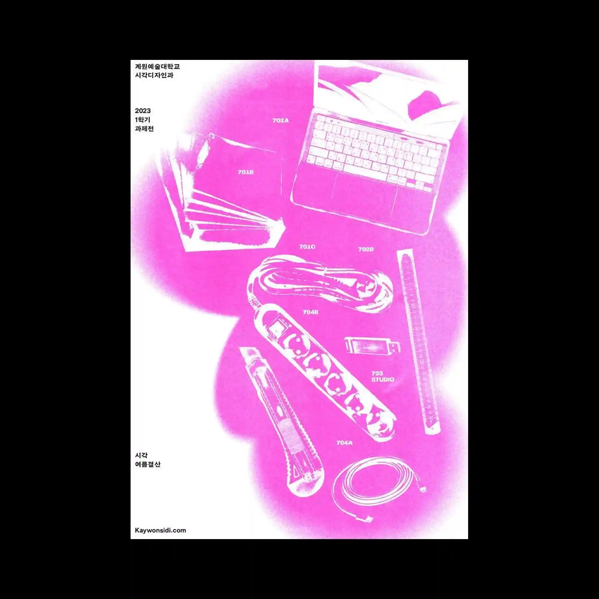
This poster features a high-contrast magenta overlay applied to everyday tools arranged diagonally. The strong color wash flattens depth, turning objects into graphic silhouettes. Small labels and numeric markers identify each item, reinforcing a catalog-like logic. The composition balances expressive color with systematic annotation.
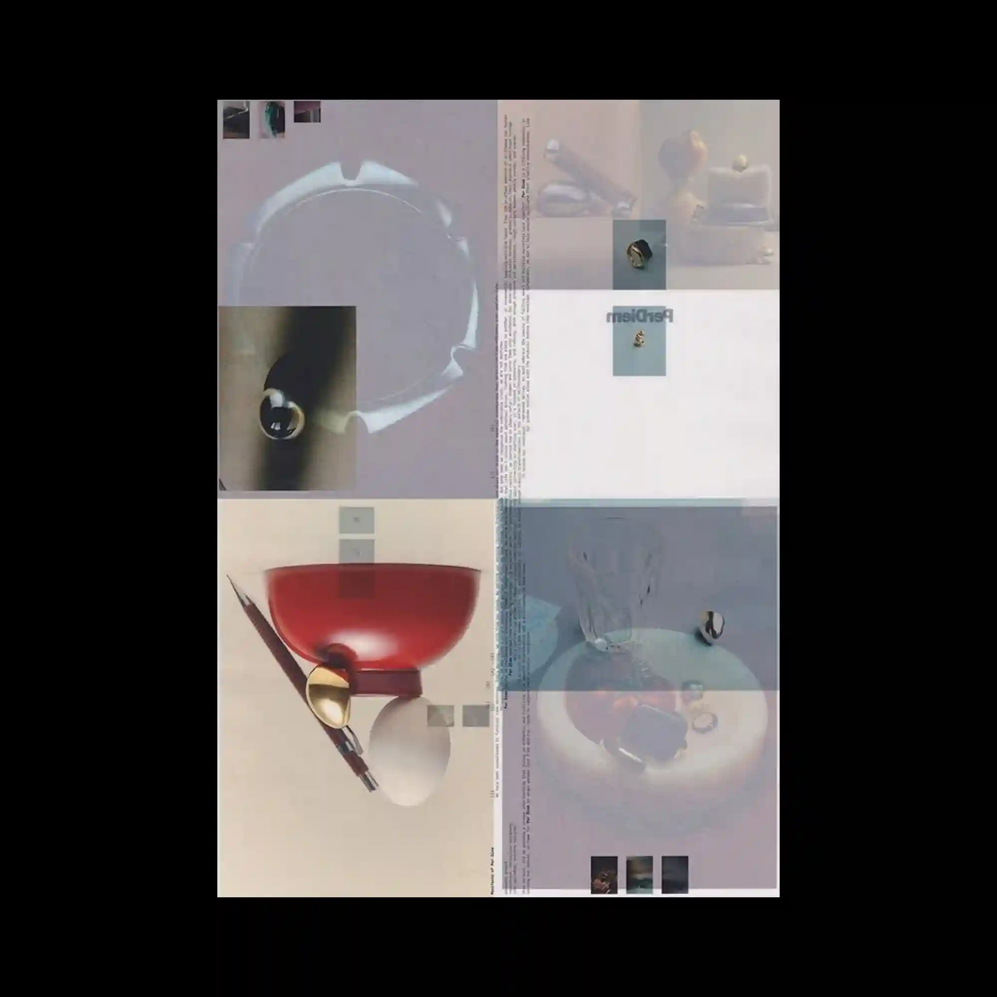
The composition is divided into quadrants, each containing softly lit objects photographed from similar angles. Semi-transparent overlays and fine text columns run vertically through the center. Muted colors and consistent lighting unify the disparate elements. The grid structure supports a calm, editorial rhythm.
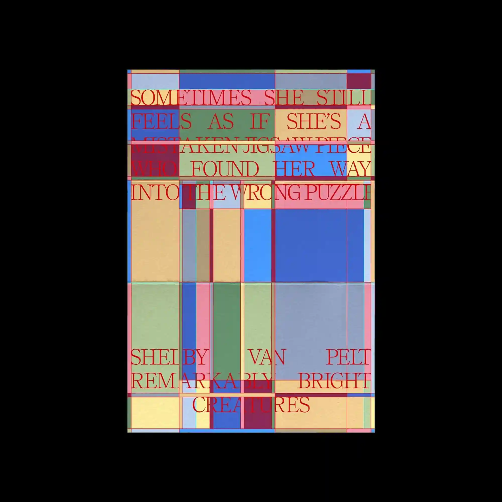
The image uses overlapping rectangular blocks in muted tones, intersected by thin red grid lines. Serif text is layered across the blocks, sometimes misaligned with the underlying grid. The tension between strict geometry and expressive typography defines the composition. Transparency allows multiple layers to remain visible simultaneously.
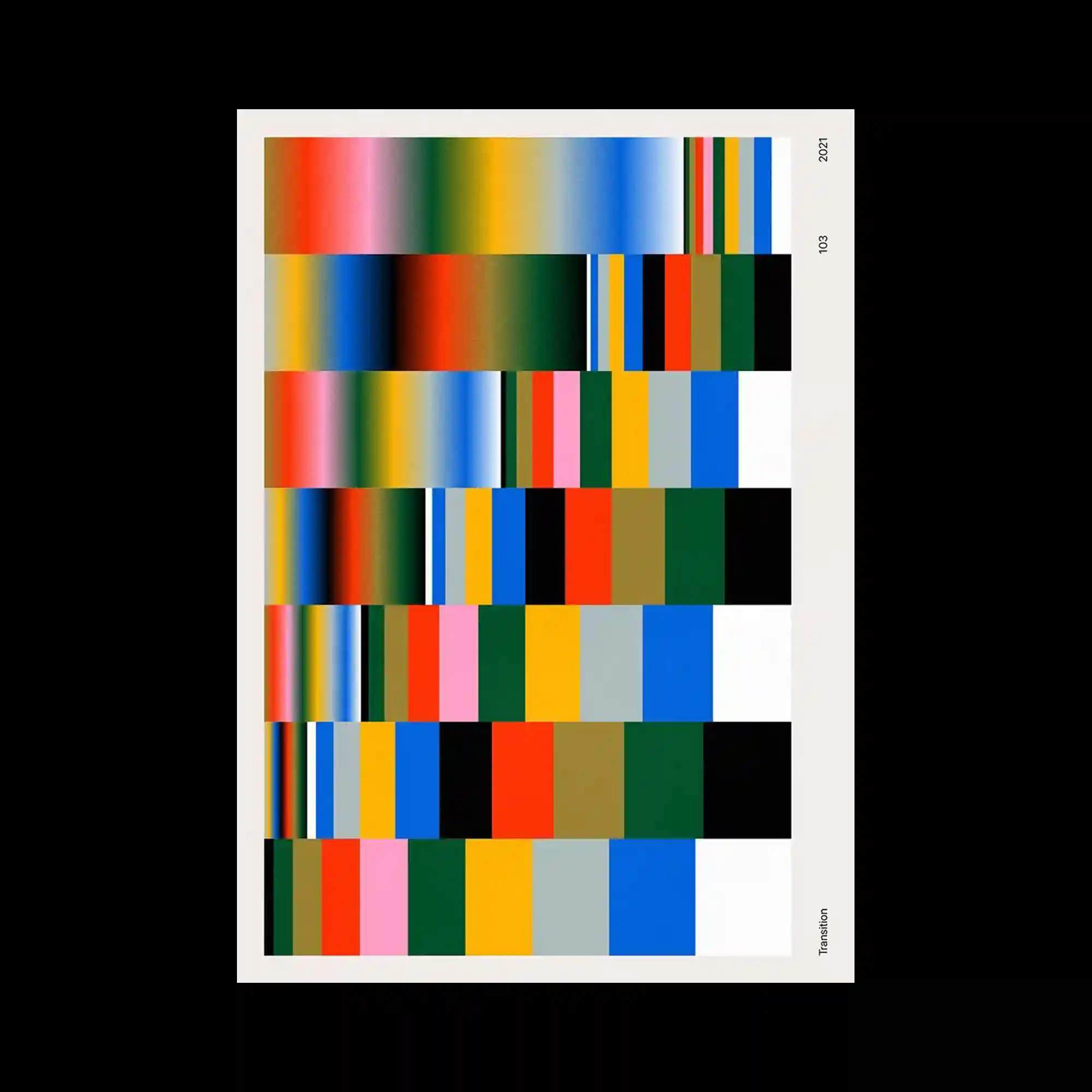
This poster is composed of horizontal bands of color arranged in a grid-like system. Gradients transition smoothly within each band, while abrupt color changes occur between rows. The neutral margin around the composition frames the dense chromatic field. The design explores systematic variation through repetition and controlled shifts.
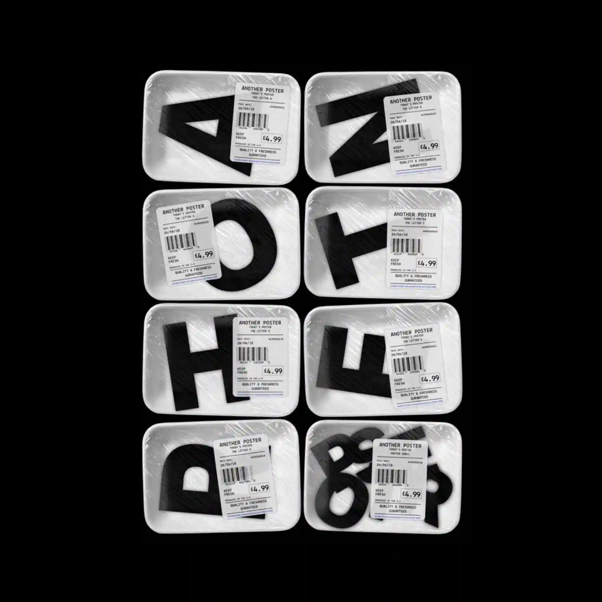
The composition features multiple packaged letterforms arranged in a strict grid. Transparent plastic textures and barcode labels introduce a commercial, standardized aesthetic. Each unit contains a bold black character, with slight variations in shape creating visual diversity. The repetition and equal spacing emphasize modularity and serial production.

A vivid yellow background dominates the poster, supporting a radial composition that expands outward from the center. Numerous small images and icons are connected by fine lines, forming a network-like structure. Large rounded letterforms anchor the top and bottom, framing the dense visual information in the middle. The hierarchy is driven by scale rather than color variation.
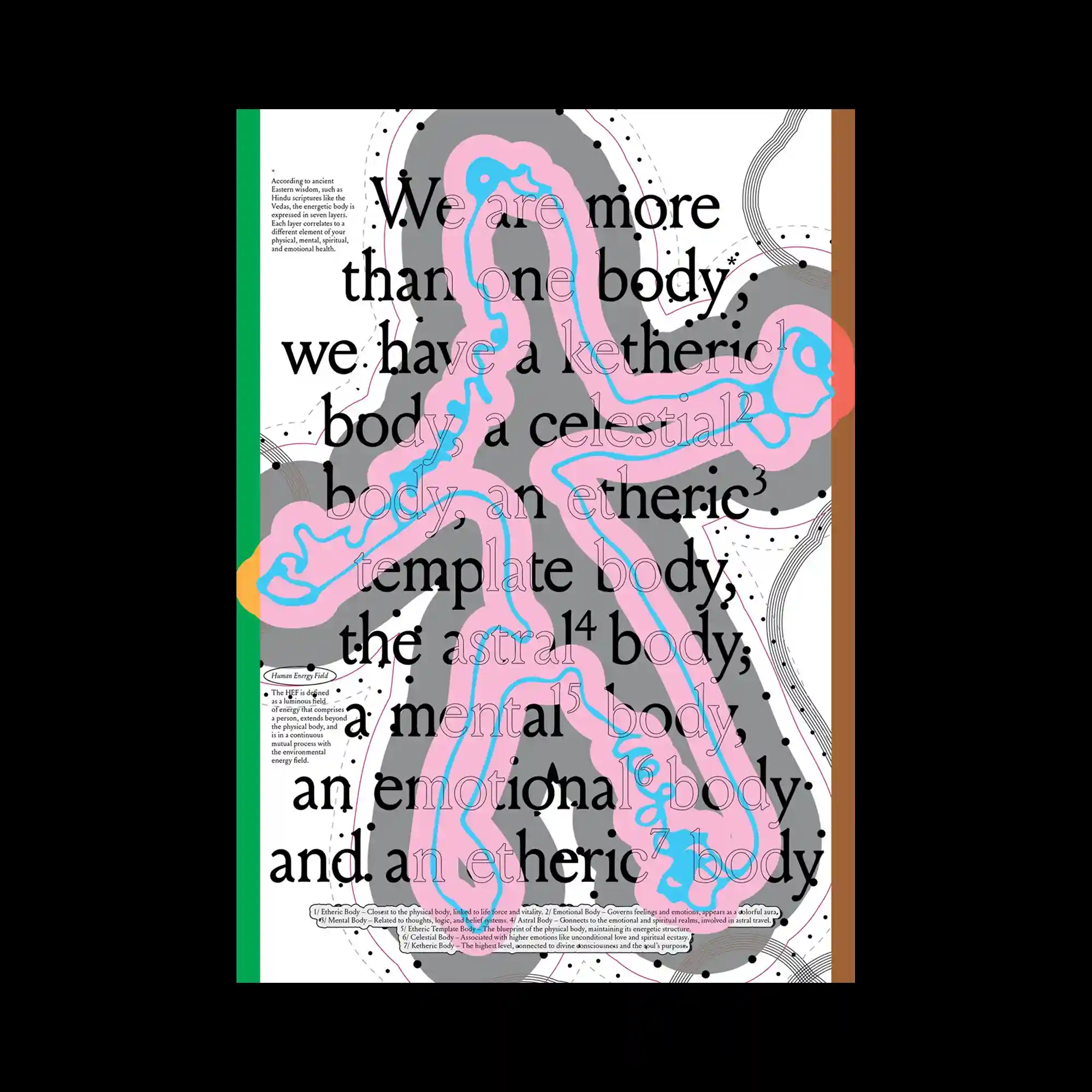
The layout combines a central organic silhouette with layered contours and dotted paths. Soft pastel shapes overlap with darker outlines, creating a sense of internal structure within the form. Large serif typography is overlaid across the entire surface, partially obscuring and integrating with the illustration beneath. Vertical color bars at the edges act as framing elements rather than focal points.
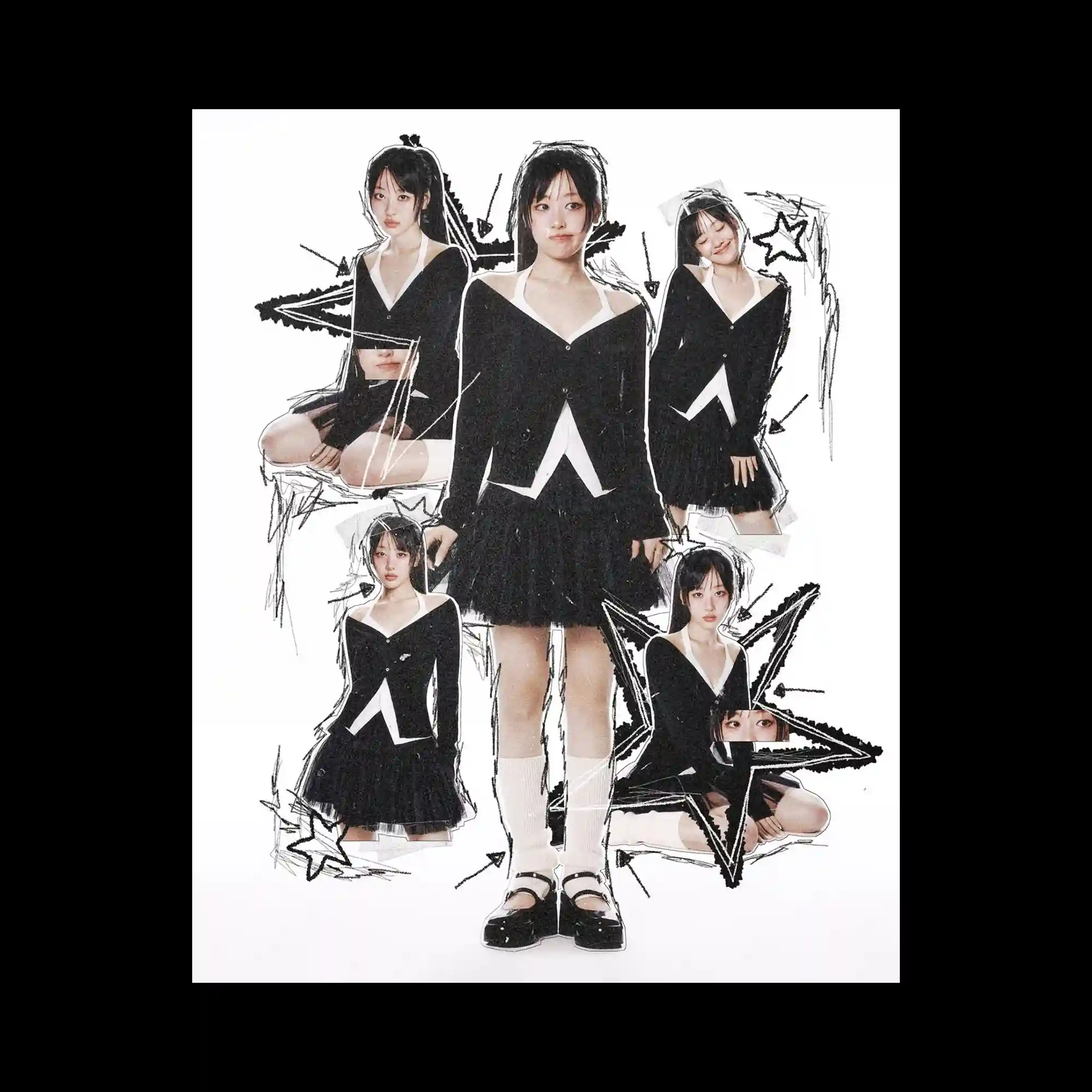
This image centers on a cut-out collage of a single figure repeated in multiple poses against a white background. Rough, hand-drawn black lines and star shapes are layered around the figure, adding a sketch-like texture. The repetition of the same subject at different scales creates depth without spatial perspective. The composition balances photographic realism with graphic intervention.
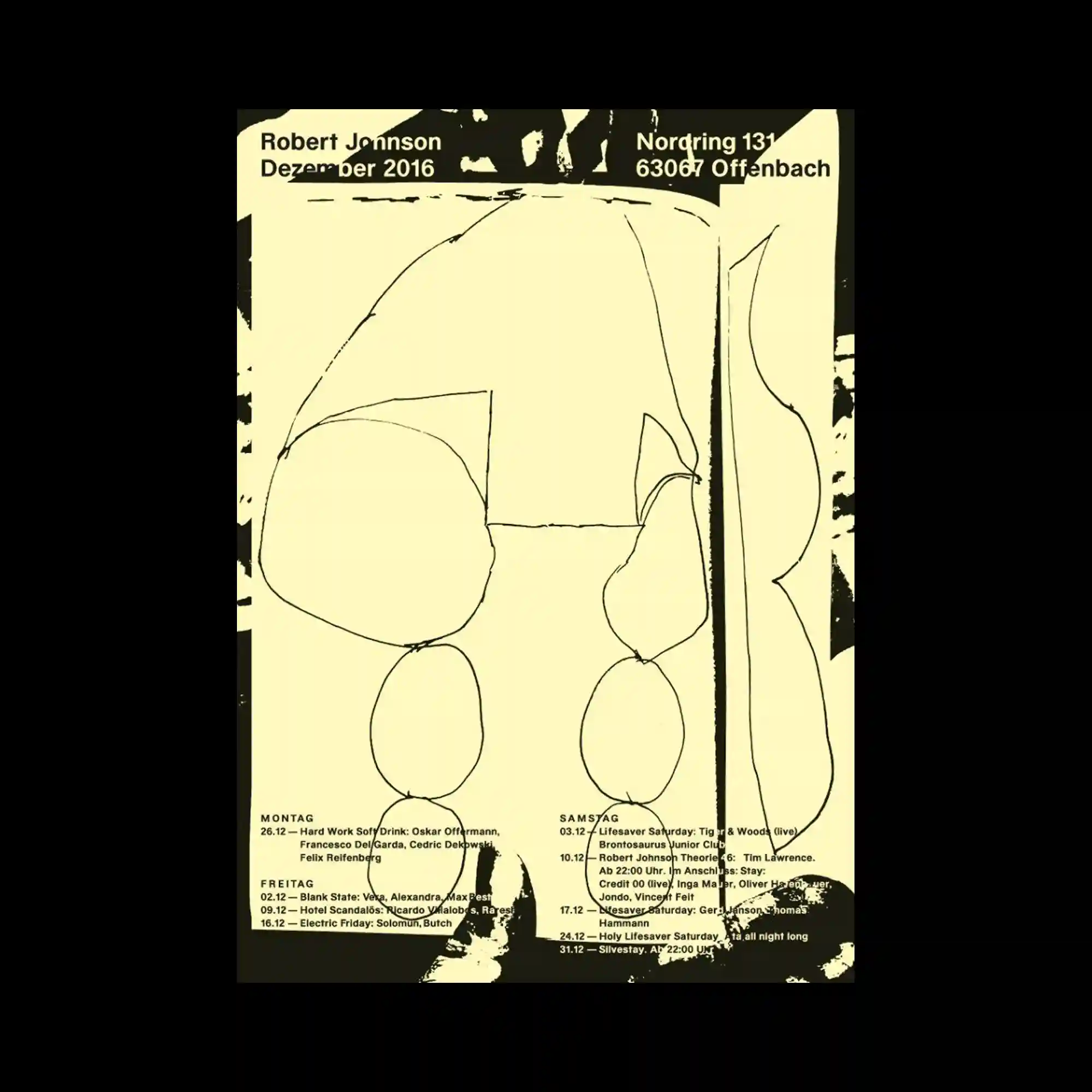
A limited color palette of pale yellow and black defines this poster, dominated by loose, hand-drawn line forms. Organic shapes are outlined with uneven strokes, suggesting spontaneity and imperfection. Dense black areas frame the composition, compressing the central forms inward. Text is kept minimal and aligned near the edges, functioning as a quiet counterbalance to the expressive lines.
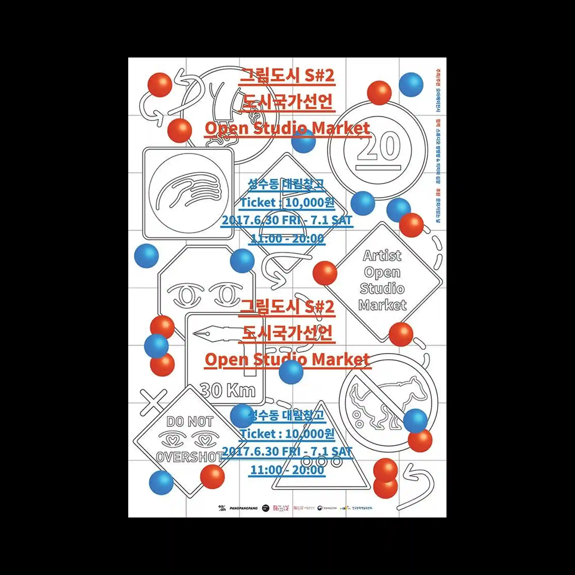
This design is structured on a visible grid, populated by outlined icons, arrows, and symbols. Red and blue spherical elements float across the grid, overlapping line drawings and text. The interplay between precise line work and soft, shaded spheres creates a contrast of rigidity and playfulness. Text blocks are integrated into the grid, maintaining alignment while allowing visual interruptions.
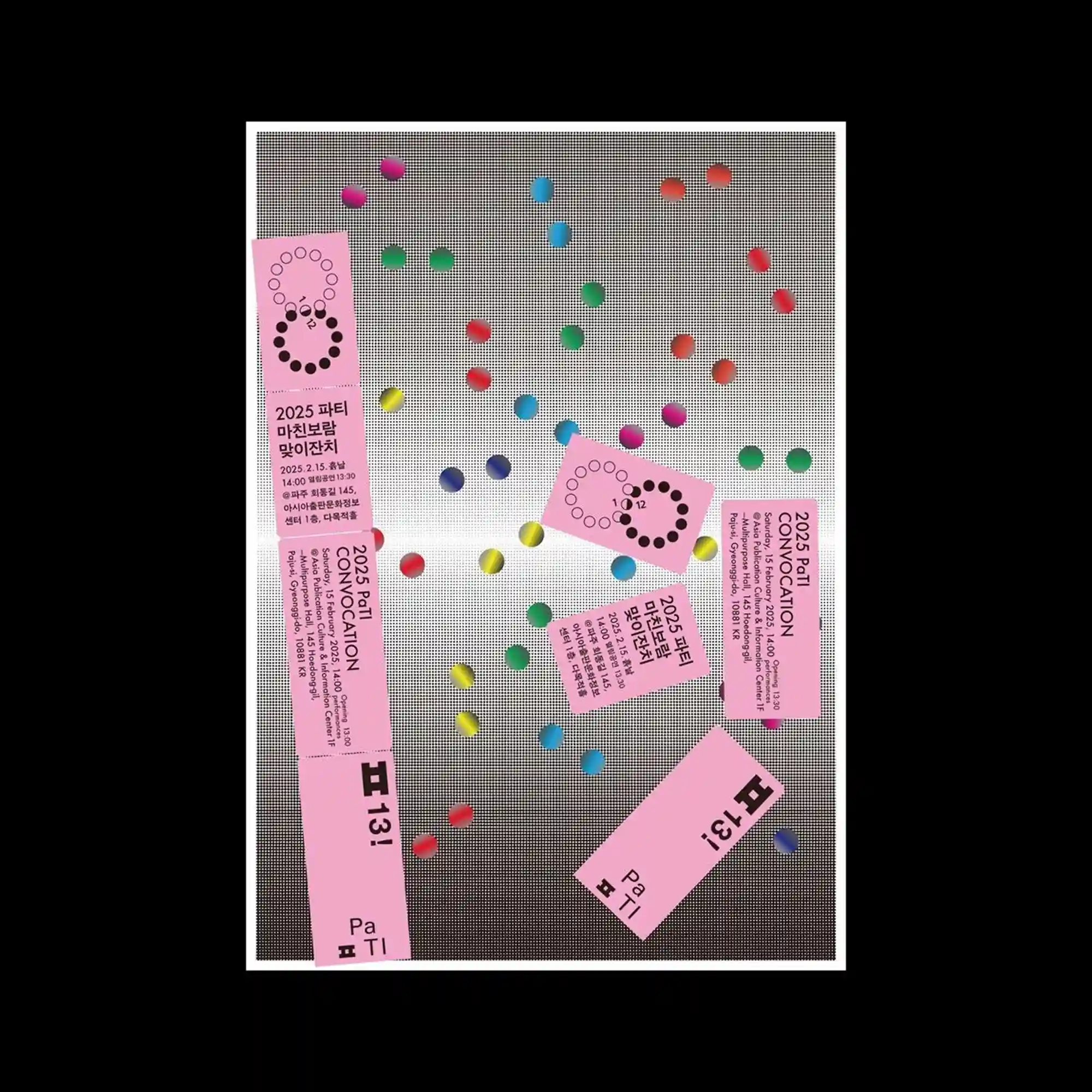
The composition features a neutral, textured background over which small, vividly colored circular elements are scattered. Pink rectangular cards with dense text blocks are placed at varied angles, creating a collage-like arrangement. The contrast between the muted backdrop and saturated dots emphasizes depth through layering. Repetition of circular motifs establishes visual rhythm across the surface.
This poster uses a white background as a neutral stage for bold black typography and scattered, brightly colored geometric stickers. Irregular rectangles in pink, green, yellow, and blue overlap the text, partially obscuring and revealing letterforms. The contrast between strict typographic alignment and casually angled shapes introduces tension and movement. Color placement is evenly distributed, preventing a single focal point and encouraging the eye to scan the entire surface.
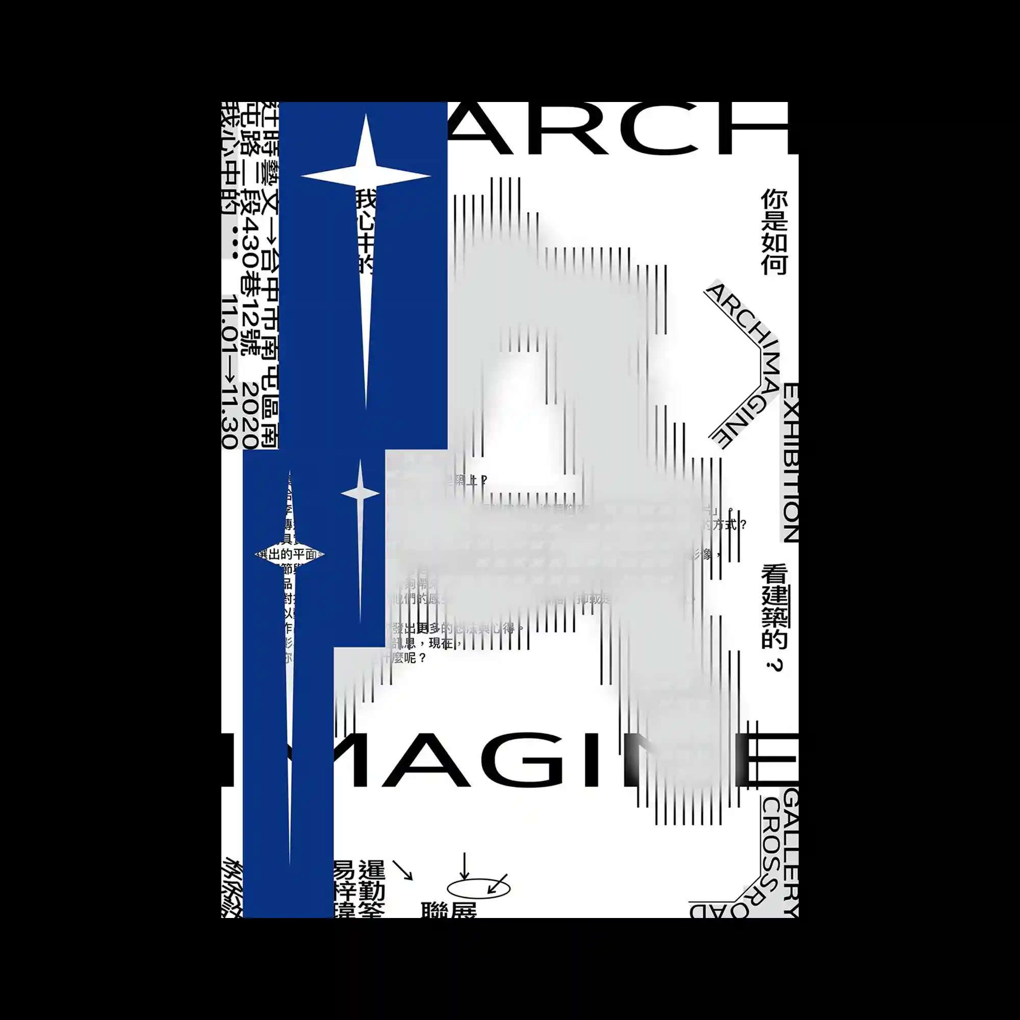
The composition is built around a strong vertical axis, where deep blue rectangular blocks intersect with a white background and black typographic elements. Sharp, star-like symbols are repeated at different scales, creating a rhythmic contrast between geometric precision and symbolic emphasis. Thin black lines and blurred linear gradients form a layered texture that suggests depth and motion without relying on perspective. Typography in multiple orientations frames the central structure, functioning as both informational blocks and visual borders within the layout.
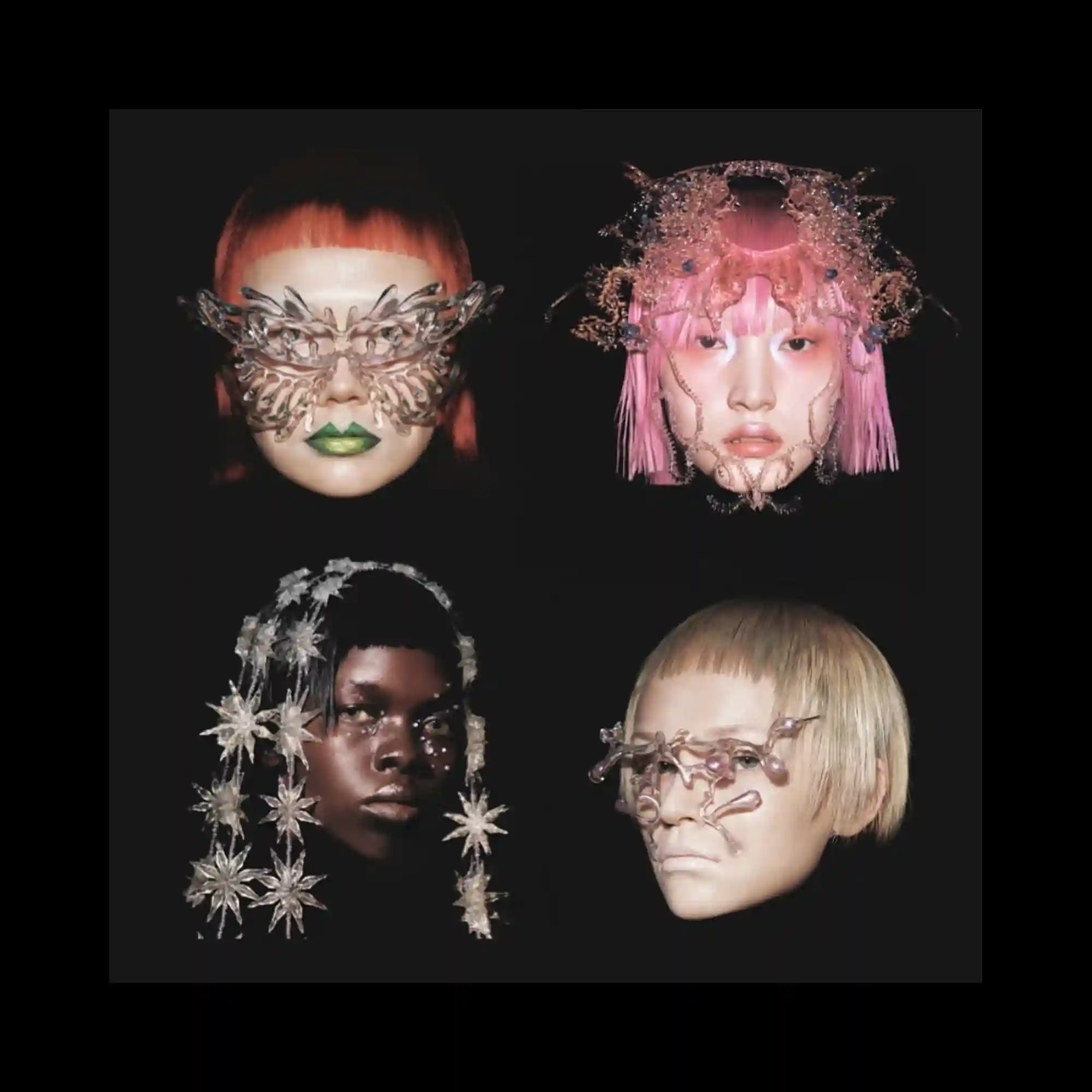
Four portrait-style faces are isolated against a dark background, arranged in a balanced grid. Each face is adorned with intricate, translucent structures that extend beyond facial contours. Lighting accentuates texture and materiality, while the uniform framing maintains cohesion. The composition explores variation within a fixed structural system.

Bold vertical red strokes aggressively obscure large portions of dense black text beneath. The underlying typographic field remains visible at the edges, creating tension between concealment and revelation. Decorative script typography emerges at the bottom, contrasting with the rigid block text above. The composition uses interruption as its primary visual strategy.

Vivid, wave-like color bands distort vertically across the poster, creating a dynamic sense of motion and digital interference. Saturated hues collide against a dark background, heightening contrast and depth. Typography is placed at the edges, remaining stable while the image appears to ripple and bend. The composition balances controlled structure with expressive visual disruption.
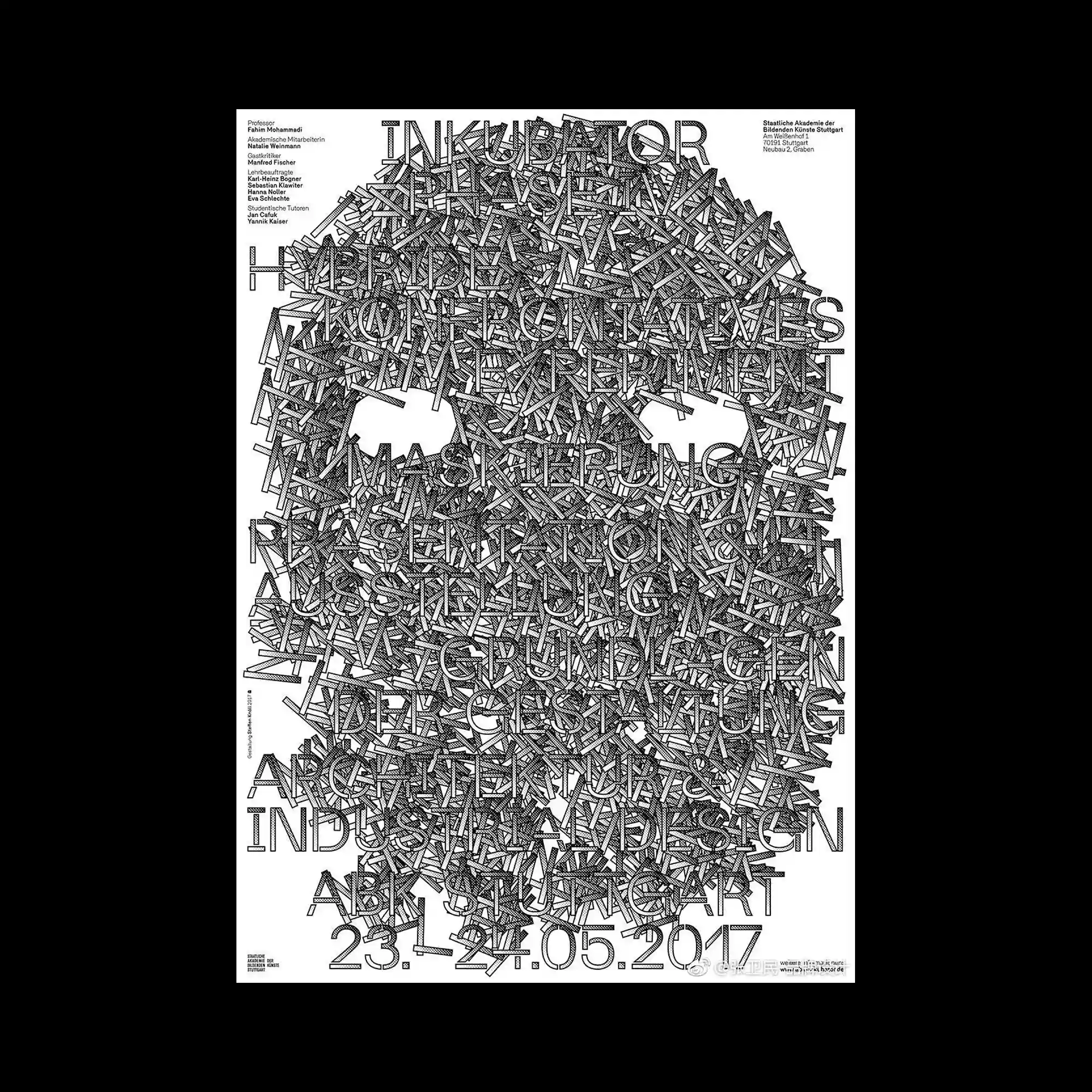
A dense typographic composition fills the entire page, where countless short linear fragments overlap to form the silhouette of a skull-like structure. The letterforms and strokes are tightly packed, creating a textured mass that oscillates between readable typography and abstract pattern. Negative space is carefully carved out around the eye areas, allowing the overall figure to emerge from the visual noise. The monochrome palette and uniform line weight emphasize structure, repetition, and visual density over hierarchy.

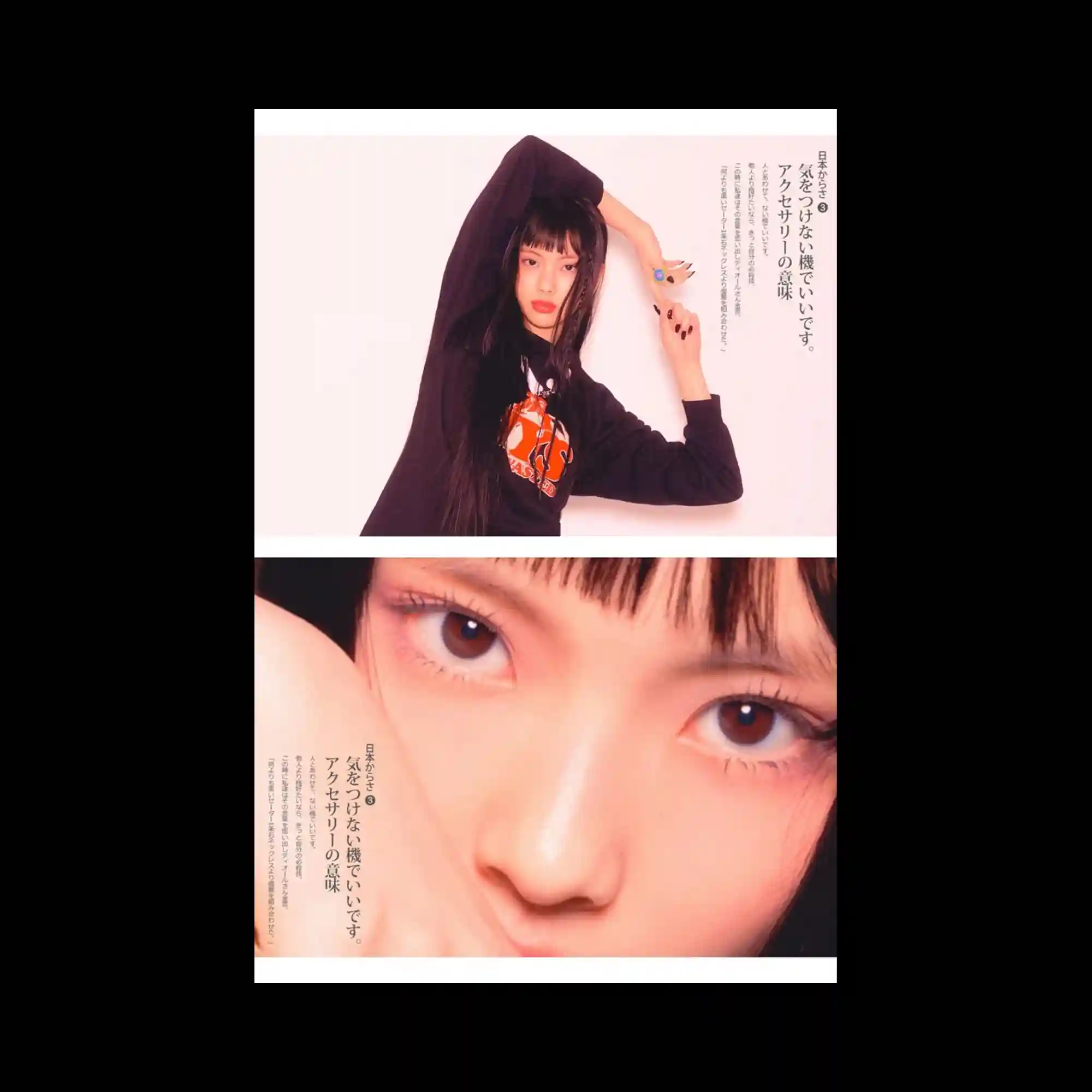
A tight photographic close-up focuses on the face, with emphasis on the eyes. A small decorative object is attached across the face, introducing texture and color contrast. The background is subdued, directing attention to surface detail and expression. The composition relies on intimacy, framing, and selective focus.
The layout is split into two horizontal photographic panels showing the same subject at different scales. Soft, warm lighting and pale backgrounds create a gentle atmosphere. Vertical lines of text are placed close to the subject, integrated into the negative space. The composition balances editorial photography with restrained typographic placement.

An image composed entirely of typed characters forms a portrait-like figure, with varying density creating light and shadow. The monochrome palette emphasizes texture and pattern rather than color. Individual letters remain visible, reinforcing the constructed nature of the image. The composition blends typography and image into a single, highly detailed surface.
A blurred photographic image serves as the background, dominated by cool blue tones and soft green highlights. Large, elegant serif typography overlays the image, sharply defined against the defocused photograph. The text hierarchy is clear, with oversized words anchoring the composition and smaller supporting text placed discreetly. The contrast between photographic softness and typographic precision defines the visual tone.

The composition fills the frame with fluid, calligraphic strokes rendered in soft red, green, and blue, overlapping and blurring into one another on a white background. The marks resemble enlarged letterforms but remain abstract, emphasizing motion over legibility. A thin red border tightly frames the image, while small serif text is placed near the edges, contrasting the expressive central mass. The overall structure balances controlled framing with energetic, painterly typography.

A sharp, cone-like three-dimensional form stands centered against a neutral background, rendered with glossy, distorted surface textures. One side appears smooth and reflective, while the other shows warped, liquid-like patterns overlaid with a wireframe grid. Circular typography wraps around the base, following a curved path. The contrast between precision geometry and fluid distortion defines the visual character.
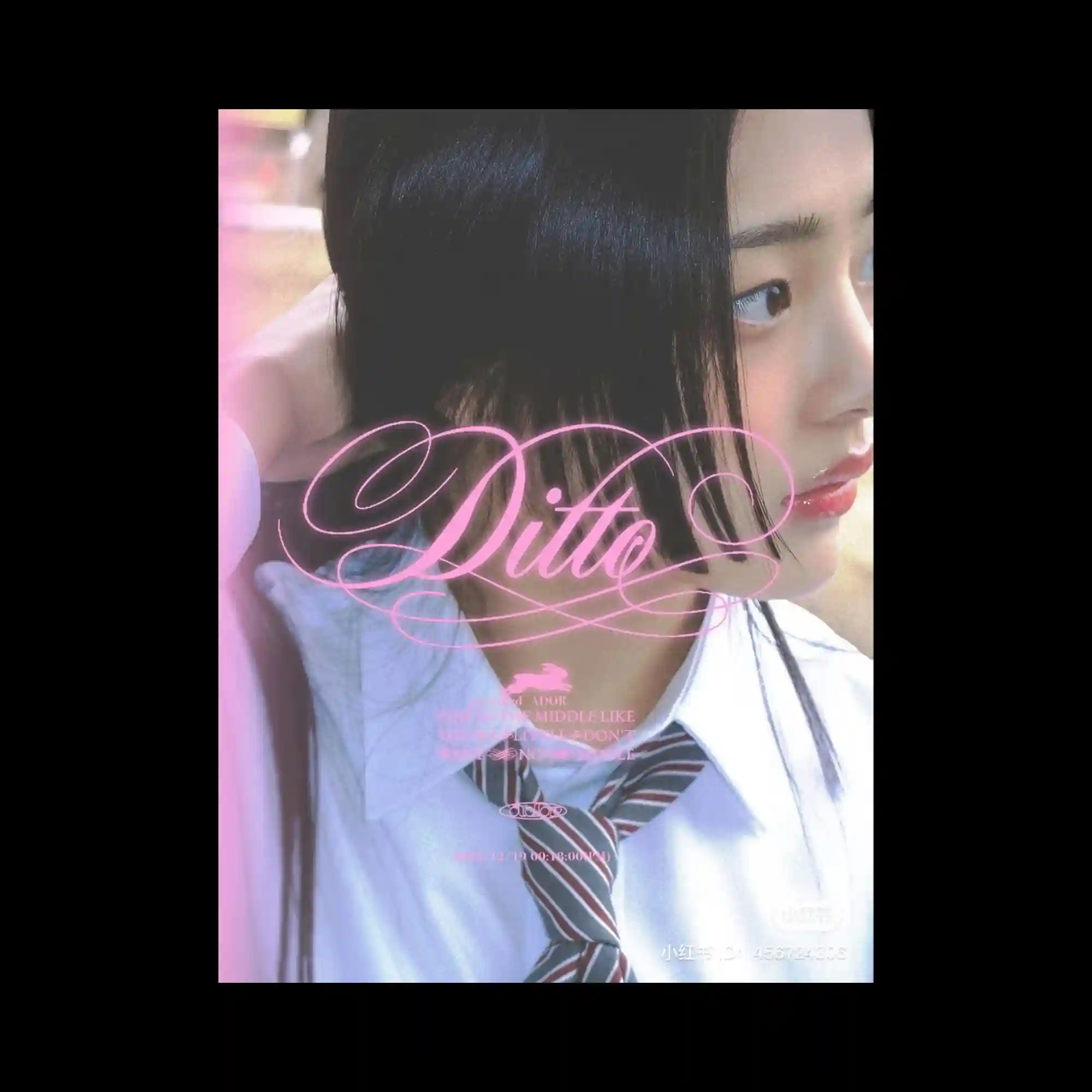
A photographic portrait fills the frame, softly lit with a shallow depth of field. Overlaid on the image is ornate, flowing pink script typography that contrasts with the realism of the photo. Smaller text elements are delicately layered without overpowering the face. The composition balances photographic intimacy with decorative typographic emphasis.
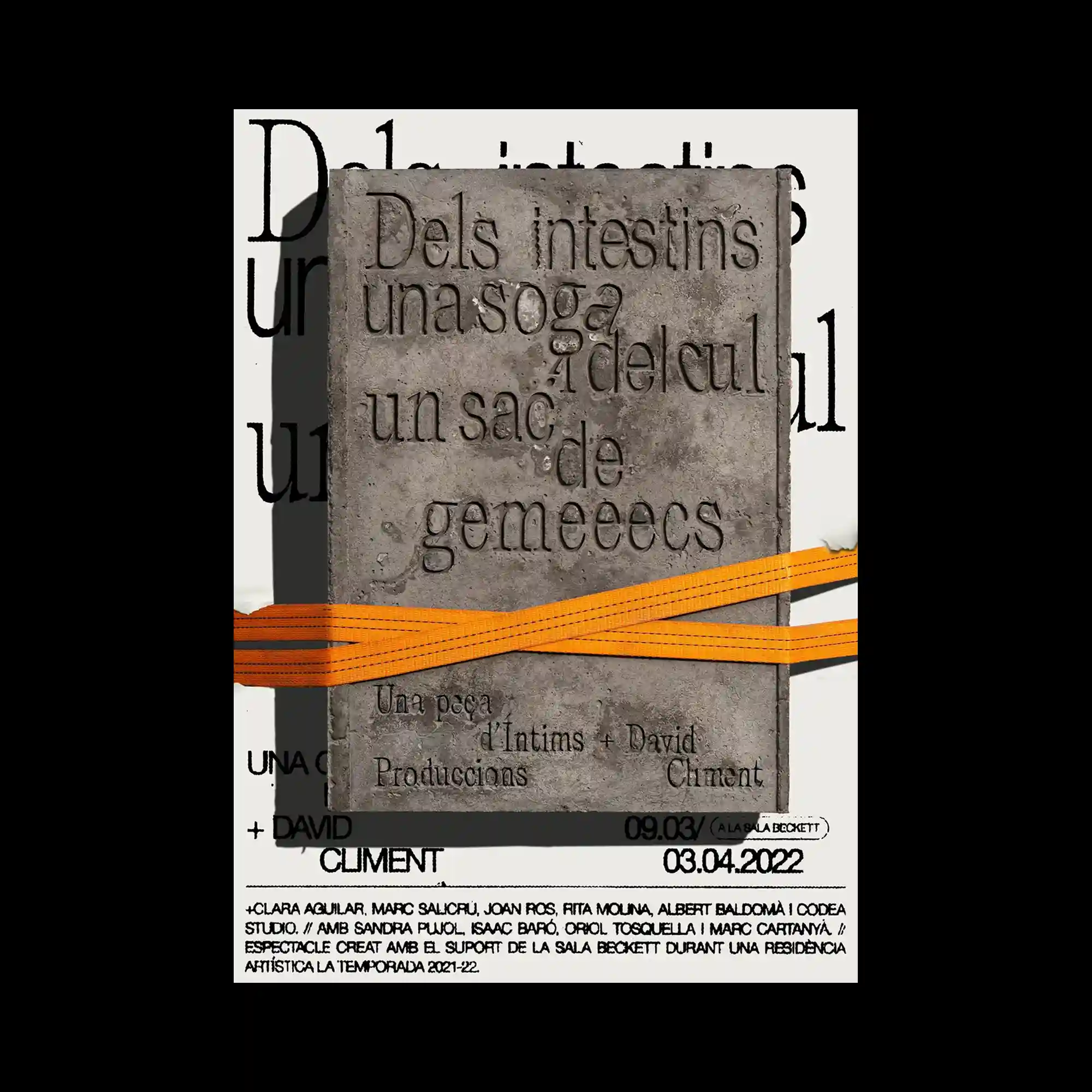
A textured, stone-like rectangular slab sits centrally against a light background, with embossed lettering carved into its surface. An orange strap cuts horizontally across the slab, adding a contrasting industrial element. Behind it, large black typography is partially visible, creating layered depth. Material contrast between rough texture, flat color, and crisp type defines the composition.
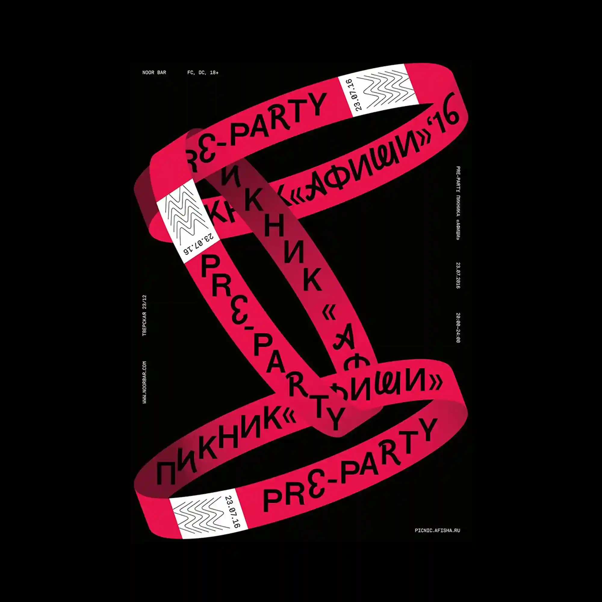
On a black background, a ribbon-like form in vivid red twists and loops through the center, carrying bold typography along its surface. The ribbon appears three-dimensional through shading and overlap, while white accent segments break the continuity. The text orientation changes with the ribbon’s direction, emphasizing motion and depth. The composition is driven by contrast between dark background and saturated color.

Overlapping oval shapes in bright green, orange, and pink stack vertically, partially obscuring bold black typography beneath. The transparency of layering is suggested through overlap rather than actual opacity changes. Large sans-serif text is cropped by the shapes, creating a dynamic interplay between foreground color fields and background type. The composition relies on repetition, overlap, and color blocking.
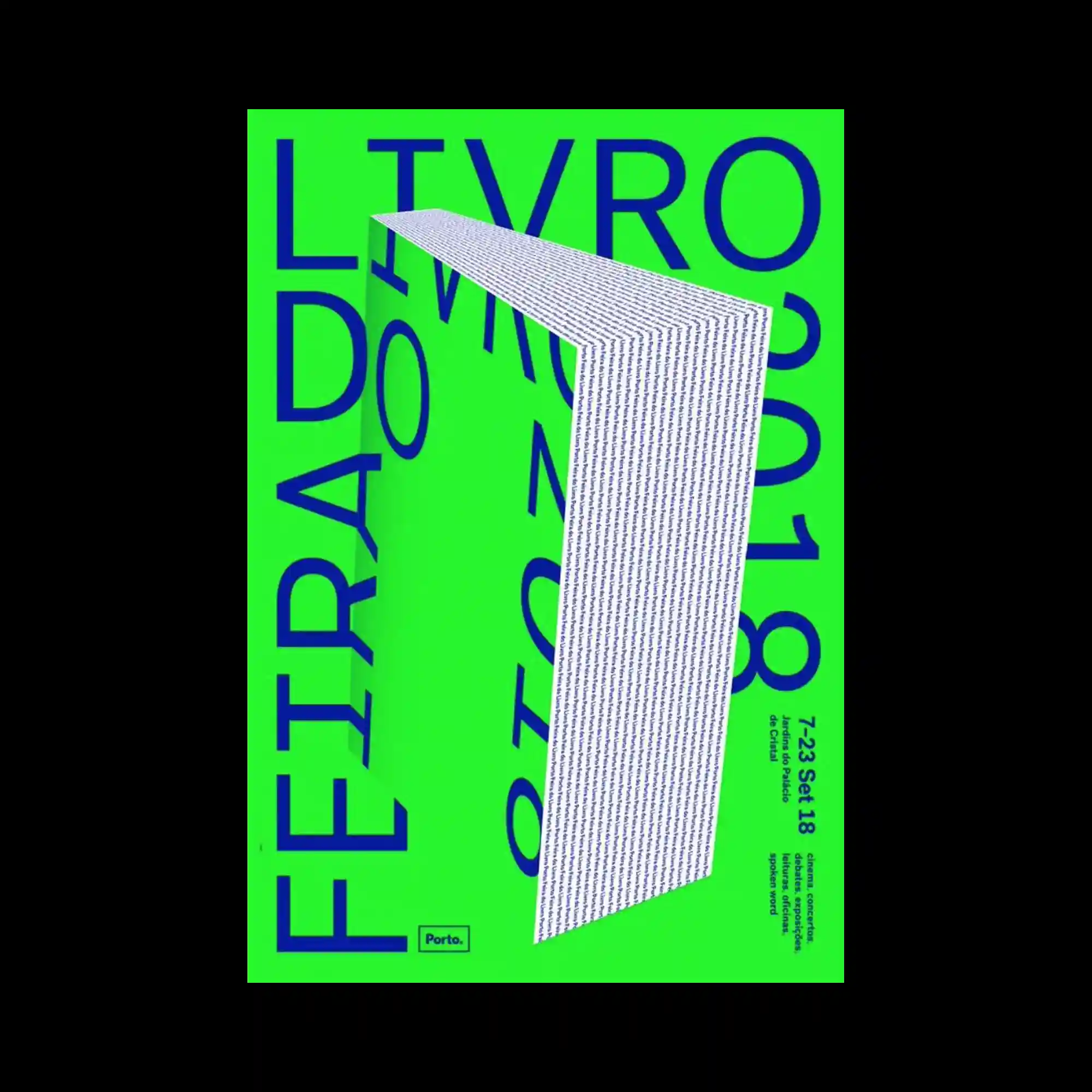
A vivid neon-green background dominates the poster, creating a high-contrast field for deep blue typography. Oversized letters extend beyond the frame edges, suggesting scale and movement. A folded, three-dimensional strip of densely set text cuts diagonally through the composition, adding depth and a sense of spatial interruption. Flat color, extreme contrast, and typographic scale shifts define the visual impact.
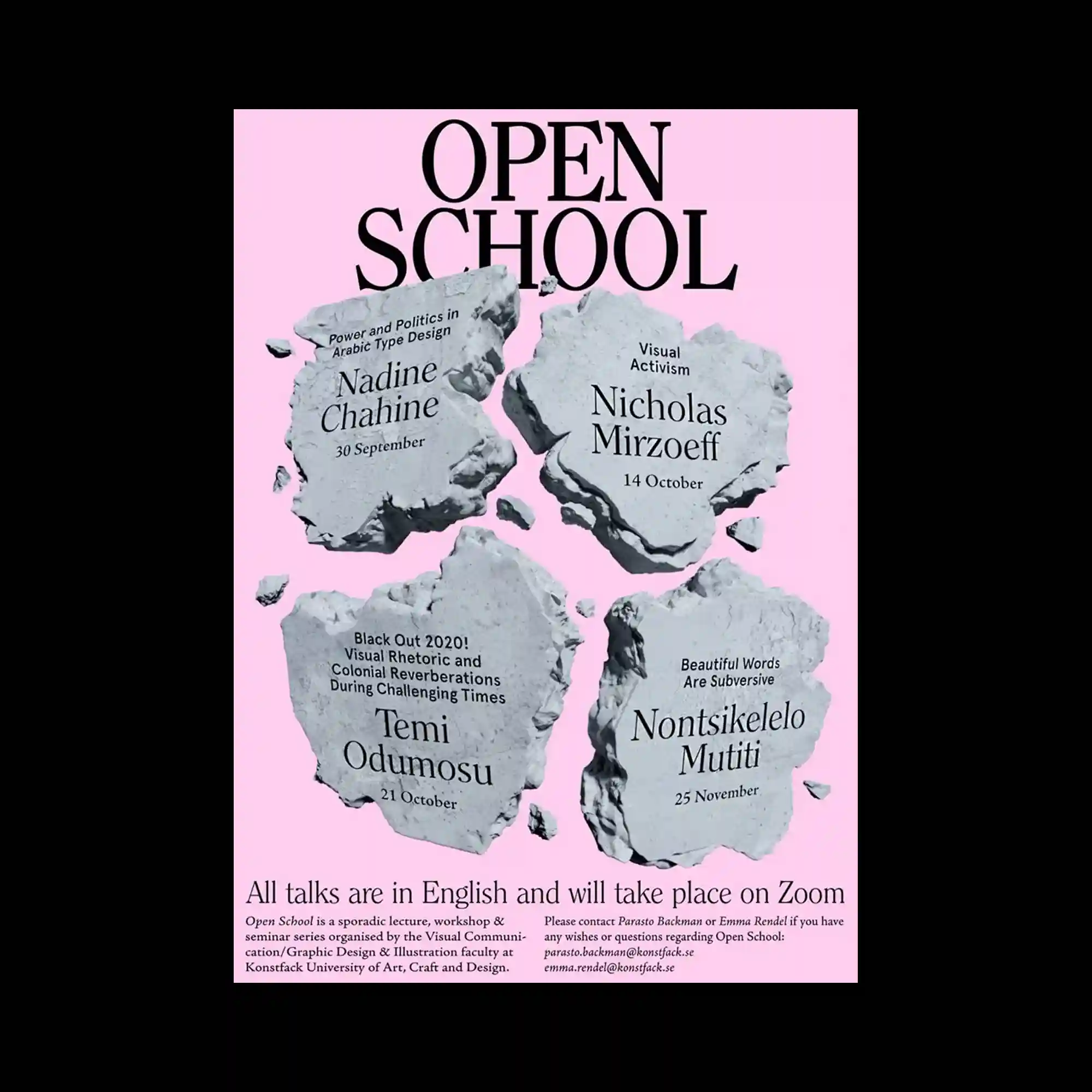
The composition uses a soft pink background contrasted with irregular, stone-like gray fragments arranged in a loose grid, each fragment acting as a container for typographic information. Large serif typography at the top establishes a strong vertical hierarchy, while smaller serif text is embedded directly into the textured shapes, creating a carved or engraved effect. The balance relies on symmetry in placement but asymmetry in the organic contours of each fragment. The visual tension comes from the contrast between refined editorial typography and rough, fractured surfaces.

A bright green blocky shape dominates the center, cutting into a white background like an architectural silhouette. Black vertical Japanese and English text aligns along the edges of the green form. Smaller informational text clusters around the margins. The composition emphasizes bold color fields and spatial interruption.
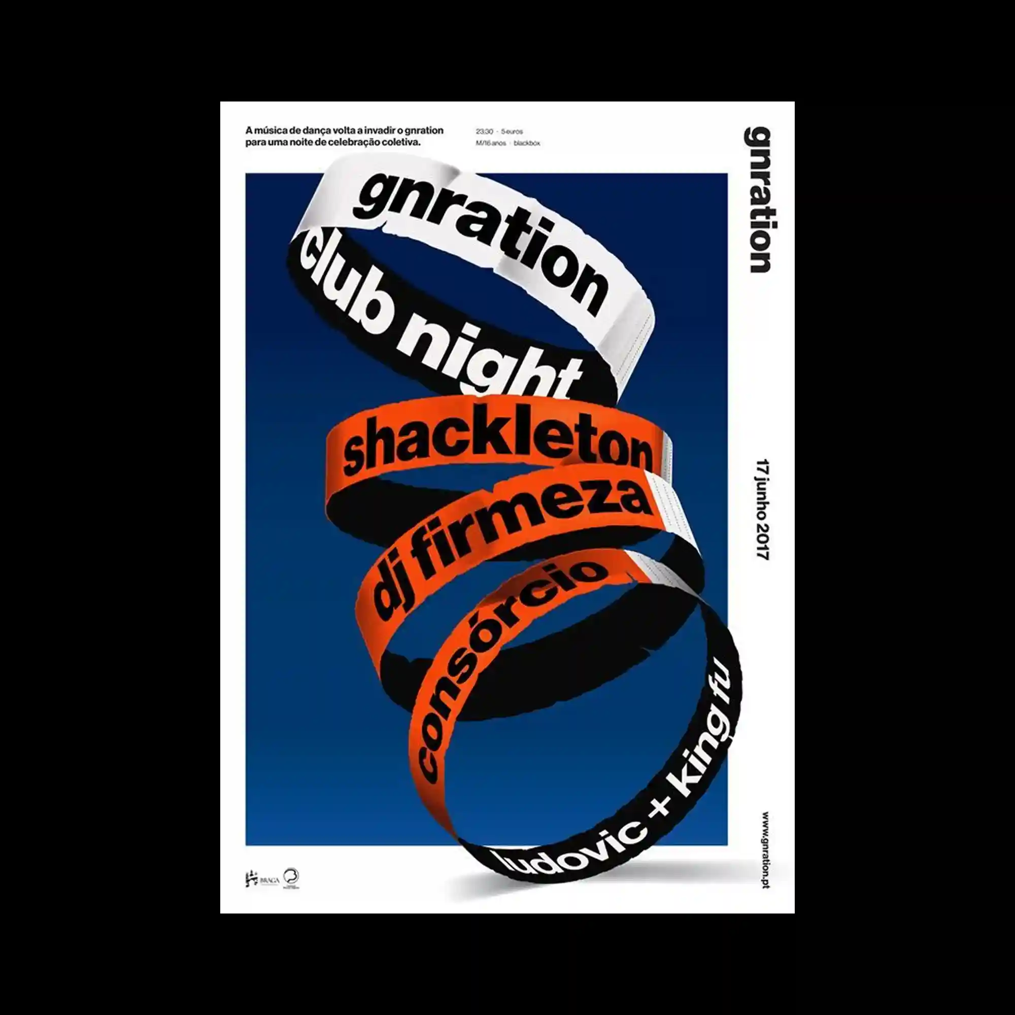
A spiral ribbon structure winds upward, each band carrying bold text in contrasting colors. The background is a solid deep blue, enhancing depth and motion. The ribbons overlap and twist, creating a strong sense of vertical movement. Typography becomes a three-dimensional element.
Flowing calligraphic typography stretches across the upper portion of the poster. Below, rough green textured strokes rise vertically, creating organic contrast. Small informational text blocks are tucked into corners. The composition juxtaposes expressive lettering with raw painterly surfaces.

Large white sans-serif typography is stacked vertically over a photographic grid of a glass building facade. Warm orange-red blurred streaks overlay the image, partially obscuring the background. The text remains sharply legible despite the visual interference. The composition explores contrast between clarity and distortion.
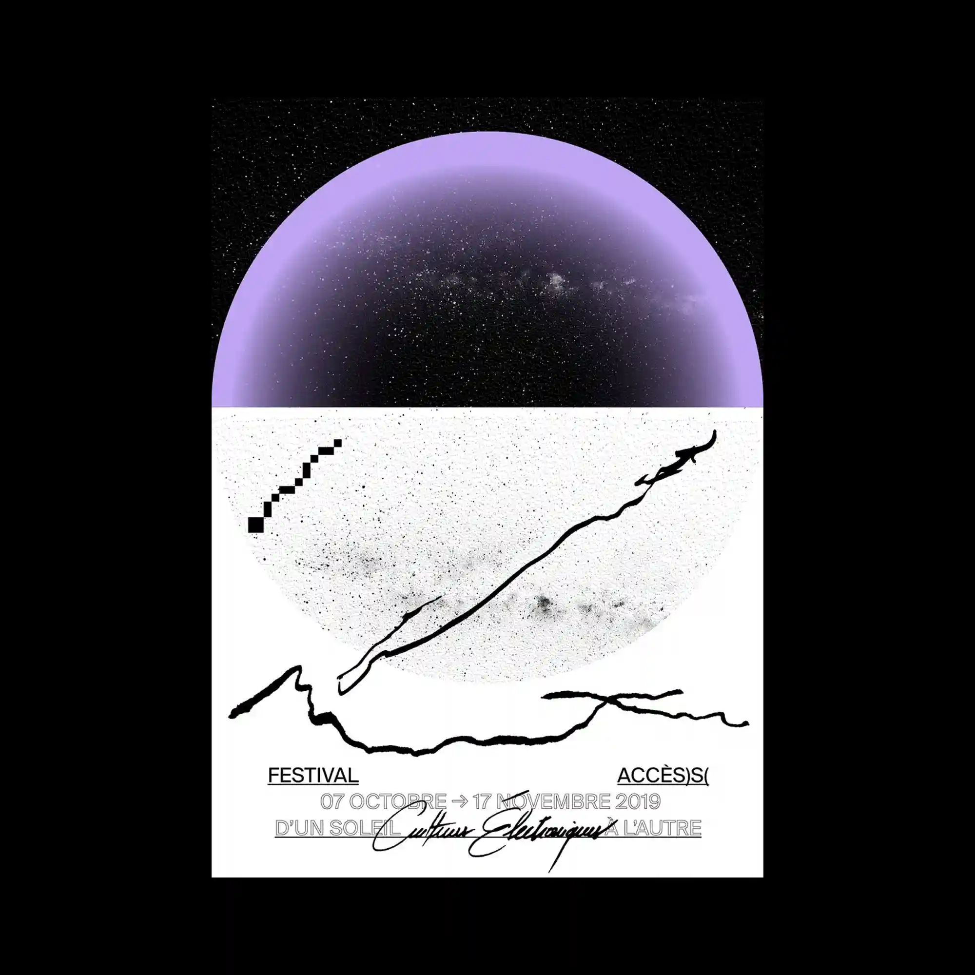
A circular composition is divided horizontally, with a deep black starfield occupying the upper half and a pale textured surface below. A translucent violet arc frames the top portion, creating a dome-like enclosure. Thin, irregular black lines cut across the lower area like gestural marks, contrasting with a small pixelated diagonal element. The layout balances cosmic imagery with raw graphic interventions.

A cosmic, grain-textured background supports an oval celestial form. Over it, a bright rectangular sticker-like graphic is centered, containing bold text and symbols. Along the bottom edge, small icon silhouettes are arranged in sequence. The composition contrasts organic imagery with sharp graphic overlays.

A still-life photograph shows a tall stack of books against a black background. The spines create horizontal color bands, varying in thickness and hue. Titles and author names form a typographic rhythm across the stack. The composition highlights accumulation, order, and material variety.
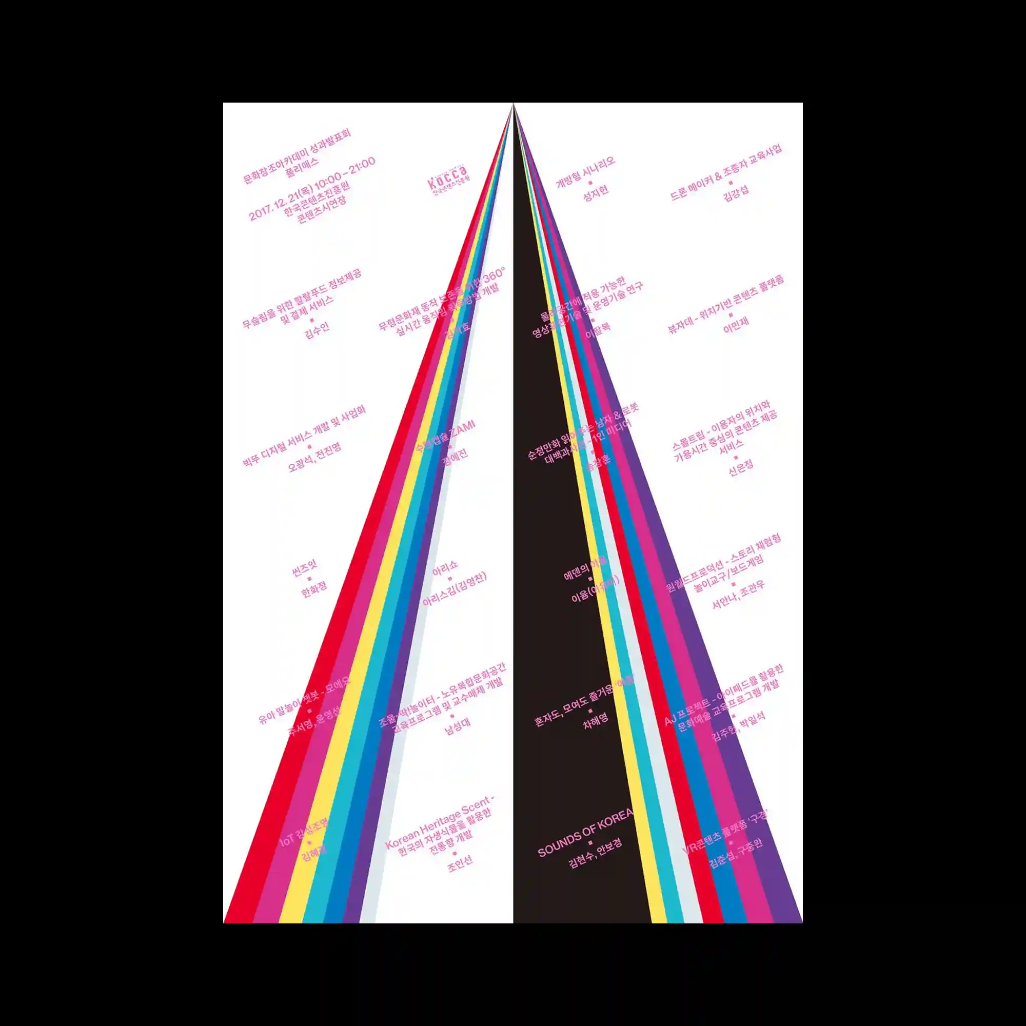
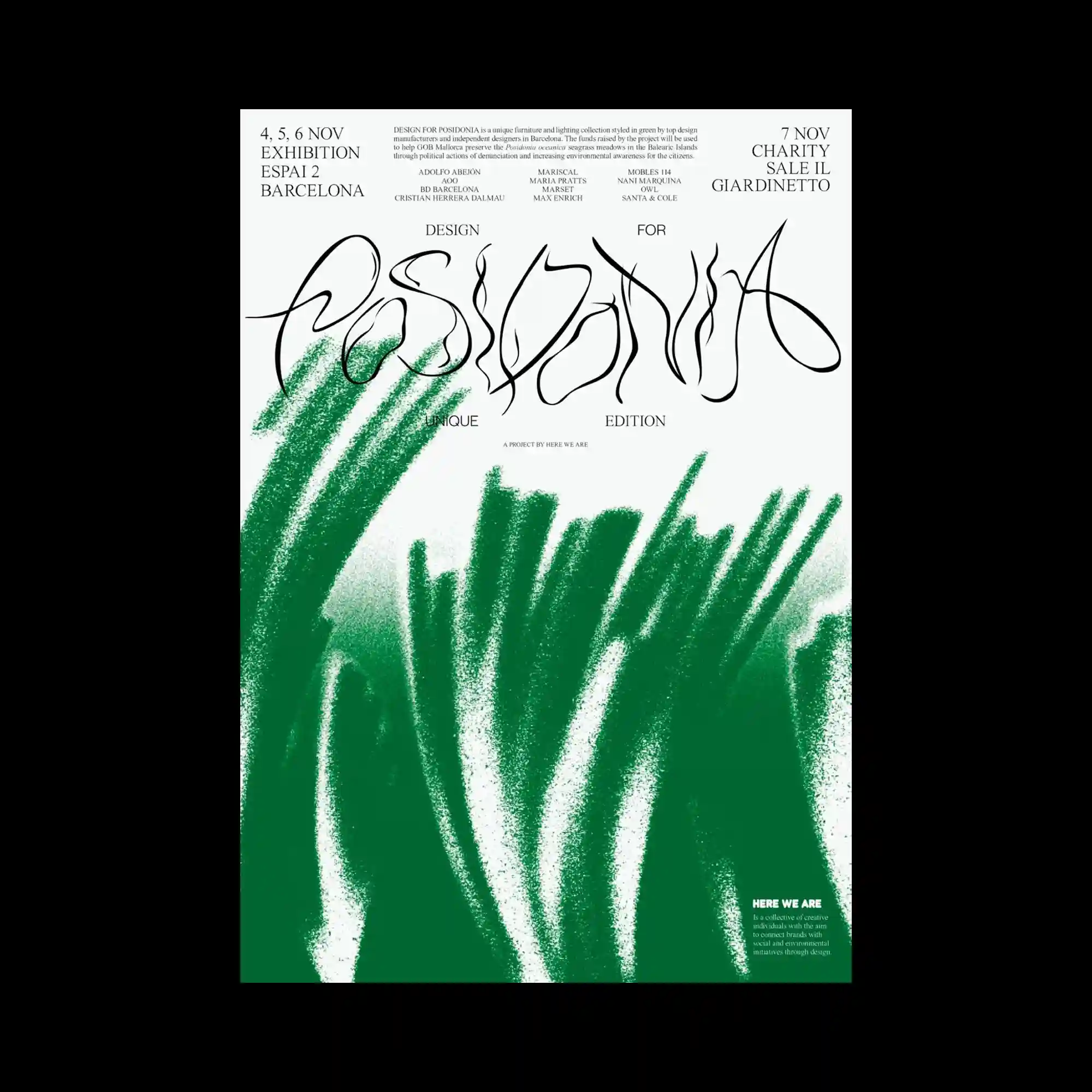
A tall triangular composition is formed by multiple diagonal color bands converging toward the top. Bright, saturated stripes contrast with a central dark wedge. Small text labels are aligned along the bands, following their angles. The poster emphasizes directionality, convergence, and chromatic contrast.

Three vertical panels resembling browser windows are placed side by side. Bold black typography curves and bends as if printed on flexible surfaces. Each column carries a different name, creating variation within a uniform structure. The design plays with digital interface metaphors and physical distortion.
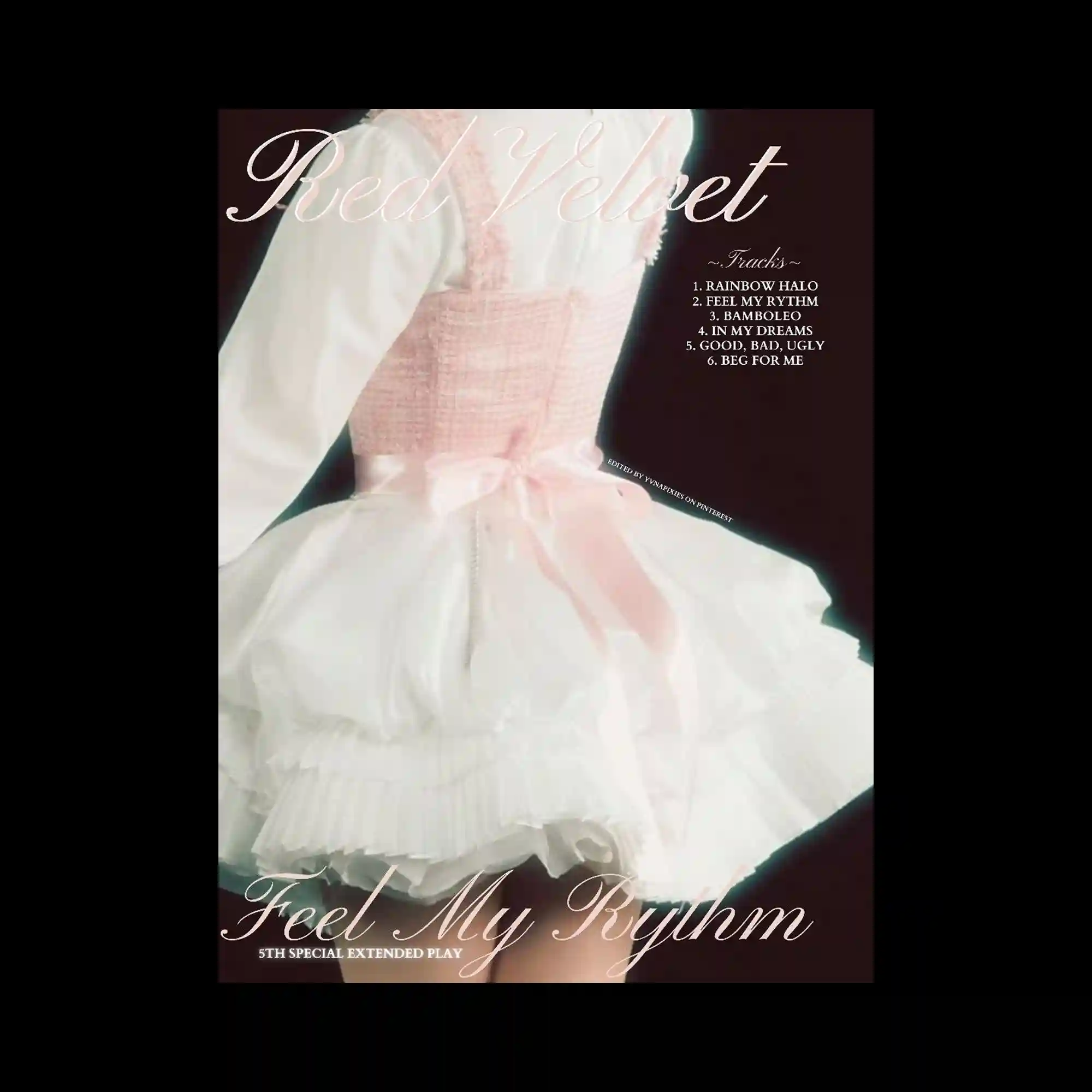
A soft-focus image of a layered dress fills the frame, with sheer fabric and ruffles emphasized by gentle lighting. Elegant cursive typography overlays the image, following the contours rather than strict alignment. The color palette remains muted and pastel. The composition prioritizes texture, softness, and flowing type.

A minimalist poster centers a white flag attached to a diagonal pole against a blue gradient sky. Text is aligned along the sides and top, framing the central object without overlapping it. Thin outlined typography appears faintly in the background, adding a secondary layer. The composition balances emptiness, symbolism, and precise alignment.
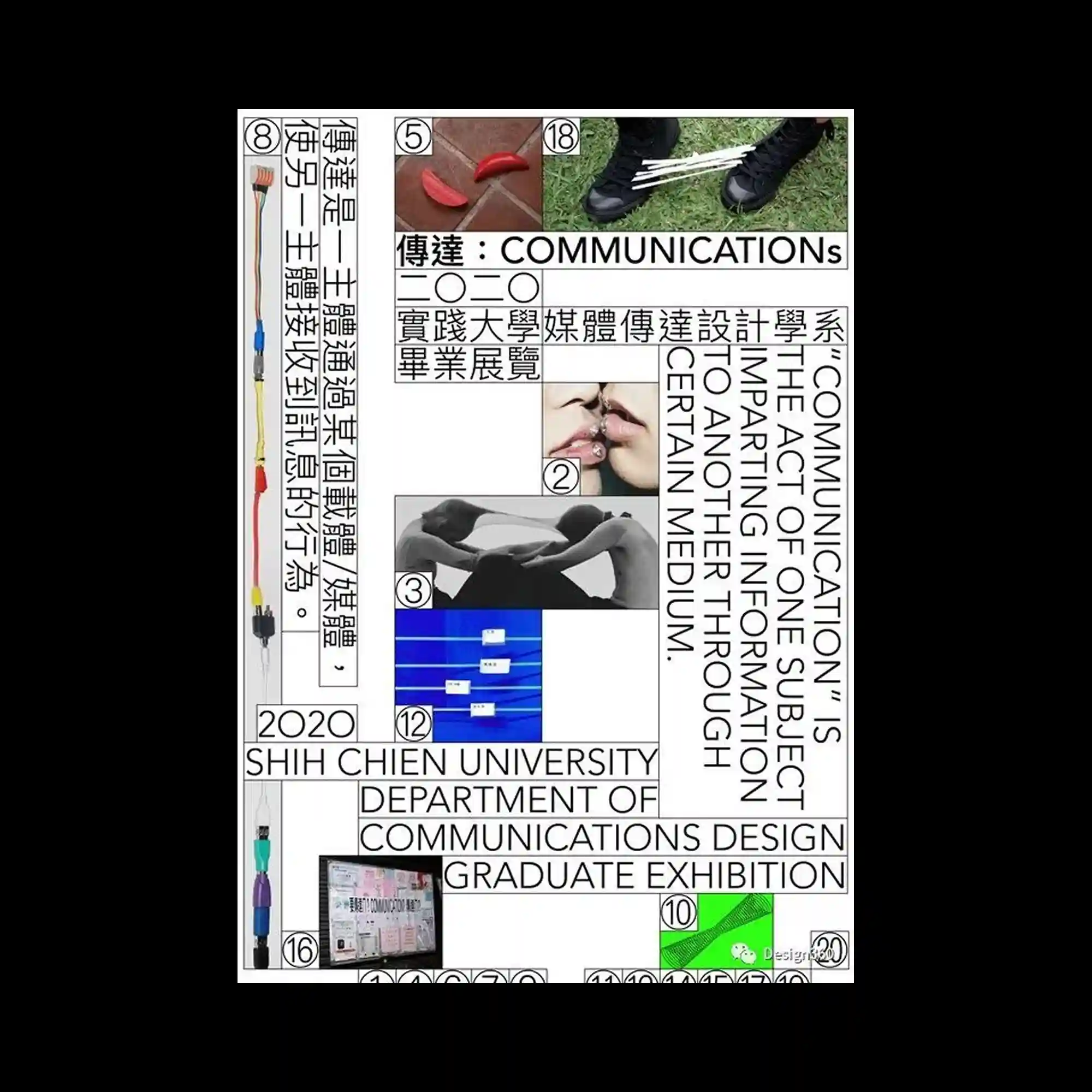
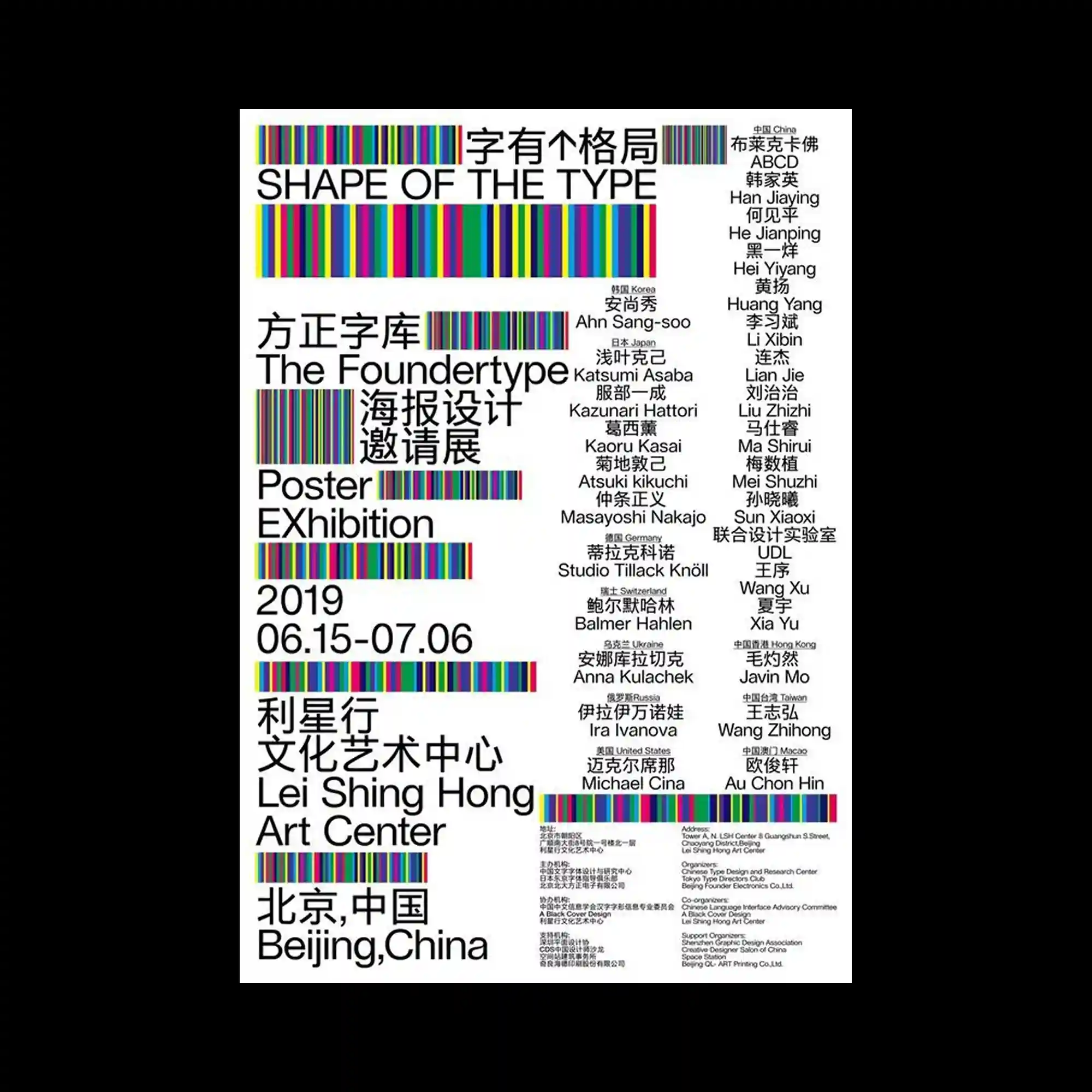
A grid-based poster combines photographs, diagrams, and multilingual typography within rigid rectangular frames. Vertical and horizontal text blocks intersect, guiding reading flow in multiple directions. Small numbered image inserts punctuate the layout, adding rhythm. The overall composition emphasizes structure, hierarchy, and information density.

A vintage instructional graphic depicts two open hands rendered in sepia tones. Each palm is covered with numbered markings and fine lines, paired with dense explanatory text blocks. The layout mirrors left and right hands, creating strict bilateral symmetry. Typography and illustration merge into a didactic, archival composition.

A collage-style poster layers multiple photographic portraits within torn-paper edges and overlapping frames. Images vary in scale, from close-up facial crops to full-body poses, creating depth through stacking rather than perspective. Interface-like icons, labels, and small graphic marks are scattered around the composition, acting as visual anchors. The white background allows the dense imagery to remain legible while emphasizing fragmentation and assembly.
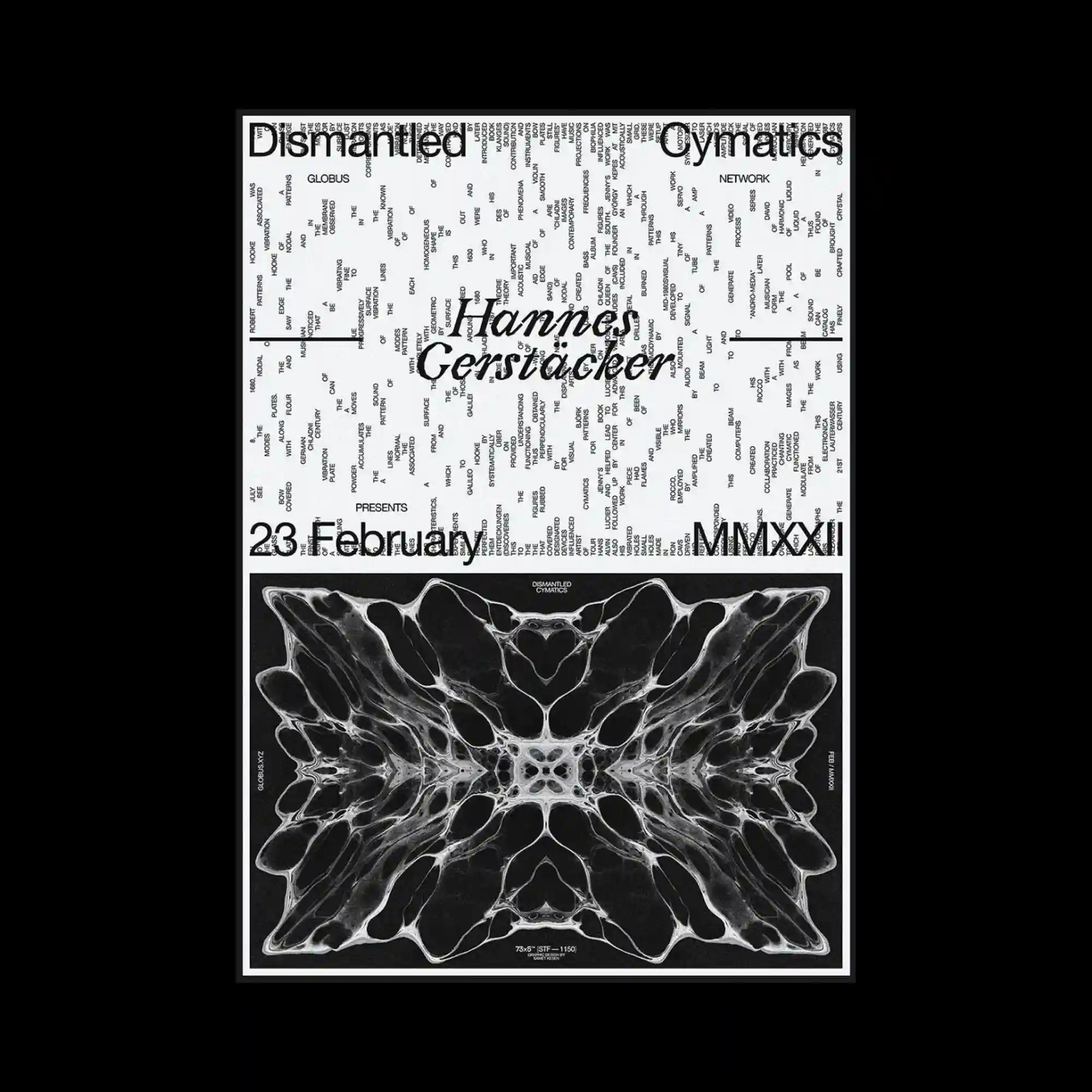
A typographic poster is densely packed with small text blocks forming a rectangular field. Larger serif titles cut across the surface, intersecting the text grid. The lower section features a mirrored, organic abstract image framed in black. The composition contrasts textual density with visual symmetry.
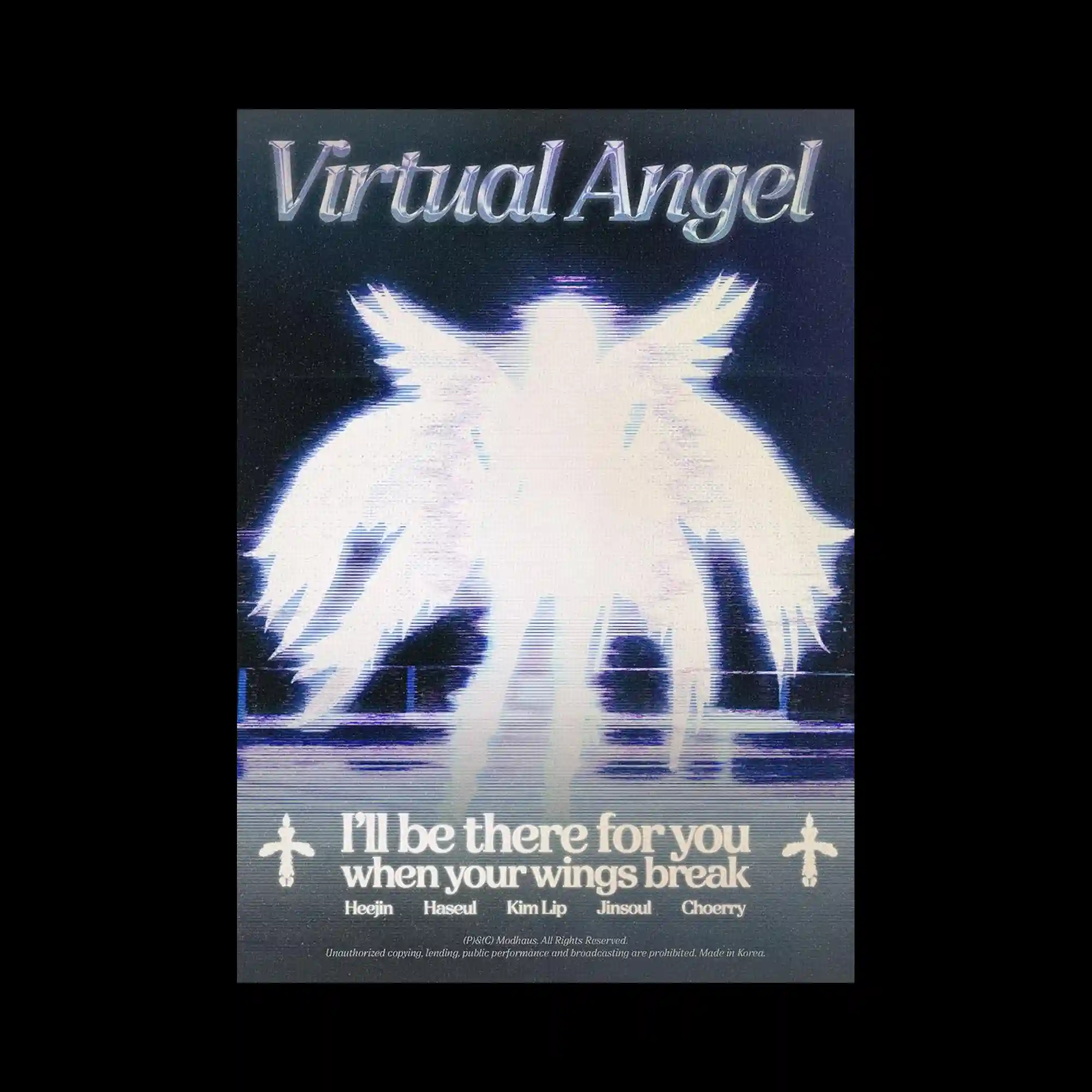
A glowing angelic silhouette dominates the center, rendered with heavy blur and scanline distortion. Feather-like shapes radiate outward, dissolving into light. Retro-styled typography sits above and below, aligned symmetrically. The composition blends digital noise with luminous softness.

A sculptural stone-like form fills the frame, engraved with stacked typographic names. Organic textures and moss-like color patches appear across the surface. The background is dark and cosmic, enhancing contrast with the pale form. Typography becomes part of the object’s physical relief.
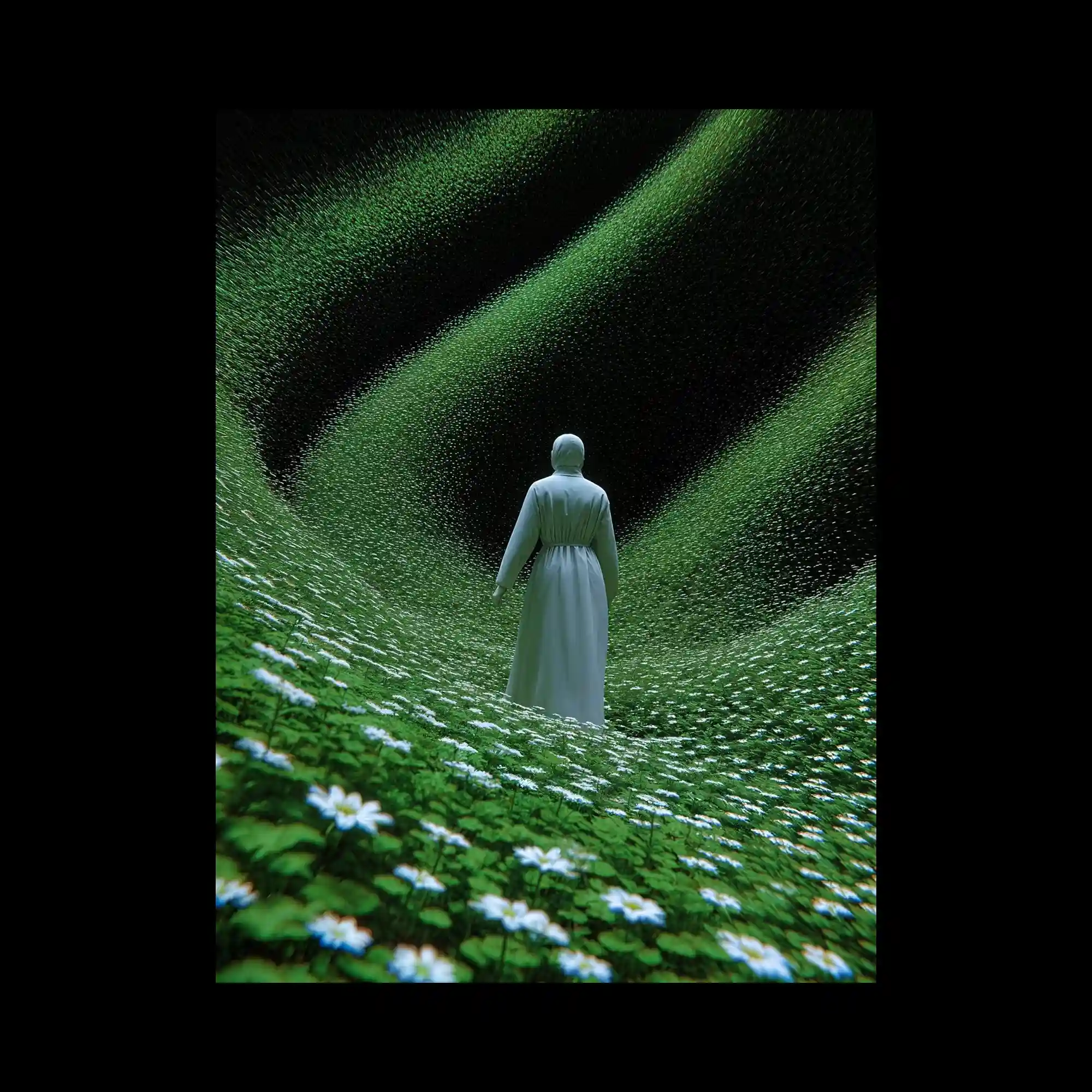
A lone figure in white stands within a vast field of small flowers, arranged in flowing wave-like patterns. The landscape curves upward, creating a tunnel-like sense of depth. Soft lighting and uniform color tones unify the scene. The composition emphasizes scale, repetition, and immersive spatial flow.
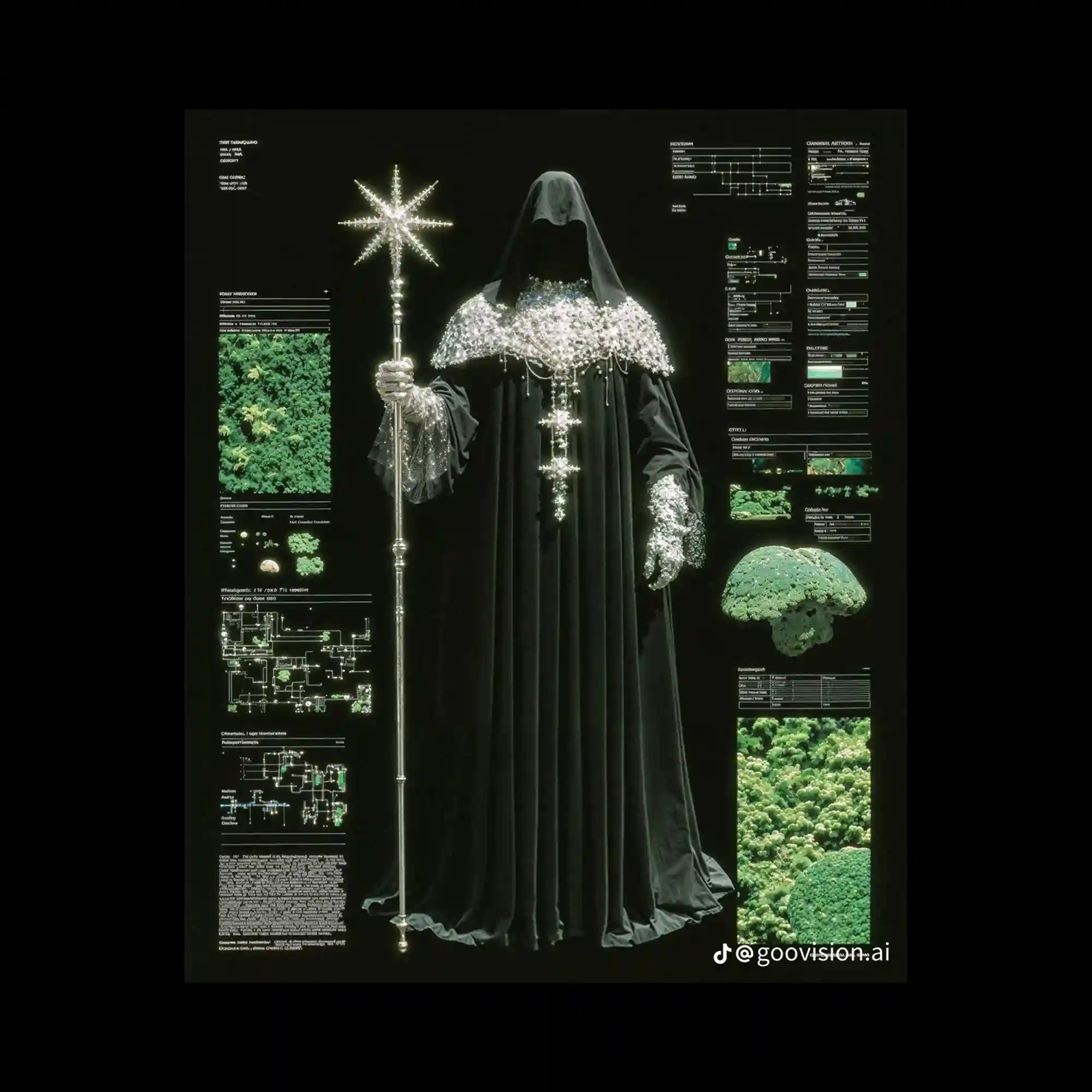
A dark, cinematic composition presents a robed figure rendered with high-detail textures. The figure is centered, holding a radiant staff-like object, while technical diagrams and data panels surround it. Green-toned imagery and interface elements contrast with the black background. The layout merges figurative focus with information-dense framing.
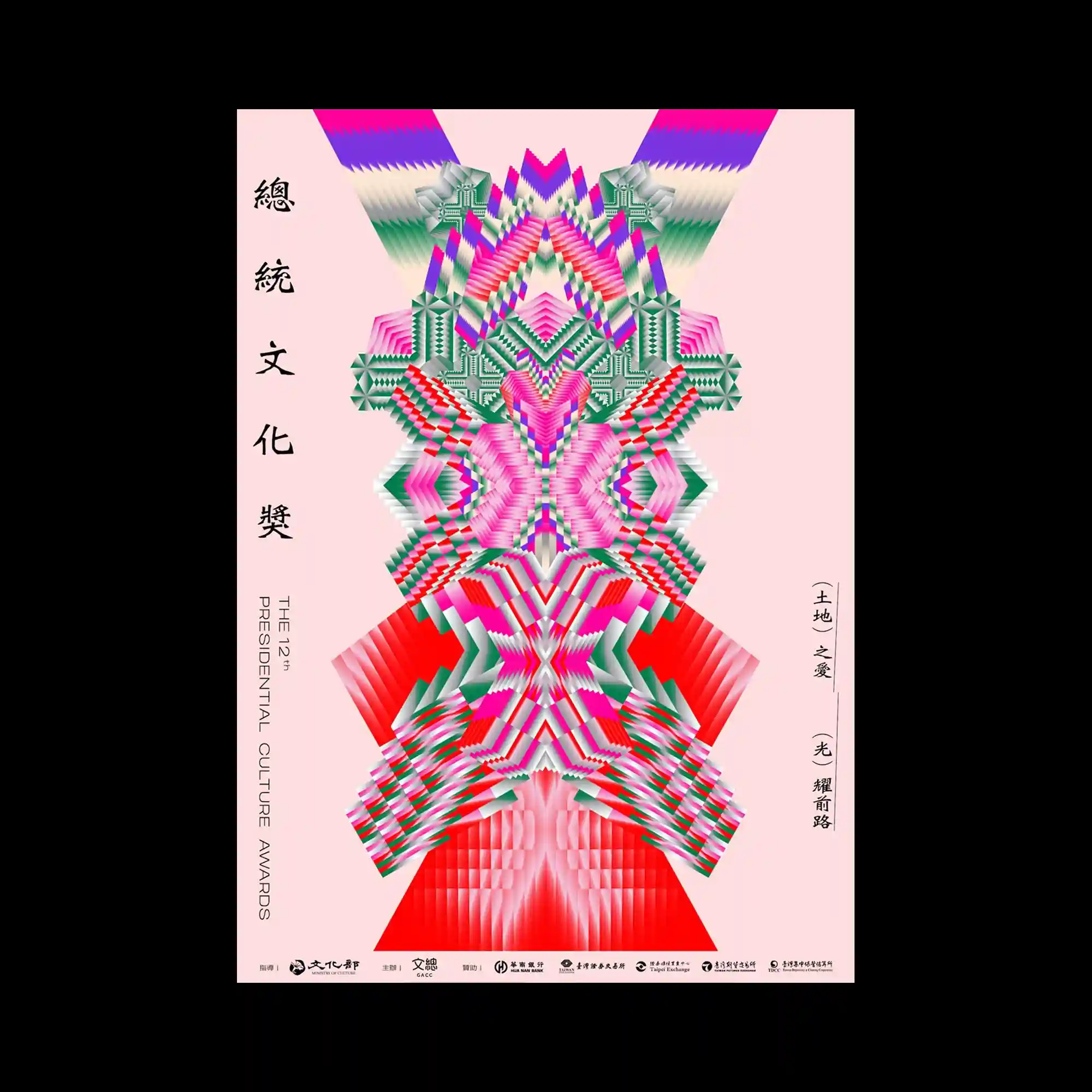
A vertically symmetrical poster features layered geometric patterns stacked along a central axis. Bright pink, green, and red gradients repeat in stepped forms, creating a kaleidoscopic effect. Serif and traditional-style vertical text lines frame the sides, reinforcing symmetry. The composition relies on repetition, color rhythm, and precise alignment.

A close-up eye photograph is overlaid with a dense halftone dot pattern, flattening depth into texture. A red cross-shaped symbol appears both inside the pupil and below the image, creating visual repetition. Minimal red typography is aligned along the lower margin, spaced widely against black negative space. The composition emphasizes gaze, contrast, and graphic reduction.
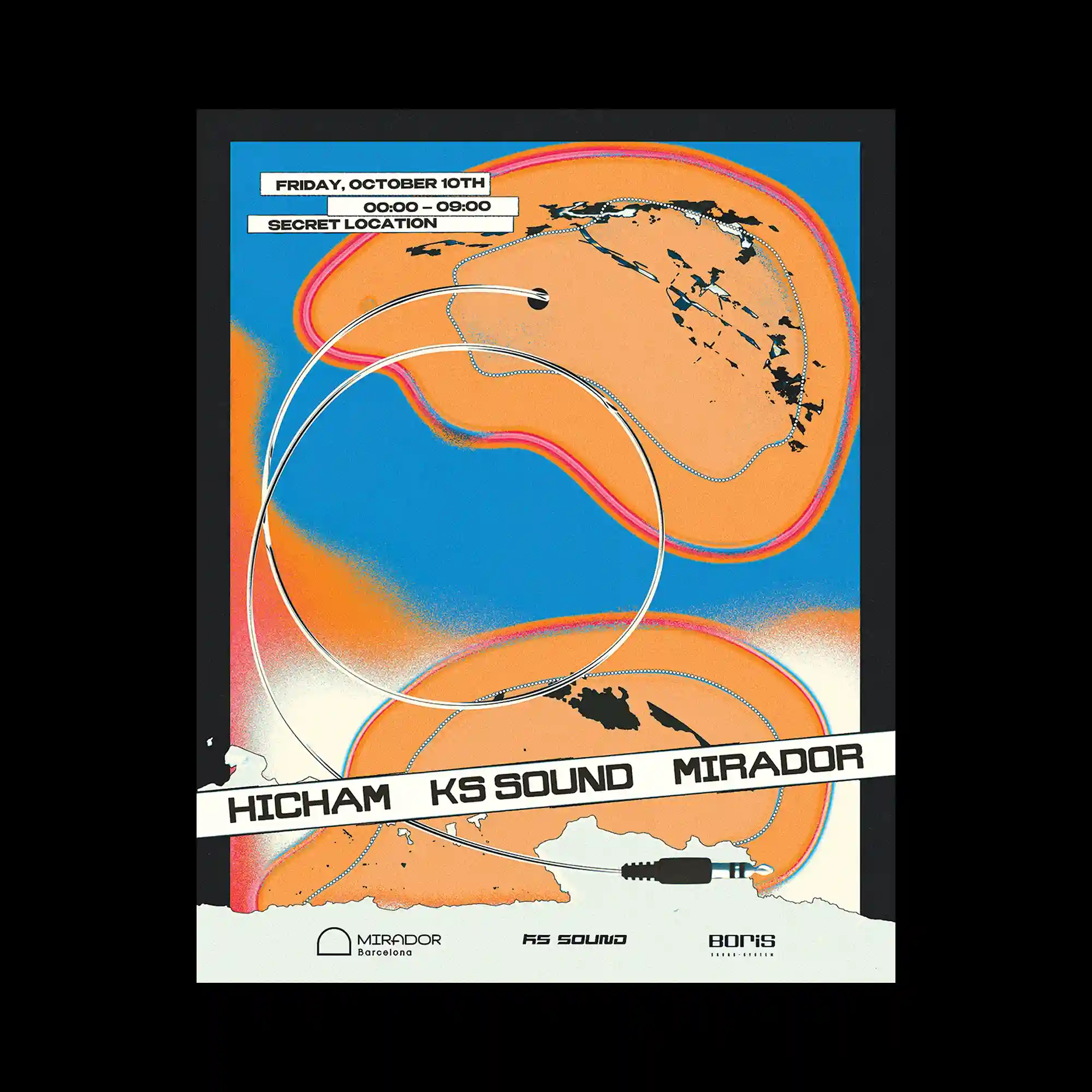
An abstract event poster combines organic orange shapes with a saturated blue background, outlined by soft neon gradients. Curved cable-like lines loop across the composition, intersecting the shapes and creating directional flow. Small rectangular text labels are stacked in the upper area, while a bold diagonal title strip cuts across the center. The layout balances fluid forms with sharp typographic interruptions.
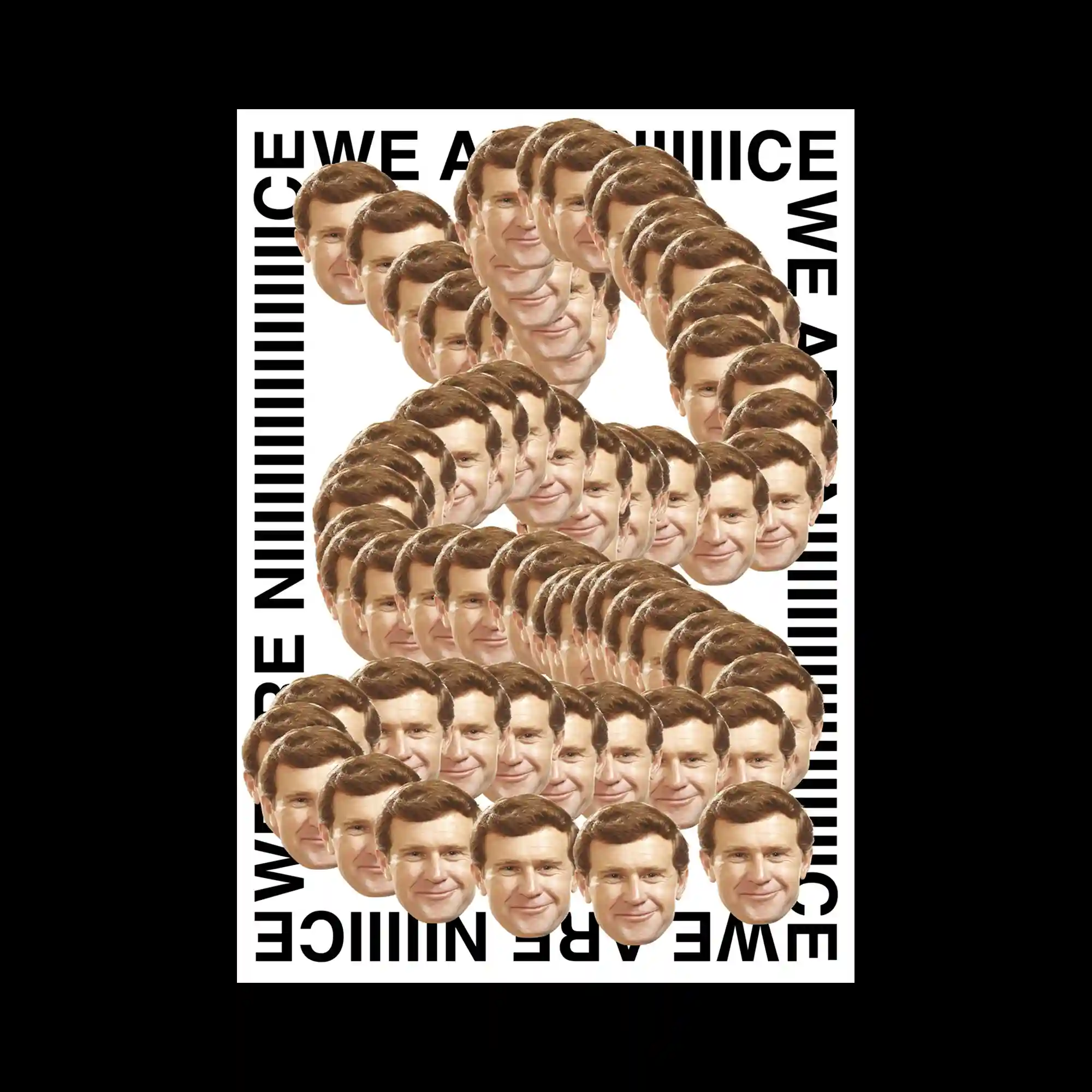
A repeated photographic portrait is duplicated dozens of times to form a large spiral shape. Each face is evenly scaled and aligned, creating a rhythmic pattern. Black typographic bands frame the composition, reinforcing a graphic border. The visual impact comes from repetition and geometric arrangement of human imagery.
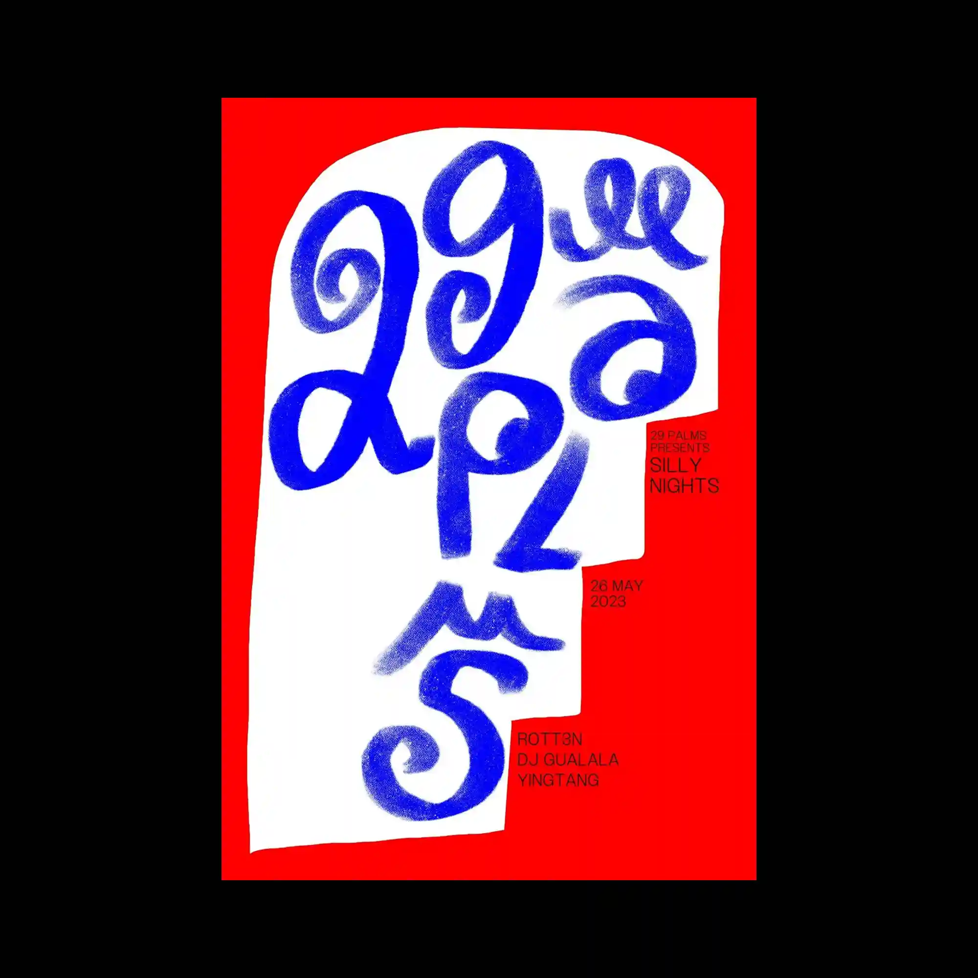
Hand-painted blue lettering fills an irregular white shape placed on a vivid red background. The brushstrokes vary in thickness, revealing texture and pressure. Minimal event information is tucked into small blocks at the edges. The composition relies on strong color contrast and expressive typography.

A flea market poster assembles bold typographic numbers with cut-out illustrations of everyday objects. Items such as chairs, tools, and clocks are scattered between oversized letters. A limited palette of yellow, orange, black, and white maintains cohesion. The layout is playful yet tightly packed.

A heavily glitched cityscape image is fragmented into horizontal and vertical blocks. Color channels appear misaligned, creating digital noise and rupture. Large dark negative spaces frame the distorted imagery. The composition conveys instability through repetition and disruption.
Organic, liquid-like shapes flow across a white field, rendered in high-saturation colors and textured gradients. Each form appears outlined and inflated, overlapping without a clear hierarchy. Small typographic labels are scattered near the edges, remaining secondary to the visuals. The composition is driven by fluid motion and surface variation.
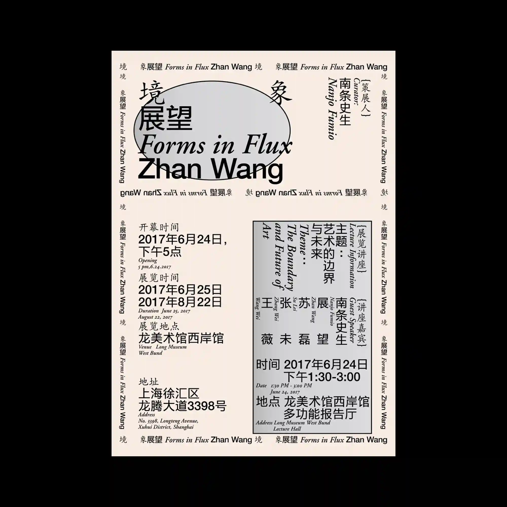
A typographic exhibition poster uses a rigid grid to organize multilingual text blocks. Serif and sans-serif typefaces are mixed, rotated, and boxed within clear boundaries. A large soft-edged oval shape sits behind the main title, acting as a visual anchor. The layout balances density with careful spacing.

A futuristic vehicle render dominates the frame, stretched with motion blur and neon color shifts. Cyan and magenta overlays trace the contours, creating layered afterimages. Large-scale typography floats above the car, detached from perspective. The composition emphasizes speed, gloss, and synthetic lighting.

A mirrored black-and-white portrait is duplicated vertically, creating a symmetrical, stacked face. The image is rendered in coarse halftone texture, reducing detail into grain and contrast. Ornamental vertical frames flank both sides, reinforcing symmetry. Dense micro-typography anchors the bottom edge as a solid text block.
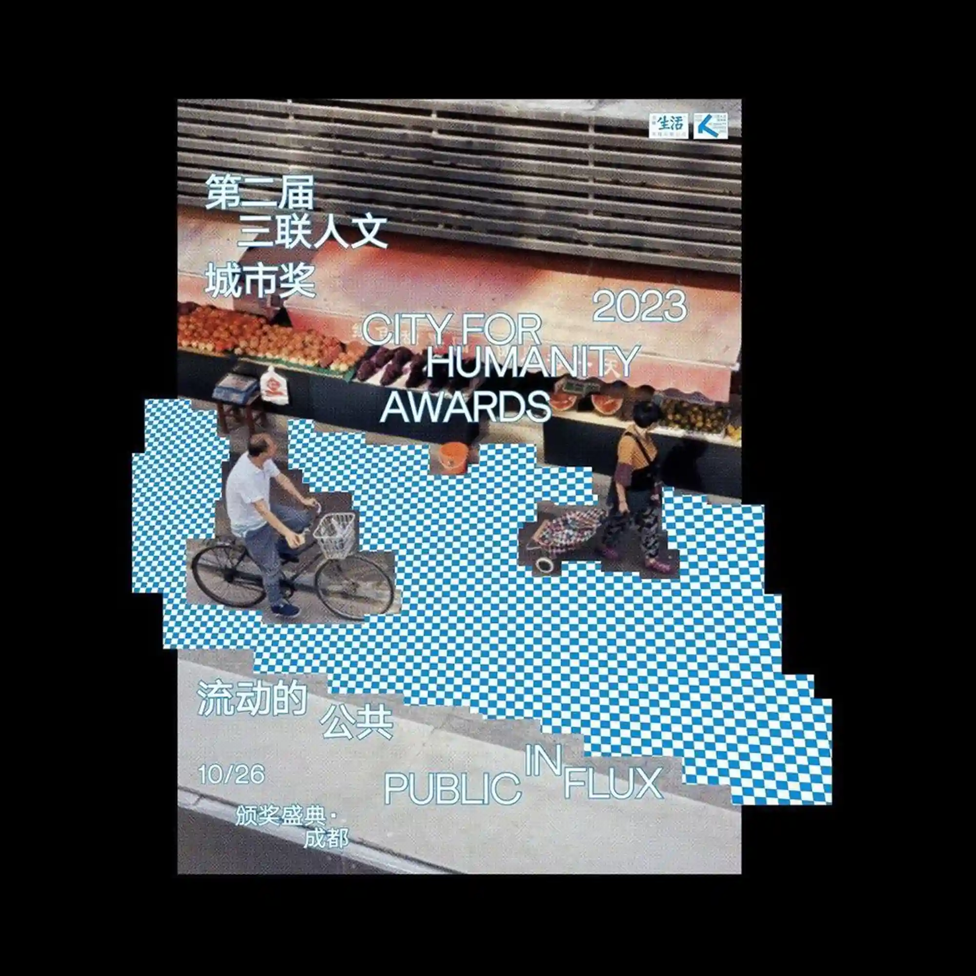
A photographic street scene is cropped and overlaid with pixelated checkerboard blocks that interrupt the ground plane. Human figures and bicycles remain partially visible, floating above the disrupted pattern. The typography is layered directly onto the image, mixing Chinese and English text with varying alignment. The composition contrasts documentary realism with digital obstruction and fragmentation.
Multicolored vertical stripes act as both graphic elements and typographic underlines. Clean sans-serif text is arranged in clear columns, balancing the vibrant accents. The palette introduces rhythm without overwhelming the structure. The layout emphasizes clarity through alignment and repetition.

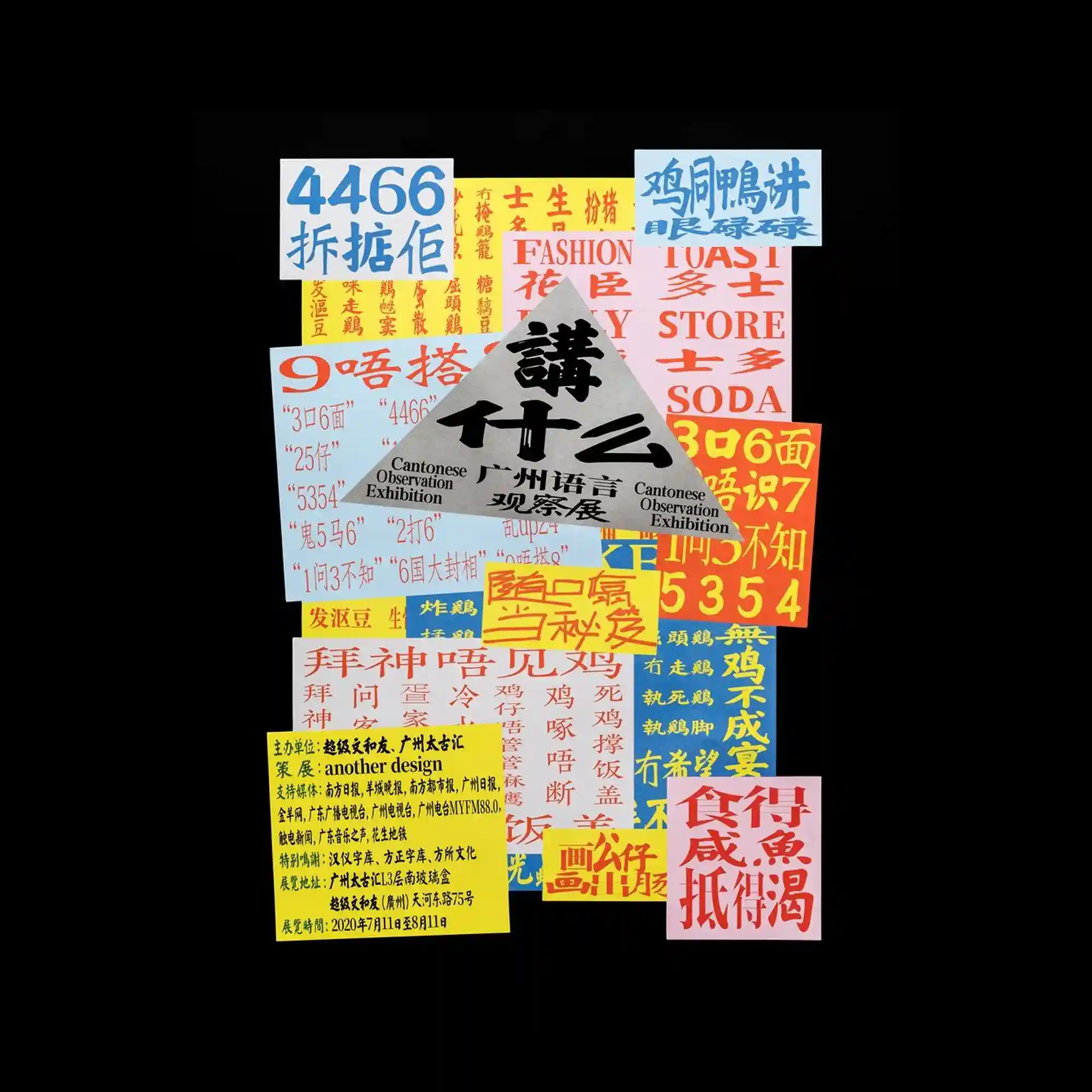
Layered blocks of bilingual typography overlap in varying sizes and orientations. Strong color fields anchor the text, while vertical and horizontal alignments intersect. The density of information creates a poster that feels both structured and crowded. Contrast between languages becomes a visual rhythm.
A soft gradient background is divided into horizontal color bands with subtle transitions. A compact typographic mark sits at the center, surrounded by generous empty space. Small interface-like labels appear at the edges, hinting at a system or template. The overall impression is restrained and minimal.
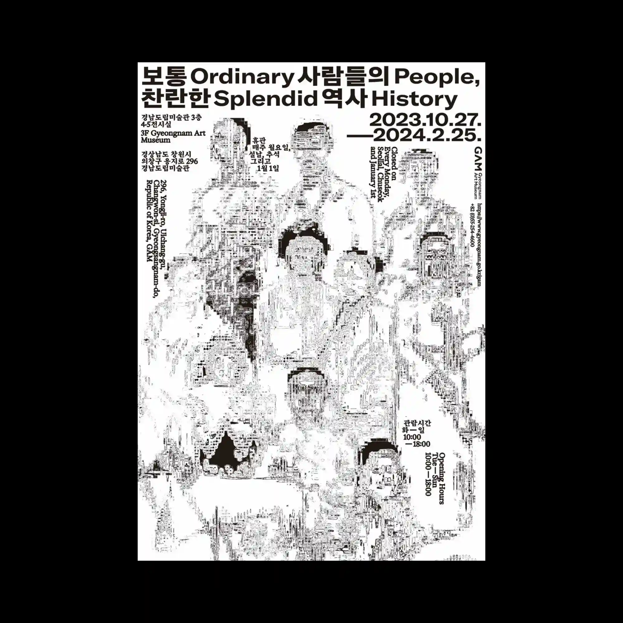
High-contrast black typography dominates the top, while fragmented human silhouettes emerge below. The figures are built from dense micro-textures, dissolving into the white background. Text blocks frame the image edges, creating a poster-like hierarchy. The visual tension comes from clarity in typography versus fragmentation in imagery.
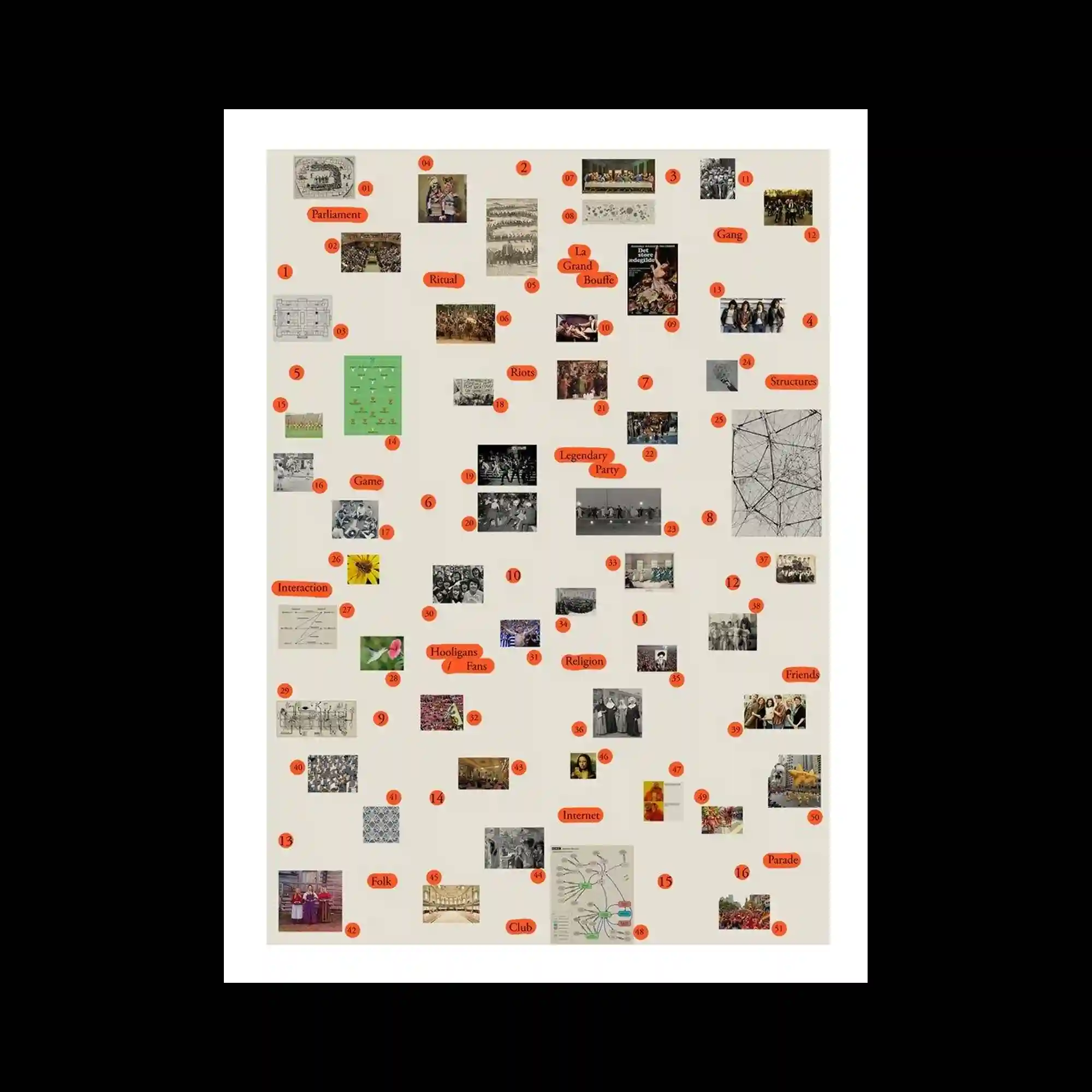
A neutral background hosts a diagram-like arrangement of small photographs and labels. Images are distributed evenly, each paired with minimal text markers and numeric tags. The spacing creates a sense of mapping rather than narrative flow. The composition reads as an organized archive or visual index.
Bold, glowing text sits above an abstract landscape of saturated blues and reds. A continuous, hand-drawn line snakes across the composition, connecting disparate color fields. Flat shapes and textured surfaces overlap, creating a layered depth. The layout feels energetic, driven by color contrast and fluid line movement.
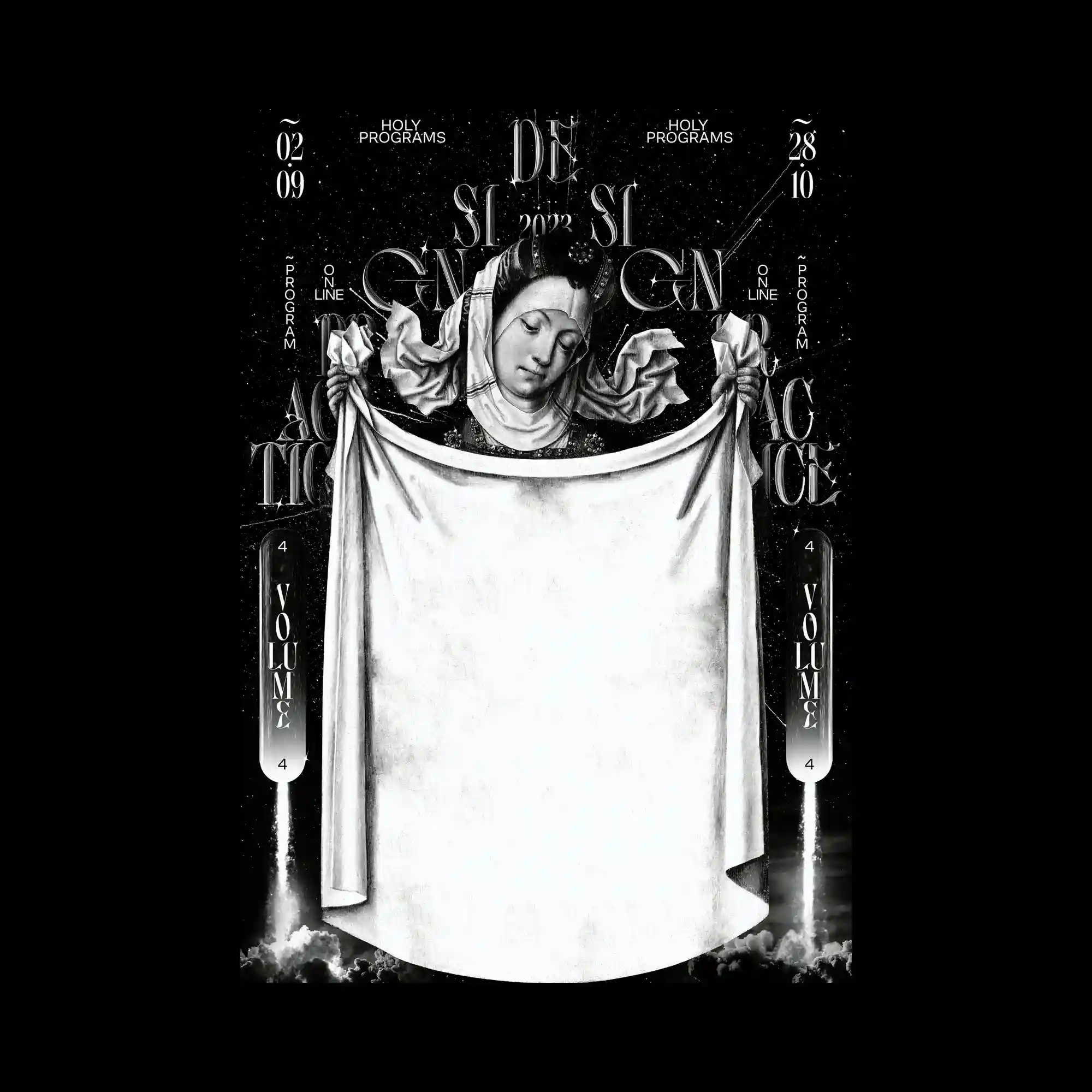
A monochrome, classical figure is centered against a dark, star-like backdrop. Ornate typography and decorative symbols frame the figure symmetrically, creating a ritualistic layout. The draped fabric occupies a large central area, acting as a visual anchor and empty canvas. High contrast between black and white reinforces a solemn, icon-like presence.

A bright sky-blue background is filled with scattered bird silhouettes that collectively form typographic shapes. The birds vary in size and density, creating legible words through clustering rather than outlines. Small blocks of text float in the open sky, balancing the heavier typographic masses below. The composition relies on scale contrast and negative space to maintain clarity.

Photographic textures, geometric shapes, and graphic dots are assembled into a layered collage. Diagonal bands cut through the composition, creating directional movement. Muted tones are punctuated by occasional saturated accents. The overall structure balances randomness with a clear underlying alignment.
Soft color gradients form overlapping vertical planes that fade gently into one another. Typography is light and airy, floating within the layered background. The absence of hard edges creates a calm, atmospheric depth. The layout relies on transparency and tonal shifts rather than contrast.
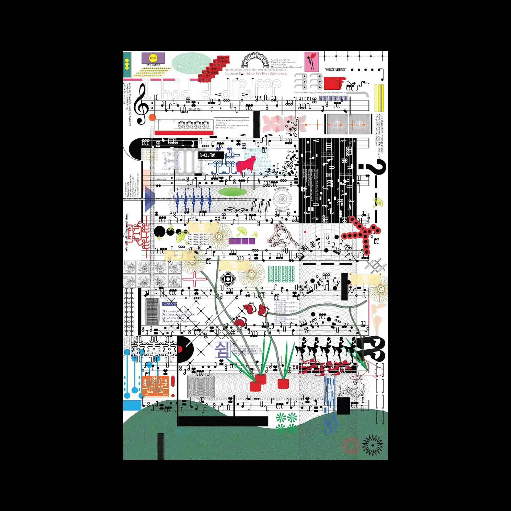
The surface is densely filled with symbols, musical notation, diagrams, and ornamental graphics layered across a grid. Each element maintains distinct visual language while coexisting in a crowded field. Color accents punctuate an otherwise monochrome structure, guiding the eye through complexity. The composition reads as an accumulation of systems rather than a single image.
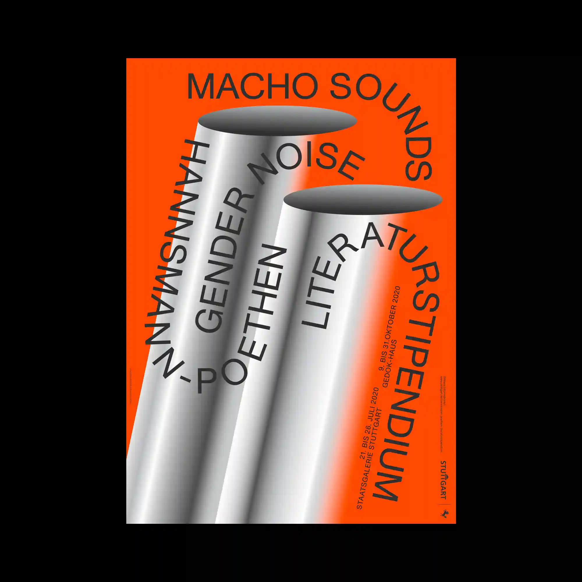
Large cylindrical forms rendered with smooth gradients dominate the composition against a vivid background. Typography wraps around and cuts through the cylinders, following their curvature. The contrast between flat background color and volumetric shading creates a strong spatial illusion. The layout balances bold scale with controlled alignment.
Abstract shapes resembling liquid splashes radiate outward from the center, leaving a bright void in the middle. Flat colors and rough edges suggest digitally manipulated paint or ink forms. Typography is integrated around the perimeter, following the contours of the composition. The visual energy is driven by outward motion and contrast between dense edges and open space.
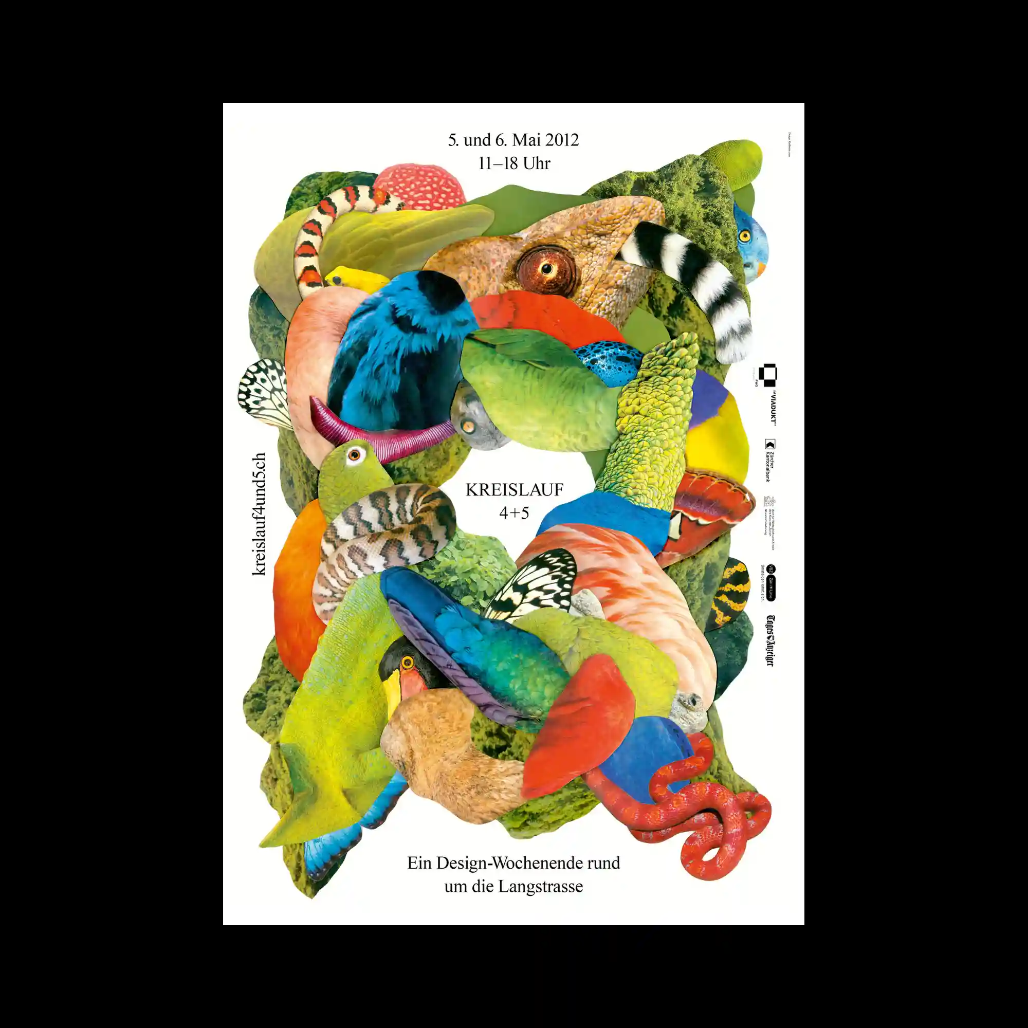
A dense collage is constructed from cut-out fragments of animals, plants, and textured surfaces, layered to form a vertically flowing mass. Each fragment retains its original photographic texture, creating sharp contrasts between scales, feathers, skin, and foliage. The composition is organized through overlapping curves and organic silhouettes that interlock without a clear focal center. Negative space around the collage frames the form and emphasizes its sculptural density.
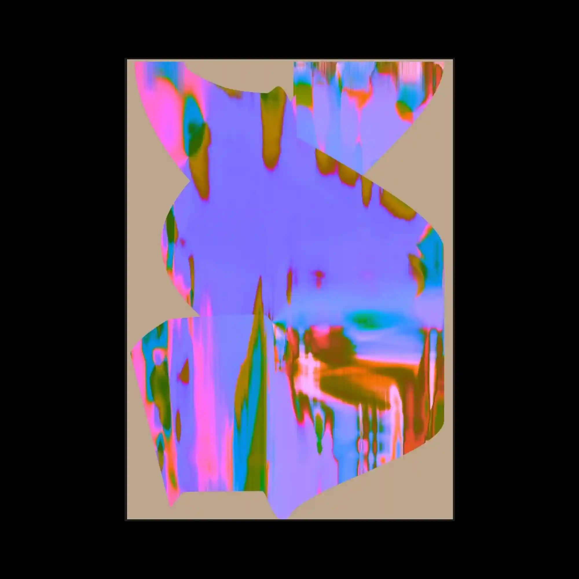
The composition presents jagged, organically shaped planes filled with saturated iridescent gradients. Colors shift in vertical streaks of pink, blue, green, and orange, giving a liquid glitch sensation. The irregular silhouettes break the rectangular boundary, making the central form appear like a fragmented digital object. The muted beige background stabilizes the intense color play.
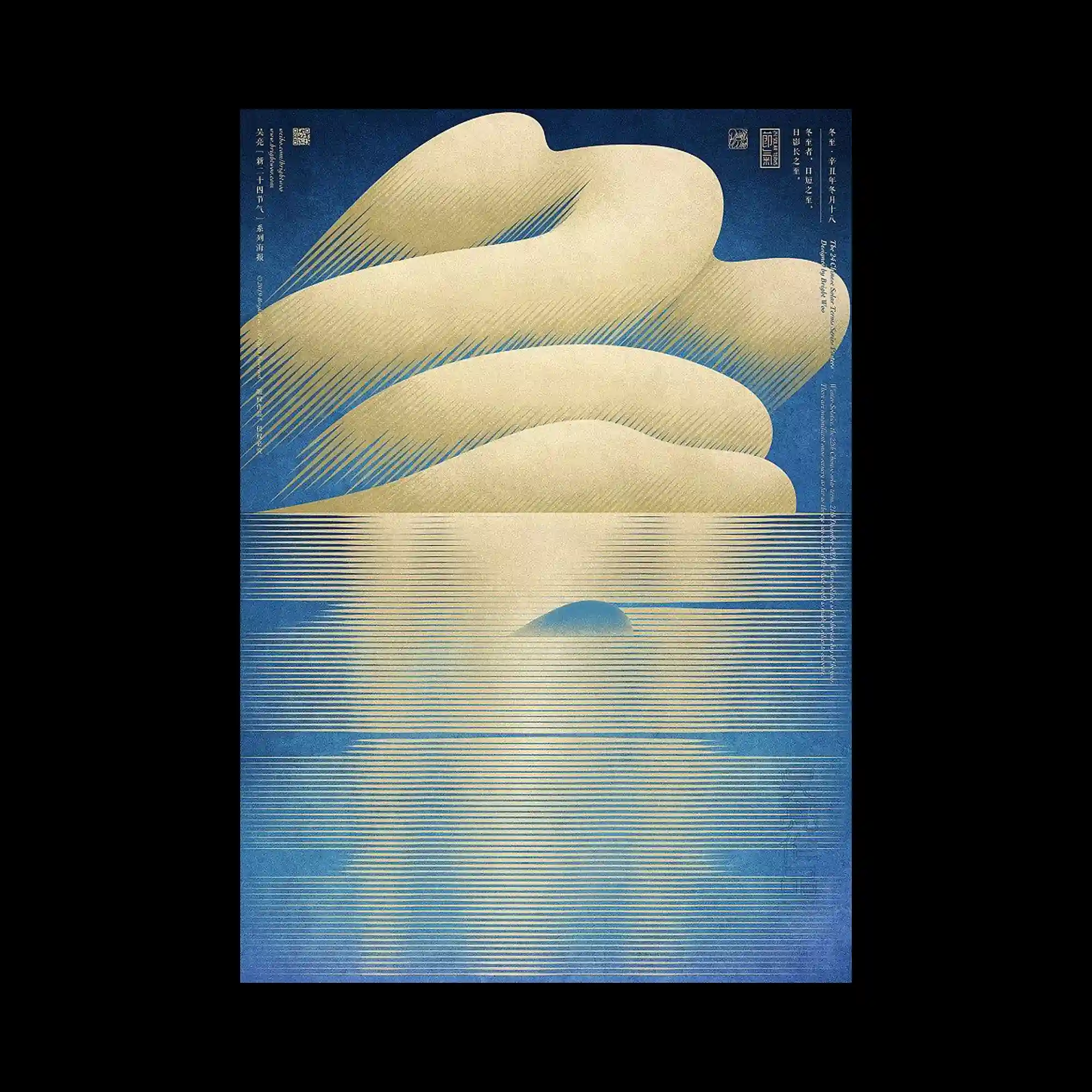
Soft beige cloud-like forms sit above a horizontal field of fine golden lines that extend downward like reflections on water. The lines vary subtly in thickness and spacing, producing a shimmering gradient. Deep blue surrounds the scene to evoke sky and depth. The poster uses minimal shapes and refined line repetition to create a serene, atmospheric landscape.
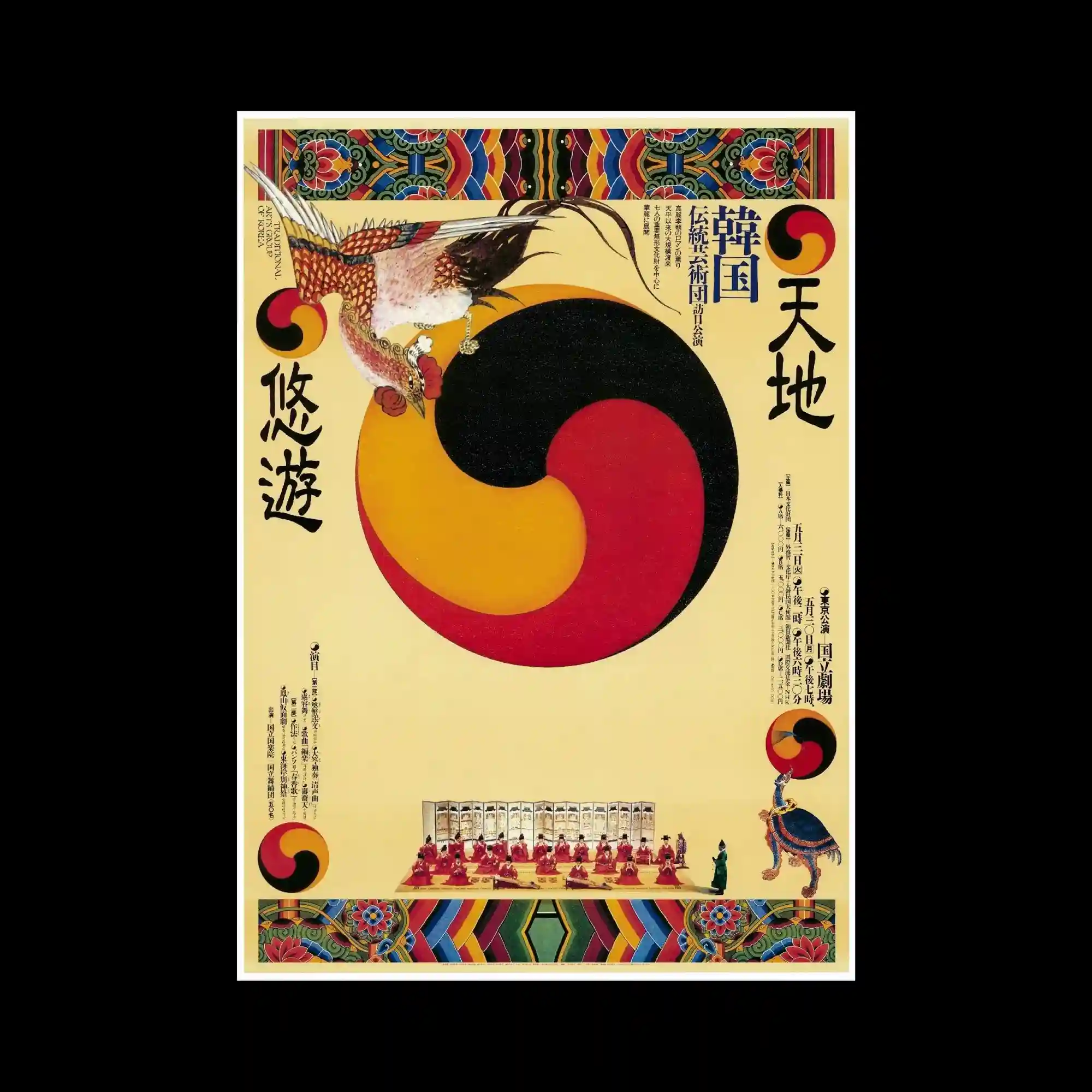
A traditional Korean-inspired composition features a large tri-color taegeuk-like swirl occupying the center. Symmetrical decorative borders frame the top and bottom, using vivid geometric folk patterns. A detailed bird illustration perches on the main circular form, adding narrative character. The arrangement blends flat illustration with symmetrical framing to create a ceremonial, classical tone.
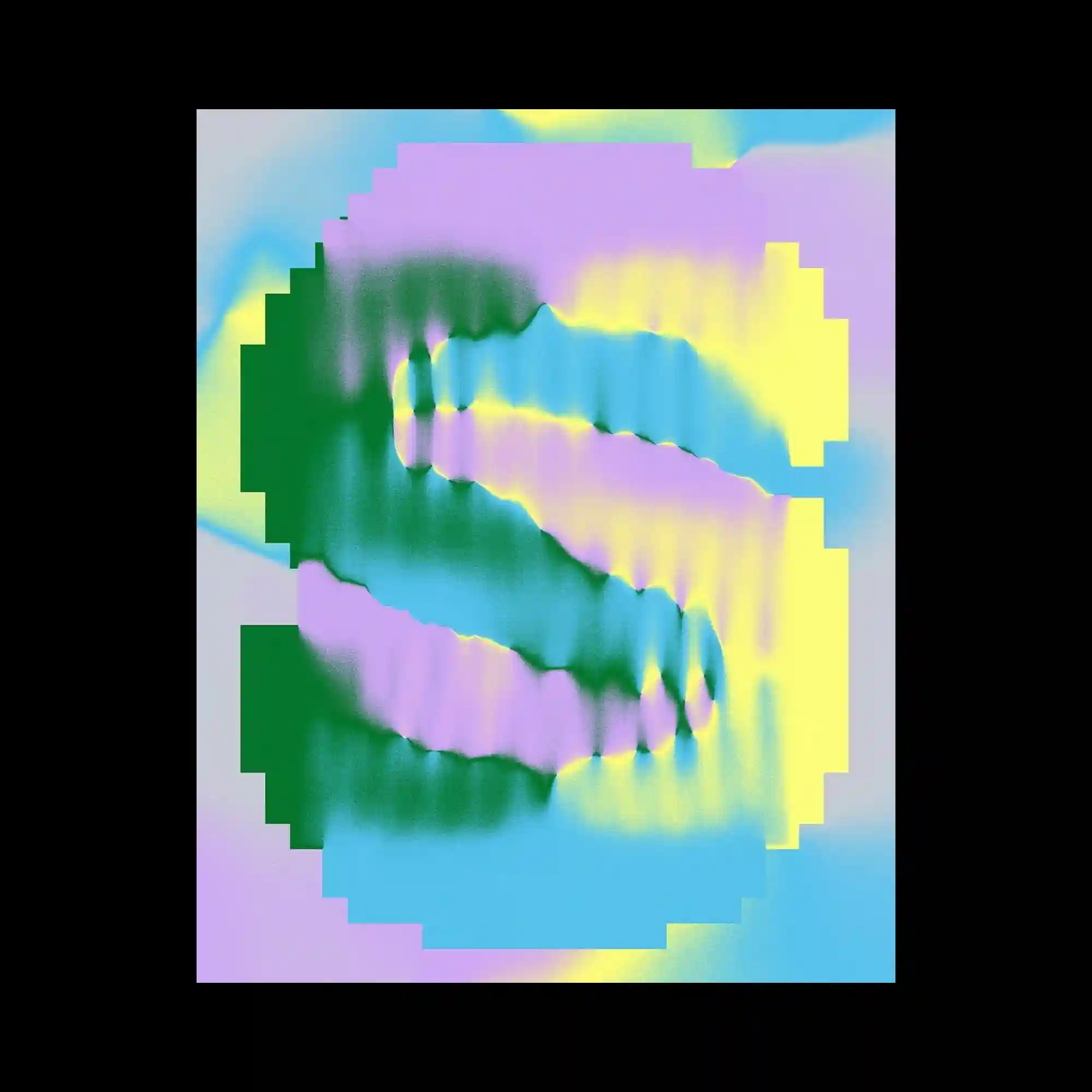
The composition uses a pixelated stepped frame surrounding a soft, diffused gradient interior. Within the center, two mirrored S-shaped forms ripple with airbrush-like color transitions in green, purple, yellow, and blue. The blurred edges create a liquid digital texture, contrasting with the rigid, blocky border. The mix of softness and geometry evokes glitch and vaporwave aesthetics.
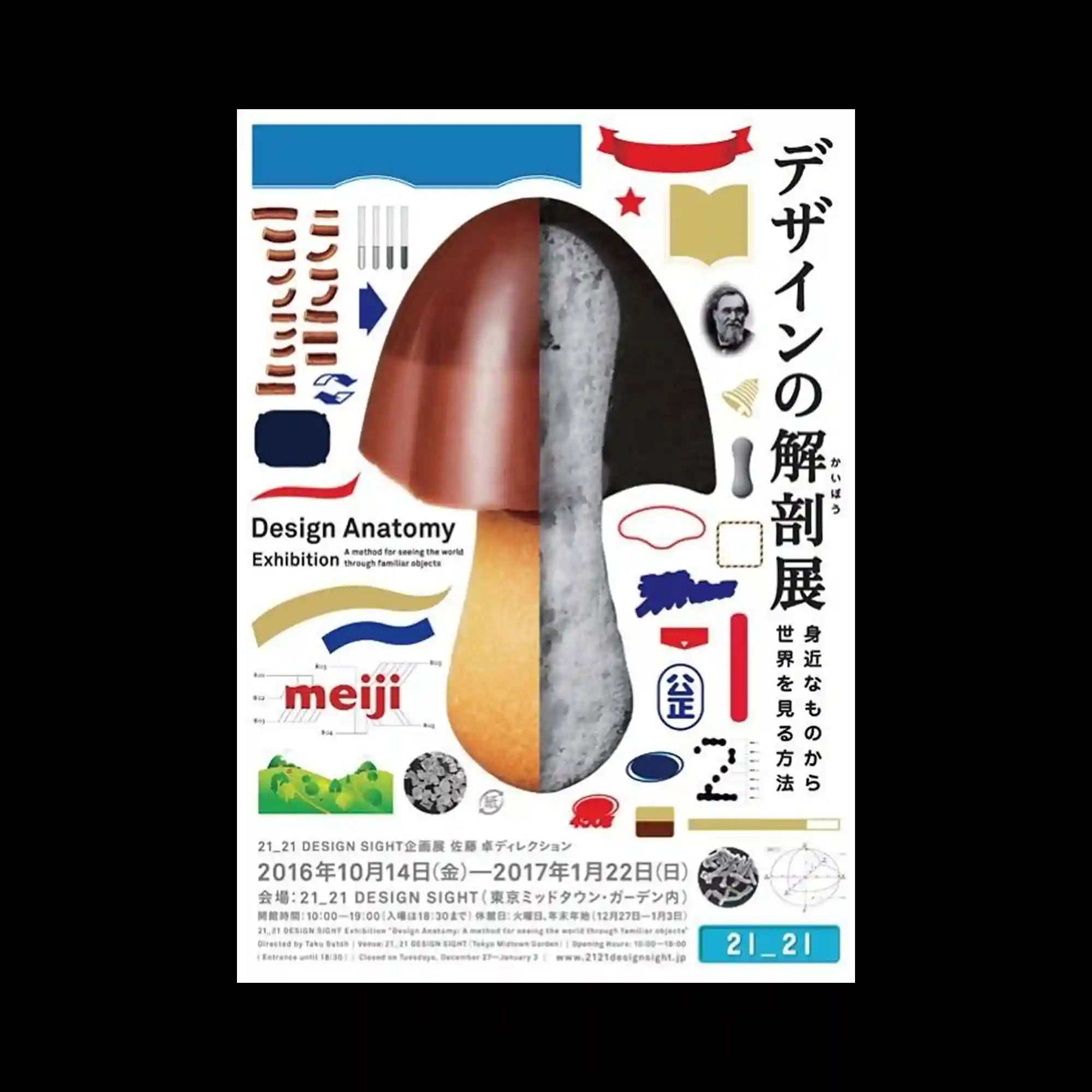
A central mushroom-like object is split vertically into contrasting material sections—glossy, textured, and soft. Surrounding it are diagrammatic fragments, graphic shapes, and labeled components, suggesting analytical breakdown. The layout resembles an instructional sheet where everyday objects are dissected visually. The mixture of photography and flat illustration reinforces the educational, exploratory tone.
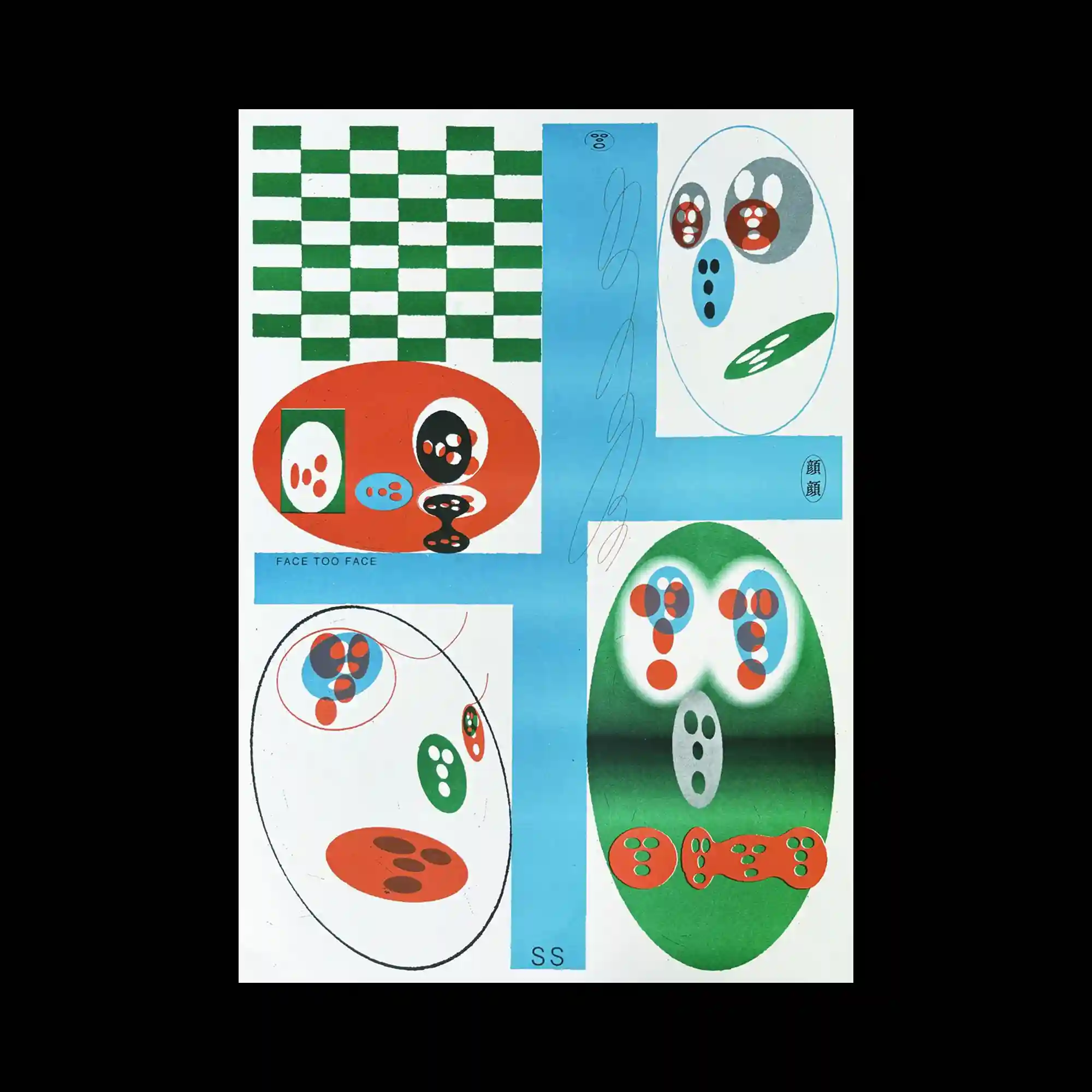
The poster is divided into panels featuring checker patterns, oval compositions, and color gradients. Inside the ovals, small abstract face-like shapes are arranged in various groupings. A vertical blue strip intersects the layout, adding balance to the scattered forms. The arrangement feels playful and experimental, focusing on simple geometric shapes transformed into expressive symbols.
A collection of brightly colored posters, flyers, and handwritten notes are arranged in a chaotic collage. Each piece features different letterforms, sizes, and textures, creating a patchwork of visual fragments. The grayscale triangular piece in the center anchors the arrangement. The composition resembles a wall plastered with layered street advertisements, emphasizing diversity and cultural noise.

Large brush-like characters in blue and green fill the entire surface with translucent overlapping strokes. The layered effect creates subtle color blending, reminiscent of marker ink bleeding. Thin black English text sits across the center, contrasting with the soft, swollen shapes behind it. The poster relies on gesture, texture, and transparency to build rhythm rather than strict structure.

Large color blocks—green, white, black, orange, blue, yellow—form a modular layout resembling signage. A bold yellow star anchors the center left, while thick Japanese characters occupy the surrounding rectangles. The crisp separation of each color panel creates a strong grid system. The poster’s simplicity relies on flat color, geometric division, and emblem-like elements.
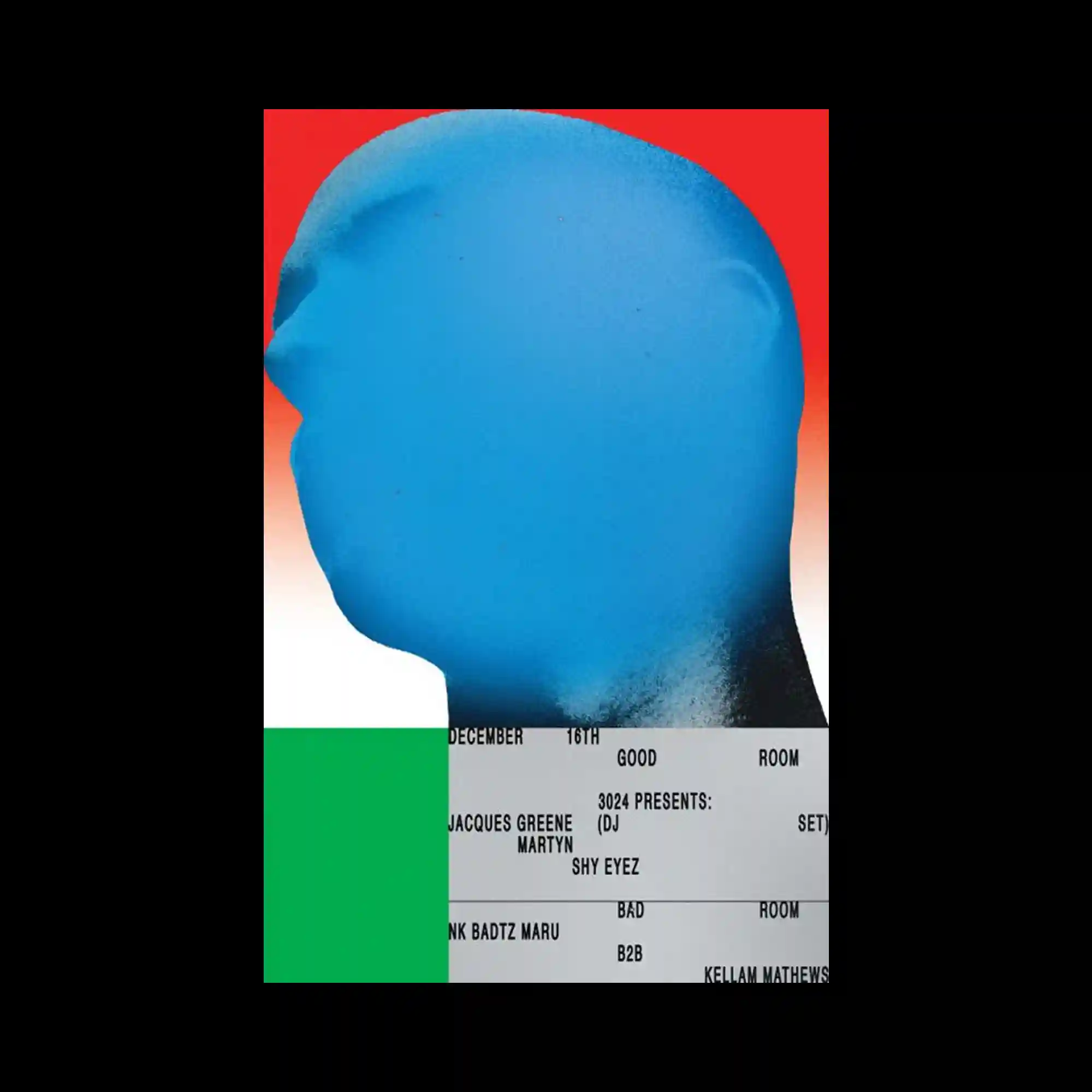
A large blue silhouette head dominates the upper portion, rendered with a soft gradient spray texture. The red-to-white background intensifies the profile’s edge. The lower portion consists of a rigid typographic block arranged in ticket-like strips, creating a sharp structural contrast. The juxtaposition of airbrushed organic form and mechanical text grid yields a striking duality.
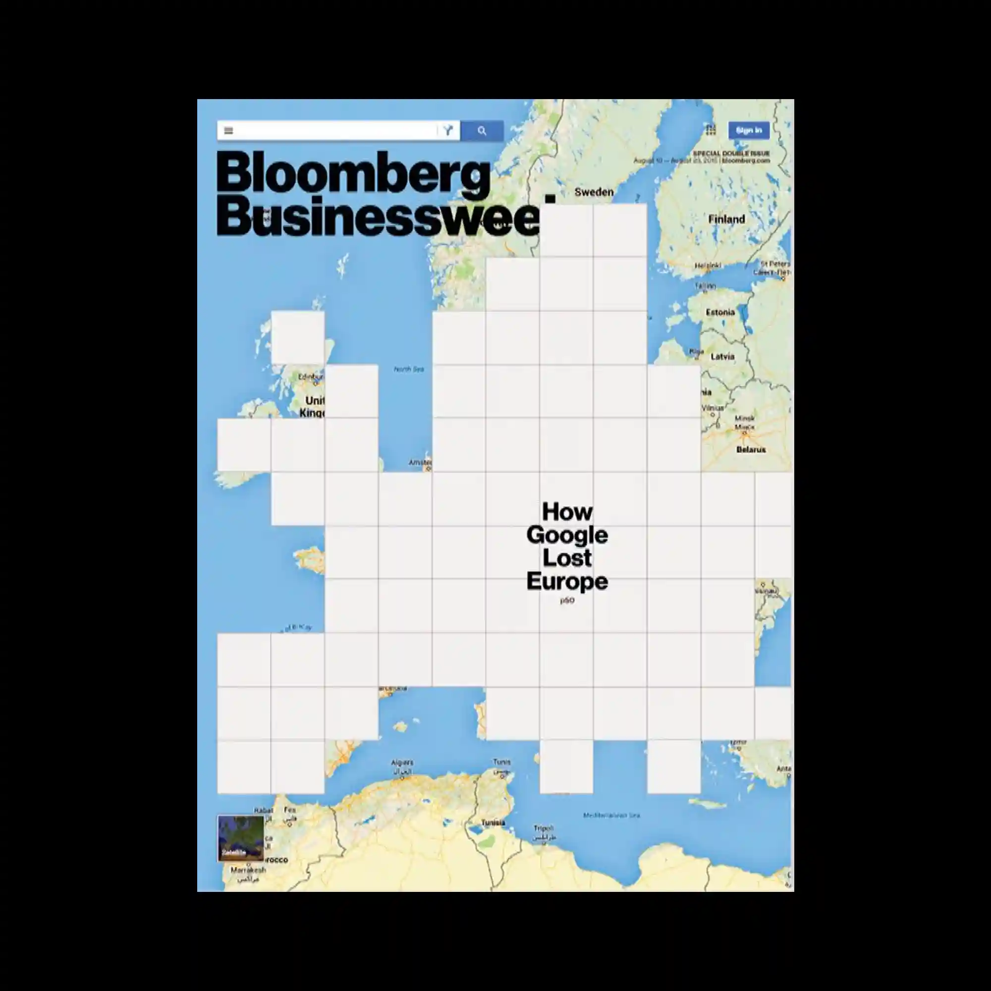
A map of Europe fills the background while a grid of white squares overlays the continent, obscuring most geographic features. The grid creates a pixel-like mask with varying levels of coverage, leaving only partial borders visible. Text sits centrally within the grid, emphasizing the blocked-out structure. The juxtaposition of recognizable map imagery and rigid abstraction creates a conceptual tension.

A large irregular grey block occupies the center, functioning as a dominant shape that interrupts the bright orange background. Around its edges, finely spaced vertical and horizontal typography forms a strict grid-like structure. The contrast between the geometric orange field and the heavy central mass produces a strong spatial hierarchy. Minimal color use—orange, black, and grey—keeps the composition sharp and architectural.

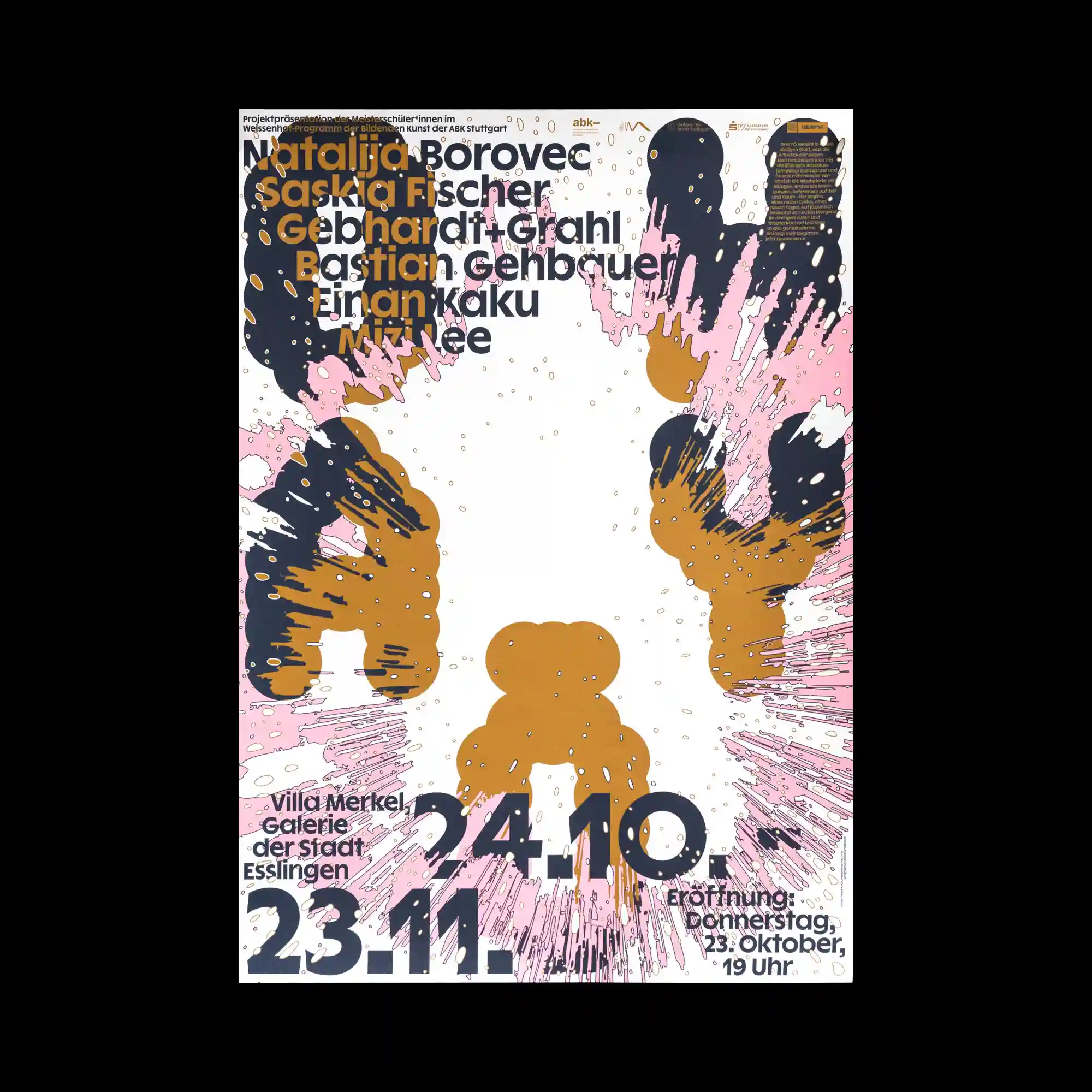
Large black initials dominate the upper and lower portions, while a stepped arrangement of long rectangular blocks fills the center. Each block in orange, green, or pink contains tightly packed text, creating a stacked chart-like layout. The diagonal progression of modules introduces directionality and flow. The contrast between oversized type and dense informational blocks produces a structured, editorial tone.

White silhouette figures—teapots, gnome-like characters, and a candle—sit atop a vibrant splash of orange and pink ink. The background fades from black to green, producing a moody gradient that contrasts with the bright central blot. Thin outlined typography wraps softly around the imagery, retaining an airy quality. The mix of whimsical shapes and bold color spread generates a playful yet mysterious atmosphere.

Brightly colored irregular patches serve as backgrounds for clusters of overlapping serif letters. The letters appear fragmented, as if rebuilt from scattered typeset pieces. The green, yellow, and blue blocks provide distinct zones for separate textual arrangements. The interaction between broken typography and bold color fields creates a playful, puzzle-like visual rhythm.
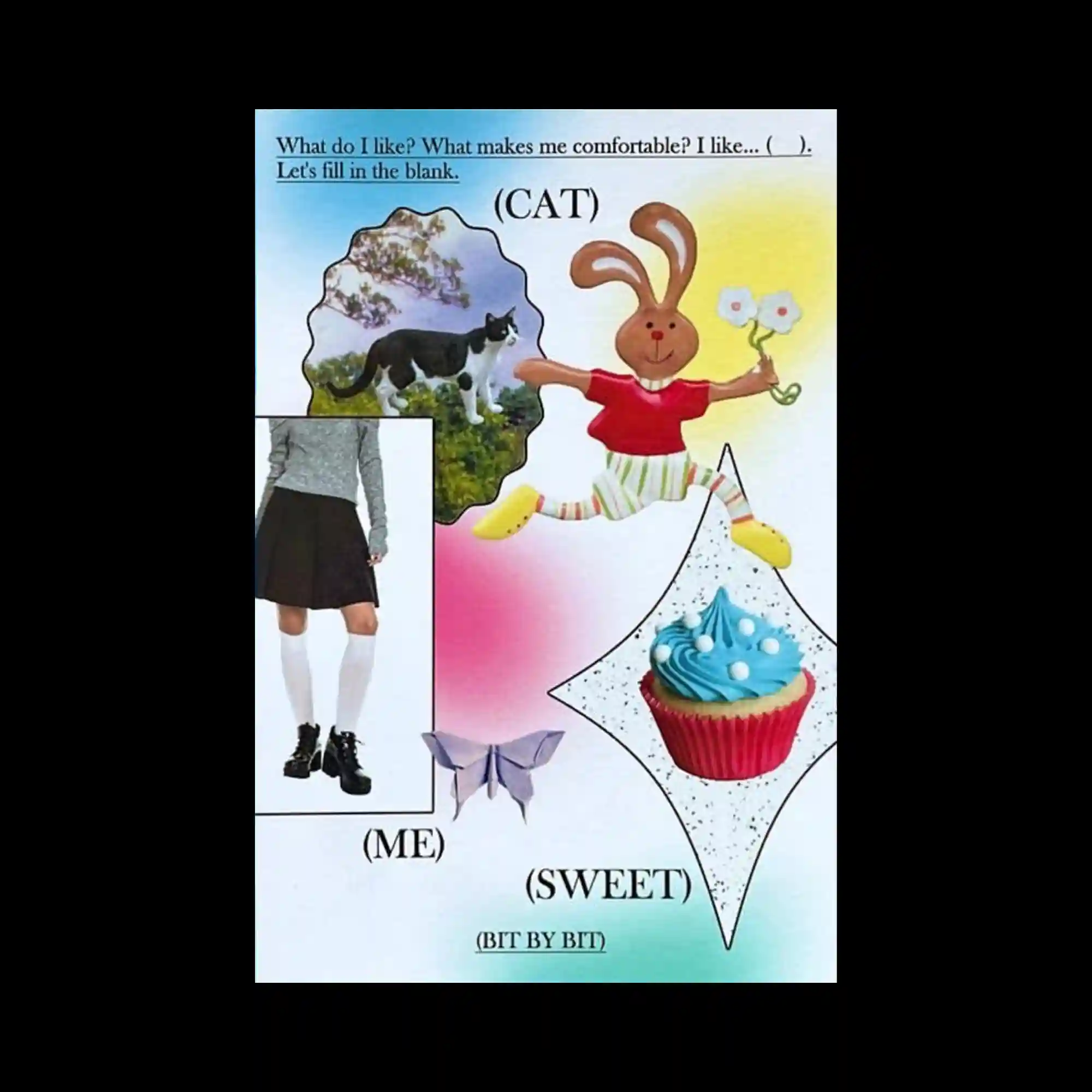
The composition resembles a scrapbook collage, combining cut-out photos, cartoon characters, and gradient-filled shapes. Each element sits independently with minimal overlap, producing a playful, childlike arrangement. The handwritten-style text at the top enhances the casual, diary-like tone. Soft pastel gradients unify the scattered objects into a cohesive visual field.