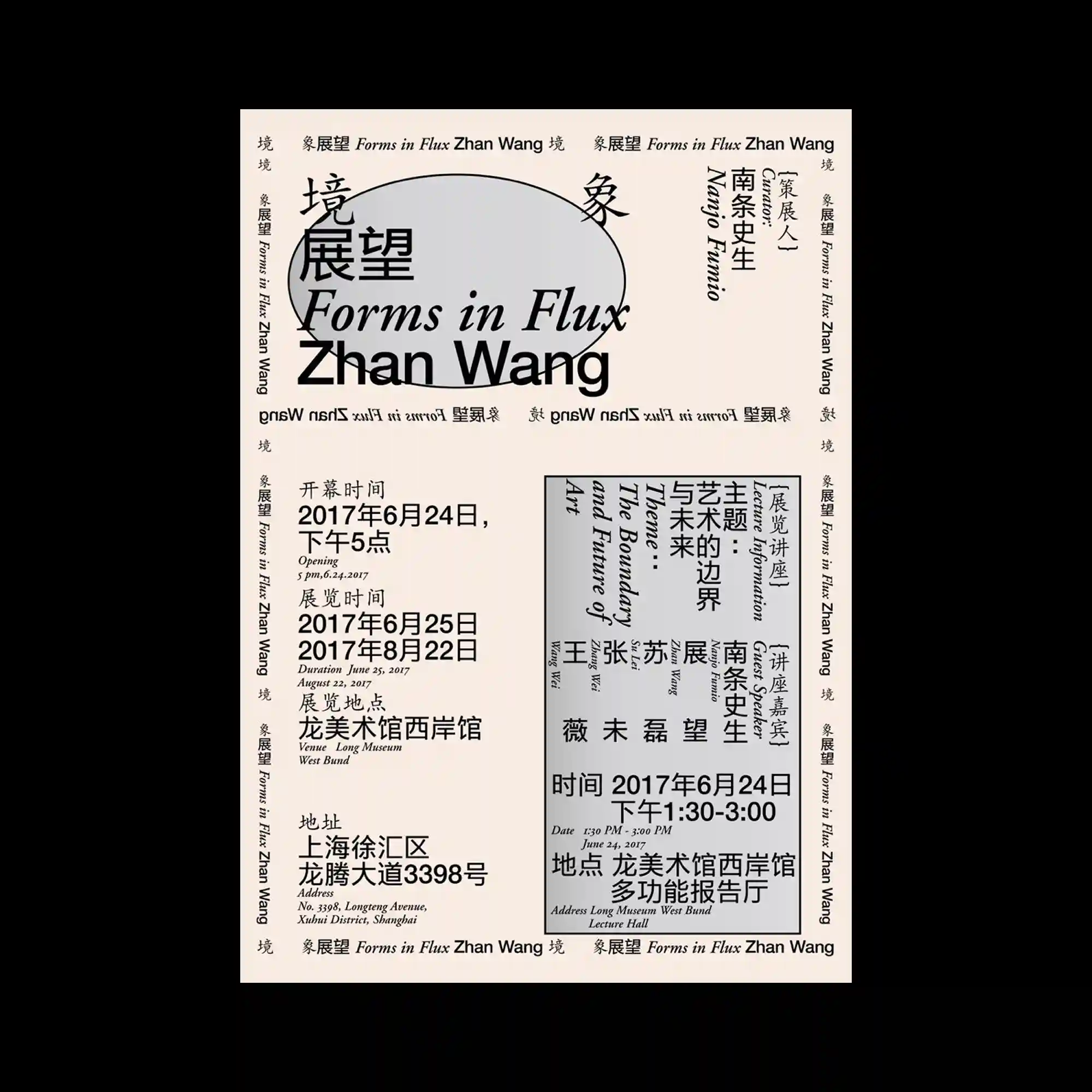
A typographic exhibition poster uses a rigid grid to organize multilingual text blocks. Serif and sans-serif typefaces are mixed, rotated, and boxed within clear boundaries. A large soft-edged oval shape sits behind the main title, acting as a visual anchor. The layout balances density with careful spacing.
전시 포스터로 보이는 타이포그래피 중심의 구성임. 그리드 위에 다국어 텍스트가 회전되거나 박스 안에 정리되어 배치됨. 메인 타이틀 뒤에는 부드러운 타원형이 배경 요소로 놓임. 정보 밀도와 여백의 균형이 유지됨.
该展览海报以严格网格组织多语言文字信息。衬线与无衬线字体被混合使用,并通过旋转与框线进行区隔。主标题后方放置了一个柔边椭圆形,作为视觉锚点。整体在高信息量中保持清晰节奏。