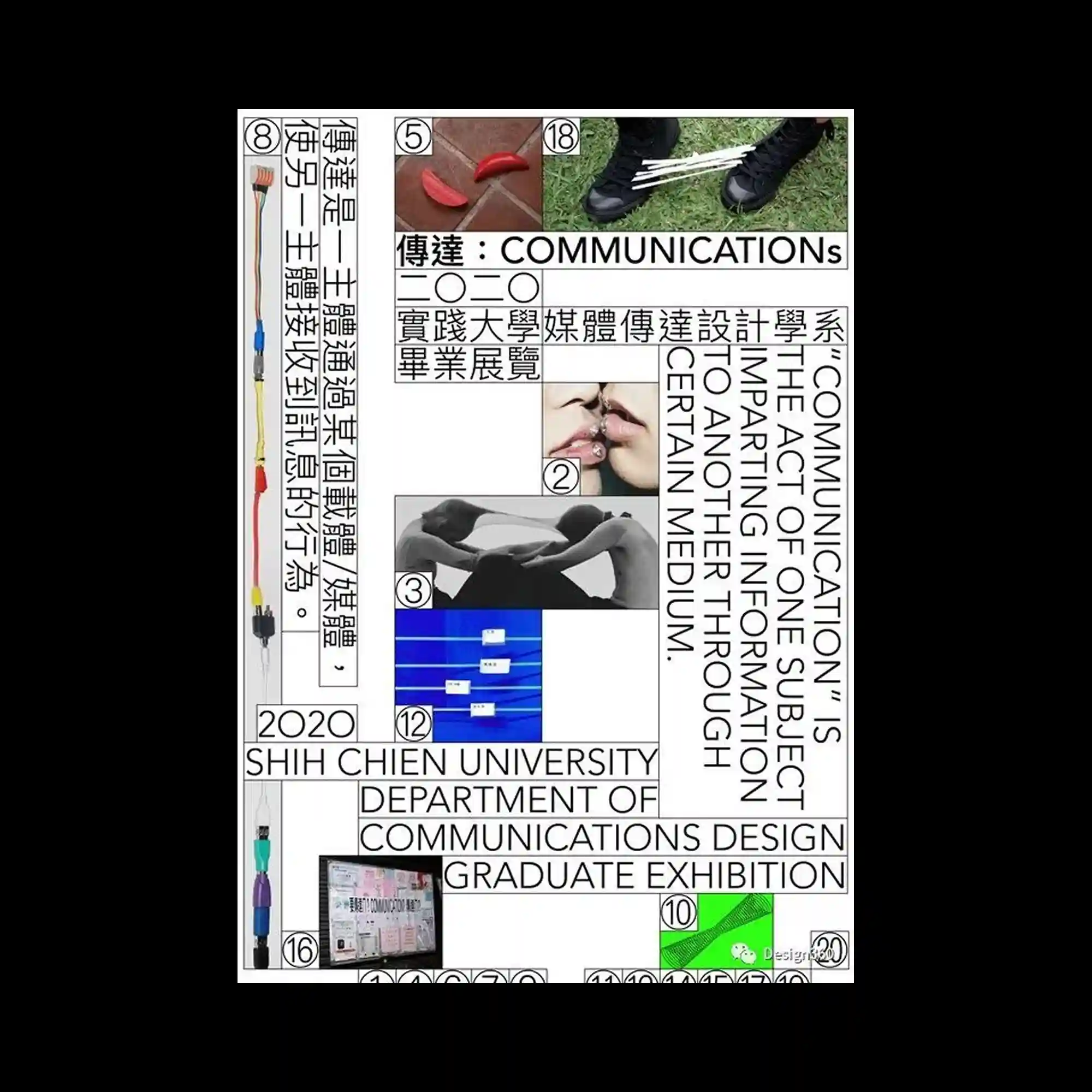
A grid-based poster combines photographs, diagrams, and multilingual typography within rigid rectangular frames. Vertical and horizontal text blocks intersect, guiding reading flow in multiple directions. Small numbered image inserts punctuate the layout, adding rhythm. The overall composition emphasizes structure, hierarchy, and information density.
격자 기반 레이아웃 안에 사진, 도식, 다국어 타이포그래피가 결합됨. 가로와 세로 텍스트 블록이 교차하며 읽기 방향을 분산시킴. 번호가 붙은 작은 이미지들이 리듬을 만듦. 정보 구조와 위계가 중심임.
基于网格的海报将照片、示意图与多语言文字置于严格的矩形框架中。横竖文字区块交错,形成多向阅读路径。带编号的小图像点缀其中,增加节奏感。整体强调结构性、层级与信息密度。