
A large black character dominates the center, rendered in ultra-thick strokes with sharp geometry. Multiple neon-colored border stripes frame the composition, adding depth through layered outlines. Fine, delicate numerals overlay the top portion, creating contrast between heavy and light typographic forms. The strict symmetry and bold character silhouette give the poster a monumental quality.

A torn-edge layout divides the poster into two contrasting sections: a textured white area with hand-drawn crayon shapes and a black panel containing glossy metallic forms. The crayon drawings in blue and purple mimic rough, childlike strokes, while the metallic shapes introduce smooth, digitally rendered contrast. Delicate serif typography weaves between the irregular forms, creating an interplay between structured text and spontaneous marks.
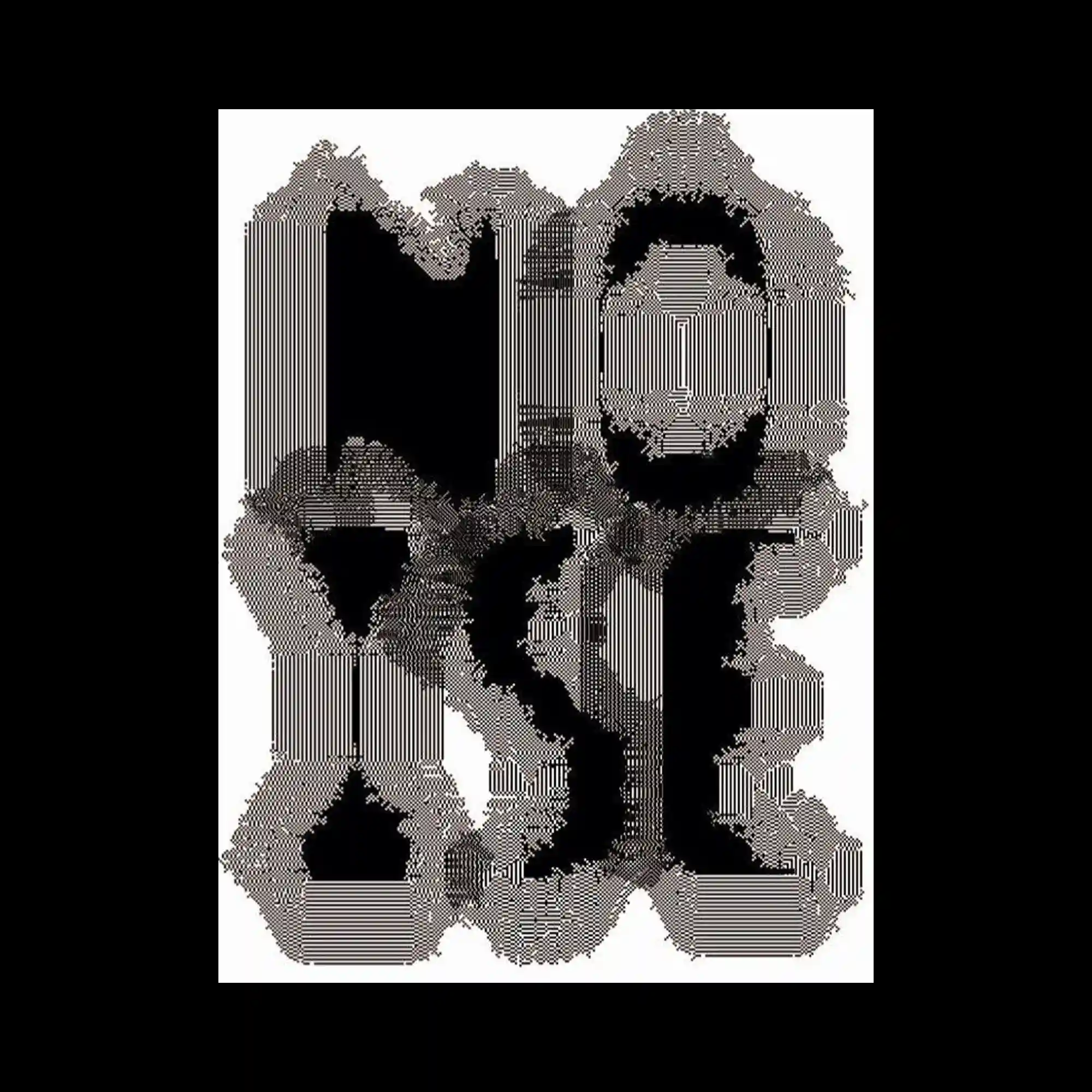
The graphic consists of dense black letterforms that dissolve into clusters of thin horizontal lines, creating a textured, glitch-like appearance. The letters lose their solidity along the edges, blending into fragmented strokes that feel computational and mechanical. The high contrast between the dark core shapes and the dispersed line noise emphasizes the breakdown of the form. Overall, the image balances legibility and abstraction through repetition of linear patterns.
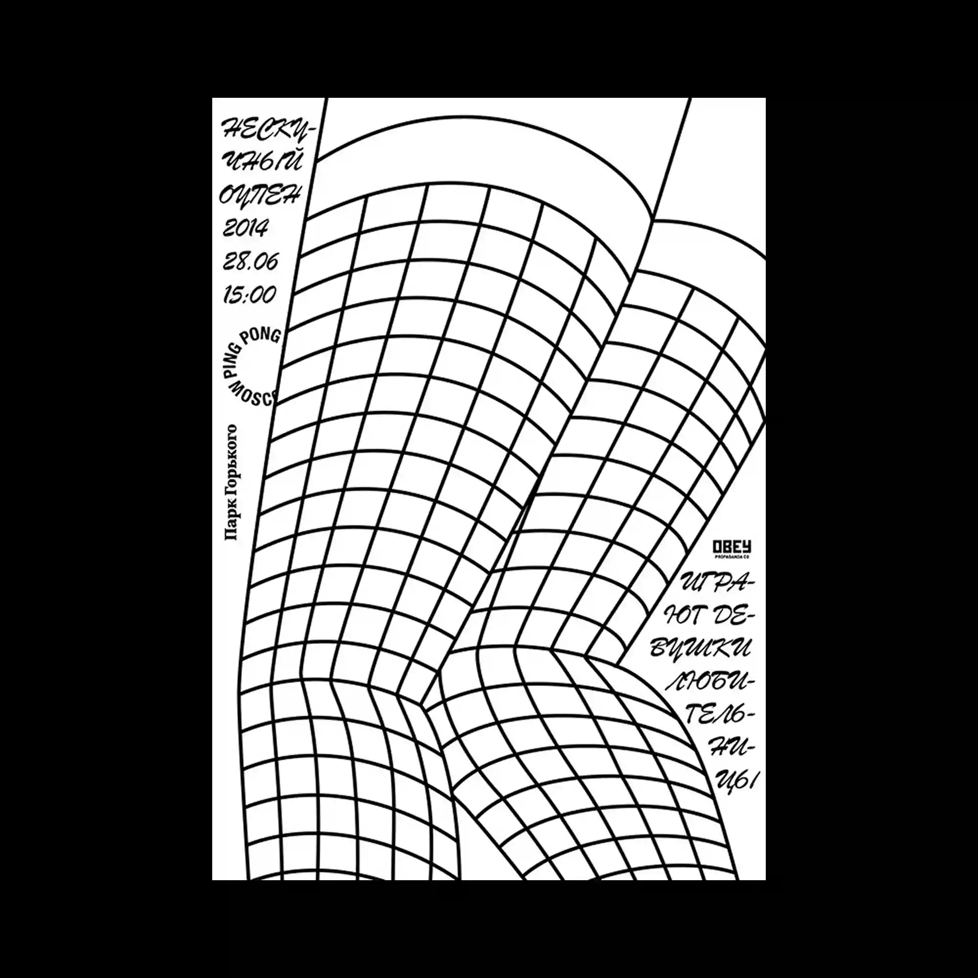
Thin black grid lines curve dynamically across a white background, forming an illusion of warped architectural surfaces. The minimal typography, placed around the edges, enhances the diagrammatic feel. The bending structure implies perspective and tension within a two-dimensional space. The poster balances precision and elasticity through disciplined simplicity.
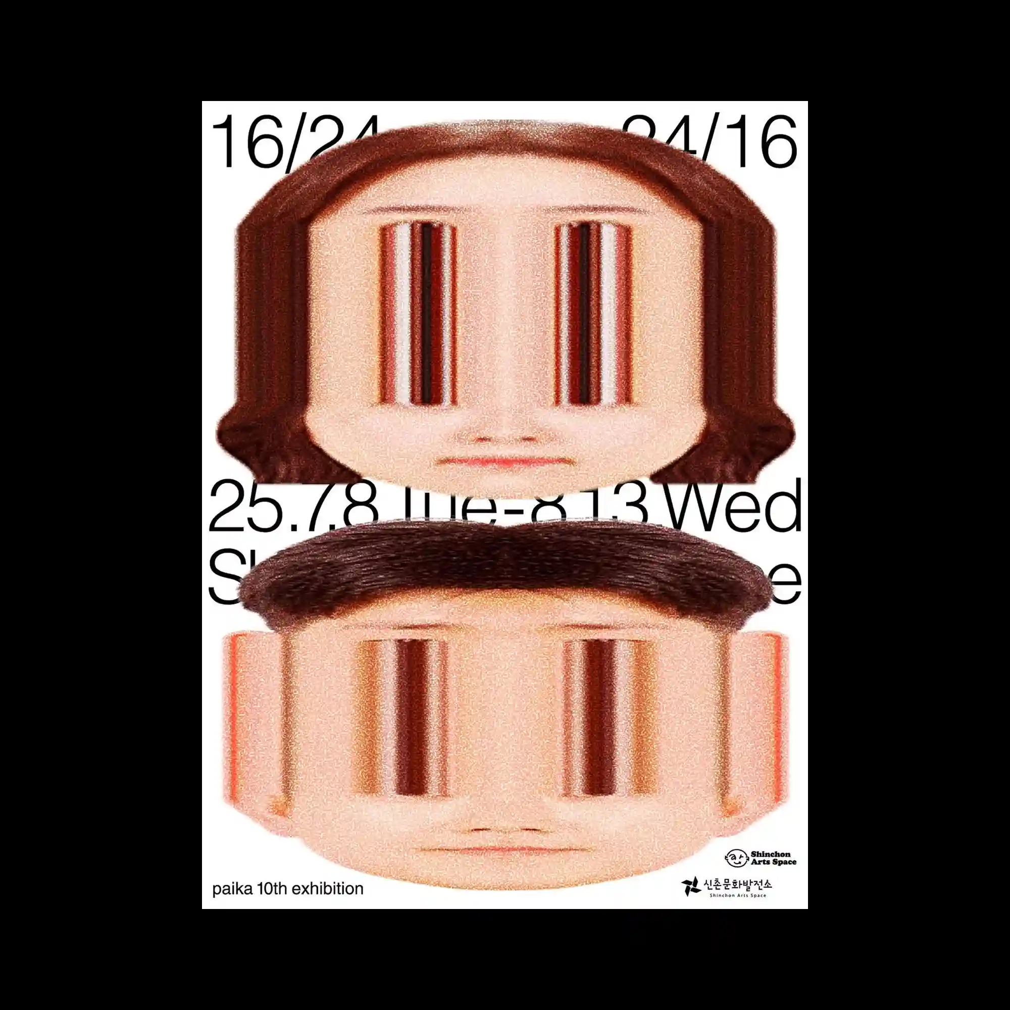
Two distorted human faces are vertically stacked, their eyes stretched into elongated reflective voids. The warped perspective and grainy texture evoke a sense of digital manipulation and uncanny familiarity. Minimal black typography anchors the surreal imagery within a structured layout. The contrast between the mechanical distortion and human softness produces an unsettling visual impact.
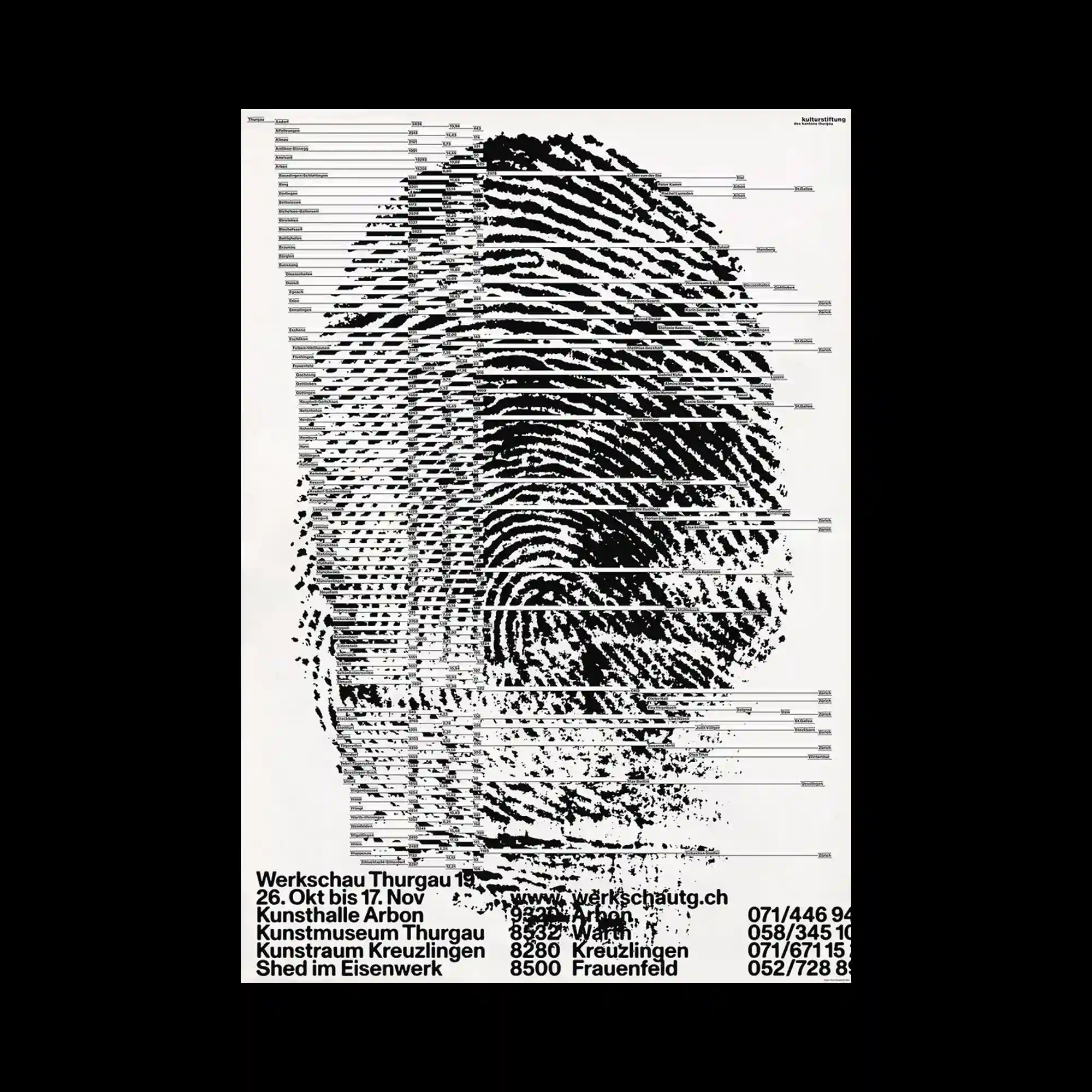
A large fingerprint dominates the composition, fragmented by horizontal data lines resembling barcodes or information charts. The dense black ridges contrast sharply against the white background, creating a sense of identity dissected through digital analysis. The text at the bottom provides structured order beneath the chaotic visual of the fingerprint. This juxtaposition of organic pattern and systematic data highlights the tension between individuality and information systems.
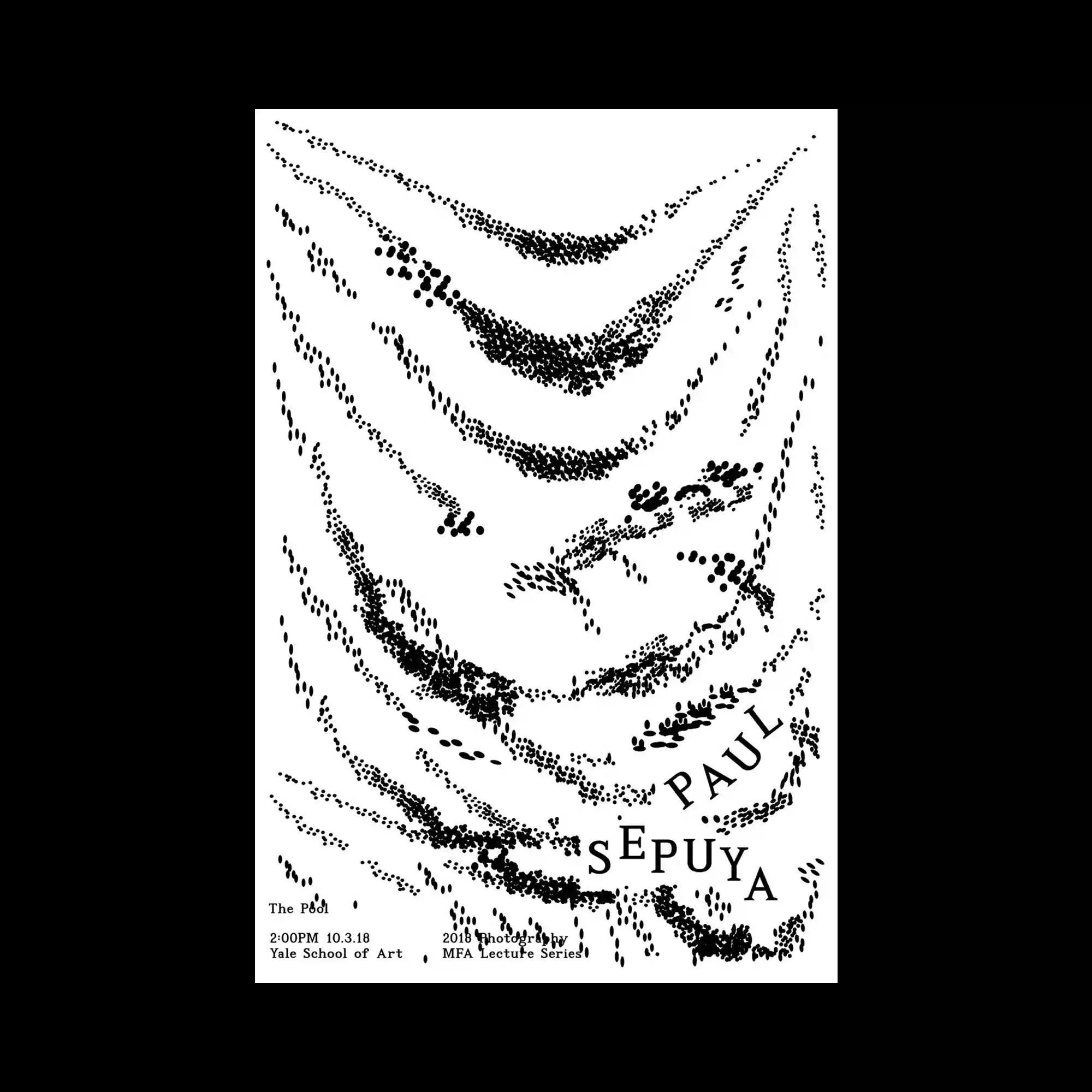
Sparse black dots form sweeping, wave-like trails on a white background, suggesting fabric folds or motion traces. The typographic elements are delicately positioned to follow the curved flow, integrating seamlessly into the composition. The simplicity highlights rhythm through repetition and spacing. The poster embodies quiet motion within a minimal monochrome field.
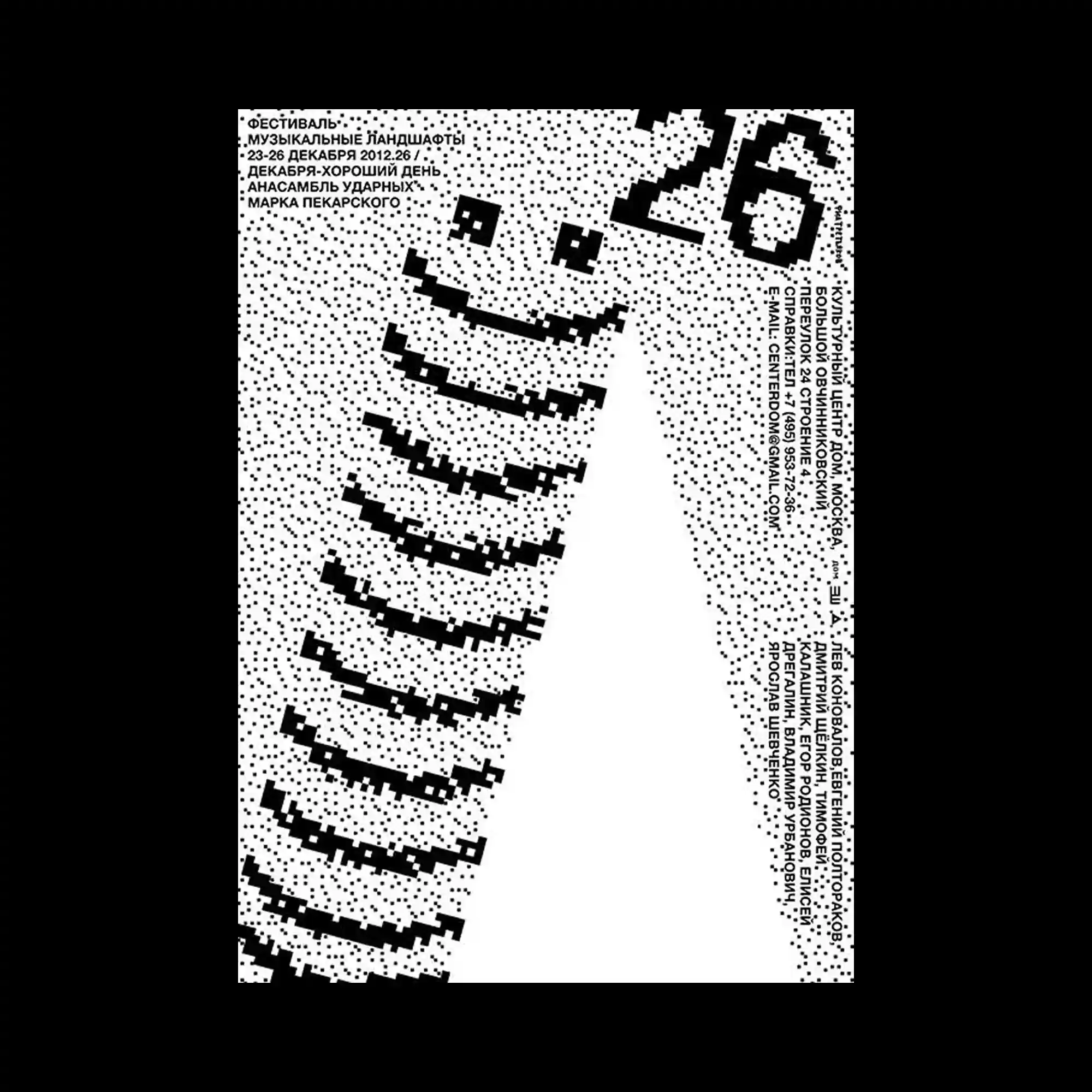
Composed of black pixel-like dots, the poster depicts a large curved form resembling a smiling face or spiral. The dotted texture creates gradation and movement across the surface. Sparse typography integrated at the corners balances the dynamic central shape. The overall aesthetic evokes early digital print processes and playful minimalism.
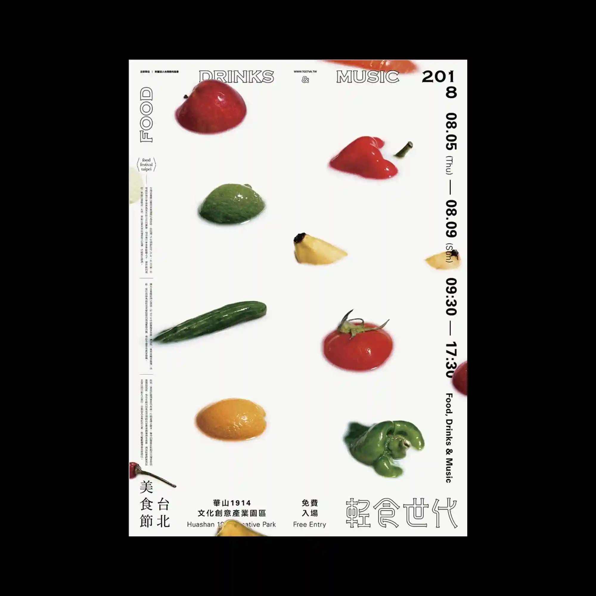
A minimalist white layout presents scattered fruits and vegetables, each isolated against clean space. The glossy textures and slight shadows create a hyperreal photographic quality. The composition’s order and spacing recall a museum display or scientific taxonomy. The restrained design emphasizes material beauty through clarity and precision.

A minimal composition dominated by pale tones, thin lines, and subtle wrinkles resembling folded paper. Yellow accents run vertically and horizontally, guiding the viewer’s eye across the otherwise quiet surface. The faint textures evoke material tactility despite the digital execution. The piece explores tension between emptiness and structure, creating a refined sense of spatial balance.
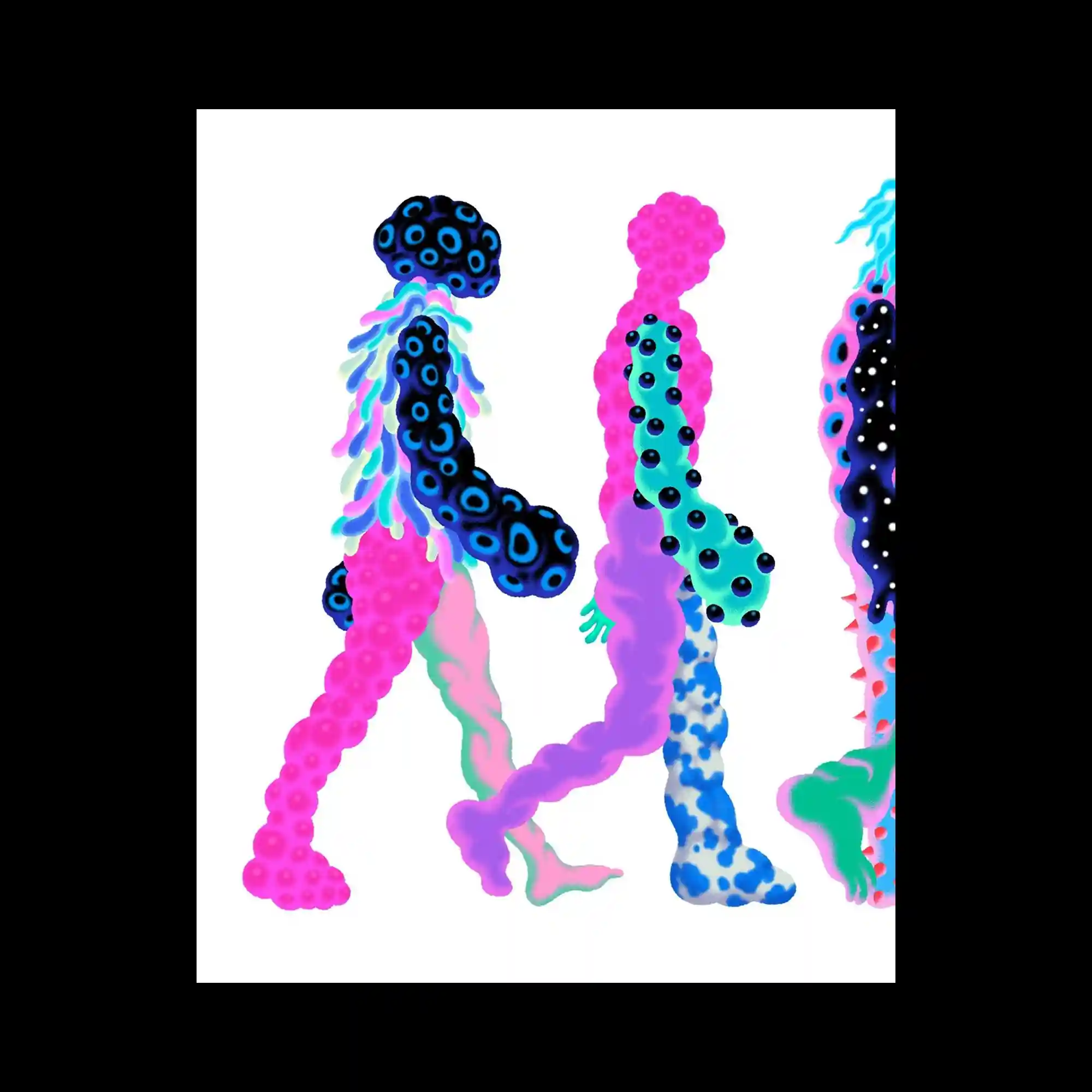
Three abstract human-like figures march across a white background, each constructed from bubble-like textures and gradients. The bodies are composed of organic cells in neon pink, blue, and turquoise, giving a microscopic or alien impression. Despite their strangeness, the repetition of walking poses unifies them as a group. The visual rhythm of rounded forms and smooth transitions emphasizes motion within stillness.
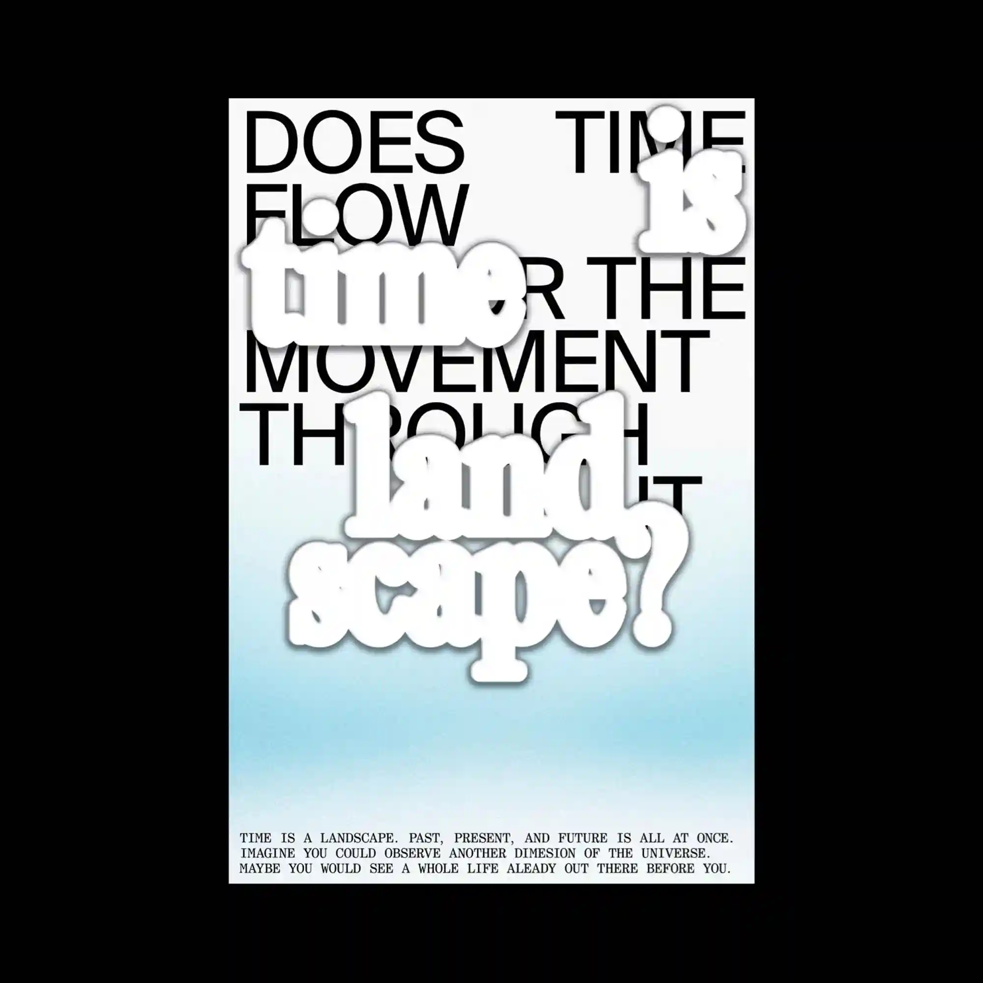
Large black sans-serif text is overlaid with soft, cloud-like white words that float in the foreground. The layered typography explores the relationship between conceptual and visual time, blending gradients from white to cyan that suggest depth and atmosphere. The composition’s hierarchy shifts depending on focus—foreground words appear tactile while background text provides structural rhythm. The overall effect is contemplative, balancing spatial and temporal perception.
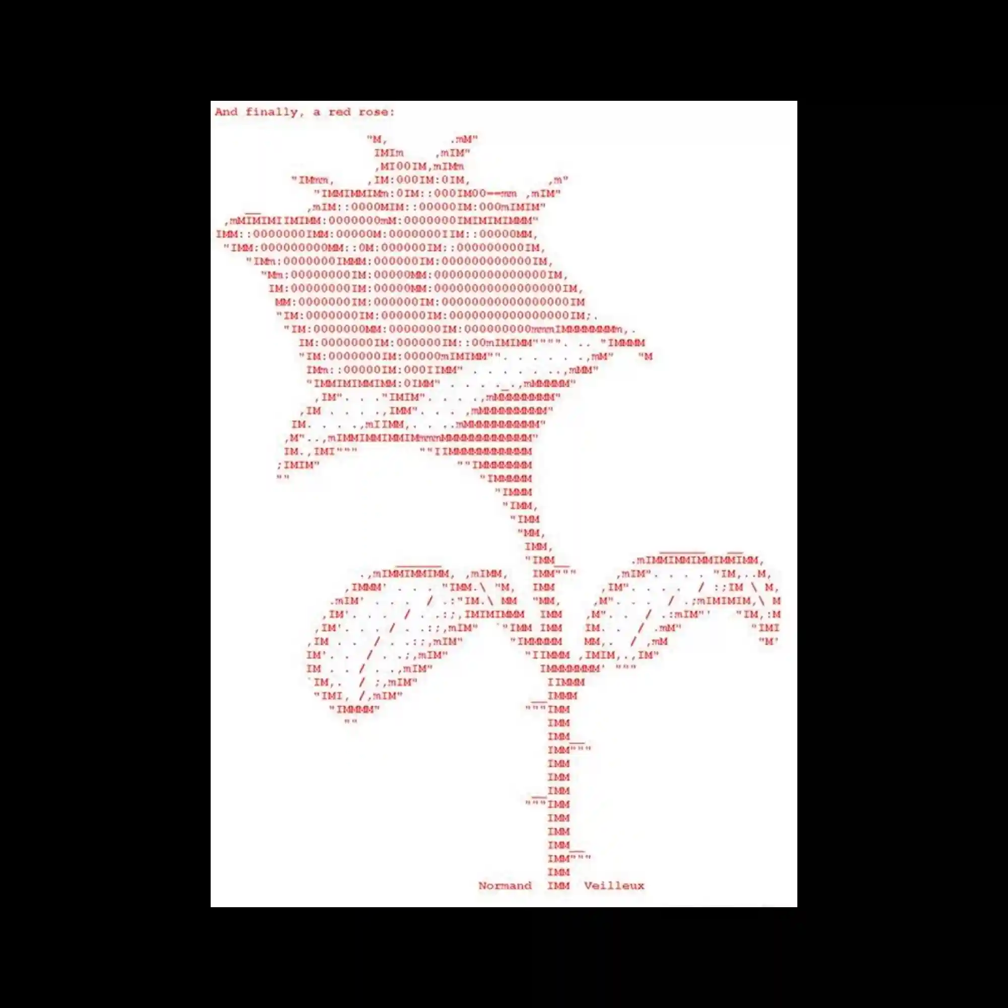
A red ASCII illustration of a rose is meticulously constructed from letters and symbols, evoking early computer-generated art. The pixel-like arrangement of characters forms a delicate balance between technology and organic form. The limited color palette and type-based rendering highlight the nostalgia of digital aesthetics. The work merges mechanical precision with poetic imagery, celebrating the intersection of code and emotion.
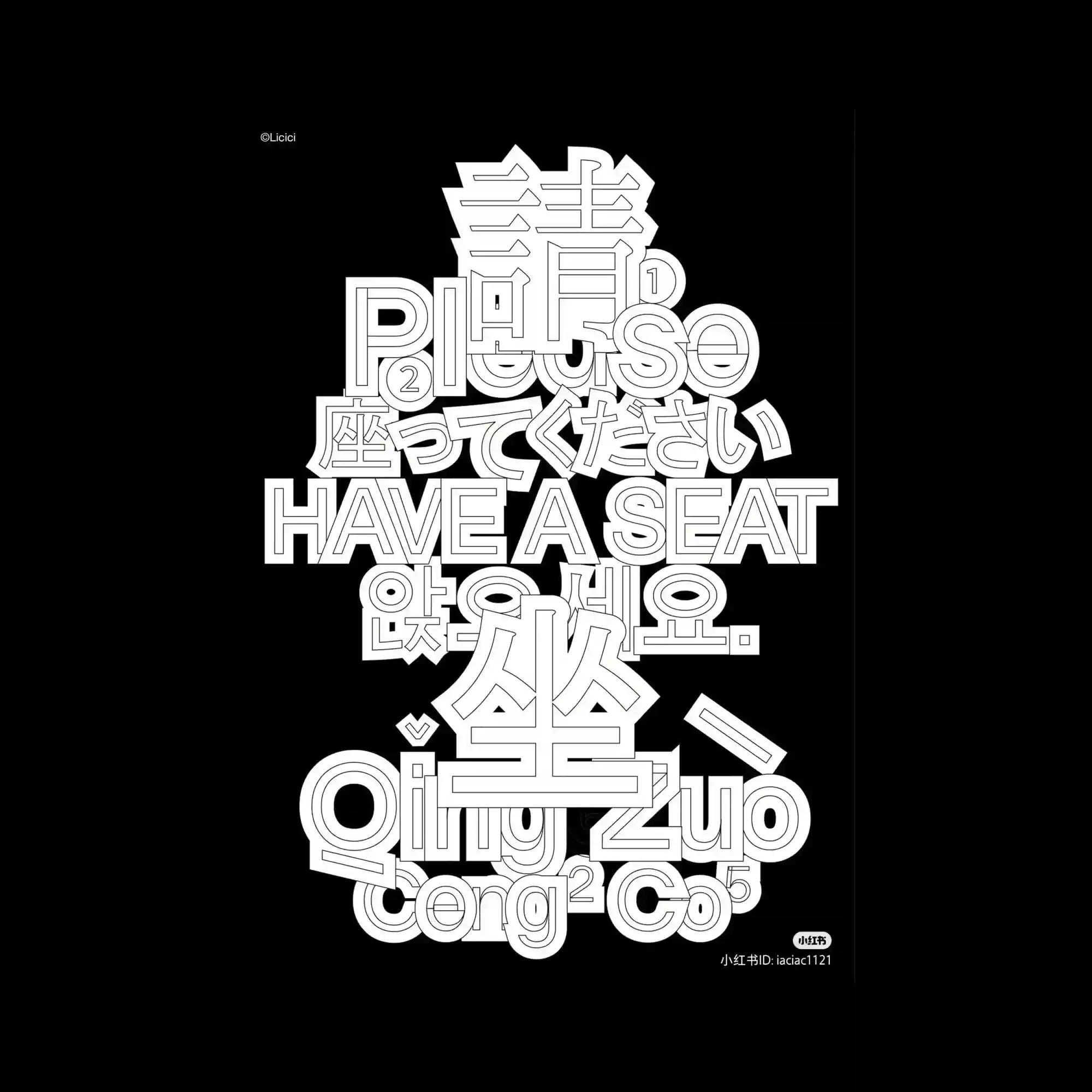
This poster layers multiple languages and scripts in a stacked typographic structure rendered in white outlines against a black background. The dense vertical alignment creates a sense of weight and compression, as if the words are physically pressing down on one another. Each letterform is given equal prominence, forming a unified block of text that transcends linguistic difference. The monochrome palette accentuates the graphic rhythm and hierarchy of the letter shapes.
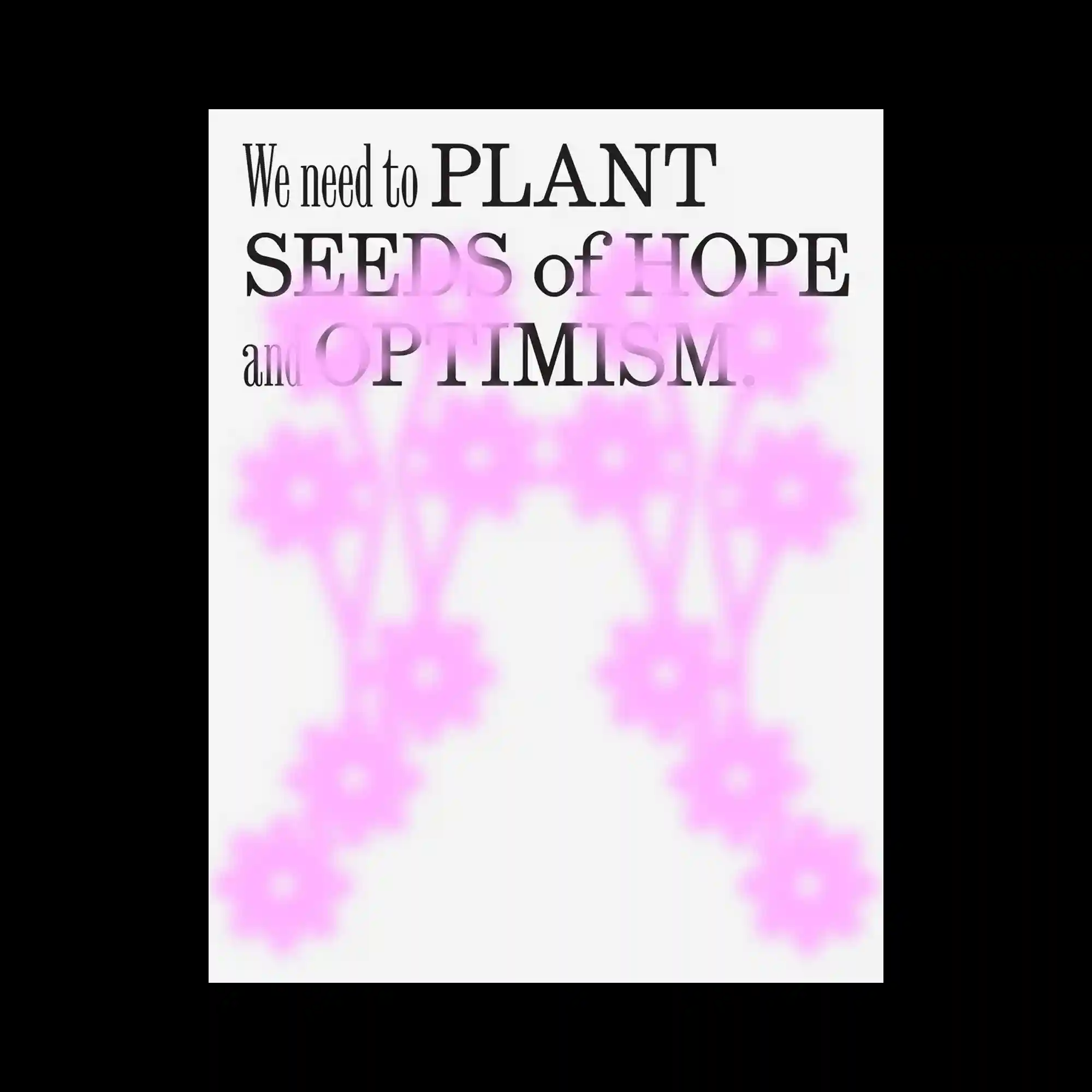
Large serif typography overlays a faint pink floral silhouette. The blurred blossoms form a glowing background for the motivational text. The composition balances softness and conviction through minimal color.
Overlapping blue and green rectangles carry text blocks in varying sizes, resembling fragmented signage. Hand-drawn black lines cut across, adding gesture and spontaneity. The mix of structure and freedom creates a playful editorial mood.
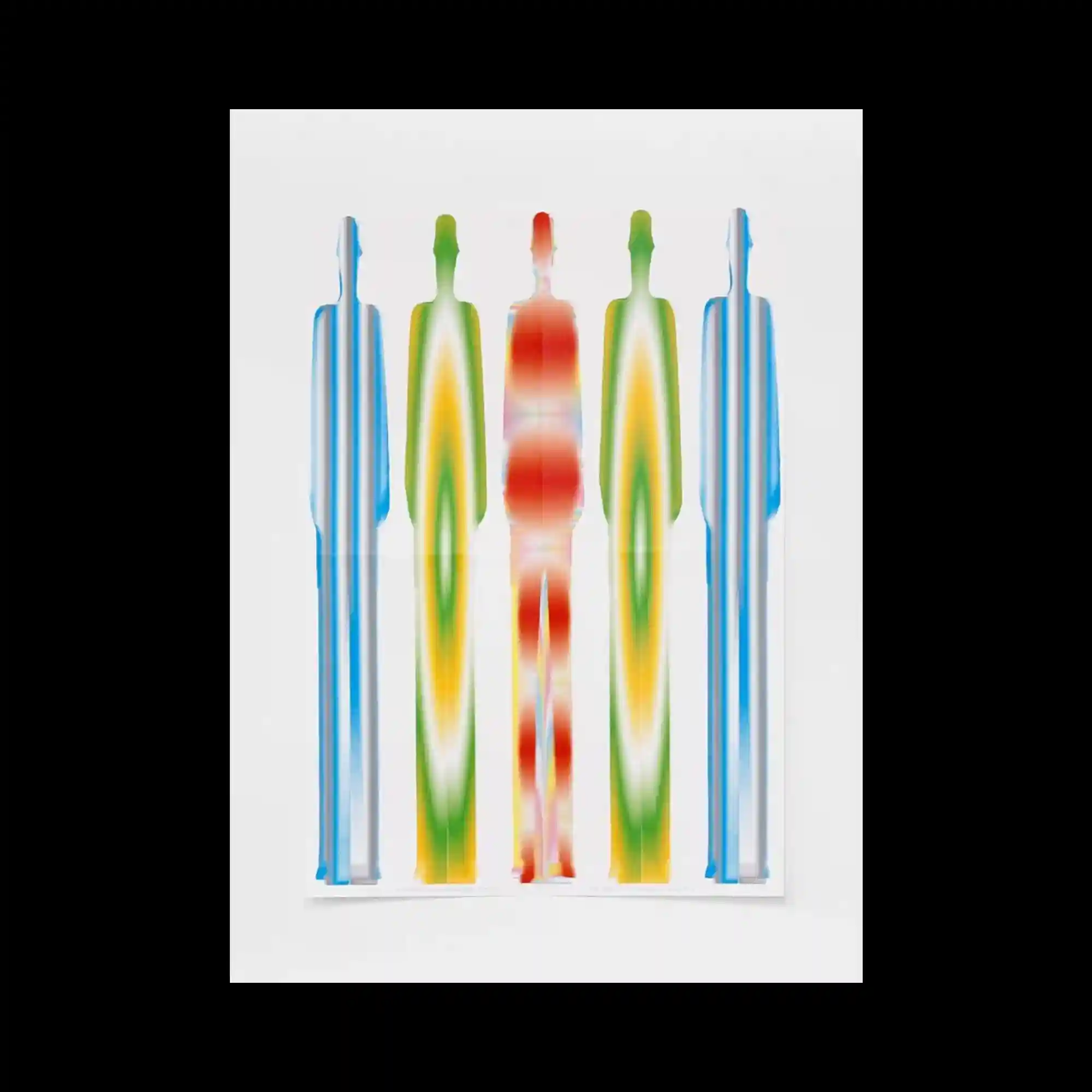
Five vertical silhouettes stand side by side, each rendered in smooth heatmap gradients. The central red-orange figure radiates warmth, while cooler blues flank it symmetrically. The minimal composition evokes balance and energy.
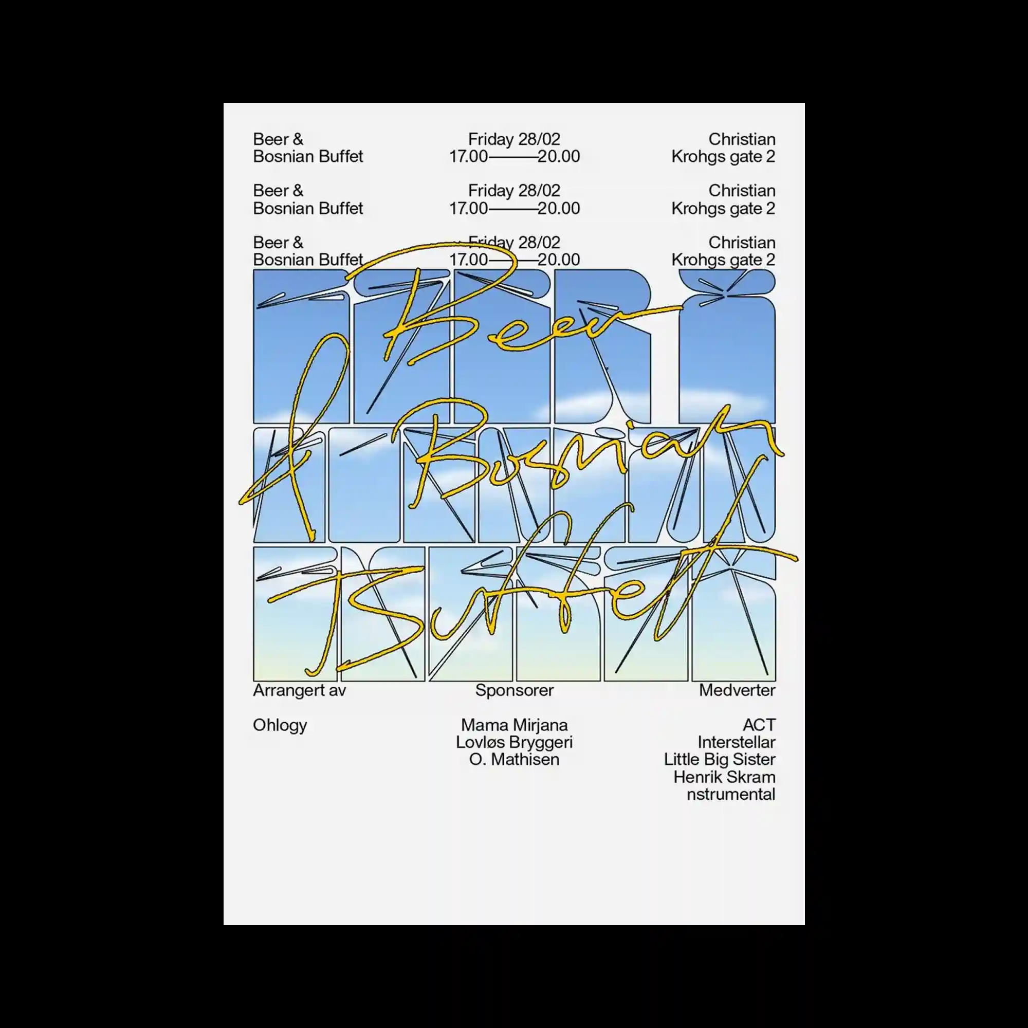
Grid-based layout with soft sky-blue panels overlaid by golden cursive handwriting. The juxtaposition of rigid modular structure and fluid script creates elegant visual tension. The thin linear elements unify the composition with calm precision.
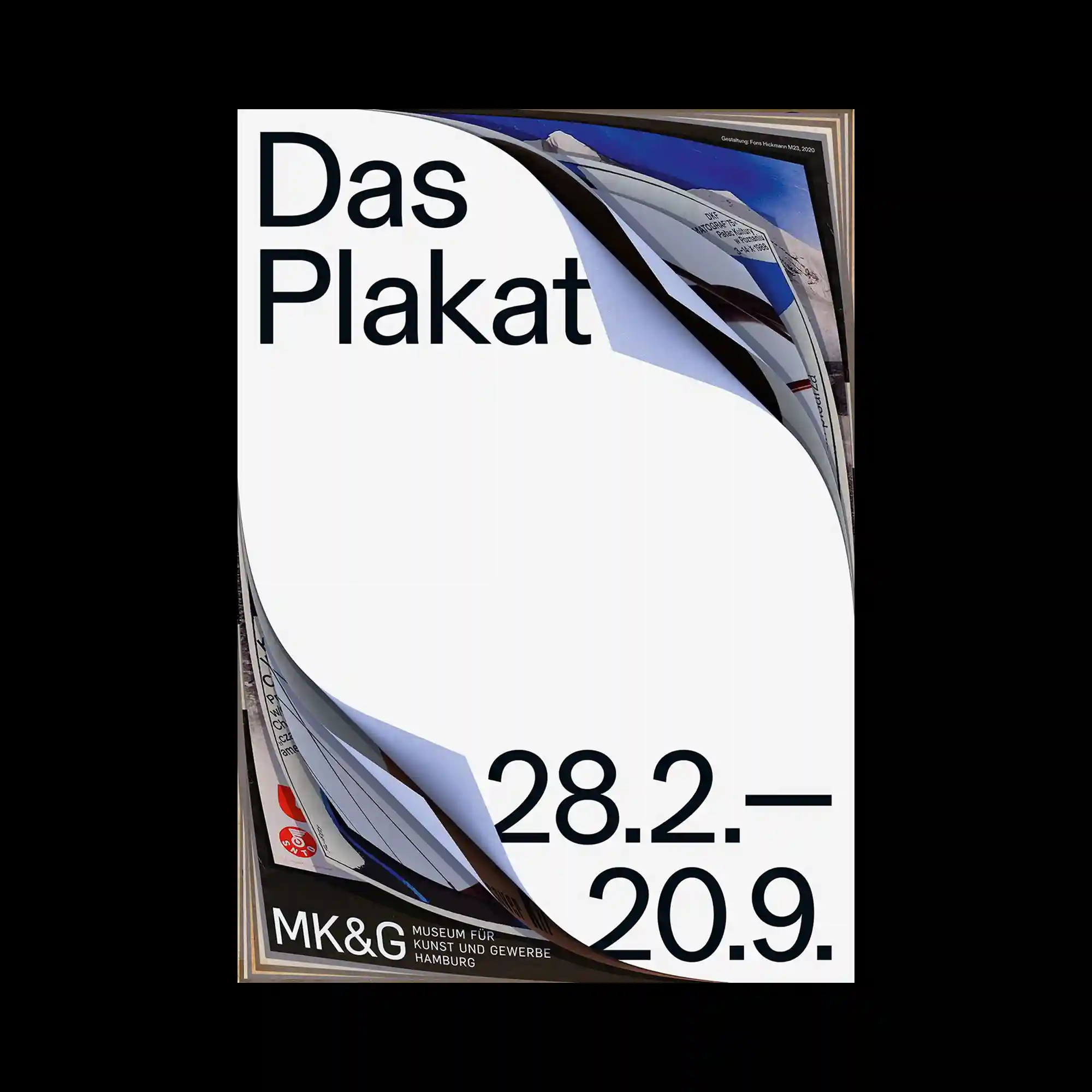
A stack of layered paper sheets is peeled back to reveal hidden posters beneath. The curved fold in the white space becomes the central focal point. Minimal typography contrasts with the tactile realism of the layered edges.

Overlapping typographic layers in red and white form a dynamic composition across a white background. Some words are oversized and tilted, breaking alignment to emphasize motion. The visual density expresses chaotic energy and theatrical presence.
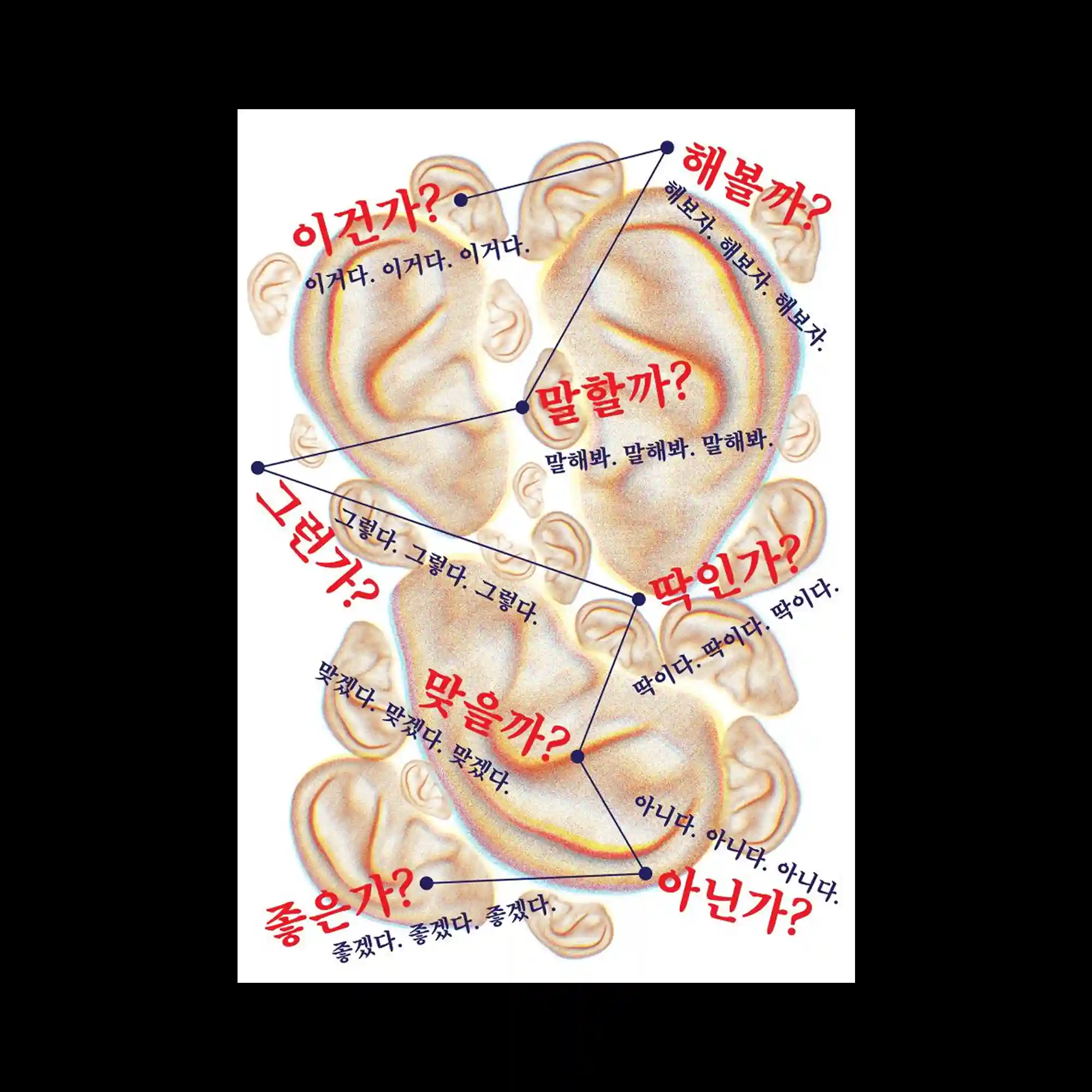
A collage of ears overlaps across the frame, each paired with bold red Korean text asking rhetorical questions. The dialogue lines connect through blue dots and lines, forming a conversational network. The composition visualizes the complexity of communication and hesitation through rhythm and repetition.
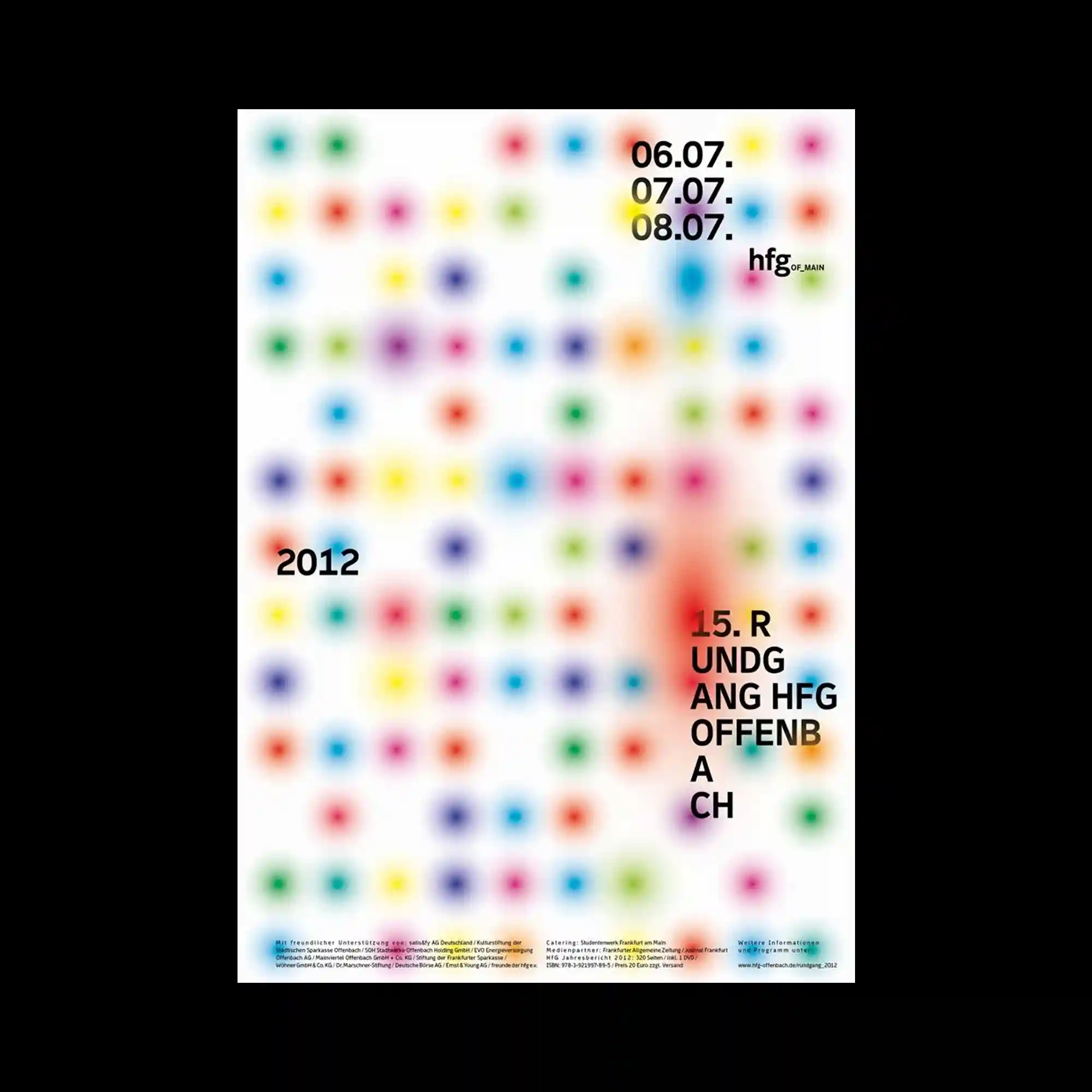
A field of multicolored blurred dots fills the composition, each glowing softly against a white background. The randomness of colors contrasts with the rigid placement of text. The gradual diffusion of hues evokes a digital yet organic texture.
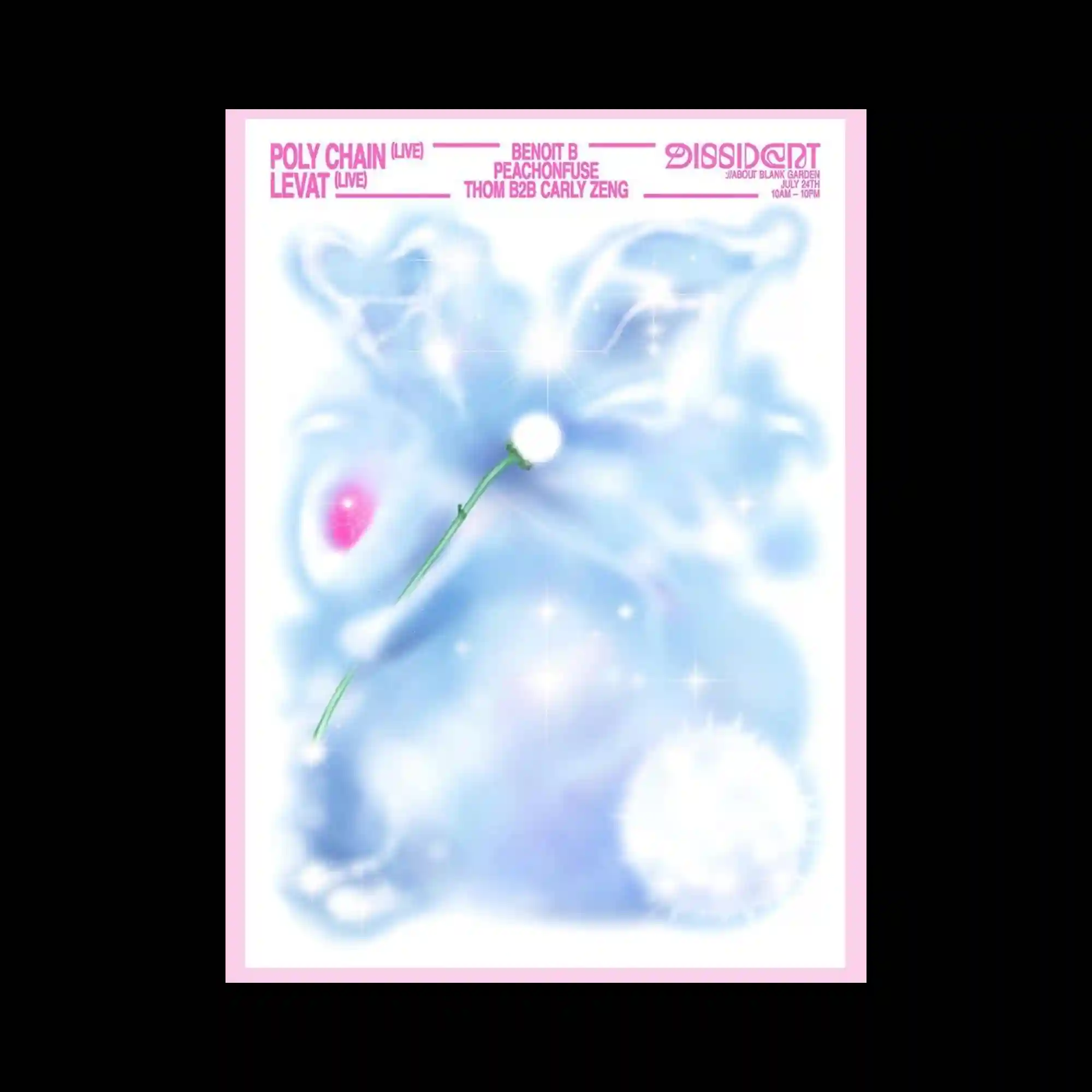
Soft cloud-like forms rendered in icy blue and white evoke an ethereal, dreamlike atmosphere. Sparkling highlights and a single thin green stem add a delicate contrast. The diffuse edges create a sense of floating and lightness.
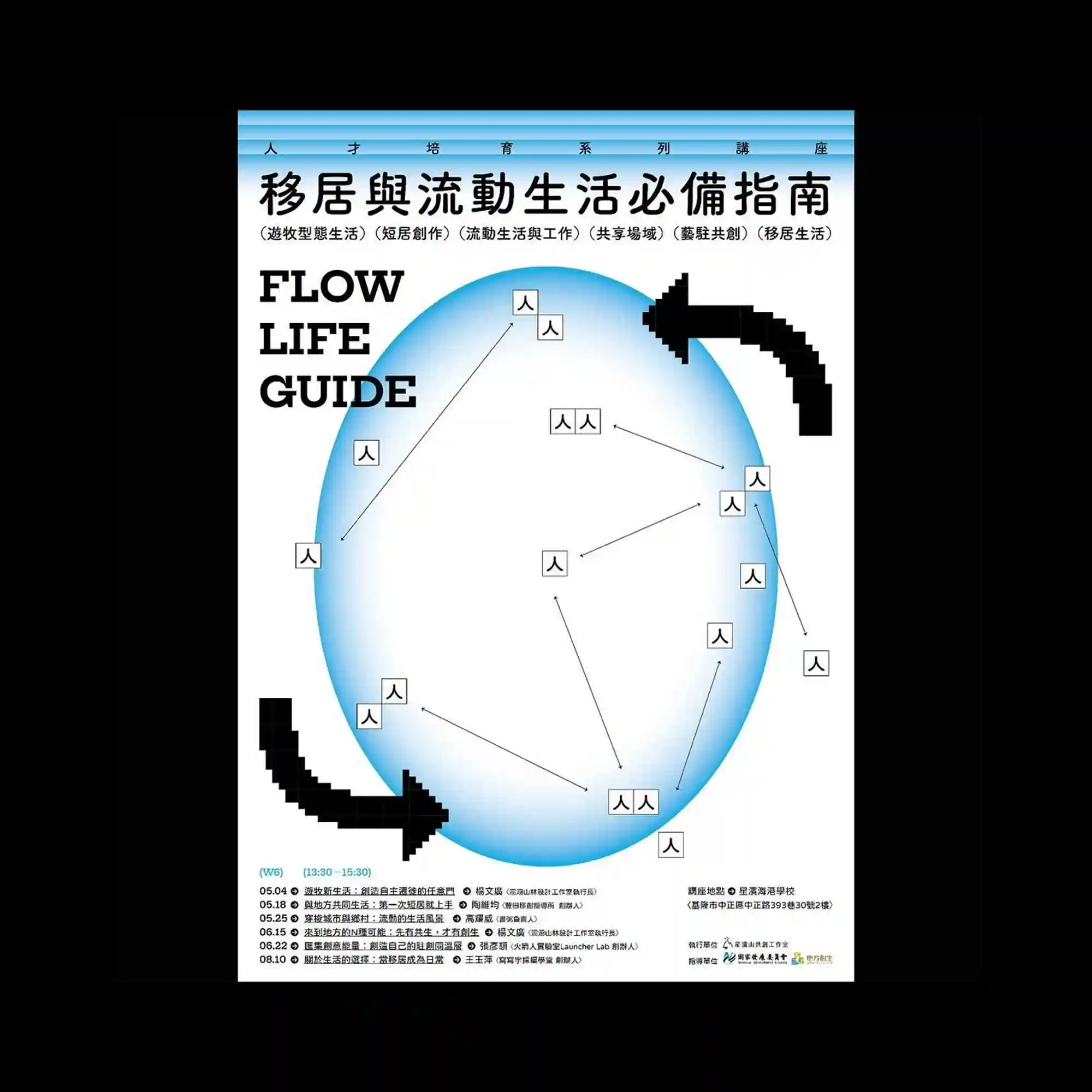
Set against a clean white background, pixelated arrows and scattered icons depict a network-like diagram. The blue oval gradient serves as a focal point, framing the flow of connected symbols. The composition feels both instructional and playful.

The composition features a grid of smooth blue and green squares, partially blurred to create a soft gradient transition. Transparent floral outlines overlap the grid, introducing a subtle rhythm between geometric order and organic flow. Vertical typography on the right balances the composition, lending a clean and futuristic impression.
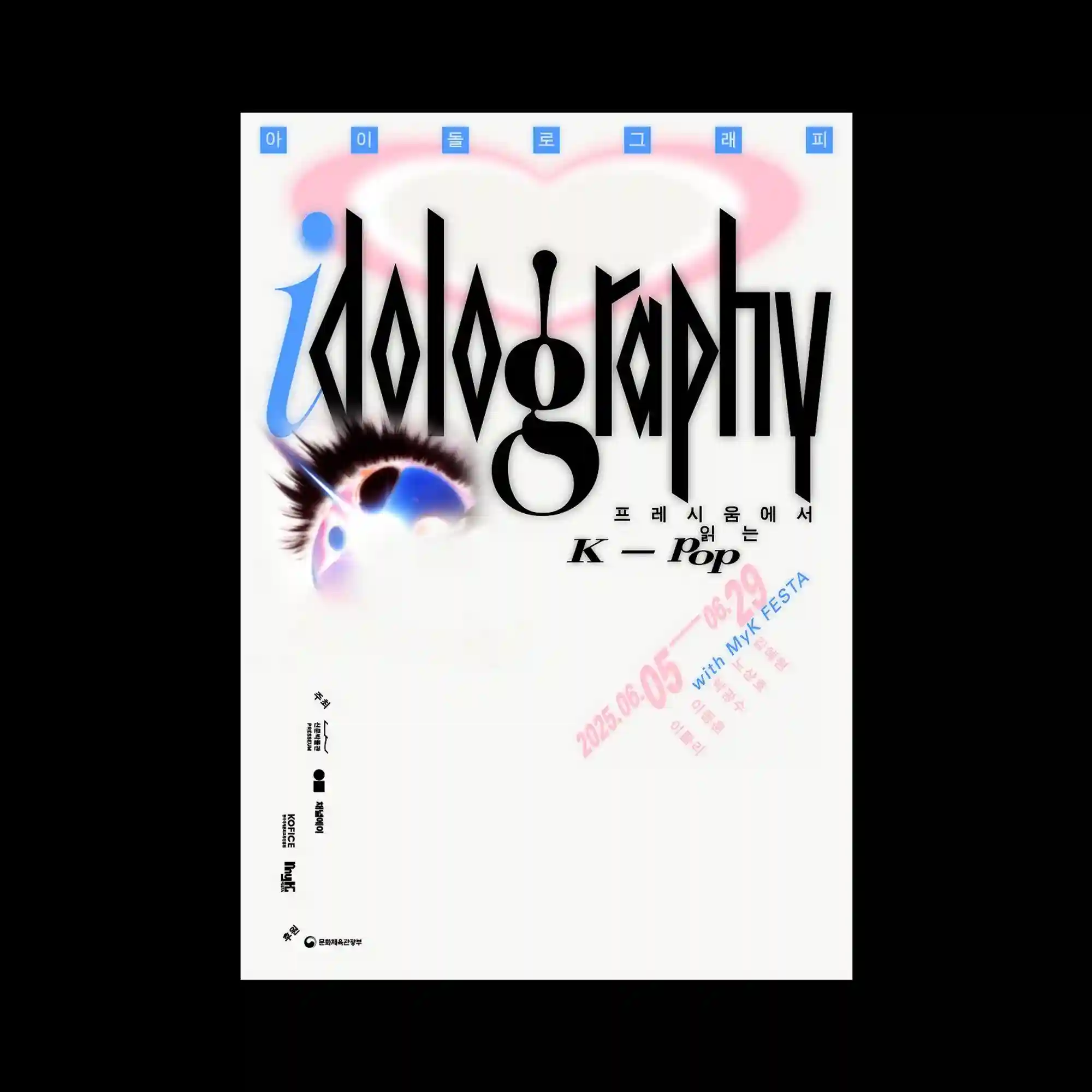
The design highlights the word “idolography” in a stylized black typeface with exaggerated vertical strokes and sharp edges. A gradient blue “i” contrasts with the rest of the text, adding emphasis. Above the text, a blurred pink heart shape provides a soft background accent. Additional small Korean and English texts are scattered around the composition in light blue and pink. The overall aesthetic merges pop culture references with experimental typography, suggesting playfulness and spectacle.

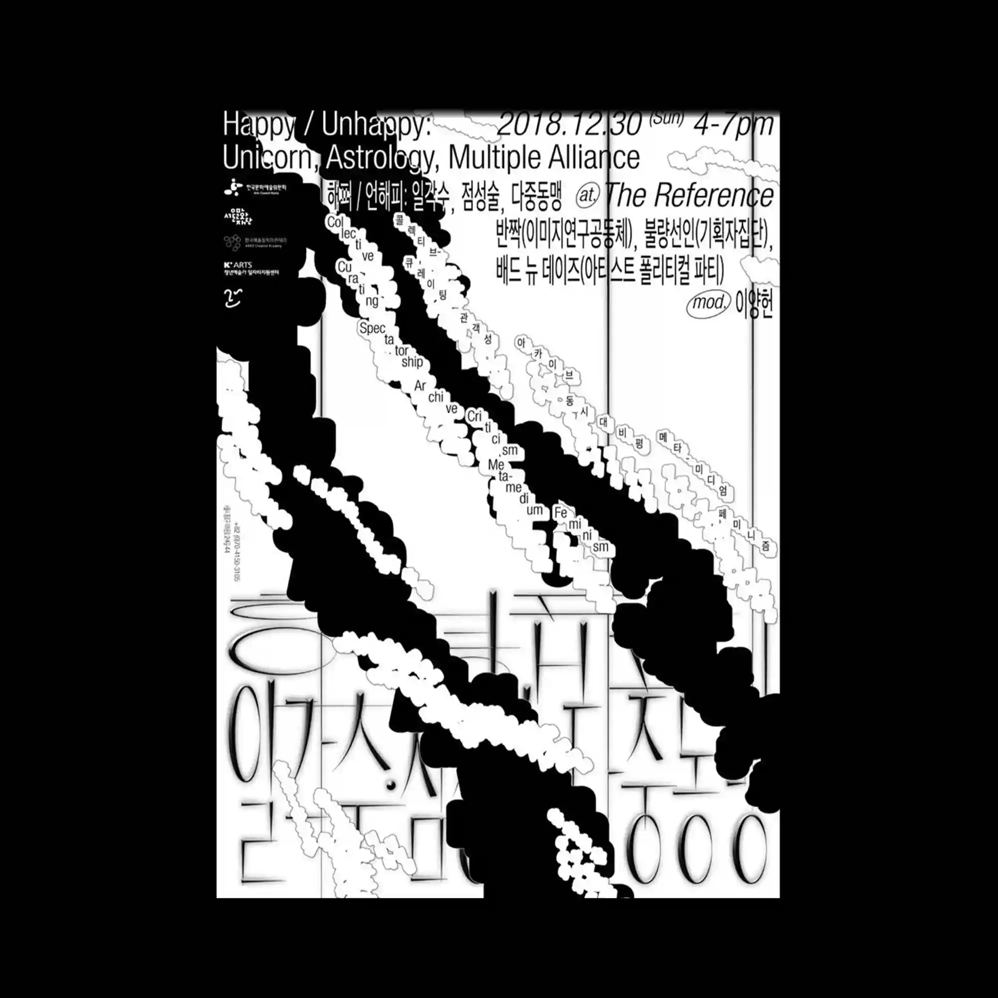
This design layers numerous overlapping typographic blocks in black on a white background, shaped into irregular speech bubble forms. Each bubble is filled with dense text at different scales, creating visual noise and complexity. The repetition of forms arranged in a grid suggests rhythm but avoids strict symmetry. Variation in font size and orientation emphasizes dynamism and disruption. The overall effect recalls fragmented conversations or overloaded communication.
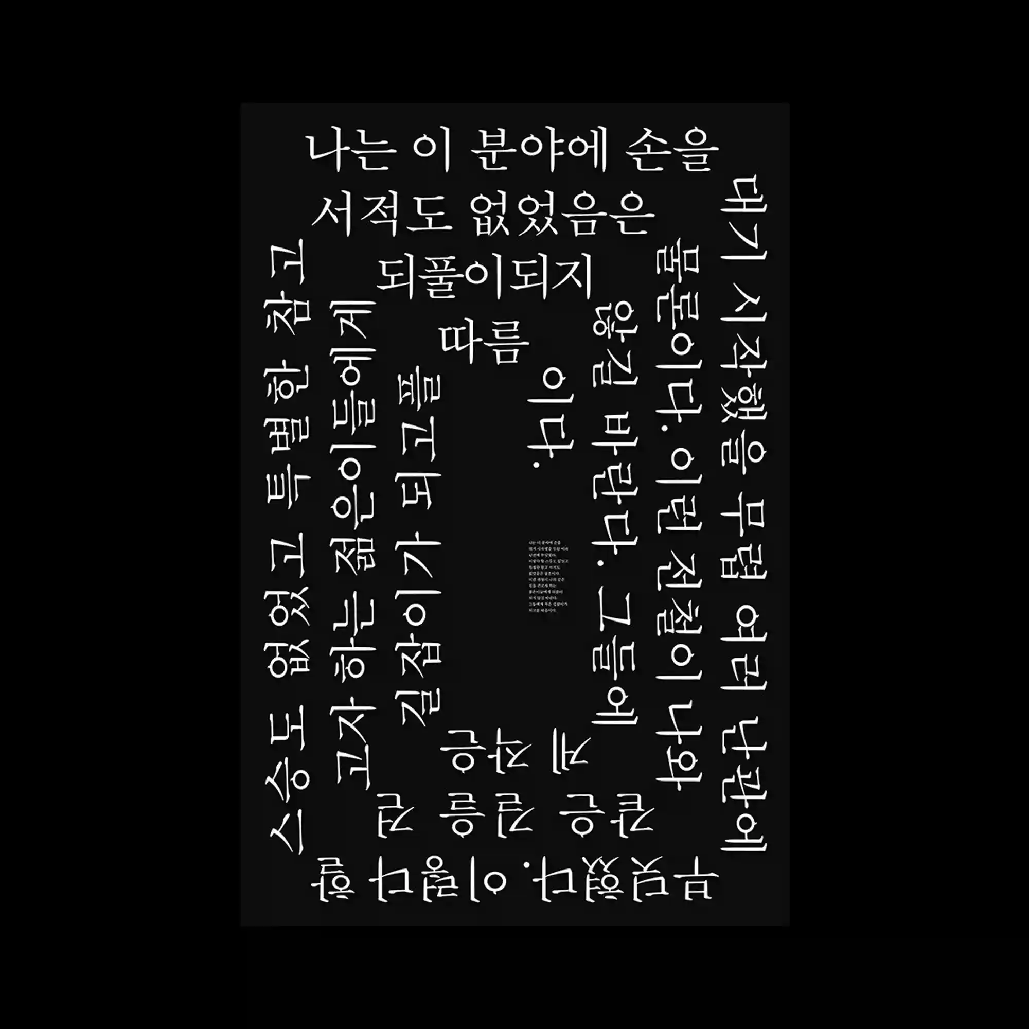
The design uses a deep black background with large white Korean characters arranged along the edges, forming a rectangular border. The typography is rotated and stretched, creating a sense of movement around the perimeter. At the center, smaller and denser text anchors the layout, serving as a visual counterweight. The interplay between oversized type and compact inner content creates dynamic contrast. The overall composition evokes both monumentality and intimacy within a single frame.

This composition combines a clean white background with a structured calendar-like arrangement of text in black and gray. Colorful, multi-layered radial motifs resembling flowers or fireworks are scattered across the page, overlapping key text elements. The contrast between strict typographic order and playful decorative symbols generates visual tension. The bright shapes serve as interruptions that disrupt readability while adding vibrancy. The overall design merges systematic information with spontaneous ornamentation.

This poster features typography constructed from countless small blue strokes arranged like flowing currents. The clustered strokes form the words, creating an image that oscillates between text and texture. The organic density gives the impression of movement, almost like swarming fish or rippling water. Sparse red text on the side adds contrast and balance. The piece emphasizes collective form-making from repeated micro elements.
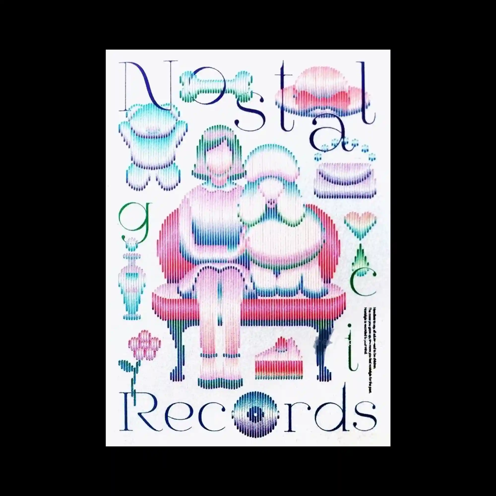
This illustration uses pixelated gradients to depict figures and objects. A central seated character with a pet-like companion is rendered in colorful vertical stripes, giving a digital moiré effect. Surrounding elements, including toys, flowers, and abstract symbols, share the same striped texture. Large serif typography is integrated into the layout, wrapping around the central imagery. The interplay of nostalgic softness and digital distortion gives the work a unique visual identity.
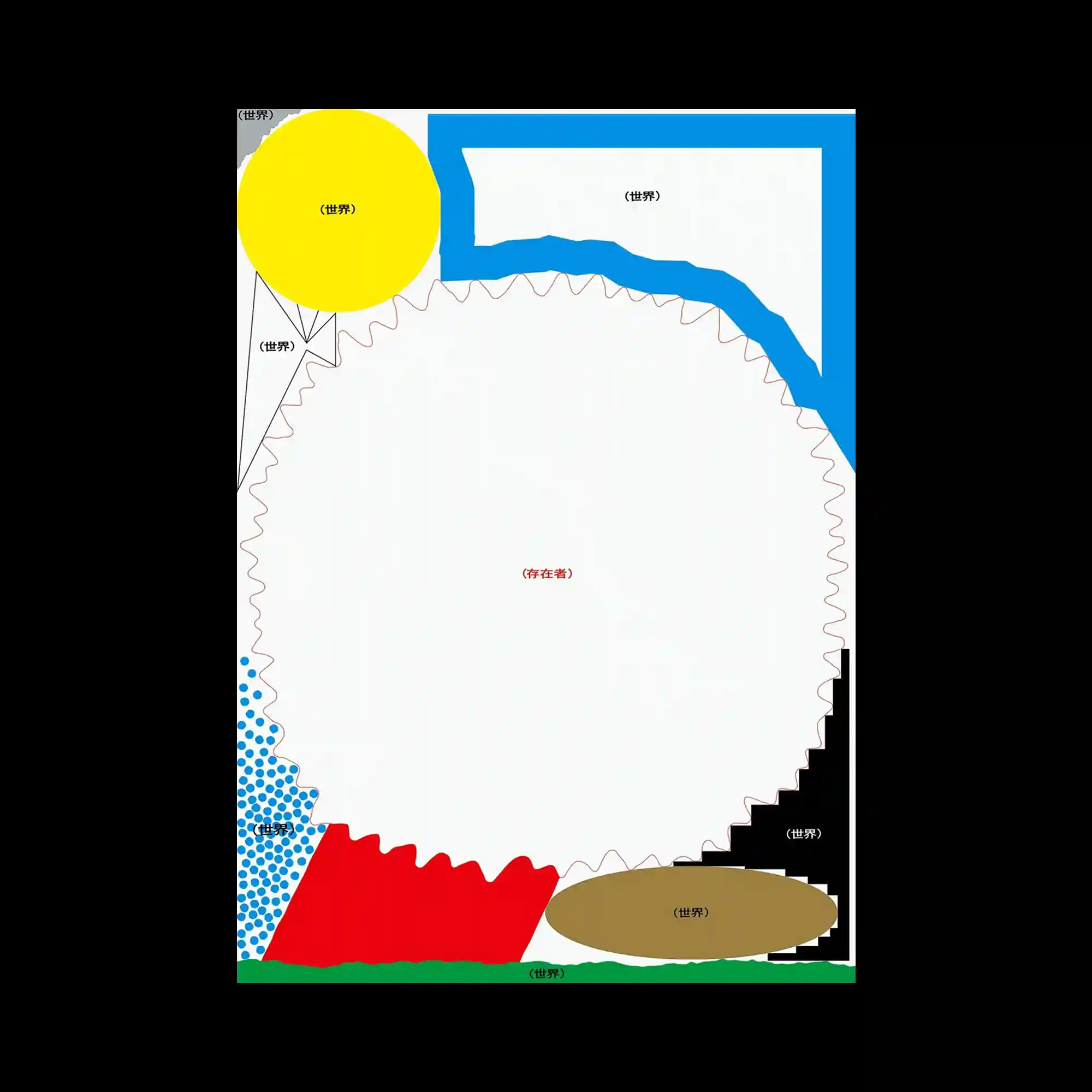
This design employs a minimal yet abstract composition with bold primary shapes. A large central white circular form is surrounded by geometric blocks of color, including yellow, red, blue, black, green, and brown. The edges of the circle are marked with irregular wavy and jagged outlines, contrasting sharp and soft elements. Sparse text labels positioned near each shape contribute to a schematic or diagram-like feeling. The overall impression is one of conceptual mapping through color and form.
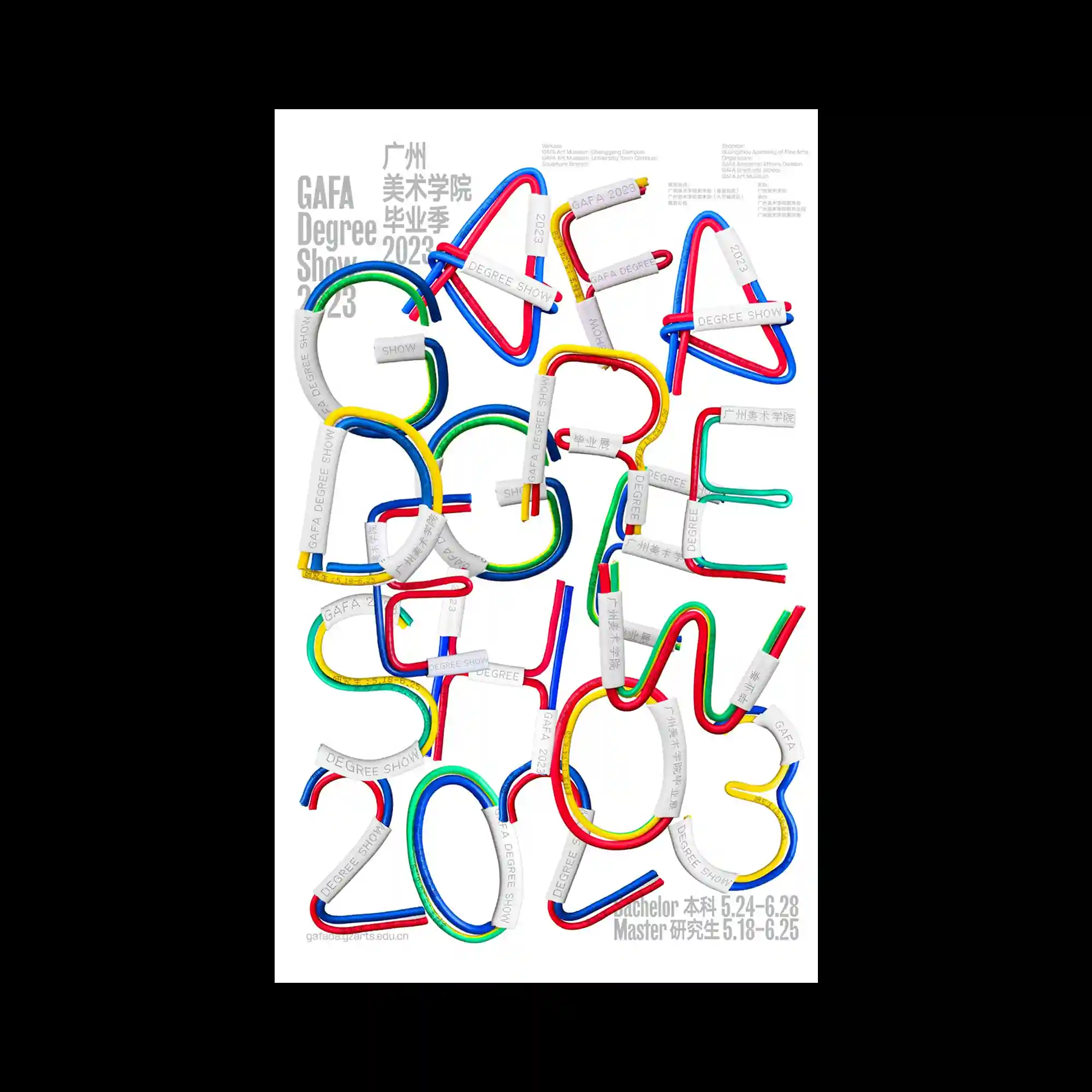
The poster features three-dimensional letterforms constructed from flexible, multicolored tubes, predominantly in red, blue, green, and yellow. Each letter is reinforced with metallic-like clamps that add a structural and industrial touch. The playful curvature of the tubes contrasts with the clean white background, emphasizing both movement and readability. Text elements in different languages are carefully arranged in the corners, balancing the chaotic central typography. Overall, the design merges tactile materiality with typographic experimentation.

The design resembles a fashion magazine layout, with photographic cutouts of models in playful, animated outfits placed in a collage format. The styling blends early 2000s aesthetics with Y2K cartoon motifs, surrounded by stars, text blocks, and branded graphics. The overall look is nostalgic yet hyper-stylized.
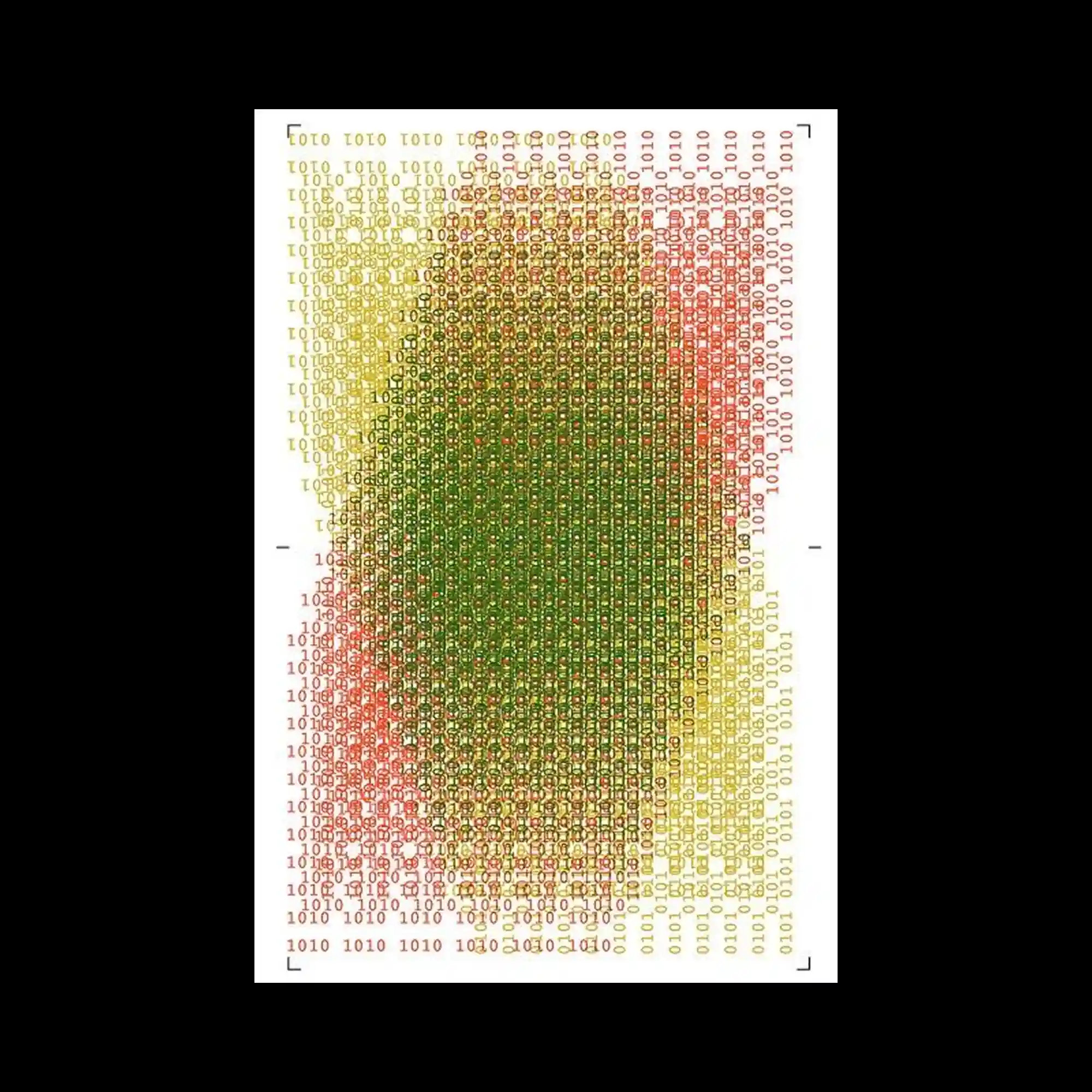
This composition utilizes binary code as the primary graphic element, arranged densely in a grid to form an abstract, organic shape. The red, green, and yellow gradation is achieved through variations in font weight and transparency. The overlapping text creates a digital texture reminiscent of pixel accumulation or data visualizations.
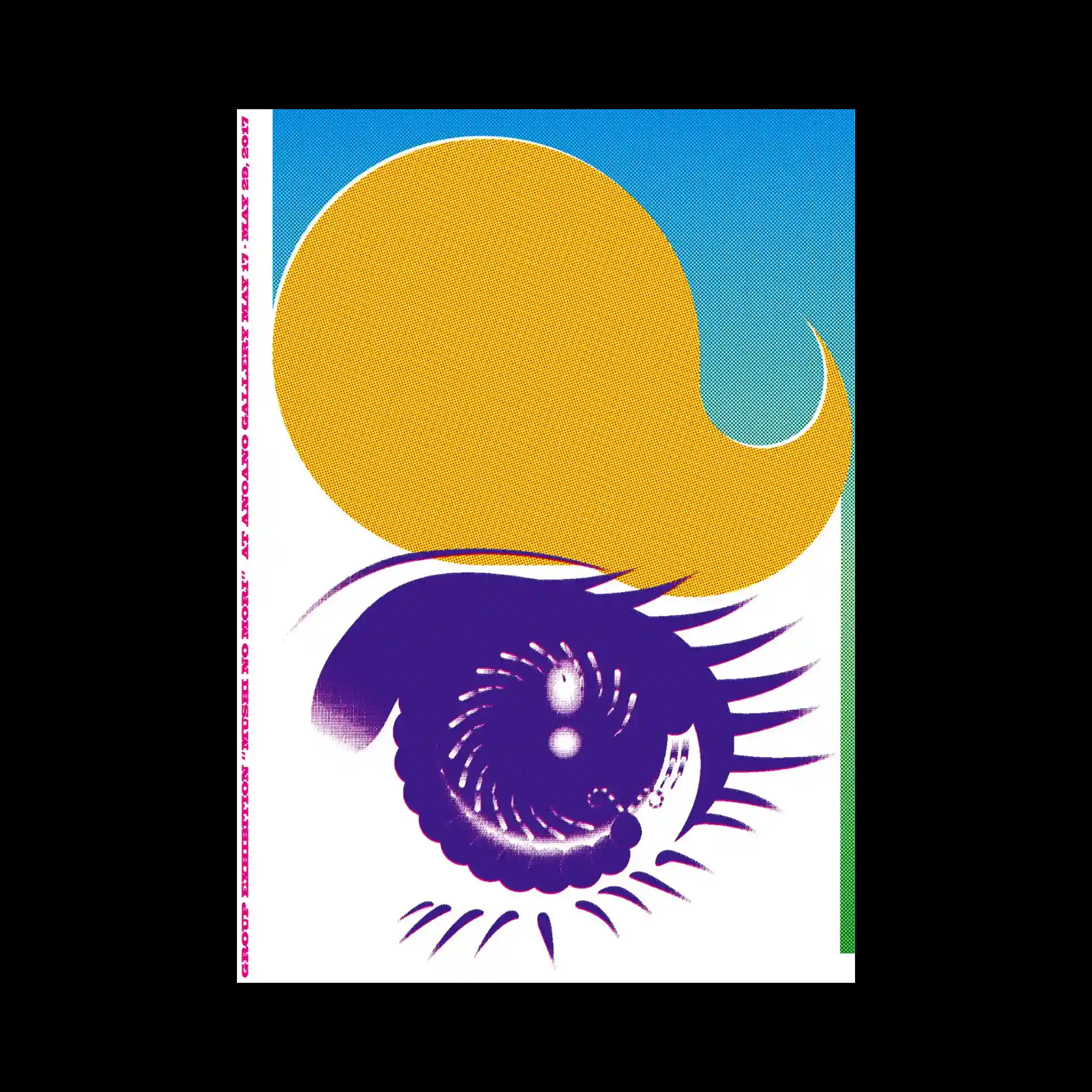
This design incorporates surreal, vector-based elements including a spiral eye with stylized lashes and a large curved yellow shape resembling a thought bubble. The halftone gradients and complementary color palette (blue, yellow, purple) enhance the retro-futuristic aesthetic. The unusual layout and asymmetrical framing lend a sense of playful absurdity.
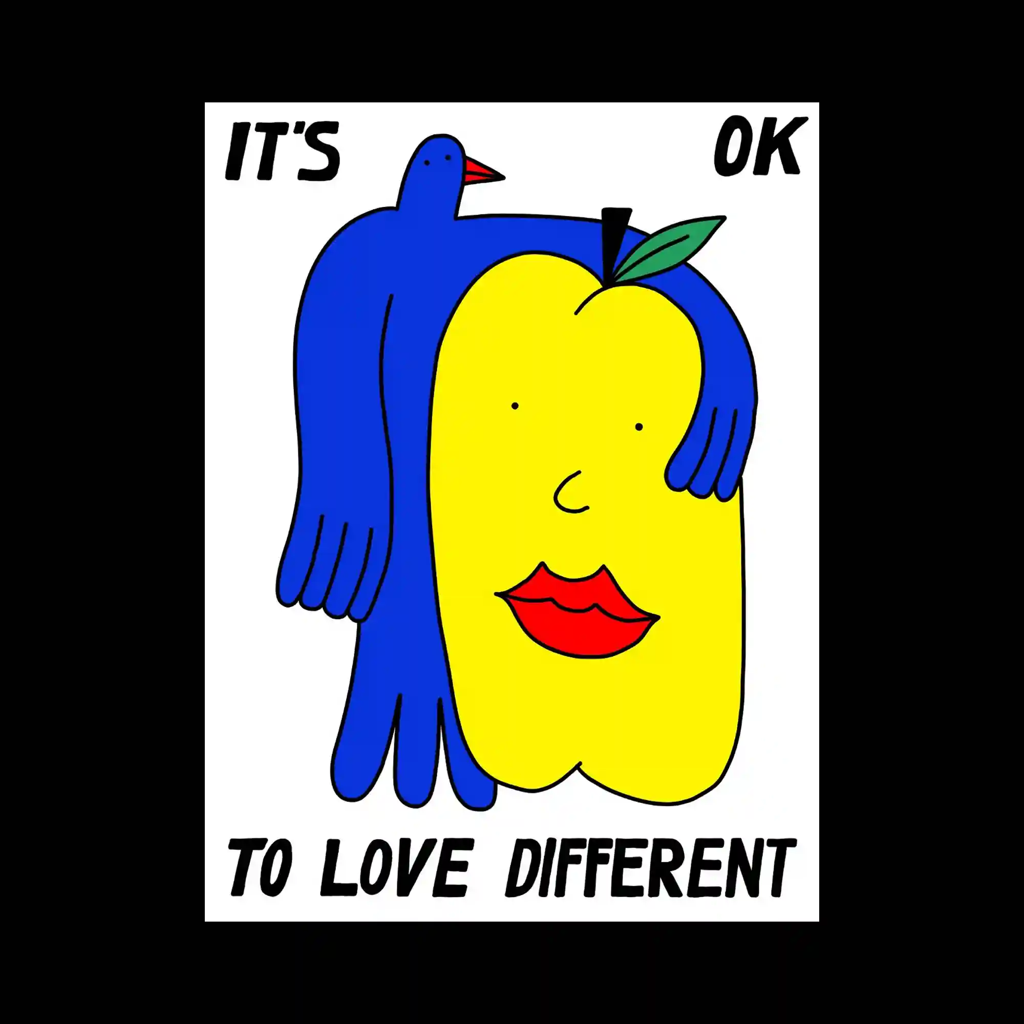
A cartoon-style illustration combining anthropomorphized objects: a yellow fruit with facial features, red lips, and a blue bird embracing it. The bold outlines and flat colors recall children's books or pop art influences. The hand-lettered text at the top and bottom enhances the message of inclusivity and acceptance with a playful tone.

An eclectic collection of hand-drawn animal figures, cartoon characters, and symbols scatter across the page in red and graphite tones. The line quality ranges from sketchy to highly detailed, evoking a sense of layered chaos. Negative space is intentionally preserved, balancing the energetic imagery with compositional breathing room.

This visual layout combines adorable illustrations and handwritten-style text to form a stylized menu system. The color scheme of pastel pink and cream creates a soft, approachable tone, while varying text weights and sizes establish clear information hierarchy. Animal characters and pictogram elements serve as visual accents, with product mockups and descriptions arranged in a cohesive, grid-based structure.
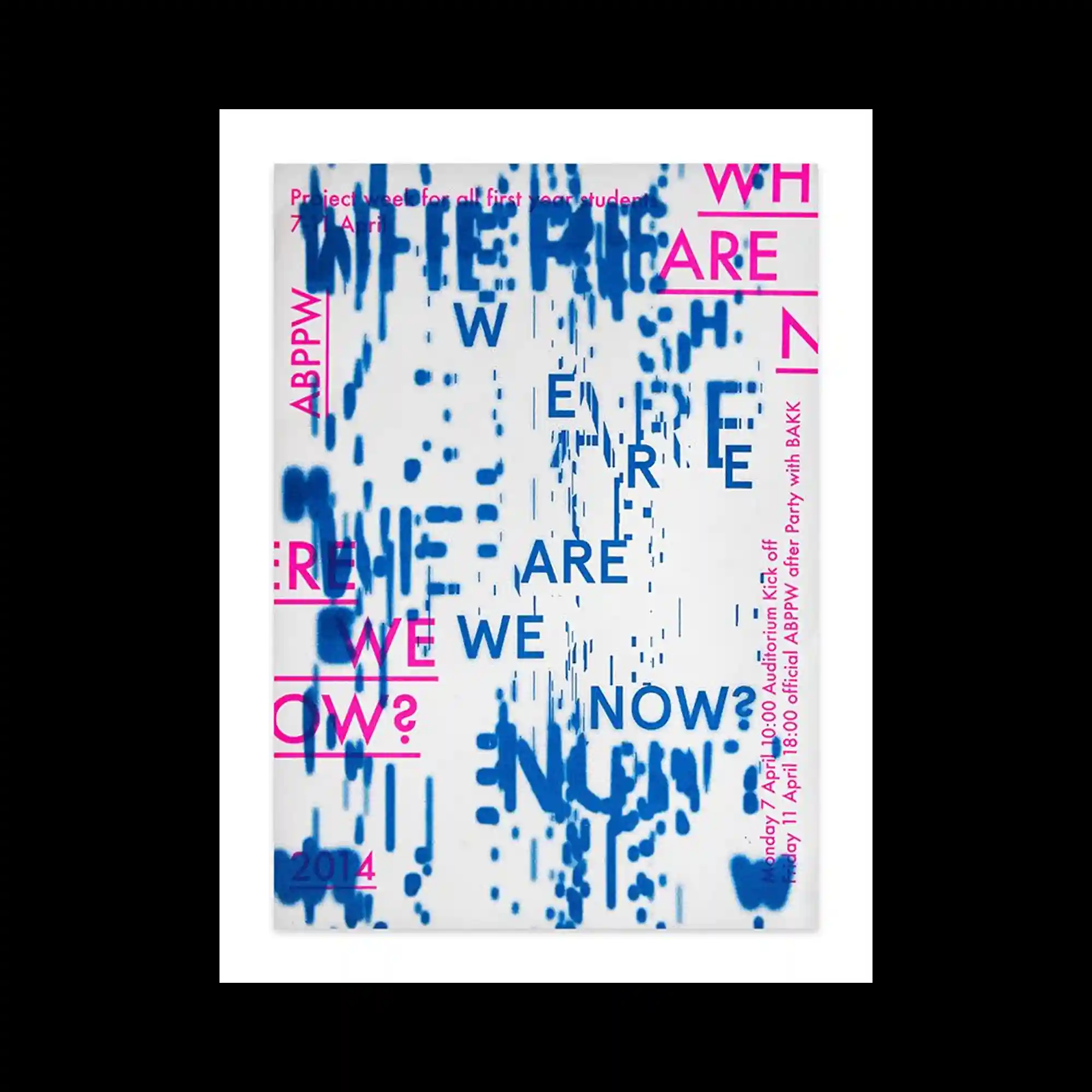
This poster juxtaposes glitch-inspired blue patterns with high-contrast magenta typography. The scattered arrangement of the words emphasizes disorientation, reinforced by a digital distortion motif at the center. The type’s varying scale and rotation enhance the sense of temporal or spatial dislocation.
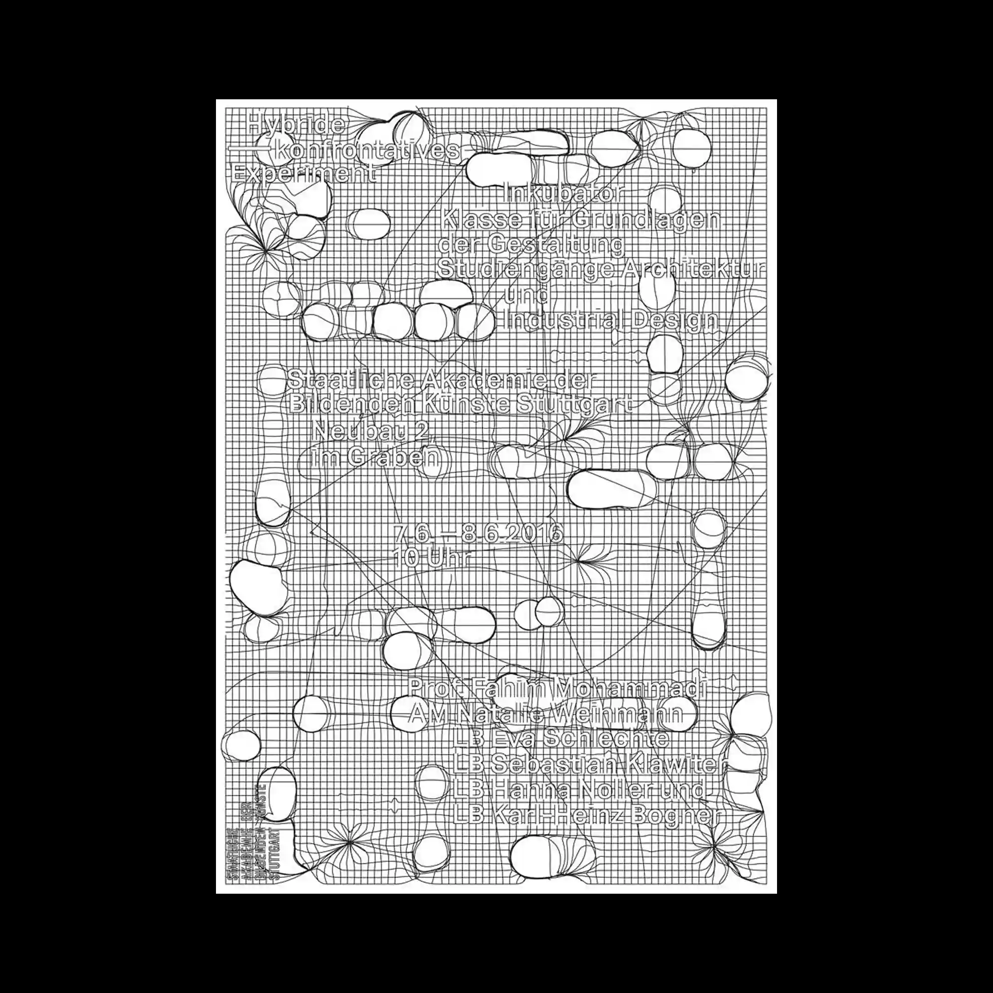
This black-and-white poster uses a wireframe mesh as a background, layered with irregular contour-like shapes and floating text. The typography adheres to the grid yet feels fluid due to the distortion of surrounding lines. The overall result is a tension between systematic structure and organic disruption.
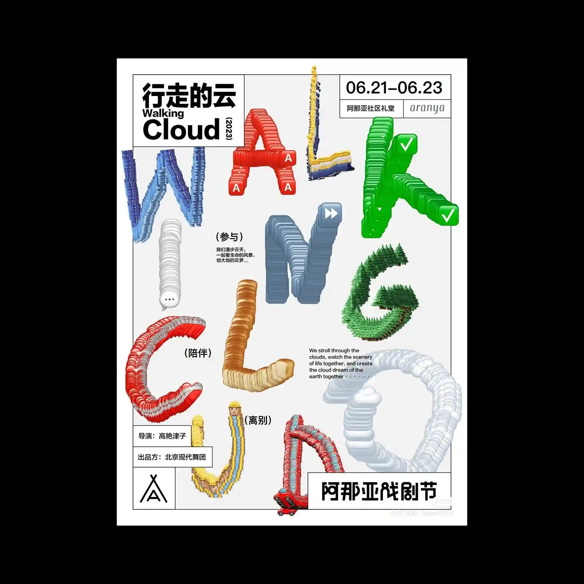
Each letter in the word “WALKING CLOUD” is built from a different 3D object stack, using materials such as trees, rubbery tubes, or plastic forms. The typography becomes sculptural, and the diversity in texture and structure makes each letter distinct. The background remains minimal to enhance the focus on typographic play.
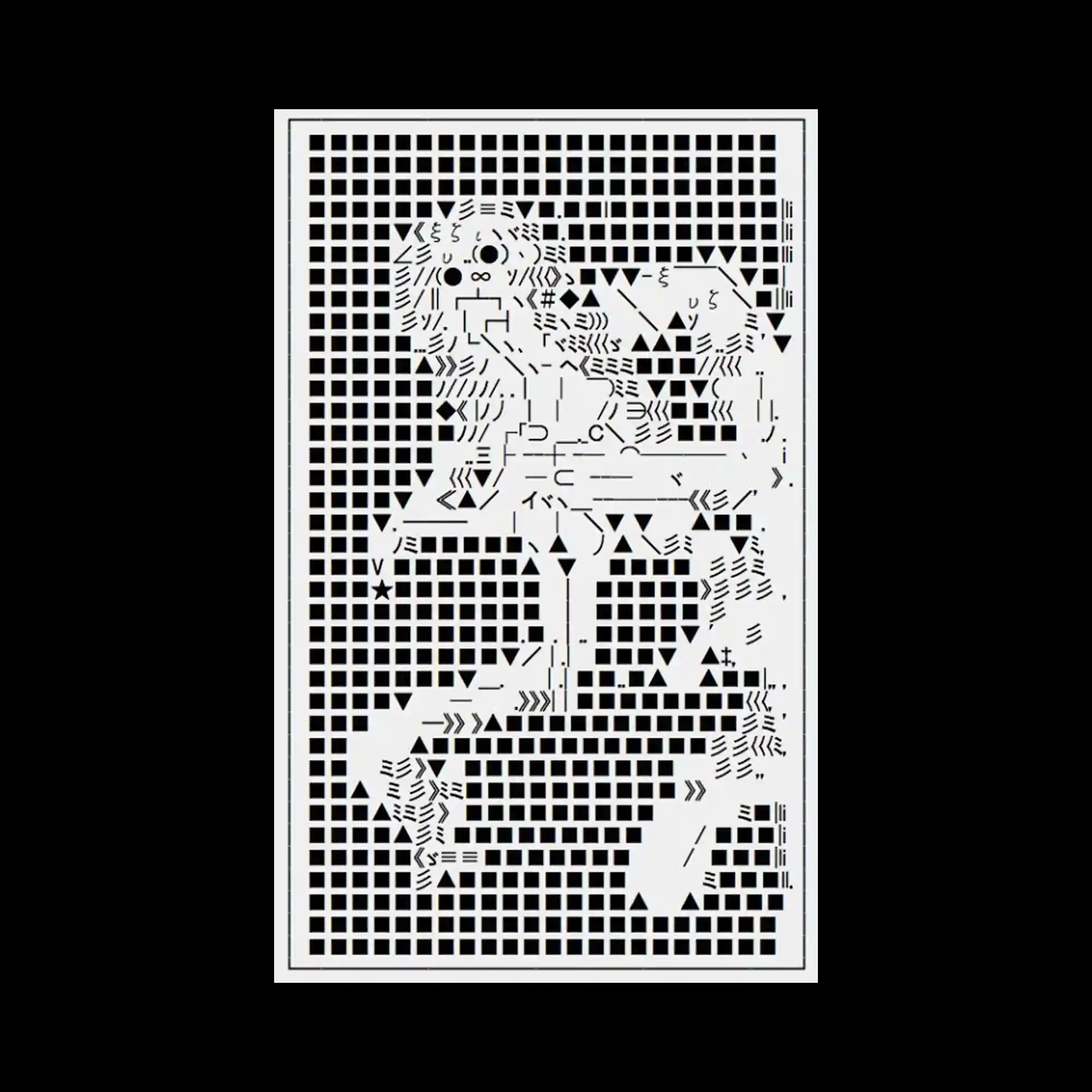
This poster uses a white grid of uniform squares as a background, through which a complex ASCII-art-inspired pattern emerges to form a lion. The image leverages repetition and negative space to construct an illustrative figure without traditional imagery. The entire composition feels digital, code-based, and symmetrical.
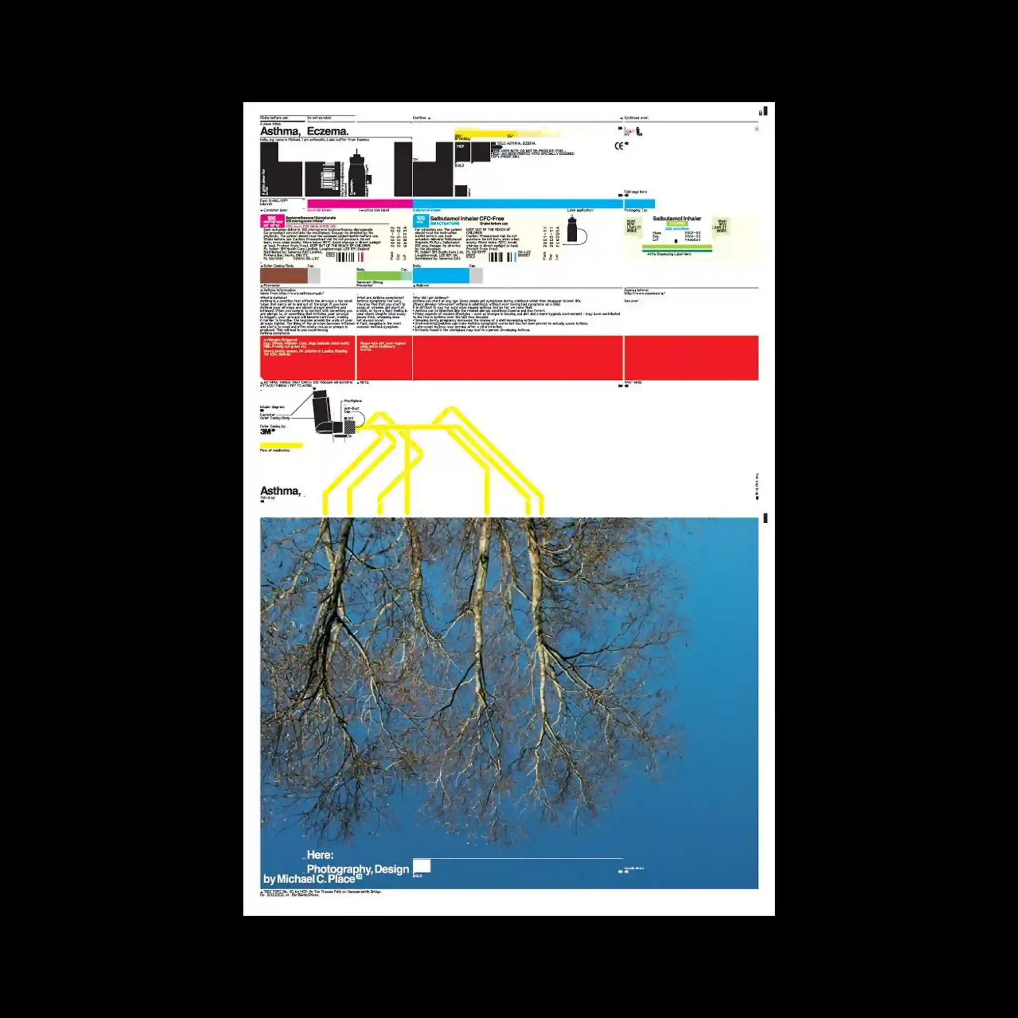
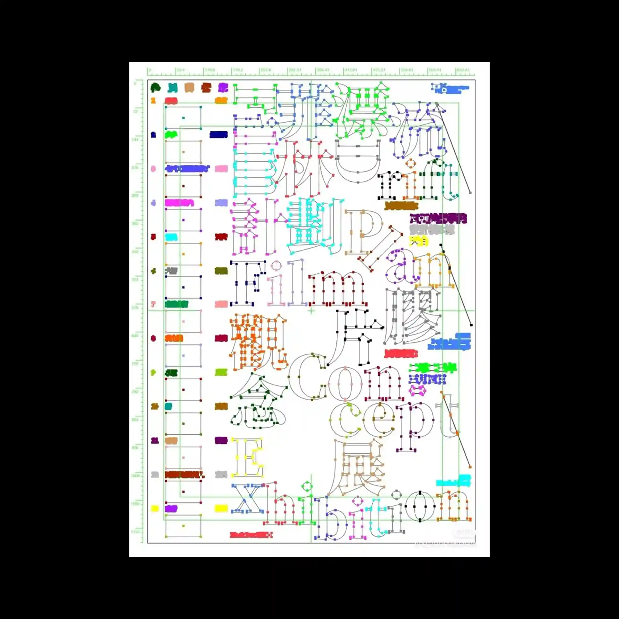
This poster is split into two contrasting halves: a highly structured, grid-based infographic above, and a serene, inverted photograph of bare tree branches against the sky below. The top half employs visual elements such as charts, diagrams, and color bars in a medical or technical layout style, with layered text and micro-typography. The lower half provides a visual counterbalance with its open space and organic imagery.
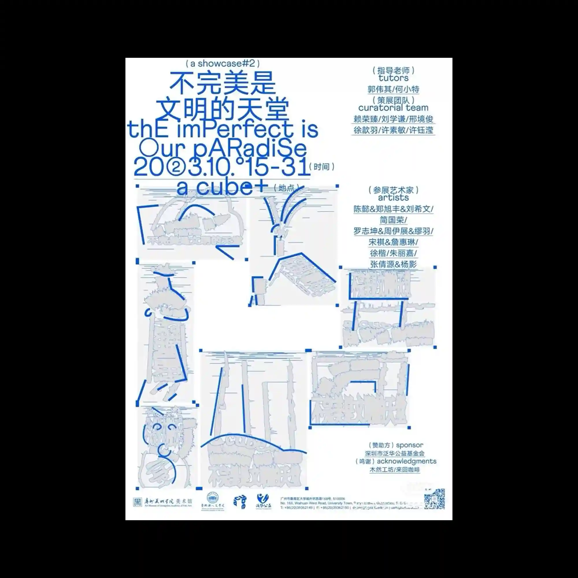
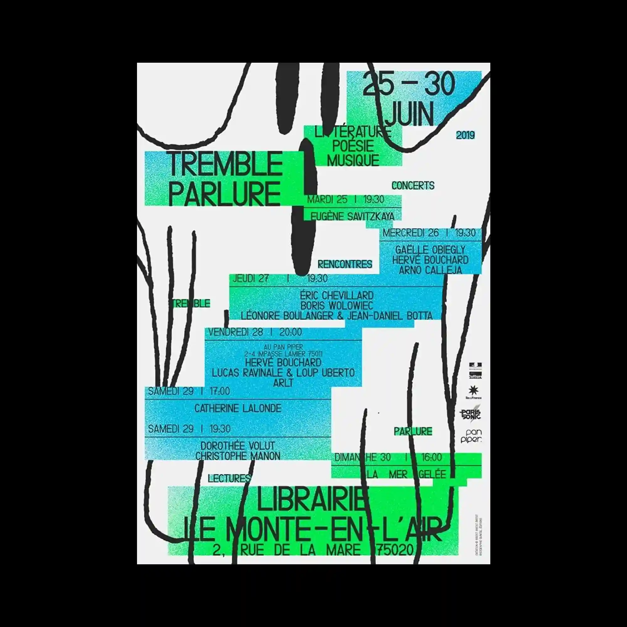
This exhibition poster adopts a curatorial layout that features fragmentary object sketches bordered by blue rectangles. The header typography mixes uppercase and lowercase styles, conveying experimental spirit. The asymmetric grid and minimal linework emphasize clarity and openness in spatial communication.
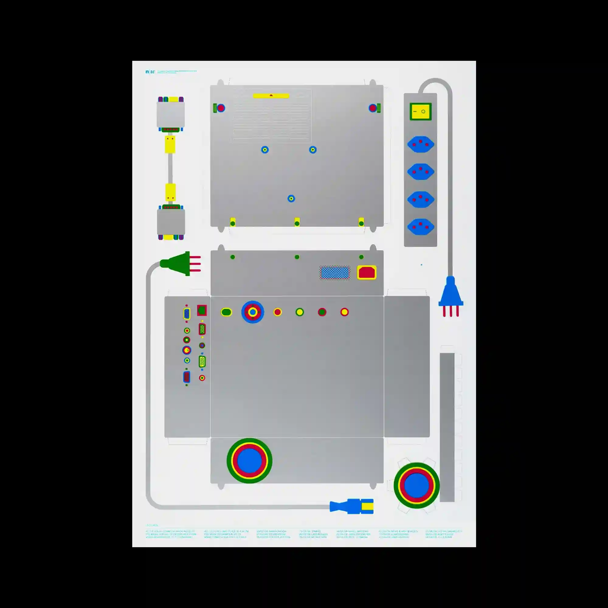
A schematic illustration simulates a hardware blueprint, presenting a fictional electronic device with sockets, plugs, and indicators. Flat vector shapes with saturated colors are arranged in modular zones, suggesting technical specificity. The mechanical symmetry and exaggerated simplicity reference retro-futuristic design language.

The design features irregularly cropped abstract shapes layered over handwritten Chinese calligraphy. Organic green and yellow blocks suggest landscape elements, while grainy textures simulate analog drawing. The composition balances structured rectangular zones with gestural linework, evoking a sense of controlled spontaneity.

The layout mimics an instruction manual, using iconographic graphics and bilingual typography in a highly structured grid. Visual hierarchy is achieved through numerical labeling and symbolic colors—red for human interaction, blue for material specifications. The overall aesthetic references retro packaging and precision product branding.

This digital rendering maps a satellite-style city grid onto a stylized human torso, warping geographic information along anatomical contours. The integration of real map labels onto a sculptural form blurs the boundary between data visualization and body mapping. The slight distortion around the navel accentuates the surreal tension between digital precision and organic curvature.
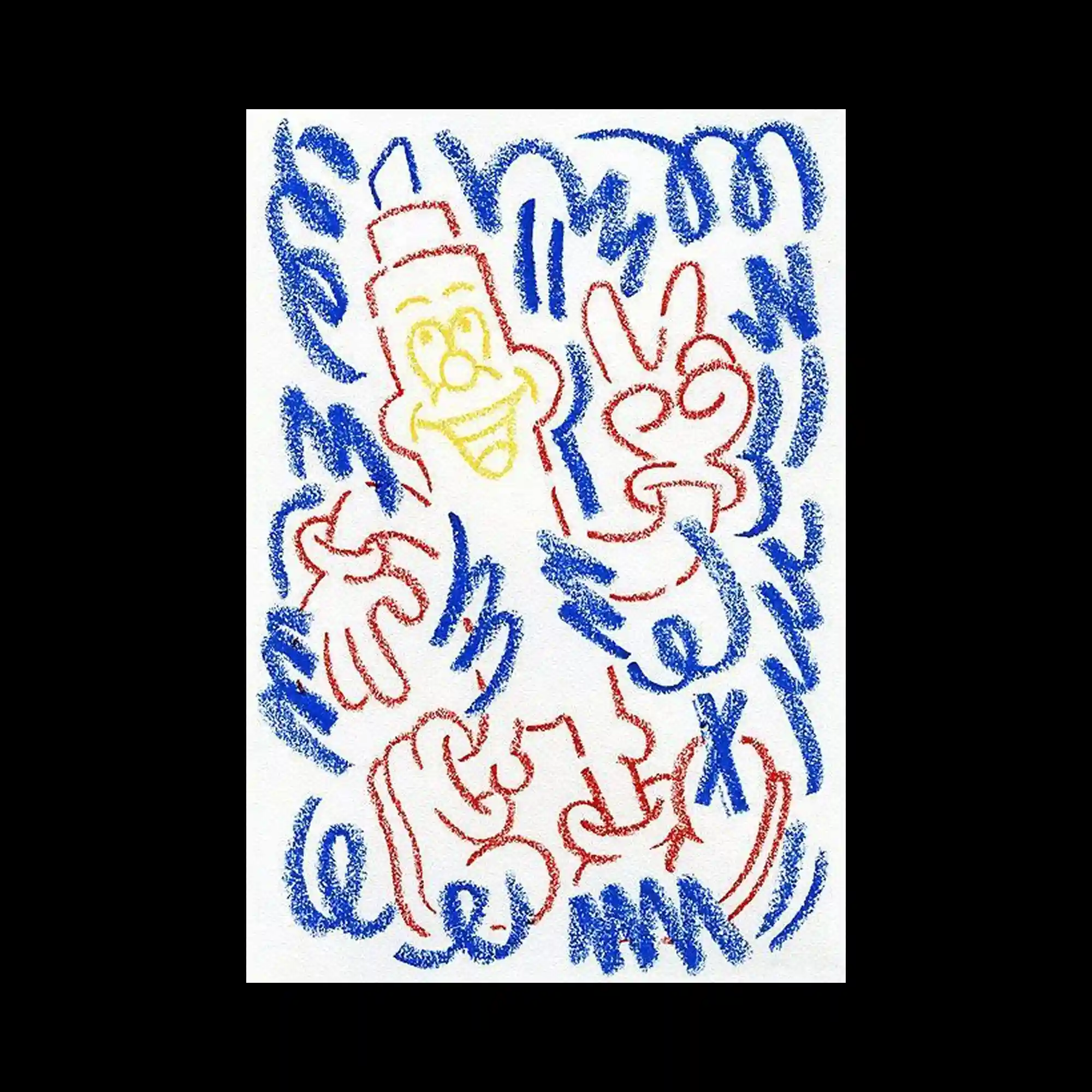
This drawing utilizes crayon-like textures and thick, playful lines rendered in red, yellow, and blue. Cartoon hands, facial expressions, and animated characters are scattered rhythmically across the surface, invoking childlike spontaneity. The dynamic repetition of lines creates a vibrating field of movement, balancing chaos with recognizable forms.

This composition overlays two photographic subjects using a grid-based pixel fragmentation technique, where square sections are shifted horizontally and vertically to produce a warped, glitched effect. The pixelated displacement distorts the human forms into mosaic-like abstractions, creating a jarring contrast between costume aesthetics and tattooed skin. The overall result is a fusion of identities, manipulated through computational visual language.

A surreal landscape shows ghostly white trees stretching up from the green hills, their roots spilling over a small red-roofed house. The sky blends from warm pinks to deep blues, setting an eerie and atmospheric tone. The melting shapes and stark color contrast evoke both dream and unease.
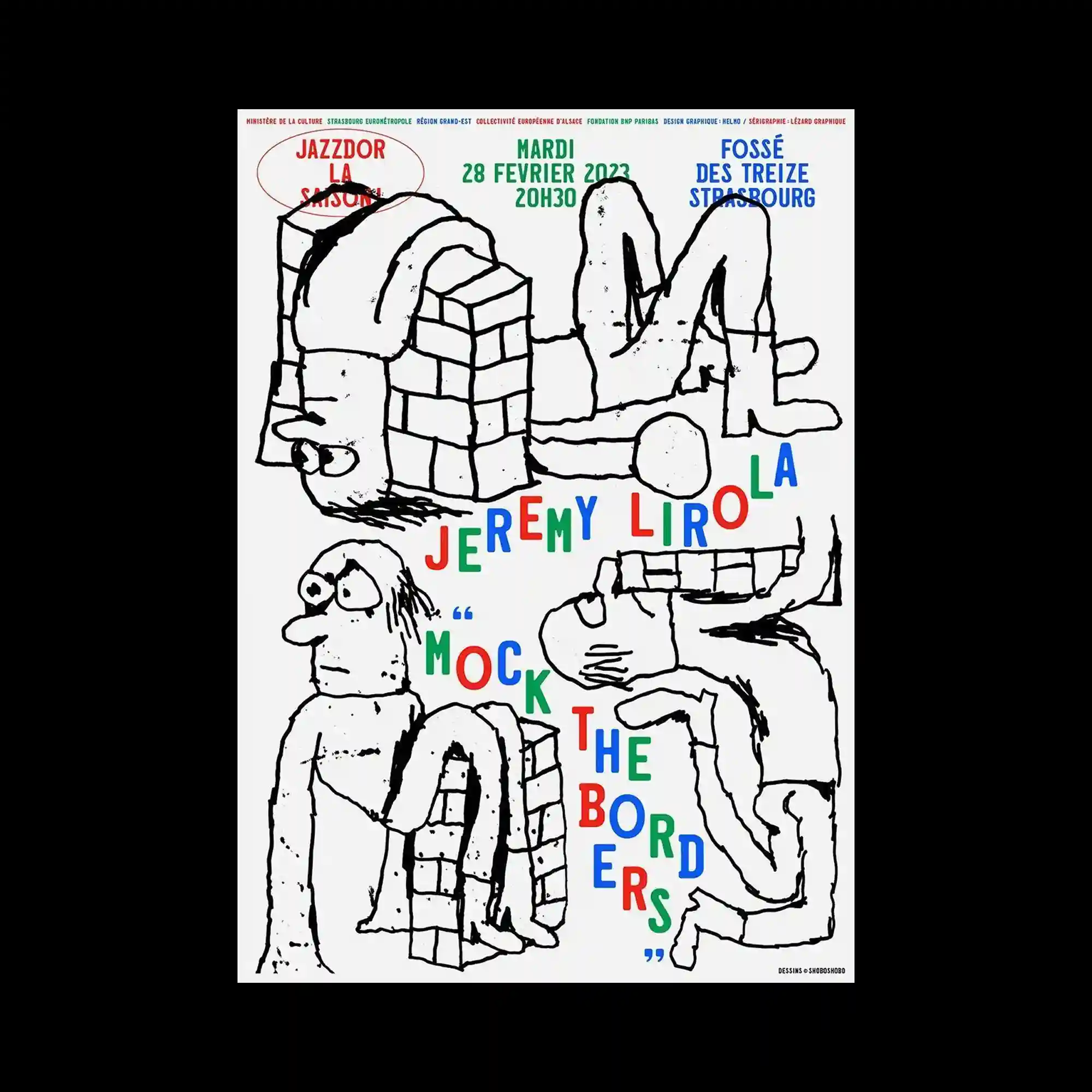
Hand-drawn cartoon figures constructed from bricks and bent limbs are arranged across a white background. Each character is rendered with rough, sketchy lines, paired with colorful text in playful, bouncing alignment. The mismatched typography and raw drawing style emphasize absurdity and improvisation.
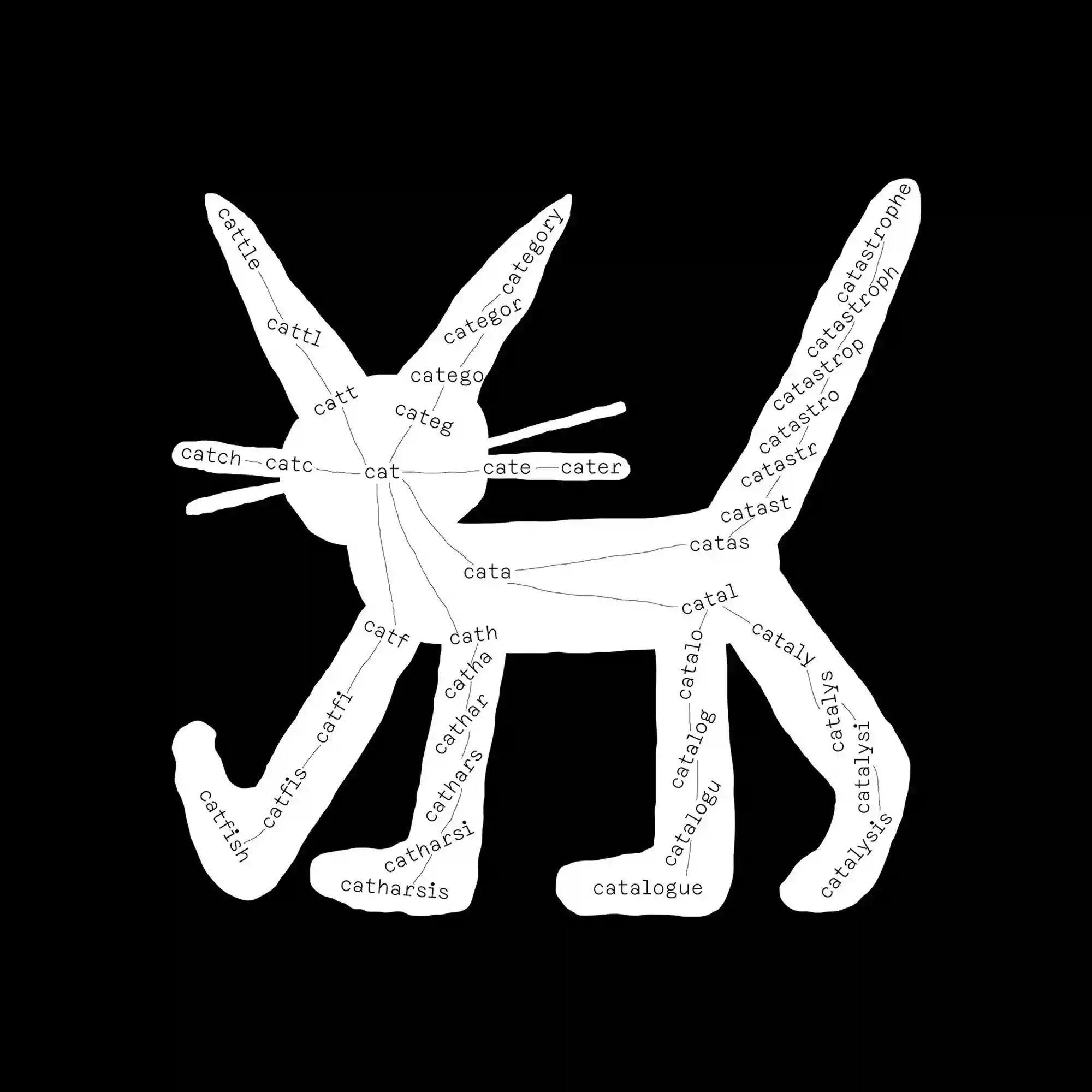
The silhouette of a cat is filled with branching words derived from the root “cat,” such as “catalyst,” “catch,” and “catfish.” This typographic exploration turns the feline shape into a diagram of linguistic morphology. The stark contrast between the white form and black background emphasizes the structure and semantic connections.

A stark black-and-white photo of stacked sound equipment anchors the bottom left, while an exaggerated blue soundwave radiates outward in sharp, rhythmic peaks. The background is divided into pastel yellow and cream sections, providing a soft contrast to the jagged wave. Handwritten typography adds a raw, informal energy to the otherwise geometric layout.
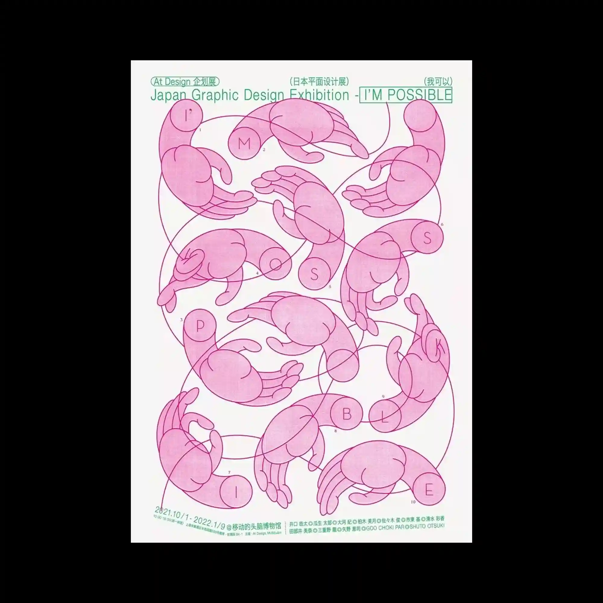
A repeating loop of stylized hand illustrations fills the space, each hand posed in slightly different gestures, forming a circular pattern. Thin magenta outlines define the hands, while a network of overlapping curves connects them into a continuous flow. The diagrammatic composition and use of line precision evoke a sense of instructional formality.
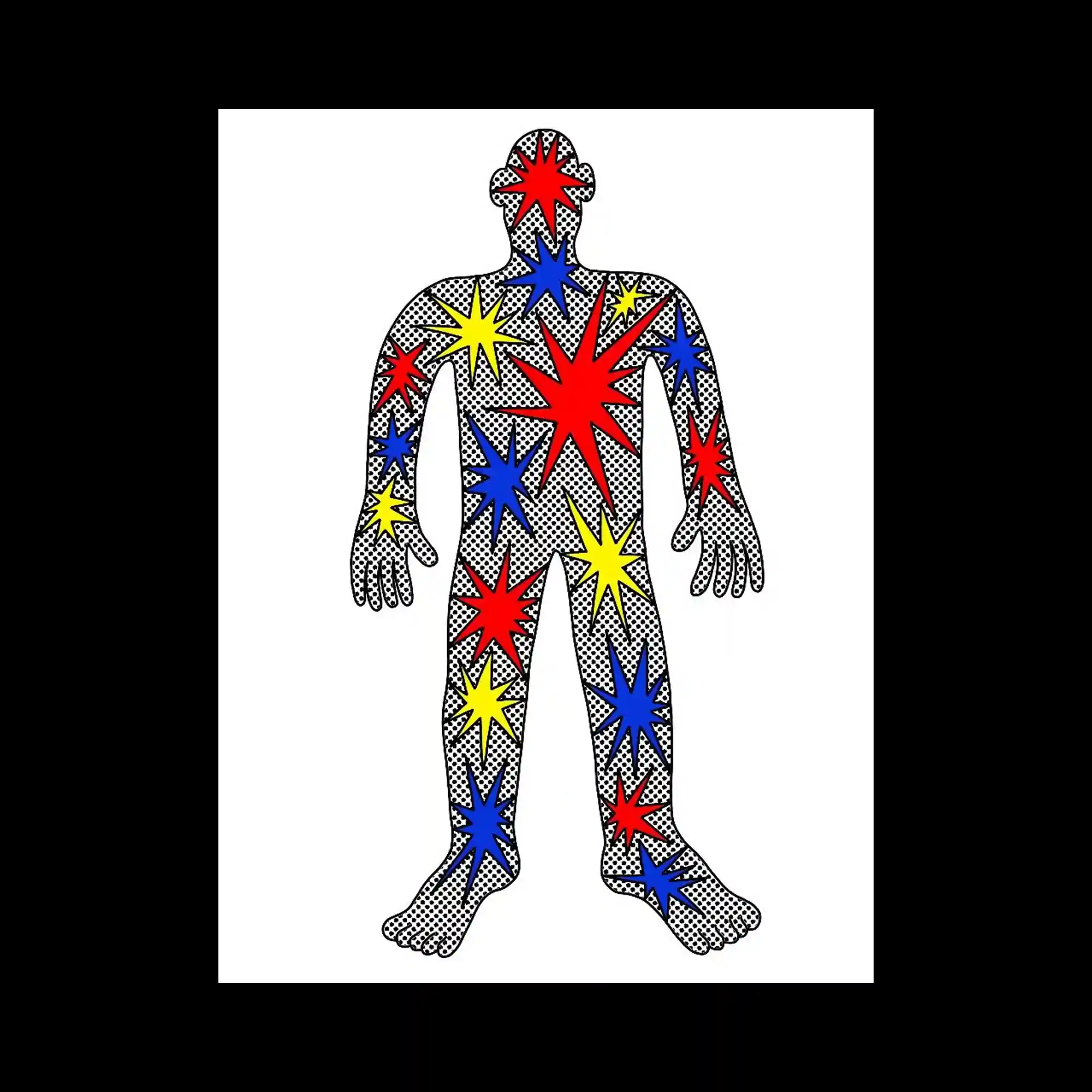
The human figure is stylized with comic book aesthetics, filled with high-contrast halftone dots and overlaid with sharp, multicolored starbursts. Red, blue, and yellow stars radiate across the figure’s form, suggesting motion or impact. The repeated star motif and dotted texture evoke a retro-pop sensibility with dynamic graphic energy.

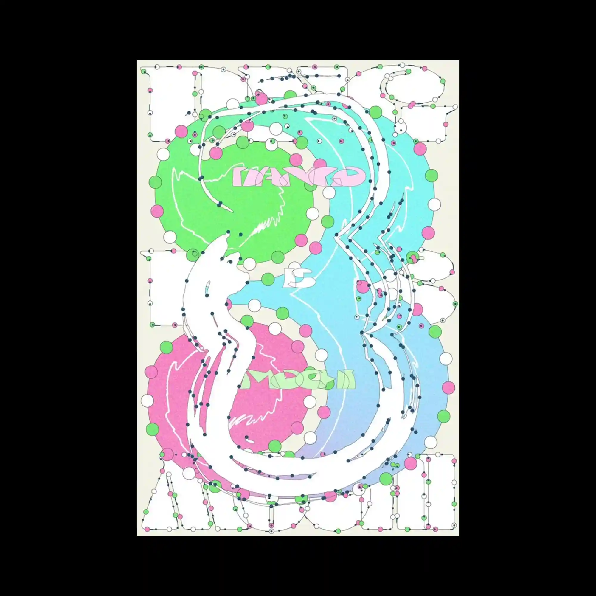
A bold typographic character dominates the canvas, rendered in a thick pink silhouette with an overlaid web of green contour lines. These sweeping lines loop and swirl across the surface, generating a sense of dynamic entanglement. The interplay of flat solid forms and thin, wiry strokes creates a layered visual experience that feels both controlled and chaotic.
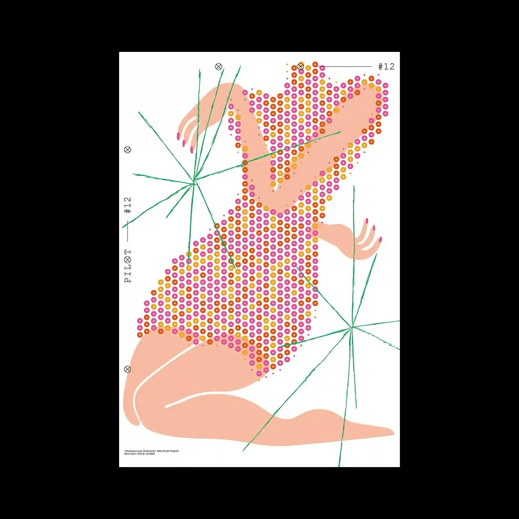
A reclining female form composed entirely of tightly packed concentric circles in pink, orange, and purple, intersected by sharp green starburst lines.
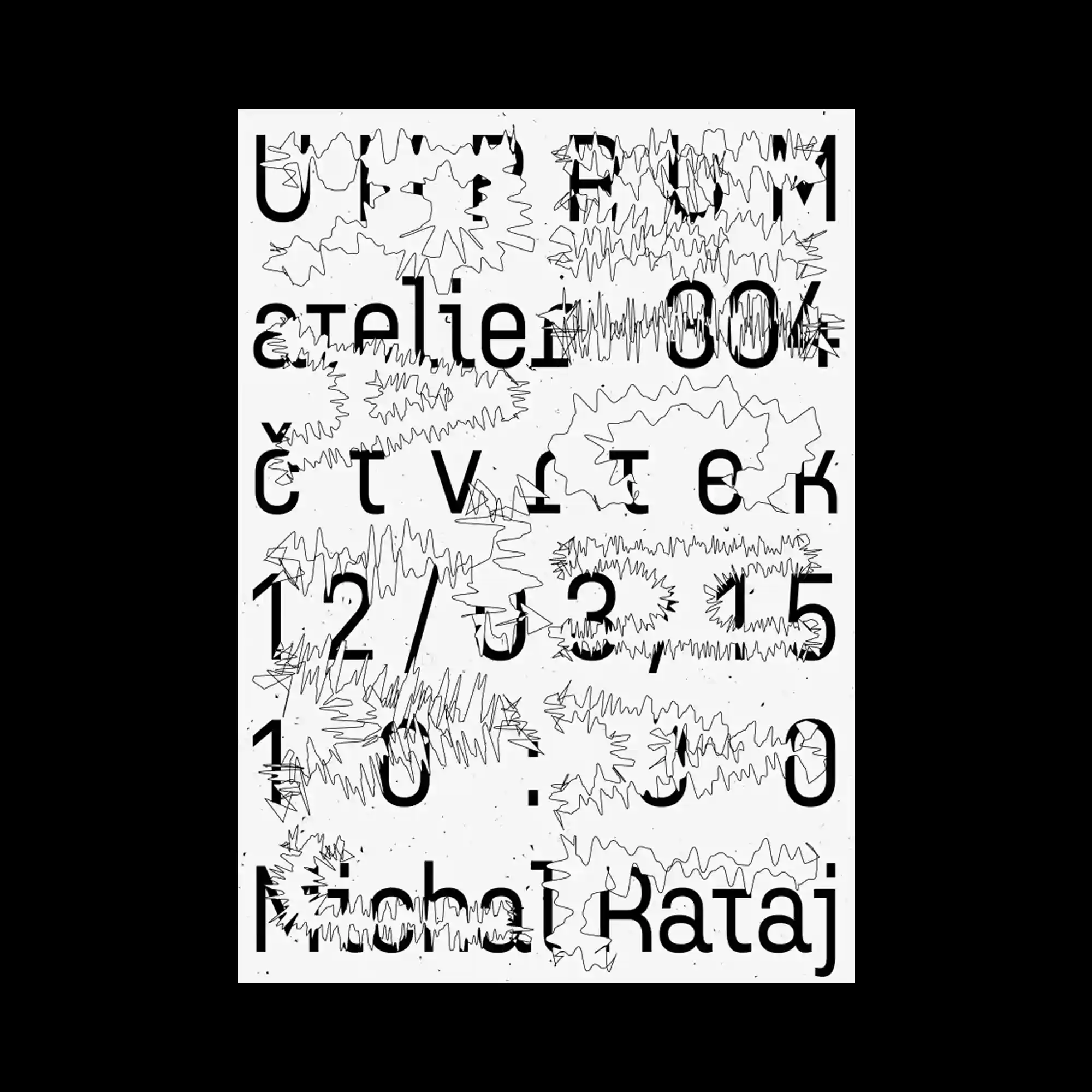
Black geometric sans-serif typography is overlaid with erratic hand-drawn zigzag strokes, creating contrast between structured layout and organic noise.

A floating arrangement of multicolored circular letters scattered over soft, inflated translucent letterforms, creating a layered and luminous composition.

A nostalgic digital fashion layout styled after MS Paint, displaying a doll-like female figure with sparkles, surrounded by selectable outfit icons and retro interface elements.
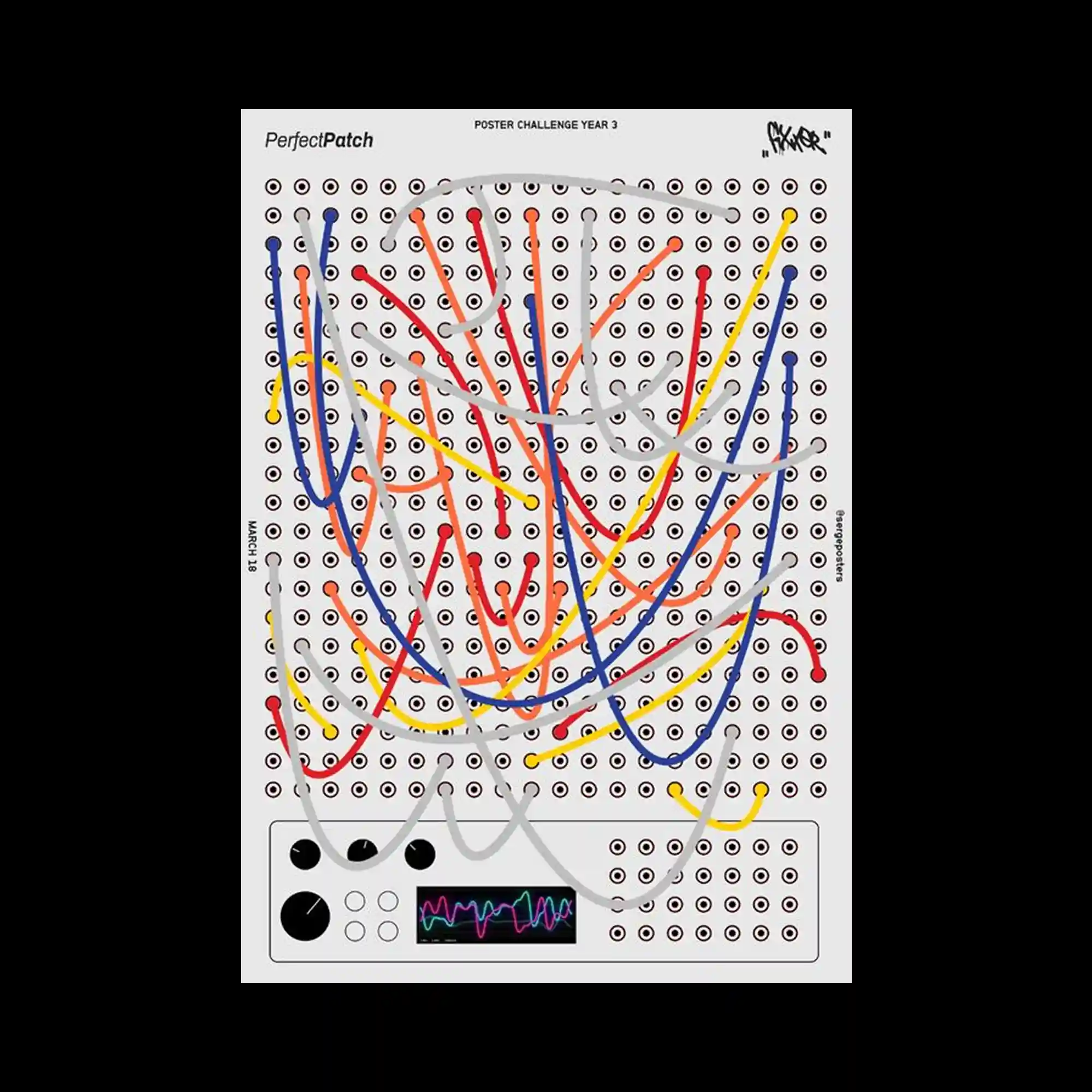
A modular synthesizer-style graphic densely filled with multicolored cables in red, blue, yellow, and gray, tangled across a matrix of sockets and interface dials.
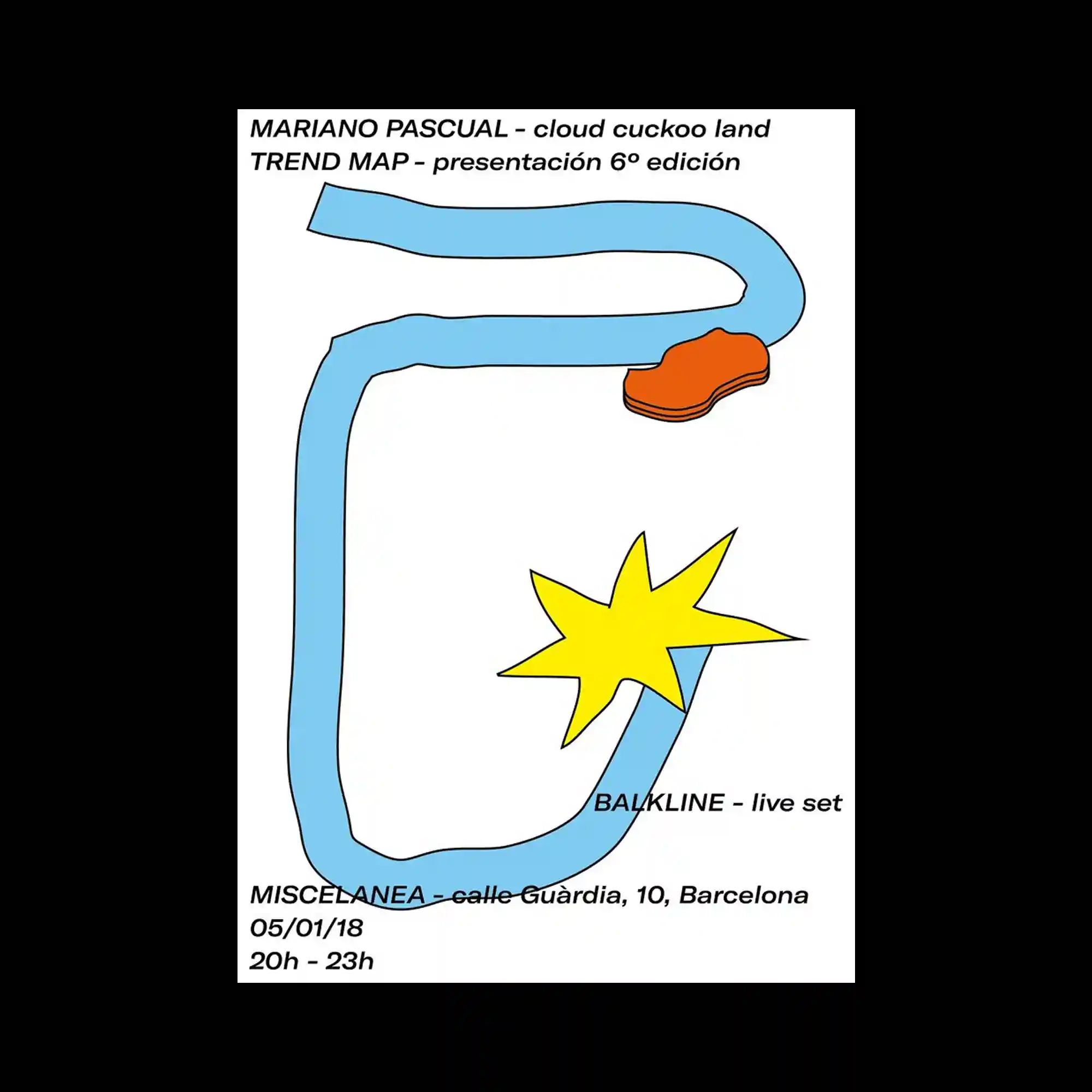
A minimal composition featuring thick blue curved lines forming a loose frame, a yellow star shape piercing through the lines, and a red abstract blob at the corner.

A monochrome scan of a standardized multiple-choice test sheet emphasizes repetition, grids, and optical symmetry, evoking themes of regulation, assessment, and depersonalization.
Red and green overlapping text set in a bold geometric font vibrates over thin black contour lines that radiate outward, evoking a kinetic, optical illusion.

A manga-style eye and expression are fragmented into abstract symbols and blue scribbles, creating visual chaos filled with hand-drawn grids and vertical scripts arranged around a central explosion.
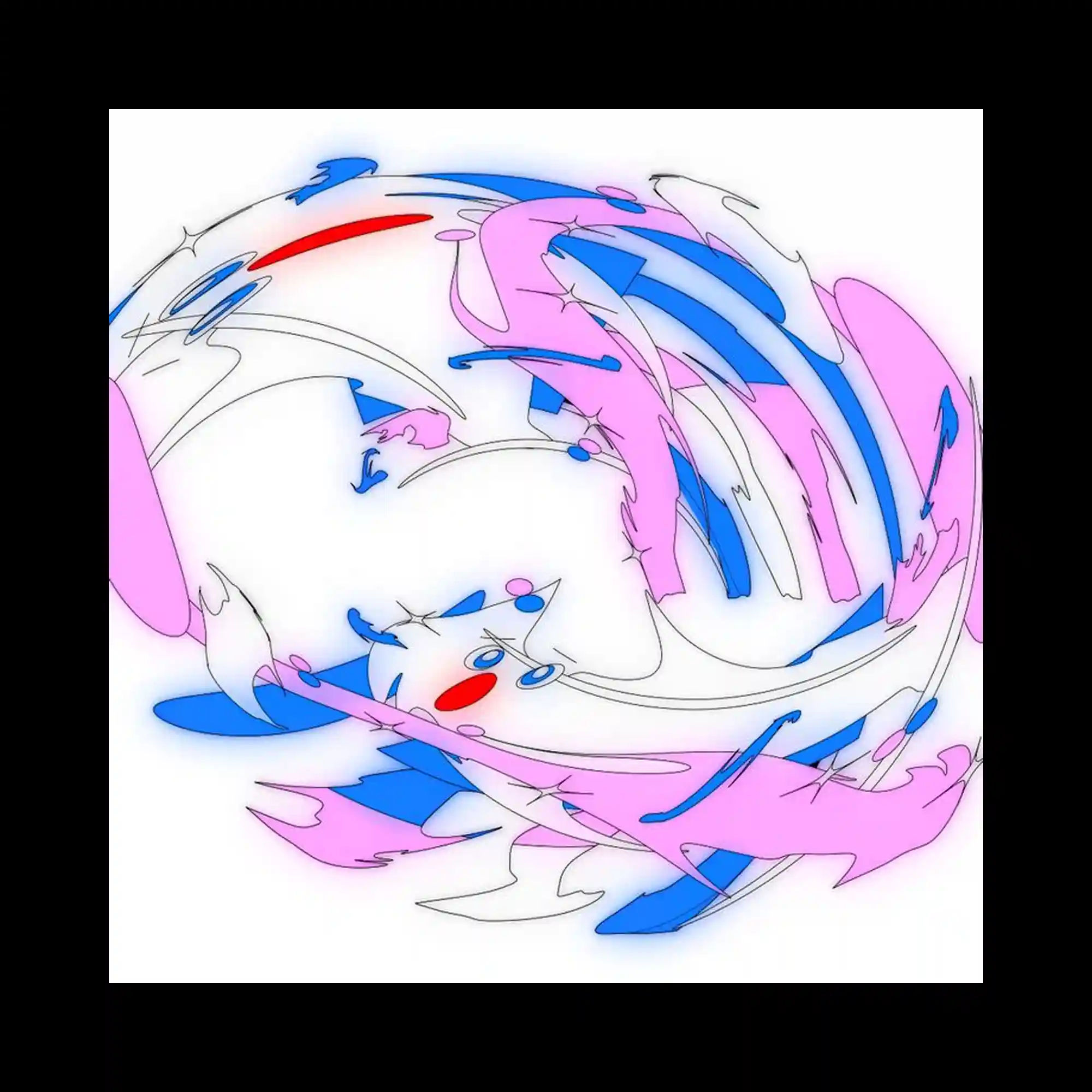
Abstract curved lines in pink, blue, and red twist across a white background, forming a vortex-like composition with a slight 3D illusion, enhanced by faint glows and shadows.
A bright yellow fuzzy character with googly eyes takes center stage, with jagged bubble typography in pink forming the event details in a playful, childlike aesthetic.
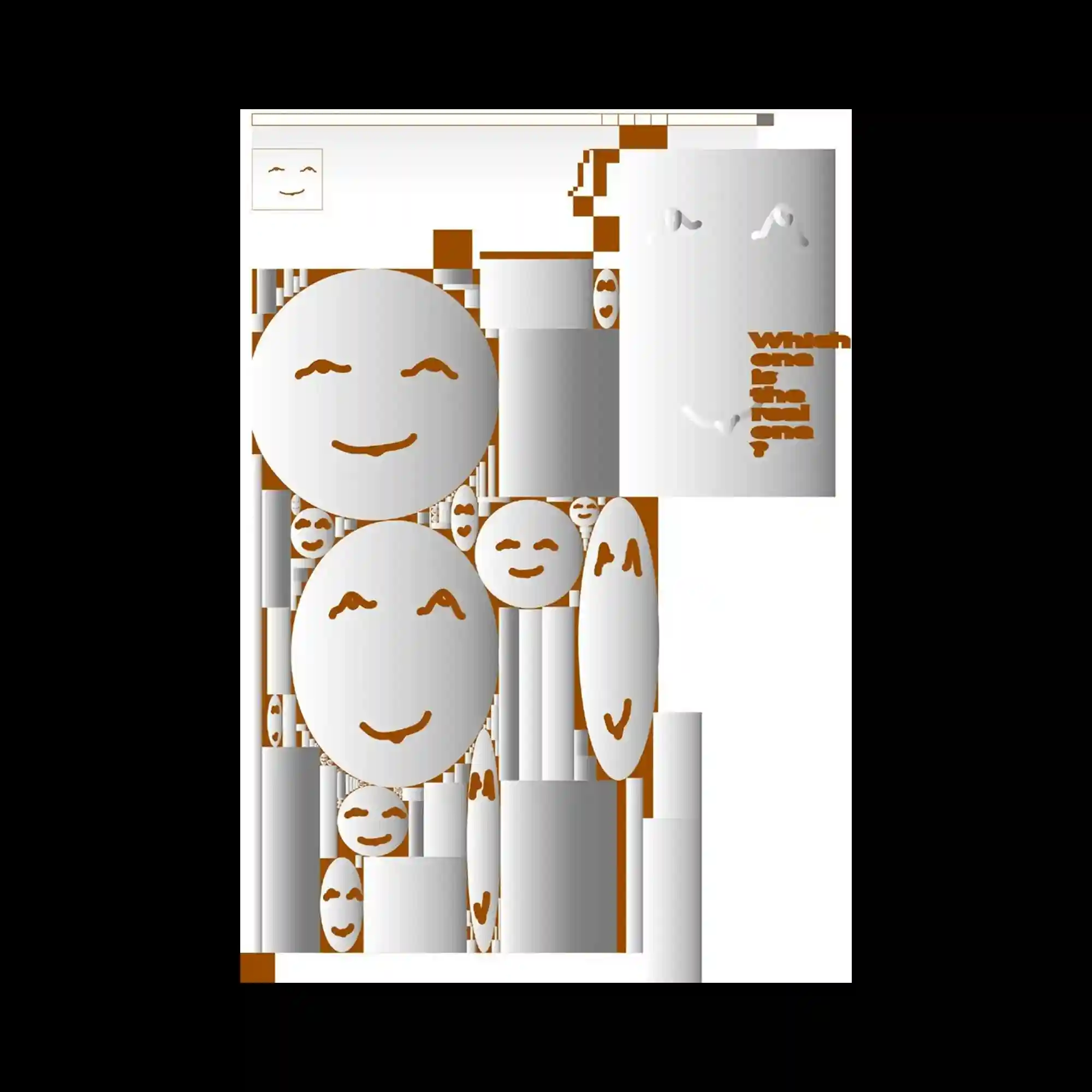
A white-based composition with brown smiling emoticons in different scales, repeated with rhythm to generate a surreal yet friendly tone
A typographic poster with oversized Chinese and English text that overlays vector anchor points, resembling a font design file layout

A highly saturated, modular event poster segmented by date, where overlapping typography and colorful pixel blocks dominate the layout
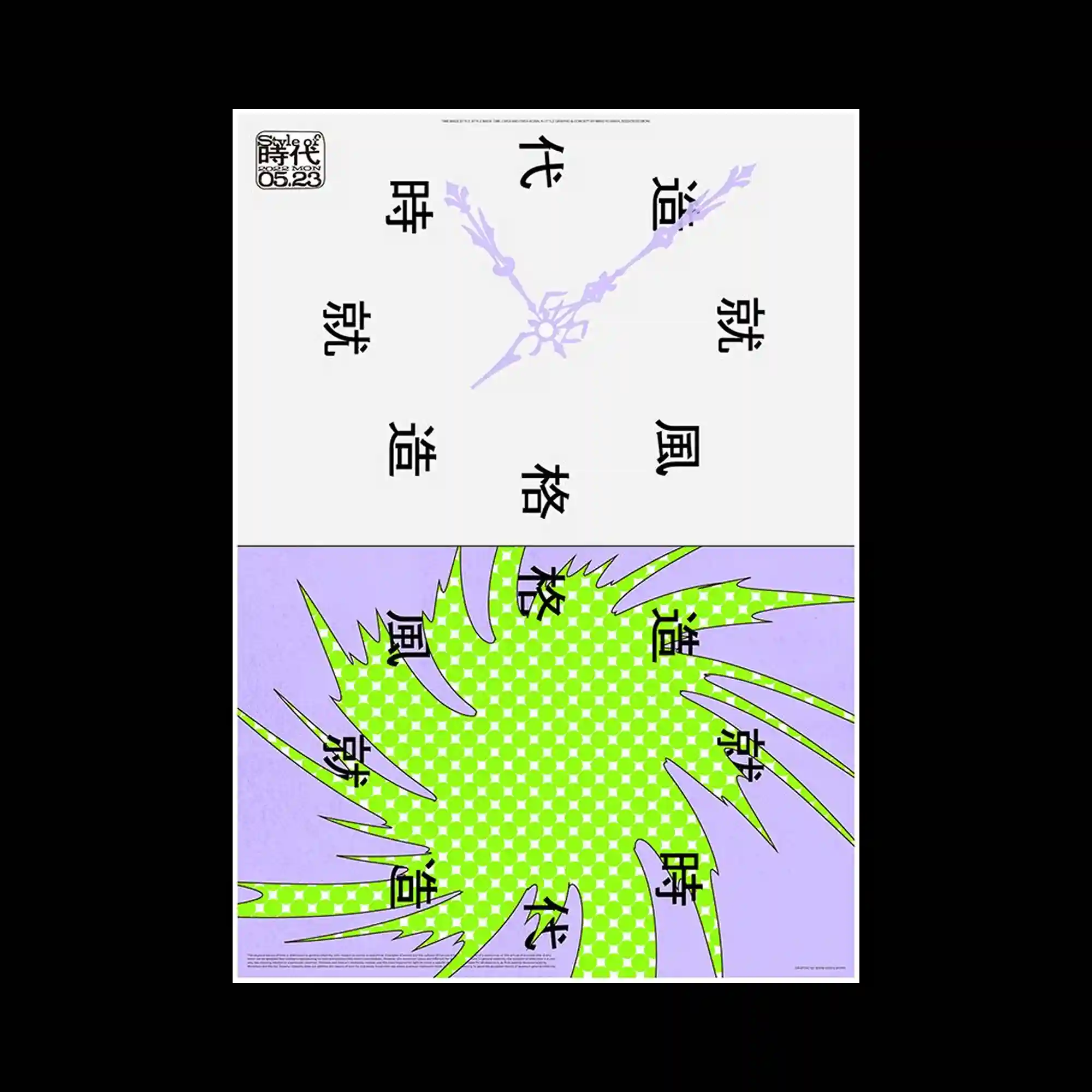
A vertically split minimalist poster showing stylized clock hands and Chinese characters on top, with a jagged green shape over a lavender grid below
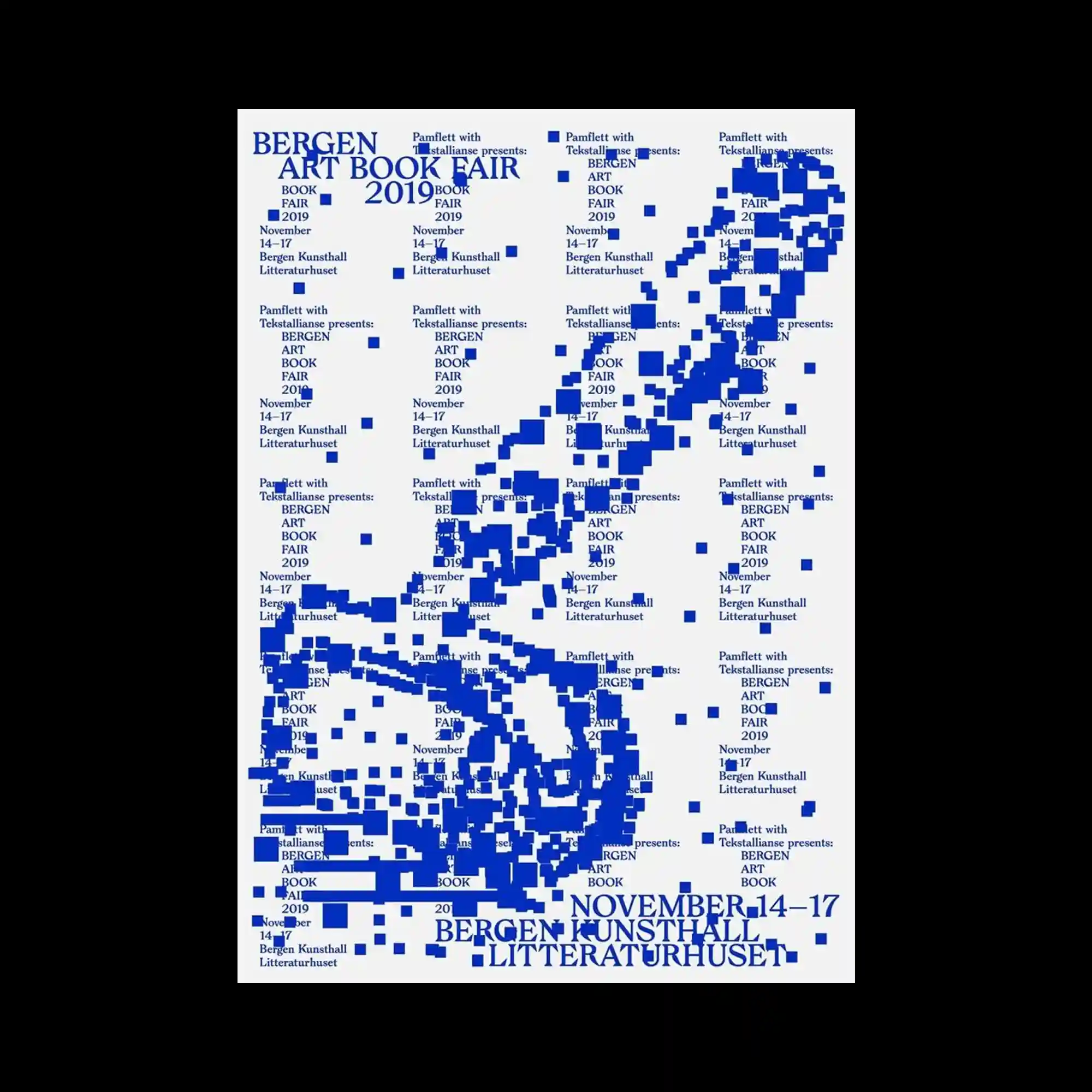
A typographic image composed of small blue squares and densely repeated text blocks arranged to depict the silhouette of an elongated tool, integrating event information into the overall form.
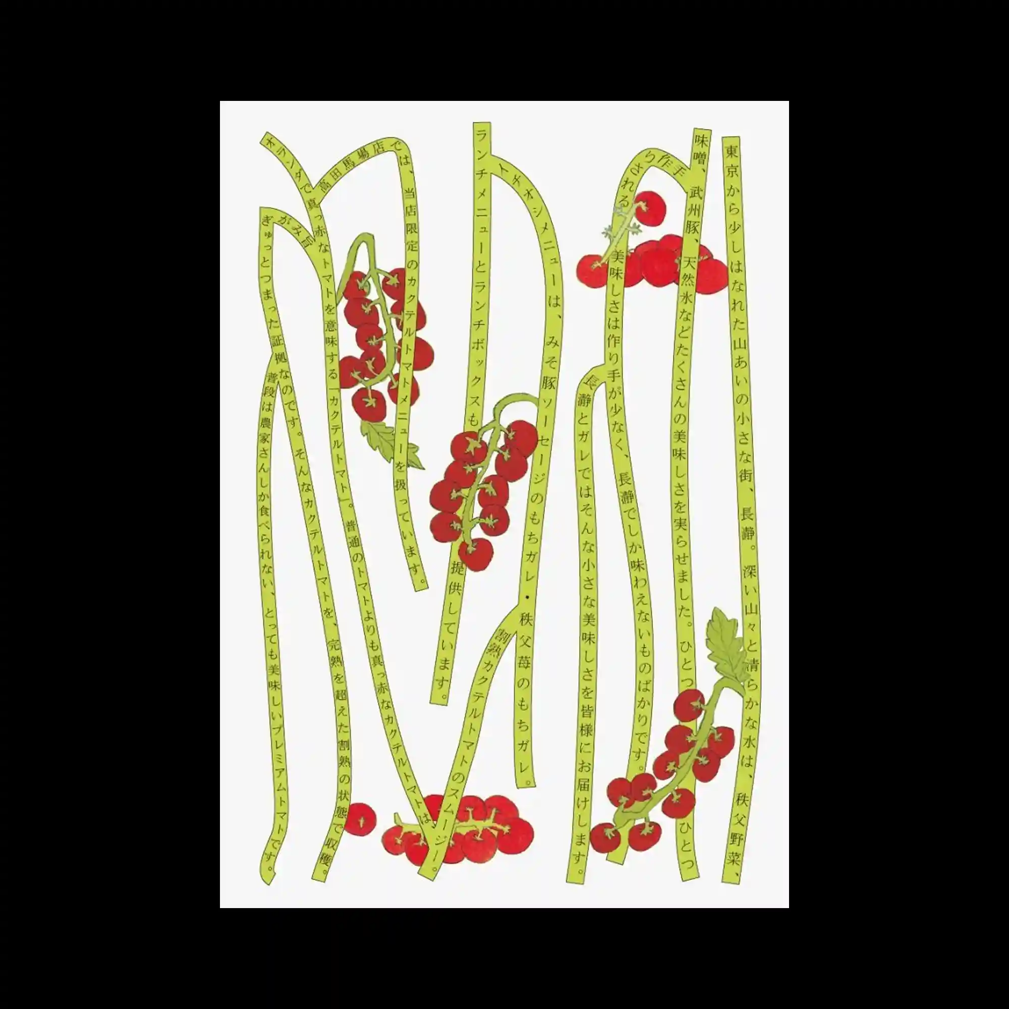
A minimalistic white background with long, curving yellow stalks of text intertwined with bright red tomato illustrations in a vertical composition.

A monochrome black-and-white layout with contour lines in the background and thick, pixelated characters dominating the foreground; minimal contrast.
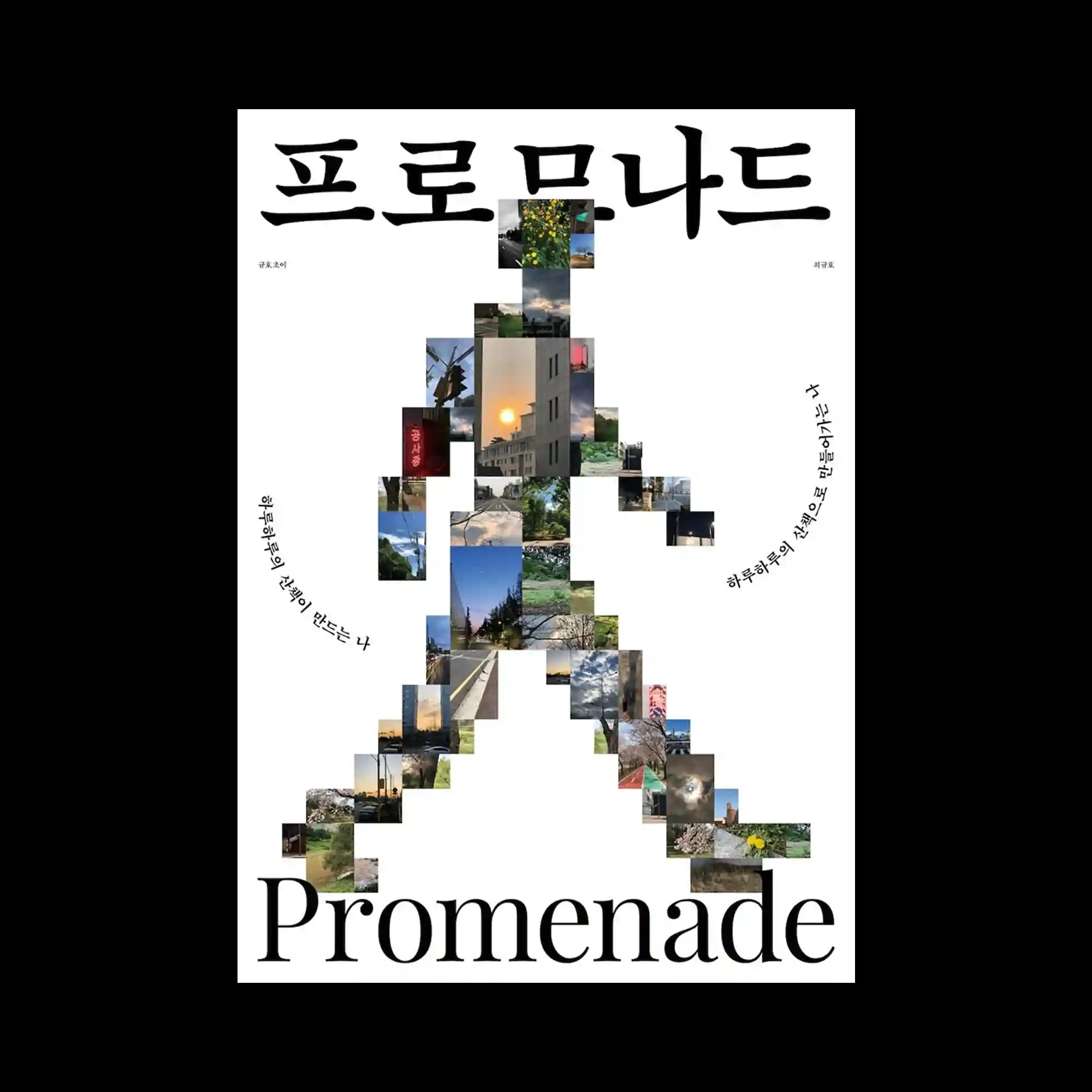
A white background featuring a walking human figure composed entirely of small landscape photographs, with Korean typography arranged around the silhouette.
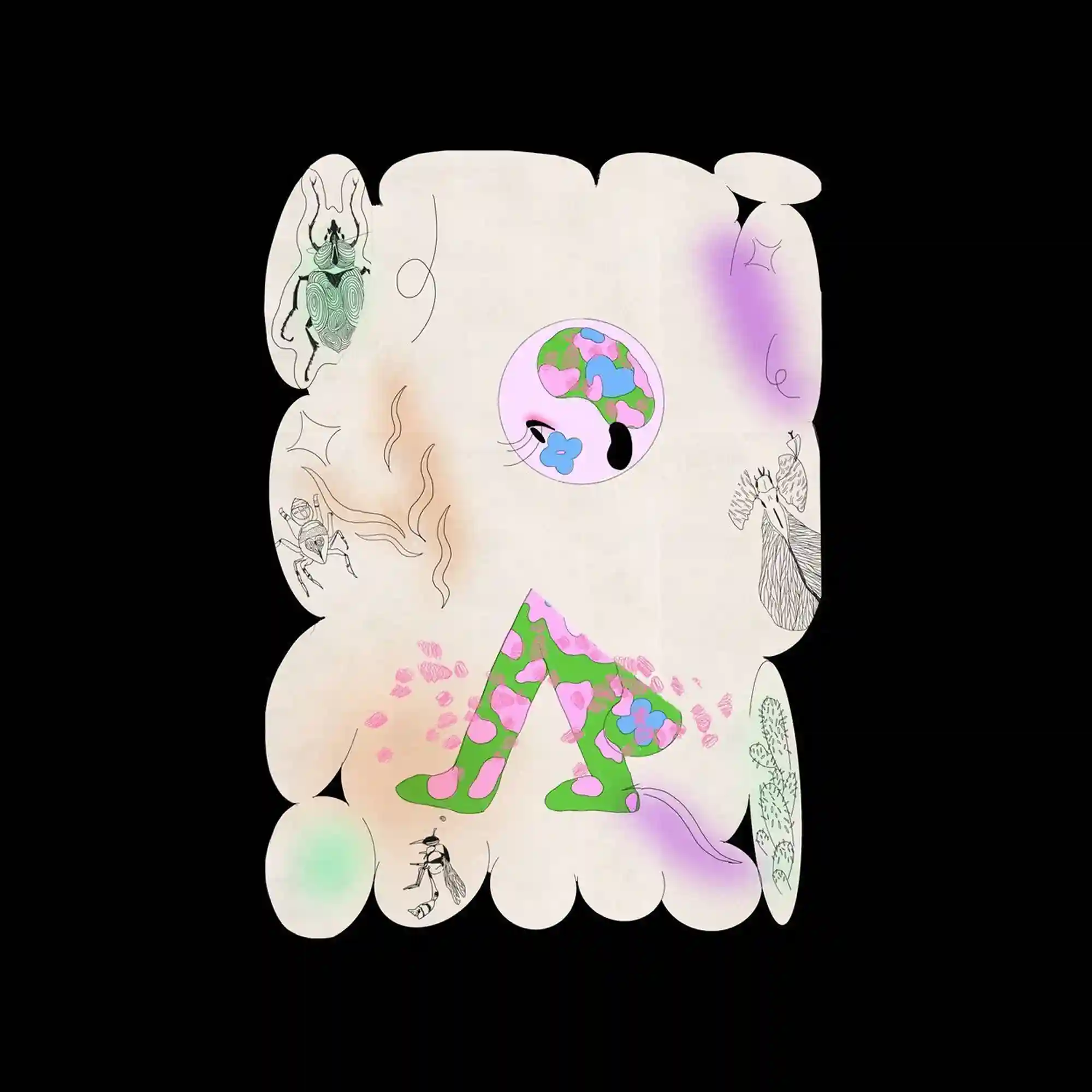
Minimalist off-white background with pillowy rounded edges, scattered thin-line doodles, pastel airbrush shadows, and a central flower-patterned cartoon figure.
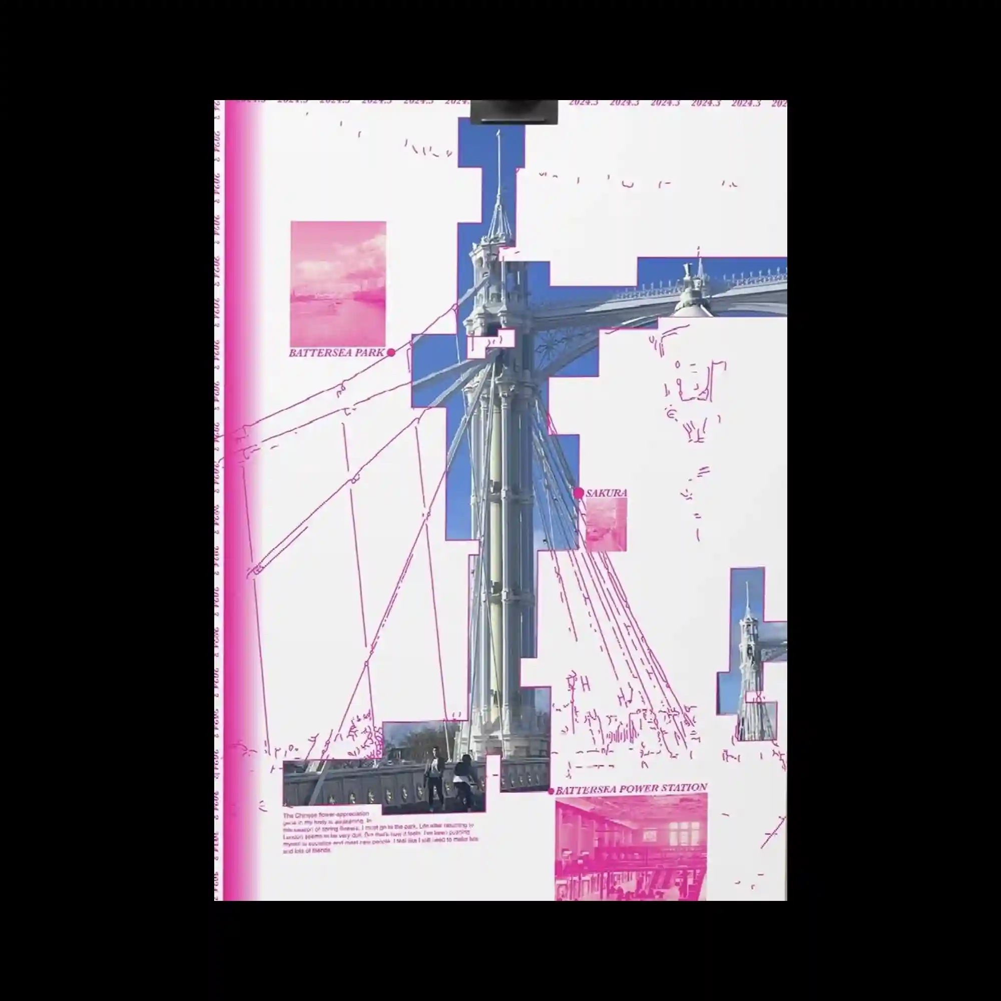
A composite collage featuring architectural photography of a suspension bridge, overlaid with diagrammatic pink linework and rectangular photo cutouts in pink and blue.
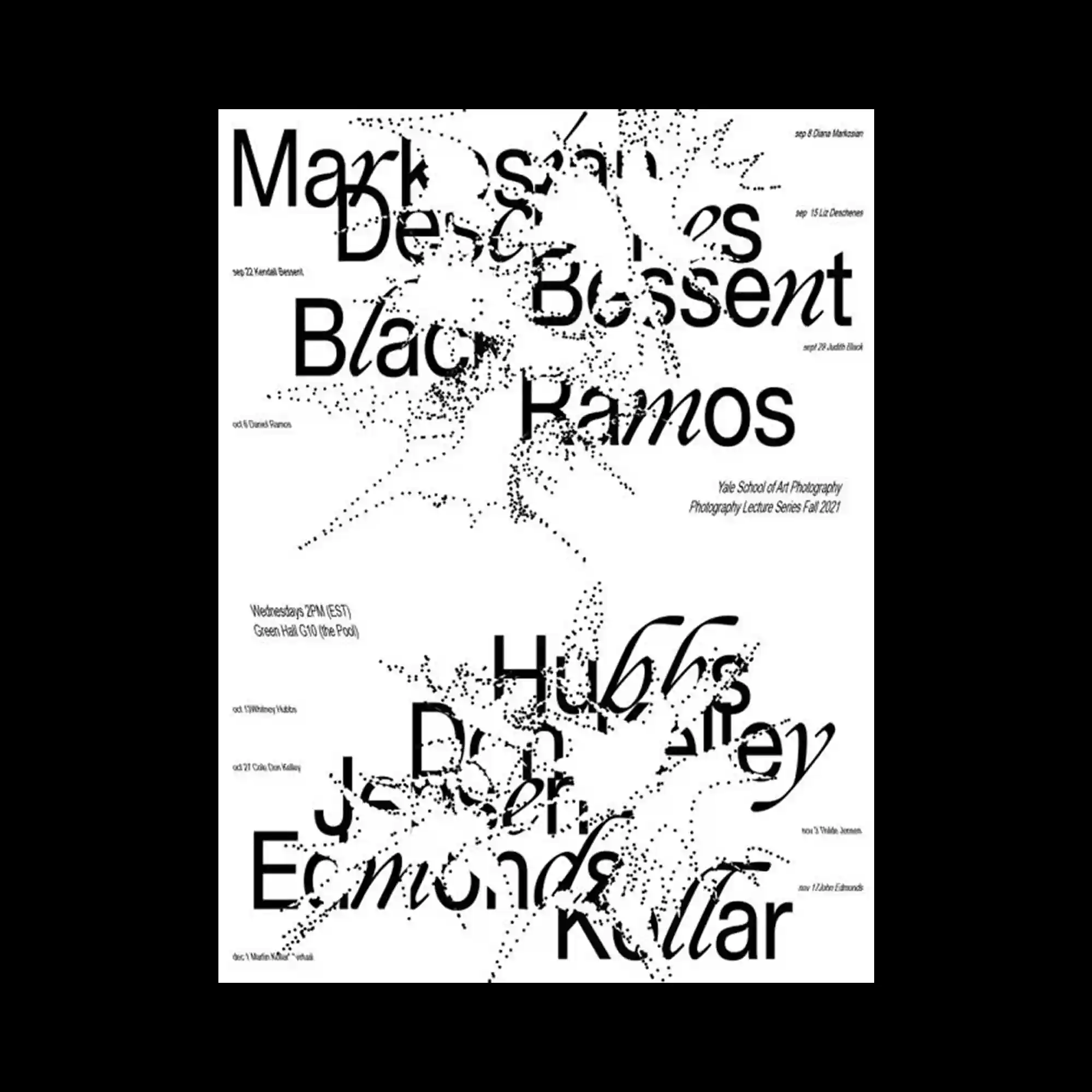
Large, overlapping black sans-serif and serif typography dominates a white background, intersected by fine, particle-like textures that resemble dispersed ink or data points.

White cut-out tree-like silhouettes layered over a blurred watercolor background, with faint gridlines and subtle English text at the bottom.
An illustration built from dot-and-line modules forming organic curved shapes in pastel tones of green, pink, and blue, arranged symmetrically.
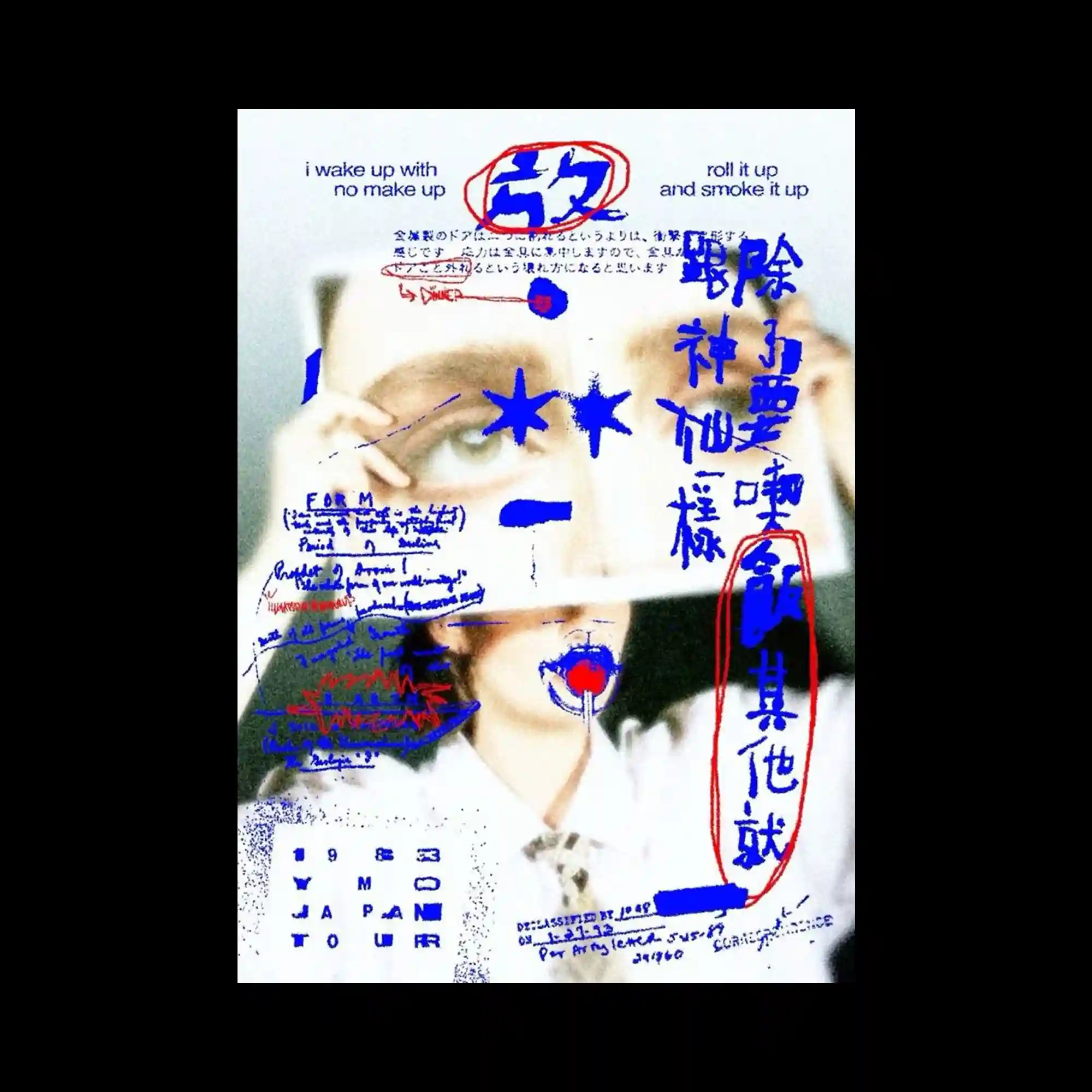
A layered photographic poster with a grainy close-up of a face overlaid by blue and red handwritten-style text and symbols.
A high-contrast monochrome poster featuring vertical Korean and English text, with abstract cloud-like black shapes diagonally intersecting the page.
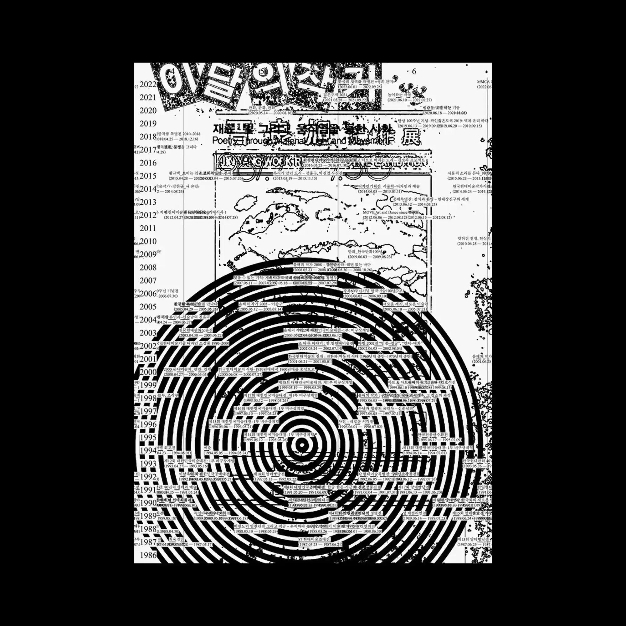
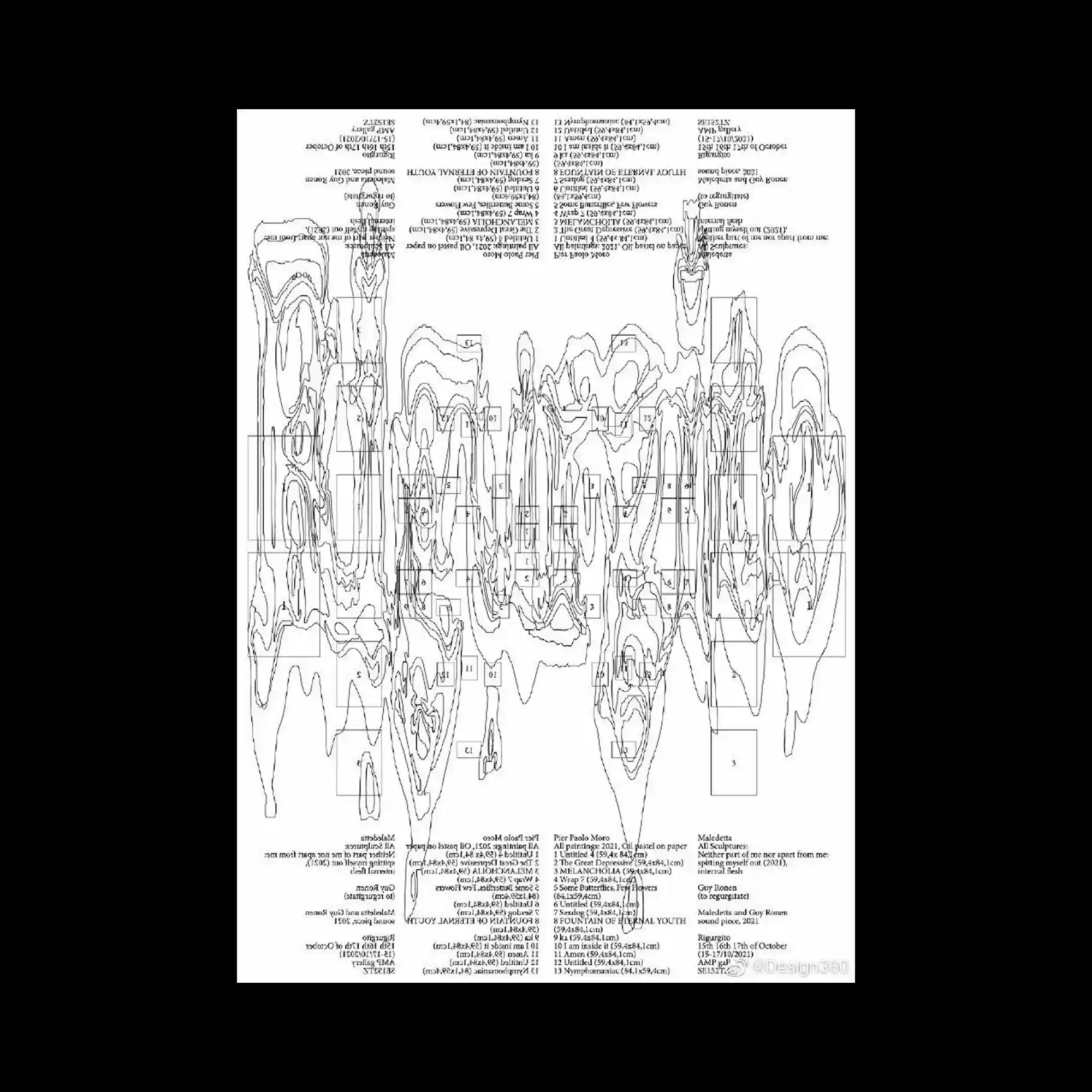
Black and white timeline-style layout with heavy spiral target graphic overlaying a chronological list of years and exhibition events in Korean.

Soft-focused photo of folded objects combined with vertically arranged cryptic text and magenta circular scribbles, framed by “KORNER” and “DECEMBER.”
Poster composed of ultra-dense contour lines resembling topographic mapping, interlaced with inverted text blocks and technical references.

Psychedelic symmetric frame filled with airbrush gradients, metallic textures, and a central glowing orb surrounded by Gothic lettering.

Layered exhibition poster combining botanical, mechanical, and calligraphic imagery with multilingual text, featuring the Nam June Paik Art Center.
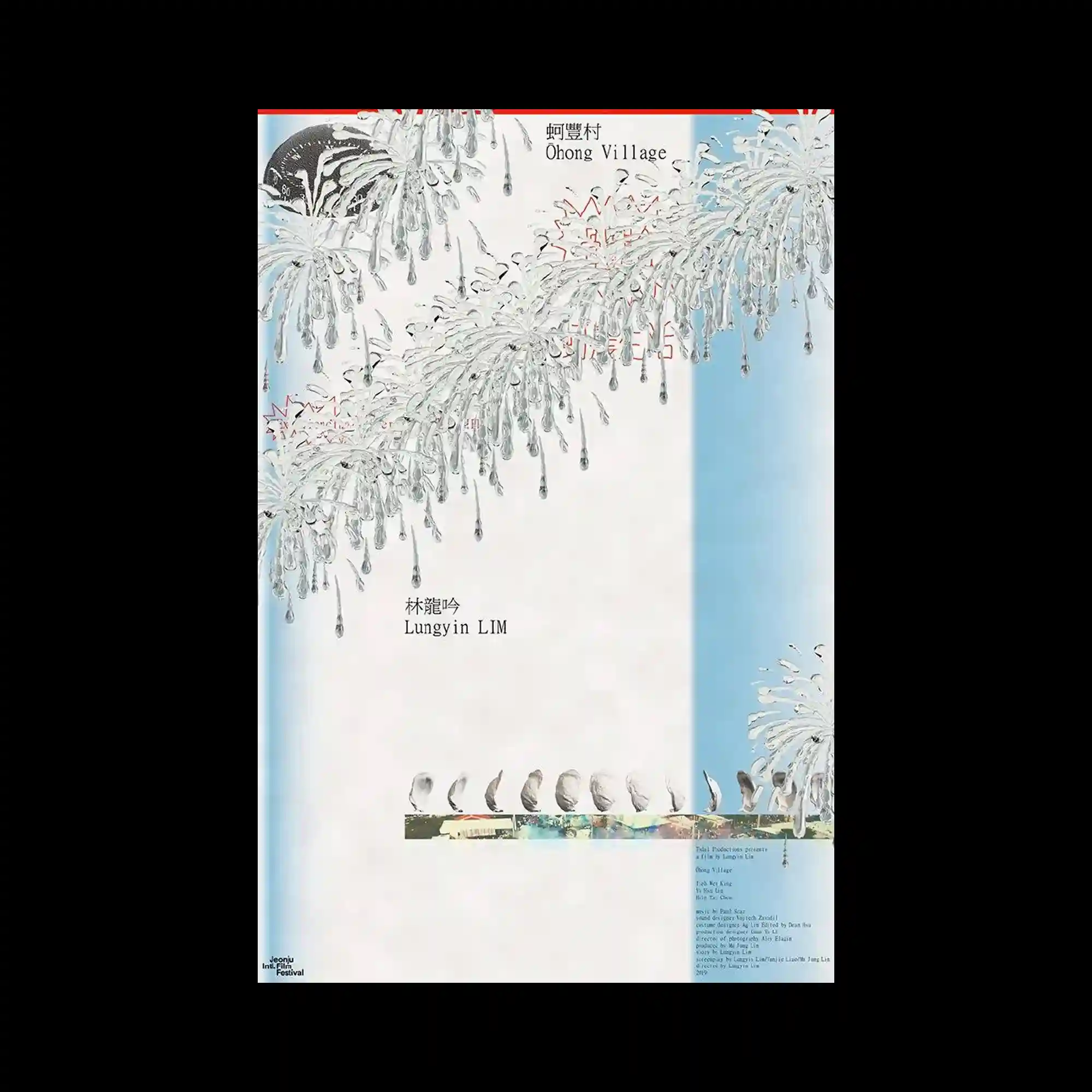
Poster featuring delicate line drawings of fireworks and birds, with vertical and horizontal symmetry, combining Chinese characters and English titles like “Ohong Village.”
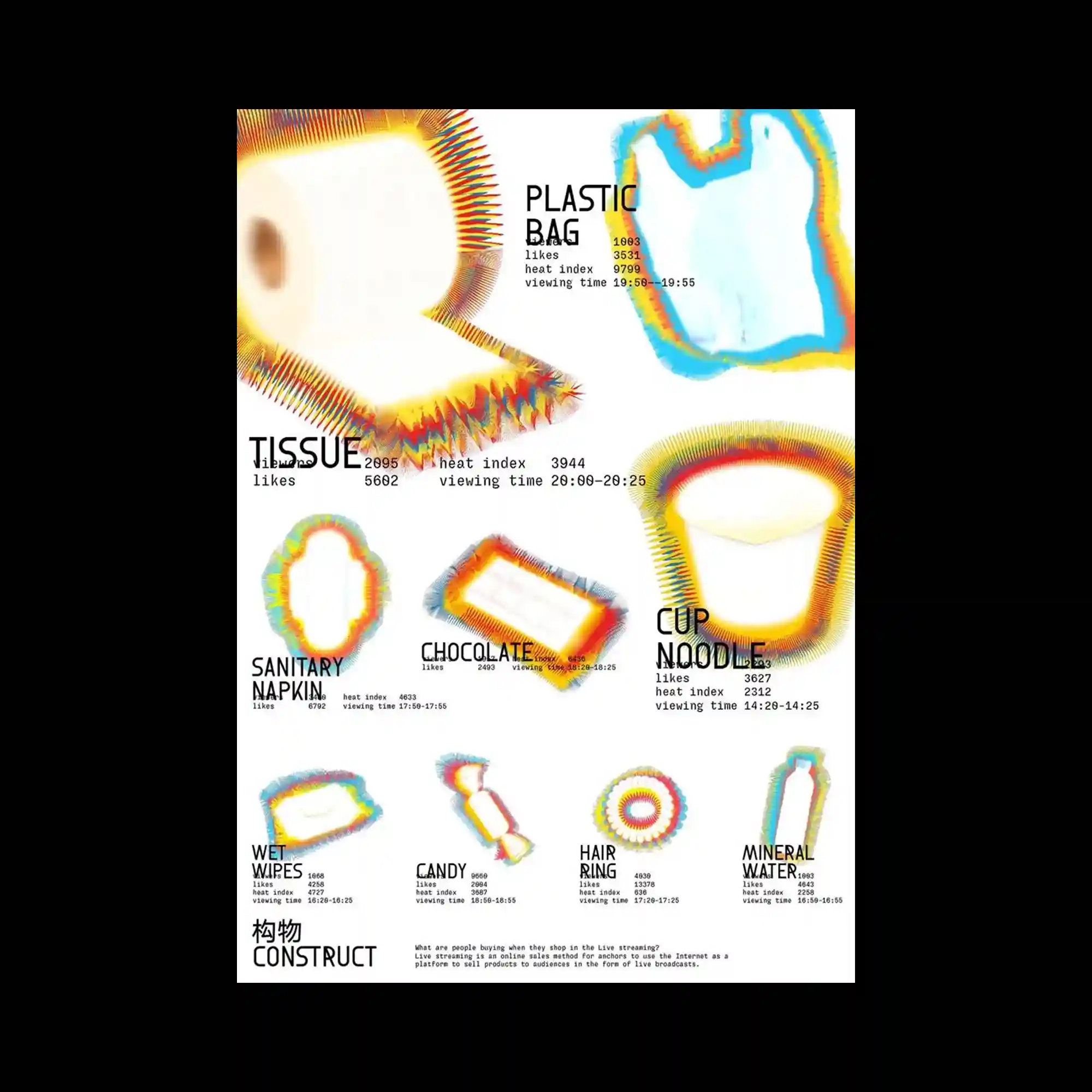
Poster visualizing consumer product categories like “tissue,” “plastic bag,” and “cup noodle” with heatmap-style gradients and statistics about likes and viewing times.

Abstract blurred forms in pastel and neon tones, resembling thermal imagery or topographical distortions, with soft gradients and no text.

Repeating 3D-rendered heads overlaid on Cyrillic text, forming a disorienting digital theatre poster.
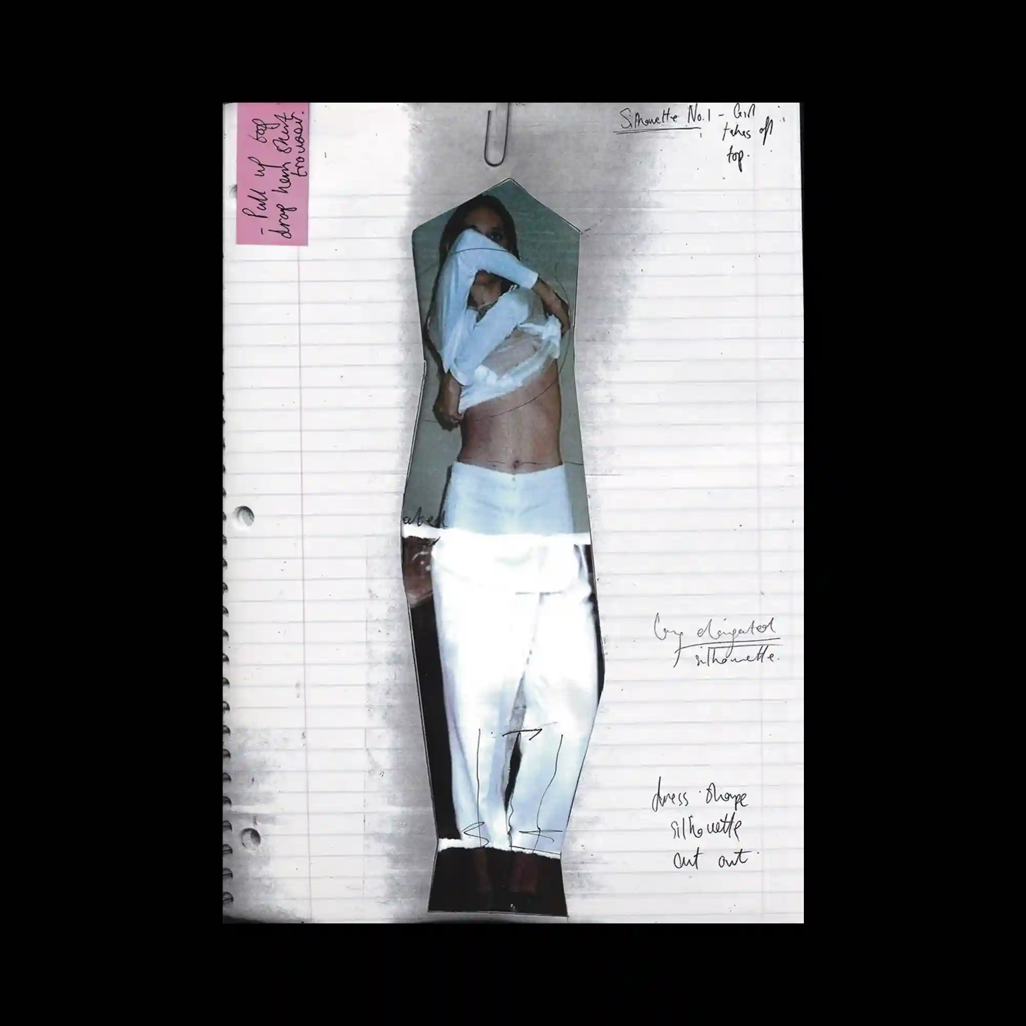
Notebook paper backdrop with a paper-doll cutout of a woman, blending fashion sketch and photo.
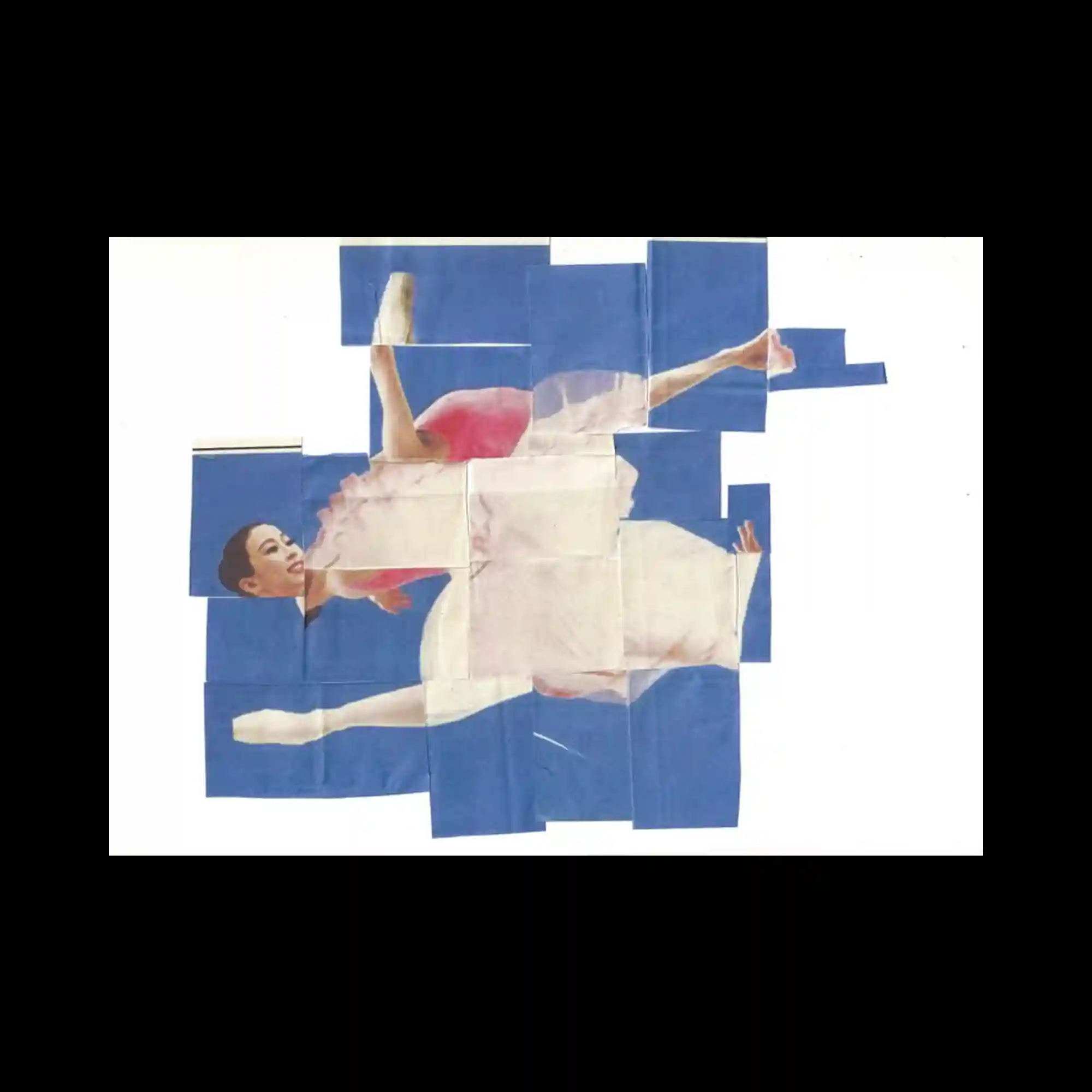
A fragmented ballerina image reconstructed with uneven blue paper strips, evoking analog collage.
Cyber-aesthetic collage mixing vintage web UI, cosmetic imagery, and anime-style pop elements in a fragmented composition.
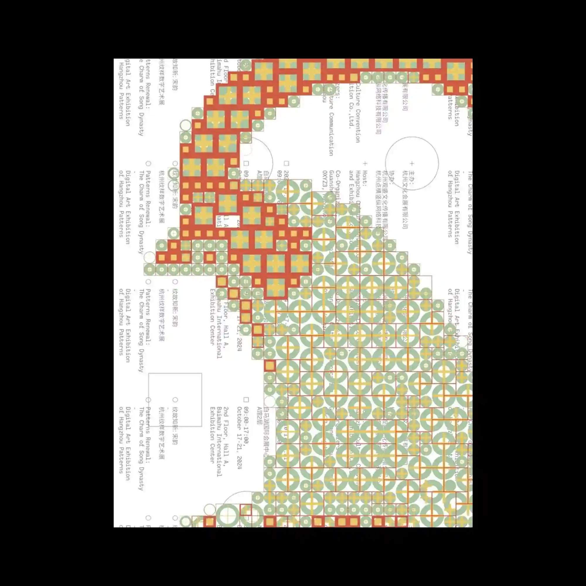
Dense matrix of geometric shapes forming intricate curved patterns, combined with a technical layout and multilingual typography.

Pixel-art-inspired letterforms and typography scattered playfully across the canvas, accompanied by tiny icons and grid-based structure.
Circular alphabet layout with white textured circles layered on a stark black background, minimal yet experimental.

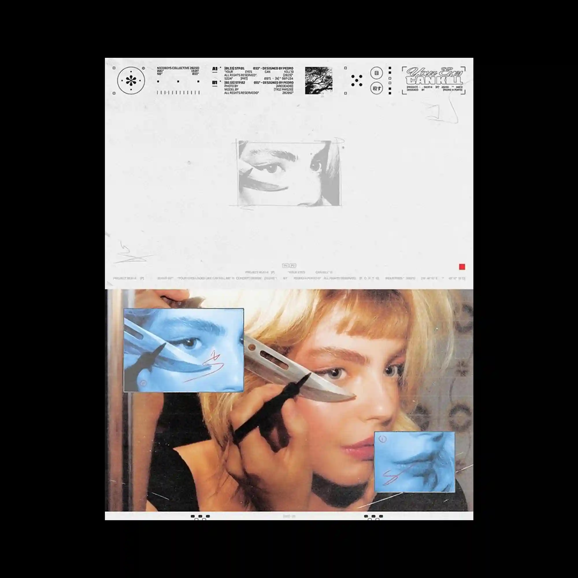
A collage of high-contrast fashion portraits featuring a model with painted blue face, combining both soft light and wet textures.