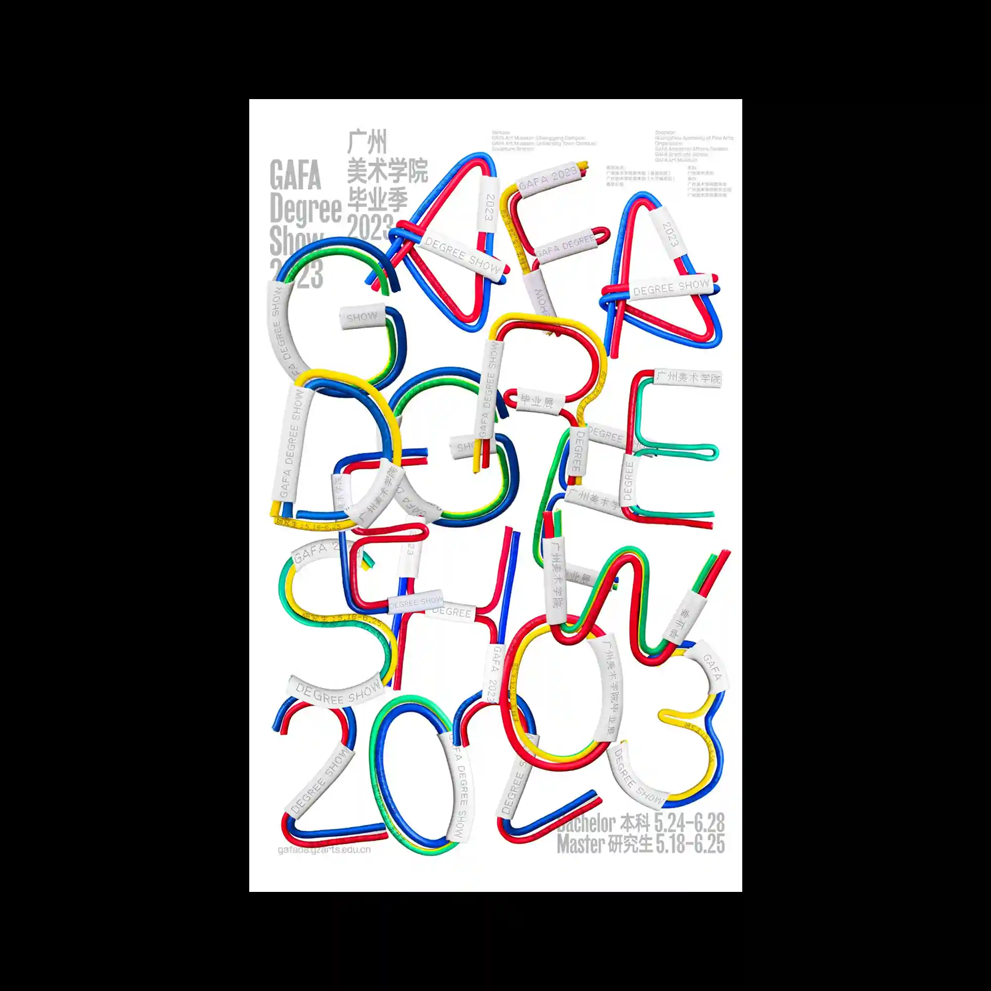
The poster features three-dimensional letterforms constructed from flexible, multicolored tubes, predominantly in red, blue, green, and yellow. Each letter is reinforced with metallic-like clamps that add a structural and industrial touch. The playful curvature of the tubes contrasts with the clean white background, emphasizing both movement and readability. Text elements in different languages are carefully arranged in the corners, balancing the chaotic central typography. Overall, the design merges tactile materiality with typographic experimentation.
컬러 튜브로 만든 입체적인 글자 형태 중심으로 구성됨. 빨강, 파랑, 초록, 노랑 선들이 꼬이고 굽어지며 글자 형성함. 금속 재질처럼 보이는 고정 장치가 각 글자 보강함. 흰색 배경 위에 배치돼서 글자의 움직임과 가독성 강조됨. 주변에 배치된 텍스트가 중심의 복잡한 구조 균형 잡아줌.
该海报以立体字母为主,由红、蓝、绿、黄的彩色管道构成。每个字母都由类似金属的夹具加固,带来结构感和工业感。弯曲的管道与白色背景形成对比,突出流动感和可读性。不同语言的文字分布在边角处,平衡了中心的复杂排版。整体设计融合了触感材质与字体实验性。