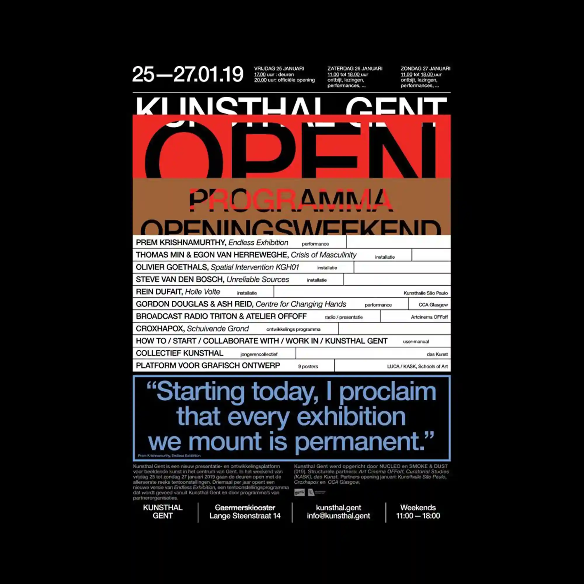
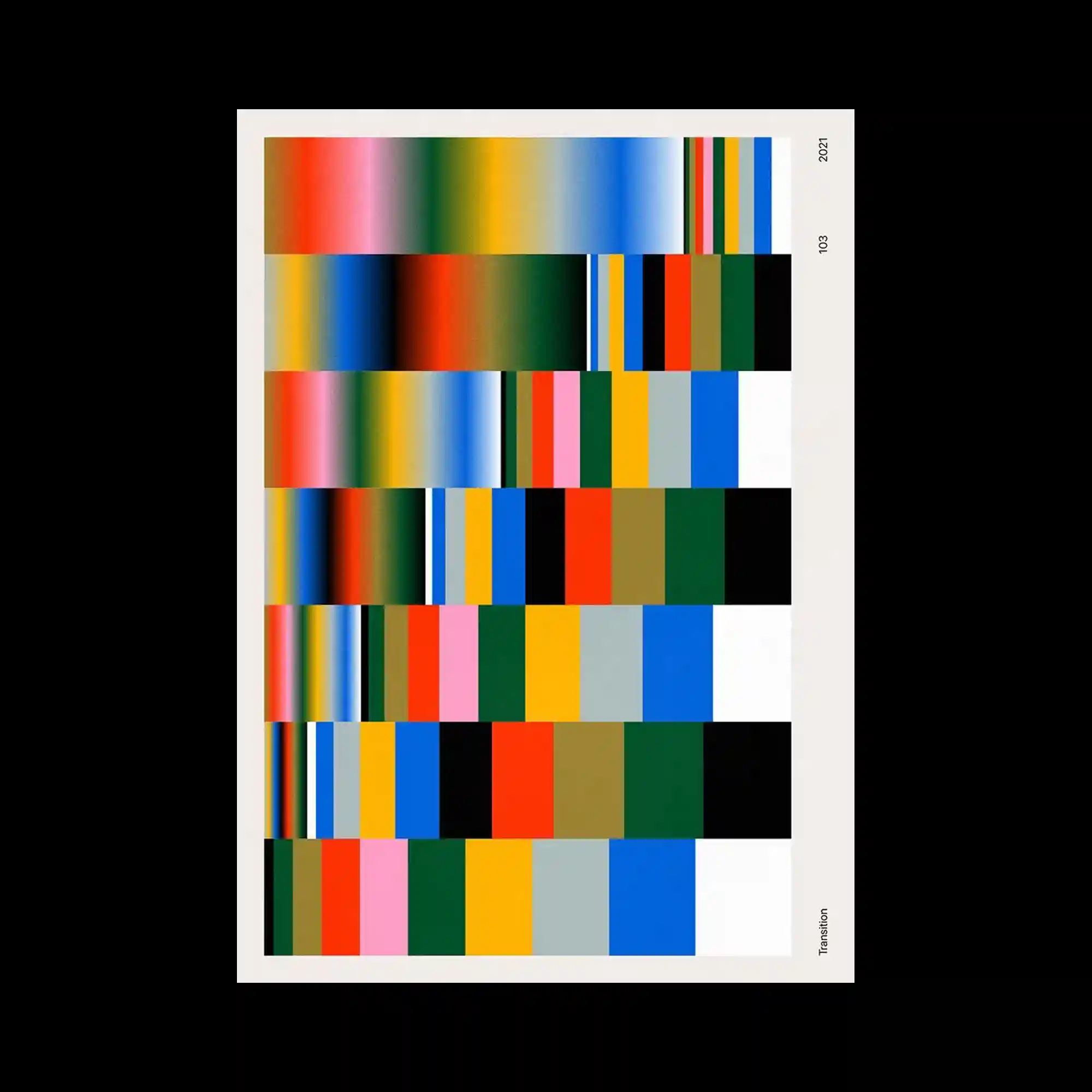
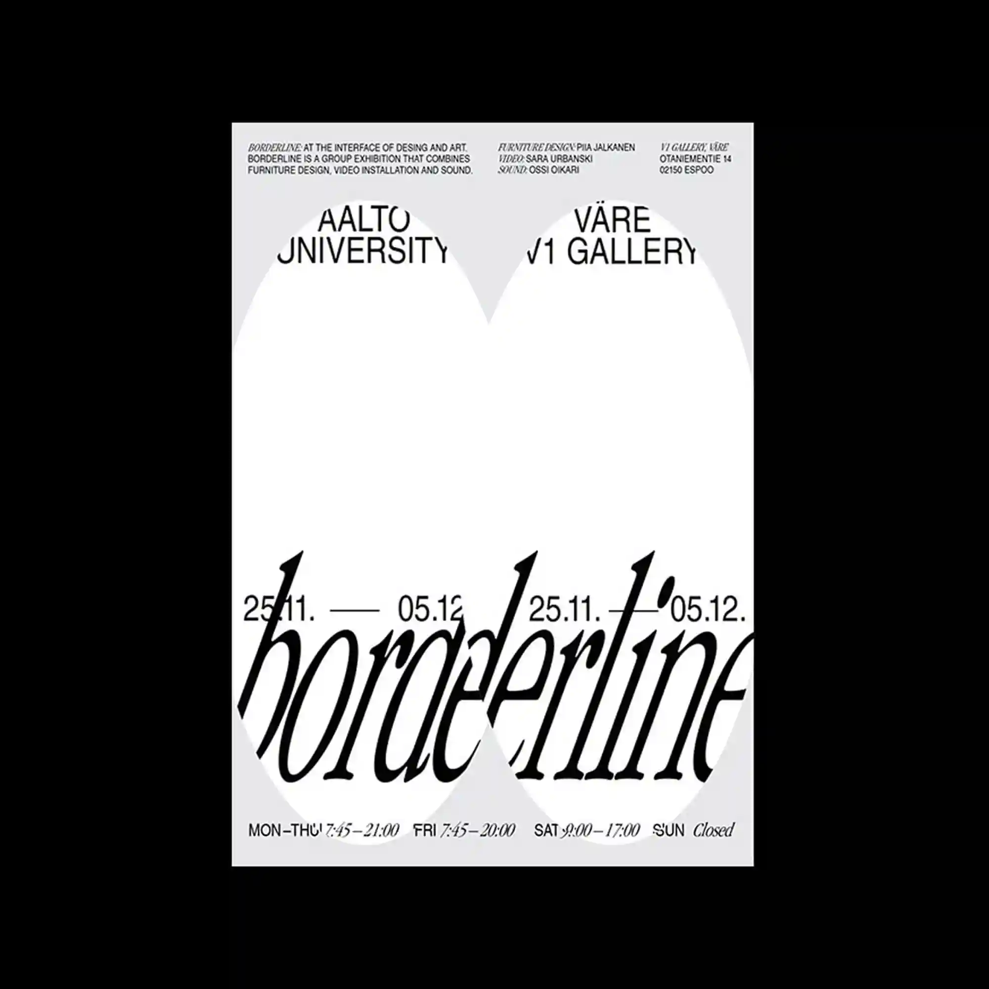
@kunsthalgent | Bold horizontal color bands overlay a dense informational layout of text and tables. Large typography partially obscures smaller details beneath, creating layered depth. The lower section features a strong typographic statement separated from the main grid. High contrast and strict alignment maintain clarity despite density.
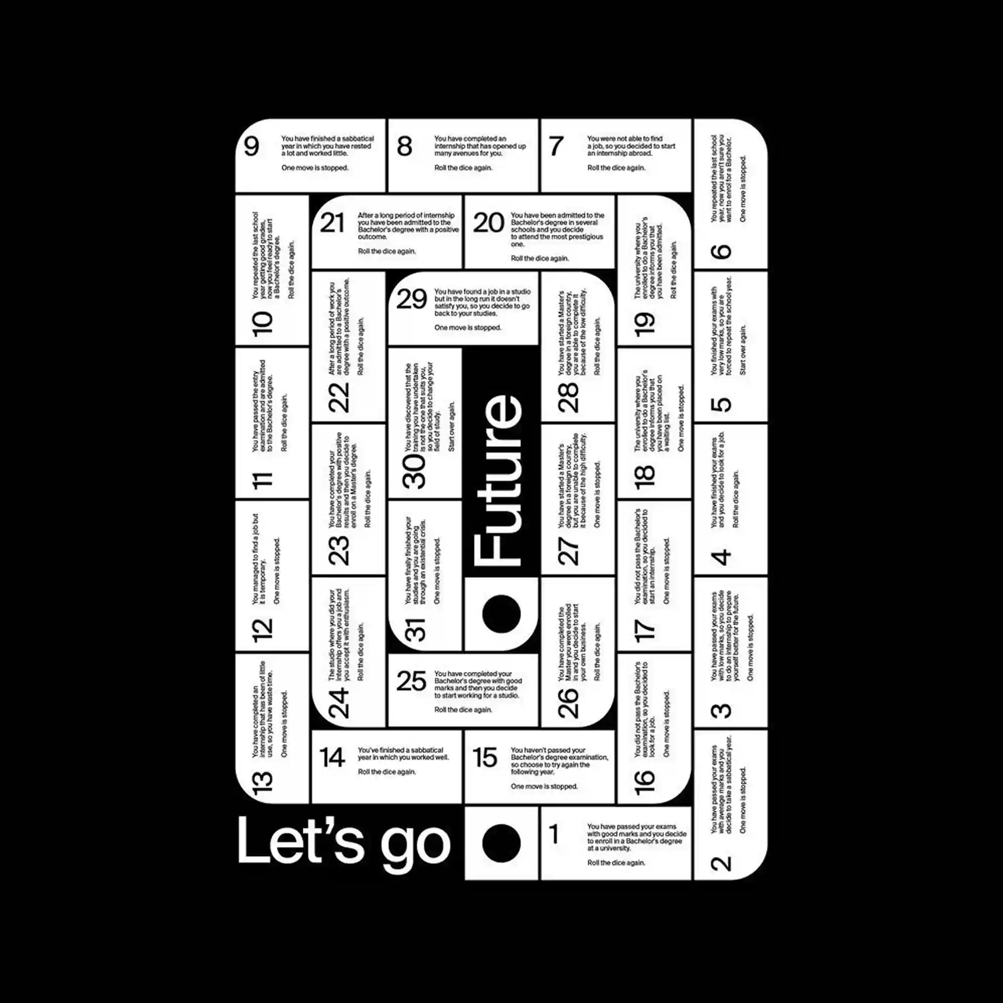
@ares_pedroli | A board-game-like layout organizes numbered cells in a continuous path. Rounded rectangles create a flowing track around a central title. Black and white contrast emphasizes legibility and structure. The design transforms informational text into an interactive visual system.
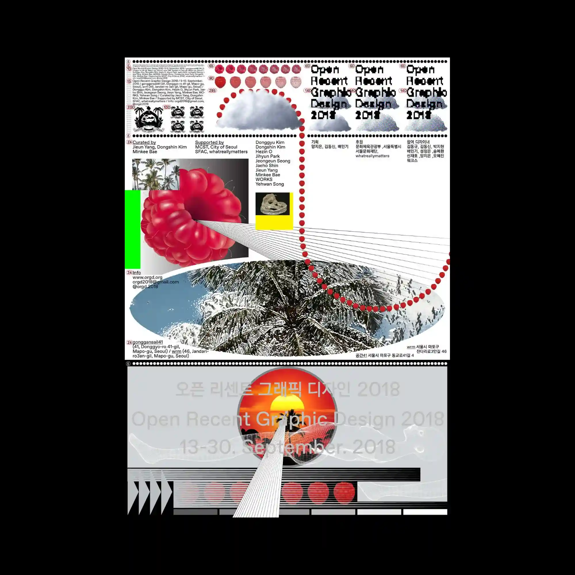
@jho.kr | The composition blends photographic landscapes with abstract shapes and dotted graphic paths. Circular elements guide the eye through the layout, connecting disparate sections. Text blocks are embedded within the collage, varying in scale and density. The design feels exploratory, with layered narratives across the surface.
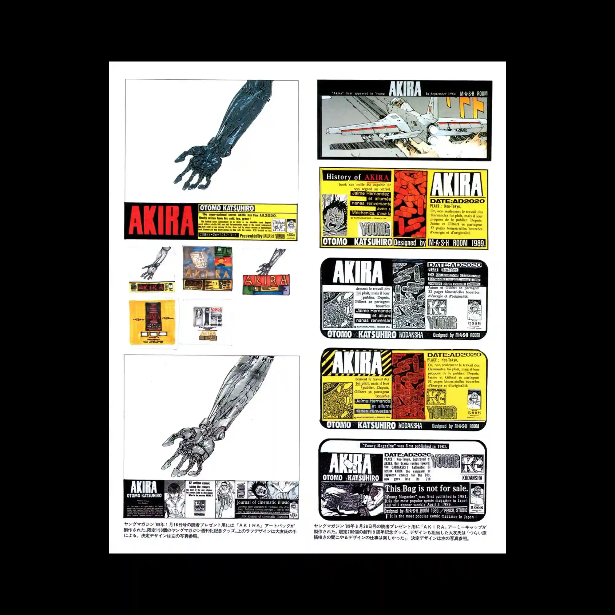
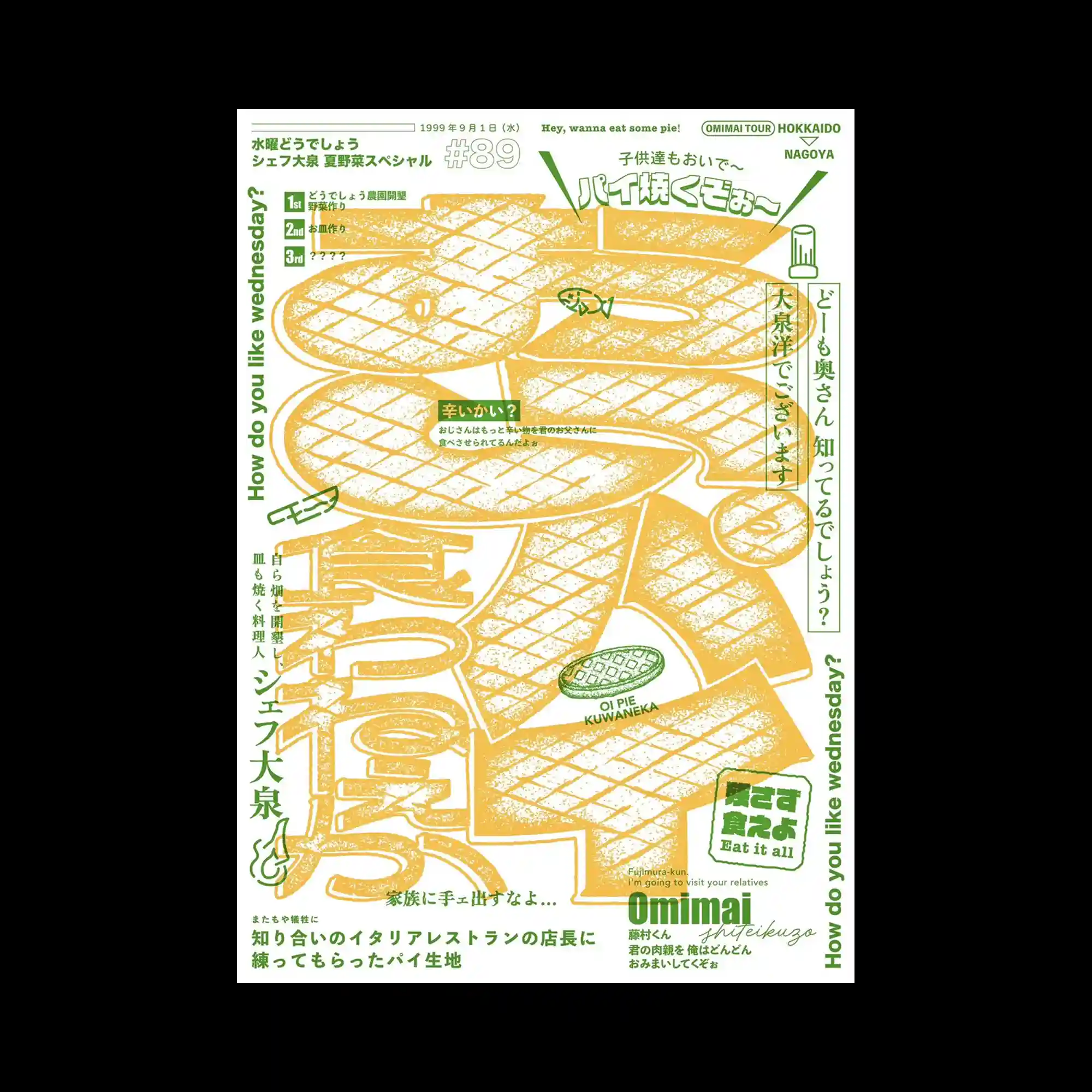
#OTOMO_KATSUHIRO | A grid-based archival layout presents multiple panels of illustrations, typography, and image fragments. Repetition of title blocks establishes consistency across variations. Yellow, red, and black dominate the palette, evoking print ephemera. The arrangement reads as a catalog rather than a single focal image.
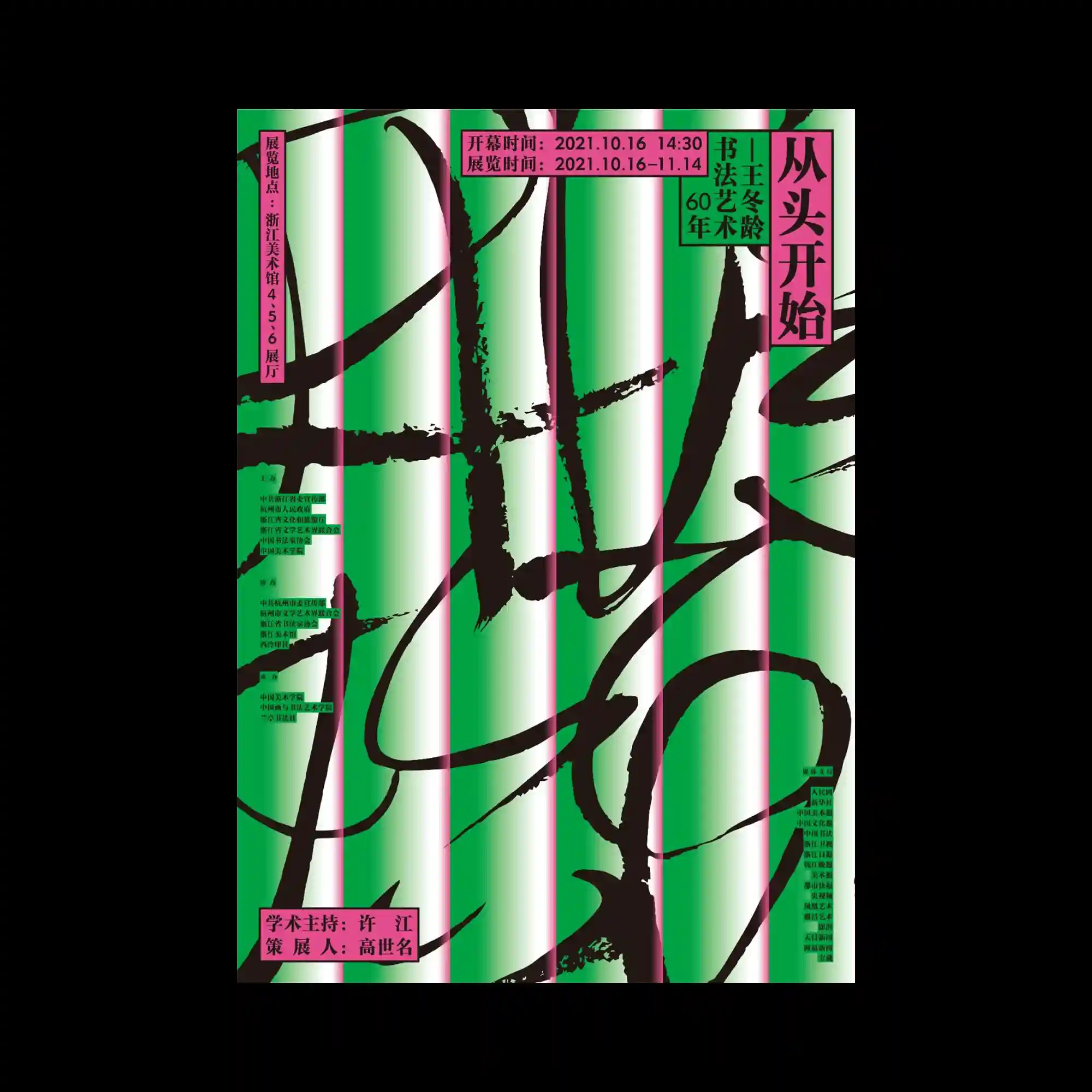
@transwhitestudio | Vertical stripes of gradient color form the background, while expressive black brush strokes sweep across the surface. Text blocks are confined to narrow rectangular labels, contrasting with the freeform marks. The interplay of strict vertical rhythm and gestural diagonals creates dynamic tension. Color transitions soften the aggressive strokes.
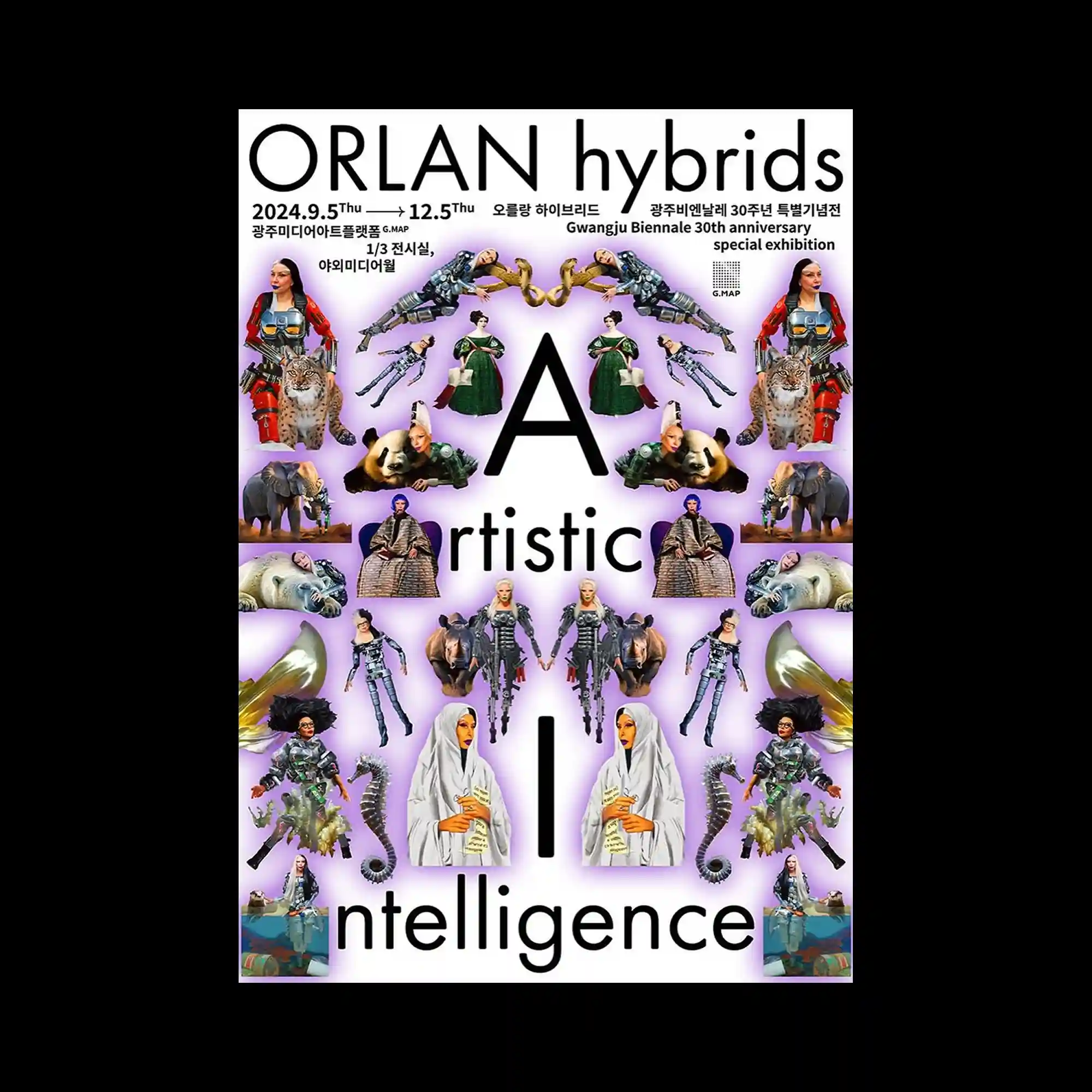
@pa_i_ka | A mirrored collage arranges repeated figures and objects symmetrically around a central axis. Human, animal, and mechanical forms are cut out and placed against a softly glowing background. Bold typography anchors the composition vertically. The symmetry creates a ritualistic and icon-like visual structure.
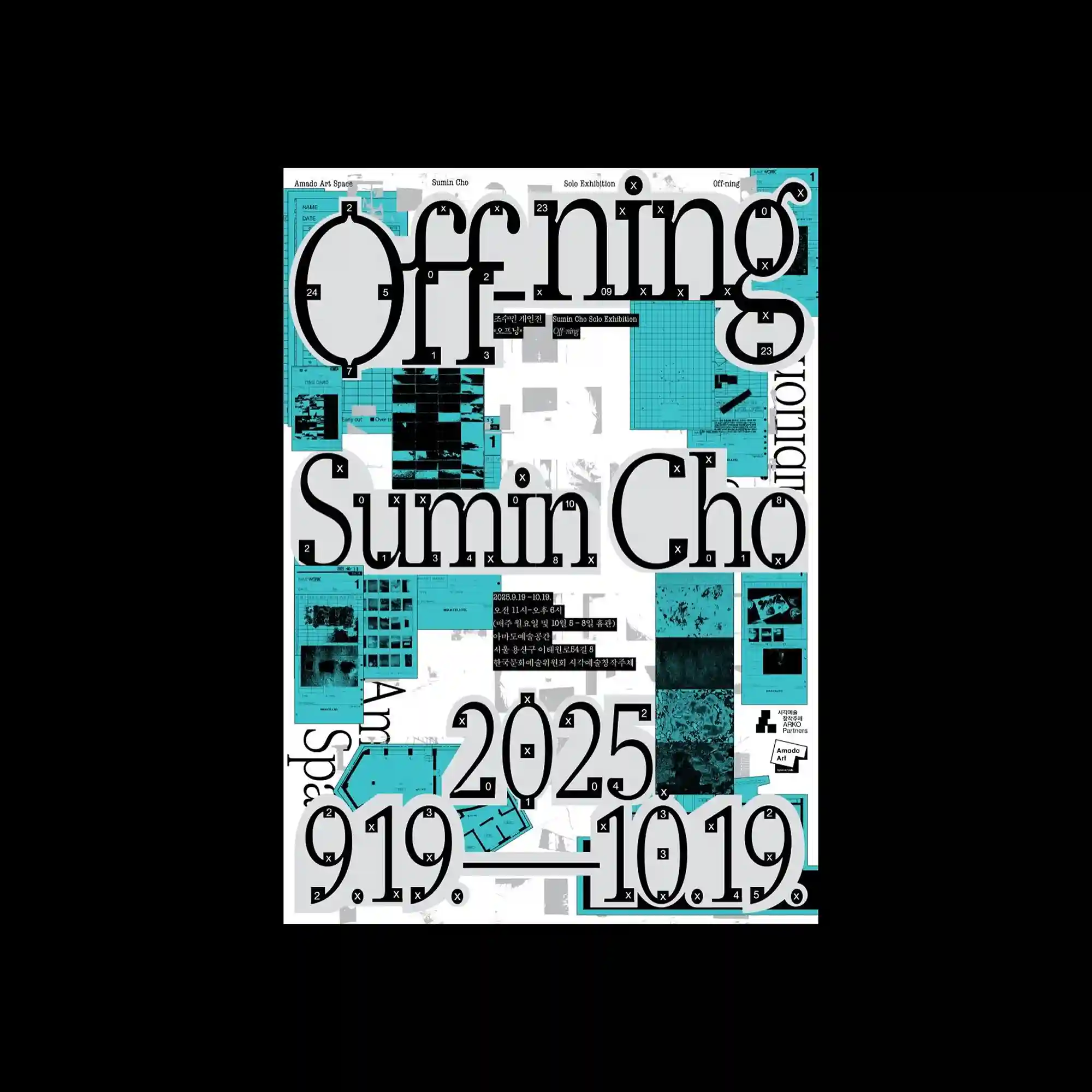
@tedhyoon | Large-scale typography sits atop a grid of smaller images and interface-like panels. Cyan-toned blocks contrast with grayscale textures beneath, creating a layered information field. Small numeric markers and icons punctuate the surface, suggesting modular organization. The composition balances chaos and structure through consistent alignment.
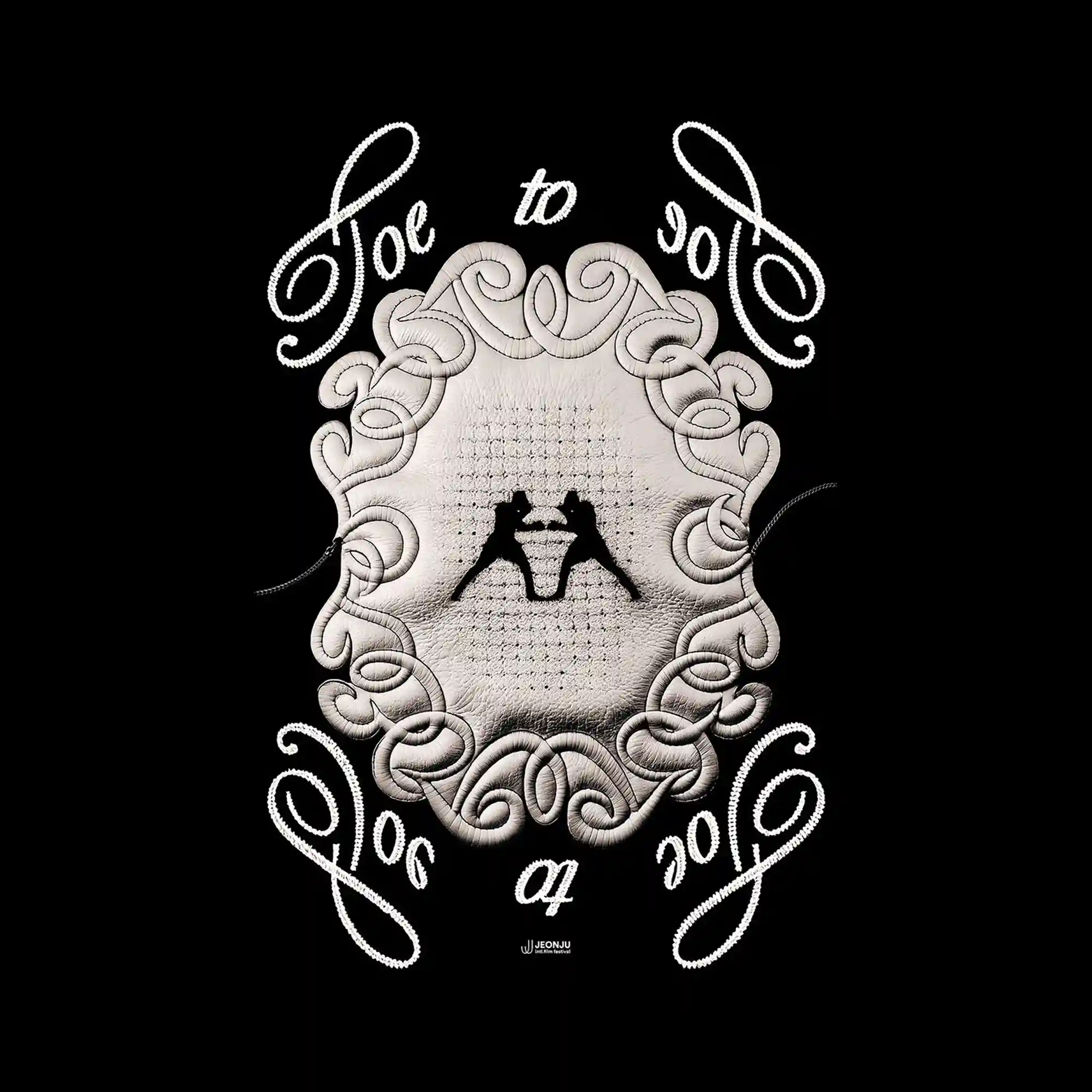
#EunAh_Lee | A symmetrical ornamental frame encloses a textured central surface, resembling stitched or padded material. Curvilinear decorative elements surround the center, forming a balanced oval silhouette. Handwritten-style lettering flows around the perimeter, echoing the softness of the inner textures. The black background isolates the pale forms, enhancing contrast and focus.
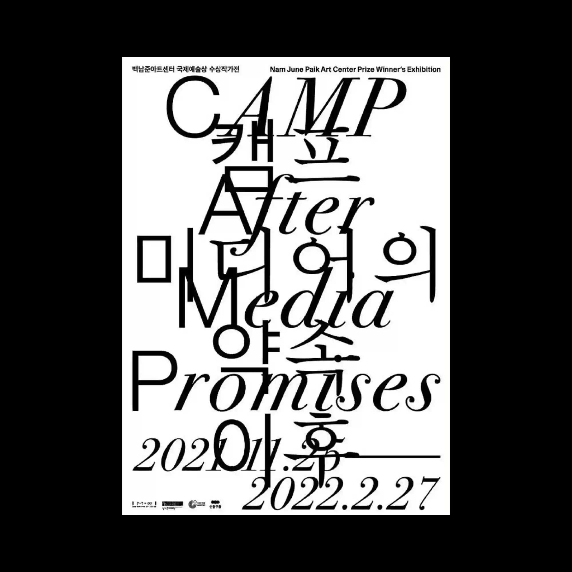
@njpartcenter | Typography dominates the entire surface, with multiple scripts and languages overlapping in a dense vertical composition. Serif and sans-serif letterforms intersect, stretch, and collide, creating visual friction. The layout abandons conventional hierarchy, allowing text to function as both content and form. Black text on white background emphasizes precision and contrast.
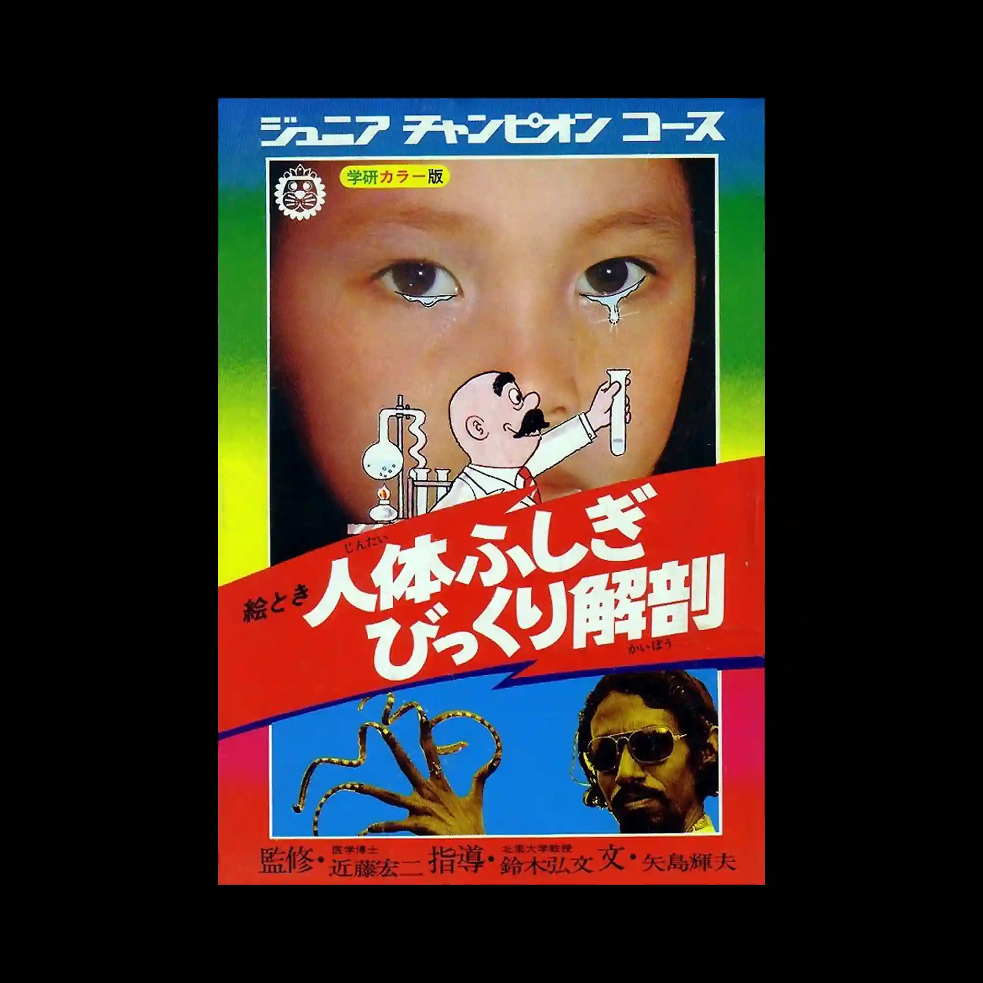
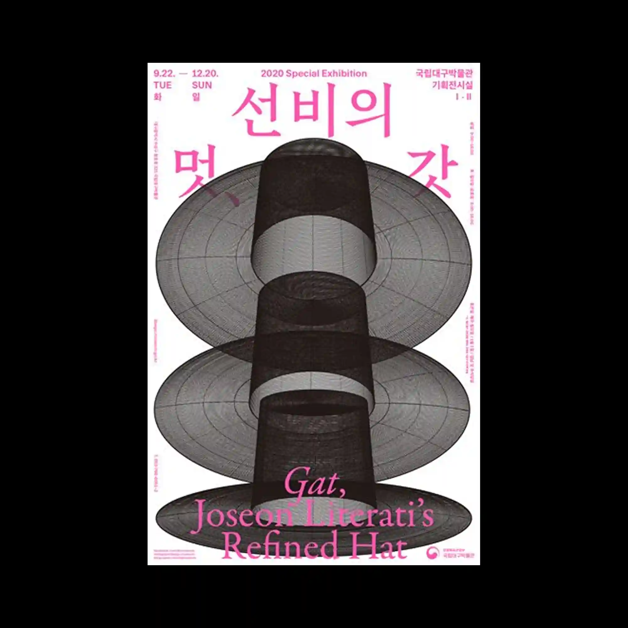
The composition centers on a photographic portrait framed tightly within a rectangular border, with illustrated and graphic elements layered directly over the face. Bright gradient color bands fill the background, transitioning vertically and intensifying the contrast with the skin tones. A cartoon-style character and simplified scientific icons are placed in the foreground, disrupting the realism of the photograph. Large diagonal typography cuts across the layout, creating a dynamic division between upper and lower sections.
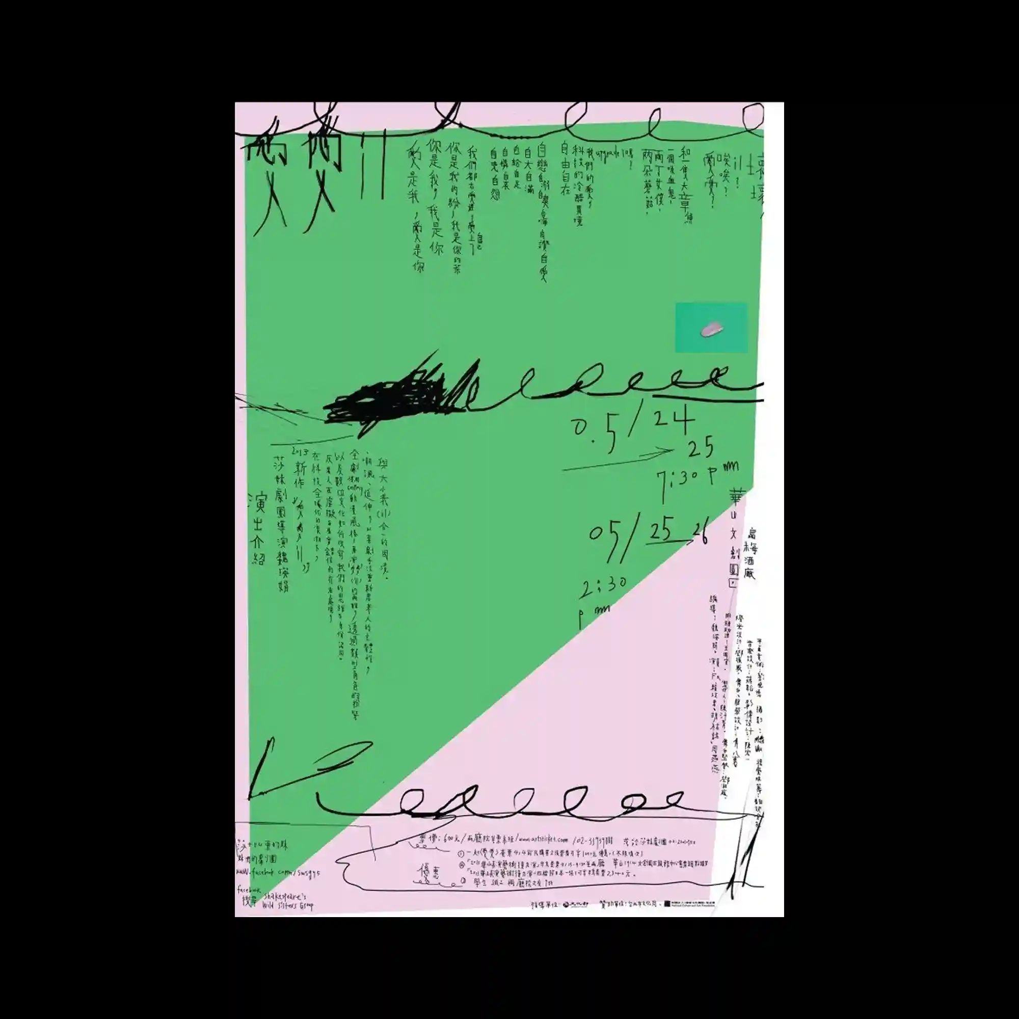
@yuehyuehdotco | The design combines large flat color planes with handwritten lines and dense vertical text blocks. Diagonal color division introduces asymmetry, while freeform strokes overlay the structure. The contrast between rigid text columns and expressive marks creates layered tension. Pastel tones soften the overall composition despite its density.
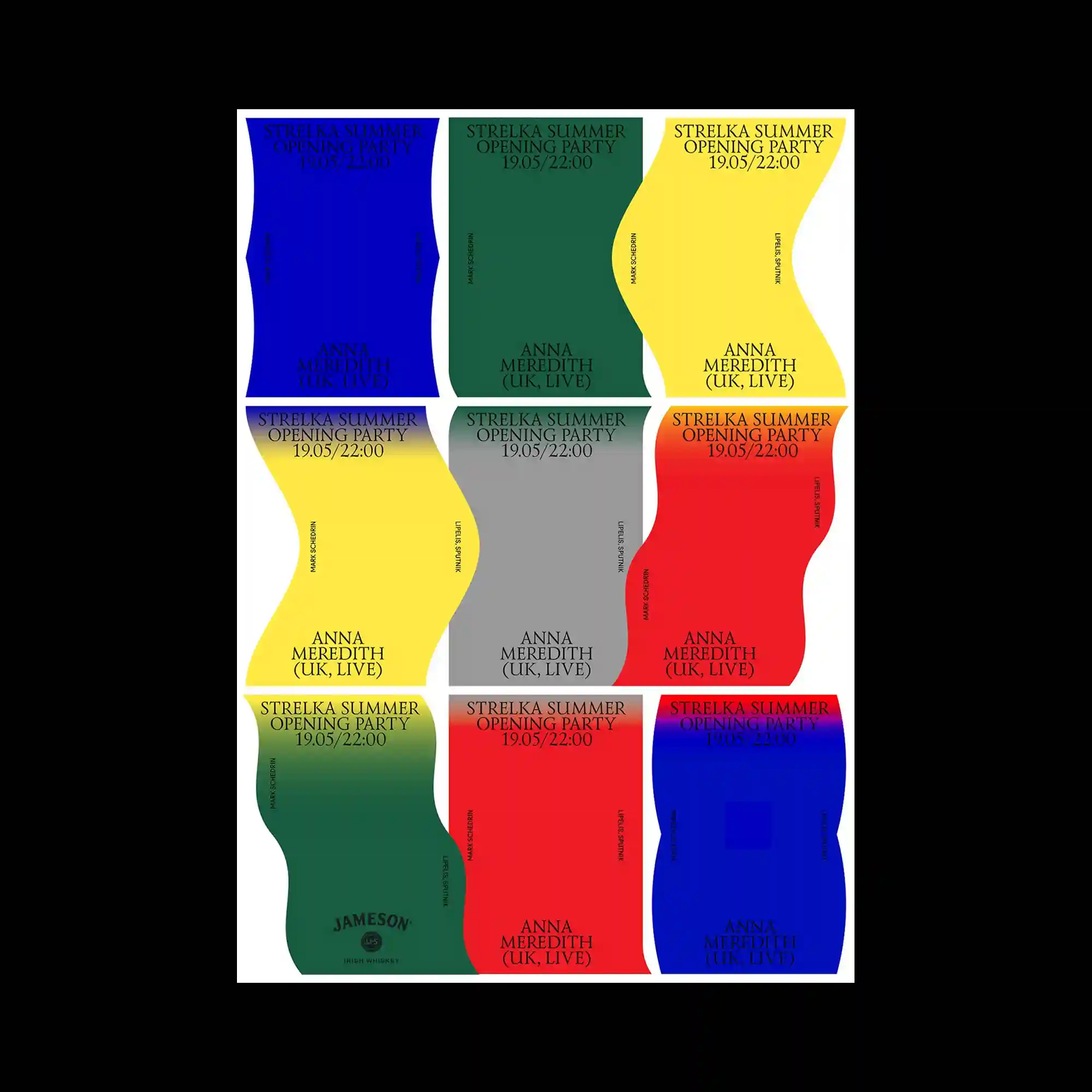
@aigaeyeondesign | A modular grid organizes repeated poster variations, each maintaining consistent typography while shifting background color and shape curvature. The wavy vertical forms subtly distort the grid, preventing rigidity. Color changes act as the primary differentiator between units. The repetition creates rhythm while preserving individual variation.
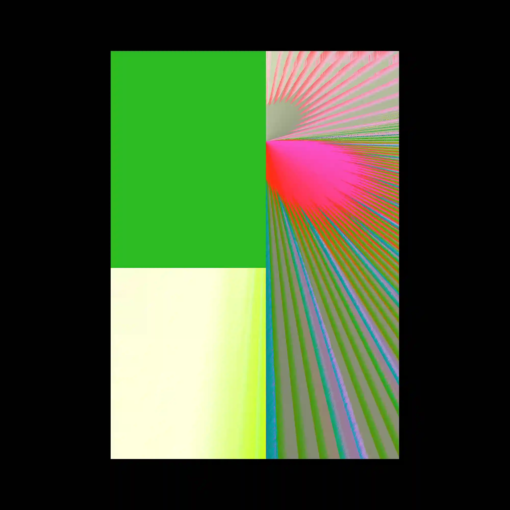
The composition splits the frame into contrasting color fields and radial line patterns. One section remains flat and uniform, while the other explodes into dense, directional streaks. The sharp division emphasizes opposition between stillness and motion. Color intensity shifts reinforce the sense of spatial pull toward the radiating center.
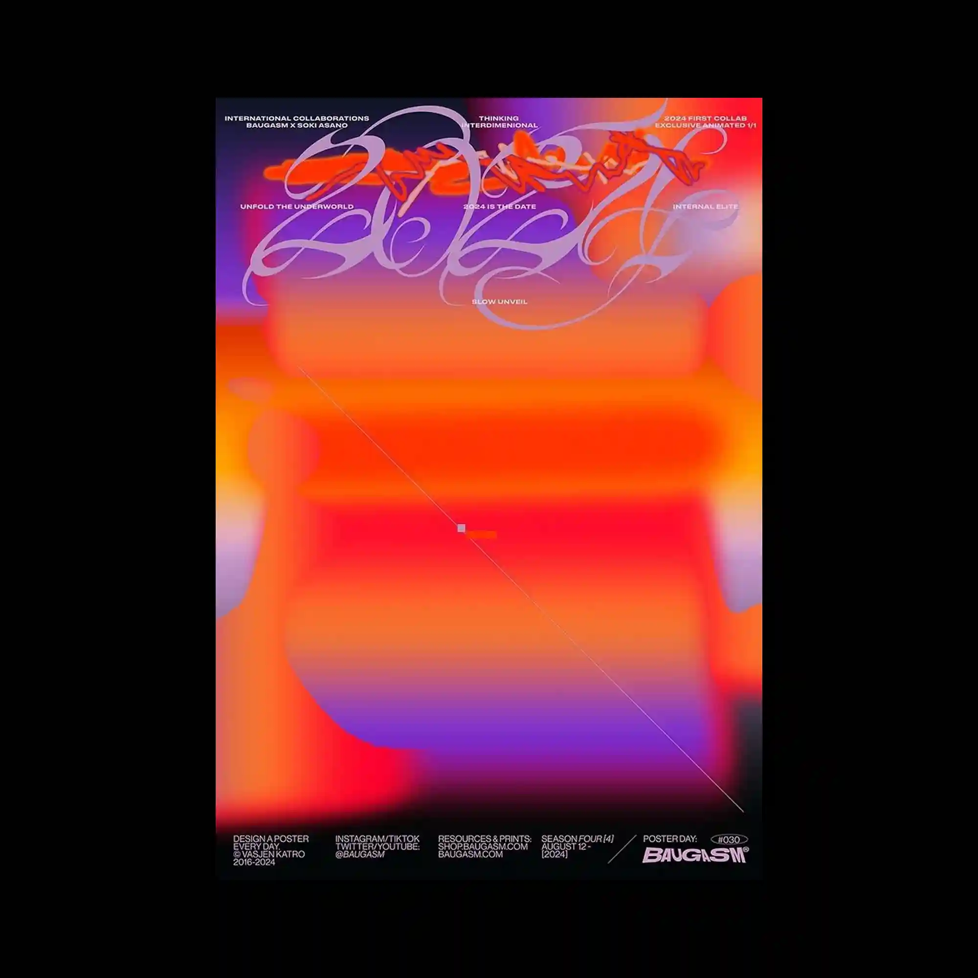
@baugasm | Soft gradients blend horizontally across the surface, with subtle color transitions creating a smooth depth field. Thin lines and small text elements float lightly on top, adding precision to an otherwise fluid background. The composition avoids hard edges, relying on diffusion and overlap. Overall balance is achieved through centered alignment and restrained detailing.
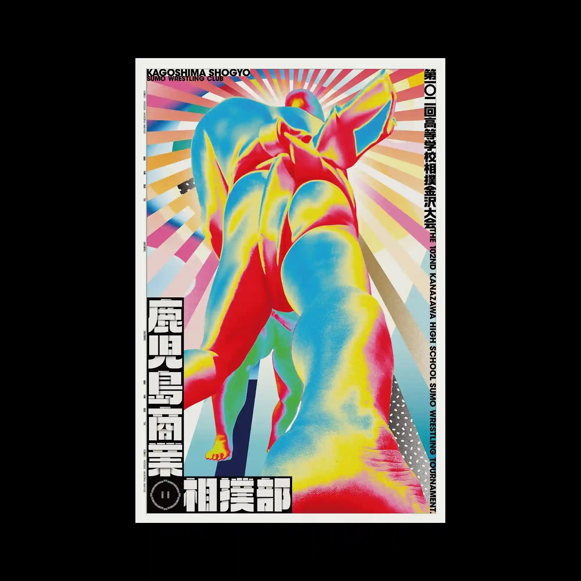
@dentsu | The image uses a dramatic low-angle composition with exaggerated perspective, elongating the central figure. Saturated, multi-hued color gradients define form instead of realistic shading. Radiating background lines emphasize direction and dynamism. Typography is confined to borders, allowing the central visual to dominate spatially.
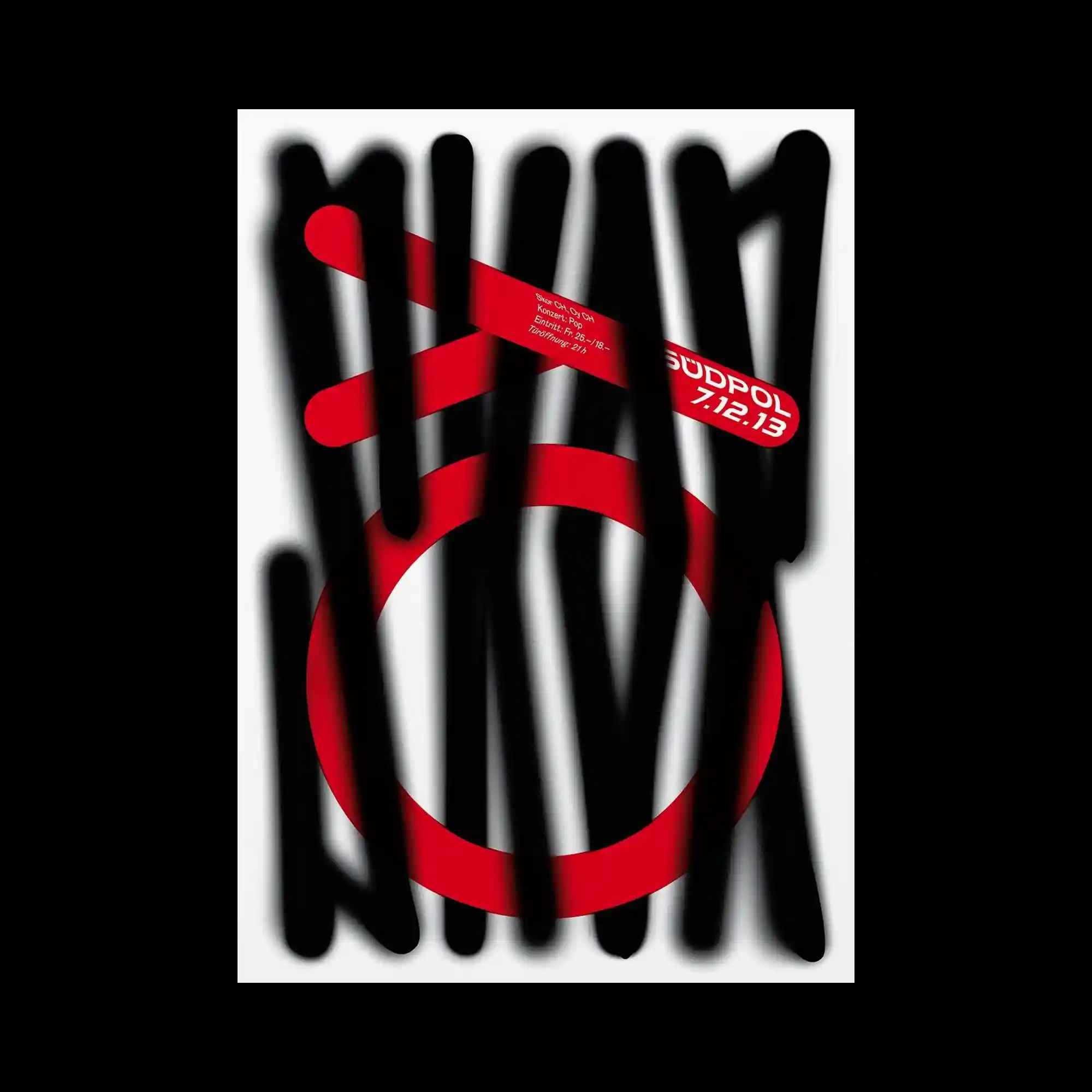
@studiofeixen | Bold black strokes obscure and cut across a bright geometric base, creating deliberate visual interference. Circular and linear shapes beneath remain partially visible, producing layered depth. The interaction between opaque brush marks and clean vector forms introduces contrast between chaos and order. Negative space around the central forms keeps the composition from collapsing visually.
The composition features a large illustrated object dominating the frame, rendered with rough textures and limited color separation. Typography is embedded around and within the illustration, following vertical and horizontal alignments. The surface treatment resembles screen printing, with visible grain and uneven ink density. The overall layout feels dense yet controlled through consistent margins and directional flow.
@pangram.pangram | This poster layers bold diagonal typography over a blurred, motion-like photographic background. Rectangular text blocks overlap vertically, creating a sense of compression and tension. The background image appears stretched and smeared, suggesting movement without defining a clear subject. High contrast between sharp type edges and soft, diffused imagery defines the visual hierarchy.
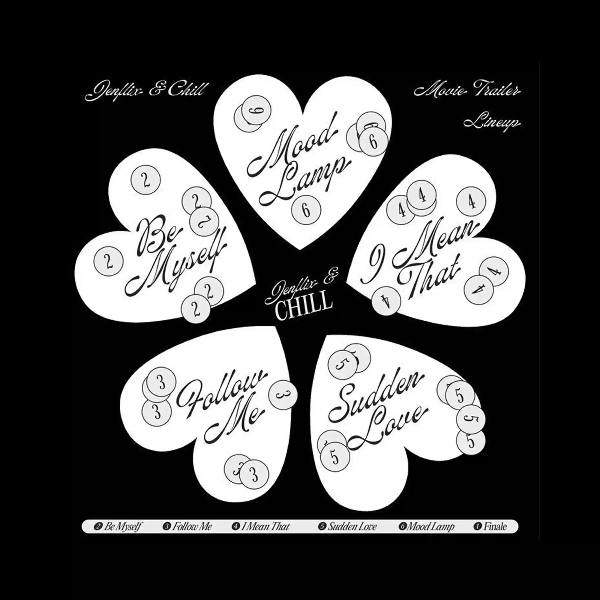
The layout centers on repeated heart-shaped forms arranged radially, creating a symmetrical yet playful structure. Handwritten-style lettering contrasts with the clean, solid shapes, adding a sense of softness and informality. Small circular markers with numbers are distributed across each shape, functioning as rhythmic visual accents rather than strict informational elements. A stark black background isolates the white forms, heightening clarity and graphic impact.
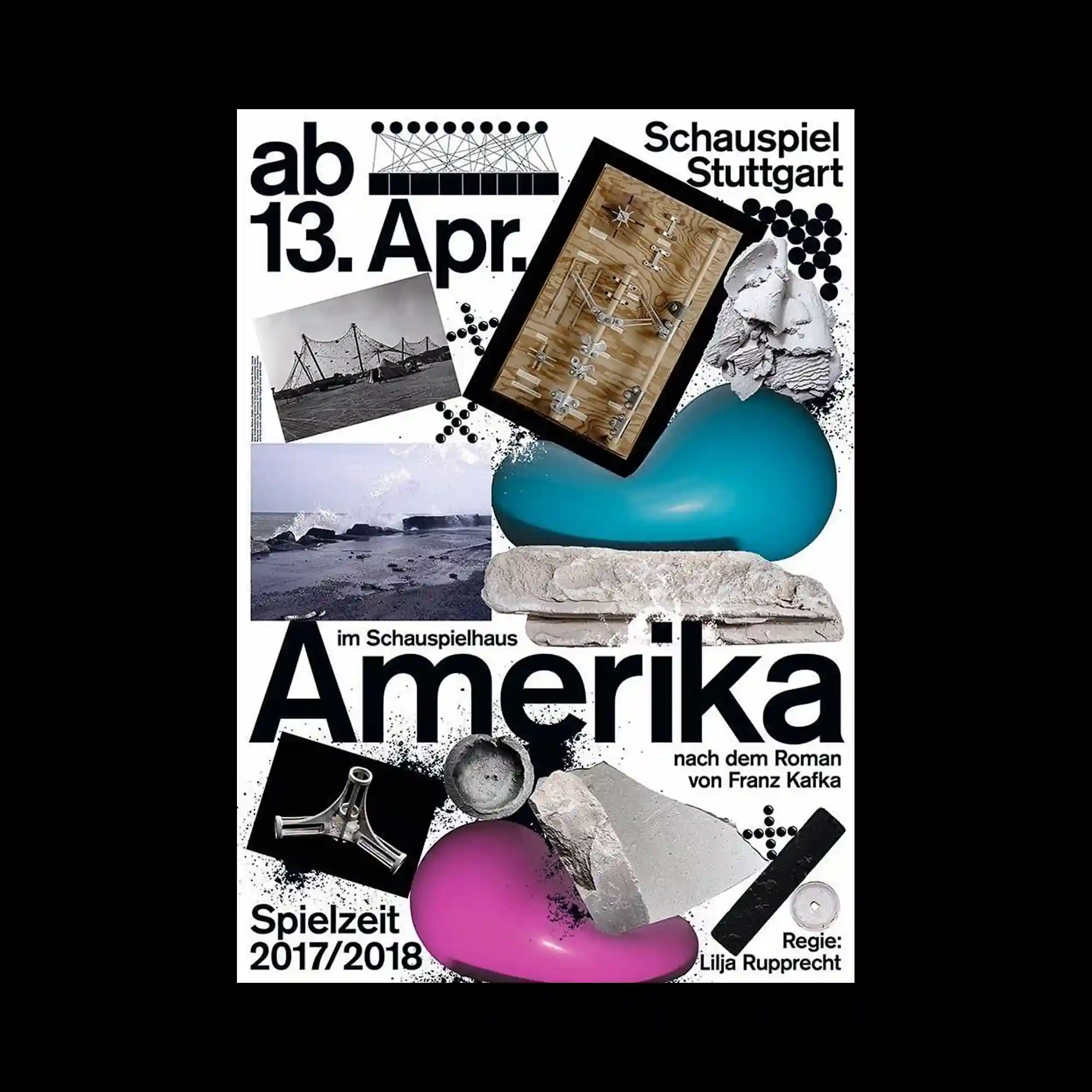
@spectorbooks | The composition uses a dense collage structure where photographic fragments, sculptural objects, and typographic elements overlap within a rigid rectangular frame. Flat black typography contrasts sharply with organic textures such as stone, fabric, liquid-like blobs, and mechanical components, creating tension between softness and rigidity. Circular dot patterns and grainy noise are scattered across the surface, acting as visual connectors between otherwise unrelated elements. Scale shifts abruptly, with objects floating without perspective consistency, reinforcing a fragmented and layered spatial logic.
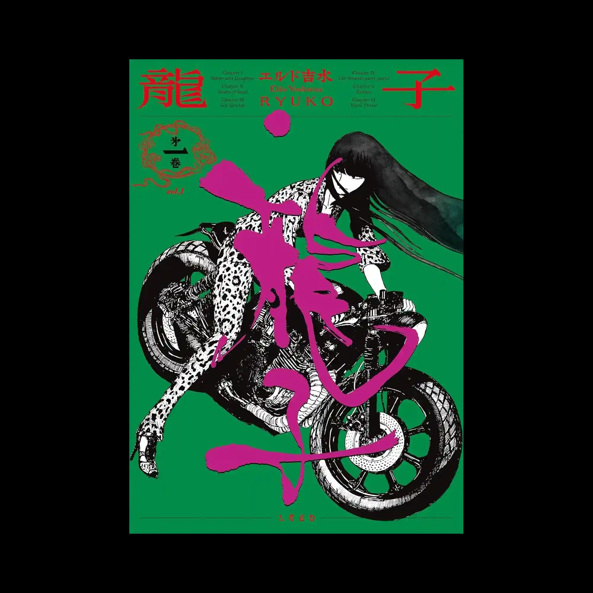
@eldo_yoshimizu | A vivid green background frames a dynamic illustration of a figure riding a motorcycle. The illustration is rendered in high-contrast black and white with detailed linework. A large magenta calligraphic stroke cuts diagonally across the scene, overlaying both figure and vehicle. Traditional typography elements are arranged along the top margin, balancing motion with order.
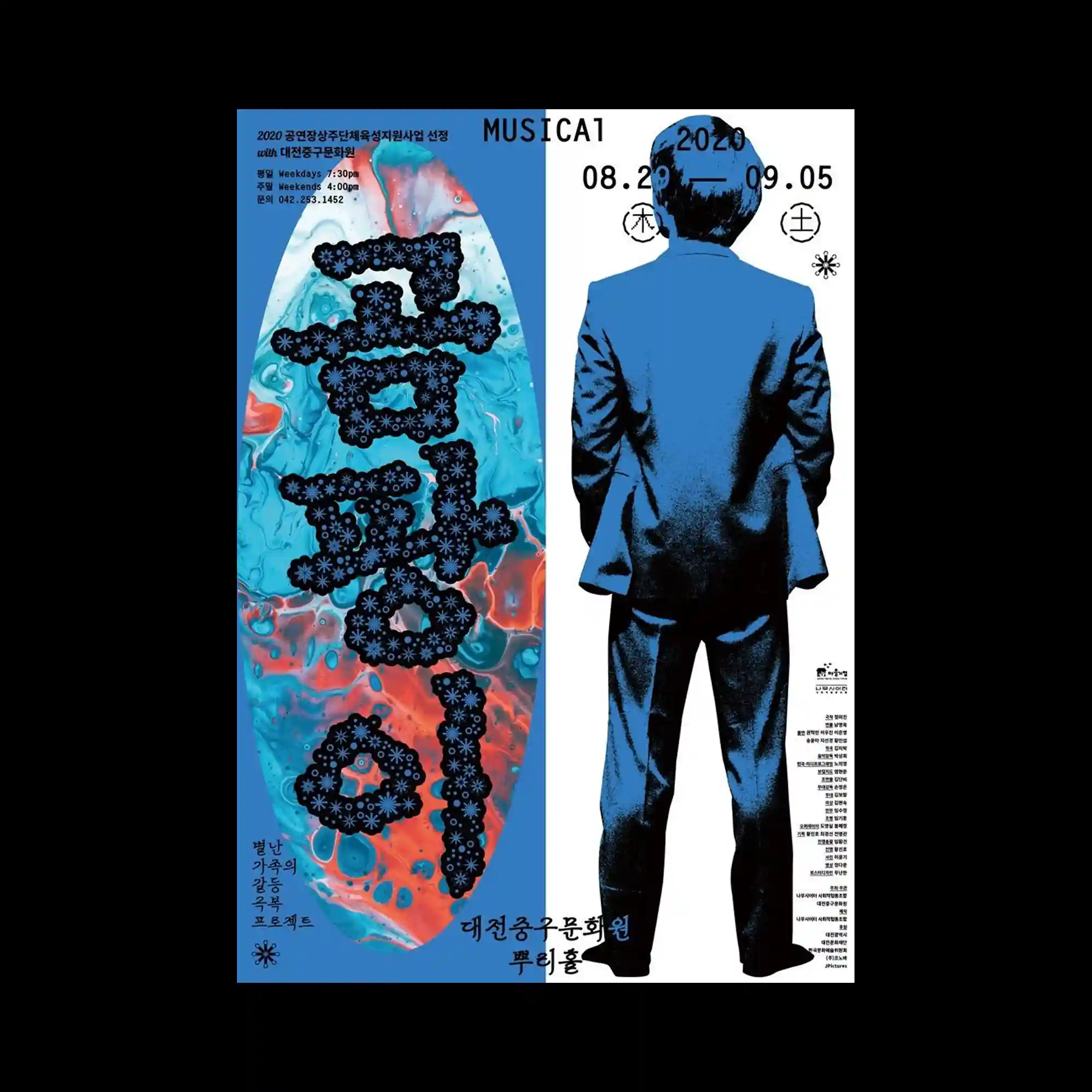
@moonaanhaan | The poster is split vertically, contrasting a fluid marbled texture panel with a solid blue field containing a silhouetted figure. Dense typographic elements are integrated into both halves, with text following the shape of the marbled form. The figure is rendered in flat tones, anchoring the composition. The design relies on opposition between abstraction and figuration.
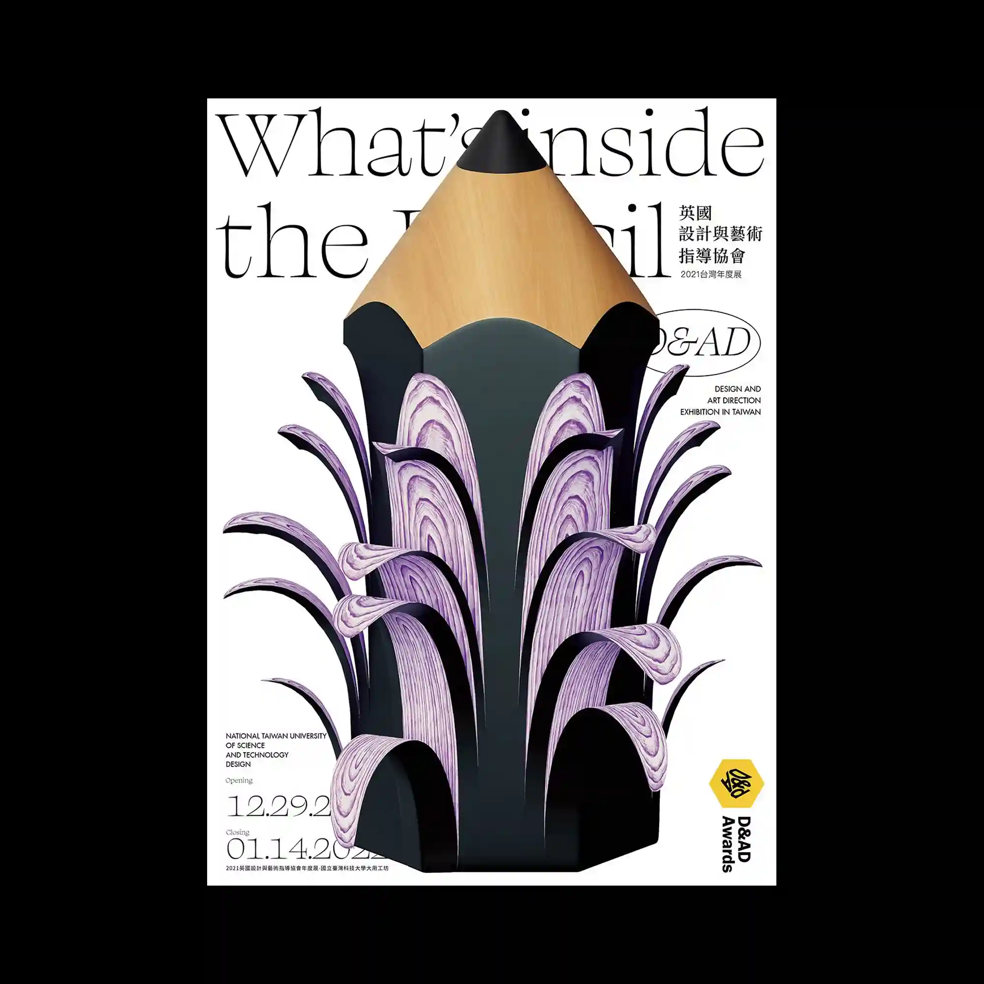
@kentsailee | A sculptural central object resembles a pencil tip merged with layered organic forms. The surface alternates between matte black, wood-like texture, and marbled purple ribbons that rise vertically. Serif typography sits lightly in the background, partially obscured by the object. The composition emphasizes depth and material contrast.
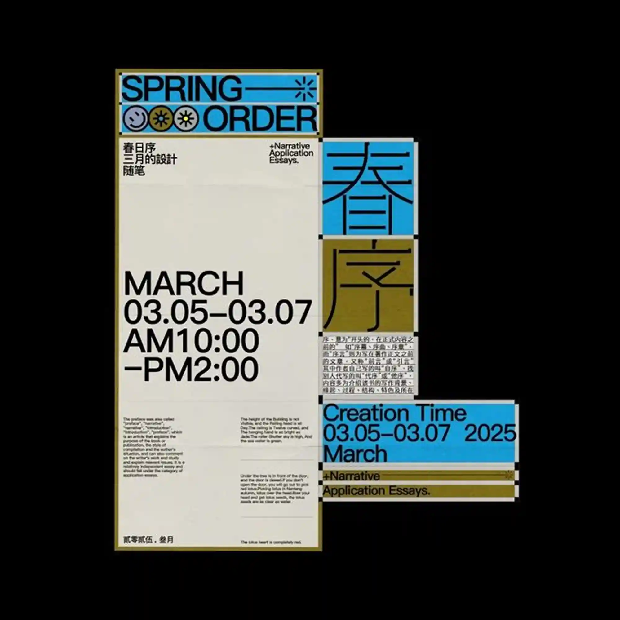
A modular poster system uses blocks of cream, blue, and olive tones arranged in offset panels. Bold sans-serif type dominates the left column, while smaller multilingual text fills secondary blocks. Icon-like symbols and thin rules act as separators between sections. The composition emphasizes hierarchy through scale and alignment shifts.
@hello_ep | Three stacked wireframe-like cylindrical forms are aligned vertically on a white background. Each layer is semi-transparent, revealing overlapping grid lines and circular contours. Pink serif typography is placed delicately around the forms, contrasting with the technical linework. The design combines architectural precision with light ornamental type.
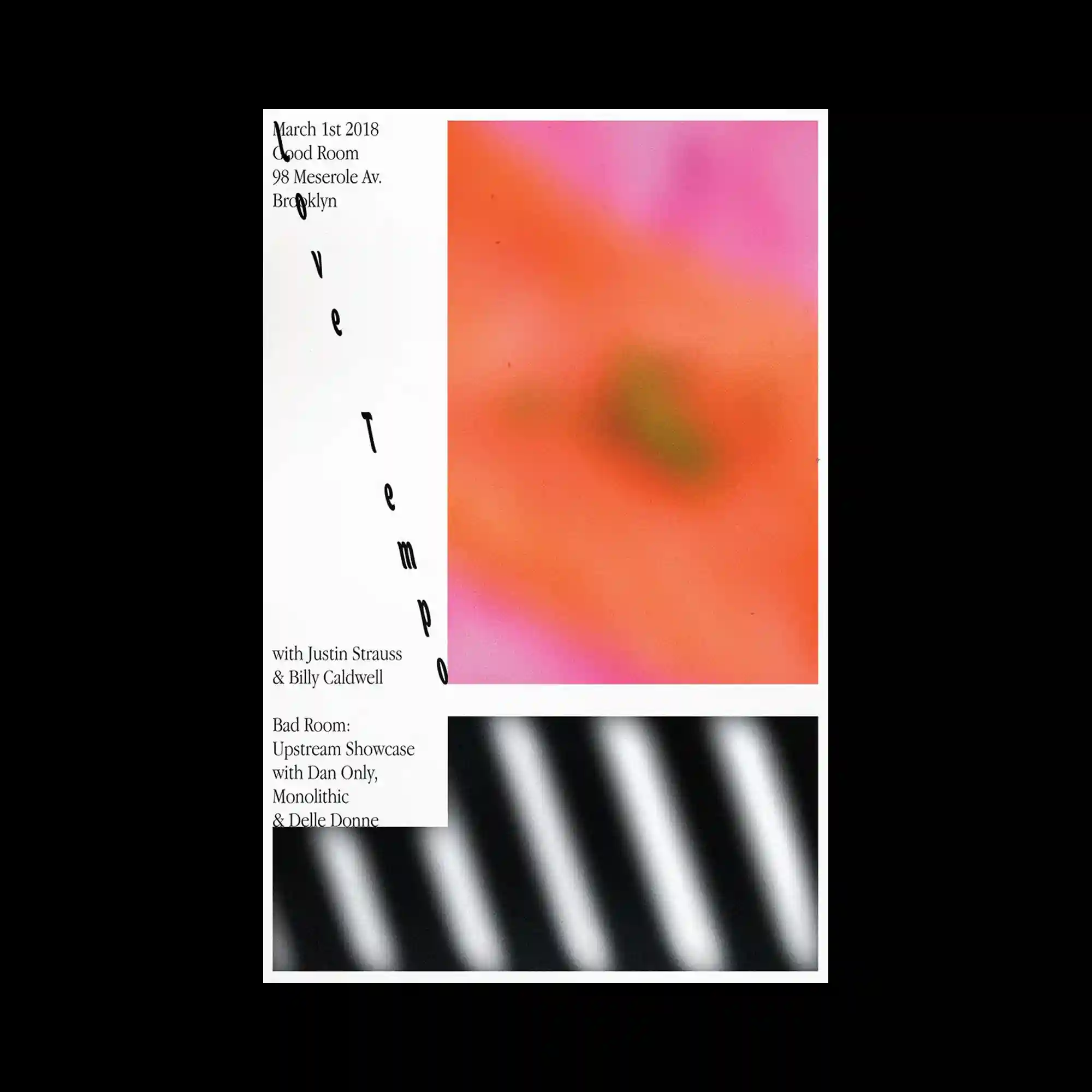
The layout is divided into a vertical text column and two rectangular image panels. Soft, blurred gradient imagery occupies the right side, while a striped grayscale texture fills the lower panel. Thin serif typography runs vertically with generous spacing, maintaining a calm rhythm. The composition emphasizes balance between empty space and muted visual fields.
@hello_ep | An organic black shape fills the center, its edges irregular and fluid. Bright pink typography is wrapped and distorted across the surface, following the curvature of the form. Smaller circular offshoots echo the main shape and repeat the typographic texture. The composition relies on extreme contrast between black mass and neon lettering.
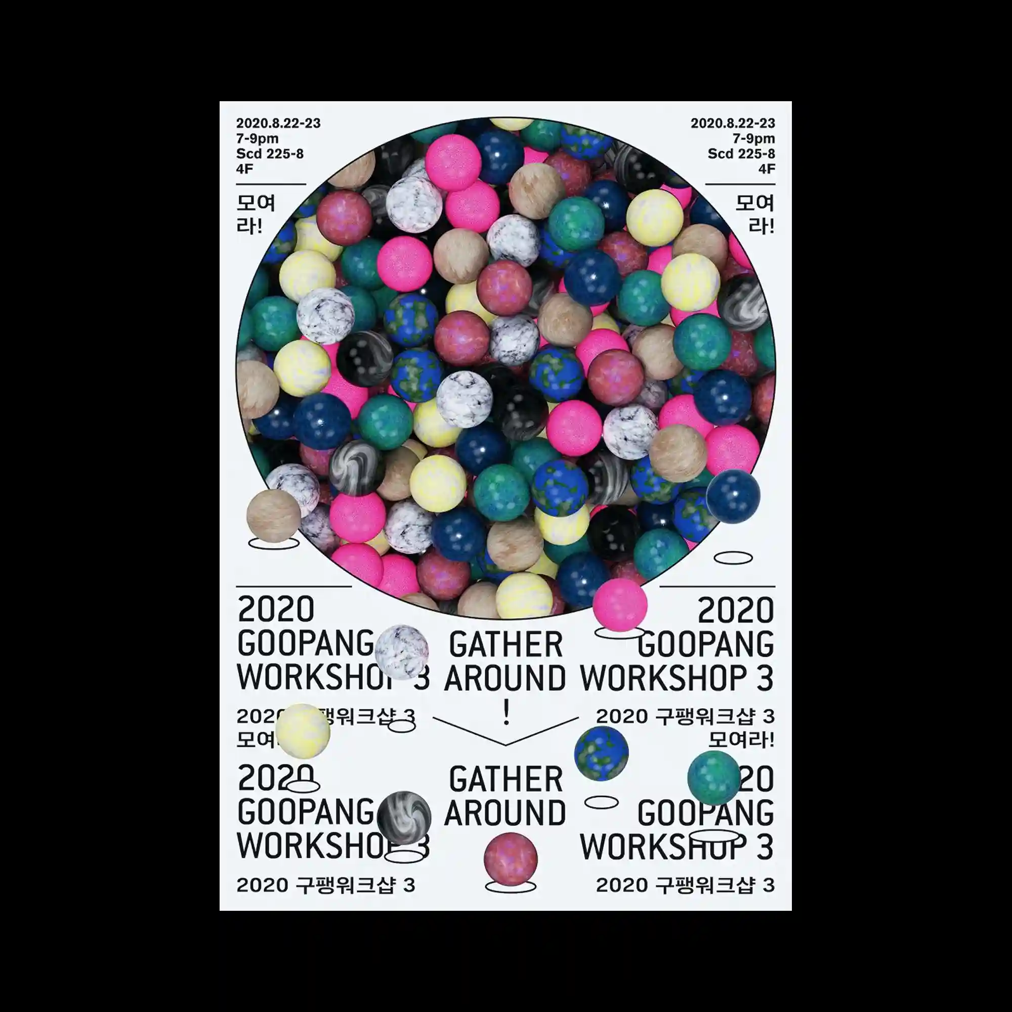
@oddhyphen | A large circular frame contains dozens of glossy spheres packed tightly together. Each sphere features a distinct material texture, ranging from marble and stone to plastic-like surfaces in vivid colors. Several spheres break out of the circle and rest on the surrounding white space, disrupting the boundary. The typography is arranged symmetrically around the circle, reinforcing its centrality.
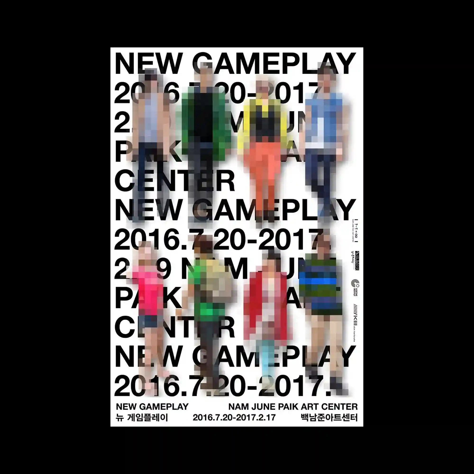
@jinandpark | A white background supports a grid of human figures rendered with heavy pixelation. Each figure is distinct in silhouette and color blocking, yet blurred into blocky mosaics that obscure detail. Large black sans-serif typography is stacked behind and between the figures, forming a rigid textual structure. The contrast between legible text and illegible imagery defines the composition.
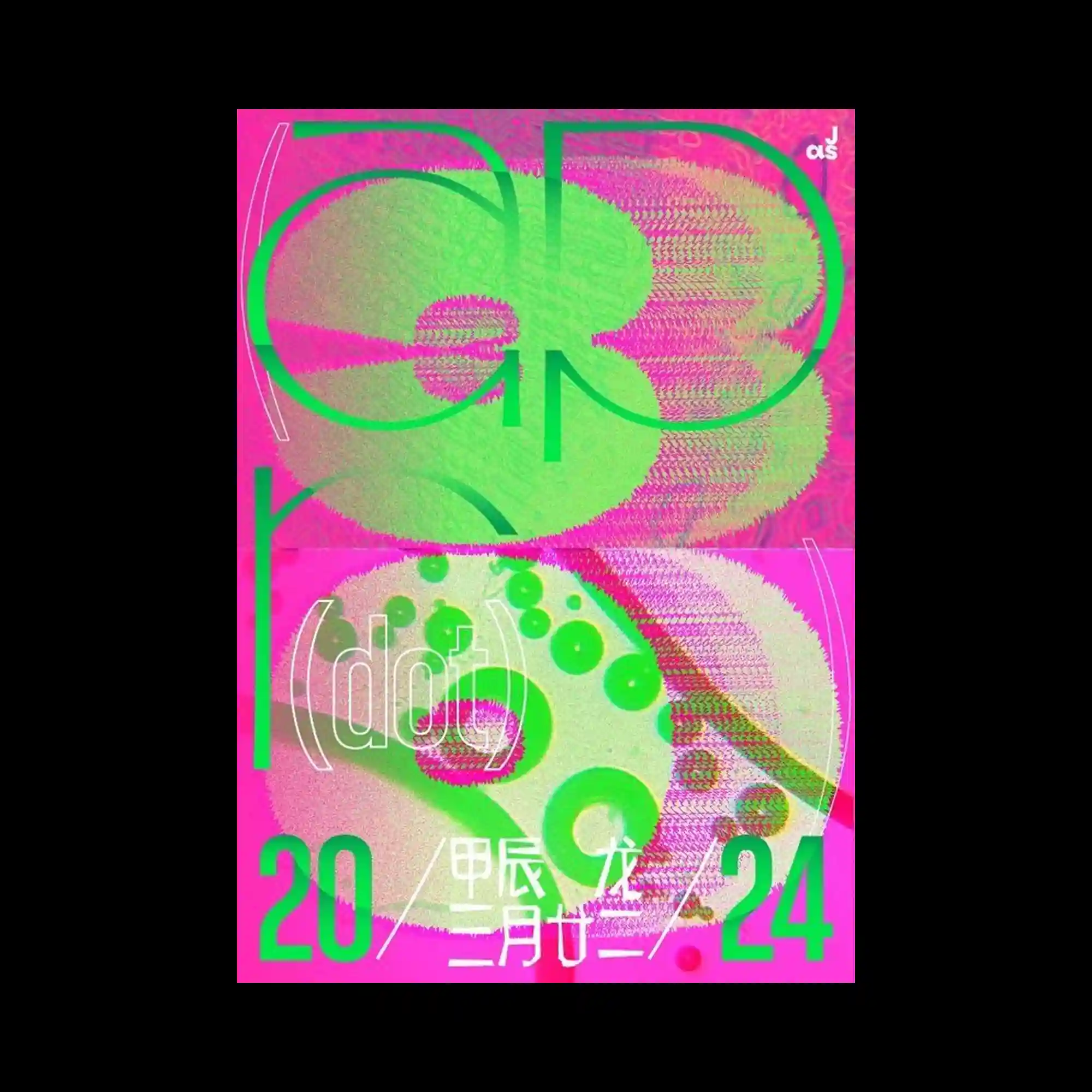
@_justastudio | The composition is split horizontally into two equal panels, each filled with saturated magenta backgrounds and layered green typographic forms. Large rounded letterforms overlap with textured, noise-like patterns that create a vibrating surface effect. Thin white curved lines and outlined parentheses float around the typography, adding secondary motion cues. The layout emphasizes contrast between flat vector shapes and granular raster textures.
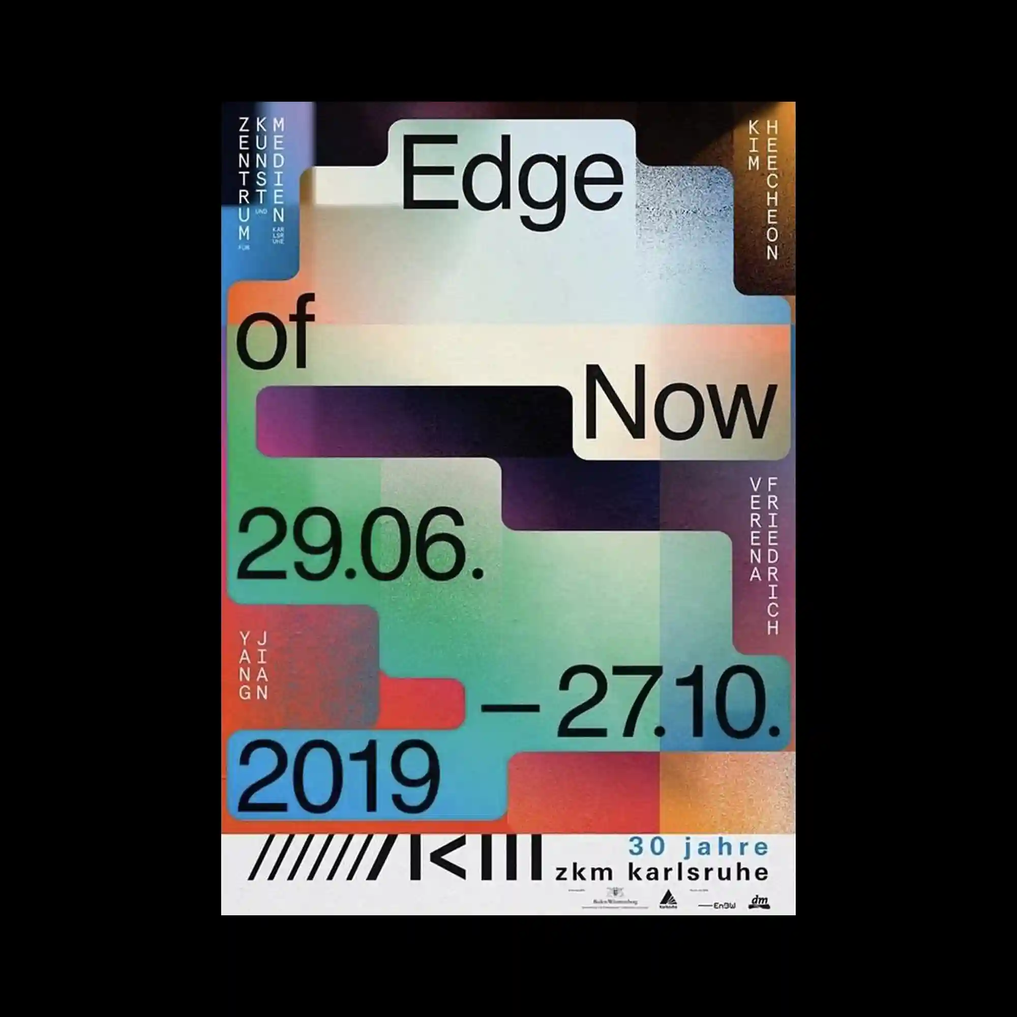
Rounded rectangular blocks in muted gradients interlock like steps across the surface. Typography is embedded within these shapes, aligned to their edges and corners. Fine grain texture overlays the entire composition, softening transitions between colors. The design emphasizes modular structure and layered depth.
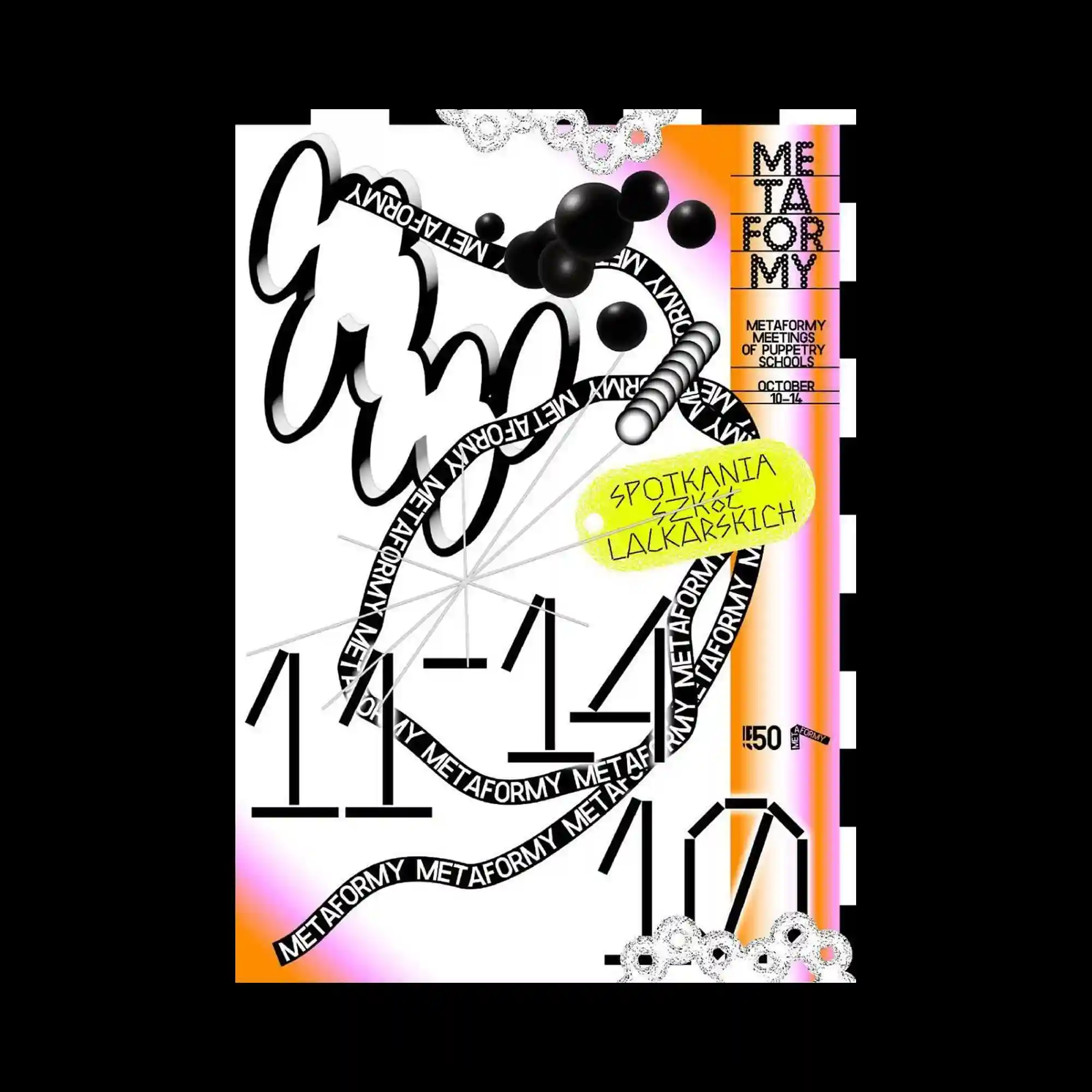
@metaformy_festival | A dark background supports two large, abstract shapes stacked vertically in contrasting colors. The upper form is smooth and flattened, while the lower form splays outward with finger-like extensions. Text is duplicated symmetrically across the top and bottom, reinforcing the vertical axis. The graphic relies on bold silhouette and color contrast.
@eastsidestudio_london | The poster resembles a blurred digital interface, with layered panels and image blocks visible beneath a frosted effect. Scribble-like text floats across the surface, contrasting with the structured UI elements below. The depth is created through varying opacity and softness. The composition evokes a screen captured mid-transition.
A highly layered composition combines hand-drawn strokes, vector typography, and three-dimensional spheres. A looping ribbon of text weaves through the center, acting as both line and message. Bright gradient strips frame the sides, while irregular shapes break the grid. The layout prioritizes motion and overlap over alignment.
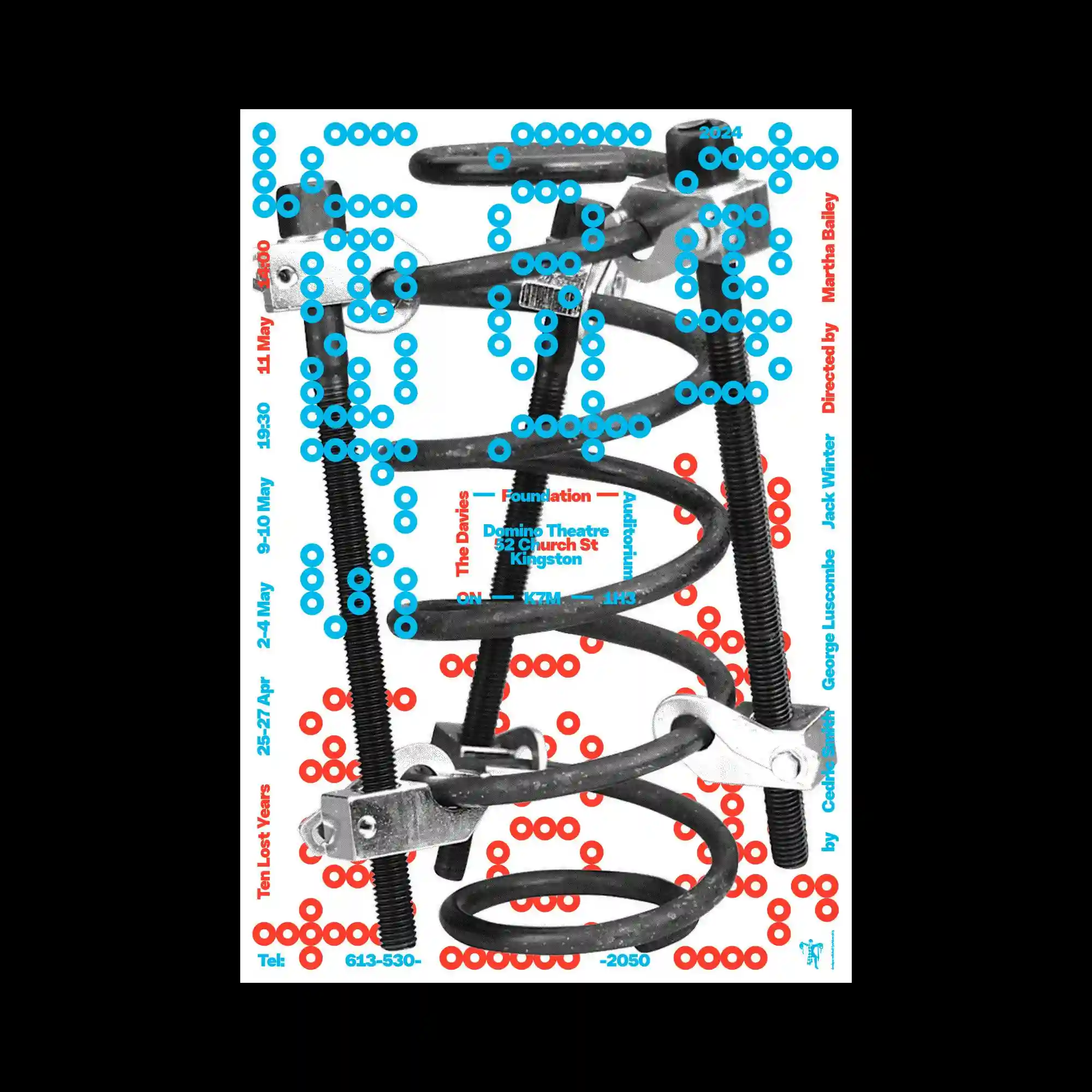
@studio_dasol | A monochrome photographic image of mechanical springs is used as the central background. Over it, circular dot matrices in cyan and red form typographic characters and patterns. Informational text runs vertically along the edges, contrasting with the dense central imagery. The interplay between industrial photography and playful modular dots defines the visual tension.
@designintaiwan | Soft, airbrushed gradients sweep horizontally across the surface, partially obscuring the typography beneath. Serif letterforms emerge through the haze, creating a layered reading experience. The background shifts subtly between warm and cool tones, while ribbon-like shapes fold and overlap. The overall effect emphasizes atmosphere over sharp separation.
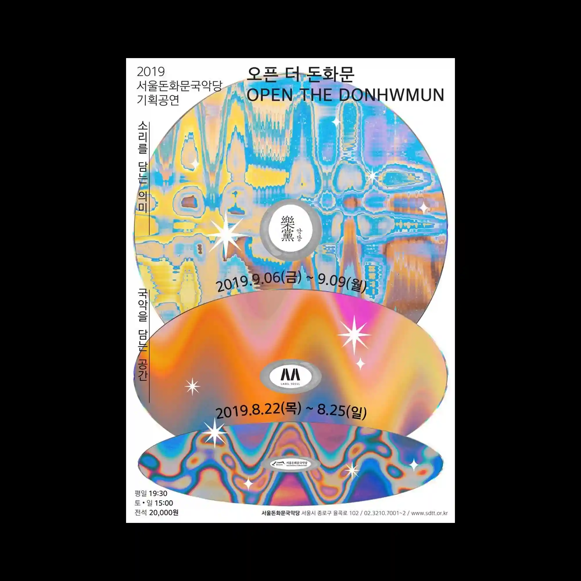
@outracena_lisboa | Three large circular discs dominate the composition, stacked vertically with slight overlaps. Each disc contains intricate, marbled gradient textures that resemble layered waves. Small star-like symbols are scattered across the surfaces, adding points of emphasis. Typography is placed around and within the circles, following their curvature to reinforce the circular hierarchy.
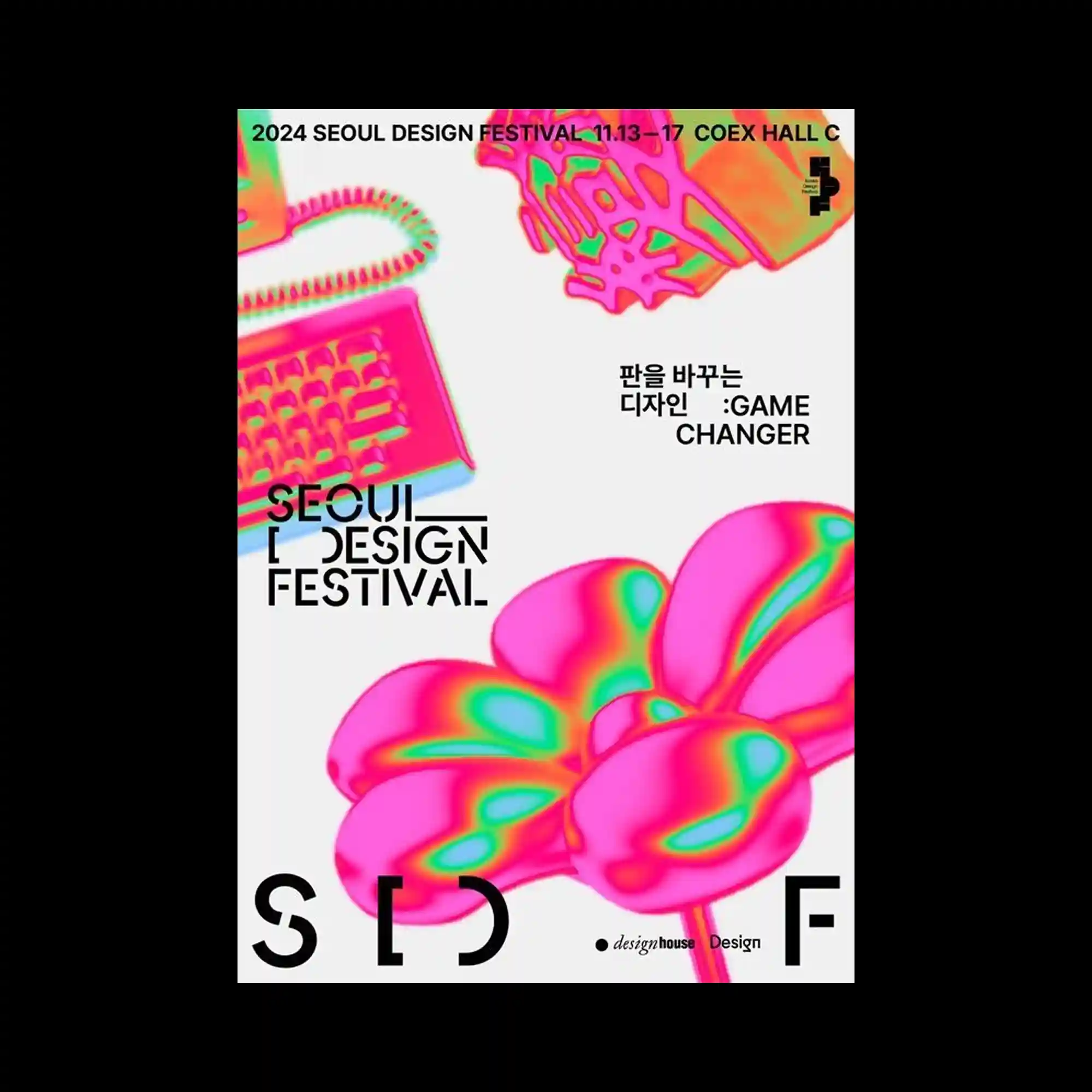
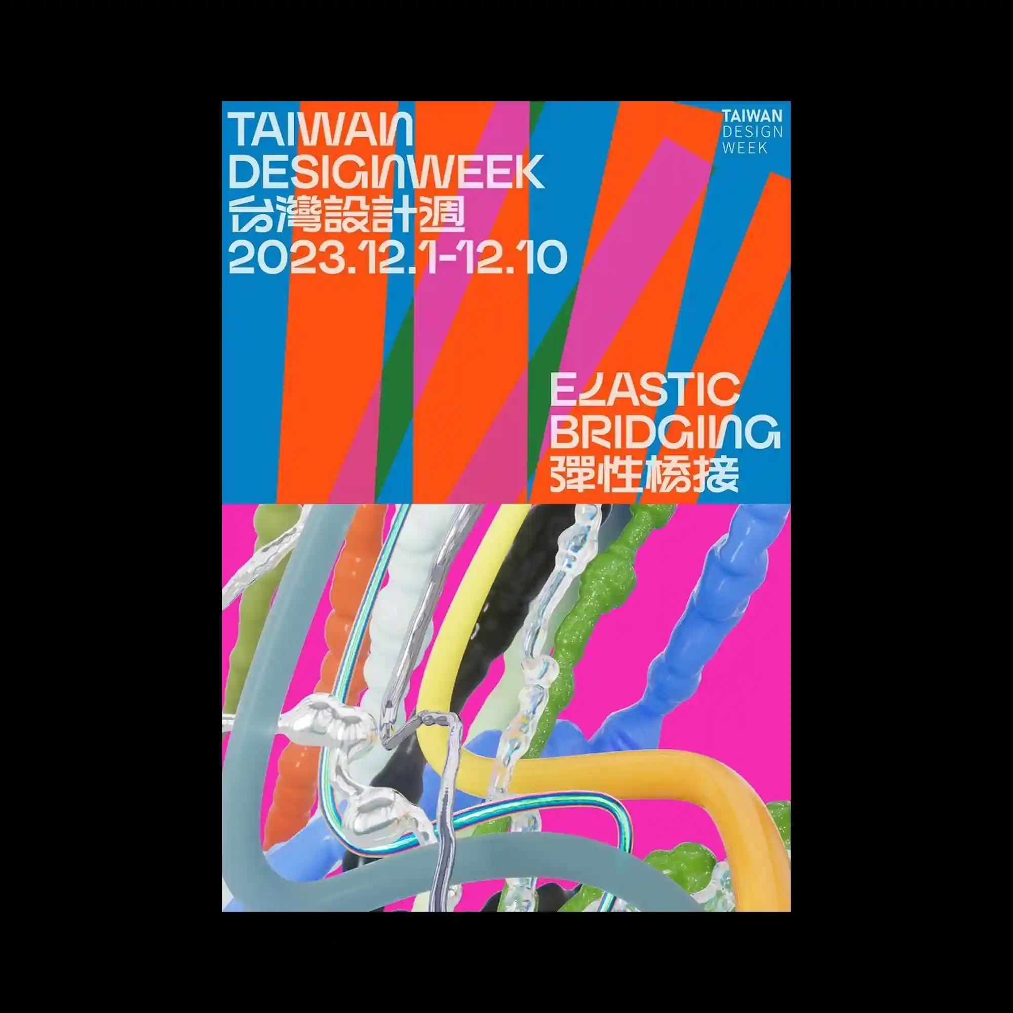
@designfestival.kr | Bold vertical color bands in blue, orange, pink, and green divide the poster into rhythmic segments. Typography is layered on top in both horizontal and vertical orientations, interacting with the stripes. The lower half introduces glossy, tubular forms that overlap and twist, adding dimensional contrast to the flat graphic field above. The composition balances strict geometry with fluid three-dimensional elements.
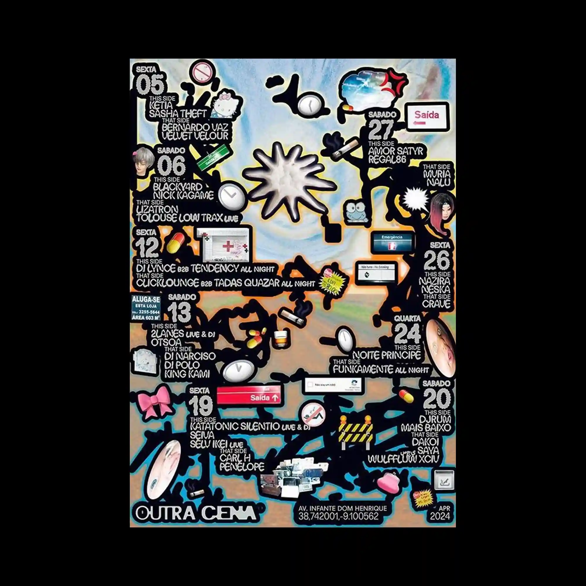
A dense illustration-like layout fills the entire surface with black silhouetted shapes acting as containers for text and icons. Small pictograms, symbols, and labels are embedded throughout, creating a map-like visual rhythm. Bright accent colors punctuate the otherwise muted background, guiding the eye across sections. The composition relies on accumulation and fragmentation rather than empty space.
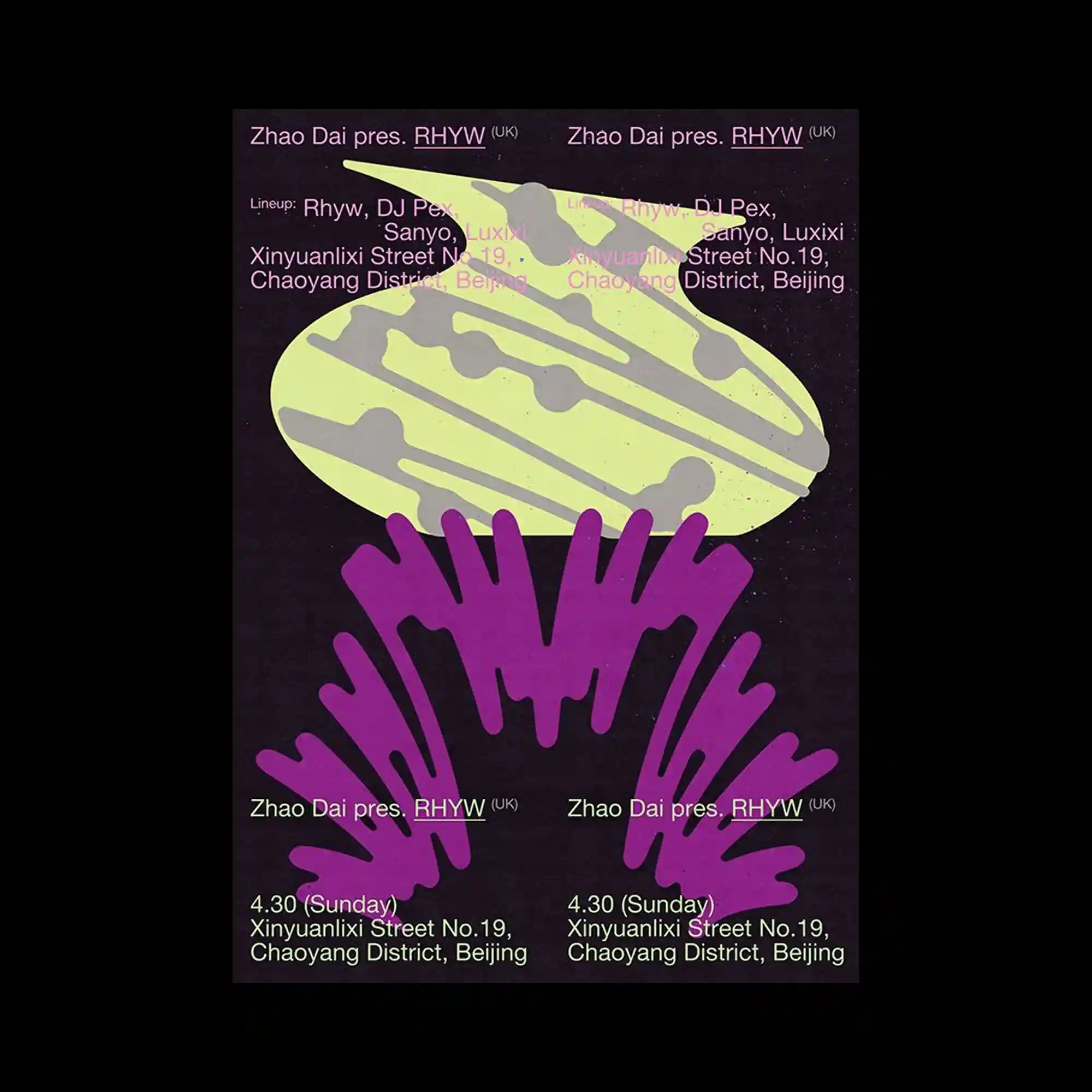
@zhaodaiclub | The poster features a clean white background with large, amorphous gradient objects rendered in neon pink, green, and cyan tones. These organic forms are cropped at the edges and float independently, creating a sense of scale through partial visibility. Typography is arranged with strong asymmetry, combining bold sans-serif blocks and smaller informational text aligned to the margins. The contrast between the minimal background and the high-saturation forms emphasizes the graphic objects as primary anchors.
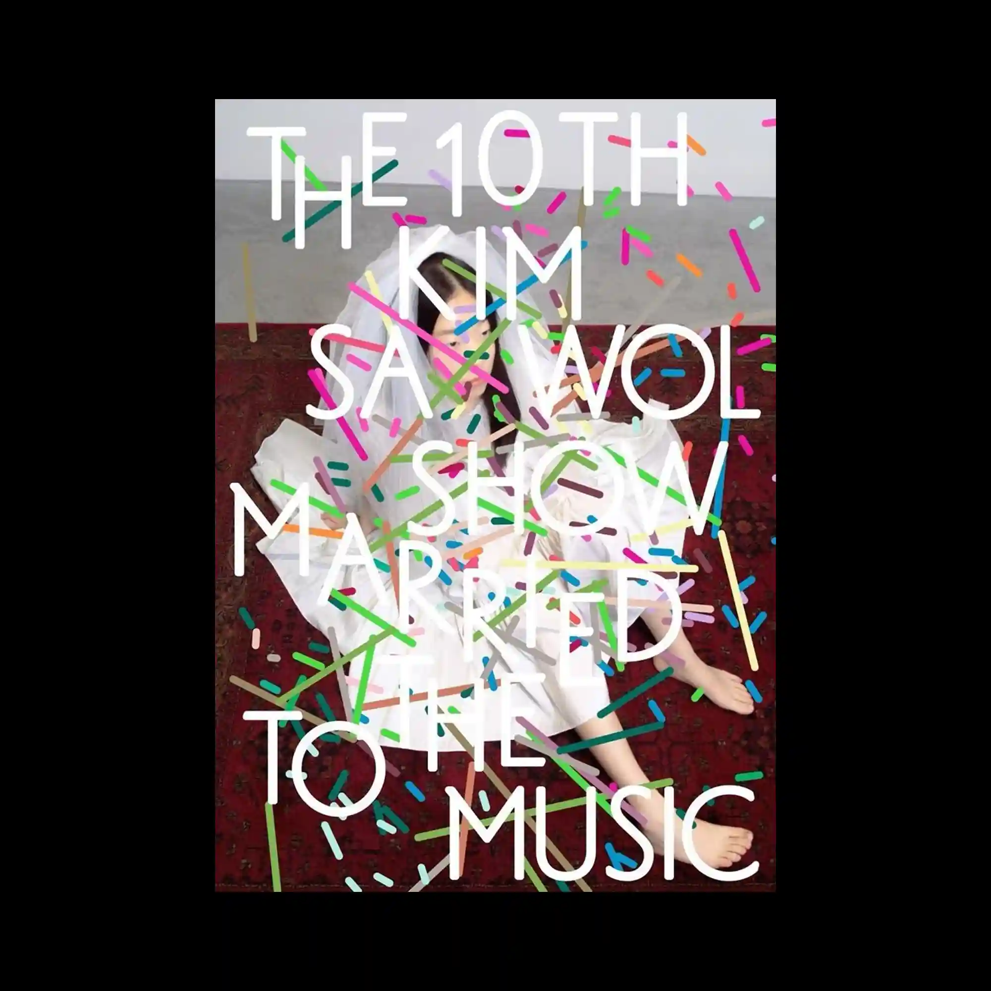
@april_sour | A full-bleed photograph of a seated figure is overlaid with large white typography arranged vertically. Colorful confetti-like strokes scatter across the surface, intersecting both text and image. The typography acts as a structural grid, anchoring the dynamic marks. The interplay of static text and energetic graphic elements defines the composition.
@abcdinamo | Photographic fragments of architectural interiors are layered with translucent pink and purple organic shapes. Text blocks are distributed across the surface, maintaining alignment despite visual interference. The overlays introduce fluid movement over otherwise rigid imagery. The result is a collage that merges spatial photography with abstract color fields.
@alexis_jamet | A dense typographic layout fills the background, over which a circular, airbrushed ring is layered. The ring’s soft, multicolored gradient partially obscures the text beneath. The typography remains legible through gaps and overlaps, creating depth through occlusion. The composition balances informational density with a single dominant gesture.
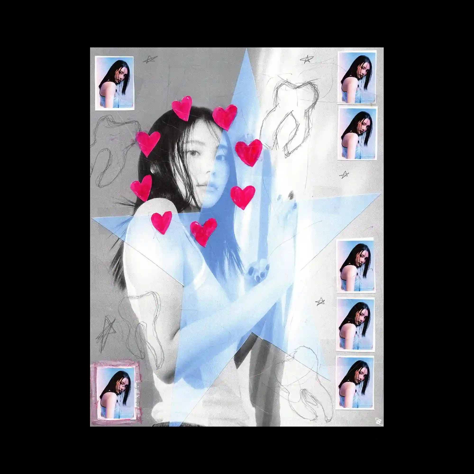
A collage composition centers on a grayscale portrait, intersected by a large translucent star shape. Repeated smaller photo frames line the edges, creating a patterned border. Hand-drawn sketches and symbols are scattered across the surface, adding informal texture. Bright heart-shaped stickers punctuate the image, contrasting with the muted base.
@ben__jo_ | This poster combines torn-paper textures with sharp black gestural marks across a bright, high-contrast background. A small glossy sphere floats above the surface, acting as a focal accent. Horizontal color bands organize the text into clear sections. The contrast between rough edges and smooth gradients defines the visual character.
Layered arches and curved shapes repeat inward toward the center, creating a tunnel-like visual effect. Serif typography sits at the top, while large numerals are stacked concentrically within the composition. Overlapping pastel color fields intersect with darker shapes, producing depth through transparency. The repetition of form drives both motion and focus.
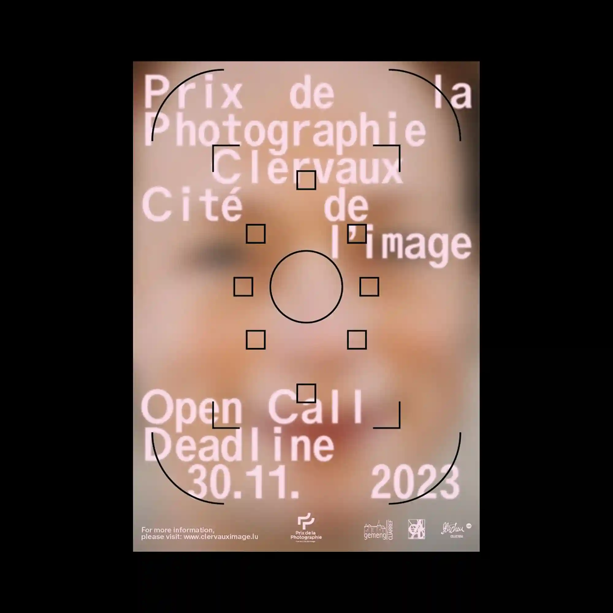
@hannesbrischke | A softly blurred photographic background fills the frame, with sharp black geometric markers layered on top. Square brackets, circles, and corner guides suggest a focus or targeting interface. Large white typography floats above the background, slightly diffused to blend with the image. The composition balances precision graphics against an intentionally unfocused base.
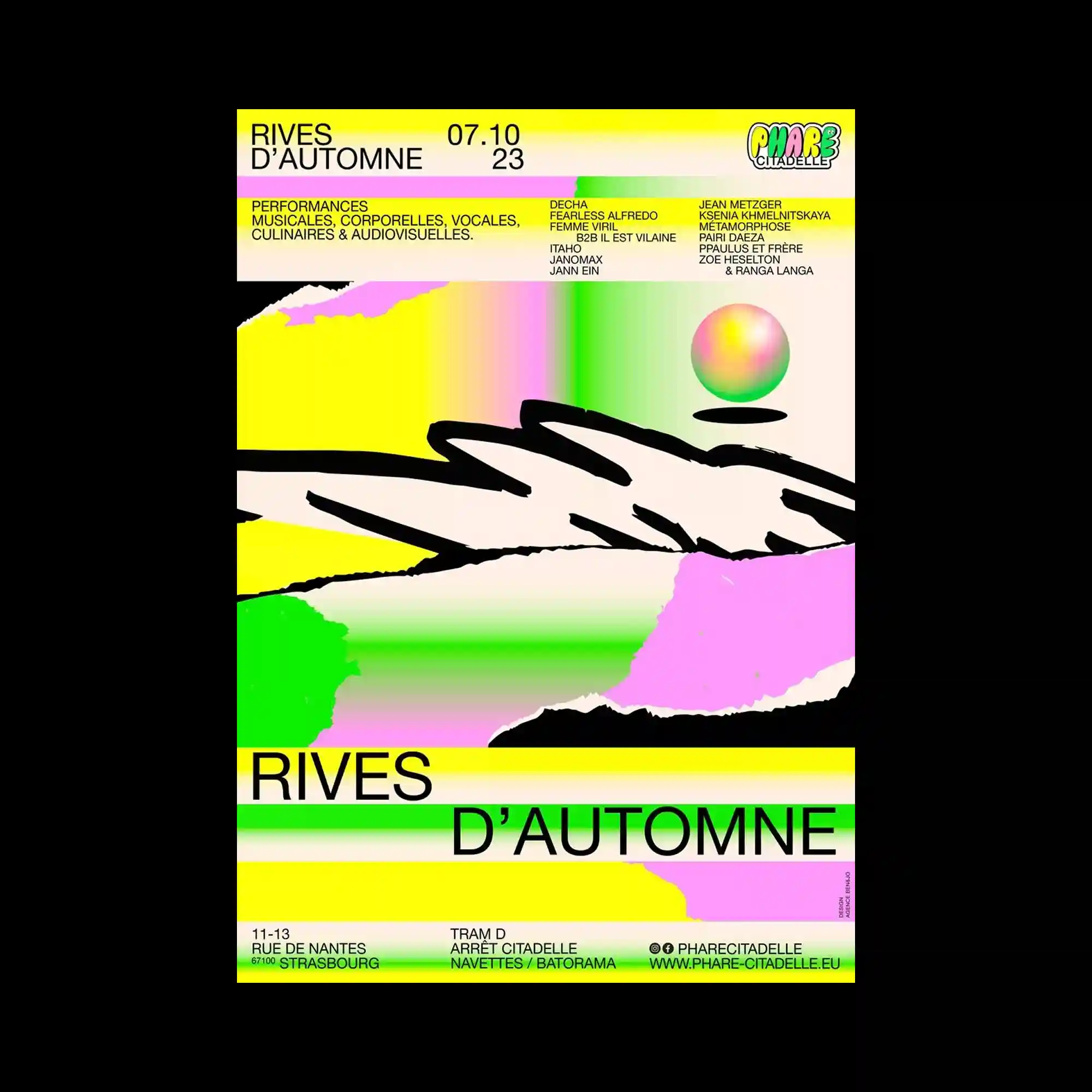
@festivalzero1 | The poster is organized into horizontal bands, each containing a distinct visual texture. A high-contrast monochrome image occupies the top, followed by a bright yellow strip densely packed with text. Below, saturated gradient circles expand across the surface, while the bottom section features repeated translucent spheres aligned in a row. The clear segmentation creates rhythm through variation rather than repetition alone.
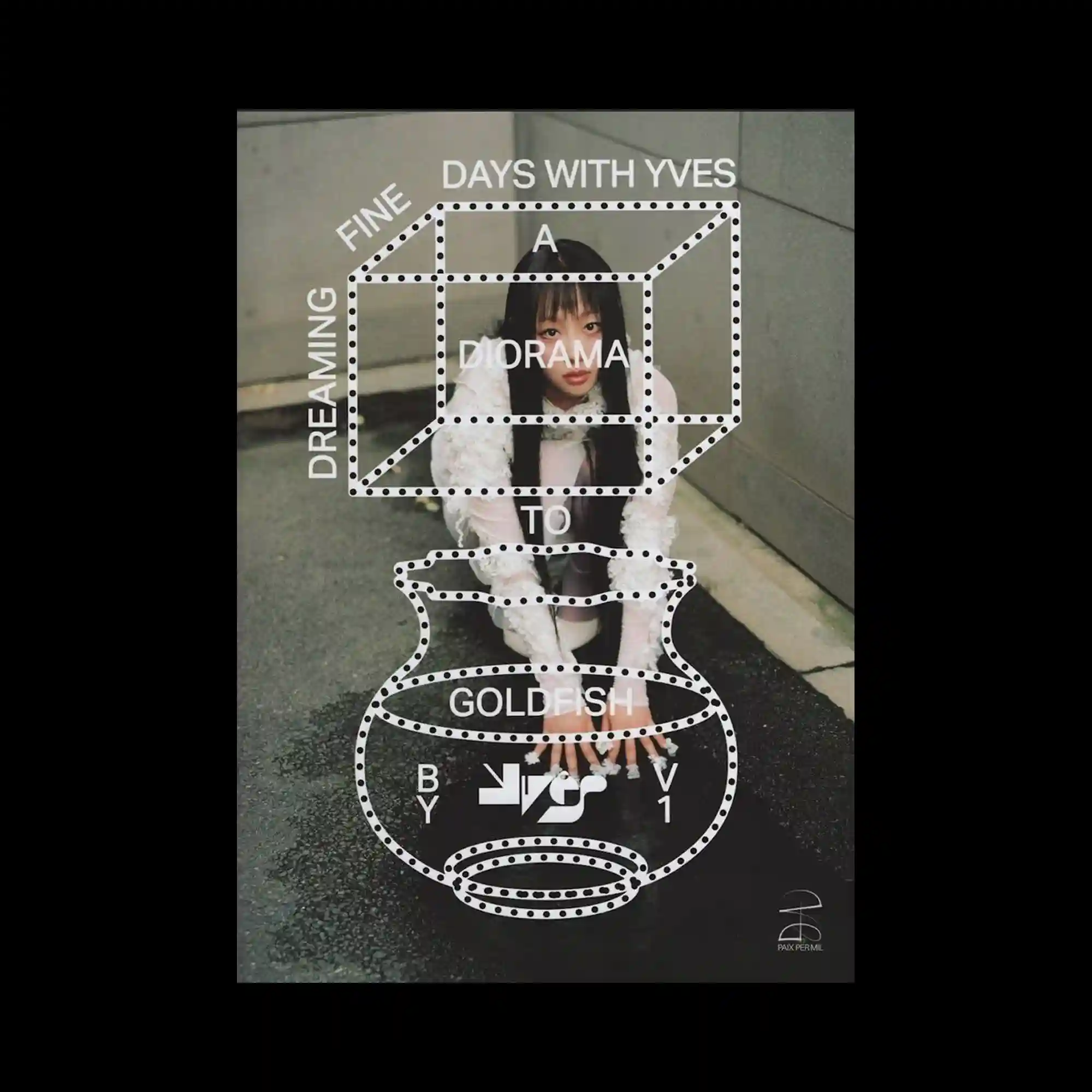
@yvesntual | A photographic portrait is overlaid with a dotted white wireframe structure resembling a three-dimensional diagram. The geometric outline floats above the image, intersecting the subject without fully obscuring it. Typography is integrated along the edges of the wireframe, following its perspective lines. The contrast between organic photography and schematic graphics creates a layered visual dialogue.
@laura_hilbert_ | The composition is divided into bold rectangular zones filled with smooth, blurred gradients in purple, green, blue, and pink. Large uppercase typography is tightly cropped and layered over these color fields, creating strong figure–ground tension. Rounded corners and soft edges of the shapes contrast with the rigid alignment of the letterforms. Smaller text blocks are confined to a single area, reinforcing a structured hierarchy within the otherwise fluid background.

@kaywon.sidi | This poster features a high-contrast magenta overlay applied to everyday tools arranged diagonally. The strong color wash flattens depth, turning objects into graphic silhouettes. Small labels and numeric markers identify each item, reinforcing a catalog-like logic. The composition balances expressive color with systematic annotation.

@samiraschneuwly | The composition is divided into quadrants, each containing softly lit objects photographed from similar angles. Semi-transparent overlays and fine text columns run vertically through the center. Muted colors and consistent lighting unify the disparate elements. The grid structure supports a calm, editorial rhythm.
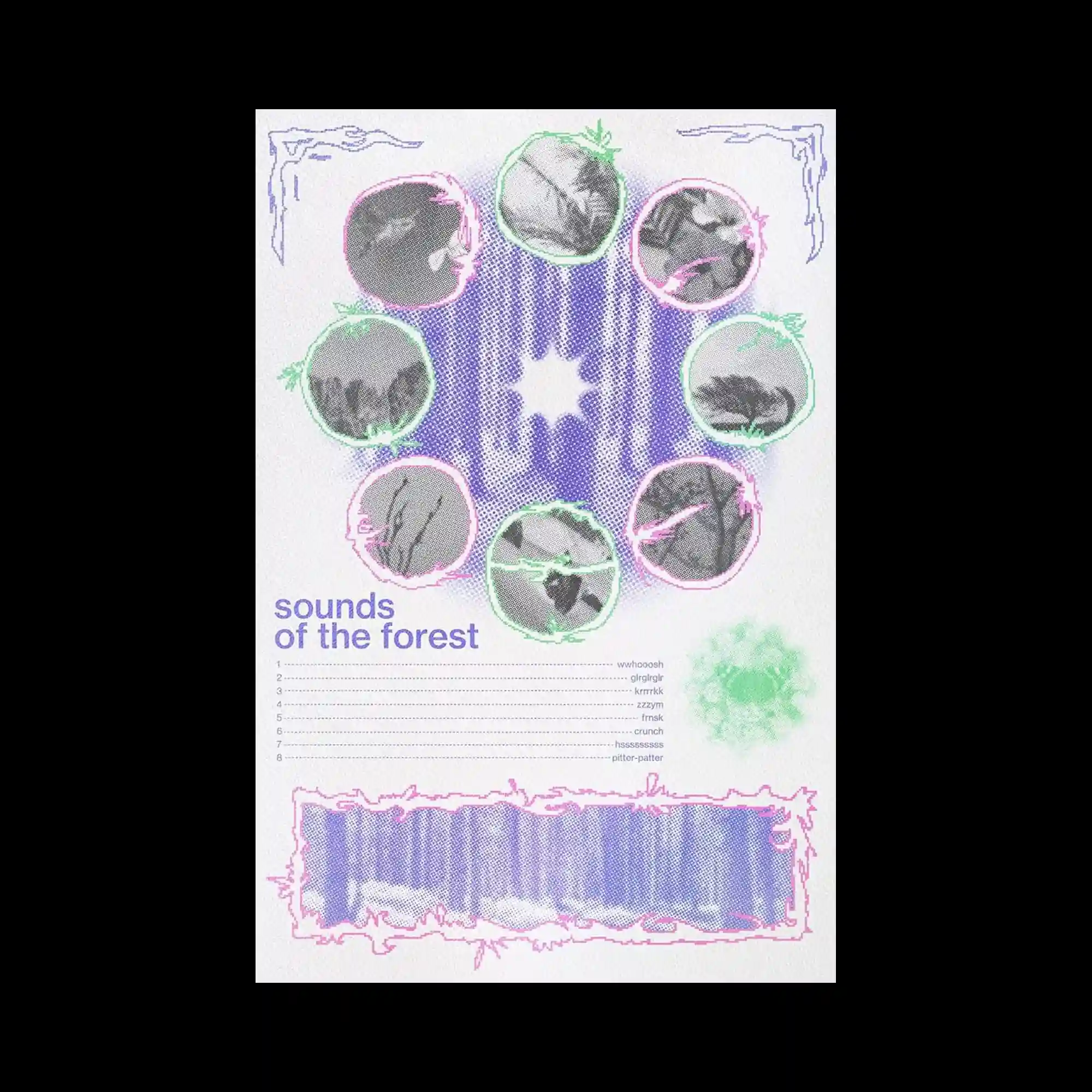
@333dashi | A circular arrangement of small photographic fragments surrounds a textured central shape. Each fragment is enclosed by hand-drawn outlines in contrasting colors. The lower section introduces a list-like text layout, balancing image density above. The overall composition combines diagrammatic order with tactile graphic treatment.
@khyatitrehan | The image uses overlapping rectangular blocks in muted tones, intersected by thin red grid lines. Serif text is layered across the blocks, sometimes misaligned with the underlying grid. The tension between strict geometry and expressive typography defines the composition. Transparency allows multiple layers to remain visible simultaneously.
@jerbosmans | This poster is composed of horizontal bands of color arranged in a grid-like system. Gradients transition smoothly within each band, while abrupt color changes occur between rows. The neutral margin around the composition frames the dense chromatic field. The design explores systematic variation through repetition and controlled shifts.
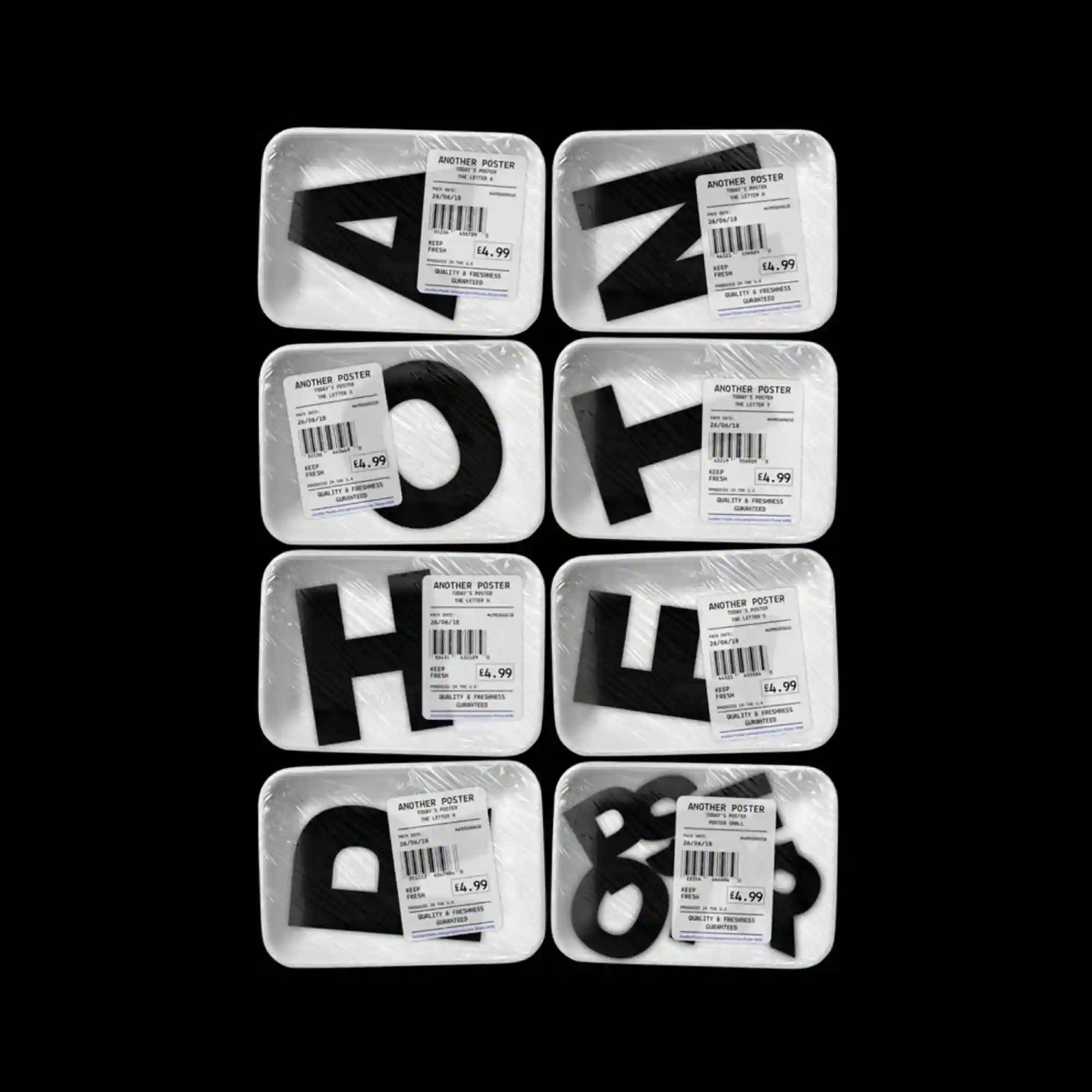
The composition features multiple packaged letterforms arranged in a strict grid. Transparent plastic textures and barcode labels introduce a commercial, standardized aesthetic. Each unit contains a bold black character, with slight variations in shape creating visual diversity. The repetition and equal spacing emphasize modularity and serial production.
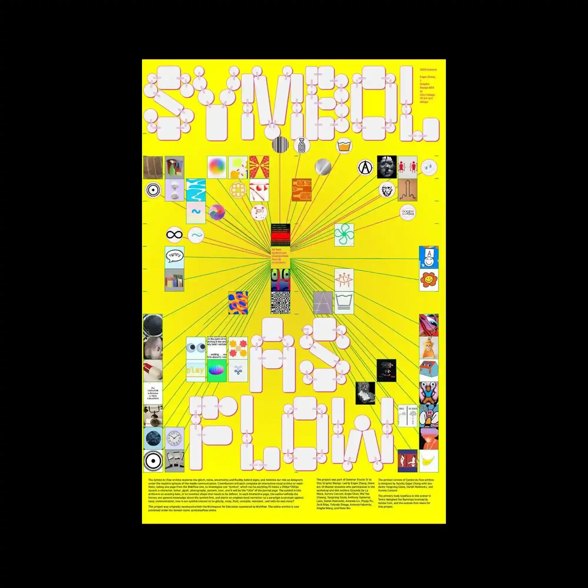
@eagerzliterally | A vivid yellow background dominates the poster, supporting a radial composition that expands outward from the center. Numerous small images and icons are connected by fine lines, forming a network-like structure. Large rounded letterforms anchor the top and bottom, framing the dense visual information in the middle. The hierarchy is driven by scale rather than color variation.

@spechtstudio | The layout combines a central organic silhouette with layered contours and dotted paths. Soft pastel shapes overlap with darker outlines, creating a sense of internal structure within the form. Large serif typography is overlaid across the entire surface, partially obscuring and integrating with the illustration beneath. Vertical color bars at the edges act as framing elements rather than focal points.
This poster is defined by a stark black field framed with a thin white border, creating a strong contrast. Bold, fragmented letterforms cluster near the top, appearing tilted and loosely connected, while the lower area remains intentionally empty. Small blocks of text are tightly set in the corner, balancing the expressive typography above. The composition emphasizes tension between density and void.
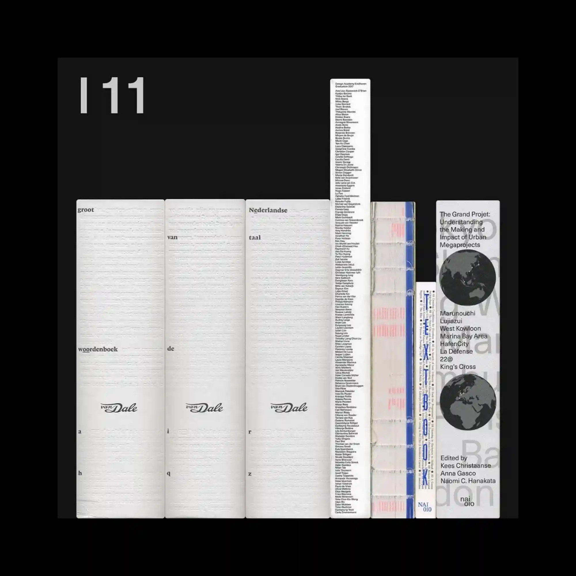
The image presents a horizontal lineup of book spines arranged with precise alignment against a dark background. Variations in width, texture, and typographic density create a subtle rhythm, while the limited color palette emphasizes material differences rather than contrast. The composition relies on repetition and vertical edges to form a quiet structural grid. Negative space above and around the books isolates the objects and reinforces their sculptural presence.
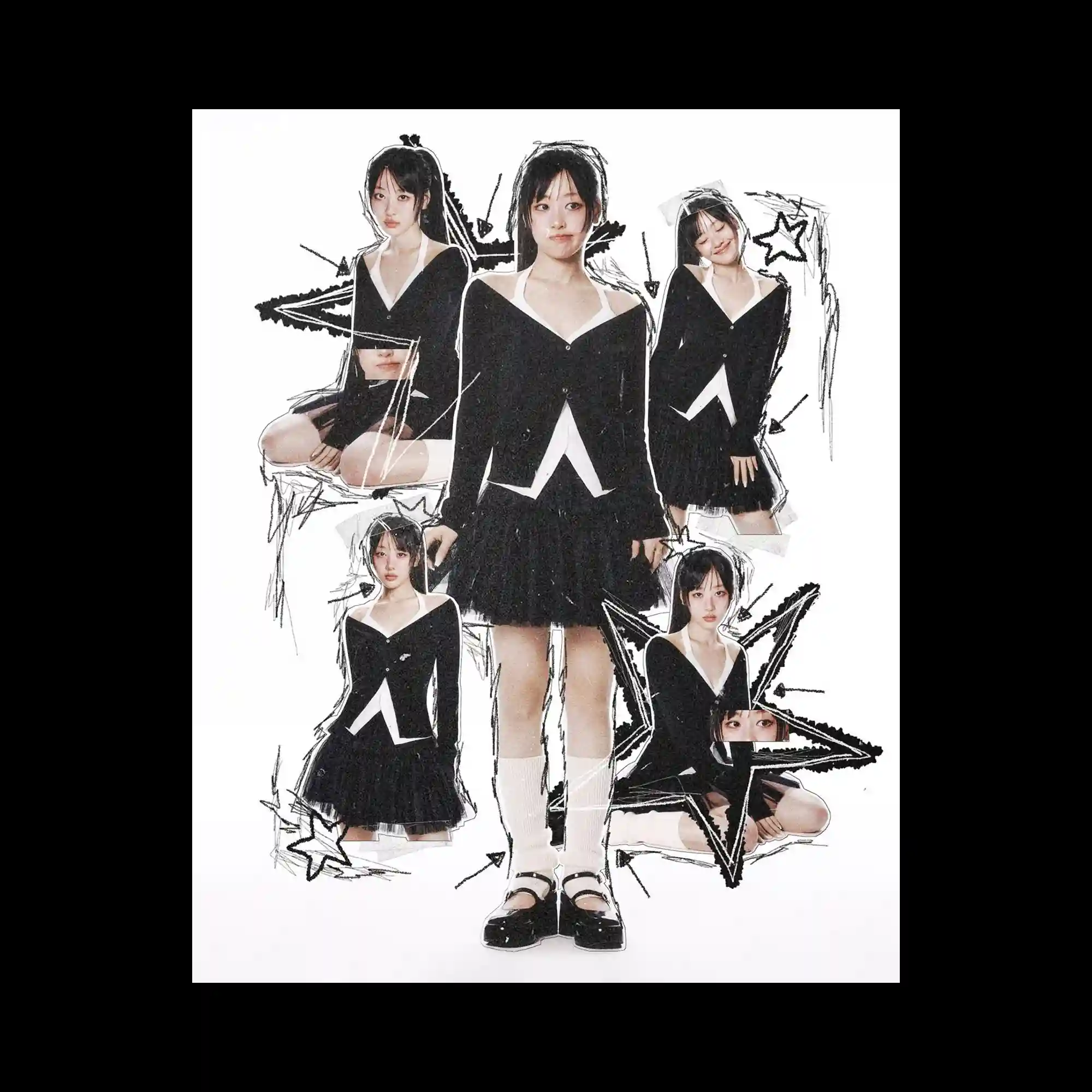
@yvesntual | This image centers on a cut-out collage of a single figure repeated in multiple poses against a white background. Rough, hand-drawn black lines and star shapes are layered around the figure, adding a sketch-like texture. The repetition of the same subject at different scales creates depth without spatial perspective. The composition balances photographic realism with graphic intervention.
@dalbi_graphics | The composition is filled with floral and organic motifs rendered in a pastel pink and blue palette. Repeated flower stamps and leaf-like marks create an all-over pattern, while curved text follows gentle, winding paths. The background gradient softens the overall appearance, reinforcing a light and decorative rhythm. Symmetry is loose, relying on repetition rather than strict alignment.
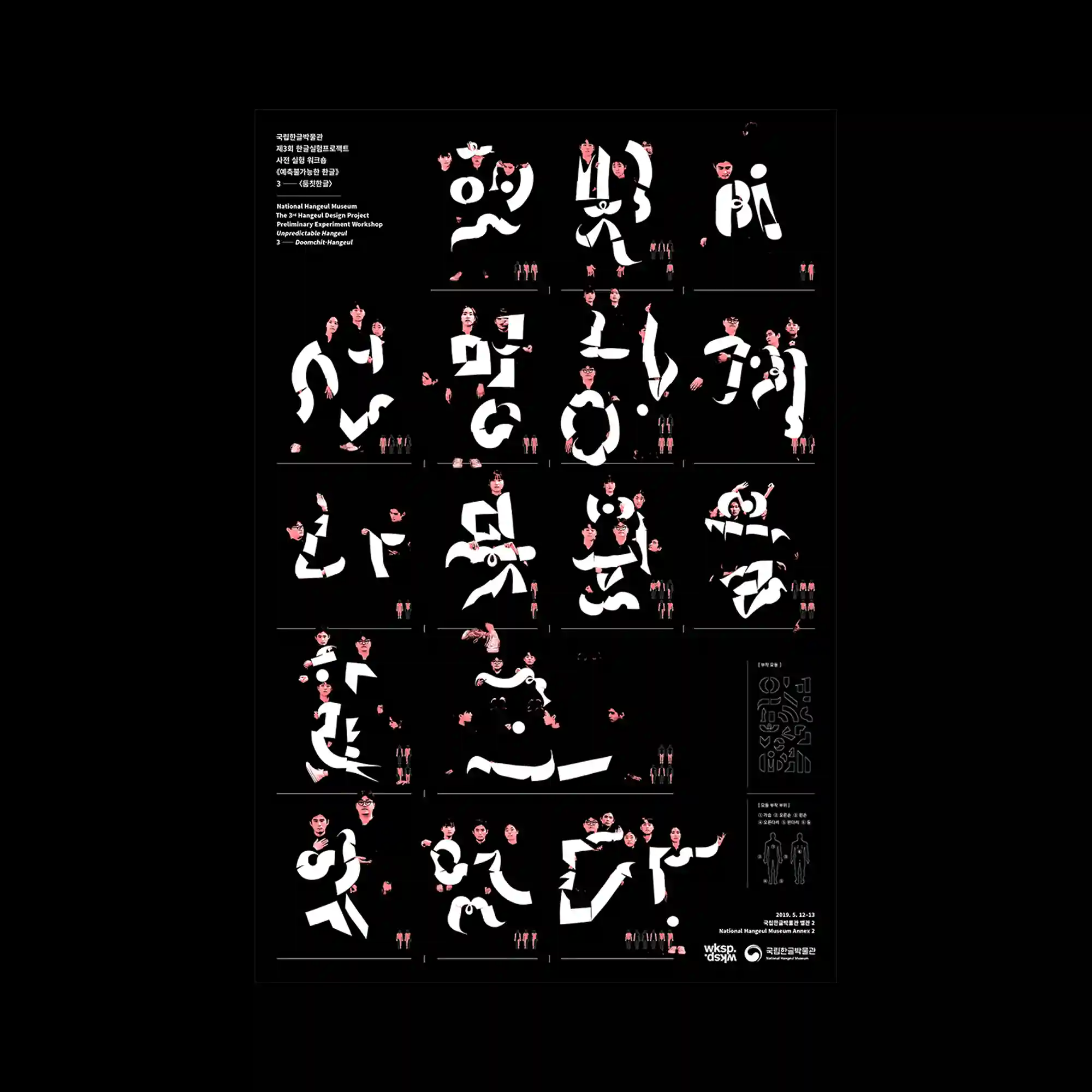
@segal_choi | This poster uses a black background to highlight white typographic forms combined with photographic fragments of human figures. Letters are fragmented and rearranged, integrating faces and bodies within their shapes. The grid-based division organizes multiple variations of these hybrid forms. High contrast between black and white intensifies the sculptural quality of the composition.
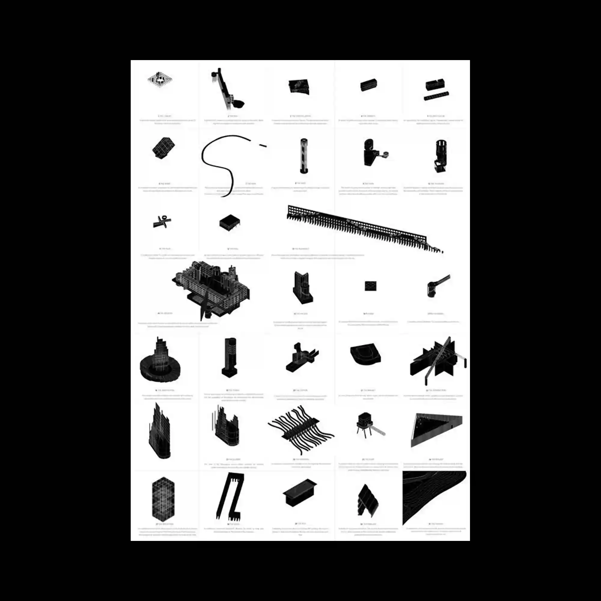
The layout presents a catalog-like grid of small, monochrome three-dimensional objects. Each item is isolated within its own cell, rendered in consistent lighting and perspective. The repetition of modules creates a systematic rhythm, while subtle variations in form maintain visual interest. Negative space between cells reinforces clarity and separation.
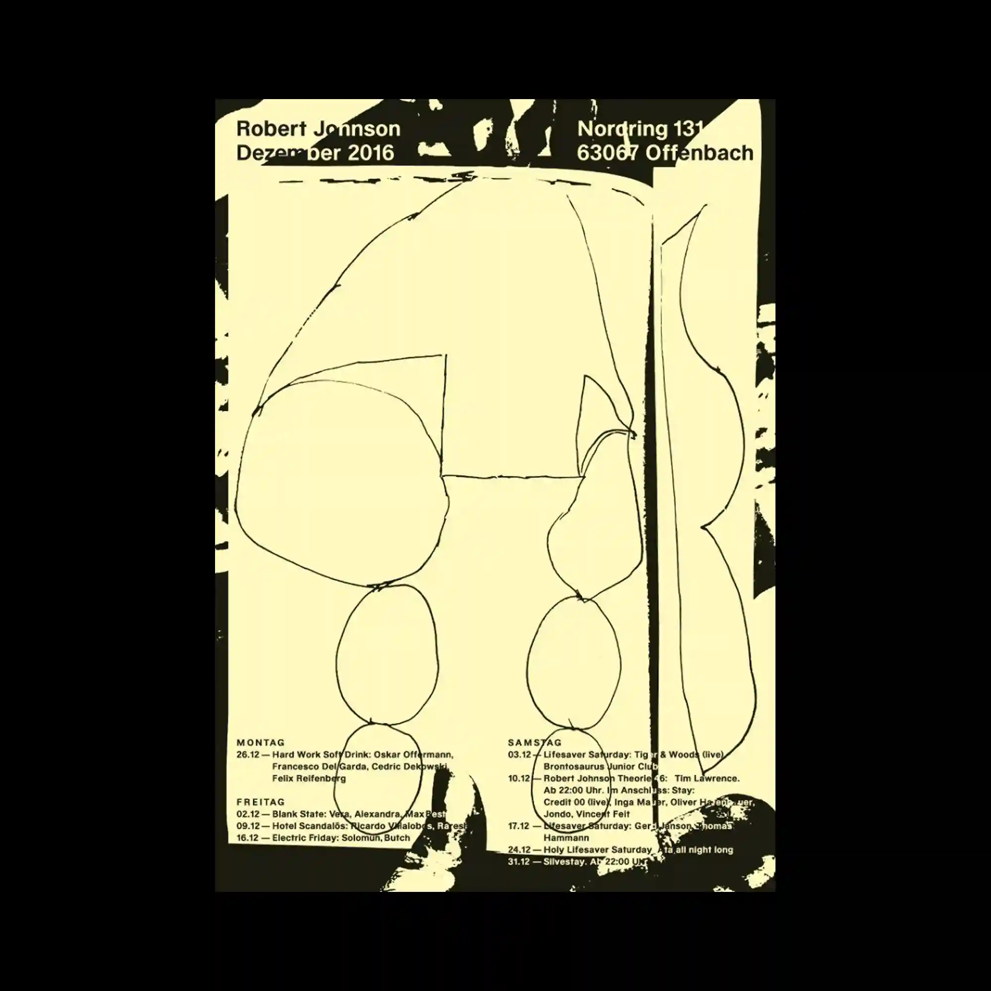
@studiomichaelsatter | A limited color palette of pale yellow and black defines this poster, dominated by loose, hand-drawn line forms. Organic shapes are outlined with uneven strokes, suggesting spontaneity and imperfection. Dense black areas frame the composition, compressing the central forms inward. Text is kept minimal and aligned near the edges, functioning as a quiet counterbalance to the expressive lines.
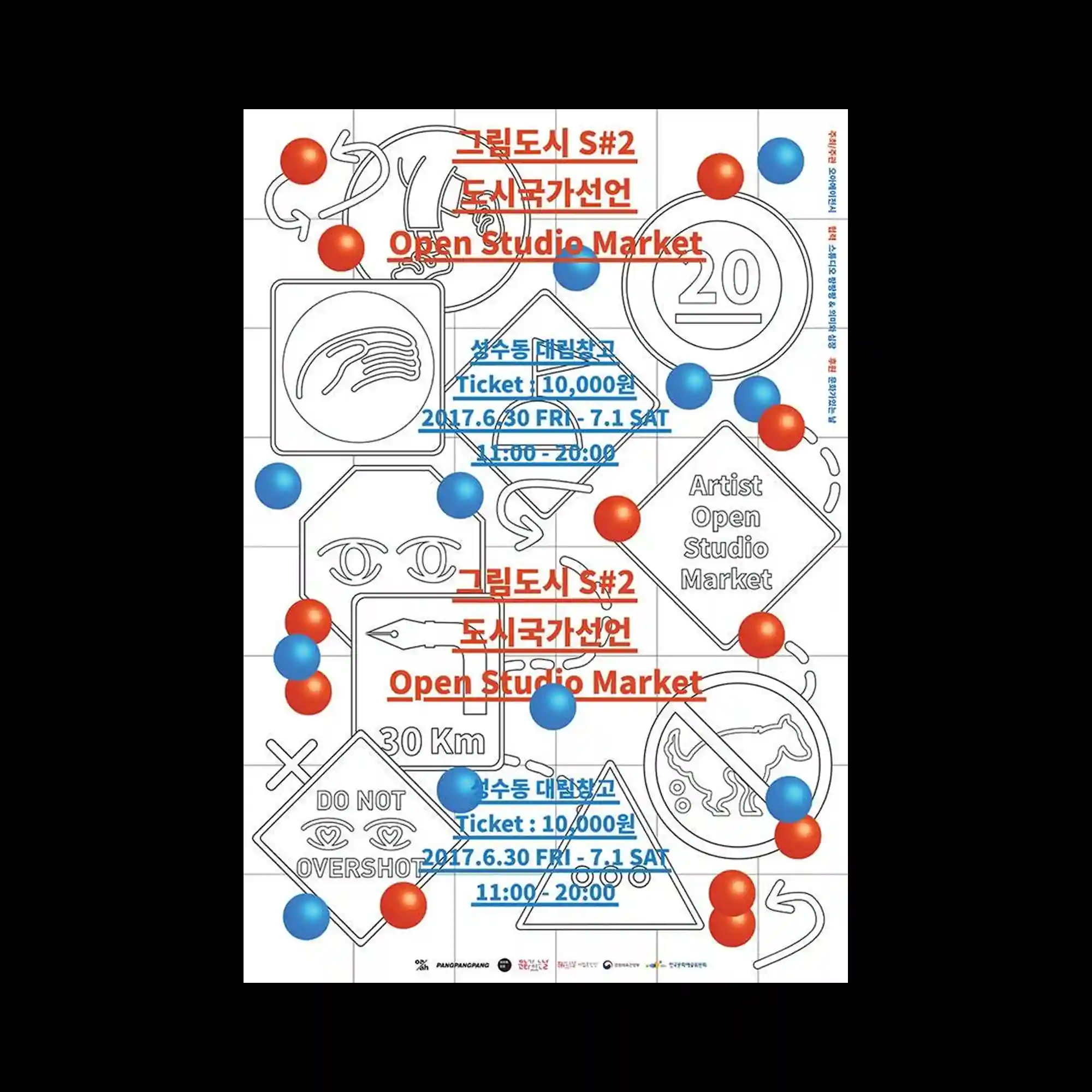
@grimdosi | This design is structured on a visible grid, populated by outlined icons, arrows, and symbols. Red and blue spherical elements float across the grid, overlapping line drawings and text. The interplay between precise line work and soft, shaded spheres creates a contrast of rigidity and playfulness. Text blocks are integrated into the grid, maintaining alignment while allowing visual interruptions.
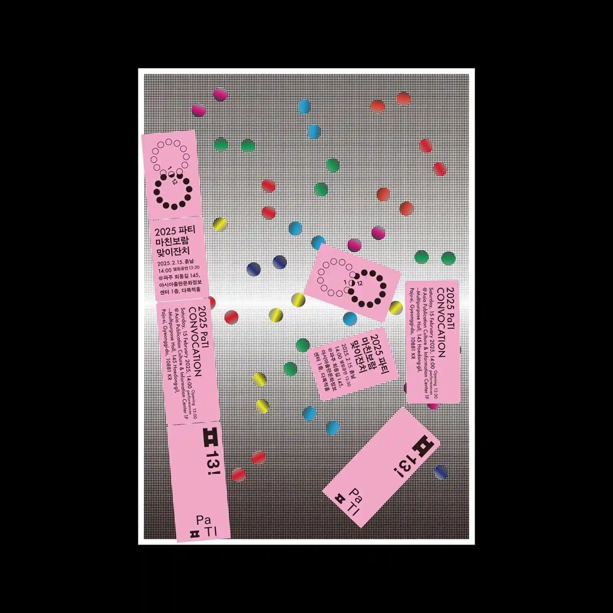
@paju.typography.institute | The composition features a neutral, textured background over which small, vividly colored circular elements are scattered. Pink rectangular cards with dense text blocks are placed at varied angles, creating a collage-like arrangement. The contrast between the muted backdrop and saturated dots emphasizes depth through layering. Repetition of circular motifs establishes visual rhythm across the surface.
@kulachek | This poster uses a white background as a neutral stage for bold black typography and scattered, brightly colored geometric stickers. Irregular rectangles in pink, green, yellow, and blue overlap the text, partially obscuring and revealing letterforms. The contrast between strict typographic alignment and casually angled shapes introduces tension and movement. Color placement is evenly distributed, preventing a single focal point and encouraging the eye to scan the entire surface.
@yu_na_kim_c | The layout is organized as a dense, layered diagram composed of overlapping circular and fan-shaped forms. Bright green and blue color fields dominate the surface, segmented by thin outlines and semi-transparent overlays. Repeated radial shapes create a sense of rotation and accumulation, while rectangular panels anchor the composition vertically. Text elements are embedded into the structure rather than separated, reinforcing the feeling of an informational map.
@sionhsugraphic | The composition is built around a strong vertical axis, where deep blue rectangular blocks intersect with a white background and black typographic elements. Sharp, star-like symbols are repeated at different scales, creating a rhythmic contrast between geometric precision and symbolic emphasis. Thin black lines and blurred linear gradients form a layered texture that suggests depth and motion without relying on perspective. Typography in multiple orientations frames the central structure, functioning as both informational blocks and visual borders within the layout.
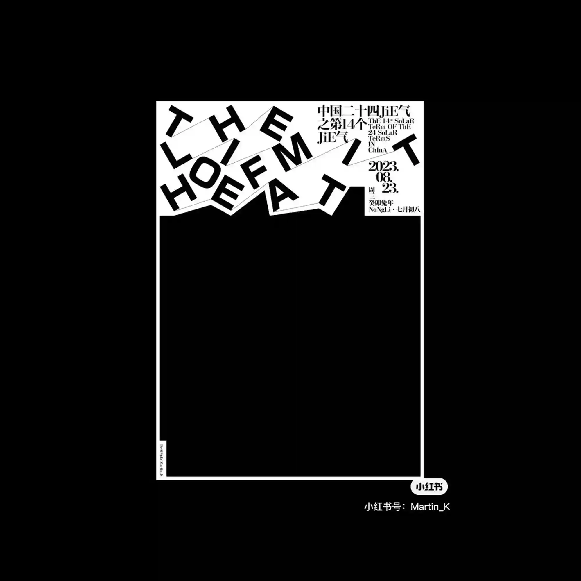
@he_jumping | Distorted black typographic forms curve inward from the edges, framing an empty central space. Letterforms are stretched and repeated, transforming text into rhythmic visual elements. The asymmetrical balance directs attention toward the void rather than the content itself. Negative space functions as an active structural component.
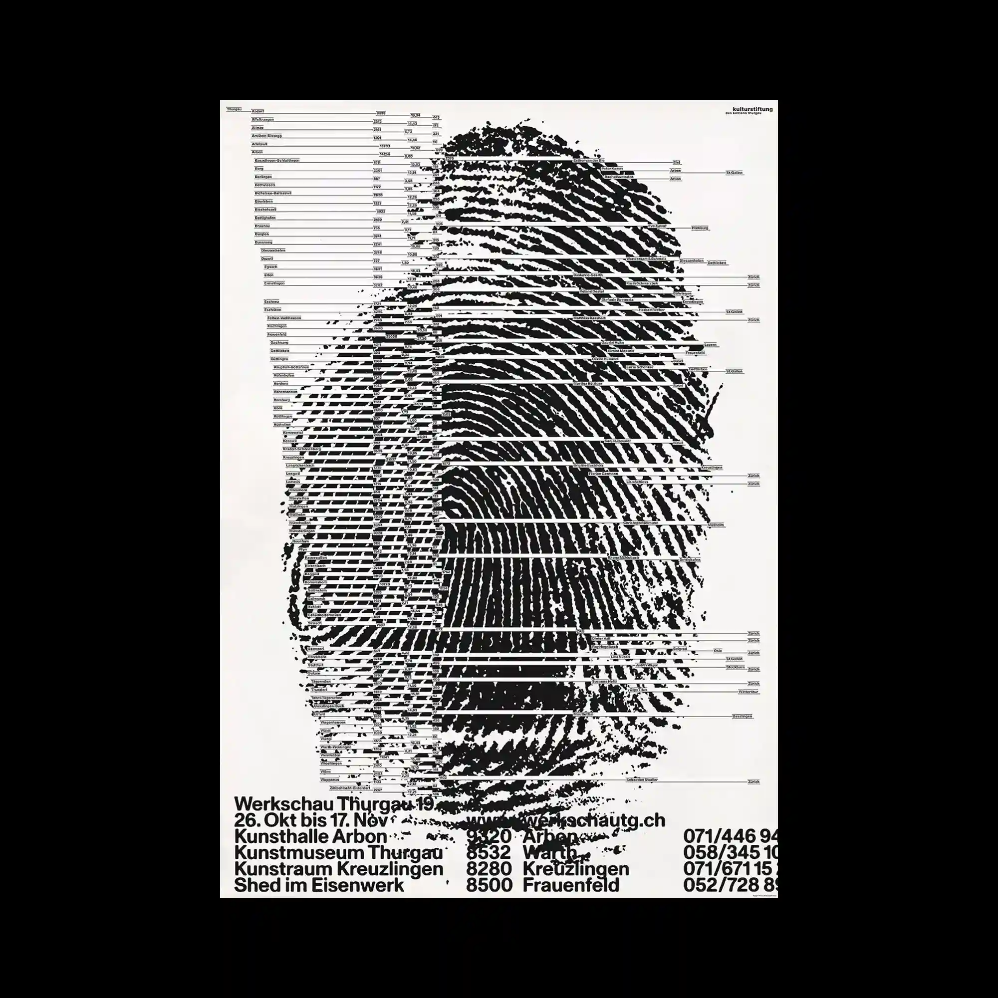
@kulturstiftung.thurgau | A large fingerprint graphic dominates the page, intersected by numerous horizontal lines of text. The biometric pattern is fragmented by the typographic overlays, merging image and information into a single surface. Alignment and spacing of text follow a strict horizontal rhythm. The contrast between organic pattern and mechanical layout defines the visual tension.
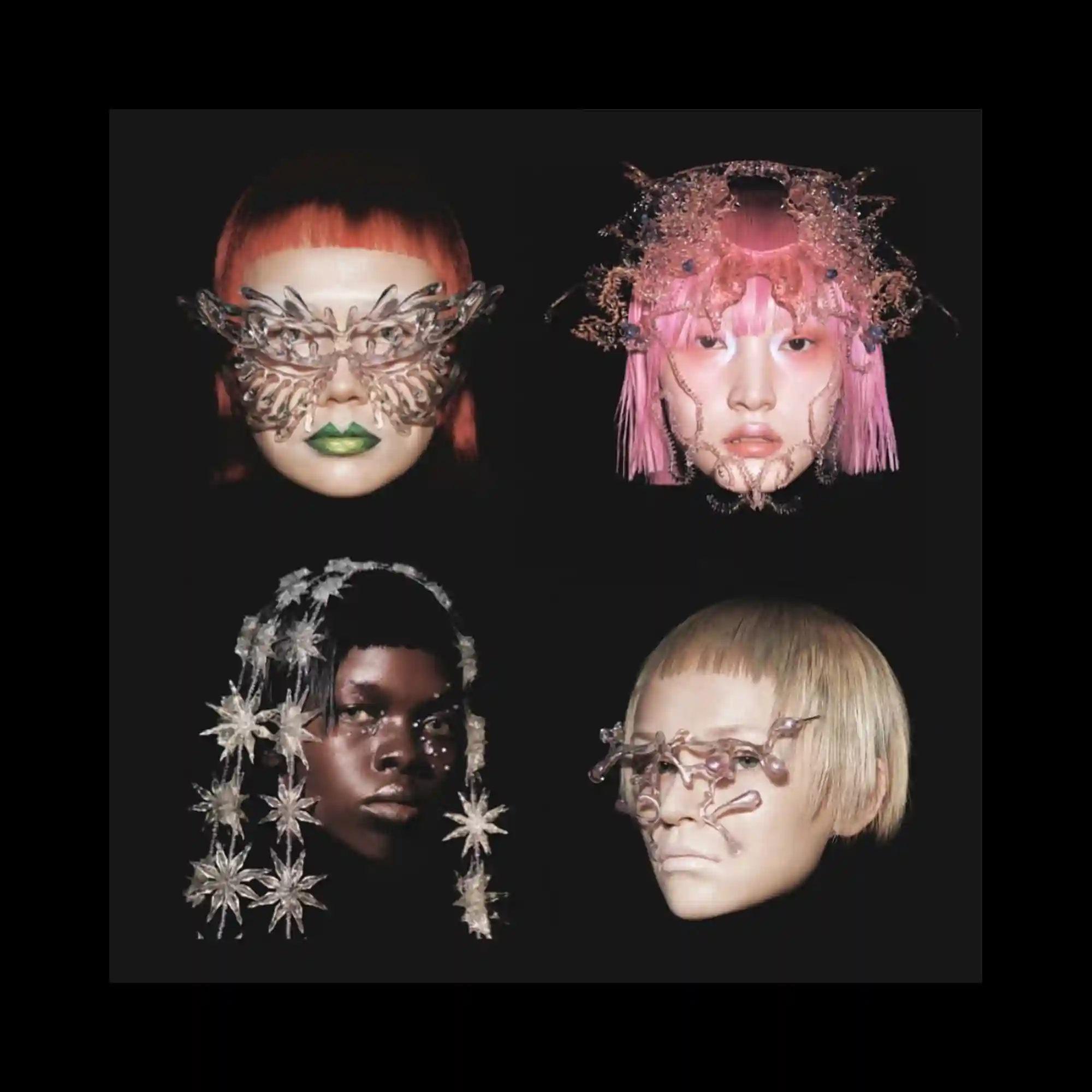
@mmwdwork | Four portrait-style faces are isolated against a dark background, arranged in a balanced grid. Each face is adorned with intricate, translucent structures that extend beyond facial contours. Lighting accentuates texture and materiality, while the uniform framing maintains cohesion. The composition explores variation within a fixed structural system.
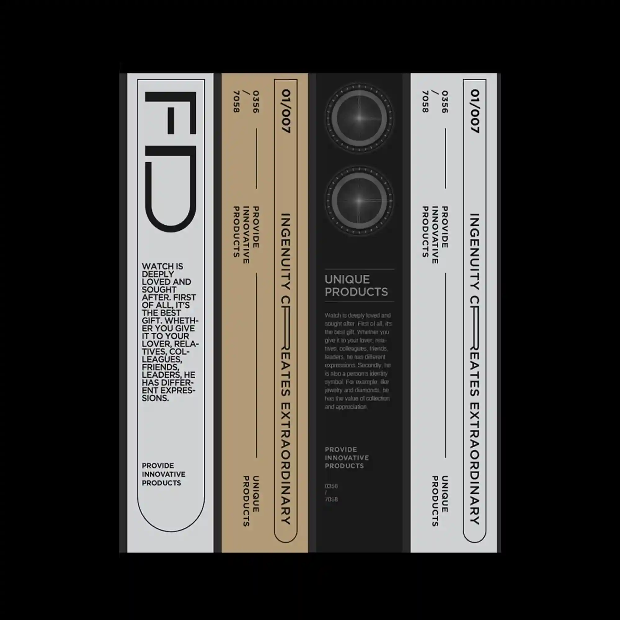
Tall vertical panels align side by side, each containing restrained typography and graphic indicators. A limited color palette and consistent proportions create a product-label-like system. Circular graphic elements introduce focal points within otherwise linear compositions. The design emphasizes precision, alignment, and serial variation.
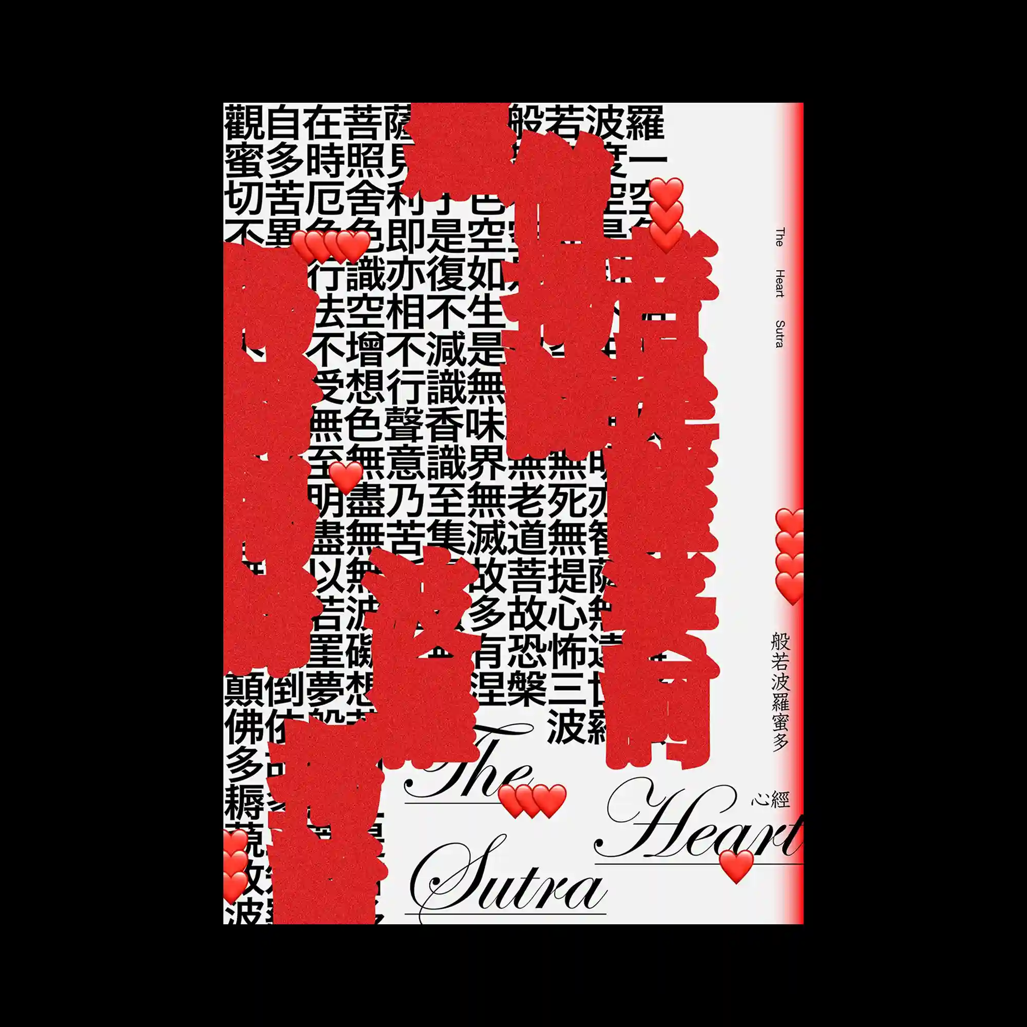
#TAI_YUAN_HU | Bold vertical red strokes aggressively obscure large portions of dense black text beneath. The underlying typographic field remains visible at the edges, creating tension between concealment and revelation. Decorative script typography emerges at the bottom, contrasting with the rigid block text above. The composition uses interruption as its primary visual strategy.
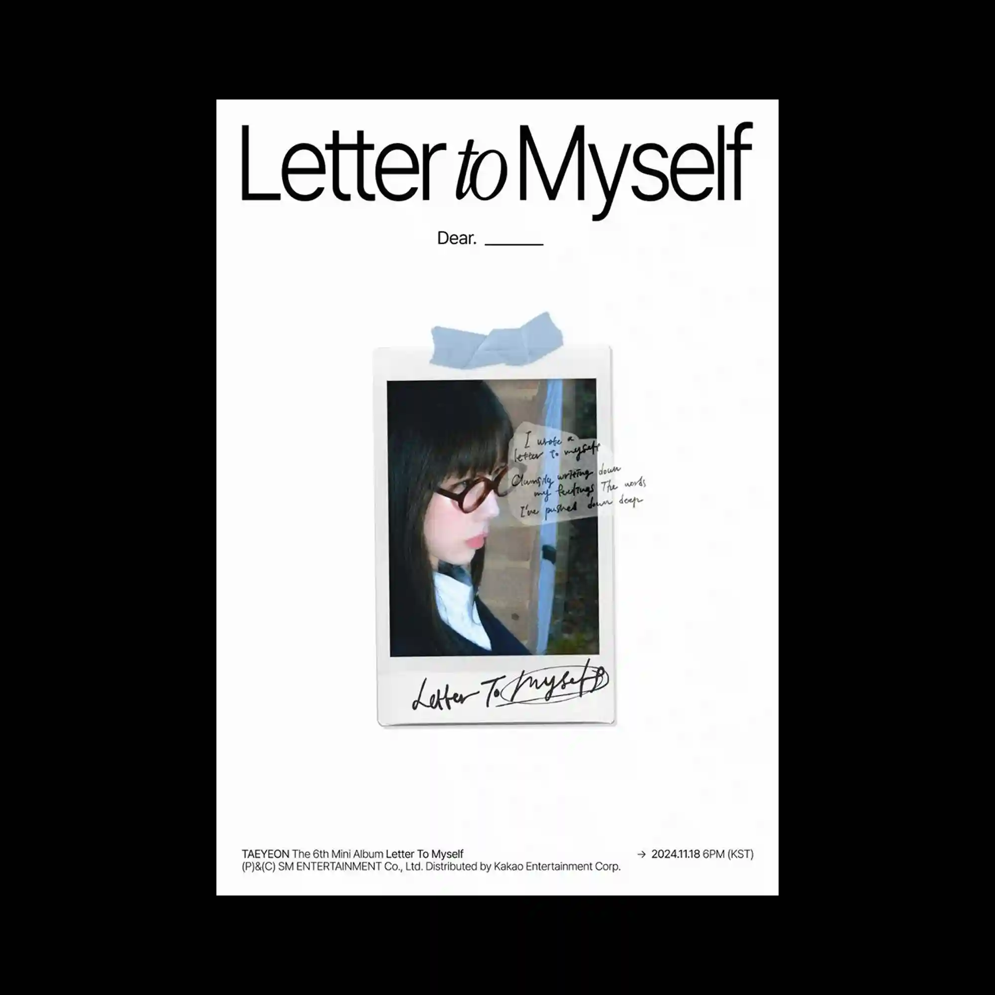
@taeyeon_ss | A minimalist layout centers on a single polaroid-style image attached with tape, surrounded by generous white space. The photograph introduces softness and personal texture, contrasting with the clean typographic treatment above and below. Handwritten elements overlay the image, adding irregularity and intimacy. The hierarchy relies on spacing and scale rather than graphic density.
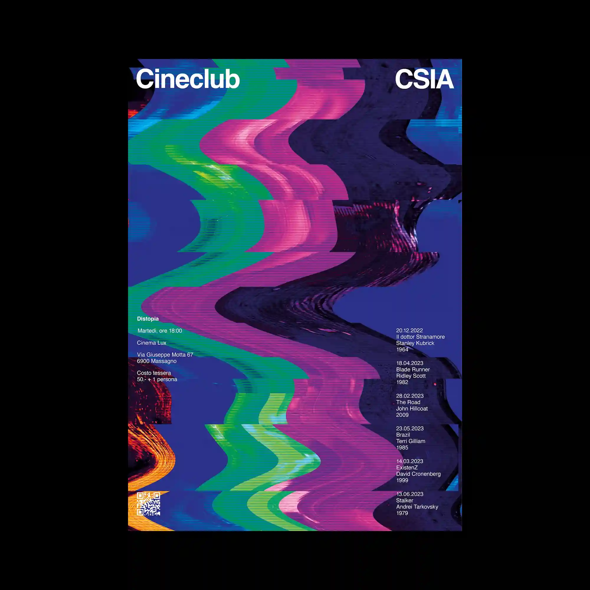
@la_graficata | Vivid, wave-like color bands distort vertically across the poster, creating a dynamic sense of motion and digital interference. Saturated hues collide against a dark background, heightening contrast and depth. Typography is placed at the edges, remaining stable while the image appears to ripple and bend. The composition balances controlled structure with expressive visual disruption.
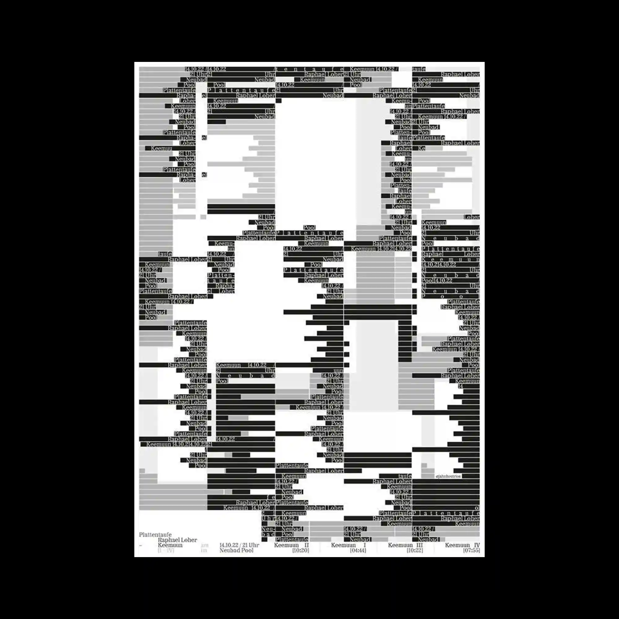
Horizontal bars of varying lengths and tones are layered to construct a fragmented, data-like surface. Text elements are embedded within the bars, becoming part of the visual texture rather than standalone information. The composition lacks a central focal point, encouraging scanning across the entire field. Contrast between light and dark strips creates a sense of rhythm and interruption.
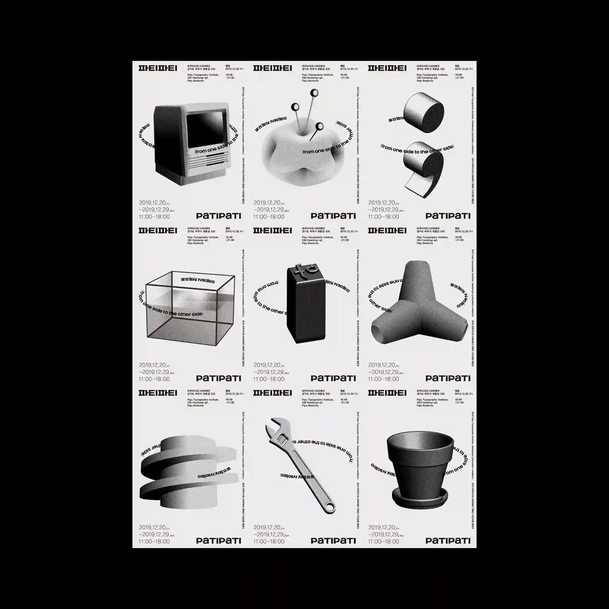
@paju.typography.institute | The layout is divided into a strict grid of repeated poster units, each containing a grayscale object rendered with soft lighting and subtle shadows. Three-dimensional forms are isolated against neutral backgrounds, emphasizing volume, material, and silhouette. Typography is consistently placed around each object, creating rhythm through repetition rather than variation. The overall composition reads as a modular archive, where uniformity and spacing establish visual order.
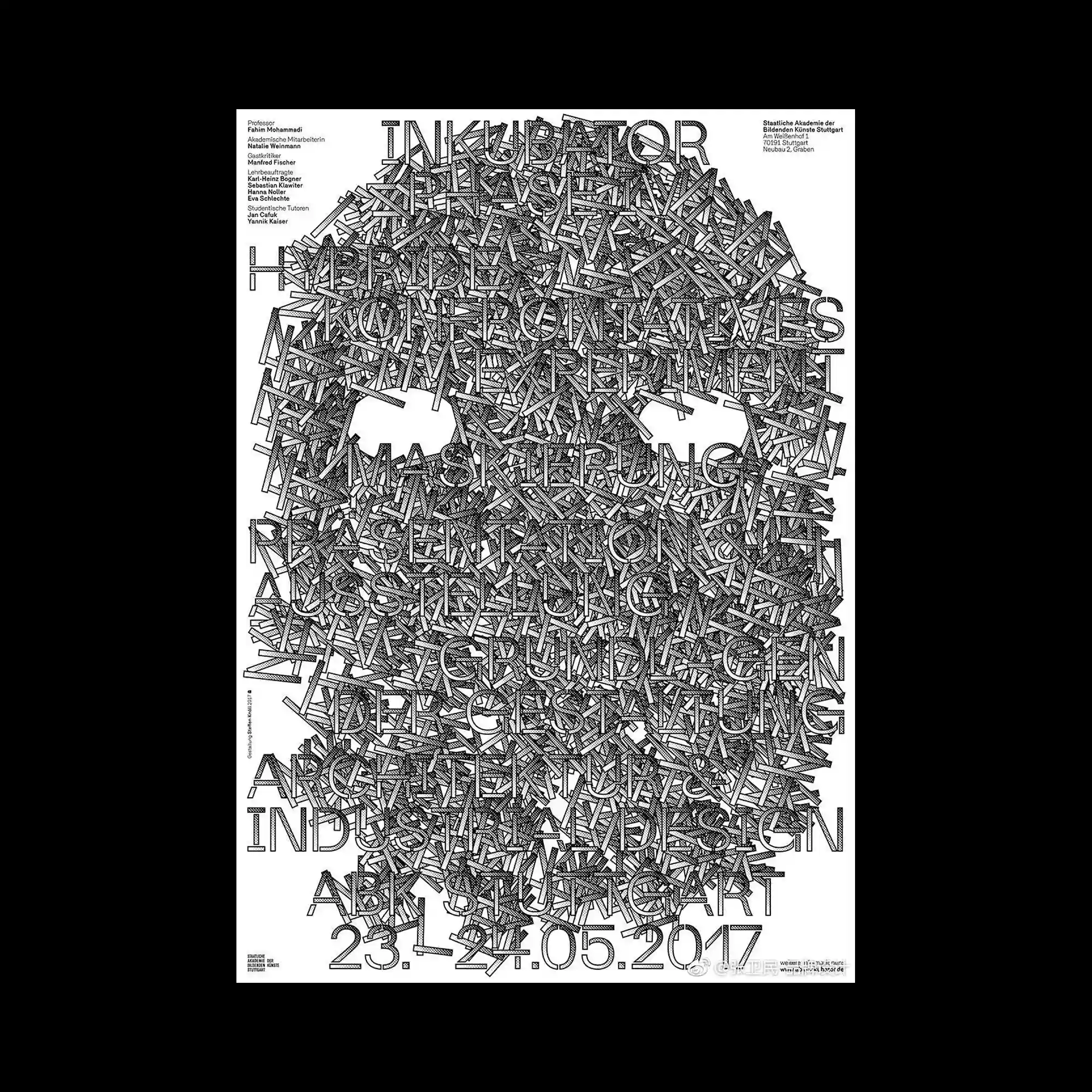
@abkstuttgart | A dense typographic composition fills the entire page, where countless short linear fragments overlap to form the silhouette of a skull-like structure. The letterforms and strokes are tightly packed, creating a textured mass that oscillates between readable typography and abstract pattern. Negative space is carefully carved out around the eye areas, allowing the overall figure to emerge from the visual noise. The monochrome palette and uniform line weight emphasize structure, repetition, and visual density over hierarchy.
A grid of colorful horizontal bands fills the poster, each band containing bold black typography. The colors vary from muted to saturated, creating rhythm through repetition. Thin graphic marks overlay some bands, adding subtle disruption. The composition reads as a stacked typographic system driven by color blocking.
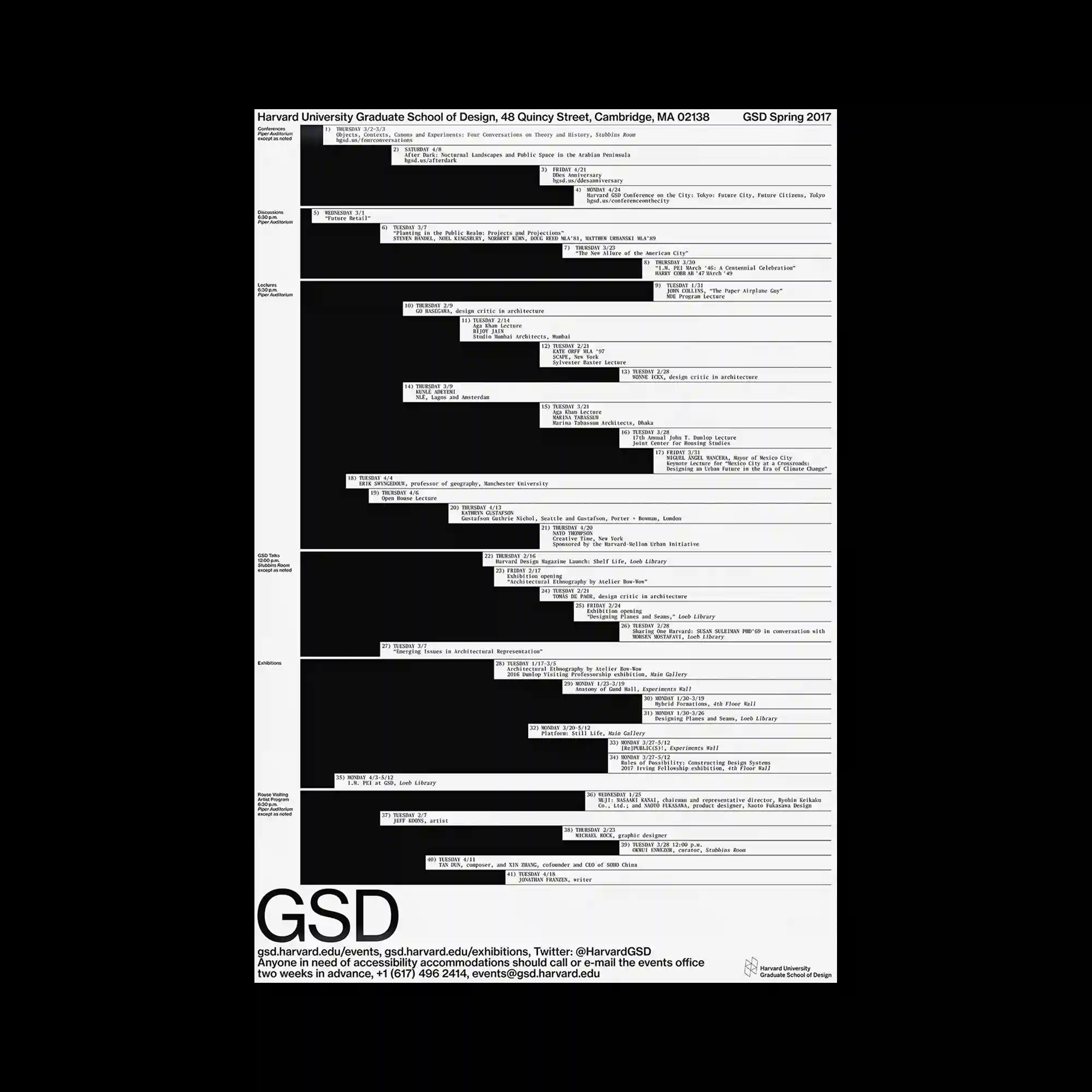
@harvardgsd | A tall, information-heavy poster uses a black-and-white palette with horizontal bars indicating events and timelines. Thin lines and compact text blocks are aligned precisely, creating a strict grid. Large dark fields contrast with narrow white strips, guiding reading order. The design emphasizes structure, hierarchy, and chronological flow.
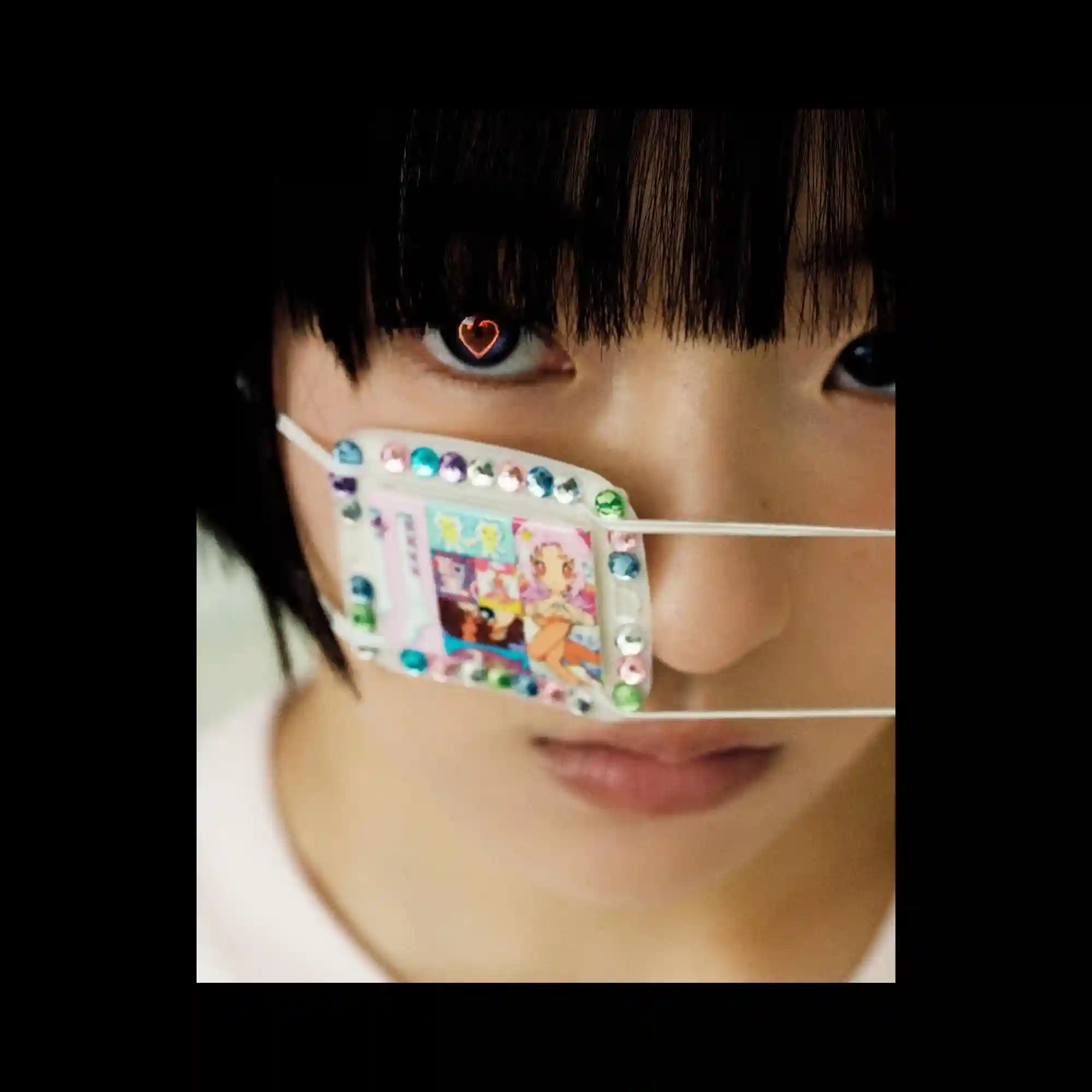
A tight photographic close-up focuses on the face, with emphasis on the eyes. A small decorative object is attached across the face, introducing texture and color contrast. The background is subdued, directing attention to surface detail and expression. The composition relies on intimacy, framing, and selective focus.
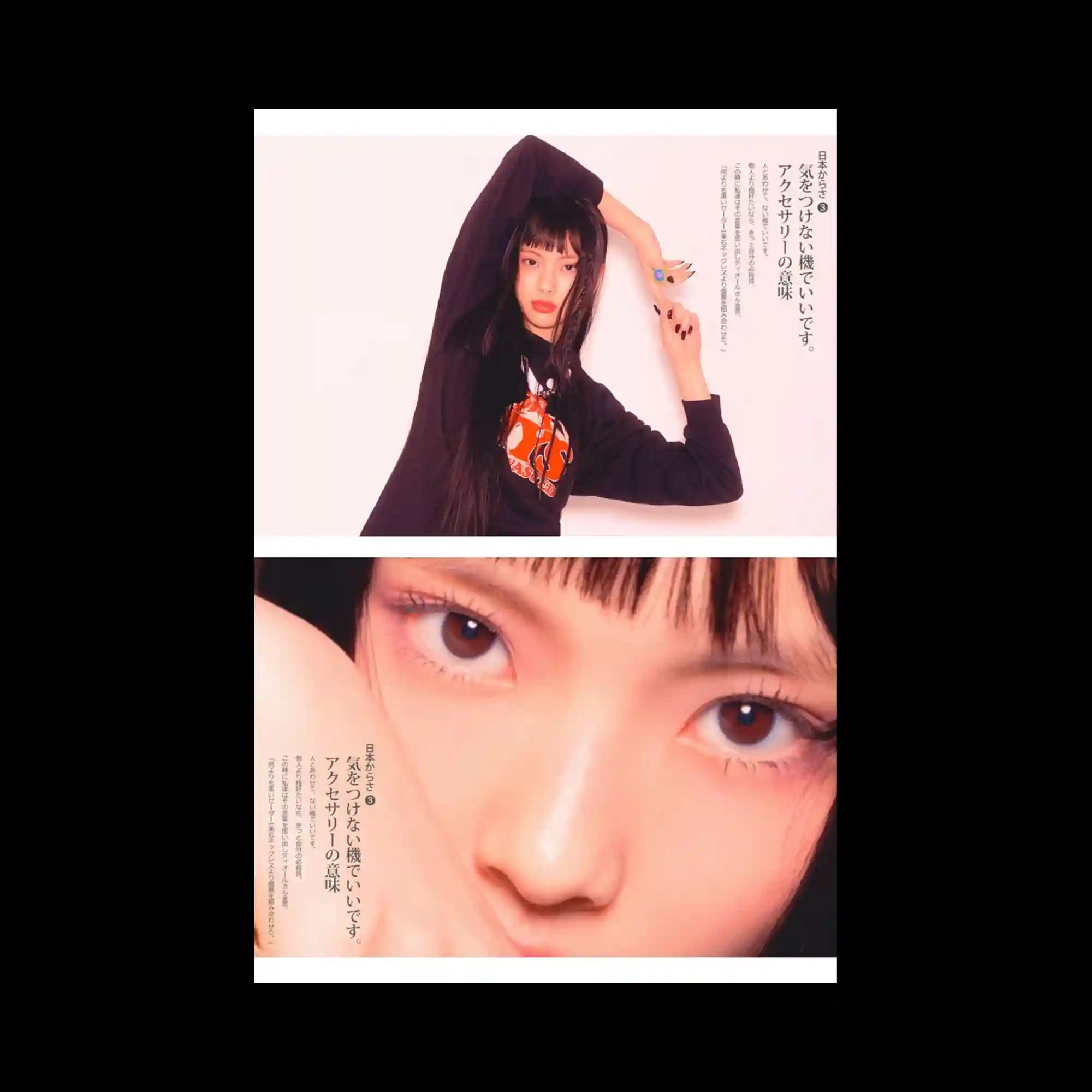
@newjeans_official | The layout is split into two horizontal photographic panels showing the same subject at different scales. Soft, warm lighting and pale backgrounds create a gentle atmosphere. Vertical lines of text are placed close to the subject, integrated into the negative space. The composition balances editorial photography with restrained typographic placement.
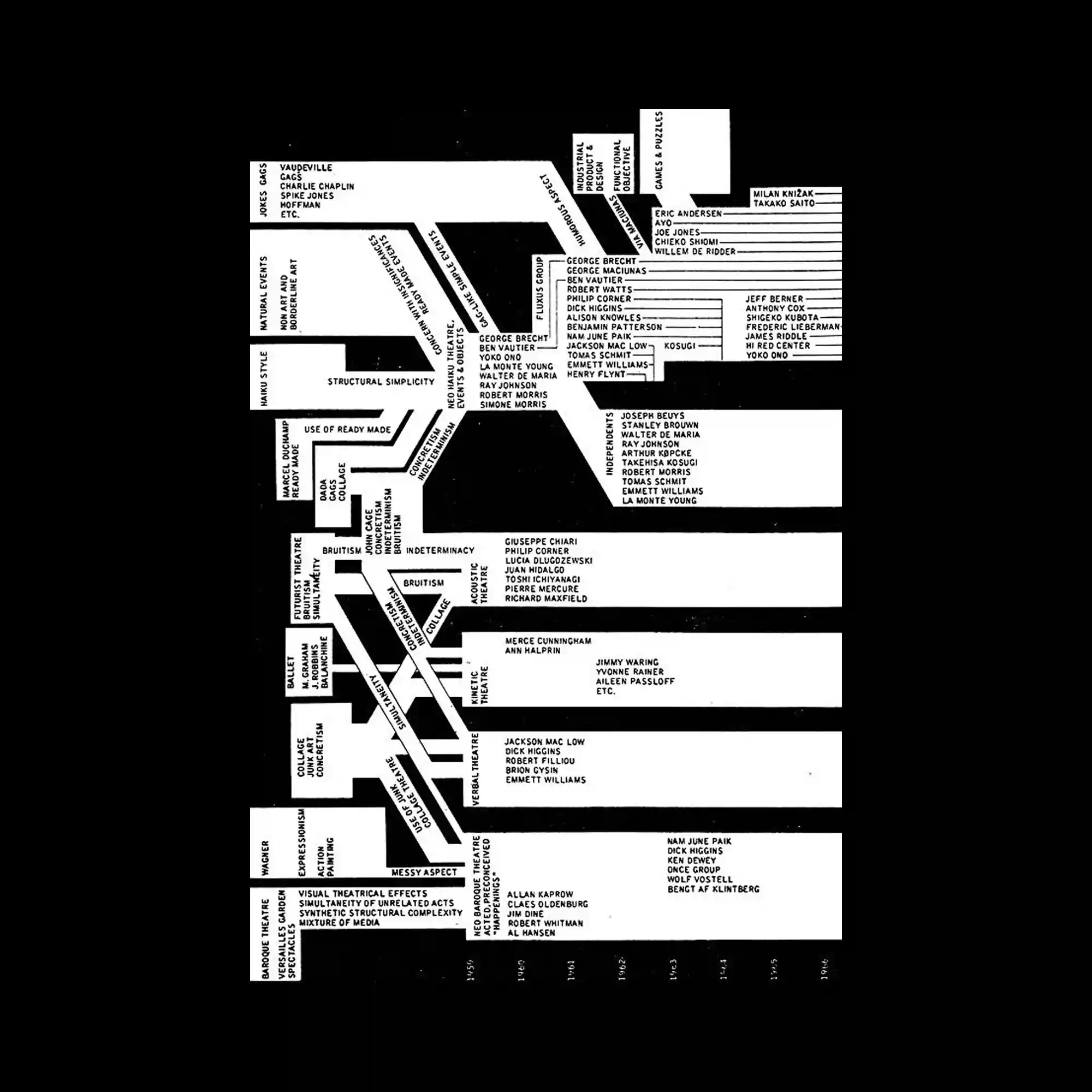
#George_Maciunas | On a black background, white rectangular blocks of text branch and intersect like a diagram or flowchart. The typography is compact and utilitarian, emphasizing relationships rather than decoration. Lines and blocks connect horizontally and vertically, guiding the eye through a complex network. The composition reads as an analytical map built from text.
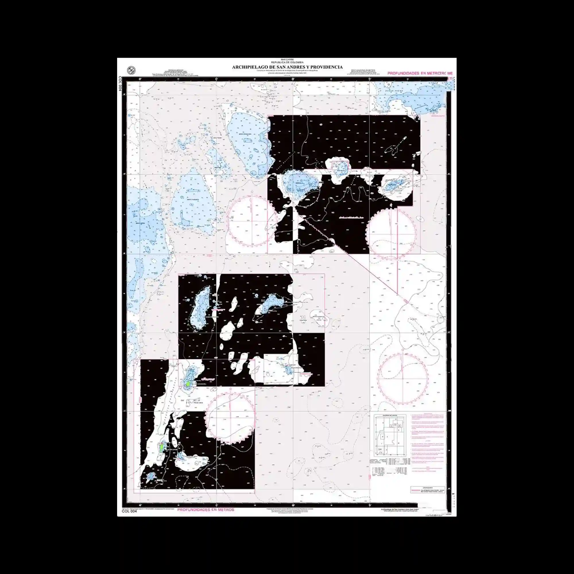
A detailed nautical chart fills the frame, combining pale backgrounds with black land masses and fine grid lines. Various symbols, circles, and annotations are distributed evenly across the surface. The composition is information-dense, with visual hierarchy created through line weight and color contrast rather than scale. The overall impression is systematic and technical.
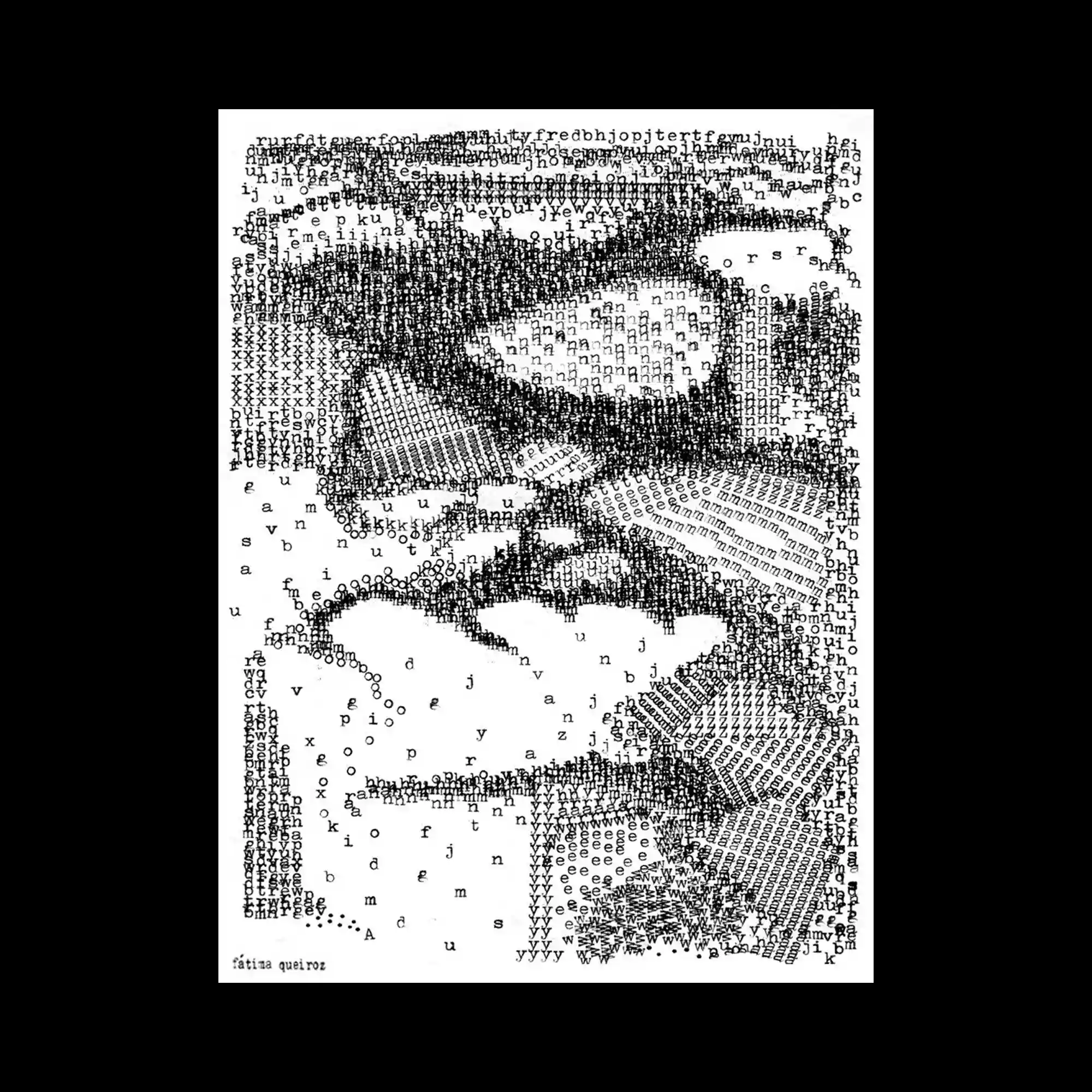
An image composed entirely of typed characters forms a portrait-like figure, with varying density creating light and shadow. The monochrome palette emphasizes texture and pattern rather than color. Individual letters remain visible, reinforcing the constructed nature of the image. The composition blends typography and image into a single, highly detailed surface.
@veziko | A minimal gray-and-white layout is structured around two large curved cut-out shapes that dominate the upper half. Bold sans-serif headings sit above each curve, while dense informational text is aligned along the top and bottom margins. A large italic word stretches across the center, partially masked by the shapes. The design relies on cropping, overlap, and typographic scale contrast.
@violaineetjeremy | A blurred photographic image serves as the background, dominated by cool blue tones and soft green highlights. Large, elegant serif typography overlays the image, sharply defined against the defocused photograph. The text hierarchy is clear, with oversized words anchoring the composition and smaller supporting text placed discreetly. The contrast between photographic softness and typographic precision defines the visual tone.
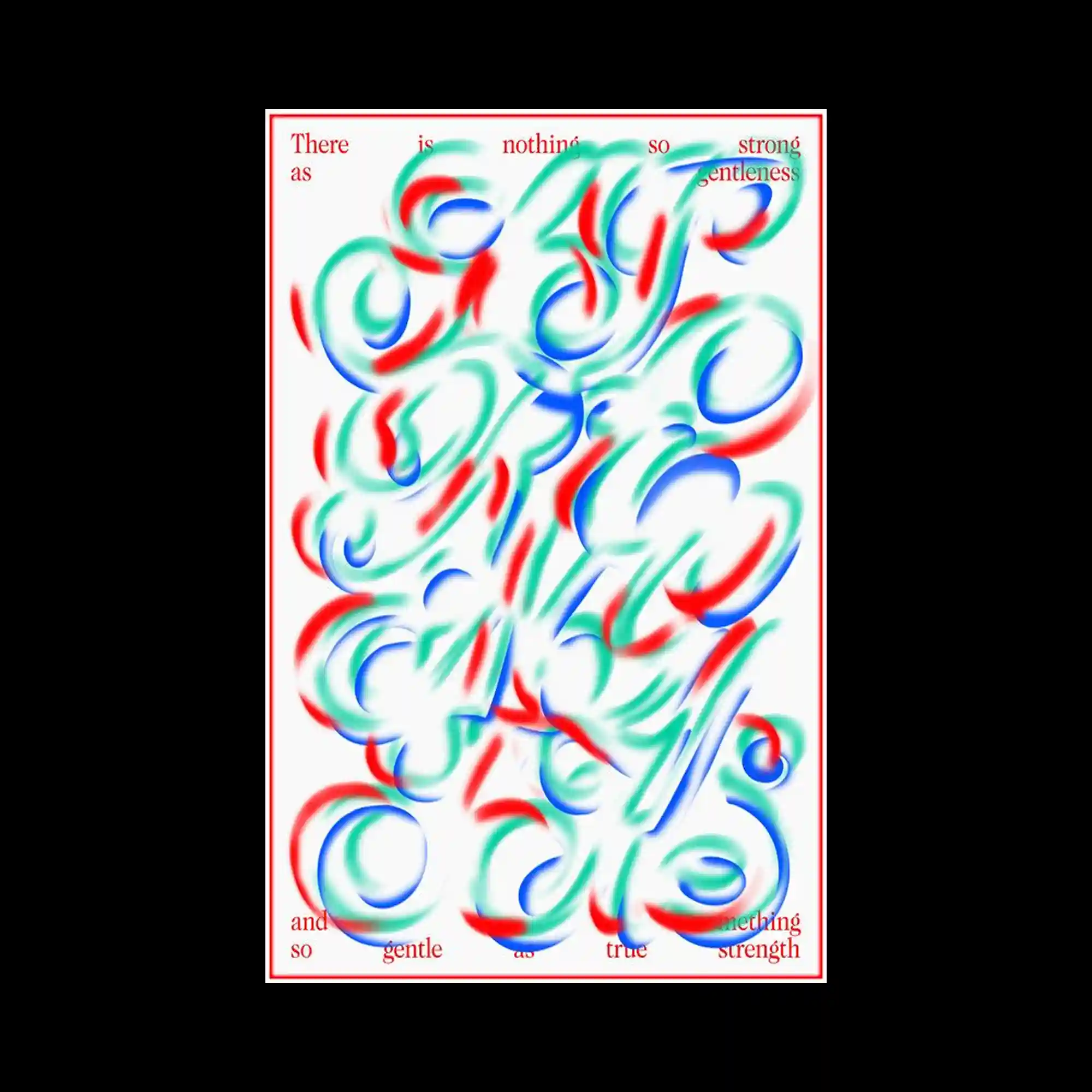
@lacasamira | The composition fills the frame with fluid, calligraphic strokes rendered in soft red, green, and blue, overlapping and blurring into one another on a white background. The marks resemble enlarged letterforms but remain abstract, emphasizing motion over legibility. A thin red border tightly frames the image, while small serif text is placed near the edges, contrasting the expressive central mass. The overall structure balances controlled framing with energetic, painterly typography.
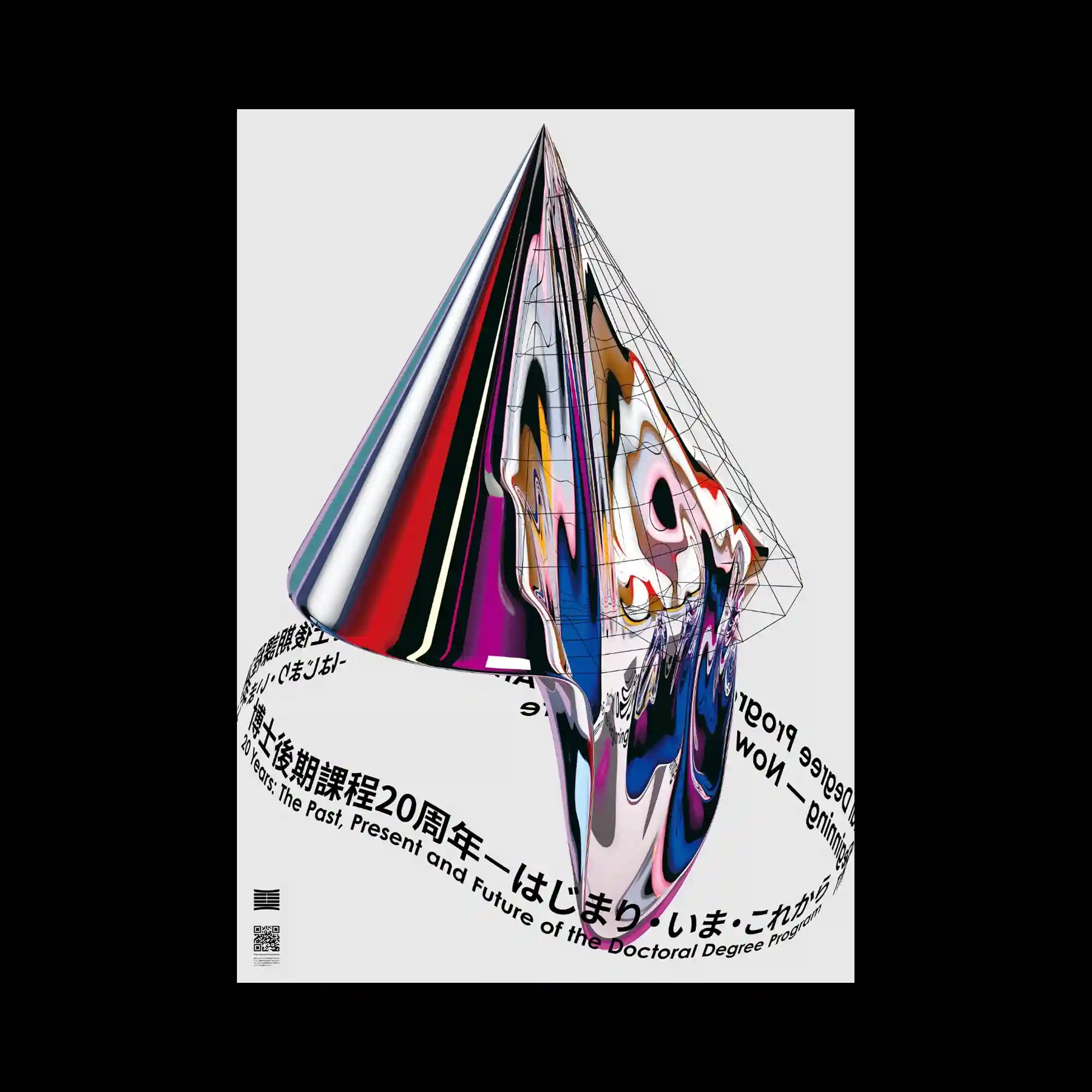
@tsin_wang | A sharp, cone-like three-dimensional form stands centered against a neutral background, rendered with glossy, distorted surface textures. One side appears smooth and reflective, while the other shows warped, liquid-like patterns overlaid with a wireframe grid. Circular typography wraps around the base, following a curved path. The contrast between precision geometry and fluid distortion defines the visual character.
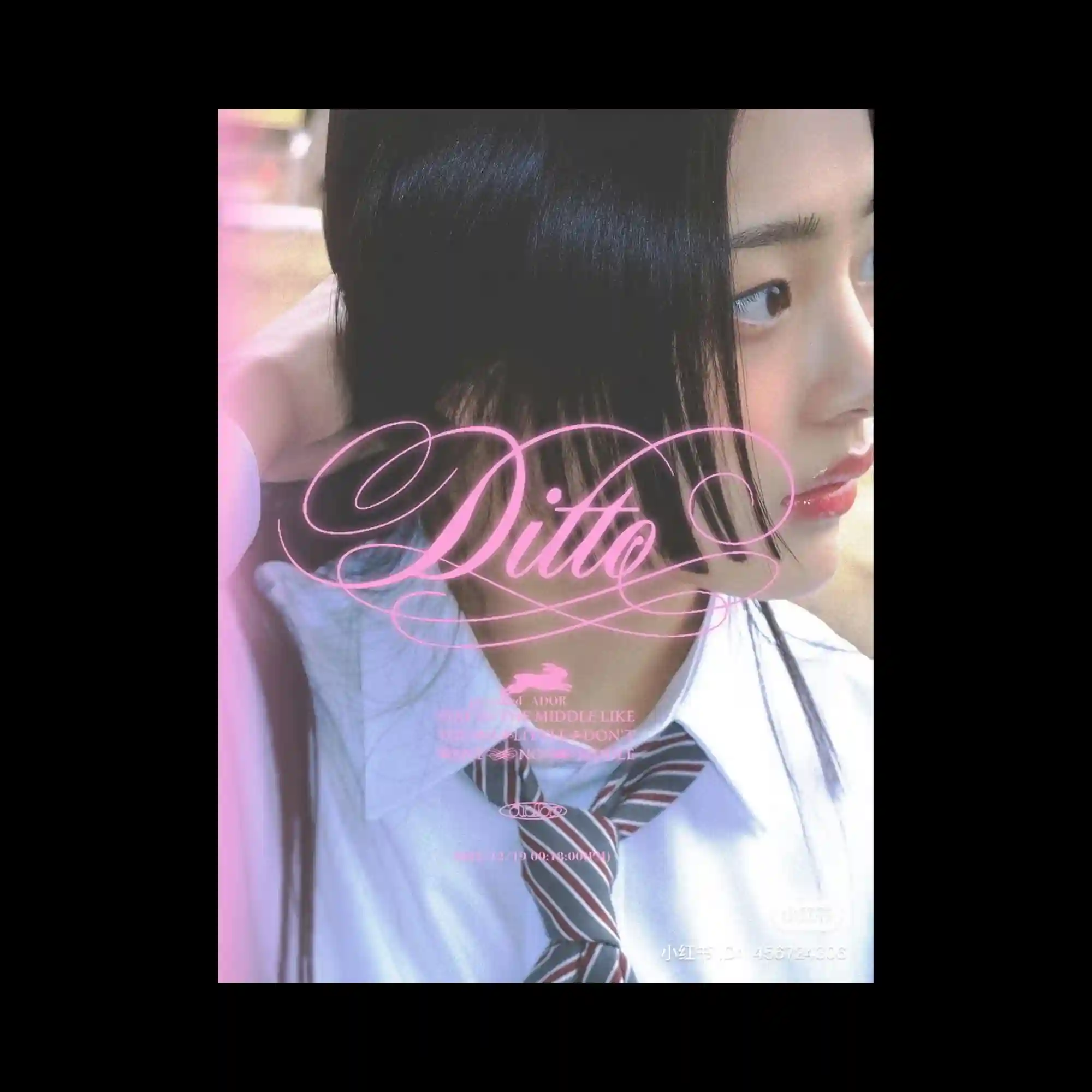
@newjeans_official | A photographic portrait fills the frame, softly lit with a shallow depth of field. Overlaid on the image is ornate, flowing pink script typography that contrasts with the realism of the photo. Smaller text elements are delicately layered without overpowering the face. The composition balances photographic intimacy with decorative typographic emphasis.
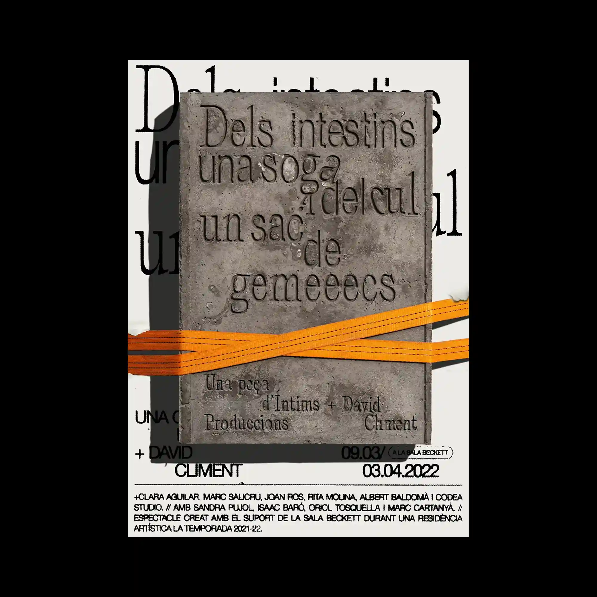
@enric.pe | A textured, stone-like rectangular slab sits centrally against a light background, with embossed lettering carved into its surface. An orange strap cuts horizontally across the slab, adding a contrasting industrial element. Behind it, large black typography is partially visible, creating layered depth. Material contrast between rough texture, flat color, and crisp type defines the composition.
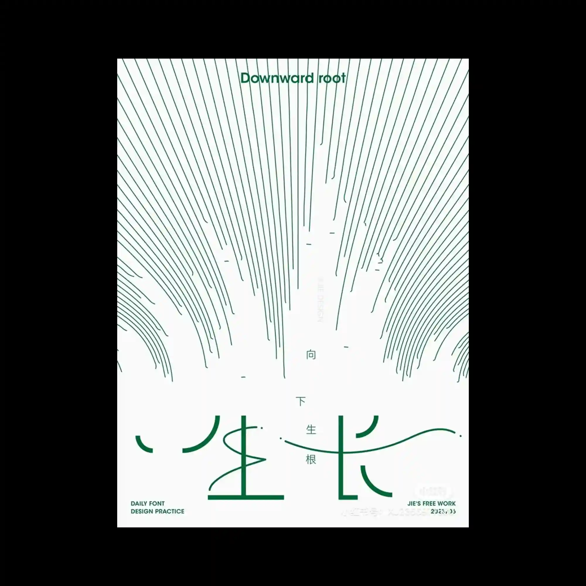
Fine green lines radiate downward across a white field, forming an organic, root-like pattern. The lines vary subtly in thickness and spacing, creating depth through density rather than shading. Minimal typography is placed sparingly, allowing the linear pattern to dominate. The composition feels restrained, relying on repetition and directional flow.
@e__tat | On a black background, a ribbon-like form in vivid red twists and loops through the center, carrying bold typography along its surface. The ribbon appears three-dimensional through shading and overlap, while white accent segments break the continuity. The text orientation changes with the ribbon’s direction, emphasizing motion and depth. The composition is driven by contrast between dark background and saturated color.
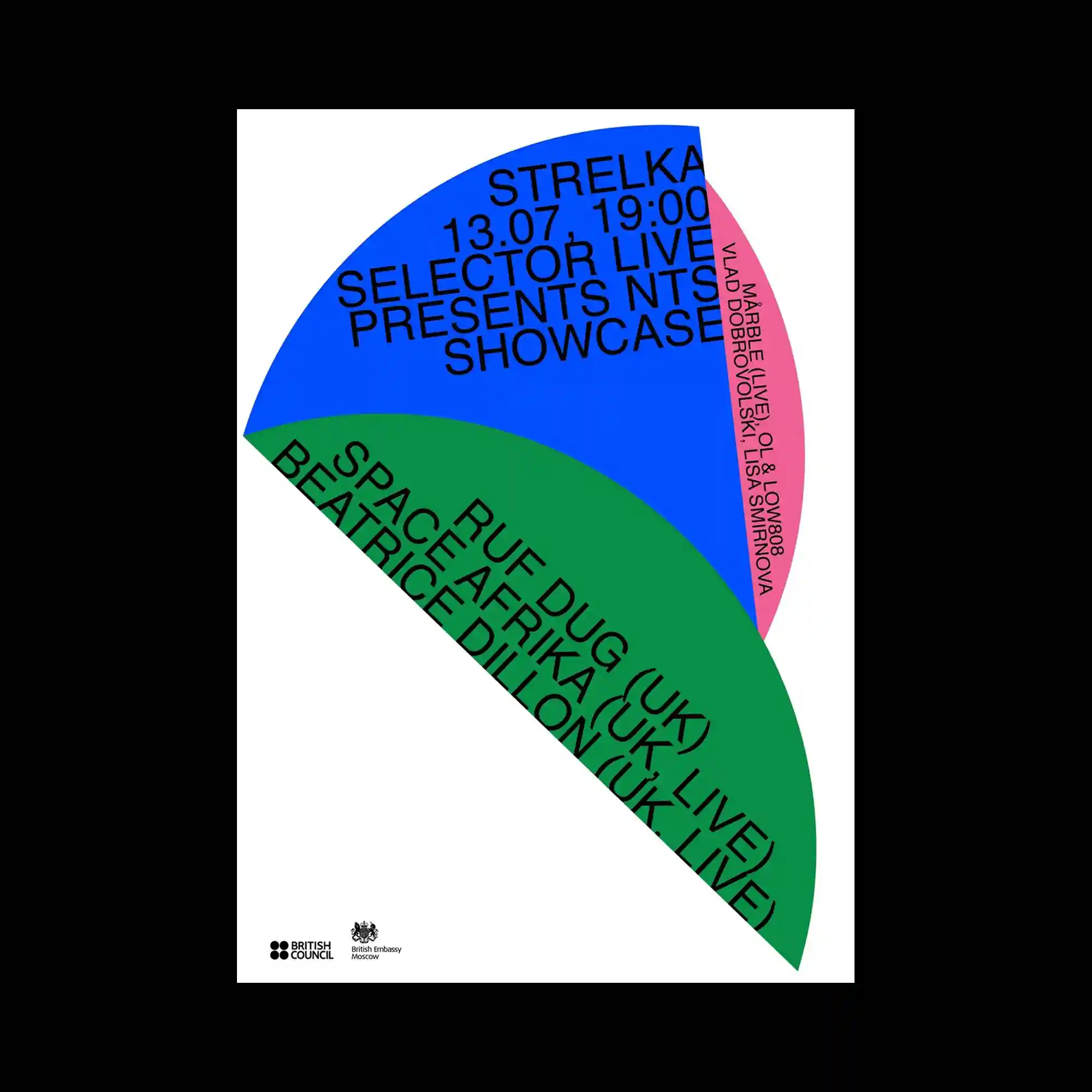
@kulachek | Large curved segments in blue, green, and pink intersect within a white background, forming a fan-like geometric composition. Text follows the curvature of each segment, aligning to the arc and reinforcing the shape. The contrast between rigid geometry and flowing text paths creates visual cohesion. Negative space plays a key role in separating and clarifying each colored form.
@kulachek | Overlapping oval shapes in bright green, orange, and pink stack vertically, partially obscuring bold black typography beneath. The transparency of layering is suggested through overlap rather than actual opacity changes. Large sans-serif text is cropped by the shapes, creating a dynamic interplay between foreground color fields and background type. The composition relies on repetition, overlap, and color blocking.
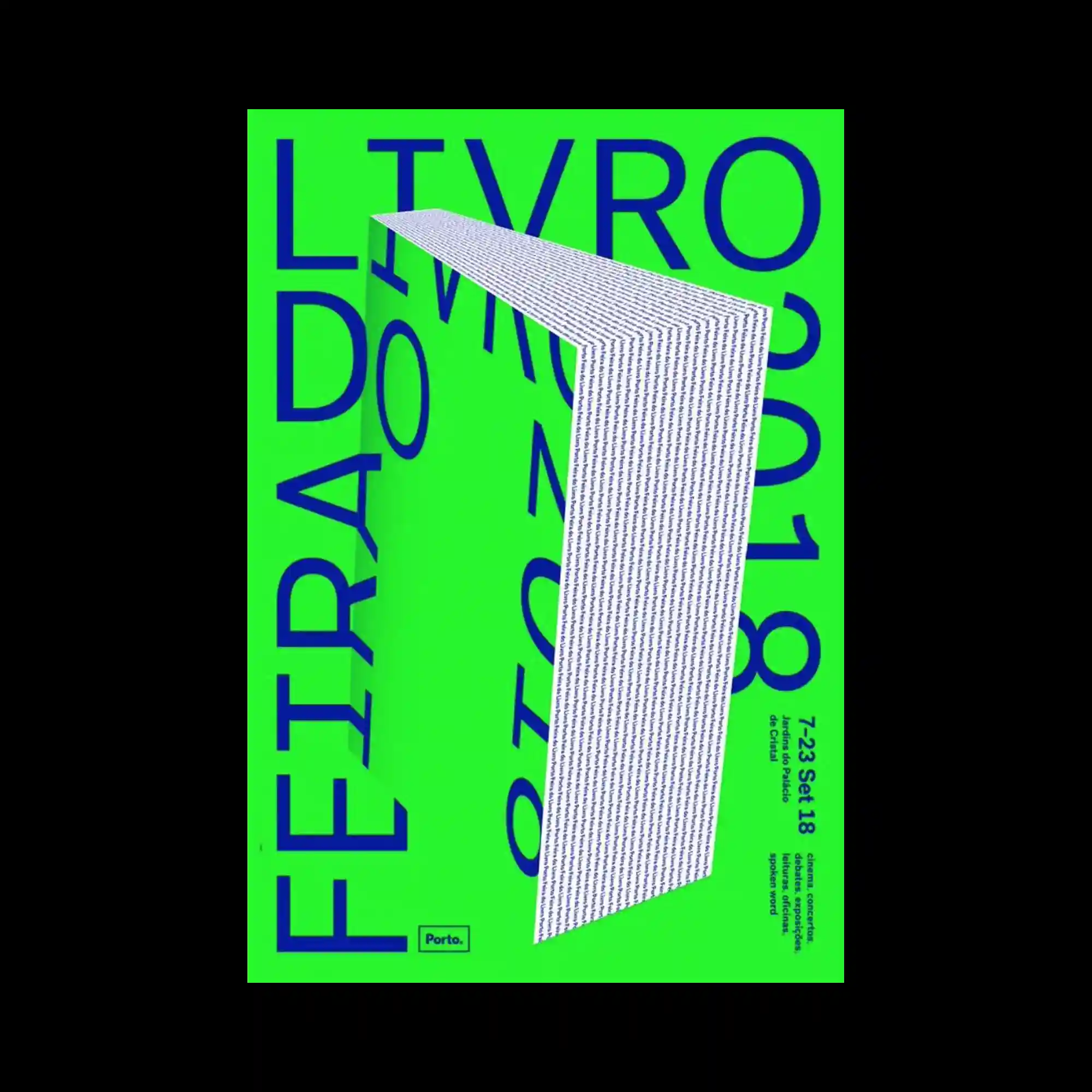
@feiradolivrodoporto | A vivid neon-green background dominates the poster, creating a high-contrast field for deep blue typography. Oversized letters extend beyond the frame edges, suggesting scale and movement. A folded, three-dimensional strip of densely set text cuts diagonally through the composition, adding depth and a sense of spatial interruption. Flat color, extreme contrast, and typographic scale shifts define the visual impact.
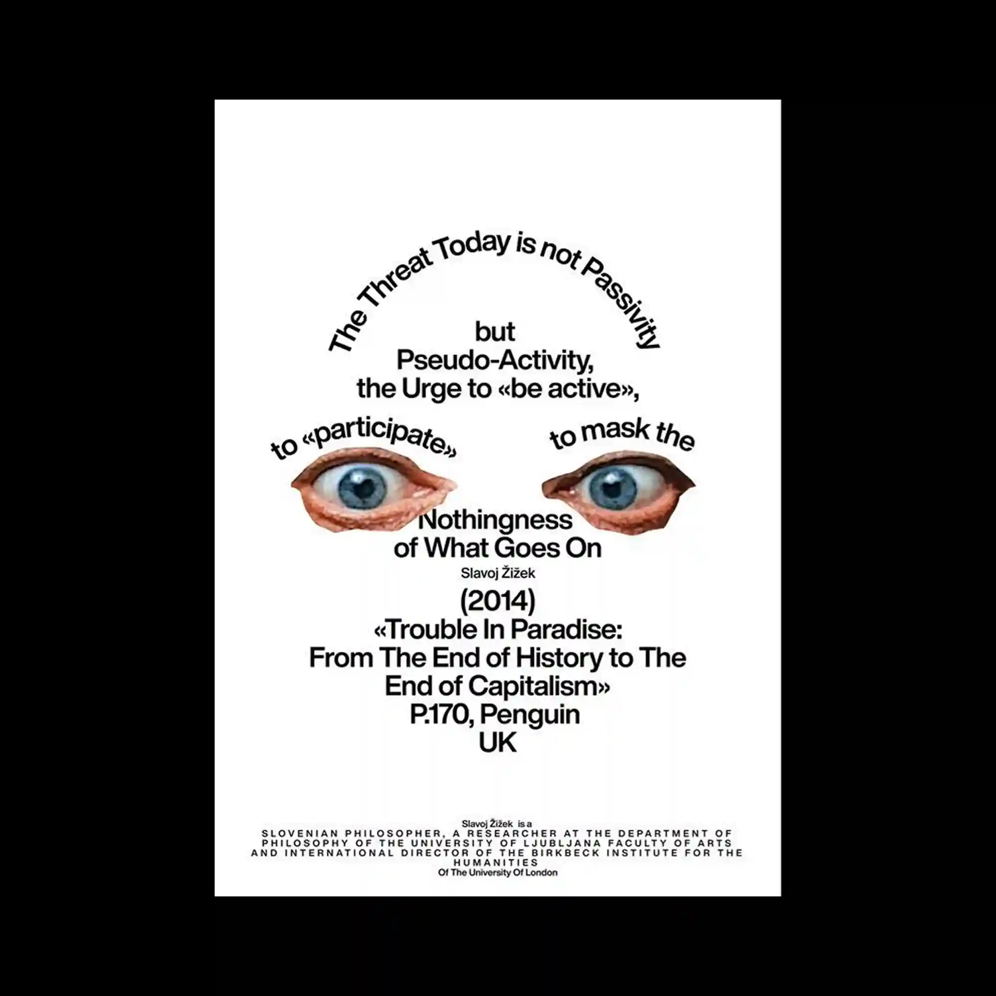
A white background supports a centralized typographic composition arranged along curved paths, forming an arch-like structure. Photographic cut-outs of eyes are placed symmetrically near the center, acting as focal points within the text. The typography varies in size and weight, guiding the eye from the arc down to the dense block of text below. The overall structure feels editorial and conceptual, driven by alignment, spacing, and typographic rhythm rather than color.
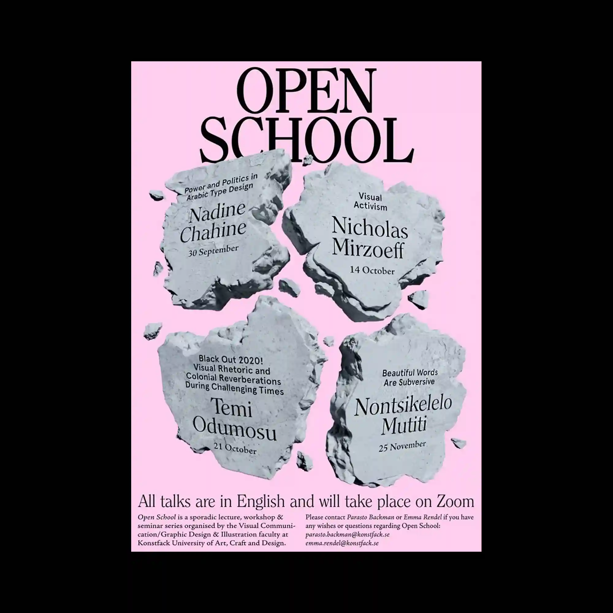
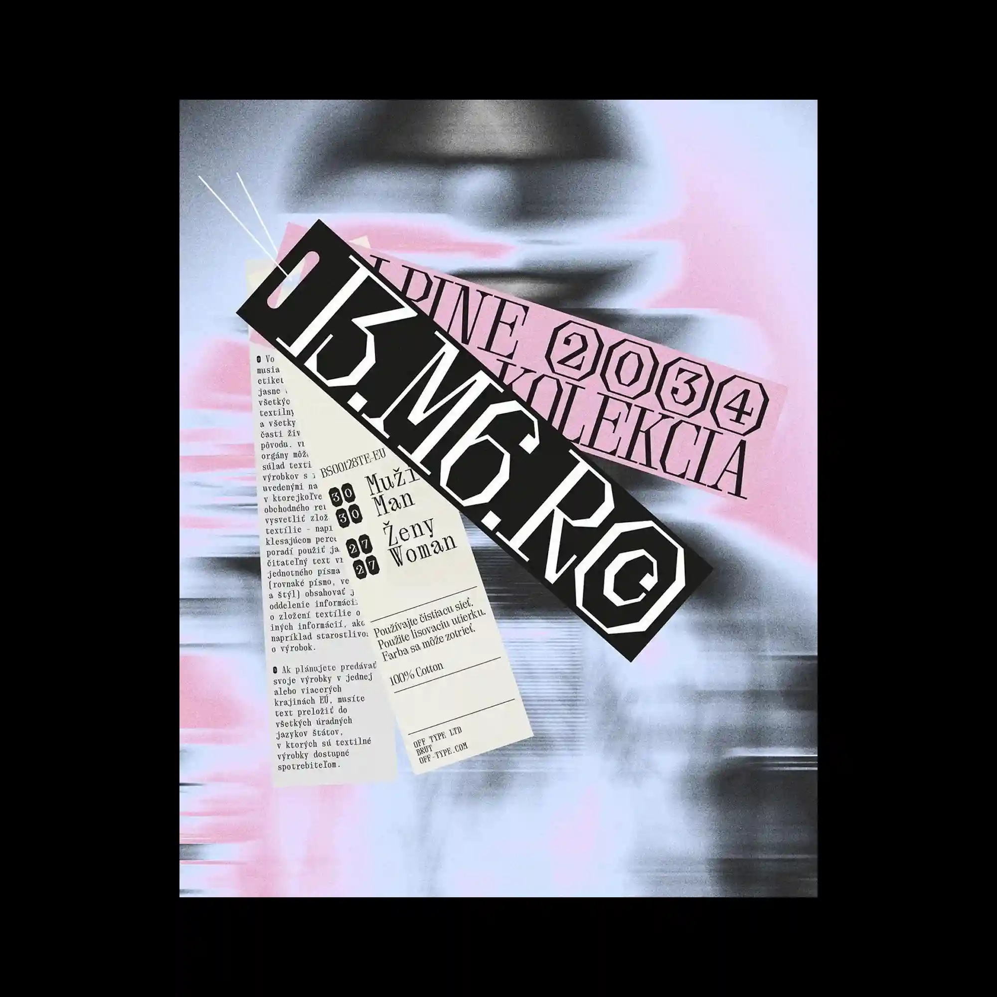
@konstfack | The composition uses a soft pink background contrasted with irregular, stone-like gray fragments arranged in a loose grid, each fragment acting as a container for typographic information. Large serif typography at the top establishes a strong vertical hierarchy, while smaller serif text is embedded directly into the textured shapes, creating a carved or engraved effect. The balance relies on symmetry in placement but asymmetry in the organic contours of each fragment. The visual tension comes from the contrast between refined editorial typography and rough, fractured surfaces.