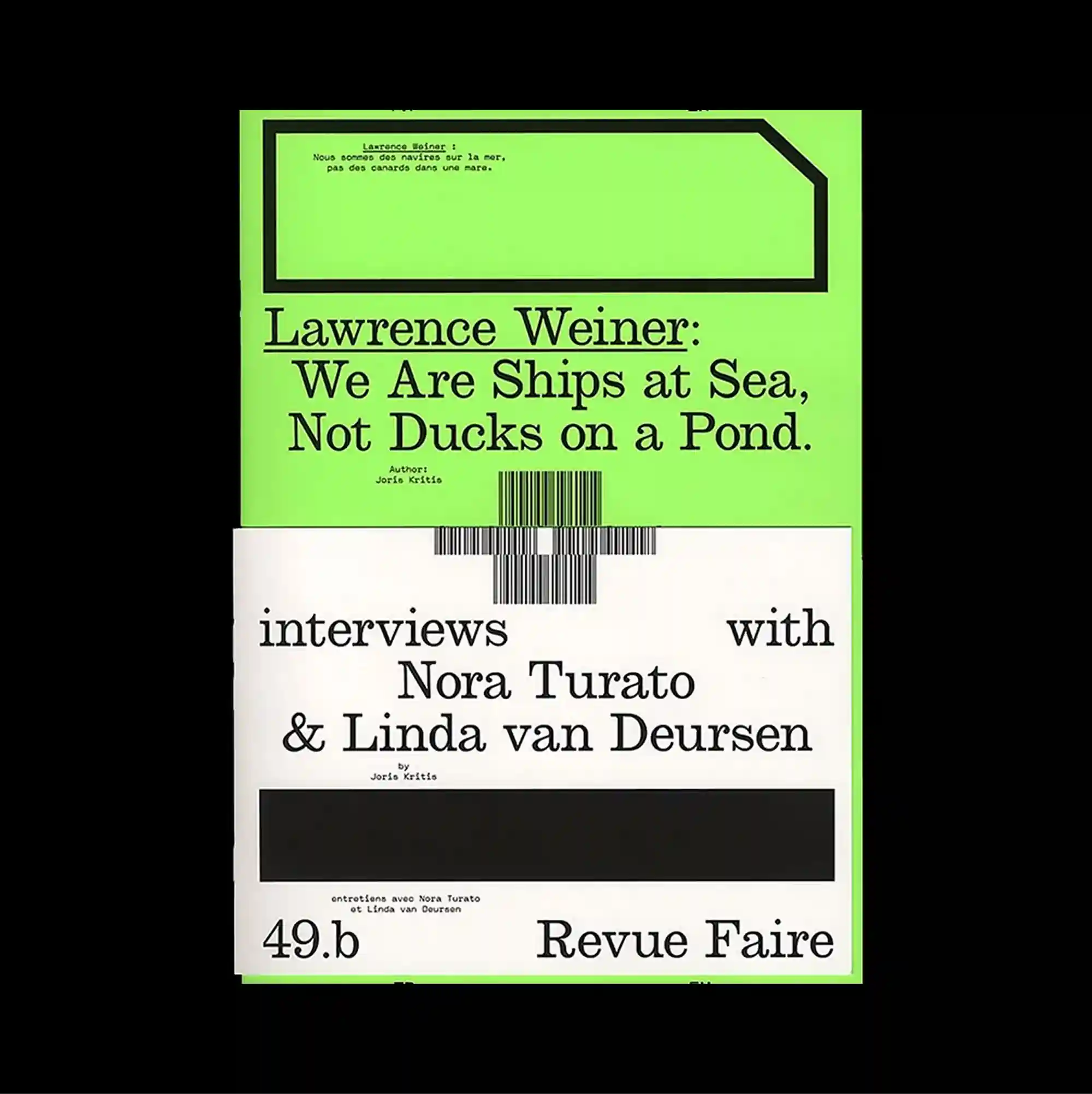
The surface is built from stacked rectangular panels of different sizes, producing a clear vertical rhythm through repeated blocks and abrupt transitions. Serif and sans-serif styles are mixed with thin rules and compact captions, producing a layered hierarchy through changes in weight, width, and alignment. A neon green upper panel contains large serif text within a rectangular frame, while the lower white section combines a barcode, black blocks, and widely spaced interview-style typography. Bold color contrasts and abrupt shifts in scale produce an energetic graphic rhythm that remains legible despite the density of the elements.
서로 다른 크기의 직사각형 패널을 위아래로 쌓아 반복되는 블록과 급격한 전환으로 뚜렷한 세로 리듬을 형성함. 세리프와 산세리프 서체를 얇은 선과 작은 캡션과 함께 혼합해 굵기, 폭, 정렬의 변화로 다층적인 위계를 형성함. 형광 녹색 상단 패널의 사각 프레임 안에 큰 세리프 글자가 들어가고, 하단 흰 영역에는 바코드, 검정 블록, 넓게 떨어진 인터뷰형 타이포그래피가 결합됨. 강한 색 대비와 갑작스러운 크기 변화가 요소가 많아도 읽힘을 유지하는 활기찬 그래픽 리듬을 만들어냄.
画面由不同尺寸的矩形面板上下堆叠而成,通过重复区块与突然的转换形成清晰的纵向节奏。 衬线体与无衬线体结合细线和小型说明文字,通过字重、宽度与对齐方式的变化建立多层级关系。 荧光绿色上方面板的矩形框内放置大型衬线文字,下方白色区域则结合条码、黑色块与宽松分布的访谈式文字。 强烈色彩对比与突变的尺度形成充满能量的图形节奏,即使元素密集仍保持清晰可读。