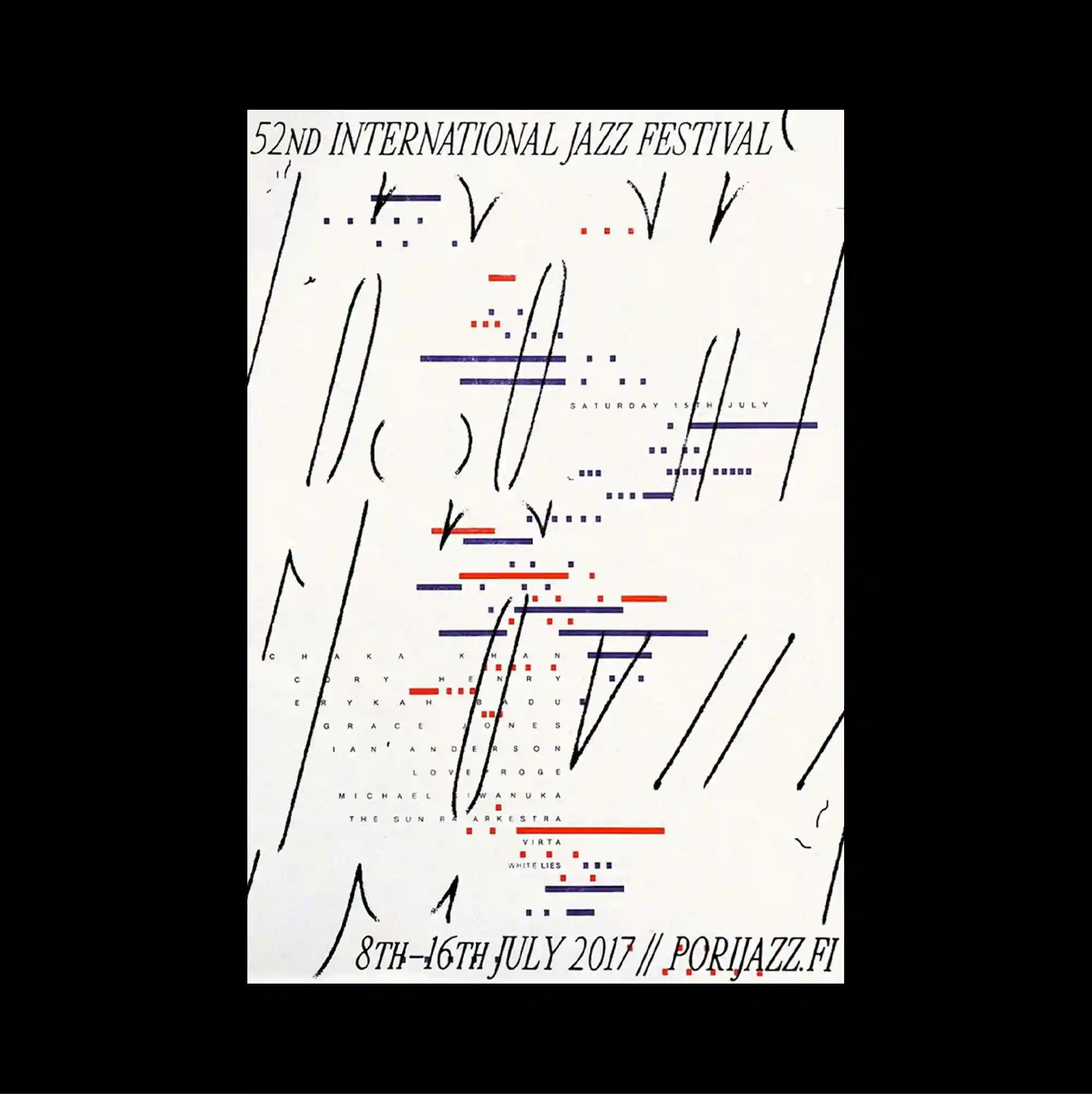
A centered composition leaves a substantial amount of open space around the main elements, allowing a small cluster of imagery and type to carry most of the visual weight. Typography is integrated with diagrams, coordinates, and graphic notation, so textual information and visual systems become difficult to separate. Thin black strokes, scattered dots, and short red and blue bars are distributed like musical notation across the center, with small condensed information held close to the perimeter. The repeated structures make the poster read like a diagram or index, with visual meaning emerging from accumulation rather than a single focal image.
주요 요소 주변에 넓은 여백을 남긴 중앙 집중형 구성으로, 작은 이미지와 타이포그래피 묶음이 화면의 대부분의 시각적 무게를 담당함. 타이포그래피를 다이어그램, 좌표, 그래픽 표기와 결합해 문자 정보와 시각 시스템이 분리되기 어려운 상태로 구성함. 가는 검정 획, 흩어진 점, 짧은 붉은색과 파란색 막대가 중앙에 악보처럼 분산되고 작은 압축 정보는 주변부 가까이에 정돈됨. 반복 구조가 포스터를 다이어그램이나 인덱스처럼 보이게 하며 단일 초점 이미지보다 요소의 축적에서 시각적 의미가 형성됨.
居中的构图在主要元素周围保留大量留白,使少量图像与文字组合承担页面大部分视觉重量。 文字与图解、坐标和图形符号相互结合,使文本信息与视觉系统几乎无法分离。 细黑线、散落点与短红蓝条像乐谱一样分布在中央,小型压缩信息则靠近页面边缘排列。 重复结构使海报呈现图解或索引般的特征,视觉意义更多来自元素累积而非单一焦点图像。