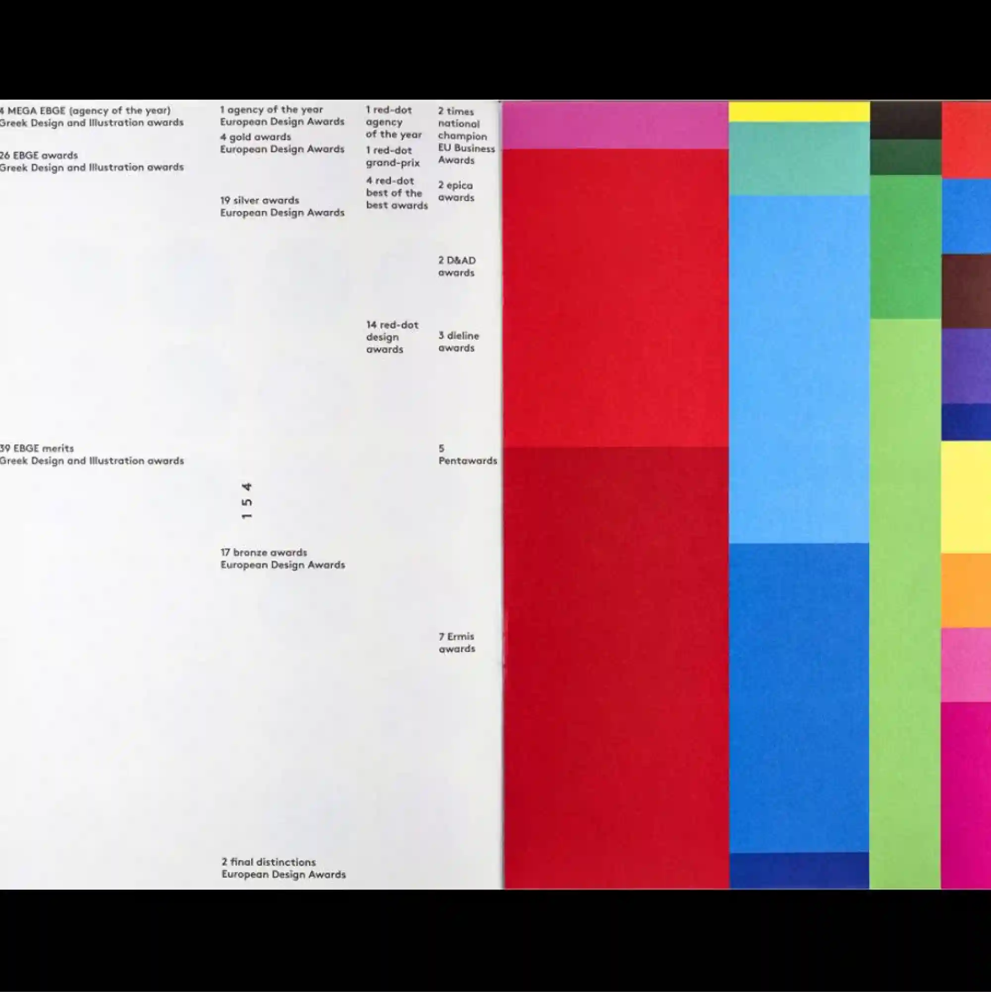
The design is divided into strongly contrasting color and image zones, using large rectangular fields to establish a clear structural hierarchy. Monospaced and data-like typography is arranged in repeated rows and columns, giving the text the character of measurements, indexes, or coded information. A compact list of small black information occupies the left side, while tall vertical color bars in red, blue, green, yellow, and dark tones dominate the right half. Precise alignment and dense secondary information give the design a highly functional appearance while preserving a distinctive graphic hierarchy.
큰 직사각형 색면과 이미지 영역을 강하게 대비시켜 분할하고, 이를 통해 명확한 구조적 위계를 형성함. 고정폭 및 데이터형 타이포그래피를 반복되는 행과 열로 배치해 텍스트가 측정값, 인덱스, 코드 정보처럼 보이게 함. 작은 검정 정보 목록이 왼쪽에 압축되어 있고 붉은색, 파란색, 녹색, 노란색, 어두운 색의 세로 막대가 오른쪽 절반을 지배함. 정밀한 정렬과 조밀한 보조 정보가 기능적인 인상을 강화하면서도 뚜렷한 그래픽 위계를 유지함.
设计以强烈对比的色块与图像区域进行分割,并利用大面积矩形建立清晰的结构层级。 等宽与数据化字体以重复的行列排列,使文字呈现测量值、索引或编码信息般的特征。 紧凑黑色信息列表集中在左侧,红、蓝、绿、黄与深色的高竖条则主导右半部。 精确对齐与密集次级信息强化功能性外观,同时保留鲜明的图形层级。