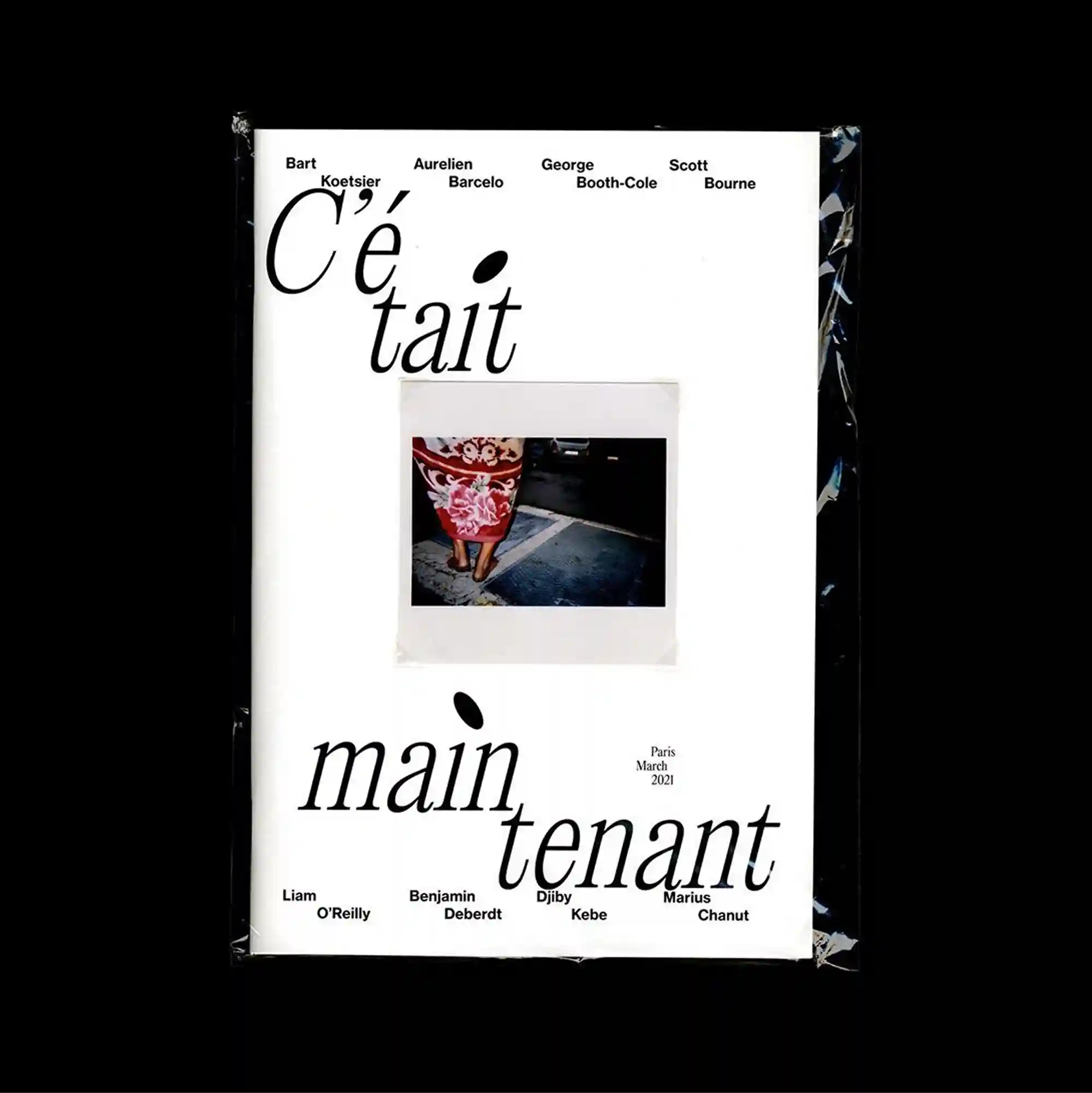
A centered composition leaves a substantial amount of open space around the main elements, allowing a small cluster of imagery and type to carry most of the visual weight. Serif and sans-serif styles are mixed with thin rules and compact captions, producing a layered hierarchy through changes in weight, width, and alignment. A small Polaroid-like photograph sits near the center beneath an elegant serif heading, while oversized italic words stretch across the lower half and small names remain aligned near the edges. The careful sequencing of headings, captions, and images gives the piece the discipline of a publication page while retaining the impact of a poster.
주요 요소 주변에 넓은 여백을 남긴 중앙 집중형 구성으로, 작은 이미지와 타이포그래피 묶음이 화면의 대부분의 시각적 무게를 담당함. 세리프와 산세리프 서체를 얇은 선과 작은 캡션과 함께 혼합해 굵기, 폭, 정렬의 변화로 다층적인 위계를 형성함. 우아한 세리프 제목 아래 중앙에 작은 폴라로이드형 사진이 놓이고, 초대형 이탤릭 단어가 하단 절반을 가로지르며 작은 이름은 가장자리 근처에 정렬됨. 제목, 캡션, 이미지의 세심한 순서가 출판 페이지의 규율을 만들면서도 포스터 특유의 시각적 충격을 유지함.
居中的构图在主要元素周围保留大量留白,使少量图像与文字组合承担页面大部分视觉重量。 衬线体与无衬线体结合细线和小型说明文字,通过字重、宽度与对齐方式的变化建立多层级关系。 优雅衬线标题下方中央放置一张小型拍立得式照片,超大斜体词语横跨下半部,小型姓名则沿边缘对齐。 标题、说明与图像的精心编排赋予作品出版页面般的秩序,同时保留海报的视觉冲击力。